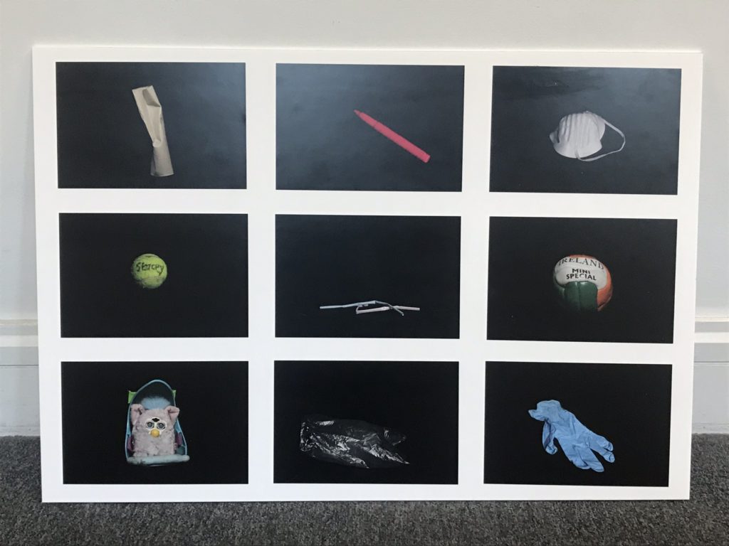
I chose to lay my images out in a grid, taking inspiration from Typologies that showcase variations of the same thing; in this case, rubbish. The layout is also inspired by methods of classification, commonly used in scientific processes. This is why I chose to use only images with a black background to serve as a standardised feature amongst all images.
- All images are A5 to fit on one board.
- I placed both images of balls in the centre row on either side as a way of balancing out the visual aesthetic.
