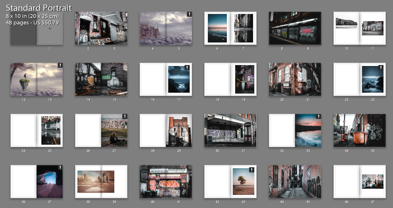
Photo book Layout 1

This is my first photobook layout that I have come up with incorporating all styles of photographs to give variety and keep the viewer interested. The above image shows all pages included with the differing layout styles on each page i have gone with. I have included a range of layouts from double page spreads to single images with a boarder. The majority of my images are full bleed to allow the viewer to view the whole image in as much detail as possible and really connect with the visual story. Throughout the book there is contrasting imagery from aesthetically pleasing coastal landscape shots to images depicting the grotty back streets in Manchester. I have tried to pair up some images that have similar shapes and colors to create more intriguing and interactive pages for the viewer.
Photo-book Layout 2

With the thought that i had too many differing concepts in my last book layout I condensed it down to having only the urban landscapes and dream like images. I think that this has helped for the viewer to understand the narrative and story that I am conveying about environmental change and the destruction of the natural environment. The clear juxtaposition between the dark contrasted urban landscapes and the bright dreamy images shows my anger towards the urban development all across the world. I like how throughout this photo book, there is reference to a Utopian world from two perspectives. The urban images shows a Utopian world from the graffiti artists perspective because they are creating beautiful art that they think is making the world better. Also, the dream like images are a clear Utopian world from my perspective showing the audience my view on what the world should be like. However there are also elements of the sublime incorporated within this layout. For example, the graffiti could be viewed as vandalism or gangs marking their territory as appose to an art form. Also my art/manipulation photos may be seen to incorporate elements of fear as the natural land is a scary place with the force and natural disasters it can create.
Photo-book Layout 3


For this layout I wanted to revert back to my first layout and try to incorporate all of the images that i started off with. To still go with the idea of narrowing down the selection of the main images I have used a montage method to combine the urban landscapes and dream like images. I have tried to match up the colors of the urban landscapes and dream like images to achieve the best results. I think it has worked out well for certain images however has also lead to be a bit distracting and confusing too.
