Link to Final Photobook

Link to my Photobook,Waste

In the final version, I changed the cover images to what was originally the first pages in the book. I felt that these images were more powerful in portraying my ideas as well as captivating the essence of my project.

I summed the topic of my project in one word being ‘Waste’ as it reflects the three concepts behind my work:

  1. The ‘Waste’ featured in the images

2. The action behind humans throwing away the things they do not consider important

3. The consequences of disposing items to ‘Waste’ away.

The title is written sideways to give a ‘scientific document’ feel.

Photobook Layout Experimentation

I repeated the same pattern of images throughout the book, to give an organised aesthetic. The circle images are placed alongside their close-up comparisons to show the detail in the items depicted. I chose to make many of my images full scale, as they all have dark backgrounds. Black is used in a minimalistic style to emphasize the items, as well as being associated with darkness and negativity to reflect the topic of pollution.

As Keith Arnatt and Mandy Barker formed my biggest inspirations amongst the project, all the images used within the book reflect their work, styles and methods.

To fit the theme, I also incorporated the use of black in the cover.

Photo-Book Layout

Photo book Layout 1

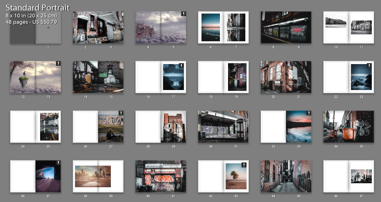
This is my first photobook layout that I have come up with incorporating all styles of photographs to give variety and keep the viewer interested. The above image shows all pages included with the differing layout styles on each page i have gone with. I have included a range of layouts from double page spreads to single images with a boarder. The majority of my images are full bleed to allow the viewer to view the whole image in as much detail as possible and really connect with the visual story. Throughout the book there is contrasting imagery from aesthetically pleasing coastal landscape shots to images depicting the grotty back streets in Manchester. I have tried to pair up some images that have similar shapes and colors to create more intriguing and interactive pages for the viewer.

Photo-book Layout 2

With the thought that i had too many differing concepts in my last book layout I condensed it down to having only the urban landscapes and dream like images. I think that this has helped for the viewer to understand the narrative and story that I am conveying about environmental change and the destruction of the natural environment. The clear juxtaposition between the dark contrasted urban landscapes and the bright dreamy images shows my anger towards the urban development all across the world. I like how throughout this photo book, there is reference to a Utopian world from two perspectives. The urban images shows a Utopian world from the graffiti artists perspective because they are creating beautiful art that they think is making the world better. Also, the dream like images are a clear Utopian world from my perspective showing the audience my view on what the world should be like. However there are also elements of the sublime incorporated within this layout. For example, the graffiti could be viewed as vandalism or gangs marking their territory as appose to an art form. Also my art/manipulation photos may be seen to incorporate elements of fear as the natural land is a scary place with the force and natural disasters it can create.

Photo-book Layout 3

For this layout I wanted to revert back to my first layout and try to incorporate all of the images that i started off with. To still go with the idea of narrowing down the selection of the main images I have used a montage method to combine the urban landscapes and dream like images. I have tried to match up the colors of the urban landscapes and dream like images to achieve the best results. I think it has worked out well for certain images however has also lead to be a bit distracting and confusing too.

Political Landscape Evaluation Analysis

Overall I found my chosen stance regarding the topic of political landscapes went well. Though I was a bit unsure of what to do at the beginning, after some more research I came to a conclusion of what I wanted do and achieve in the project, looking at how consumerism impacts the environment around us through industrialization.  I found that the photographers I studied, Edward Burtynsky, Henry J Fair and Andreas Gursky proved to be great examples of what I wanted to do, with their unique photography style providing inspiration throughout the course for what I referred back to. My favorite project from them is called ‘Industrial Scars’, a book that consisted of aerial perspectives of industrial landscapes and the chemicals produced by them. This as a result led to me exploring a variety of landscapes present within Jersey such as quarries, shops and dumps, essentially the three main sectors of any consumerist industry. When I arrived at the designated area for photography I made sure to capture the subject in a straight documentary approach, a style that I really like regarding how political visions are put across, leading me to not use manipulation when editing the shoots as I wanted to keep it as close as possible to the reality I saw it as. I used Burtynsky’s style of photography to capture the landscape of the area in a more documentary style and Fair’s style to create abstract aesthetic results of rubbish and signs, and finally using Gursky’s work as a reference when photographing aisles of food and consumerist products. What I wanted from this was to present how we treat the environment in relation to the idea of our ever-increasing demands of societies needs, exploring how the present threat of wanting the newest thing leads to the destruction of landscapes not necessarily seen by the general public, but present enough to pose as a disruption to our we preserve land. As a result I wanted use straight photography as my leading cause for these topics where I would present a single sided perspective disregarding any other form of opinion as a means of causing debate and attraction the attention of the audiences.

Through the project I have explored various techniques to enhance my images such as gradients and black + white, which all the while have improved my overall skills and perspective regarding my stance and interpretation of intended matters. This project has taught me about how we perceive the issues in Jersey, whether they are seen or unseen by the eye, giving me opinions that I would have never taken into consideration if I’d never done the chosen topic, giving me opportunities to take images of things I never imagined I would do. The whole process I have gone through has given me a new understanding of how composition affects the viewers opinion and its warping of perspectives regarding my take on issues, allowing me to explore a variety of different styles that I would not have originally not used.

Evaluation of Political Landscape

Going into exploring ‘political landscape’ initially I knew that I wanted to explore the development of my house over time and my experience of living within a house that is constantly changing and never truly finished.  I had my vision of what I wanted to do but I had to do some research to find inspiration on how to approach my project.  The first set of photographers that I studied were Bression and Ayesta and Fernando Maselli.  Bression and Ayesta focused on human memories and how the Fukushima exclusion zone has changed over time without human inhabitants having an influence over it whereas Maselli looked more at nature and land that had been untouched by humans.  I started to lean more towards Bression and Ayesta’s style as I felt that their project ‘Retracing Our Steps’ had a strong narrative throughout it whilst including a human element, which inspired me to include some archival and new family portraits.  I then started to explore the work of Lewis Bush – specifically his work ‘Metropole’ in which he photographed buildings with a double exposure effect in order to create a sense of confusion.  After creating a response to this I decided that this would not be an appropriate way to show the story of the development of my house.  I then found Huang Qingjun who had a strong body of work titled ‘Jiading’ which explored the modernisation of China and how the rural population had been affected – I felt that this was an appropriate project to take inspiration from as it brought a real human element to the table as well as exploring building and social trends in an area (which is seen in my project as the fashion of houses and clothing changes over time).  From here I took inspiration from the idea that Qingjun was looking at the belongings of the residents, and so I photographed the belongings of my dad, who is a carpenter with his own workshop, because he developed the house in his own vision and design with only help in specialist areas.  For this reason I felt that it was important to show an aspect of what goes into developing a house.  I took a lot of inspiration for my project from the straight photography movement as I aimed to create the photographs in this project in a documentary style in order to show things for what they are.   This interest in a documentary style approach led to the inclusion of lots of archival photographs of the house that were taken by my parents throughout the renovation as well as photographs dating back to the 1800’s.

Overall, I had a vision for what I wanted to do from the start and throughout the project the idea of how I would approach the project changed as I researched more and more.  I believe that the changing approaches helped me to achieve an outcome that was thoroughly researched and well put together as well as including a lot of the many aspects that come under the title ‘political landscape’.  Through this project, I have learnt that doing plenty of research is a priority when trying to find your approach – it can bring lots of inspiration to you and force you to think in ways that you had not previously thought about leading to more original and interesting ideas.  This project has taught me a lot about how much editing and experimenting goes into creating a photobook – halfway through the project I thought that I was nearly finished and so put together a selection of photographs only to find that the selection was missing something in a few areas and so I went out and increased the portfolio of photographs which ended up adding more complexity and sub-narratives to the book.  It is clear that experimenting with different ideas is essential for a successful project rather than being narrow-minded and sticking to one idea and allowing that to guide your decisions.