

71 pages
Evaluation of Project and Photo Book:
In conclusion, I think i approached the project Political Landscapes successfully and developed my concept of the changing environment thoroughly. I started my project with the intention of exploring issues of pollution and plastic specifically, taking inspiration from the photographer Mandy Barker and experimented in my first shoot by taking images with string infront of the lens looking at rules of manipulation. I then found the photobook ‘The Meadow’ by photographers Barbara Bosworth and Margot Anne Kelley which is what first interested me in photographing and exploring specific areas, as well as gathering objects and photographing them. I also discovered the photographer Chrystel Lebas and her photobook ‘Field Studies: Walking through Landscapes and Archives’ which is where I read about the changing environment. She compared her modern images to the photography of Edward James Salisbury in the early 20th century and walked in his footsteps, going to the same areas he did to explore how the environment had changed over 100 years. This is where I decided that the concept for my project would be looking at how the natural environment had changed over 90 years at the location La Motte. I found archival images from this area and thought i would build my photobook around them, comparing and contrasting them to my own images. I noticed Lebas’ influences from sublime ideologies by Edmund Burkina his book ‘Enquiry into the Origin of our Ideas of the Sublime and the Beautiful’,with her images being vast and other-worldly, which is an aspect I wanted to reflect in my own work. From then on, I did an additional five shoots where i went and took landscape images of La Motte and at the same time gathered natural objects that i found on the island and the beach i.e. rocks, seaweed, flowers. I did multiple shoots where I photographed these objects formally with plain background and edited them to reflect the work of early botanists where they used light sensitive paper to create photograms. I did this as i thought it would give my project and photobook a scientific appearance and reflect that of an investigation into a specific area. Towards my final shoots, I walked around La Motte and tried to find man made objects that I could photograph to perhaps represent how the natural landscape had changed.
The front and back cover of my photobook is the same continuous archival image taken at La Motte showing the eastern end of the grave with E T Nicolle, J Sinel and J Sinel junior within the photo. I choose this as my front and back cover as I think it intrigues the reader and I also specifically liked the composition. The earth of green island fills up 3/4 of the image with the man on the bottom level looking up towards the two men at the top. Also I think because it is in black and white it creates a more authentic and historical appearance for the book. I didn’t include the title of the book on the front cover, and just had it along the spine off the book so there was more mystery when opening the book. The first page contains the title of the book ‘La Motte’ and the sub title ‘Walking through Landscapes and Archives’ which is inspired by Chrystel Lebas’s book title ‘Field Studies: Walking through Landscapes and Archives’ as her photo book is something I take a lot of inspiration from in my project, so including the same sub title immediately connects my work to hers. The second page contains an full page photo of one of the images from my photogram section in my book. I thought that I would include this as my first image as I think that it interests the reader about my project without giving too much away. On the other page I included the text: “La Motte is a tidal island, and listed archaeological site, also known as Green Island, located in the Vingtaine de Samarès in the parish of St Clement on the south-east coast of Jersey, Channel Islands.” I did this so the reader had some background information about the area they will be looking at and by informing them about the history makes the project more understandable. On the forth and fifth page i included an archivel image across the two pages of of the naturalist and archaeologist Joseph Sinel at the excavation. I used this as a double page as i liked the diagonal shape of the earth, making an interesting composition, as well as the position Sinel is sitting in. I then contrasted this image with the sixth and seventh page showing one of my own images. I used the same layout, but mirrored, creating variety in the sequence of the book. I chose this image to contrast with the archival one as i liked the bright blue sky and detailed rocks in the foreground in comparison to the black and white image of the earth. Also because of the similar composition of the diagonal line and shape in the center of the image. This creates a more modern interpretation of the archival one. For the next two double pages I contrasted one of my images to an archival one using a full page and a smaller photo as the layout on the first double page, and the mirrored on the second. This creates the repetition of mirroring the layout to the previous one, producing a more interesting sequence of images. I included more text in these two double pages about the excavation and what was found there as that is what is happening in the archival images displayed and by explaining more about it makes the book easier to understand. The 12th and 13th page is the fist double page image inside my photo book. I chose this image as the liked how it has different sections all showing different aspects of the beach ie. blue sky, rocks, sand, creating an interesting composition for a double page spread. In the 14th and 16th double pages I chose to display the images 3/4 of the way onto the oppsite page as if these image were displayed as full pages I think hat important detail would be cut off due to how the book would be printed. By diplaying the images like this it shows more of the details in the images, with less being cut off. Especially on the 16th double page where the main subject of the image in the incinerator which is centered, meaning that this would be cut off in printing. Across these two double pages I mirrored the layout again to keep variety in the sequence.
For the rest of the landscape images in my photo book, 8 double pages display one of my modern images contrasted alongside an archival one. When chosing these combinations I tried to find similarities between the two images so that they would complement each other but also contrast each other. For example the 21st page displays one of my images of the earth of green island at a close up angle which i contrasted with a similar archival image of the earth from the early 20th century on the opposite page. In my image i tried to emphasise the warm colours, as well as the light and shadows. This then contrasts to the black and white of the archival image, complementing each other. Another example is the 25th page where I used the archival image of a skull and contrast it to one of my modern image, the main subject being a rock. I think this this combination of images works well as the shape of the bright rock in my image resembles the shape of a skull and is a similar colour. This creates a link between the two images which I think makes a good layout, linking the past to the present. When editing I brightened the rock so it was more noticeable, which i think also makes the link more noticeable. I also like the contrast in the background of the two images. The archival image has a lack background as it’s a formally taken photo, this then contrast to the background of my image which is brown rocks, adding more detail to the image. I also used various full double page images where I specifically edited them so they have emphasised blue tones to increase the vastness to reflect sublime. I used the graduated filter in light room to make the skies more dramatic and to contrast more the bottom halves of the images.The one layout which was completely different to any other landscape imagery was on the 41st page where i only displayed one image across the double page spread, one of the page being blank. I chose this layout for this image as I think that it’s a powerful image and by putting emphasise on it will make the reader pay more attention to it. I specifically like this image for many reasons, the main one being the cross in the center of the image that I think links to the previous archival imagery of the excavations where they found bodies. I also like the composition in this image as it is split into three sections , with the cross in the centre of them. The bottom part is darker part of the image, the dark brown tones contrasting to the light blue ones in the sea. The tones in the bottom part of the image link to that on the horizon which creates a more aesthetically pleasing image. This is also because the blue tones in the sea complement the colour of the sky.
Towards the end of my photo book I included a series of images completely different to the landscape images in the first part of my book. I was inspired by the work of Chrystel Lebas in her photo book ‘Field Studies’ where she included a section towards the end called ‘Plant Portraits or Weeds & Aliens Species’ taking inspiration from the way Edward Salisbury documented species by uprooting them and photographing them by using photogenic paper- she produce her own interpretations of his work. I tried to create the appearance of a photo gram by inverted the images and adjusting the hues to create variations of the same image. I then displayed these together in my photo book. I also think these edits reflect the photograms that early botanists made with light. One example is Anna Atkins’ photograms of algae in 1843 which is a botanist i took inspiration from in my 5th photoshoot. I then ended my photobook with a single full page image of the rope i found at La Motte as I think it represents how the landscape has changed from a fully natural one, to one that’s now has man made objects affecting the natural environment.
Overall, I think my photo book sums up my political landscapes project well, the images showing the final outcomes of my developed ideas. I think that the contrast between the archival images of La Motte and my own images is effective in representing how the natural environment is changing. Also the edited variations of the objects I gathered shows the final outcomes of the colour experimentation i developed throughout my project. Photographing natural landscape is an aspect to photography I wasn’t as used to as I normally focus on buildings and industrial structures and by moving away from this, I think i produced a range of images that are unlike any I’ve photographed before with a different appearance and atmosphere.
Here is an online link to my photobook: La Motte: Walking through Landscapes and Archives
 For the cover I decided to use a rustic effect taken from one of the corroding metal sheets, choosing to use a white New Times Roman font as the main go to for text fonts. I made sure to place this in an area of the page that would make it clear enough to make out and read for the viewer, so by placing it against a blue backdrop seemed to be the logical choice. I selected the title ‘Preserved Consumption’ because of its referencing to how out activities that scar the landscape preserve man actions towards the environment. Along the spine I placed the title and my name in the same font and colour to add the effect of consistency before actually opening the book.

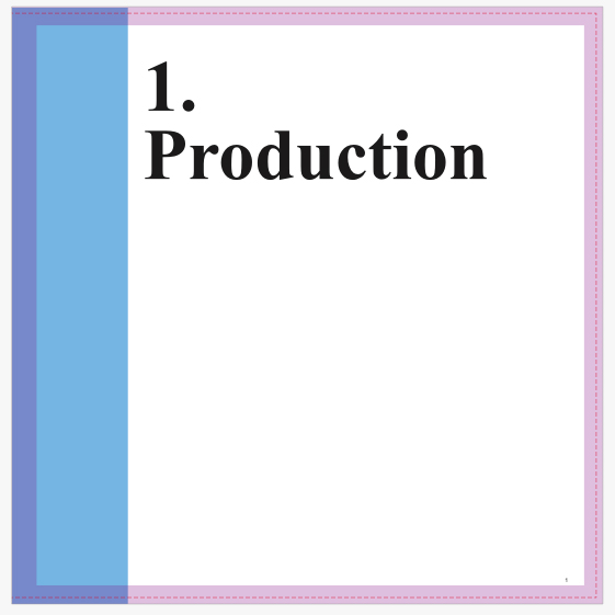
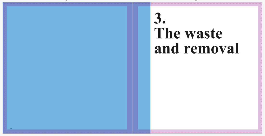
 I then proceeded to implement title pages for each of the three topics which would separate the sections of the book out to create a narrative. Once again I used the font New Times Roman to create the impression of consistency, using numbers to represent the intended topic. When laying it out I made sure to include the text underneath the number so that it would fill more space whilst providing the book with an aesthetic result, which by complimenting it with a sky blue really brought out the result. For each of the titles I made sure they had a relevance to the topic they were before, allowing a certain expectation of what will be in it to arise before going through any of the pages.


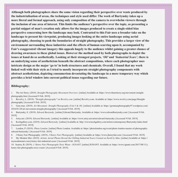
 Finally for the essay I made sure to include it at the end of the book, by doing this it would allow for the viewer to interpret the message of the book throughout, with only at the end there being any real answer to what I wanted to explore. Like the rest of the book I made sure to use the font New Times Roman, using varying font sizes throughout the essay on things such as bibliography, title, text and references so that some degree of aestheticism could be put across. Accompanied across the pages of the text I included the photos that the book referenced to and the photographers I studied when making my results, this compliments the essay nicely as the reader can switch between the pages to gain a broader insight into what I wanted to achieve. Composition wise I made sure that the images were placed in an visually appeasing area that did not draw any attention away from the text across the page. When positioning the text for the essay I made sure it started on the left hand side of the page and ended on the right, by doing this it gave the opposite pages more breathing space between them, preventing anything from becoming too eye sore.


