

Daily Archives: February 9, 2019
Filters
Final Prints
Final Print Layout Experimentation:
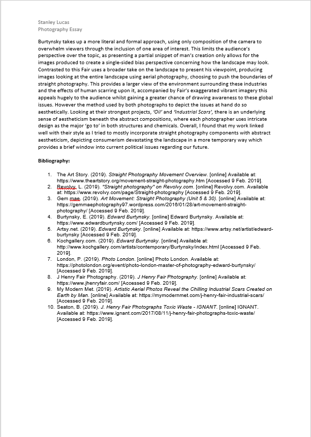
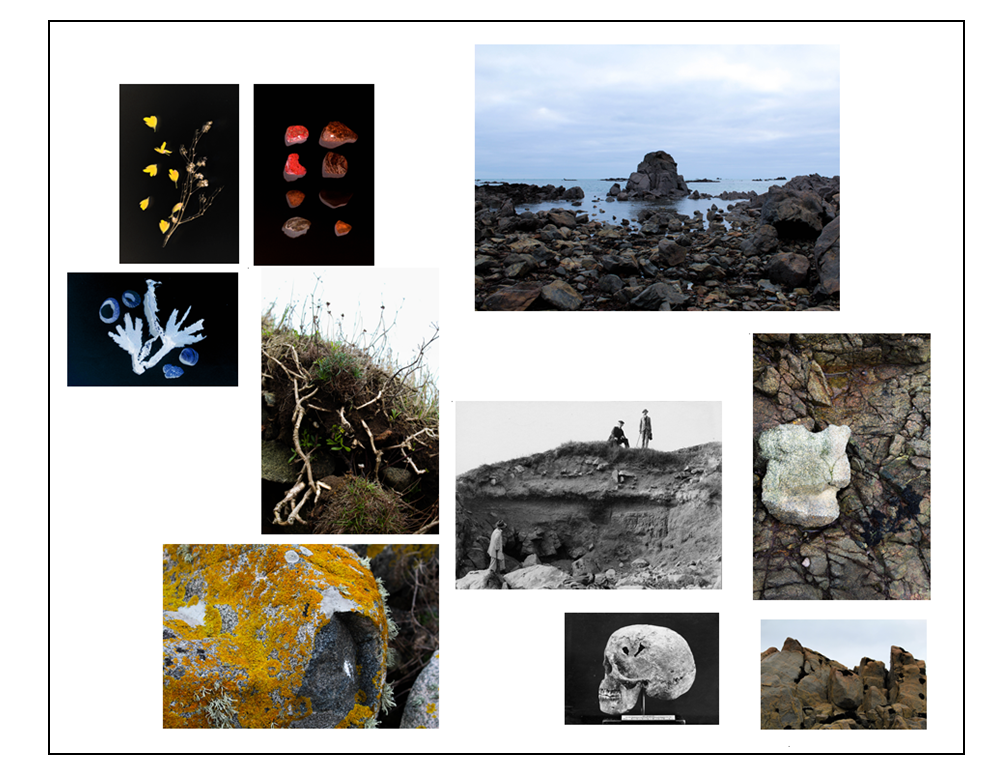
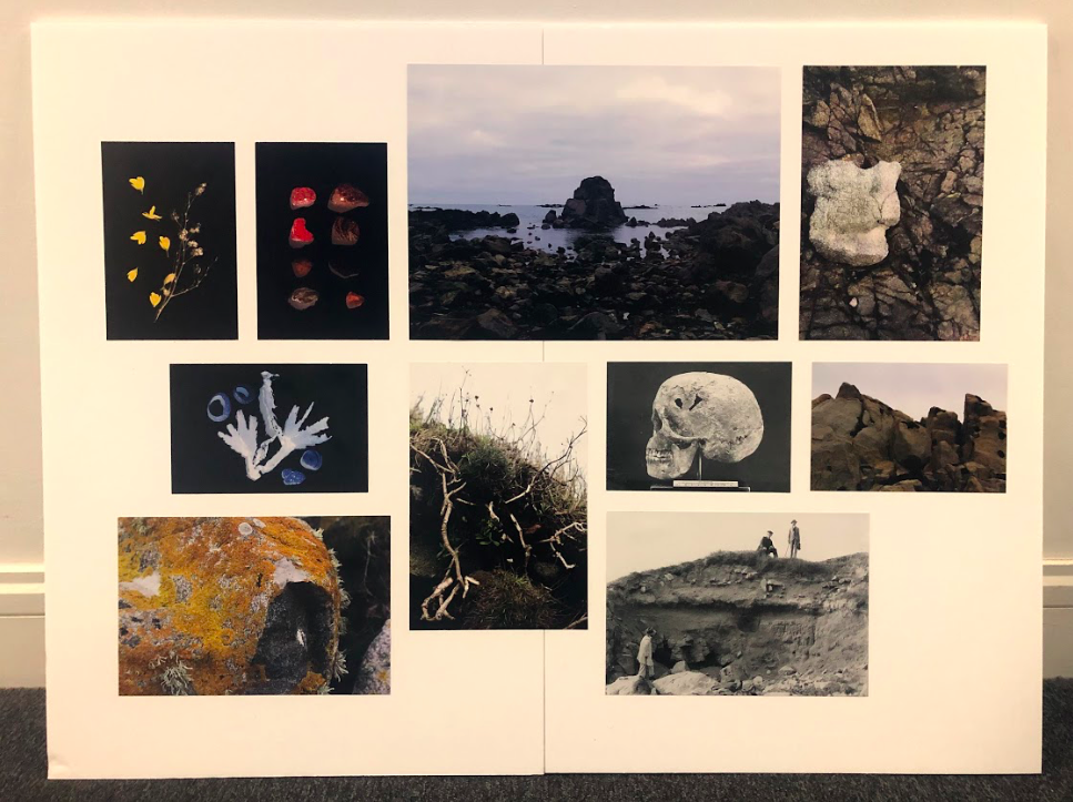
For my printed images I chose the ones that represented all aspects of my photo book. The landscape images I have chosen show when i went out at different times of the day and in different weathers. The biggest A3 image is from a shoot where I went out and photographed the landscape at dusk to produce work that had blue and cool tones within the scene to create a mysterious, other-worldly appearance. I chose this image as my only A3 image as i wanted to emphasise it as i think it gives an insight into the landscape images I produced in this projects. I then chose four A4 images to be printed where i have three of my own photos that have more detail within them and also an archival image. I included more detailed images to contrast with the A3 landscape images as i wanted to show how my photos vary in the angles they were taken and what is portrayed.
I included a archival images into my final prints as my project was based around how the landscape had changed over the period of 100 years so I thought that including them would also give an insight into what my project was about and the history of the area. The A4 archival image shows the layers within Green Island when they were doing an excavation and also shows three men in it which i think contrasts well with my images. The A5 archival image is of a skull which was found at La Motte which i included as I think it goes well with the a$ images where it shows light rock, the shape resembling a skull as well. For the rest of my A5 image I included 3 of my formal images where i photographed objects I found at La Motte in a studio and edited them so that they mimic that of a photogram. I did this to interpret the work of Chrystel Labas and included them in my final prints as they were a different aspect to my project.


I experimented by arranging the image in photo shop to see which layout was the best to arrange the printed ones in and found I liked the last layout. This is because I think that the images are balanced on each side so that one section doesn’t have too many of the same sized photo. I also like it because the images are displayed spaced out and not in a grid format, but it still looks structured and deliberate as some of the images are lined up at there edges. I tried the place images around colours that complement the ones in the picture. For example, I placed The two yellow and red edit of flowers and rocks next to each other as they are from the same series and the warm colours yellow and red complement each other. I then placed the landscape image of the rock with the yellow surface above these two images as this also complements the yellow and red colours. This creates a section of my layout that contains warm colours, which can then be contrasted to other sections of my board.
I then placed the archival image of the skull diagonal to my image looking down at the white rock as I displayed these together in my photo book. This is because I think that the shape of the skull resembles that of the rock so displaying them together creates a link between the two. I then placed the other archival image to the left which is the only image on my board that contains people. I specially chose this image to use as I liked the compostion of where the figures are standing at different levels on the earth of green island. I also think that it links to my image t of a close up angle of the earth on green island on the top right of my board showing the plants and grass growing. I think that the other layouts i experimented with are still effective, but are not as aesthetically pleasing and balanced as the first.

