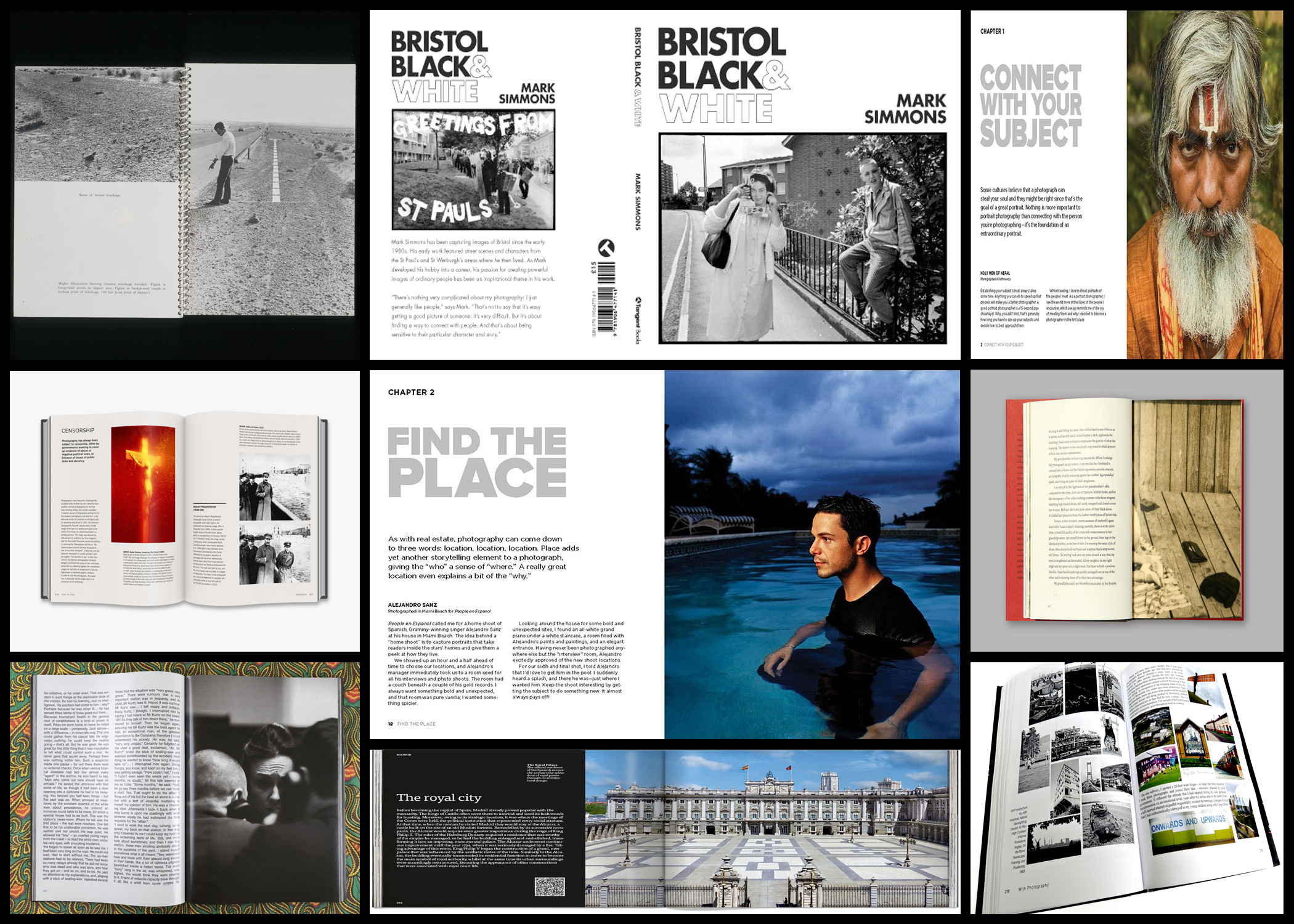
Once I had made a first draft for the layout of my book I decided to implement text into it. The text I wanted to add into the book would be quotes of the chosen photographers I studied, with my essay at the beginning. For me not only would this provide relevant text that links to the images, but also wouldn’t distract the viewer from the image causing it to lose its qualities. To do this I would firstly research various quotes from the photographers Edward Burtynsky and Henry J Fair, aiming to have them relate to the topic of consumerism, here I produced a mood-board which consisted of the quotes I found best related to the overall theme. These are my results:  By implementing these quotes into blank spaces I hoped to utilize the area, preventing it from becoming useless and instead allowing it to serve as a more aesthetic implementation into the book. Below I explored a few ways in which the text could be positioned next to the designated images:
 When looking over the text positions I found that the left and right alignment would pose as the best position due to them taking up little space as possible, whilst aligning themselves aesthetically against the side of the photo chosen. The center position however I did not think would suit the design of the book and its layout, this is because of how it did not have any end or beginning to it, leading to an unorganized look which didn’t compliment the environment it would be put in at all. Some examples of how I would like the text to be positioned next to the images can be seen below:
  I found the text to be most effective when looking over various books to be ending as the image starts, this creates an aesthetic effect which does not draw attention from the photos but instead subtly adds a bit of information. I would probably place the text near the top or bottom of the desired page due to the being the most implicit compositions to place it in, as the middle would be to clear. As a result of this I have concluded that the text should be placed in an isolated area of the blank space which does not take away from a photos visual appearance, whilst only being seen when observed closely.
