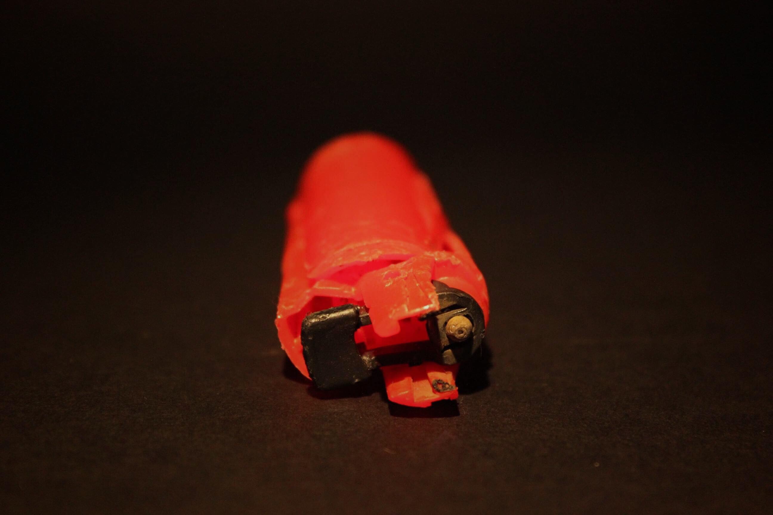
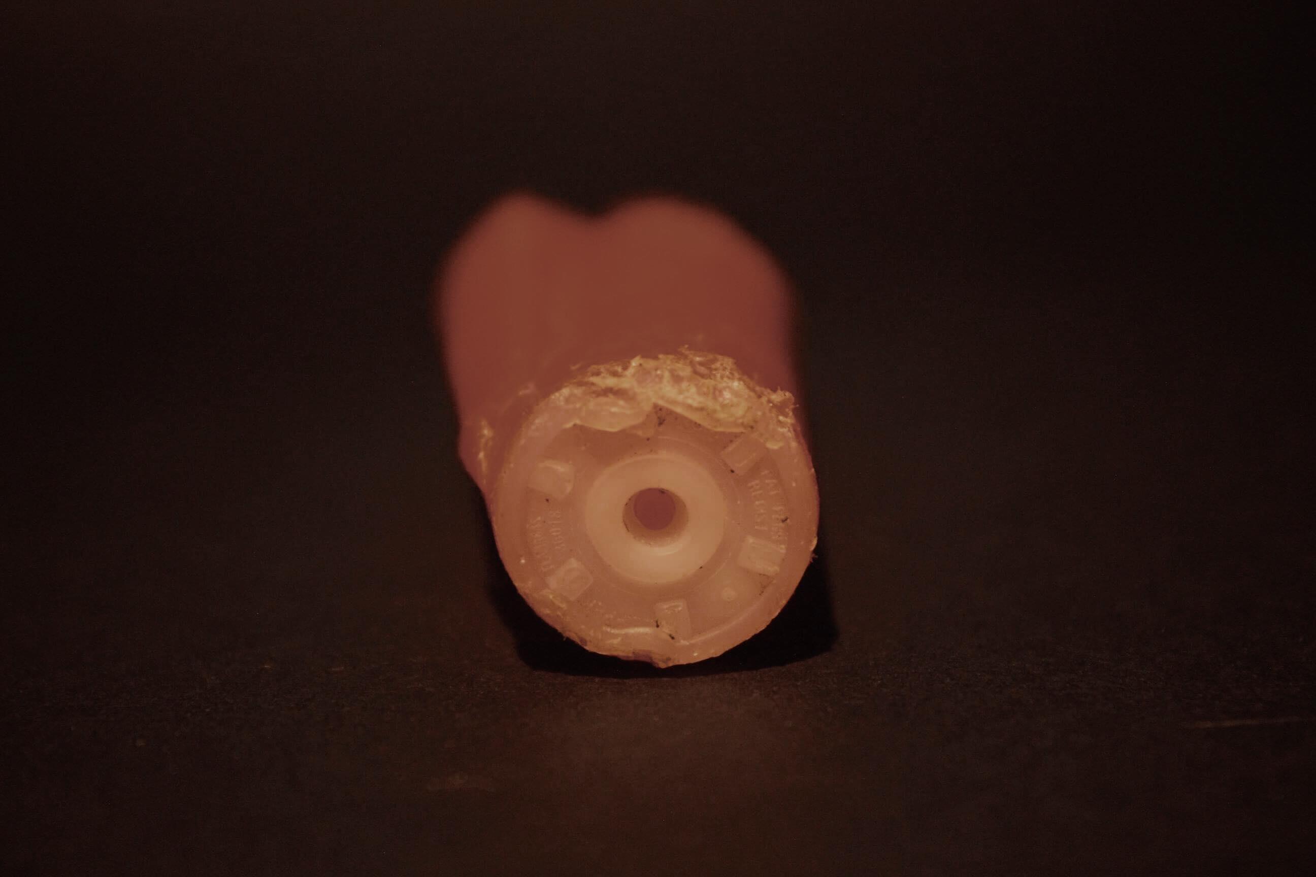
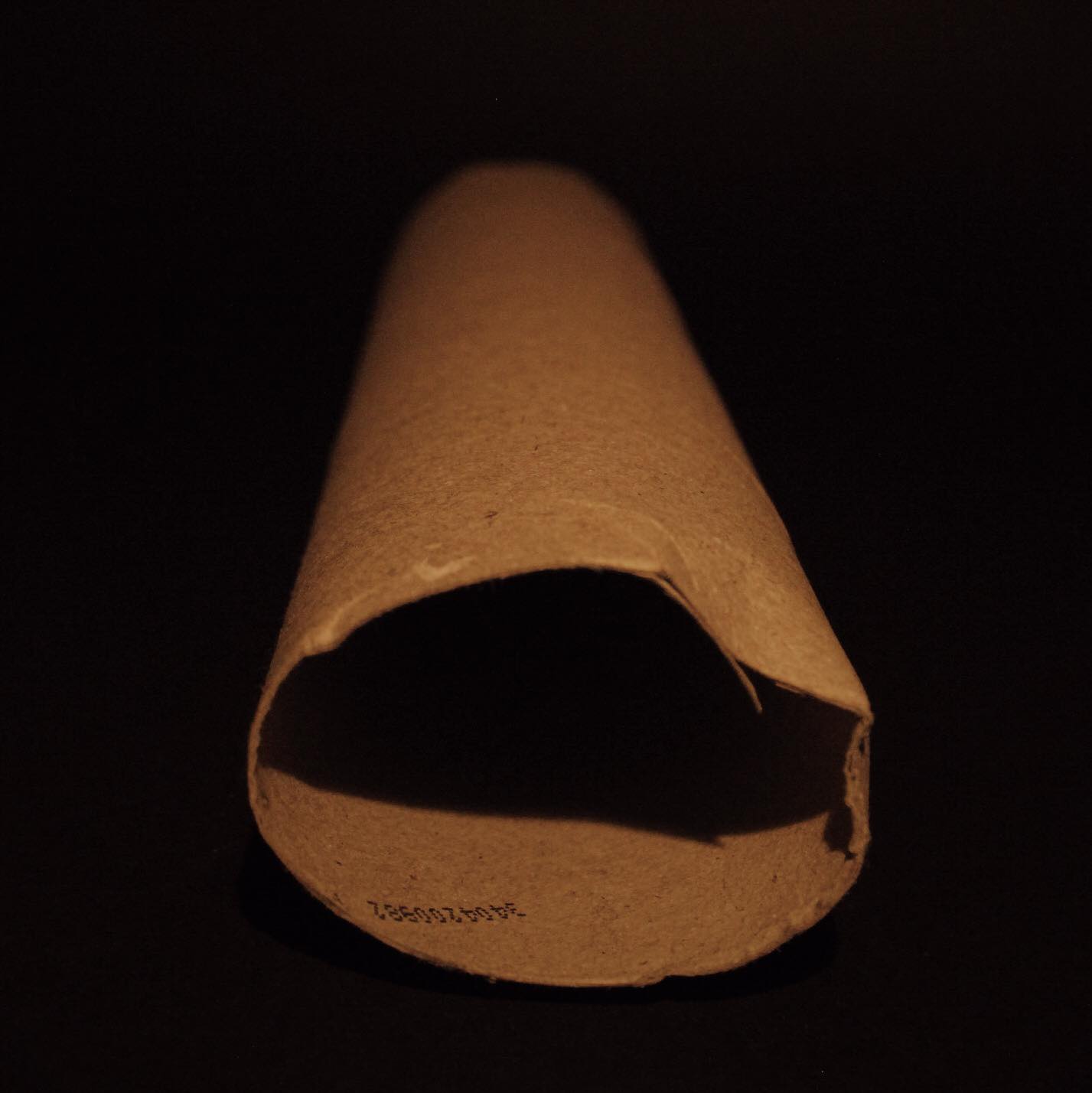
In what way do photographers Edwards Burtynsky and Henry J Fair present their perspectives regarding consumerism.
Truth portrayed in photography can be captured differently depending on the photographer’s vision, warping how the viewer sees and interprets the intended message being put across. The idea behind presenting truth in photography is unique to every individual, prompting specific feelings such as disbelief, hate, anger and happiness, all of which have been precisely thought of before taking the image, to be then presented as a singular perspective through its composition. The viewer will either agree or disagree, but these perspectives can be swayed depending on how the artist puts together each image, carefully composing it so that the result perfectly represents their intended viewpoint. Philosopher Charles Pierce states that “to represent truth, it must resemble the object it represents “and is known as ‘iconicity’. This relationship between the subject matter and the image, usually reflects the photographer’s stance regarding current, future or past world issues. The photographer is either provoking the viewer or questioning the viewers perspective of events.
What interests me is that depending on how a photo is composed, and what is present within that image, our perspective regarding that topic can either be reinforced or diminished, forming our opinion in the process. To illustrate this, I will be referencing photographers Edward Burtynsky and J Henry Fair. Burtynsky looks at how global industrialisation can scar and warp the landscapes around us, and Fair explores the effects of pollution from these global industries and how they almost stagnate and dissolve the very land used. I will be using both artist’s viewpoints and ideas to illustrate my response to the question, whilst comparing my own responses to theirs in order to broaden my understanding of the subject.
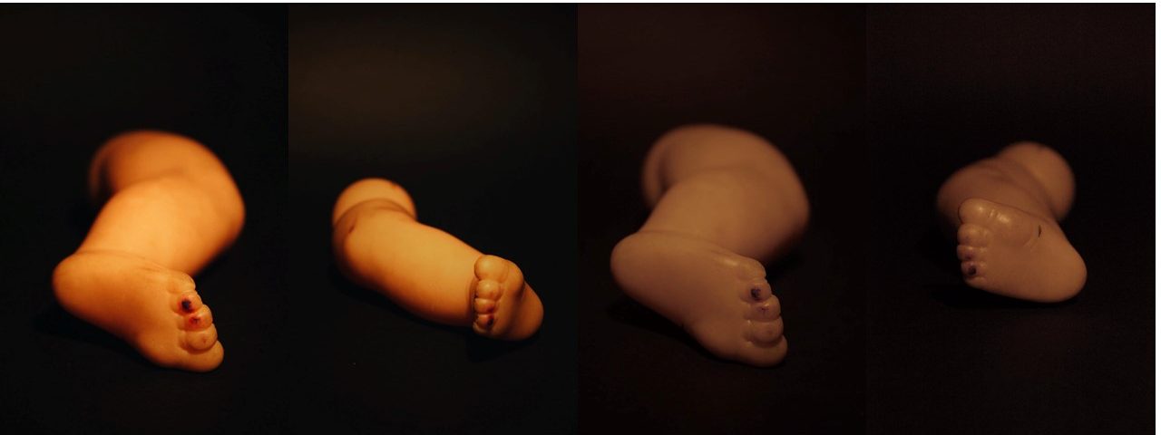
I will be responding to this idea regarding truth by going on various shoots around the island, looking at how consumerism has changed and warped the landscape of Jersey, whilst capturing the source and outcome of the every growing demands of society. To do this I would need to explore areas such as quarries (granite industries) and dumps (unwanted and unused items) as an attempt to portray how I see it affecting those who live around, whilst presenting the gradual change it forces upon the landscape in a negative but aesthetic light. Much like the photographers I will be exploring below, I wanted to identify and capture the ugliness of these landscapes but also the hidden beauty they possess, presenting each photograph in a way which is bias to my perspective regarding the topic.
Burtynsky takes on a more documentary approach, applying what can be seen in these landscapes in a more formal and symmetrical manner, choosing to portray each landscape using both intense and dull colours as an attempt to link thoughts to features, with man-made structures portrayed dully and natural ones depicted vividly. However, contrasted to this Fair almost portrays the opposite of Burtynsky’s perspective, he chooses instead to present the pollution created by these industries as aesthetic implementations that bring harmful life into the environment, where nature seems to be portrayed as the duller aspect to the surrounding area, overshadowed by the mesmerising destruction of chemicals. Both photographers here present similar, but different viewpoints regarding truth of the camera, drawing on both unconventional and symbolic ways of presenting this perspective to the viewer. Whose role? is now to interpret the image on a more personal level, known as straight photography.
Chapter One - Straight Photography
Originating in 1904, and pioneered by photographers Paul Strand and Alfred Stieglitz, straight photography presented viewers with a new system of photos that consisted of unmanipulated imagery as an attempt to engage with the viewers. Often known as a form of ‘pure’ photography, the aim was to contrast the Pictorialist stance which produced painting like results, mimicking this Impressionist art using a ‘soft focus’ effect. The idea behind this was move away from imitating pictures, and instead develop a separate art form where the natural environment would be used, which at the time in the 1950s was a very alternative concept. This gave way to a more documentary styled approach, where photographers now sought to achieve graphical structure within their photos, which could then be accompanied by unconventional viewpoints and new techniques that presented fresh perspectives into the visible, industrial world.
Although straight photographers would deliberately lack manipulation in their photography, they did make use of applied techniques commonly seen in darkrooms which could enhance the appearance of their prints. The term ‘straight photographer’ soon came to imply a style of photography that used aesthetic characteristics, amplified by higher contrast, rich tonality, sharp focus and most importantly cropping, all of which now can be seen in relation to a Modernist-inspired approach, using a variety of underlying abstract geometric structures around their subjects. An example of this can be seen through Paul Strand’s ‘Wall Street’, a piece in which Strand moves away from the portraiture of subjects, and instead attempts to portray the bankers in a purer manner using sharp contrast of shapes and angles, leading to a more abstract piece due to it representing his own personal vision. Quoted “Your photography is a record of your living, for anyone who really sees”. 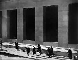 Regarding my work on political landscapes, I will be drawing most of my inspiration from straight photography, where I will be portraying my perspective concerning consumerism and the effects of it on our landscape, using as little photo manipulation as possible. The photographs which I will be comparing below from my shoots I have taken from various areas of Jersey that have been affected by consumerism and the consequent scarring of landscape around it, looking at both straight and modern photography as a guideline for my progress and intended results.
The photographers whose work I will be exploring (Edward Burtynsky and Henry J Fair) individually portray their photography in their own unique way. I have chosen both these photographs because of the link they have to my area of political landscapes, consumerism. With both using a form of straight photography to photograph industrialised areas polluting the landscape. Each photographer has taken on a rather different stance regarding how the matter at hand has progressed, using abstract and modernist styles of photography to do so. Exaggerating and influencing the perspective of the view through the enhancement of specific aspects within the image, such as saturation.
Chapter Two – Edward Burtynsky – Truth of The Camera
Regarded as one of the most accomplished contemporary photographers of all time No Tributes, Burtynsky’s interest in photography sparked when his father bought a darkroom. Here they practiced amateur photography together, leading to his eventual study of graphic arts between 1970-80, where he found his love of photographing consumerist industries. From here Burtynsky started travelling the world, depicting a unique perspective over industrial landscapes and the consequences they had on the surrounding environment. Burtynsky states that “we come from nature… There is an importance to having a certain reverence for what nature is because we are connected to it… If we destroy nature, we destroy ourselves”. Evident in the project ‘Oil’ (2009), Burtynsky travels internationally to photograph the production, distribution and the use of the most critical fuel of our time. Exaggeration is crucial aspect in the Burtynsky’s work for revealing the context behind the intended message of each image, without it specific viewpoints could not be put across or could be misunderstood if not for being obvious what is trying to be said. This is evident through Burtynsky’s focus on usually one aspect of trade, the production stage. Providing a huge amount of influence for the viewer who now is only presented with a single sided perspective (much of his work argues against the damage caused by consumerism). Seen in the piece ‘Oil Refinery’, by concentrating much of his imagery on one particular characteristic of that landscape, it sets a bias perspective for the viewer who begins to automatically associate and link the images towards current and worldwide political issues which relate to the type of consumerism at hand, such as global warming and the race to achieve sustainable power. However, by portraying and exaggerating a mostly one-sided perspective like Burtynsky has done, it removes a lot of our ability to debate and possess a personal interpretation regarding the images taken. As providing a single sided outlook of the topic, narrating itself without the input of other viewpoints, only allows room for those who share similar opinions not those who don’t. This opens the topic for debate, as though Burtynsky presents a single-sided perspective, without the explicit imagery representing his vision of the oil industries, there could be no debate concerning how society is progressing and the impact on our planet its causing. Consequentially exaggeration is a necessity in photography, as without it there would be no photos to cause awareness regarding topics open to controversy which affect our everyday lives.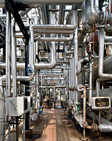 I’ve responded to Burtynsky’s work by exploring the resultant garbage collection of our ever-increasing consumerism at La Collette, especially the plastic waste which consists of mostly vividly coloured electronics.
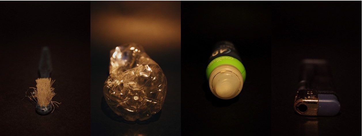
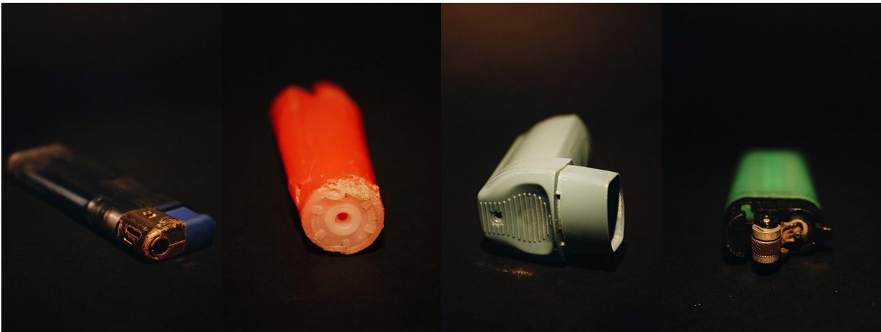
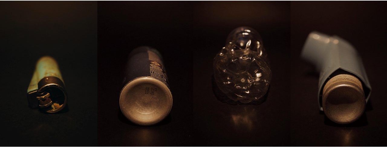
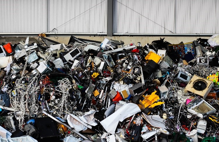
When taking each image, I made sure to use a straight photography approach, here I would use a none zoom lens to photograph the objects as accurately as I’ve seen them, editing only the brightness which would have been available in darkrooms to enhance each photo. My main focus was to bring into light the amount we throw away and wanted to do so by presenting this issue to the viewers through size comparison. To accomplish this, I found the biggest assortment of plastic waste and photographed it next to a hangar wall, making sure to carefully crop out any suggestion of a decrease of its mass. Here I purposely gave my image a one-sided political perspective, by presenting only my own bias viewpoint it would allow for debate to occur regarding the topic, as I encouraged criticism towards the result of our greed. For me this was more effective as it limited the vision of the viewer to only one aspect of the area, opposed to the whole area. This also proved a challenge as I wanted to provoke opinions regarding the outcome of waste, and only using my composition to accomplish provided more difficultly than expected. Here I deliberately disagreed with the essay question, as I wanted to provide evidence of how perception could alter perspectives regarding any chosen topic, essentially using a snippet of evidence to build a claim.
  Chapter Three – Henry J Fair
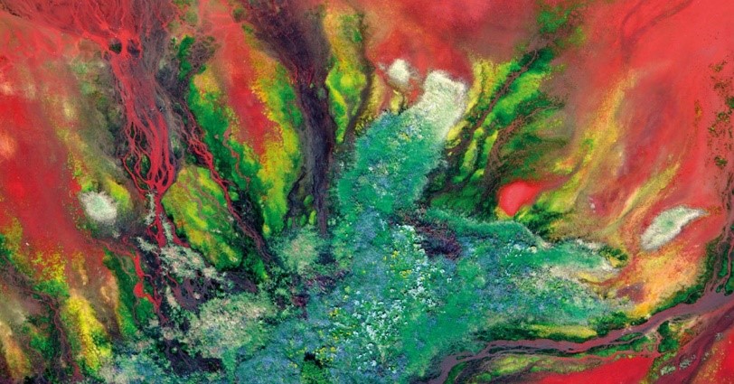
Born 1959, Henry J Fair had a fascination for the scarring of landscapes caused by large industrial companies. As his photography developed he soon found himself based in both New York and Berlin, travelling the world in search of environmental pollution. His most influential project ‘Industrial Scars’ focuses on small range environmental issues such as coal ash and oil, to large-scale ones such as abandoned mining operations. Here Fair uses mostly aerial photography to accomplish his images as they provide a perspective not usually seen by the general public. Much like Burtynsky, Fair focuses on the effects of these consumerist industries, alternativly choosing to present them in an almost devastating and destructive beauty, using vivid and aesthetic colours as a means of portraying contrast within the landscape. Fair here seems to stray from the idea of straight photography, as instead he uses increased saturation and heavy cropping to produce the outcomes desired, the result of this is extremely exaggerated imagery, where the colours of the landscape seem too dreamlike and otherworldly to exist. By using a more modern approach consisting of photo-manipulation the image gives rise to political themes, this is due to how the layout of each image makes the earth’s landscape unrecognizable to the viewer, causing disbelief and uncertainty regarding the possible future of society if this carries on. Exaggeration becomes a key aspect in telling stories through this documentary style approach, as each photo needs to be hard hitting to assert a change in mind-set for people. If the pictures were not beautiful, the viewer would not stop to consider them, or cherish them, a technique not commonly seen in documentary styled photography. These vibrant results which use an abstract approach, can be interpreted as the anchor point for drawing in audiences, with colours acting as a motif for the overflowing consumerist effects warping our landscape.
 Responding to this I then produced my own set of images based around
 consumerist landscapes. My own photos took inspiration from the bright contrasting colours that popped out in Fair’s work. Here I explored how chemicals had corroded metals based around water distilleries, finding that they produced a lava like pattern which trickled down the sheets. Much like Fair’s work I then proceeded to edit and increase the saturation of rust in software, creating abstract landscapes of the environment it was created in. I found that this exaggerated hugely the effects of chemicals on varying surfaces in the area, presenting the environment that it’s subjected to in a more demeaning light, whilst influencing the viewer’s mind-set towards un-hygienic conditions. This reflected my perspective regarding the treatment of relied upon areas (such as dumps and distillation plants), where mistreatment could lead to a shift in political landscapes. Leading many to rely on alternative methods of consumption. 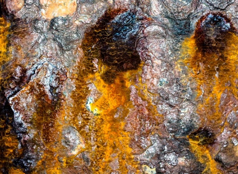 Although both photographers share the same vision regarding their perspective over waste produced by the industrialisation of areas, the techniques and style used differ. The work of Burtynsky takes up a more literal and formal approach, using only composition of the camera to overwhelm viewers through the inclusion of one area of interest. This limits the audience’s perspective over the topic, as presenting a partial snippet of man’s creation only allows for the images produced to create a single-sided bias perspective concerning how the landscape may look. Contrasted to this Fair uses a broader take on the landscape to present his viewpoint, producing images looking at the entire landscape using aerial photography, choosing to push the boundaries of straight photography. This provides a larger view of the environment surrounding these industries and the effects of human scarring upon it, accompanied by Fair’s exaggerated vibrant imagery this appeals hugely to the audience whilst gaining a greater chance of drawing awareness to these global issues. However the method used by both photographs to depict the issues at hand do so aesthetically. Looking at their strongest projects, ‘Oil’ and ‘Industrial Scars’, there is an underlying sense of aestheticism beneath the abstract compositions, where each photographer uses intricate design as the major ‘go to’ in both structures and chemicals. I found that my work linked well with their style. I tried mostly to incorporate straight photography compliments with abstract aestheticism, depicting consumerism devastating the landscape
Incorporate Andreas Gursky in there and look at photographer Mishka Henner for aerial shots.






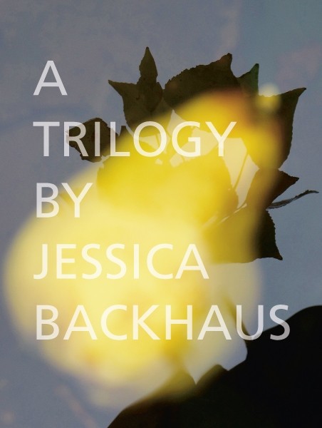 The artist’s new trilogy brings together three series of approximately 40 works each. The first series, Beyond Blue, is devoted completely to colourful threads, staged against coloured backgrounds. The viewer feels compelled to linger in this radical reduction, trying to unravel the entanglement of the seemingly unspectacular with the resulting aura of contemplation. In Shifting Clouds, Backhaus considers and documents this very transition – a reality that lies in between things. The second series shows fragments and visions that are poised on the verge of becoming, caught in limbo: reflections, chaotically appealing surfaces, shapes imaginatively metamorphosing, upbeat tones, intensely coloured sensations. In the third series, New Horizon, the artist presents free-flowing and persuasive poetic impressions. The compositions captivate with their variety and puzzle-like elements. Backhaus is breaking new ground in photography, incorporating components of mixed media, painting, and collage that expand and deepen these abstractions.
 Who is Jessica Backhaus?
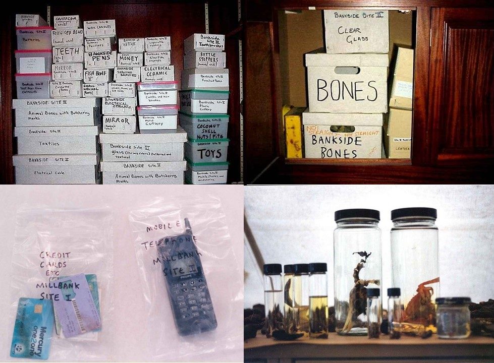
  In this series of images, the entire process of collection is captured, from the volunteers cleaning and analysing the banks of the Thames to the sorting of items by categories – ceramic, glass, bone, leather, shells, organic, plastic and metal. Mark Dion instructed the volunteers to take a ‘scatter-gun’ approach to collecting: to collect anything and everything that caught their attention.




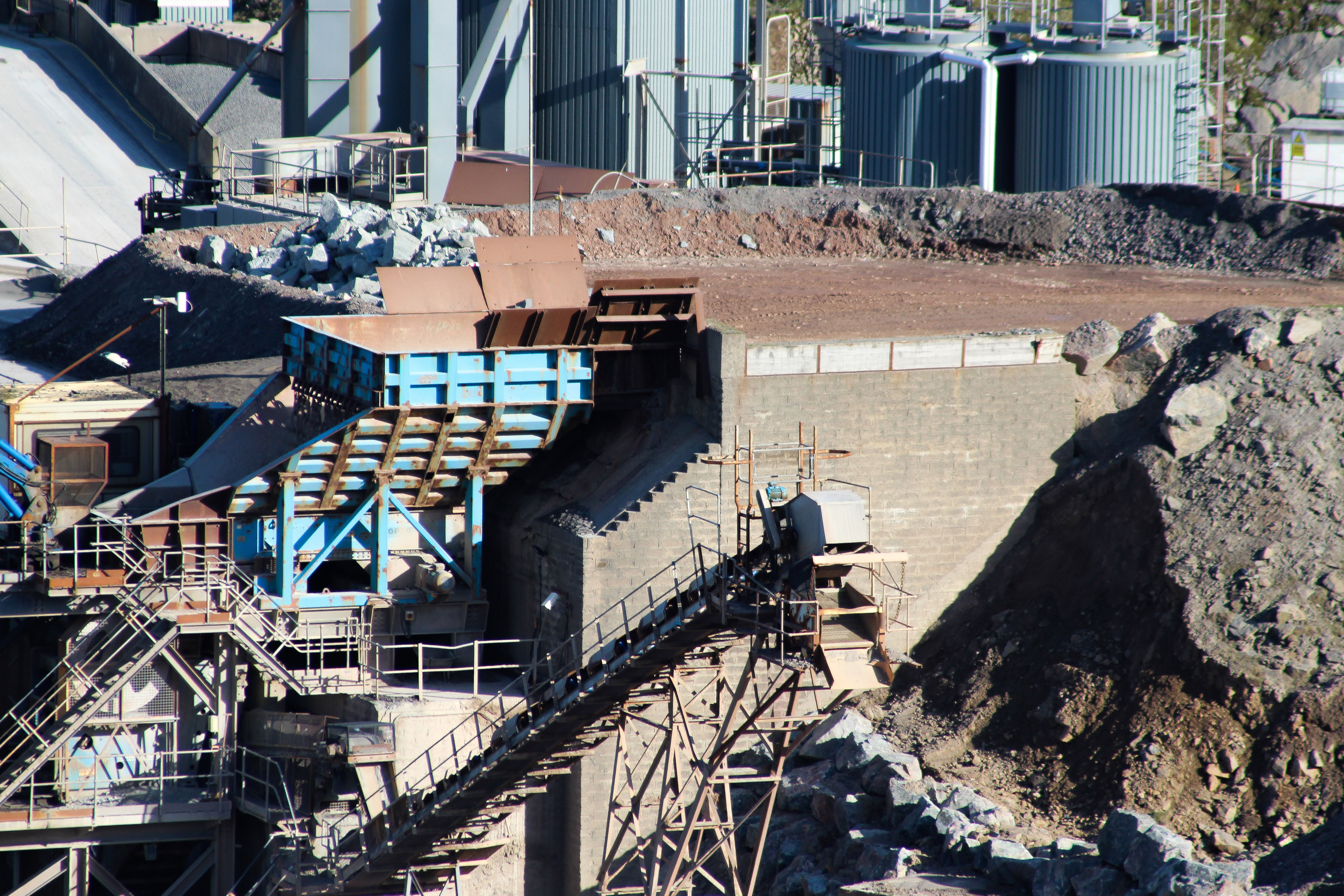 This image reflects the source of consumerism, done through the presentation of a quarry I intend to present the viewer of the devastation caused by industrialization and its effects on the scarring of the surrounding landscape. The photo of the machinery present in the quarry to me creates an insight into the generally unseen process behind the creation of our products and its impact on our environment. Accompanied with this I will be using a variety of different images based around the quarry to compliment it and provide a broader perspective regarding the landscape used for its materials. When putting this into the book I will be making sure that the other images used consist of the same coloured imagery and representation, something I would like to do as it would set a theme throughout the section using a generalized presentation of area transformation.
 The second stage of consumerism I photographed is the outcome of the industrialization, the product. Here I went into shops to explore how there was a huge change in presentation from the originally messy portrayal of the quarries, to a now more organized and aesthetic presentation of aisles of food on shelves. I put this as the second section to purposely contrast the previous topic, whilst making the viewer think of the completely different atmosphere used by companies to promote and hide the origins of products sources. When implementing the food images into the book I will be making sure there is a cold theme of organization, using colder colours compared to the warm browns and reds of the source, this hopefully will be impacting the viewer opinion regarding how we now see the process of out consumerism that consists of unseen impacts made by these global companies in order to sell their product.
 This is the final representation and outcome of consumerism, the waste. Here I photographed the piles of rubbish careless thrown away after their initial uses had been completed, left to be transported or recycled in various other locations. When taking the images here I made sure to capture the sheer mass of the rubbish in such as small area, presenting it as a jumble or unorganized mess that grows more and more by the day. Finally when I implement them into my book I will be making sure to include images that portray the same viewpoint I possess regarding the use of the landscape, in which I will be using imagery taken of landfill and the piles of dirt created from them, all the while looking at how they as a result permanently scar our environment.
 Regarding my work on political landscapes, I will be drawing most of my inspiration from straight photography, where I will be portraying my perspective concerning consumerism and the effects of it on our landscape, using as little photo manipulation as possible. The photographs which I will be comparing below from my shoots I have taken from various areas of Jersey that have been affected by consumerism and the consequent scarring of landscape around it, looking at both straight and modern photography as a guideline for my progress and intended results.
The photographers whose work I will be exploring (Edward Burtynsky and Henry J Fair) individually portray their photography in their own unique way. I have chosen both these photographs because of the link they have to my area of political landscapes, consumerism. With both using a form of straight photography to photograph industrialised areas polluting the landscape. Each photographer has taken on a rather different stance regarding how the matter at hand has progressed, using abstract and modernist styles of photography to do so. Exaggerating and influencing the perspective of the view through the enhancement of specific aspects within the image, such as saturation.
Chapter Two – Edward Burtynsky – Truth of The Camera
 I’ve responded to Burtynsky’s work by exploring the resultant garbage collection of our ever-increasing consumerism at La Collette, especially the plastic waste which consists of mostly vividly coloured electronics.
When taking each image, I made sure to use a straight photography approach, here I would use a none zoom lens to photograph the objects as accurately as I’ve seen them, editing only the brightness which would have been available in darkrooms to enhance each photo. My main focus was to bring into light the amount we throw away and wanted to do so by presenting this issue to the viewers through size comparison. To accomplish this, I found the biggest assortment of plastic waste and photographed it next to a hangar wall, making sure to carefully crop out any suggestion of a decrease of its mass. Here I purposely gave my image a one-sided political perspective, by presenting only my own bias viewpoint it would allow for debate to occur regarding the topic, as I encouraged criticism towards the result of our greed. For me this was more effective as it limited the vision of the viewer to only one aspect of the area, opposed to the whole area. This also proved a challenge as I wanted to provoke opinions regarding the outcome of waste, and only using my composition to accomplish provided more difficultly than expected. Here I deliberately disagreed with the essay question, as I wanted to provide evidence of how perception could alter perspectives regarding any chosen topic, essentially using a snippet of evidence to build a claim.
  Chapter Three – Henry J Fair
Born 1959, Henry J Fair had a fascination for the scarring of landscapes caused by large industrial companies. As his photography developed he soon found himself based in both New York and Berlin, travelling the world in search of environmental pollution. His most influential project ‘Industrial Scars’ focuses on small range environmental issues such as coal ash and oil, to large-scale ones such as abandoned mining operations. Here Fair uses mostly aerial photography to accomplish his images as they provide a perspective not usually seen by the general public. Much like Burtynsky, Fair focuses on the effects of these consumerist industries, alternativly choosing to present them in an almost devastating and destructive beauty, using vivid and aesthetic colours as a means of portraying contrast within the landscape. Fair here seems to stray from the idea of straight photography, as instead he uses increased saturation and heavy cropping to produce the outcomes desired, the result of this is extremely exaggerated imagery, where the colours of the landscape seem too dreamlike and otherworldly to exist. By using a more modern approach consisting of photo-manipulation the image gives rise to political themes, this is due to how the layout of each image makes the earth’s landscape unrecognizable to the viewer, causing disbelief and uncertainty regarding the possible future of society if this carries on. Exaggeration becomes a key aspect in telling stories through this documentary style approach, as each photo needs to be hard hitting to assert a change in mind-set for people. If the pictures were not beautiful, the viewer would not stop to consider them, or cherish them, a technique not commonly seen in documentary styled photography. These vibrant results which use an abstract approach, can be interpreted as the anchor point for drawing in audiences, with colours acting as a motif for the overflowing consumerist effects warping our landscape.
 Responding to this I then produced my own set of images based around
  Although both photographers share the same vision regarding their perspective over waste produced by the industrialisation of areas, the techniques and style used differ. The work of Burtynsky takes up a more literal and formal approach, using only composition of the camera to overwhelm viewers through the inclusion of one area of interest. This limits the audience’s perspective over the topic, as presenting a partial snippet of man’s creation only allows for the images produced to create a single-sided bias perspective concerning how the landscape may look. Contrasted to this Fair uses a broader take on the landscape to present his viewpoint, producing images looking at the entire landscape using aerial photography, choosing to push the boundaries of straight photography. This provides a larger view of the environment surrounding these industries and the effects of human scarring upon it, accompanied by Fair’s exaggerated vibrant imagery this appeals hugely to the audience whilst gaining a greater chance of drawing awareness to these global issues. However the method used by both photographs to depict the issues at hand do so aesthetically. Looking at their strongest projects, ‘Oil’ and ‘Industrial Scars’, there is an underlying sense of aestheticism beneath the abstract compositions, where each photographer uses intricate design as the major ‘go to’ in both structures and chemicals. I found that my work linked well with their style. I tried mostly to incorporate straight photography compliments with abstract aestheticism, depicting consumerism devastating the landscape
