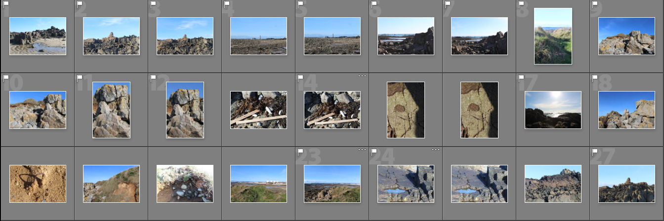

For this photo shoot i went back to La Motte to gather more objects that I thought represented what was there now to compare with archival images. I narrowed these images down and displayed them in a contact sheet above. Whilst i was there I also took additional landscape photos as the weather was different to what my other landscape images had been take in. From the photos I took, I displayed the final landscape images and studio images separately in two parts below.
Part 1- Landscapes


I particularly like these two images from this shoot as they have a different atmosphere to the other images in my project. The bright blue sky that’s behind the rocks and horizon, contrasts with the tones in the foreground in both images. When editing these images I will emphasise the contrast between the two colours. In the first image I was drawn to the unusual shape that the rock made along the top and the detailed sharp edges within it. I wanted to emphases the chaotic nature of the pattern, so contrasted it with the plain blue sky on the top half of the image, splitting the image in two. In the second image I wanted to emphases the developments that have been built along the horizon to contrast with the archival images from over 90 years ago when they were there. This is why I centered the image so that the incinerator was were the eyes are drawn to. I found I also created the same composition in this image as the first image, where the patterned bottom half of the image is contrasted to the blue sky.
I found that when I am taking photos I takes ones where the main subject is in the center of the image, creating a symmetrical composition. In my photo book I plan to space out the images where I centered an aspect of the photo, so that they create more impact by themselves.
Other images from the shoot:


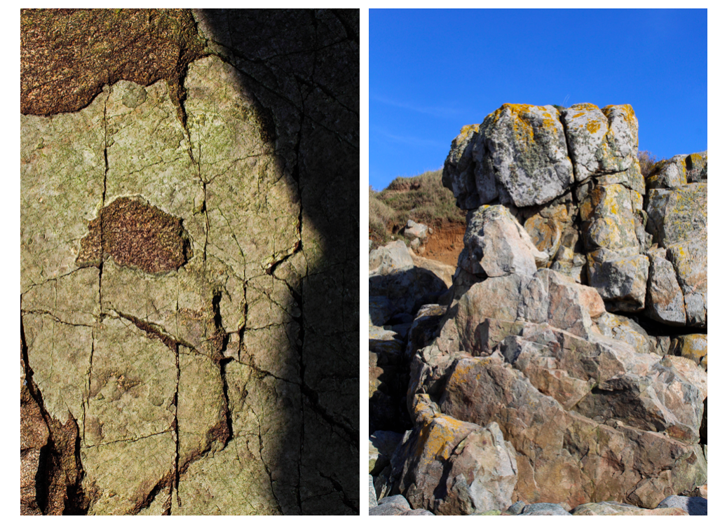
In these portrait images I tried to emphasise the shadows the that were made by the rocks. I particularly like the third image where i take a close up image of the pattern on a rock, highlighting the light and dark. I think that this image contrasts well with the other landscape images as it shows a close up angles contrasts with a wide one. In all the images, I wanted to focus on one section or a rock or the earth and emphasise it, which is why the objects all continue out of the sides of the photos.
Editing:
When editing these landscape images in photoshop I found that they were most effective when they were black and white. I experimented by editing a couple of them this way and compared them to the originals.
As well as turning the images black and white, I also adjusted the contrast and the white and black to find what made the image look the most aesthetically pleasing.

I think these two images in particular are the most effective in black and white as the detailed patterns that were originally there stand out even more. The different tones in the sky are more noticeable and are emphasised by the contrast to the rocks. Whilst editing I also used the grauduated filter to make the sky have more of a range of tones so that the final image was more vast and dramatic.
Although I like my black and white edits where I’ve emphasised the light and dark, I think that my final images for this project should be in colour as the archival images I have chosen to include in my photo book are in black and white. If my images were also in black and white the reader might get confused as to which ones are the modern ones that I took.
Part 2- Objects Experimentation

For the images photographed in a studio I edited them on photoshop. I first inverted the image to create the appearance of a photogram, simialr to Chrystel Lebas and Edward James Salisbury. I like this editing style as in my previous experiments from different shoots I found that the final images reflect the work of the early botanists where they used light sensitive paper which gives my images a scientific appearance. Instead of using natural objects i.e plants and seaweed, in this shoot I photographed man made objects to represent the changed environment in my work. Comparing these photos to that of early botanists show how what is found has changed over the period of 100 years and reflects the ideas of anthropocene. Secondly, I adjusted the levcels in my image so that the background was darker to contrast against the objects. I then adjusted the hue of the images so that that I could create different variations of the same image to see which one was the most effective. I displayed these variations below in a grid format. I also adjusted the levels in each image to brighten the obejcts and make the background darker.


From these variations of the same images, I think that the most effective image edited in the bottom row as I like the use of negative space within the circle shape the rope is making. I also like how the background in these images is completely black, taking the attention and focusing on the objects. The other edited images do this but have grey tones within this so distract the audience form the main subjects. Although I do like how the top rown images have a different appearance to the other. The bottom row shows exactly whats the object is, the appearance being more scientific, whereas in the top row it is harder to distinguish what the object is, perhaps making the overall image more interesting. This is through the lighter shapes surrounding the rope, which is the shadows inverted that were created when I photographed the images. I created shadows purposefully when photographing these objects as I wanted to see the effect it created when I inverted the images. Compared to the bottom row images, I think that they have a more delicate appearance as the shapes created are more rounded and go in multiple directions. In conclusion, I think that all the images are effective as they show different aspects of the same objects at different sections of it. In my photo book I will include a few variations of these images to interpret the work of Chrystel Lebas in her photo book ‘Field Studies’ where she include photograms.

For another object experimentation I decided to use all of the objects I had collected over the shoots I have previously done ans combine them with the objects I found in this shoot. I think that this is a good way of showing the changed environment and I thought that it could be a good image to end my photo book with. When arranging the objects, I first put the rope in a circle shape as this is the biggest object and the one that stands out the most. I then started placing the other objects around the shape of the rope, going in the same directions. I think that the combination of the natural obejcts e.g rocks, plants, flowers, seaweed in comparison to the main subjects the rope, creates an interesting image as it separates them as there is a divide in the center of the image, created by the rope.

I then went on to experiment with this image by editing the colour and tones within it. I tried to use warm and cold colours to see which was the most effective. Out of these edits I think that the black and white image is the most effective. This is because the shapes and shadows are emphasised as well as the negative space. Although in this image it is harder to see what objects are being photographed as they are all arranged so close together. In the orange/yellow toned image it is easier to tell what the objects are as the edit brightens the objects and the colours within them. In conclusion, I’ve decided that I won’t use this image in my photo book as I think it is too different from my other formally taken images and won’t create an easy sequence to look at. Also I like how in my other images I have displayed the objects by themselves to create a scientific appearance, like what botanists do when they are analysising species. In this image you cannot tell what each o f the objects are clearly and doesn’t follow the scientific approach I have been following throughout my project.

