Botanical Experimentation

I started experimenting with my images from photoshoot 5 in photoshop, taking inspiration again from the photograms in Chrystel Leas series ‘field studies’ with new material. I want to continue developing my interpretations of her work so i can include some in my final photobook. In this photoshoot i collected natural objects like plants and rocks and displayed them formally. In Photoshop I inverted the images so that the white background i photographed the objects on turned black. I then adjusted the hue of the images to create different variations of the same image. I also adjusted the levels in the image to produce the most aesthetically pleasing image with the most detail. After this process i edit the image in Lightroom and edit around the objects so that the background is the same colour, eliminating any lighting and marks that weren’t supposed to be there.

I particularly liked this image when i experimented with different colours as i think the multiple objects displayed makes the image more interesting to look at and creates more of an impactful image. I also chose to display these images together as i think they work best as multiple images together, rather than singles images by themselves, as it shows the contrast between the 4 images and the variations. It also shows how the colour of the main subject of the image can can the whole feeling of the image. For example, the red image makes me think the there is a negative concept and message behind the plants, whereas this effect is not created in the yellow edited image.

Displaying them together shows how there can be many variations of the same image, that portray different meaning through colour. In these images i think that the black background works well as it emphasises the repetition of the leaves and shapes going down in size and the different shape that each plant has. I also chose to photograph this image landscape, unlike my other images in this photoshoot as i wanted to display the different sizes of plant. I think this can then show plants at different stages of their life representing how the landscape is constantly changing and growing .

Anna Atkins’s cyanotype of the eagle fern (1843)

I like the effect created when I inverted this image and adjusted the levels without changing the hue in this image as I think it reflects the early photograms that botanists made with light. One example is Anna Atkins’ photograms of algae in 1843. I think it creates an image reflecting the ideologies of romanticism that isn’t shown as much in the images where i edited them have a black background. This is because the main subject is made to seem brighter because of the brighter blue background, creating a more delicate and fragile appearance the objects. I also like this effect as it makes the appearance of the image seem more scientific, like an X-ray analysing every aspect of what’s portrayed.

The flowers in the inverted image look as though they are slightly blurred. This is because the shadows i created when taking the photographs have turned whiter, blending with the actual objects, making it seem as it it’s slightly moving. This reflects Mandy Barkers images in her series ‘Beyond Drifting: Imperfectly Known Animals’ where she moves the the plastic debris she’s photographing so it’s blurred and looks as though it floating in the sea. 

I continued experimenting with this image to see if i liked them in colour edits. I found that i do like them, but for a different reason to the first edit. These images have a more powerful, impactful appearance in comparison to the first edit. This is is because of the contrast between the dark black background with the bright colours of the plants and rocks. I also like these images as i think they grab the audiences attention quicker, and the repetition of the same image horizontally shows how variations of the same image can look very different.

I think i prefer the first two images other than the forth and fifth images as i think the last two look to edited and artificial. Although that was the intention of editing the in bright colours, the last two might be too edited. The first two are yellow and red and work as a juxtaposition to one another, whereas the last two don’t work as well as a contrast as they are both tones of blue. Overall I think these images work well as a series showing different colour edits. If i were to use them in my photobook i would arrange them in a different order so that the two tones of blue weren’t next to each other in the series.

Finally, i created different edits of images displaying just plants in them, also including some small flowers i found on La Motte. I think these are my favourite two images that i edited as i think they created a more delicate appearance that wasn’t there when rocks were displayed in the image. This is because rocks are bold and structured in comparison to the plants I’ve displayed. I first started editing these images by inverting them and not changing the hue to see if this image work as well as the previous image. I found that i liked this edit, creating a similar appearance to the the previous ones, reflecting the work of botanist Anna Atkins that some would consider the first female photographer. I developed them further and found that i preferred these images when i adjusted them in colour.

These three images are my favourite variations of colour edits. The first two are the same image edited in yellow and blue. I like the first image as it simplistic yet detailed at the same time. The detailed patterns created by the stem and flowers on the plant make the image more interesting, but it is still simplistic through the dark black background. This focuses all the attention to the object in the image.

I arranged the plants this way, with one placed vertically with the other coming out of it side, as it creates the appearance that it’s just one plant and i also wanted the stems and flowers to be pointing in different directions to create a more interesting shape. Having the plants in different directions makes them more emphasised against the black background as you are able to see all parts of the plant, rather than them being on top of one another.

The second image is edited in blue tones. I made the plant brighter in this image in comparison to the others as i thought it worked well with the blue background. Also in this image i decided that  instead of a black background i would experiment by having a more navy colour to complement the blue tones of the plant, which i think worked well. In this images the blurred lines are emphasised more which is an effect i like.


The third image is my favourite from the shoot. In addition to the plant, i also added small flowers that i found on La Motte on the left side of the image to give it another interesting aspect. I think this image worked well as a yellow edit, as the flowers i found were originally yellow, so the edit emphasises there natural colour making them stand out more. I also think that they complement the plant well as they are different tones of yellow, the plant being a more darker yellow with hints of brown. The same delicate effect is created taking inspiration from the ideologies of romanticism, similar to the first two images but i think this effect is emphasised with further with the flowers added. This is because of how the flowers all create different shapes against the black background, not one being the same. When photographing this image i tried to make it seem a though they were originally apart of the plant, but had fallen of due to the changing environment.

3. Deconstruct the narrative, concept and design of the book such as:

3. Deconstruct the narrative, concept and design of the book for ‘ the earth is only a small spec of dust under our feet’

Book in hand: how does it feel? Smell, sniff the paper: the book in hand has a soft fabric feel in the outter wrap , I feel as if this was purposeful in order to further distinguish the unique elements of the book as a whole, The front also has a unicorn showing in a silver text, this creates a deep contrast and allows the feel to have a significant difference in depth, once again showing connotations of a mythological influence.

Paper and ink: use of different paper/ textures/ colour or B&W or both:  All the paper within the book is white thick glossy photography paper, this is done in order to be able to represent the light and colour of the images in an exaggerated manner, which is more utilising to the colourful vibrancy of the mythological images. Every page within the book has an image on it or next to a set of text. I believe it would be interesting to look more into perhaps if the text should be on a different paper to the glossy, in order to make the story feel more authentic and old, and something the audience and reader would appreciate.

.Format, size and orientation: portraiture/ landscape/ square/ A5, A4, A3 / number of pages: The size of the book, is around 1/4 smaller than a4, I believe this is done purposely as it would be used as a book people bring in hopes to too experience these mystical journeys, but also the unique size further emphasis the individualism to the text. It is portrait orientated, I believe this is due to it focusing on separate individuals throughout, and demonstrating many portrites of them throughout. The book is quite large It does not supply a page number, But I would guess it was around 300-350 pages.

Binding, soft/hard cover. image wrap/dust jacket. saddle stitch/swiss binding/ Japanese stab-binding/ leperello: After further inspection there are many interests within the book of maps and interesting necessities to further develop the journey. This is fascinating as it allows more of a believability and relationship within the people spoken about in the book itself. The covers is hard but covered with a thin fabric with free embroidery embellishment. The front is not an image taken but a design construed off the inspiration of the whole journey. The binding of the book is quite interesting, because it is divided into sections of each shoot. At the beginning and end of the book lies a section of coloured rainbow images, while within it is different it combines individual stories. This is a new constructive narrative to the book which I believe to be fascinating and An interesting composition which would be good to look more into.

Cover: linen/ card. graphic/ printed image. embossed/ debossed. letterpress/ silkscreen/hot-stamping:I believe perhaps it would be interesting to add many more conceptualised and extras into a book, however, I do want to add features within a text that have not been well thought out for a specific purpose, because of this I will think and consider in the future wether it would be worth while to add some of these aspects or not.

Title: literal or poetic / relevant or intriguing:The title is very unique in how long it is, and how symbolic and poetic it is . It bring about such a strong intrigue. It is not written on the front but the side, it is a poetic and perhaps wonderers unique view in order to how people construct the idea of life and what is true and what isn’t. I think it would be fascinating to come up with a title such as this, and will definitely be a strong inspiration for my own individual work.

Narrative: what is the story/ subject-matter. How is it told?:The narrative is many different mini stories, all with the same structure of discussing that of spiritual and mystical experiences which many would presume to be fake. It is shown to be respected and not something which is told throughout to be untrue or not possible, it is an exploration into things we do not know about, and is told form the individual unique viewpoints.

  • Structure and architecture: how design/ repeating motifs/ or specific features develops a concept or construct a narrative.

Many of the images come under similar characteristics or categories. Two categories which are current throughout the book, as that of people who have told their story being surrounded by rocks and crystals, this is a dynamic way to show each individual but still showing the direct connection to the themes of mystical fantasy. Secondly many images of rocks are shown throughout, a way to be fitting with the concept, They are shown with different combinations of rainbow patterns internalised over each rock landscape, this is very unique and something which I have never seen in a book before. Thirdly there are many landscapes taken of the areas which she travelled around Iceland, they are all taken in the same manner, but not edited, but taken in such a way there is something always beautiful, spiritual and peaceful found within them. Lastly she has some unique ways to capture her images in terms of light and composition, she occasionally puts her individual under a rainbow, or cover her face in sparks of glitter, she does so in order to allow them to glow and connote a visual representation of their spirit.

  • Design and layout: image size on pages/ single page, double-spread/ images/ grid, fold- outs/ inserts.

The images throughout the book have many variations when it comes to size on the pages, many of the landscapes are double pages and objects which show a continuation to the narrative, however many of the portraits and separate images either have a border, next to text, or have a blank page next to them. There is an insert at the end of a map of where she travelled, but displayed as an old fashioned map, i think this is interesting as it completely visualises her trip as a whole.

  • Editing and sequencing: selection of images/ juxtaposition of photographs/ editing process.

the sequencing at the beginning and end is both the same, and within the centre is split into double page spread, and portraits of individuals and their stories.  There is not so much a juxtaposition as even is the photos look very different they still carry such a strong visual chemistry within the concept of narrative.

  • Images and text: are they linked? Introduction/ essay/ statement by artists or others.  Use of captions (if any.)

I believe the images and the text should definitely have strong connection of themes throughout in order to link them and create a narrative. I will give an introduction to my book as I belive this will be important within the content, and also it will begin linking the text from personal stories and myths. I belive I might try and find or possibly even design my own drawing in order to sync in with the intro and separate parts of the stories themselves. The essay itself is linked quite well to my images with the themes of the sublime and romanticism, i will put this in the back of my book and again will do so, in order for it to be similar to the past myth.

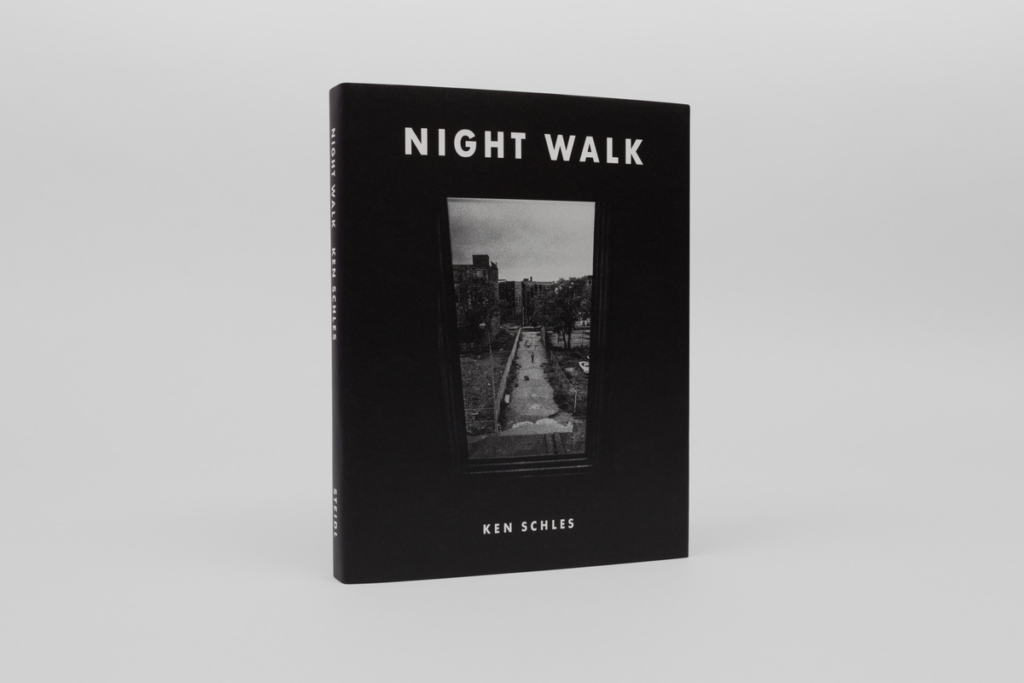
Understanding A Photobook (Night Walk by Ken Schles)

NIGHT WALK – KEN SCHLES

1. Research a photo-book (select one you have looked at previously in your project) and describe what story/ narrative the book is telling – its subject-matter, genre, style, approach etc.

2. Who is the photographer? Why did he/she make it? (intentions/ reasons) Who is it for? (audience) How was it received? (any press, awards, legacy etc.)

Photographer/Author : Ken Schles

”Twenty-five years after his seminal 1988 book, Invisible City, Ken Schles revisits his archive and fashions a narrative of lost youth: a delirious, peripatetic walk in the evening air of an irretrievable Downtown New York as he saw and experienced it. Night Walk is a substantive and intimate chronicle of New York’s last pre-Internet bohemian outpost, a stream-of-consciousness portrayal that peels back layers of petulance and squalor to expose the frisson and striving of a life lived amongst the rubble. Here Schles embodies the flâneur as Susan Sontag defines it, as a “connoisseur of empathy … cruising the urban inferno, the voyeuristic stroller who discovers the city as a landscape of voluptuous extremes.” We see in Night Walk a new and revelatory Ulysses for the twenty-first century: a searching tale of wonder and desire, life and love in the dying hulk of a ruined American city.”

The book was originally published in 2014 however a second edition was published in 2016

3. Deconstruct the narrative, concept and design of the book such as:

  • Book in hand: how does it feel? Smell, sniff the paper.

The book feels of a high quality, its a fairly thick book with 162 pages, smells like any other book

  • Paper and ink: use of different paper/ textures/ colour or B&W or both.

White ink printed on a matte black paper

  • Format, size and orientation: portraiture/ landscape/ square/ A5, A4, A3 / number of pages.

Landscape 17.3 x 23.2 cm

  • Binding, soft/hard cover. image wrap/dust jacket. saddle

The book is hardback and cloth bound with a dust jacket

  • Cover: linen/ card. graphic/ printed image. embossed/ debossed. letterpress/ silkscreen/hot-stamping.

The book has a black linen cover with an embossed title, covered by a dust jacket with one of the photographs from the book printed on it

  • Title: literal or poetic / relevant or intriguing.

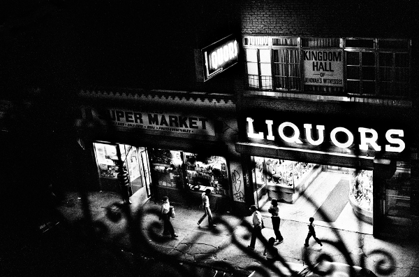
The title night walk simply describes the way in which Ken Schles has taken his photographs, as the majority of the images in the book have been taken at night out on streets and public places in Downtown New York

  • Structure and architecture: how design/ repeating motifs/ or specific features develops a concept or construct a narrative.

The way in which the book has been designed so that the monochromatic images are printed on black matte paper, this gives all of the images a common aesthetic which gives the book quite a structure despite there being no obvious narrative or pattern throughout

  • Design and layout: image size on pages/ single page, double-spread/ images/ grid, fold- outs/ inserts.

The design and layout of images in this book is considerably random, with some images having borders, some images being full bleed 1 page spreads and some being full 2 page spreads. There doesn’t appear to be a pattern in which this occurs

  • Editing and sequencing: selection of images/ juxtaposition of photographs/ editing process.

The sequencing of photographs in the book doesn’t seem to have any sort of part to part narrative/ tell a specific story, I believe that most likely the photos are in sequence of Ken Schles’ route of walking, however I am unable to be sure of this and it definitely may not be the case

  • Images and text: are they linked? Introduction/ essay/ statement by artists or others.  Use of captions (if any.)

The text at the beginning of the book is a short piece of writing from Ken Schles and the book finishes with a relevant quote by T.S. Eliot. Both of these pieces of text are linked to the photographic content of the book and help to give understanding to the purpose of the photographs used.