Text for inside the book; ideas

After researching about the photography book ‘The earth is only a little spec of dust under our feet ‘ It really made me think about some pages of text That I feel would really be fitting within the text. I decided to brainstorm over ideas and came up with the following three.

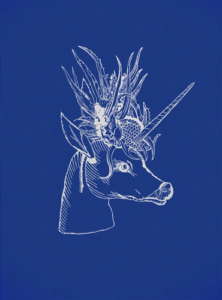
The first idea I had for the text were short stories, about mythological encounters, this could be in relation to sea-storms, sirens or mermaids. I thought this would be a good way to tie the whole concept of the book together, As I have already discussed this concept previously, so already I know it is fitting within my concept. Furthermore, when looking in the book, it was split into three main images. These being the people in a mystical scenario, this would capture my surreal water imagery, then It would incorporate a more abstract colourful imagery in order to give an ability to see the area that was taken place. The colour and way it is shown must be done in such a way to evoke that mystical surrealism, and be more indicative to everyones own impressions. I decided too that I would display the stories in a mythical way, as though on a script, I though this too would enhance the surreal aspect. I belive with the accompaniment of these short stories there is an ability to form a cohesive narrative, rather than a representation of a topic on its own.

During my research into romanticism, which is the base concept to many of my shoots,I found too that female pictorialism was a pivotal moment throughout my own work too, Because of the continuous portrayal of women and friends within this project. Because of this I decided the possible empowerment and non sexualisation of women could be expressed through stories of experiences women have been through, or poetry of what is it like being a women. This allows the highlight issues which women face everyday  which they have to cop through. The women could could be a stance of sublime beauty and power in order to ignight pivotal change.

Throughout this project I have read multiple books upon the philosophers who focus on themes such as the sublime,, and how they are expressed as pain and pleasure. Because of this I could include texts and quotes which philosophers have created when exploring different themes of exoticism and desire.I would divid this into many different themes of emotion that are all included within the images, and also have great significance to that of the sublime, pleasure, pain, desire, exoticism, love, defiance, power, I could do so with then attaching a quote, this would systematically give the book a narrative order and too let the reader apply each emotion found within the image itself.

Photo-book investigation – Picture of my life by Junpei Ueda

Picture of my life is a photo-book centered around the suicide of Junpei Ueda's parents in 1998,
  • Book in hand: how does it feel? Smell, sniff the paper.
  • Paper and ink: use of different paper/ textures/ colour or B&W or both.
  • Format, size and orientation: portraiture/ landscape/ square/ A5, A4, A3 / number of pages.
  • Binding, soft/hard cover. Image wrap. Swiss binding/ Japanese stab-binding.
  • Cover: Linen/ card. Graphic/ printed image. Embossed/ letterpress.
  • Title: literal or poetic / relevant or intriguing.
  • Images and text: are they linked/ introduction/ essay/ statement by artists/ use of captions (if any.)
  • Design and layout: image size on pages/ single page, double-spread/ images/ grid, fold- outs/ inserts.
  • Editing and sequencing: selection of images/ juxtaposition of photographs/ editing process.
  • Narrative: what is the story/ subject-matter. How is it told?
  • Structure and architecture: how design/ repeating motifs/ or specific features develops a concept or construct a narrative.

photo book investigation – Ben Anton – The earth is only a little dust under our feet – over-lapse

1. Research a photo-book (select one you have looked at previously in your project) and describe what story/ narrative the book is telling – its subject-matter, genre, style, approach etc.

I have previously fully explored a book circulating the meaning of the human body and the emotions it can express, however, Because I feel as if I have annotated this book enough that it would be more beneficial for myself to look at a different book for a new fresh perspective of inspiration. I chose this book due to its eye catching images based off surrealism, with the contextual side of influences such as mystical stories and the sublime experiences people have shared. All the images have a direct narrative and area of interests, that I too wanted to show in my images.

The creator of this book traveled many breadths from the north of Iceland further travelling to the south, east and West, all in order to search for where magical beings live. She sought out people who have a special ability to see them, asking around in every gas station, library, grocery store or hotel for anyone who could communicate with the Beings of the Earth. She was never deterred but the wild of the Icelandic weather being unforgiving. she persisted through language barriers of Spanish speaking stranger, continuing to trek over the most remote parts of the country. She was powered by her curiosity and imagination, her journey was long, but she found many people who were certain of their experiences. The people Bego visited shared their deeply personal experiences with the magical Beings of the Earth, and she reveals all in this fascinating book. Bego says, “I’m not a dreamer, but I do believe that every reality deserves to be examined and that there can be an intermediate world between reality and imagination.” I find her attitude compelling and I think it was interesting to see an environment of people who would usually be said to be crazed and isolated from society, being shown interest in and welcomed to share experiences. In a fascinating and in such a unique and creative manner.  Not only are her images more surreal in the way she uses composition in order to express and individuals mind, the use of coloured rainbows over images exploits a typical mind set of the mystique. Not only do the images themselves express a reality of stories but the stories themselves are displayed beautifully and shown to be from a demeanour of understanding and belief, rather than of mocking someone. The style of this book is so unique, which is to my mind why I find it so fascinating. Her approach is so individualistic but works for each person in such a unique manner.  Each of her images have the ability to keep their own and are so interesting as an individual image.

2. Who is the photographer? Why did he/she make it? (intentions/ reasons) Who is it for? (audience) How was it received? (any press, awards, legacy etc.)

She made this book in order to find out more about the subject matter themselves, and as an insight into these people and what there beliefs are. The artist believes what these people can see is a gift and should be celebrated through any means, this is why she explores this as a  ability or strength. In order to know how to photograph the person she asks them an arrangement of weird and fascinating questions. She states that ‘nature is our temple, so we call magic things we cannot understand, we have no reason to belive our five senses are enough to see the world, when you turn on the radio do you hear the waves?’ I believe it was well received as it was a unique and a new spectrum of photography work that had never been done before , I do not belive it won any awards, however it was widely loved within many communities. I understand that the audience they are trying to communicate with are those who are also interested within the views and abilities of other people. Perhaps they too think they have an ability, however I think it would be more likely for them to get this book as more of a spiritual development of people and their surrounding. I think due to the writers attitude of love and passion for her discovery of this topic it allows people to see this through her work and so too be inspired.

However not all the imagery is just a fantasy, her landscape imagery shows a significant talent and a complete relationship within the landscape is too found within herself.  Her capability to not only caption emotion, but a distinct and unique narrative to each and every individual is the pivotal point of her unique style and methods. I belive many people would also purchase this book due to the accord of the successful surreal imagery, she is a prime example of surreal art without having to take it through extreme editing, she perfectly captures a moment of sanctity accompanied with fantasy.


If it were possible, I would be interested in too finding similarities such as this in order to make my book more interesting, Including the use of stories to give more of a narrative to my images, Interesting colour concepts that connote the feeling of emotions of the person themselves, The composition and layout of the book having pages overlapping on another and a multitude of images over a double spread. Lastly, The use of having a dynamic design on the front which is an illustrations of the ideas and beliefs of the people, I think the colour and design on the front is part of the unique ability of the book, and creates an interest for the reader.

Photoshoot 4- Landscapes at Dusk

I went back to La Motte at dusk and took 100 images. I then narrowed them to 36 images and displayed them below. I decided to go to La Motte at this time so my images have different lighting and tones in them. In Chrystel Lebas photos she often goes out to photograph at dusk (what the French call l’heure bleu ) when the world becomes more mysterious.  “I was fascinated by night itself, by the absence of light and the impossibility of photographing” Lebas told Nanda van den Berg, the director of the Huis Marseille in Amsterdam. This inspired me to go out at this time the day to see how this would differ from the previous landscape image I’ve taken in this project.

I like this image I tried to emphasise the cool tones to heighten the elementalism relating to the ideologies of sublime. I think this particular image of mine definitely reflects that of the sublime, through the bold, structured shapes of the rocks with dark tones ranging rom brown to black. This combined with the sky which is a blue tone due to being taken at dusk, creates a mysterious and other-worldly appearance.

I wanted to show how the environment was changing by how the rocks had been warn down in comparison to archival images from one-hundred years ago. This is similar to how Lebas wanted to express how the environment was changing though how trees are growing, dying and re-generating themselves. I also like how the horizon is in the middle of the image creating a good composition, with detailed patterns and structures on the bottom half of the image which is juxtaposed with a simple sky with faint clouds. This is then connected with the rock in the centre of the image, being in both half of the image. The center rock is isolated from everything else in the image by sea and is shown by itself which contrasts to the other rocks in the image which are in groups together making the audiences eye going to the entered rock first. When editing this image i will see why it look like when i darken the clouds creating a more vast image.

I particularly like this image from my photoshoot as it has more context and meaning behind it than some of my other images. To me the cross in the center of the image could represent the peoples lives that have been lost on the beach, or the people that were buried in the island. This makes the image more mysterious and allows for the audience to interpret it however they want.

I also like the composition in this image as it is split into three sections , with the cross in the centre of them. The bottom part is th darker pat of the image, the dark brown tones contrasting to the light blue ones in the sea. The tones in the  bottom part of the image link to that on the horizon which creates a more aesthetically pleasing image. This is also because the blue tones in the sea complement the colour of the sky. The cross in the centre of the image is the point that the audience first looks at as it dark brown colour is contrasted against the sea behind it. I think image also links to the first final image in this shoot as they both have a subject in the sender of the image which draws the audience in, which is then surrounded by detailed rocks and blue tones. I think these two image would work well in a  photobook as they complement each and have simile aspects but aren’t too similar that your looking at the same image twice.

I tried to emphasise the blue tones in this image when photographing it at dusk and think I successfully did this. When editing this image i will try to further emphasises these blue tones and maybe even create more contrast between the tones in the sea compared to the sky.

Edits

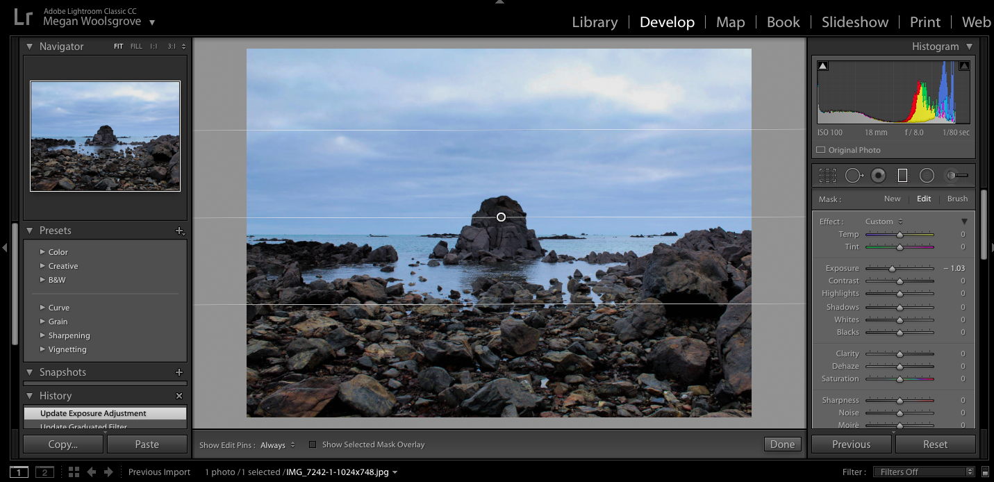
When editing my final images for this shoot i decided that i wanted to emphasise the colours in the sky and darken the colours of the clouds to create image the reflected the ideologies of the sublime more. I use the Graduated filter when editing all my images and adjusted the exposure, contrast and temperature to create more stand out images.

To experiment with this image I darken the blue sky towards the bottom but kept some of the white clouds around the top of the image noticeable so there was more contrasting colours. I think that the edited blue sky against the white clouds emphasises them more than the original and makes the landscape seem more vast. I also darkened the rocks around the bottom of the image to make it seem later in the day than to when he image was actually taken to make the overall appearance more other-worldly and mysterious.

I also experienced my adjusted the colours and temperature in the photos to see if any of the other variation would make a better image. I changed the image so that there were more warm colours int he sky the cooler colours. Doig this created completely different atmosphere in each image compared to the original. These edits make the image look more other-worldly as the colours in the sky aren’t something you would see everyday, which perhaps makes the image more interesting to look at.

Overall, I think i prefer when the first edit where i emphassed the colour tones as it creates a more sublime image and reflects the work Crystal Lebas more, which is something that i wanted to do in this shoot.

In this image i edited in a similar way to my previous image to see how editing the same way would make the images different. I darkened sky in this image using the graduated filter so there was more of a separation between the sky and the sea. I think this makes the sections in the image more noticeable as their are all different colours. Also the darkened sky makes the landscape look more vast and dangerous like there’s a storm, looking more sublime than the original.

I also tried editing this image with a warmer tone for the sky adding more yellow into the landscape, which creates a different atmosphere in the image. It doesn’t look as natural as the original, taking away the natural blue colours and adding a more other-worldly appearance. I also tried brightening the sea in the right image to create more of a contrast between the dark sky but found that it looks too edited as the dark sky would reflect the sea in real life, which isn’t happening in this image.

As a final image I prefer the first image as I think the darkened sky and clouds fits well with the aesthetic and concept of the image as the cross in the centre is representing people who have passed away, addressing a sensitive and sad topic. To me it shows how even though there’s a storm in the picture and waves the sea, the cross still stands as it always has, perhaps saying something about the people who have died in the area.

I also chose this edit as one of my final images as I like the reflects that the rocks create on the sea and also how it’s showing a different atmosphere to my other dusk landscape. The sea is flat with little waves in it, which contrasts to the other images I took which have more of a dramatic appearance. To me, this image is more calm and peaceful through the flat sea and the soft colours in the sky going from light blue and showing a little of the sun thats just set. In my opinion this image reflects more picturesque ideologies, compared my other images that look more sublime as its not as dramatic and vast and emphasises the beauty in the landscape more. When editing this image i used the graduated filter and brightened the sky a little and emphases the softer colours like the pale blue and orange.

Photobook Investigation – Rita Puig-Serra Costa

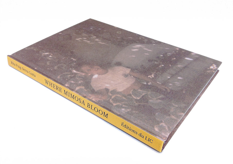
For the investigation into a photobook, I will be researching the book ‘Where the Mimosa Bloom’ by Rita Puig – Serra Costa, which focuses on the life of her mother who recently passed away, she tries to capture her life in a documentary approach through objects, places, family and friends. I have paid close attention to this particular book throughout the whole of the project, as the subject matter is similar to my personal study, but I am focusing on my own life. 

Image result for where the mimosas bloom

Cover of the Book 

There are no words on the front of the book, which is the first indication, that is photobook rather than than an informative book about her mother’s life. The image on the front cover is  faded photo of  Yolanda Costa Rico ( her mother ) in a garden as a child. The spine is a warm yellow the same colour of the mimosa trees, which where her mother mother favourite plant. Later in the book we see a photo of blooming mimosa tree, which are native to her home city of Barcelona, growing in a densely populated area which give an indication of the symbolism of the tree, the title of the book itself.

Design and Layout

The first two and the last two pages of the book are the same colour as the spine which is the colour of the mimosa tree which this a running feature throughout the whole of the book.

  • The book is an A5 linen hardcover and consist of 96 pages.
  • 18 archival images.
  • 5 full bleeds.
  • 22 objects.
  • 13 blank pages
  • 5 pages with sections cut out
  • 10 formal portraits
  • 0 inserts or fold out
  • 4 pages of letters

Image result for where mimosa bloom

Sequencing

The first five pages of the book have a small squares cut out to reveal a portrait of what we can assume is Rita’s family tree, as you continue turn the page another portrait is revealed and so on and so forth until we can see all six family members. Throughout the book we seen ten portraits of different people taken using natural light, but there is no indication that they are the people from the family tree. We can assume that these people are friends of Rita’s mother.  The portraits in the book are commonly juxtaposed by photograph of a small possession of Yolanda’s eg a shopping list, small toy or a black page, to draw the attention to the portrait, or may shows that in Yolands life she cared more about the experiences and the people around her than physical objects .Image result for where mimosa bloom

Structure 

The narraitve the book is telling to story Yoloands life through her possesions, her friends, family, places she visited. The book unlike most photobooks nearly entirely consists of photos that don’t seem to have any correlation to each other until you get towards the end of the book and find the index pages in which all of the images are given context, I think that by Rita doing this it gives the audience a better chance to connect the the book in a personal matter. I think that by not having any words next to the image creates a rather pleasant anthetic and makes the audience look at the book in two different way; as an outside having no connection to her at all, then the perspective of Rita, grieving daughter trying to honour her mother and still trying to keep the bond that she had with her mother alive.

Editing 

The book as a whole has a light and bright feel to it, the background for the majority of the book is white as objects that have been scanned onto a computer, or she has taken images of physical objects that wouldn’t have been able to scan in, she has photographed them with a white screen behind them. So this gives some depth to the images rather than them all being very flat from having been scanned in. All of the objects have been edited onto a pure white background, apart from one page.  On this page is a branch of the mimosa tree, which looks as if it is slowing dying, this could be a references to how Rita see the memory of her mother, that all of her possessions bring back happy memories of the times that they shared together hence the bright backgrounds, but when she thinks about her actual mother all she is reminded of is that she is no longer there.  Image result for where mimosa bloom

Text 

The only large amount of text in the book comes at the very back of the book, in which there is an index page of sorts which describes   all of the images that have come before so that the audience can have some of context as to what these objects are, it also gives context to where the images where taken so we are given an idea of where Yoland spent different parts of her life. At the end of the book there is a letter from Rita in which she speaks of the ways that she still feels that her mother is present in her life even though she is no longer there the letter is first written in her mother native language of Catalan and then in English.

Image Analysis

Image result for chrystel lebas photography
Rothiemurchus in Scotland

This photograph was taken in Rothiemurchus, Scotland, linking to concepts of sublime photography and focusing on nature as being the main subject.. The Rothiemurchus estate is one of the largest surviving areas of ancient woodlands in Europe where the average age of the Scots pines exceeds 100 years with some more than 300 years old. Le bas’ panoramic landscape photograph expands what is seen by the audience of the scene. The underlying story of this photograph to me is the detrimental  effects that mankind have had on the environment over the past years. This photograph was taken in 2012 which I think is Lebas’ way of expressing to people how mankind is effecting the environment today and is still very much a relevant issue. The way this photo was documented makes it seem to me as though she has stumbled across this on her walk which adds the to shocking nature of it. The surrounding trees are perfectly in tack but the tree in the centre of the image  is completely snapped in half on it’s side. This makes the audience question why it’s like this and creates mystery behind the scene.

The surrounding trees are all tall and straight, some going out of the frame on the left side of the image which adds to the contrast of the standing trees to the broken one. As well as this, most of the green tones in this image are on the surrounding trees, the broken one being a light brown tone which is different from the rest of the image, further emphasising the contrast of the two elements in the photo.   This follows on from Lebas’ environmental series looking at how the environment has changed over 90 years in comparison to Salisbury’s photograph. This image in comparison to Salisbury’s is shocking which I think emphasises the effect of climate change. “My photograph shows more trees than Salisbury’s black and white plate. Mark Spencer explained that these could have been growing thoughout the 90 years surrounding the older tree seen in the center of the image. Thus showing me that in order to understand that habitat one must understand its history.” So Lebas’ true meaning behind this image in particular was to show how landscape changes over time, portraying new trees that have grown over the 90 years, and the older tree falling apart on its side, portraying how trees are growing, falling apart and re-generating themselves.

The loss of plant and animal species due to human activities have been more rapid in the past 50 years than at any time in human history, increasing the risks of abrupt and irreversible changes to ecosystems. (www.anthropocene.info) When Lebas revisited the areas that Salisbury did she found that species that were there over 90 years ago weren’t there anymore, reflecting her views about species going extinct within her photography. The book is “an investigation of a landscape that now has such a heavy human footprint as to no longer be “natural” in the way Salisbury would have understood the term. ” stated in his article in The Guardian. I think this is true as the landscape she visited has changed so much that a whole plant species has gone extinct. This reflects the ideologies of anthropocene where atmospheric, geologic, hydrologic and other earth system processes are now altered by humans, which is a concept I think Lebas is trying to represent.

I also think many of her photographs  greatly link to the ideologies by philosopher Edmund Burke in ‘Origin of our Ideas of the Sublime and Beautiful (1757)’ where he talks about the thrill and danger of confronting untamed Nature and its overwhelming forces. This image displays nature as untamed through the broken tree in the centre of the image and the towering trees filling most of the photograph, nature overwhelming the senses. “Lebas sees her works as referring to the Romantic tradition, citing Casper David Friedrich and notions of the sublime as key influences. With images of escape, wilderness and the grandeur of nature, her practice relates some of the main tenets of Romanticism to photography and raises significant questions about how the contemporary (urban) viewer engages with nature.” (Deborah Schultz, Portfolio Catalogue – Contemporary Photography in Britain). I can see how Lebas’ work takes inspiration from the 19th-century Romantic landscape painter Casper David Friedrich through the tones she’s emphasises to portray vast nature as well as the bright backgrounds against the darker subject, creating a romanticised aesthetic.


Caspar David Friedrich Cairn in Snow 1807, Midday 1821-22

Sean O’hagan thinks that “Lebas’s images have a kind of heightened elementalism. She uses a panoramic camera and often shoots at dusk when the light quality in these still, quiet places can be almost otherworldly” (Sean O’Hagan, Photography reviewer, The Guardian). I agree with this statement as i think her use of cool dark tones adds to to an elementric quality. Elementalism refers to ‘worship of the natural elements of earth, air, water, and fire.’  and i think Lebas’ photography  has an awareness of spirituality in living things. In this image the way she’s accentuates the patterns in the dark green trees against the bright sky makes them seem alive and spiritual in comparison to the broken tree. Also the way she shoots at dusk emphasises the mystical atmosphere and shadows that consumes the image adding to the elementalism.

I agree that Lebas “alerts people to the changes wrought by man and the climate on the landscape, than by drawing them in through these photographs to consider how fragile it has become.” (Liz Jobey, Photography reviewer, Natural Histories, Weekend magazine) to an extent. Although she does present nature being ‘fragile’ and vulnerable to changes of  human activity, she also presents it as vast and powerful through her use of cool tones and boundless landscapes. Overall she presents  her underlying message that the changes in natural landscapes are due to humans and climate change and portrays nature as immense and beautiful at the same time.

Understanding Photobook

Field Studies by Chrystel Lebas

The narrative behind this photo book is the ‘grim reality of climate change leaving it’s marks on the landscape.’ She looks at the work of Sir Edward James Salisbury between 1925 and 1933 in Scotland and looks at how the landscape has changed over 90 years looking closely at botany and identifying locations he visited.

For example, she walked around the envions of the village of Arrochar in Argyll and Bute in the Trossachs National Park searching for Salisbury’s viewpoints. She observed how the sea appears to have risen dramatically in comparison to Salisbury’s black and white photograph. Salisbury was interested in the Scirpus [Bolboschoenus]  maritimus species that was now abundant in this particular place. A car park had been built on the same spot and the course of the road had been altered and now it seems that the species has disappeared.

She made these observations and documented them in her photobook, using panoramic images to show the changed landscape. Each chapter in her photobook she re-visits particular places that she found in Salisbury’s photographic records and his notes.

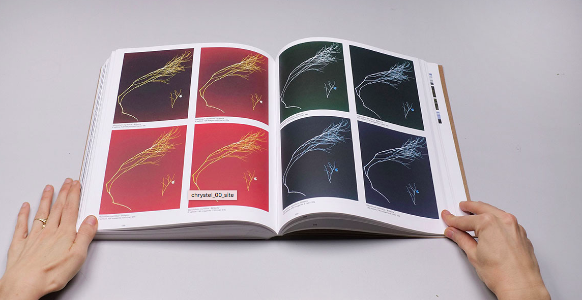
Chapter 6 in Field Studies changes from the archival and panoramic images and looks at ‘Plant Portraits or Weeds & Aliens Species’. The chapter starts with a quote from Salisbury, “We can in fact only define a weed, mutatis mutandis, in terms of the well-known definition of dirt as matter out of place. What we call a weed is in fact merely a plant growing where we do not want it” . Lebas took inspiration from the way Salisbury documented species by uprooting them and placing them directly onto paper or fabric to photograph them by using  photogenic paper in a darkroom to produce her own interpretations of his work. A few of the chosen plants are part of the species that Salisbury researched extensively and described in his book ‘Weeds and Aliens’.  The filtration values and exposure times are carefully annotated beneath each photogram.

http://www.chrystellebas.com/Re-visiting/re-visiting.htm
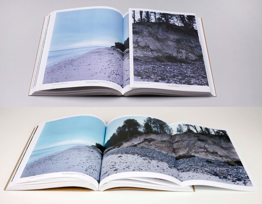
Book in hand: how does it feel? Smell, sniff the paper.

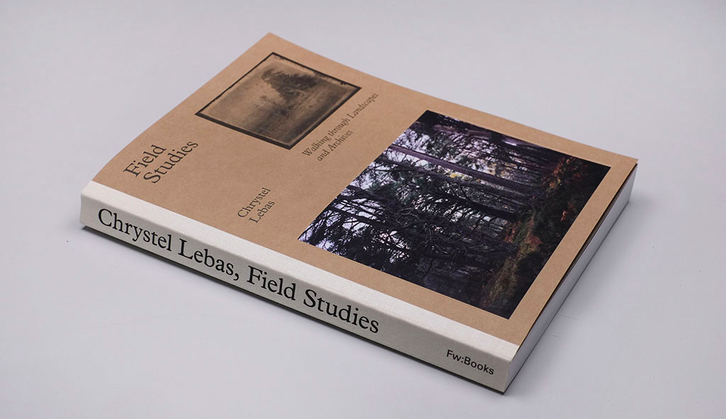
The book feels quite big as it has nearly 200 pages and is nearly A4, making it quite long compared to other phonebooks. It feels new and well put together through the brown card, making it have a strong front and back cover.

 Paper and ink: use of different paper/ textures/ colour or B&W or both.

The front and back cover are made from brown card and the spine of the book has canvas around giving the book a more authentic look. One of Chrystel Lebas colour images is displayed on the bottom half of the book and the way its printed makes it look as though its been stuck there by hand barbecue of the contrasting material to the card. One of Edward Salisbury’s black and white archival imagery is printed in the top right , the brown card behind the image replacing the whites.

Format, size and orientation: portraiture/ landscape/ square/ A5, A4, A3 / number of pages.

The size of the book is just bigger than A4 and is portrait. There is a total of 184 pages with a contents page at the front explaining the different chapters of the book e.g the different places Lebas re-visited and the pieces of writing included by other people.

Cover: linen/ card. graphic/ printed image. embossed/ debossed. letterpress/ silkscreen/hot-stamping.

It has a cover made for brown card, with canvas on the side of the book. The image on the front appears as though its been stuck on giving the photo book a handmade look. The archival image has been printed straight onto the card, Le bas telling the reader that the bigger image thats been stuck is her image, rather than the archival image.

Title: literal or poetic / relevant or intriguing.

The title of the book is ‘Field Studies: Walking through Landscapes and Archives’. On the first page of the book it states ‘The Sir Edward James Salisbury Archive Re-visited: observing environment change in British Landscape’ which is literal. It indicates the scientific nature of the book.

Narrative: what is the story/ subject-matter. How is it told?

The story of the photo book is looking at the changes in the landscape over 90 years and re-visiting the places that Edward Salisbury documented. Its looks at his landscape imagery as well as his scientific and botanical images. She looks at how factors such as climate change effect the environment.

Structure and architecture: how design/ repeating motifs/ or specific features develops a concept or construct a narrative.

She displays her images in chapters looking at one specific place and then in the next chapter going to another creating a journey travelling to different areas. The end of the book is like an evaluation of the objects she found there which is then followed by three pieces of text by Dr. Mark A. Spencer, Bergit Arends, and Liz Wells.

Design and layout: image size on pages/ single page, double-spread/ images/ grid, fold- outs/ inserts.

Lebas uses her panoramic landscape imagery on most of the pages on the first couple of chapters in the book. She uses fold out pages so the images can be full page, she then contrasts her images to Salisbury’s from the same location so you can see the effects of time. She writes alongside the image where it was taken, information about the place and what was found there. Chapter 6- Plant portraits or  Weeds & Aliens Studies displayed some of the plants and weeds she found in these locations formally with no writing. This contrasts with the start of the book that has a lot of writing.

Editing and sequencing: selection of images/ juxtaposition of photographs/ editing process.

She uses the juxtaposition of Salisbury’s archival imagery with her new panoramic images to show the effects of time and climate change on the environment

Images and text: are they linked? Introduction/ essay/ statement by artists or others.  Use of captions (if any.)

Her photobook include pieces of writing by others such as Dr. Mark A. Spencer, Bergit Arends, and Liz Wells alongside her writing and photos all linking to nature and the changing environment. This makes the book a lot more informative than other photo books as a lot of it is writing informing the reader about the places she’s visited and what she found there in comparison to Salisbury.
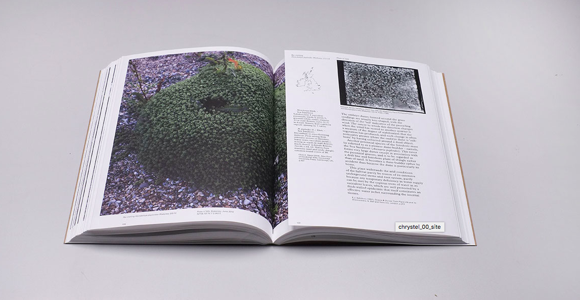
“My work is increasingly focusing on these particular issues around the environment and how we, human beings, influence it, however sometimes it is more complex then it appears and that is why we need science to step in and demonstrate the urgencies we face. In my photography and film works I am pointing out at the issues, hopefully engaging with a wider audience to share my findings and at the same time asking questions that might just provoke a reaction or a dialogue. My photographs are accompanied with GPS coordinates so that the locations can be retraced back and observed years after my photographs and Salisbury’s were taken, hence the recording of potential change in the landscape will continue.”