Before I finished with the design of the book I decided to fit in one more experimental edit. This would once again explore how the use of editing techniques could alter the portrayal of an image, using various colours to do so. I want to use the gradient because of its effects of changing the overall tone of a photo, whether it be bronze silver or two contrasting colours, something I found to be interesting when exploring conventions of the camera. Here I would be using the software Adobe Photoshop again due to its huge variety of tools available for use when looking at techniques not commonly used. This is the process of the development regarding the images used for experimentation: 

 After I had experimented with a variety of different gradients upon certain pictures I then selected the best photos that used the gradient the most effectively. I wanted to change the atmosphere of each image to a more surreal and unusual portrayal that used metallic colours to highlight certain aspects of them. Here are my favorite outcomes for gradient use:


 When looking over the images I found that I really liked the see-through metallic film placed over the photos, as it gave them an tinted and old effect that I hadn’t seen in any of my previous work. Accompanied through the slightest change of colour tone, the effects of the gradient seems to product abstract and surreal results that overall I was really happy with.
Daily Archives: January 13, 2019
Filters
Mark Dion Response


 Edits
Edits


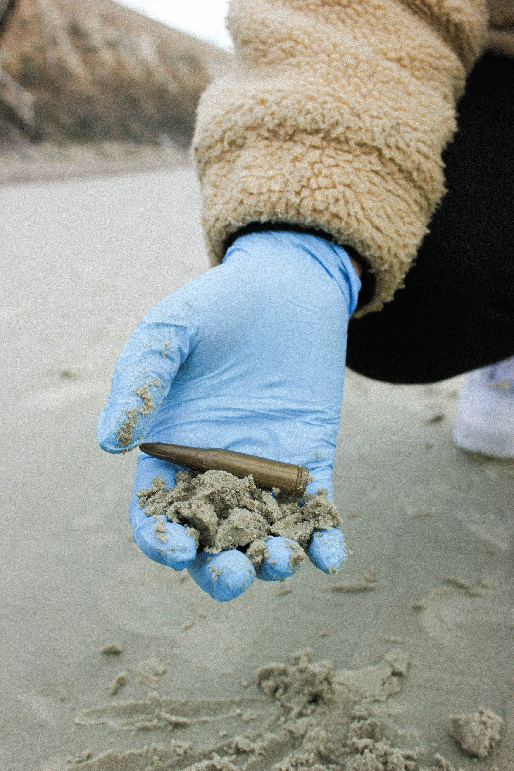

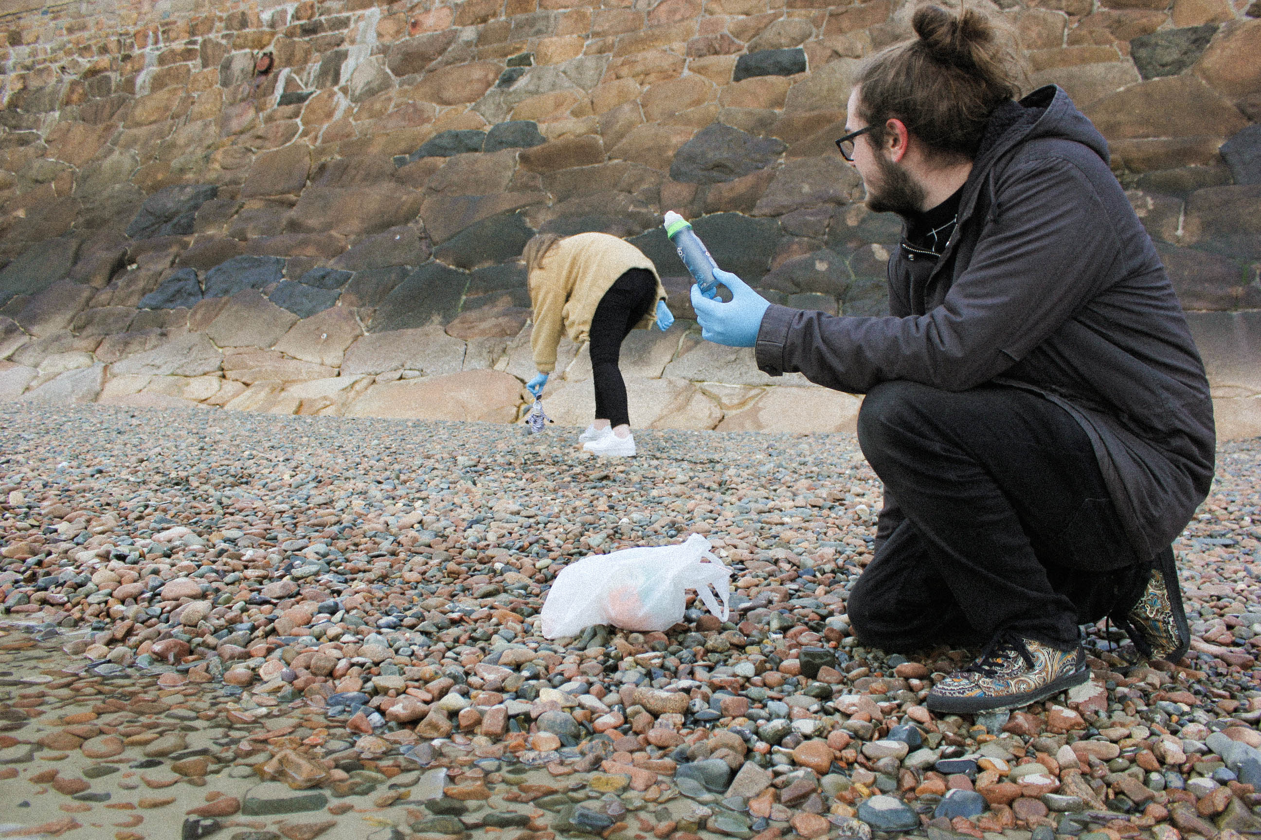

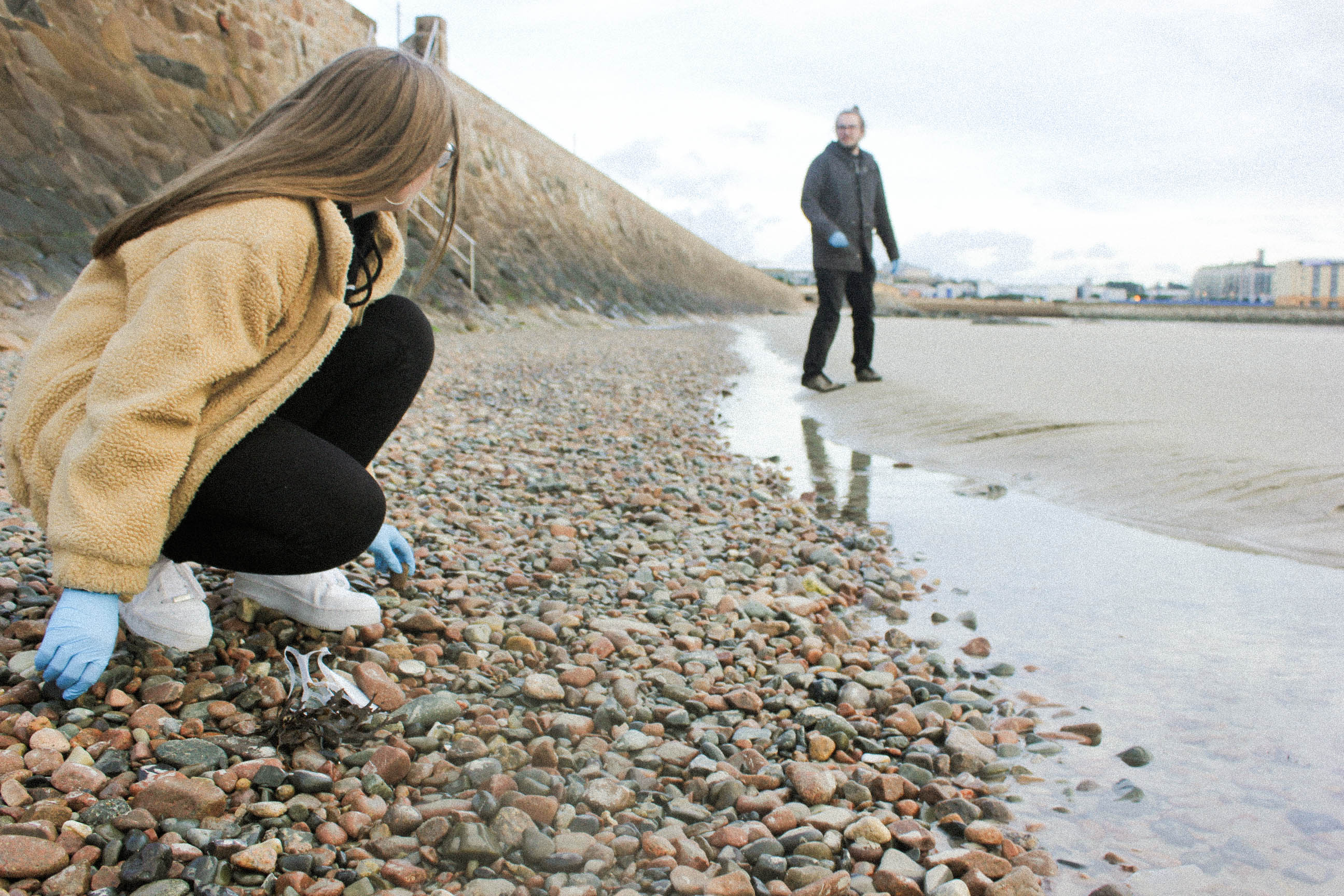


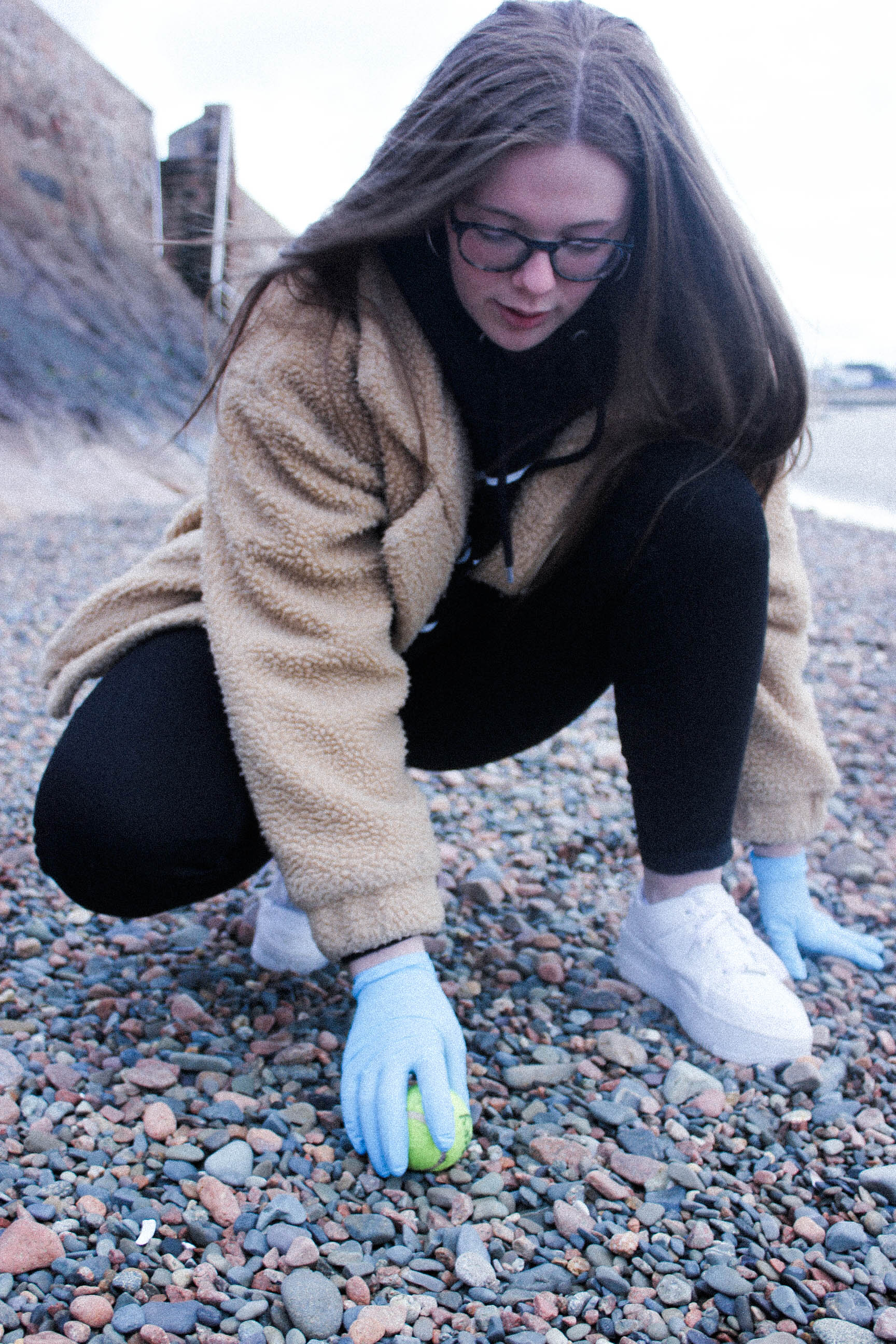

To give the images the same vintage feel as seen in photographs of Mark Dion’s work, I overexposed the images and added grain. I increased the contrast and vibrance to enhance the colour in the stones. I created two versions of an editing pre-set where one version was curved towards the blue side on point curve, and the other was curved towards the yellow side. This was to change warmth and lighting of the images, that occurred due to the overcast of the sky.
UNDERSTANDING PHOTO BOOK
UNDERSTANDING PHOTO BOOK:
DESIGN, FORM, FUNCTION, SEQUENCING, NARRATIVE, CONCEPT
Here is a link to the Personal-Study-Planner-Tracker-2018-19 for the remaining 5 weeks of this module.

READ these texts to better understand how to identify a narrative and understand the design process of photobook making.
Colin Pantall: Identifying the Story: Sequencing isn’t narrative
Francis Hodgson: On Photography and Storytelling
For the die-hards here are a serious blog post by Photobook critic, Joerg Colberg which consider the many aspects of photobook making: Understanding Photobooks: The Forms an Functions of Photobooks
This article is the first in a series of five. You can find the other parts here: part 1, part 2, part 3, part 4, part 5
Here are a few lists of Best Photobooks 2018
Photographic Museum of Humanity
Blog: Produce a number of posts that show evidence of the following:
1. Research a photo-book (select one you have looked at previously in your project) and describe what story/ narrative the book is telling – its subject-matter, genre, style, approach etc.
2. Who is the photographer? Why did he/she make it? (intentions/ reasons) Who is it for? (audience) How was it received? (any press, awards, legacy etc.)
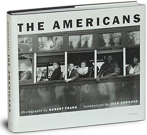
E.g Robert Frank’s “The Americans” was conceived with the help of a scholarship that allowed Frank to go on road trips across America during a two year period. He wanted to portray American society in the post-war period and his book has influenced (and still influence) many photographers since and also contributed to a new poetic style and subjective approach to documentary photography. Why?
Read an article in The Guardian by Sean O’Hagan, Photography Critic
3. Deconstruct the narrative, concept and design of the book such as:
- Book in hand: how does it feel? Smell, sniff the paper.
- Paper and ink: use of different paper/ textures/ colour or B&W or both.
- Format, size and orientation: portraiture/ landscape/ square/ A5, A4, A3 / number of pages.
- Binding, soft/hard cover. image wrap/dust jacket. saddle stitch/swiss binding/ Japanese stab-binding/ leperello
- Cover: linen/ card. graphic/ printed image. embossed/ debossed. letterpress/ silkscreen/hot-stamping.
- Title: literal or poetic / relevant or intriguing.
- Narrative: what is the story/ subject-matter. How is it told?
- Structure and architecture: how design/ repeating motifs/ or specific features develops a concept or construct a narrative.
- Design and layout: image size on pages/ single page, double-spread/ images/ grid, fold- outs/ inserts.
- Editing and sequencing: selection of images/ juxtaposition of photographs/ editing process.
- Images and text: are they linked? Introduction/ essay/ statement by artists or others. Use of captions (if any.)
Here a few examples from previous students
Photo Book Investigation (Matt Eich – I Love You I’m Leaving) – Deconstructing the Book
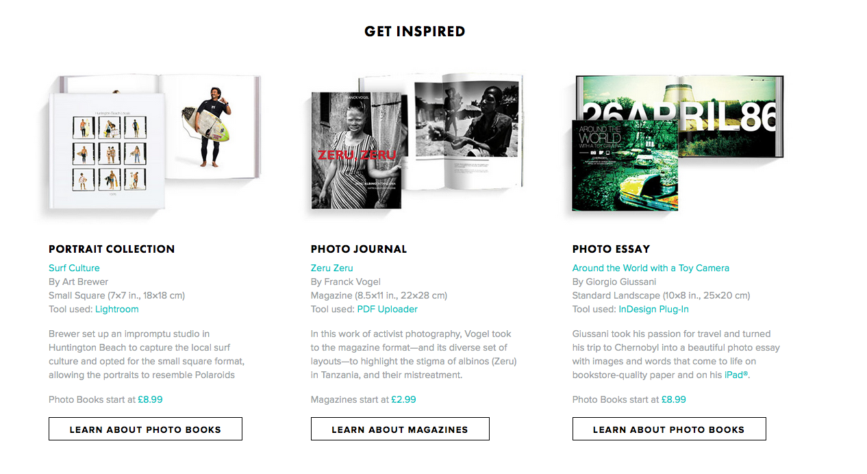
4. Look at BLURB online book making website, photo books from photographers or see previous books produced by Hautlieu students on the table in class.
5. Write a book specification and describe in detail what your book will be about in terms of narrative, concept and design. Produce a mood-board of design ideas and consider the following:
Narrative: What is your story?
Describe in:
- 3 words
- A sentence
- A paragraphs
Design: Consider the following
- How you want your book to look and feel
- Paper and ink
- Format, size and orientation
- Binding and cover
- Title
- Structure and architecture
- Design and layout
- Editing and sequencing
- Images and text
Create a BLURB account using your school email address. With Blurb you have different options on how you design your book:
a) Using Lightroom to design your book which is integrated with BLURB. Only for use on school computers, unless you have LR at home on your own laptop.
b) Download Bookwright via Blurb onto your own laptop and work offline at home and you can work indecently of school. Here you have full control of layout/ design features. Once completed, you upload photo book design to Blurb
c) Choose online option if you want to work directly online. Very limited layout/design options (not recommended!)
Deconstructing The Narrative Of A Trilogy
Book in hand: How does it feel? Smell, sniff the paper.
The book’s cover is made of a smooth matte card surface which folds back to reveal extra photography. The texture of the paper seems to be smooth with small indentations possible to reflect the type of material she has photographed inside the book. However the back of the book’s texture resembles the wall paper photographed, being more textured and harder to run your hand across, adding interaction with the reader.
Paper and ink: Use of different paper/textures/colour or B&W or both.
All the paper in the book seems to be thin paper, slightly thicker than your average printing paper in order to represent the type of materials photographed. Within the book however there are detached pages which provide extra information that informs the viewer of the overall intentions of the photographer, seen through yellow paper with black ink. The ink used is relatively thin and small compared to the size of the photos, consisting of only one variation of font. The further you progress into the book it does feel like the pages become slightly more textured and thicker to the touch as you pass through the three sections.
Format, size and orientation: Portraiture/landscape/square/A5, A4, A3/number of pages:
The book itself is A4 sized, done to compliment the graphics within it which require an equal amount of neutral space to cover each page. This is complimented through her use of a portrait styled book, allowing her to capture the textures created perfectly, something that could not have been achieved through the use of a landscape book. Overall there are 167 pages to the book, with roughly 50 pages per section and the rest being informative pages, presenting consistence throughout.
Binding, soft/hard cover. Image wrap/dust jacket. Saddle stitch/swiss binding/Japanese stab-binding/leperello
The book uses a dust cover across the font of the book which is then stuck down as it reaches the back. This makes it extremely user-friendly as it prevents the buyer from possibly losing or damaging the cover of the book, stopping it from wearing in the long run.
Title: Literal of poetic/relevant or intriguing?
The title is a literal representation of the books topic, as it consists of three individual books put in order of relevance to make one. To me this is intriguing as it presents all of the images in a new light previously not seen before.
Narrative: What is story/subject matter: How is it told?
The book is based around the experimentation of layered paper and gradients, whilst using aesthetic matte colours to allow images to pop out at you. As you progress through the book the techniques used to make these collages seem to become more and more advanced, showing the artists improvement over time.
Structure and architecture: The design/repeating motifs/specific features developing a concept or constructive narrative
The imagery inside the book tends to be based around the same subjects, paper. This is consistent throughout the book in different variations, however much of the pages have a double-sided plain matte backdrop to separate images and topics.
Design and layout: Image size on pages/single page, double-spread/images/grid, fold- outs/inserts:
Each photo is A4 within the book, with no double page or alternative styled pages. This adds a sort of consistency throughout the book which can be viewed equally, with the only other use of page design being the implementation of loose information sheets.
Editing and sequencing: Selection of images/juxtaposition of photographs/editing process:
The images inside the book seem to have been edited using software such as Photoshop and Lightroom. This enhances the matte colours in each photo massively as it presents a contrast not seen by the camera. As a result of this it produced more abstract and conceptual type photography as the colours used seem to out there to be real.
Images and text: Are they linked? Introduction/essay/statement by artists or others. Use of captions (If any).
The text inside the book mainly is about the style of photography she uses, and her biography, read through on the loose pieces of paper throughout the pages. There is no introduction to the book which instead head straight into the first topic, the same goes towards the tags which are also absent in the book.

