Sublime Shoot 2

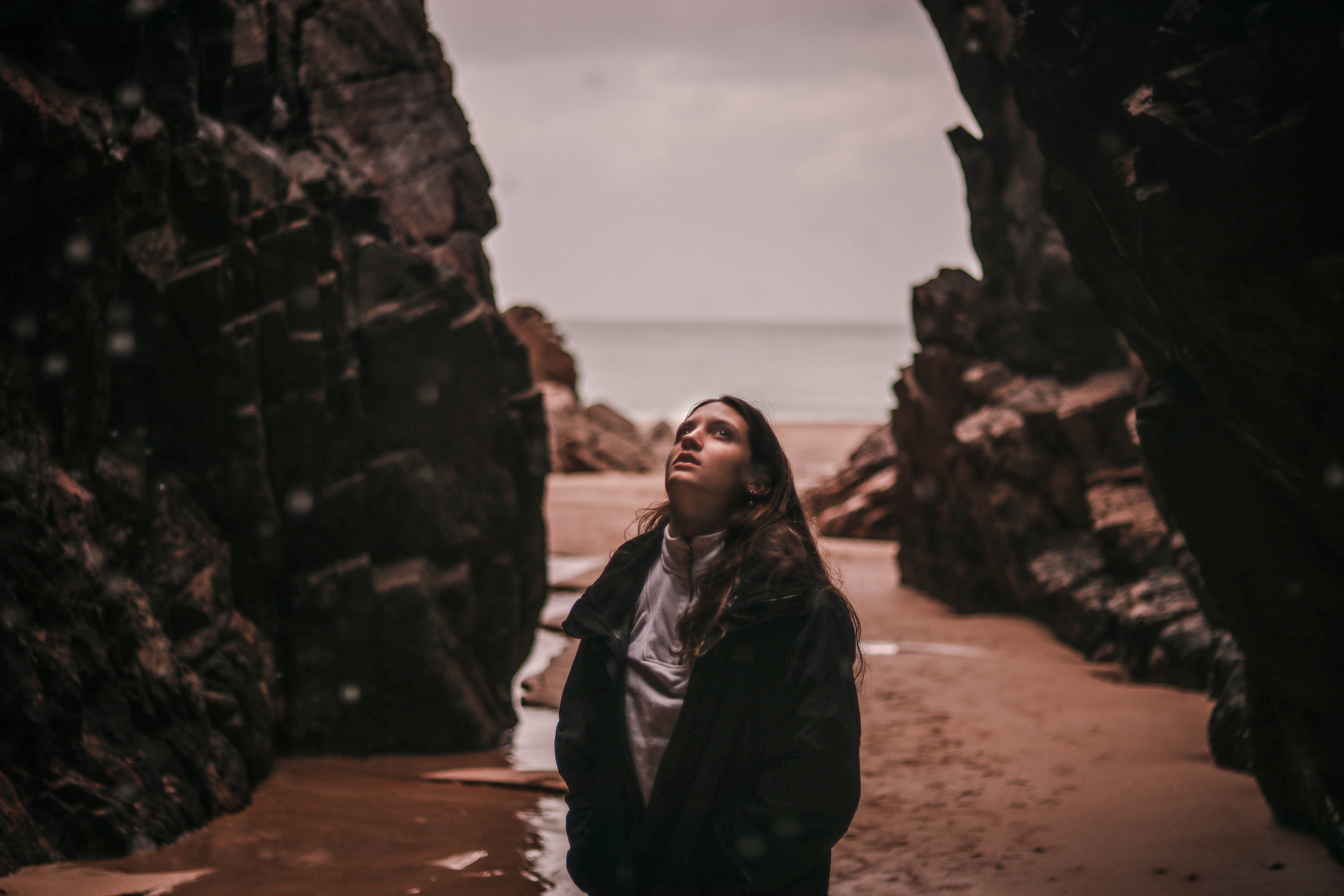
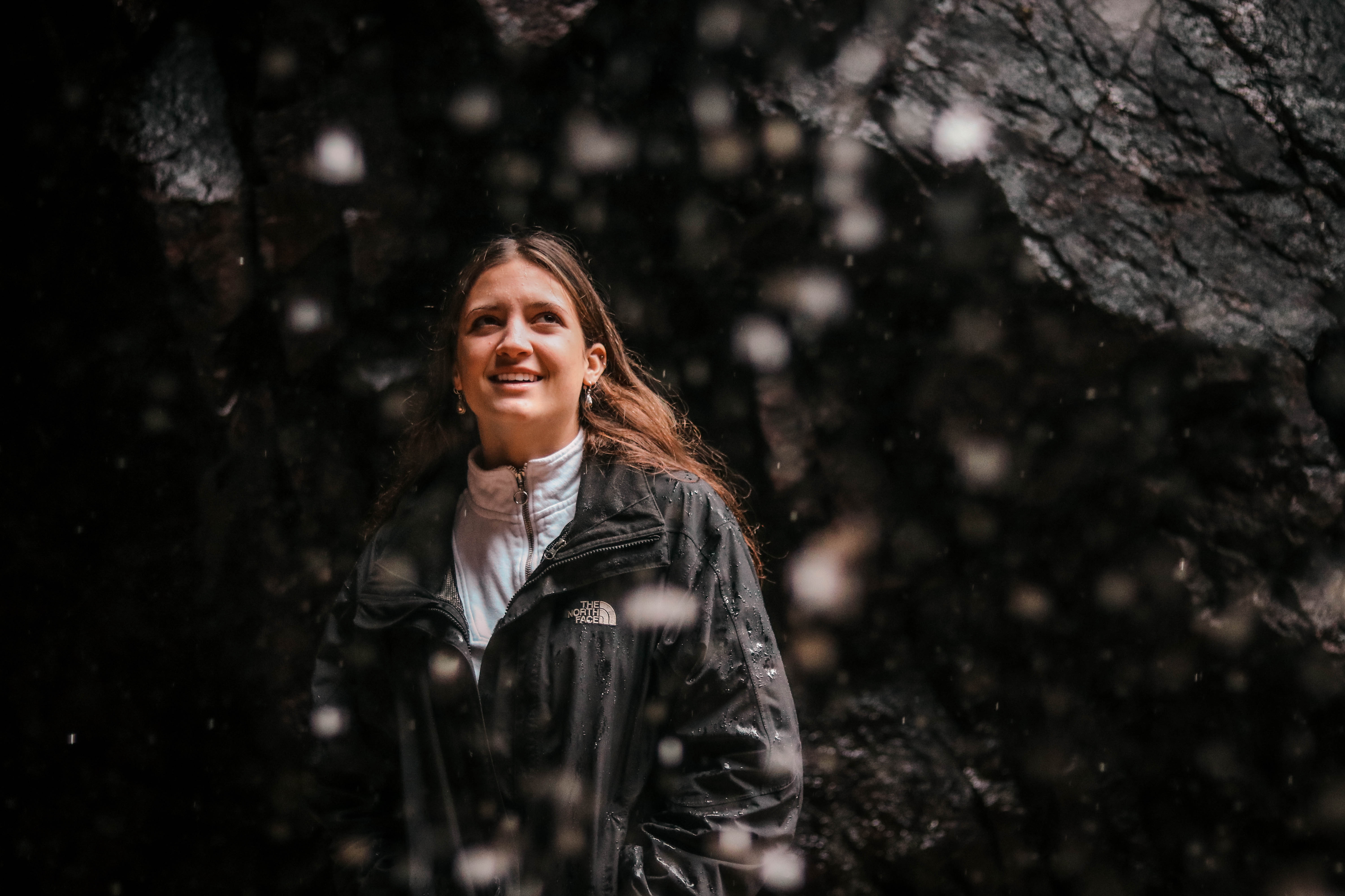
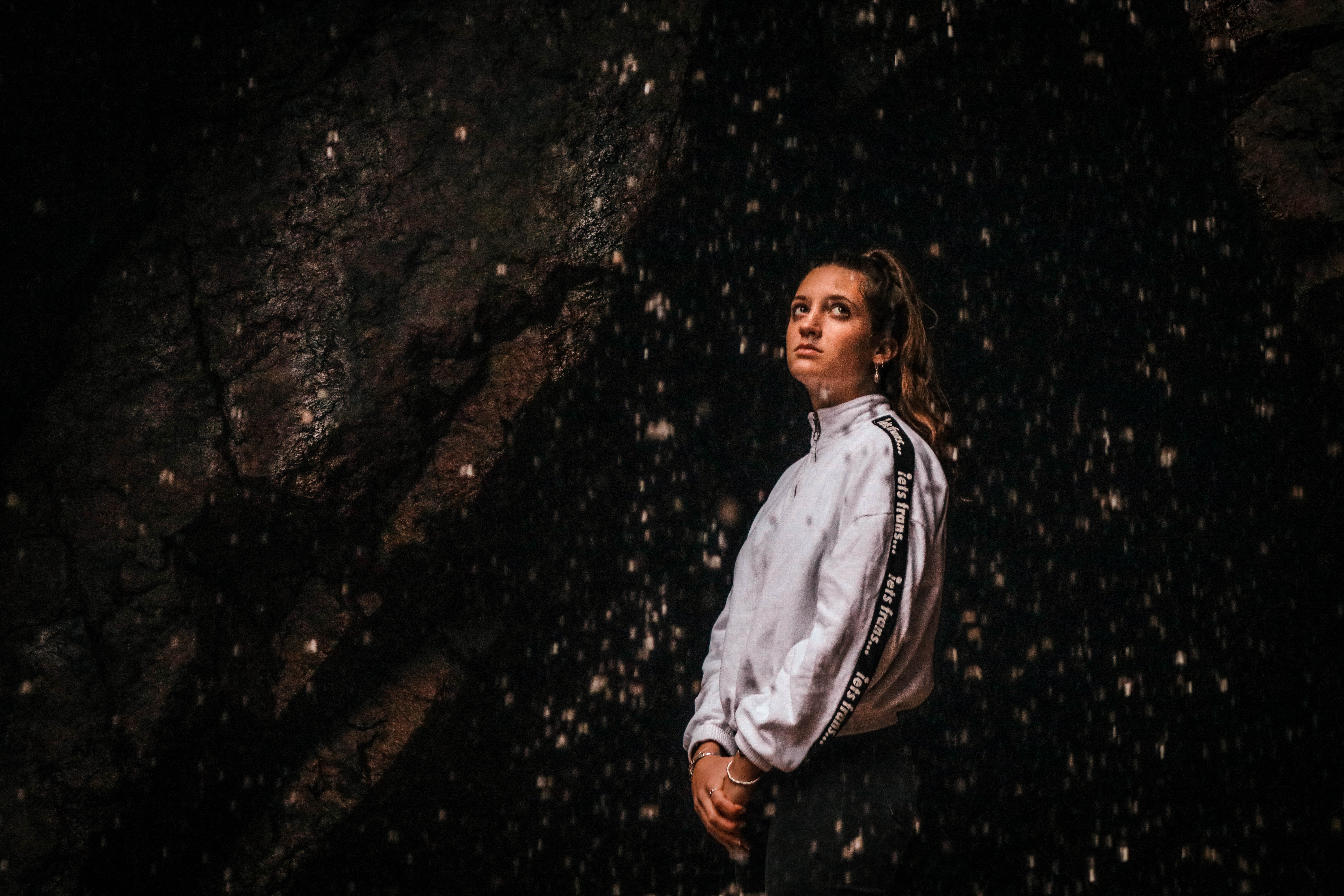
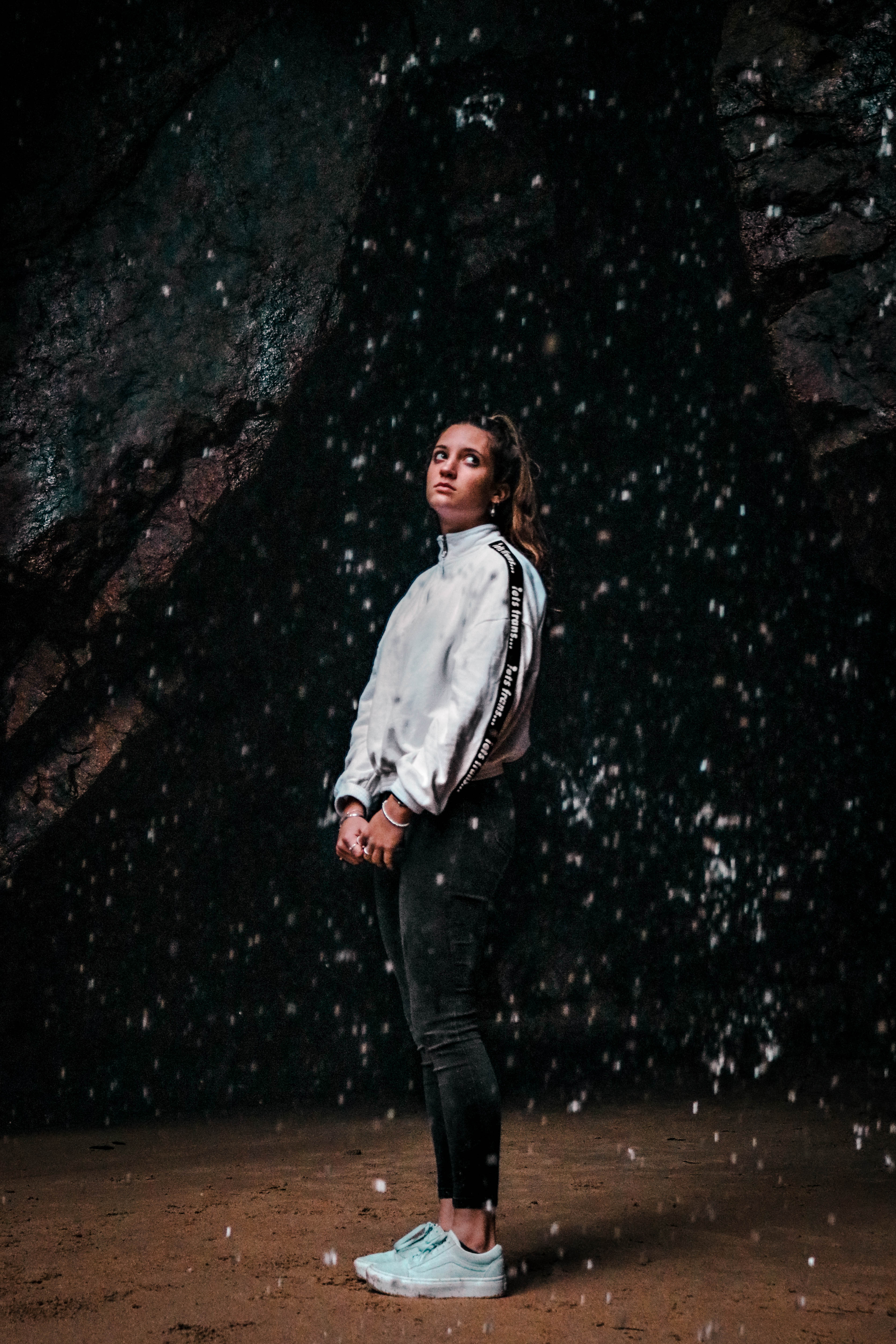
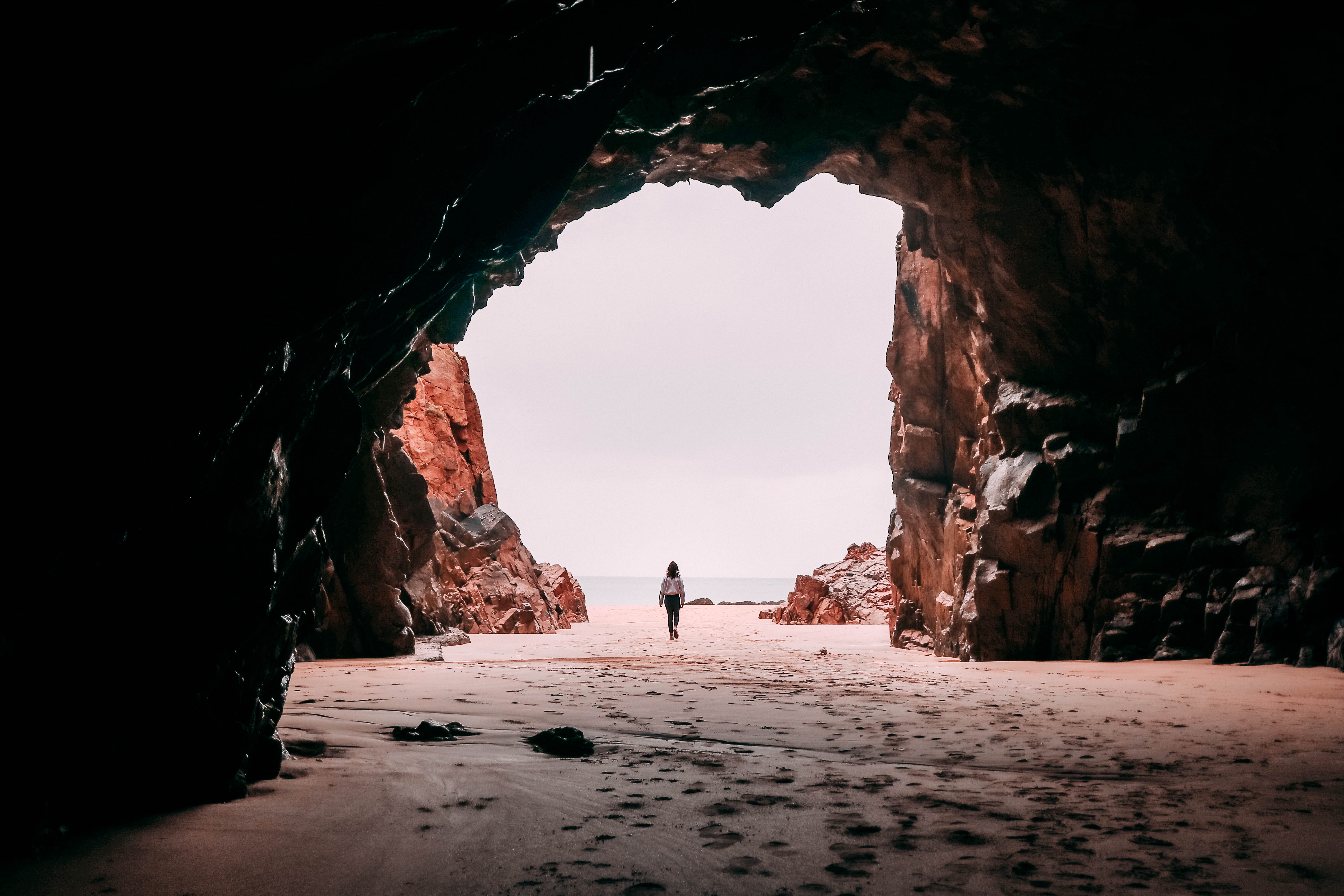
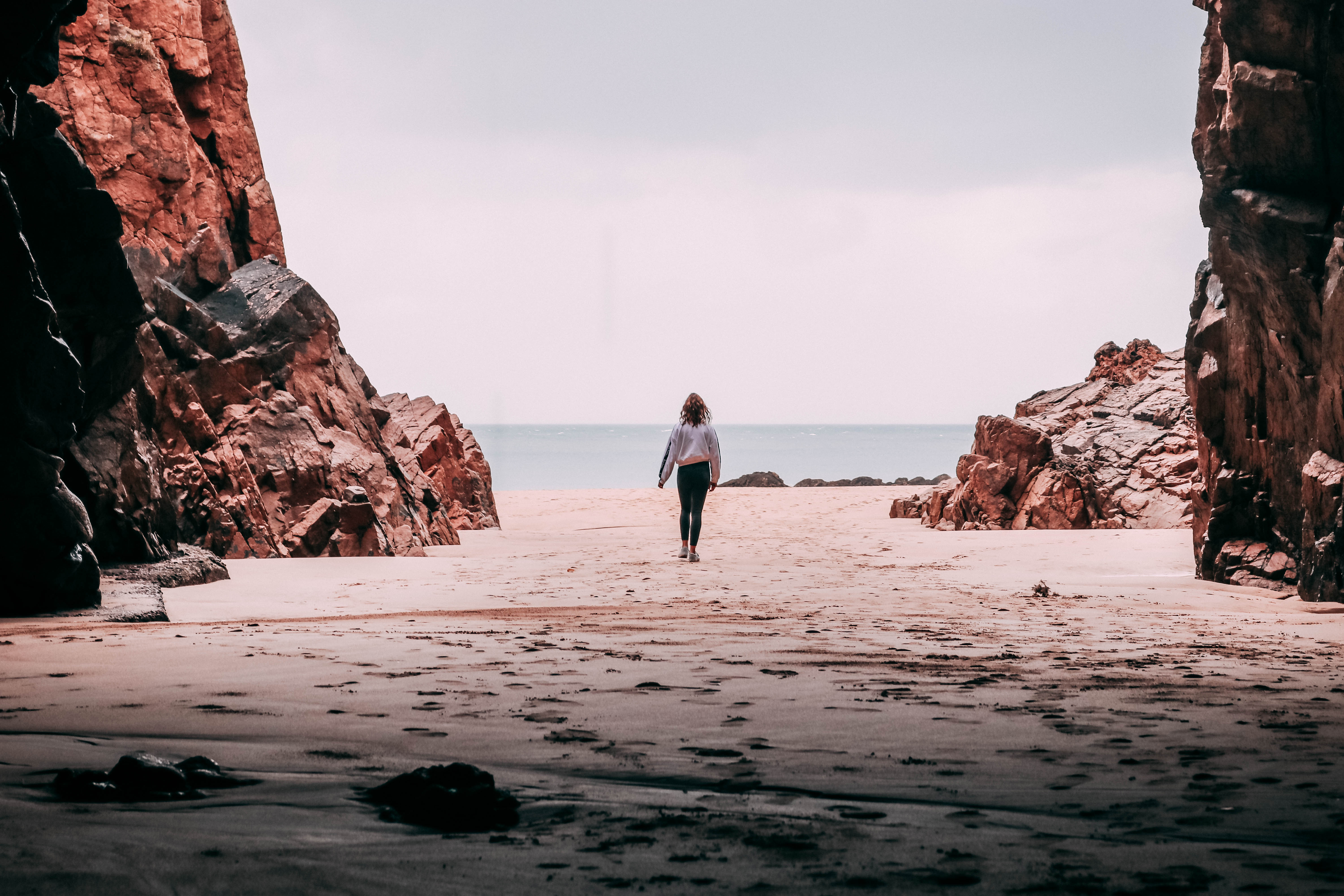
 Within Fernando Maselli’s pictures he will refrain from using people to primarily focus in on the sublime environment. I think that also without the presence of people shows the environment that we could have without the presence of people that often destroy it. I wanted to include people in this second shoot to try and portray my ideas about having a society that cares for and looks after the environment. Threw directing my model, i tried to capture her engaging with the environment and appreciating it whilst not disturbing or destroying it. The intentions for this shoot were to focus in on the future of our community that i believe in where everybody can appreciate and respect nature.

Contact Sheet
Edited Images (Lightroom)

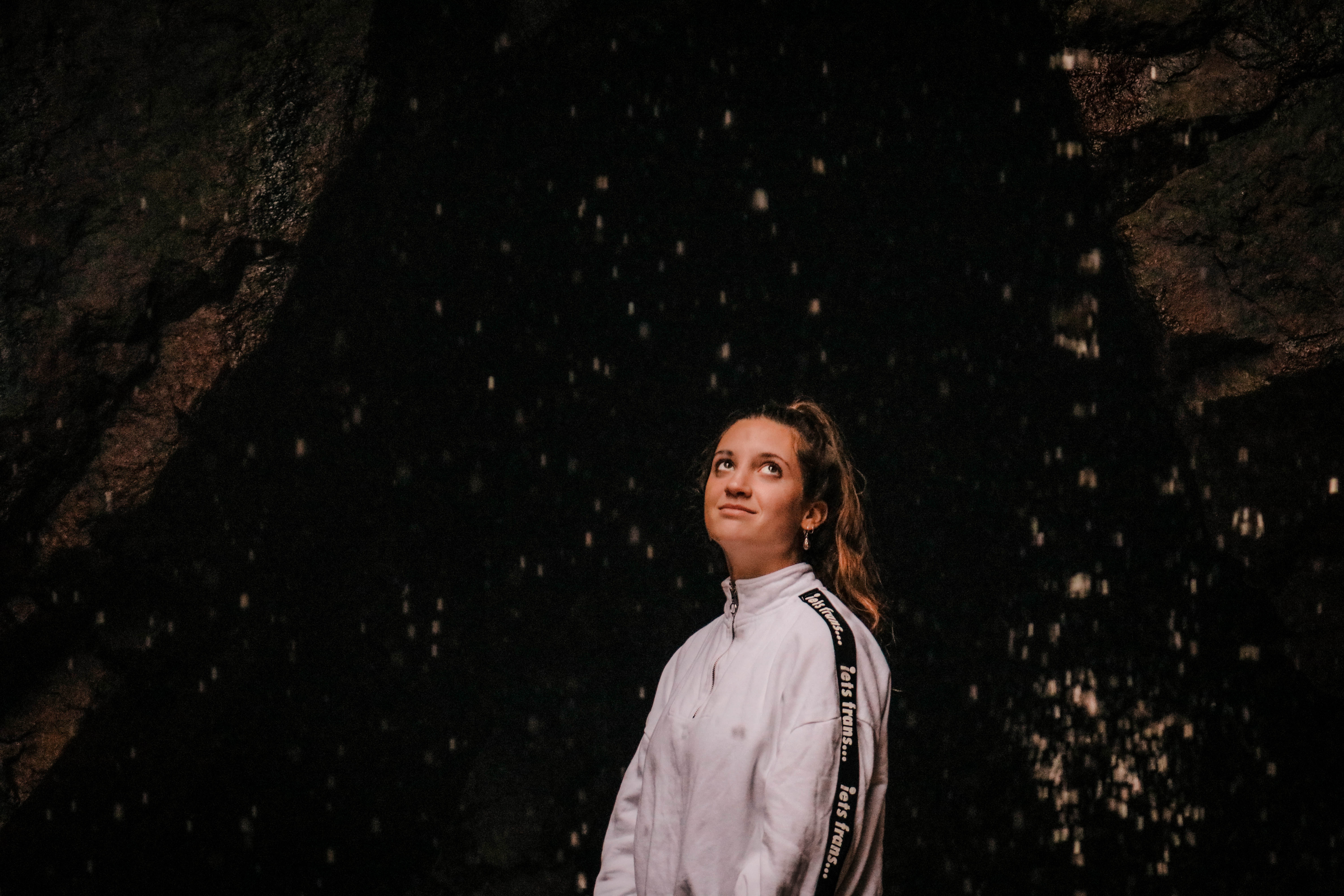
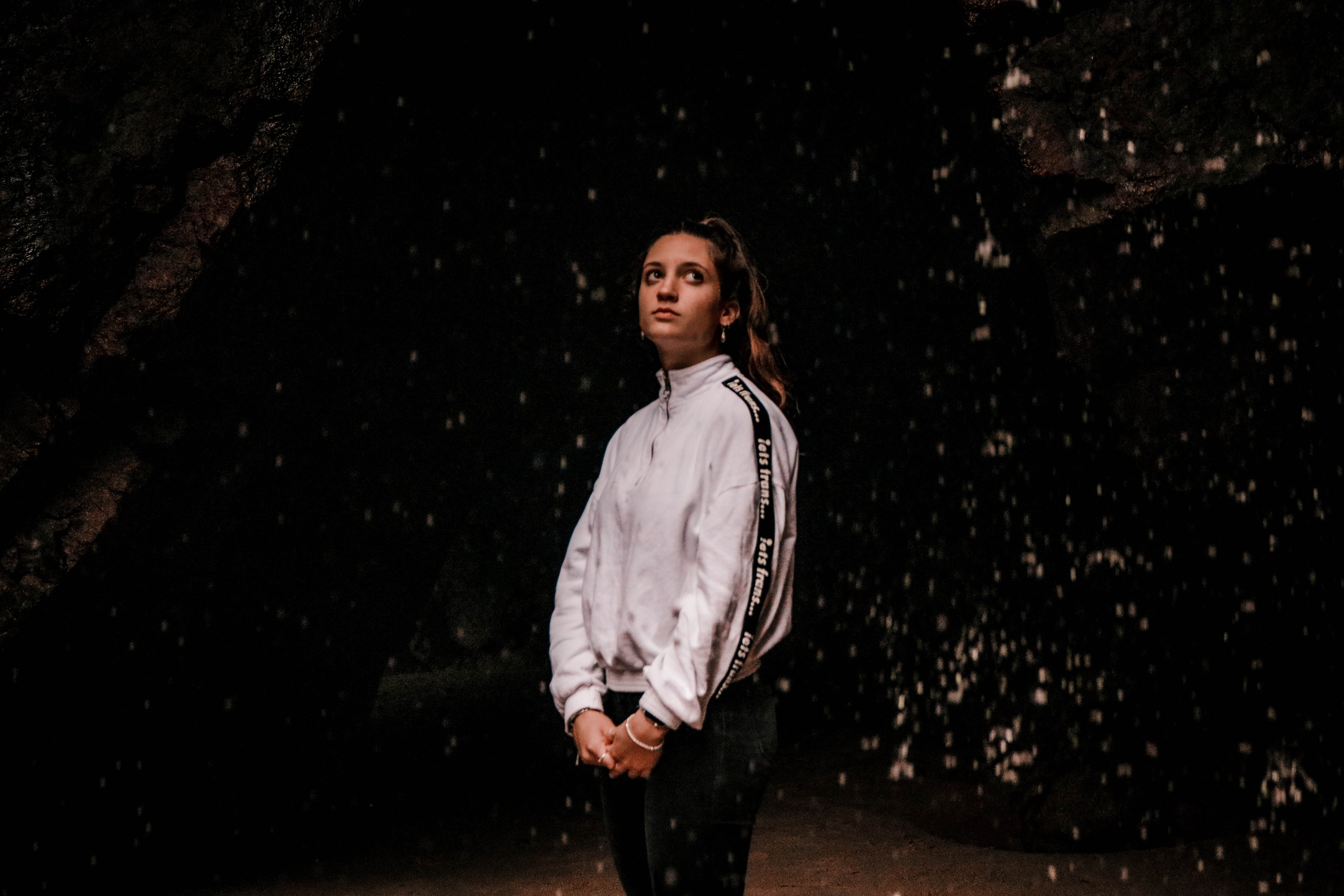
I believe this shoot was successful in responding to the artist I have researched however incorporating my own ideas too. Within these photos i have used my model to show a sense of appropriation of the sublime. Overall, i believe that the edits are effective in the way that they stand out especially with the natural light upon my models face. Also, the contrast and colors help to reach out to the viewer and bring the image to life with an emotional connection between the viewer and the environment. The way in which i have directed my model to be looking at the nature was intentionally created to influence the viewer to imitate these actions when also surrounded by a sublime environment.

Analysis

I think that this image has been my most successful in connecting my message with the audience and for aesthetics too. I believe that the dark background creates a strong contrast between the waterfall droplets, model and rock formations. These features are the main focal points in creating the story I intend and therefore the dark background is effective in showing this off. I have directed my model well in her position and the way that the natural light has illuminated her face to highlight her facial expressions and emotional connection with the environment. This was the most important factor when constructing this shoot and i believe that it has worked out well. I ensured that my model wore a white top so that the contrast was prominent and she stood out as the main subject. Another reason that this image was a success was due to the expression on the models face that comes across as natural and relaxed. I used a fast shutter speed to try and capture the water droplets however  there is still motion blur on the droplets which help in creating the falling water effect which was occurring from the waterfall.

Research – Joachim Schmid

Joachim Schmid was born in 1955 in Balingen; he lives and works in Berlin. His works have been presented in solo and group exhibitions worldwide, including at Lieu d’Art et Action contemporaine de Dunkerque (2015), the Museum Folkwang in Essen (2014). He has published over one hundred artist books. His works can be found in prestigious public collections, such as the Bibliothèque nationale de France in Paris, the Daelim Contemporary Art Museum in Seoul.

02ea55e3 7aa6 494d b009 94c2bce6ea22
No. 414, Paris, July 1996, from Bilder von der Straße © Joachim Schmid

Using other people’s (often mundane) photographs, he creates artwork that is alluring, intriguing, and captivating. He revels in photographs that other people lose or throw away in public, especially if they seem to have been discarded with some animosity or intense feeling. His project ‘Pictures from the Street’ 1982-2012, features countless images of authoress photographs and remnants of images that have been left thrown of discarded, that he has encountered by chance by walking through the streets of public spaces through out the world. The collection has more than 900 images, if he finds an image that has been ripped or towrn apart he will try his best to reassemble the image and then disply the imag on arhival paper.Displaying the images inchronological order noting the date and place where each image was  found.

7bd170d5 996a 4e50 9862 e9edab46ef00
Photogenetic Draft No. 8, 1991 © Joachim Schmid

A project that has become one of Schmid most notable works is that he created an ‘institute’ that offered to safely recycle or re-use dangerous film and photos. The Institute for the Reprocessing of Used Photographs became publicized worldwide, by chance, and Schmid was inundated with parcels of photos and negatives that people wanted to dispose of, safely. One of the parcels that was sent to the ‘institute’ was a parcel of over a decade of negative images from a professional photo studio, how ever the original company that sent the parcel had sliced the images in half to try and destroy their value, but what Schmidt discovered that he was able to put two half’s of separate images together to create weird and bizarre compositions.

9c1e8fb9 794c 41f4 831d 507a7d5052e7

Joachim Schmid created this image after he sent out a request to be sent images that people wanted to be disposed of in a safe and confidential manner, from a photograph company he received  a box  in which all of the images had been sliced in half to try and destroy the value of  the images. What Joachim did was found that he was able to combine two separate images to make an entirely different image. On first glance of this image, it looks like the young girl on the left hand side is an archival images of the grown woman of the left, so that the photograph has decades between them. The only detail that we can see of the woman face is the eyes which can be seen to have a wrinkles beginning to appear .The image looks as if it was taken in a very professional environment, such as a photograph studio, it looks as if artificial lighting was used to take both images.


EXPERIMENTATION

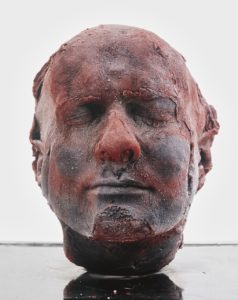
Marc Quinn ‘Self’ – 1991

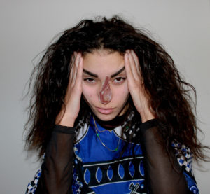
These pictures are experiments of my own existing material from previous projects. Each piece of material that I have taken from my photographic archive were taken with different incentives yet i have merged them together and created images with different meanings within their context. I’ve done this to further explore my idea of how western culture identifies with meat, in the hope of developing an alternative response that incorporates emotion and a story within my images. This inspiration has stemmed from the artist Marc Quinn and his ongoing series of self-portrait sculptures ‘Self’, sculptured entirely from his own blood, capturing his aging throughout the years. Quinn’s sculptures are innocently morbid, encapsulating the idea that we are all just made of meat.  He’s used mediums from his own body without harming himself. Throughout history, there has always been the repeated idea that the body is sacred and should be left untouched after death. When exposed, the internal body has always been associated with death, perhaps connected with the fragility of life and the fragility of the body, yet the exposure of our insides is often forbidden through the eyes of religion. Western Religion has always taught people to respect the body before and especially after death. This also aligns with our laws and standards; it is commonly known that any mutilation of the body is forbidden. Although we carry out respect for our own bodies, the consummation of meat is often overlooked. The whole process of producing meat violates and mutilates an animals body before and after death. Surely all life in every shape and form should be protected, yet we break this rule by reassuring ourselves that animals are less than us and therefore, it is okay to enforce ill treatment upon them just to satisfy an acquired taste that everyone picks up from an early age. These photos that I have created is a reflection of ourselves and our diets. I have placed another animals internal layers above the external layers of these portraits, just for the sake of spite; we can’t mutilate one another but can mutilate beings ‘lesser’ than us – I have surfaced how this reflects on us – almost like the infamous Lady Macbeth from Shakespeare’s ‘Macbeth’, relating to the scene when she hallucinates blood on her hands. The meat connotes death within a picture of a life.

Photography and the truth

For this small mini project I wanted to focus on the photos which I think had the strongest emotional impact on the viewer and the largest negative representation of mankind. This is a clear representative of an image you wish did not tell the truth. This is an image to which you do not want to show a reflection of man kind and belive in the cruelty that lies behind what the image contains. In the modern day many people ignore what is not around them or what they can be on screen. So capturing a harsh truth of humanity in order to represent  what their ignorance and carelessness has done and effected others around the world. Children are viewed by the large majority to be innocent. They are not responsible for their own decisions and yet have to face the consequence pf what adults tell them to say and do. The life of a child is held high than that of an adult. Because of this these images speak louder than anything anyone could ever say. It highlights such a horrendous political situation that people ignore, but faced with the reality they see such innocent people affected it should change their mind. these images are not sublime. There is no beauty in this image other than masses of pain and outrage. This image should not be seen as just shocking but should be seen as though provoking for change within the world.

The way to which the photographer with the body in such a lifeless condition is the most painful part of this image. There is a complete lifelessness and it removes all sense of hope. Children should be seen as playing and happy, the lack of eye contact and a boy lying face down. tHe headline for this article was a syrian boy who has drowned brings migrant focus into attention.

ISTANBUL — The smugglers had promised Abdullah Kurdi a motorboat for the trip from Turkey to Greece, a step on the way to a new life in Canada. Instead, they showed up with a 15-foot rubber raft that flipped in high waves, dumping Mr. Kurdi, his wife and their two small sons into the sea.Mr. Kurdi tried to keep the boys, Aylan and Ghalib, afloat, but one died as he pushed the other to his wife, Rehan, pleading, “Just keep his head above the water!”Only Mr. Kurdi, 40, survived.“Now I don’t want anything,” he said a day later, on Thursday, from Mugla, Turkey, after filling out forms at a morgue to claim the bodies of his family. “Even if you give me all the countries in the world, I don’t want them. What was precious is gone.”It is an image of his youngest son, a lifeless child in a red shirt and dark shorts face down on a Turkish beach, that appears to have galvanized public attention to a crisis that has been building for years. Once again, it is not the sheer size of the catastrophe — millions upon millions forced by war and desperation to leave their homes — but a single tragedy that has clarified the moment. It was 3-year-old Aylan, his round cheek pressed to the sand as if he were sleeping, except for the waves lapping his face. This went rocketing across the media and sparked, as a political bombshell across the Middle East and Europe, and even countries as far away as Canada, which has up to now not been a prominent player in the Syria crisis. Canadian officials were under intense pressure to explain why the Kurdi family was unable to get permission to immigrate legally, despite having relatives there who were willing to support and employ them. So far, the government has only cited incomplete documents, an explanation that has done little to quiet the outrage at home and abroad.

Consequently it is evident that a photographs can change the world and peoples perceptions around the concerning subject matter. For instances. Peoples classified the immigrant crises mostly for these people to be ideologised as villains and or also seen as people running from the law. Because of this i believe it become quite easy for people in the western world to ignore these people in their time of need and create a dismissal of their needs. However I think the story and image powerfully show how it is just families trying to escape war in order for a better life, And to ask the question why would you out your families life at risk with the intentions to just harm others. I believe this opened up so many conversations of what people should be doing to help and not prevent and trap these desperate people out of their borders when all they are looking for is survival and freedom. I believe the bare brutality of the image does not hide any aspect and this image cold not be made in a composition.

This image is telling the truth, it is not staged are told or produced in order to create a perception of false reality. This is a documentary journalist who was studying the immigrant crises and happened to be at this place.Although even to say that an image ,this could be fake, should this not still be taken seriously as these events are still catastrophically tragic and occurring. Just because something is real or fake does not mean that the message behind it should be any less insignificant. photographs are used to create awareness  whether this being good or bad and i think this particular problem of immigrants was one washed over by main media and portrayed many of the victims as villains. Because of this the conceptual impact on the audiences and viewers was of great significance and allowed those who minds were swayed by the hegemonic view to see a painful truth of  families just trying to escape for a better life.

There are so many aspects to this image which make it wholly disturbing. First of all the boy of the child is almost translucent, his bones clearly ripple throughout him and their is no substance of life and embodiment to his should. His small figure in such a composition that has connotations of defeat, His lack of eye contact and oblivion to his lack of life is reflected through his face down on the door, not having enough energy to even lift his head. Birds of prey live and eat off the weak and the dying, because of this it is evident that the starving child is so close to death. The bird is equally centered in the composition as it immortalised the figure of death behind the boy himself.

From these observations I have learnt that, somethings people expect or anticipate the truth to not be true, or perhaps in circumstances they wish it want. So many people spend their times purposely ignorant to others than themselves as then nothing is seemed to be their problem. However these actions of doing nothing still consequences in the deaths ad suffering of many.through photography telling the truth such as these then there would never be any cause for change within the world.I believe in society everyone carries an instinct within themselves to help others, perhaps this is seen through a maternal or paternal outlook on wanting to care for children. I believe that once again the effect of this image being a child will in turn create a much larger impact altogether rather than just that of a person. You cannot blame the child as it is an adults duty to care and to be responsible for the outlook and loving of a child, to raise and let them live in a life which they are happy and health. This sheer amount of malnourishment is consequently a factor that even in the worst states of poverty within the us or England would never happen. It shows how for a child to be in this help. this poor of a condition and people wanting to help, how little everyone around the child has, and no ones ability to help. This narrative documentary tells so much of as story and would hopefully speak some truth to people, It has not been a deception of an act as this is evident within the posture and lack of life within the young boy. It deems how we need to urge those with money to help, not just those close to them, but the ones who need it most. Because of this the large exploitation of the image itself, it allows so many to see a sit that only a few have seen in person. The though of poverty has finally been out into . appreciable consequence of their inhumanity. The change has sparked many and hundreds of campaigns, for starvation around places such as Africa, yet this will never reach everyone who needs it.Within the article itself speaks about the photographer and his intentions and what he saw. After spending many days in a village in south Africa he headed out to the bush. He heard ‘whimpering’ and come across an ’emaciated’ toddler. This little boy had collapsed whilst attempting to make a trip to the feeding center. the photographer was not allowed to touch the victims due to to disease. After 20 min of gaining back energy the little boy continued to the feeding center.

The irony within the image conceptually is how well fed the vulture is, this harsh juxtaposition posses the thought hat the vulture has been eating off the well nourished who has sadly died. It shows the harsh reality and inability for people being deprived of what they need for survival. The New York times ran this photo, there was much debate on what happened to the child and the irony of peoples concern when they themselves have done nothing to help this boy. However while telling this truth, many questioned the photographer for taking the picture and not helping to the aid of the child instead. This lead to many debates on a photographers duty to intervene. However sadly it comes out 14 years later around when the child was 16 he died of malialsial fever. Although winning awards and spreading awareness of crucial and dark situations such as this, he has never been able to forget that day and says ‘ i am haunted by the vivid memories of killing and corpses anger and pain’ Technically the image has a strong composition both focusing on the irony and well being of the bird towering over the fragility of the boy, this conceptual shows the weakness of mankind and how we have been reduced to animals when having nothing to eat and no longer thriving as a community. I believe there is such a core importance of showing images such as these otherwise nothing and no change would ever come of anything. Not because people don’t want to help, but they might be ignorant to the thought of something as terrible as this happening within the world.

There is such a strong sense of propaganda within these images. these images being used by the media as a weapon against governmental regimes. When an image is in a newspaper there is a certain reliability that is dependent on the paper for being truthful. this weapon too needs to have such a pivitol point to encourage patriotism and promote national interests. If this image wasn’t so upsetting, people would forget about it and move on with a new paper the next day.

Sublime Shoot 1

Photo shoot Plan

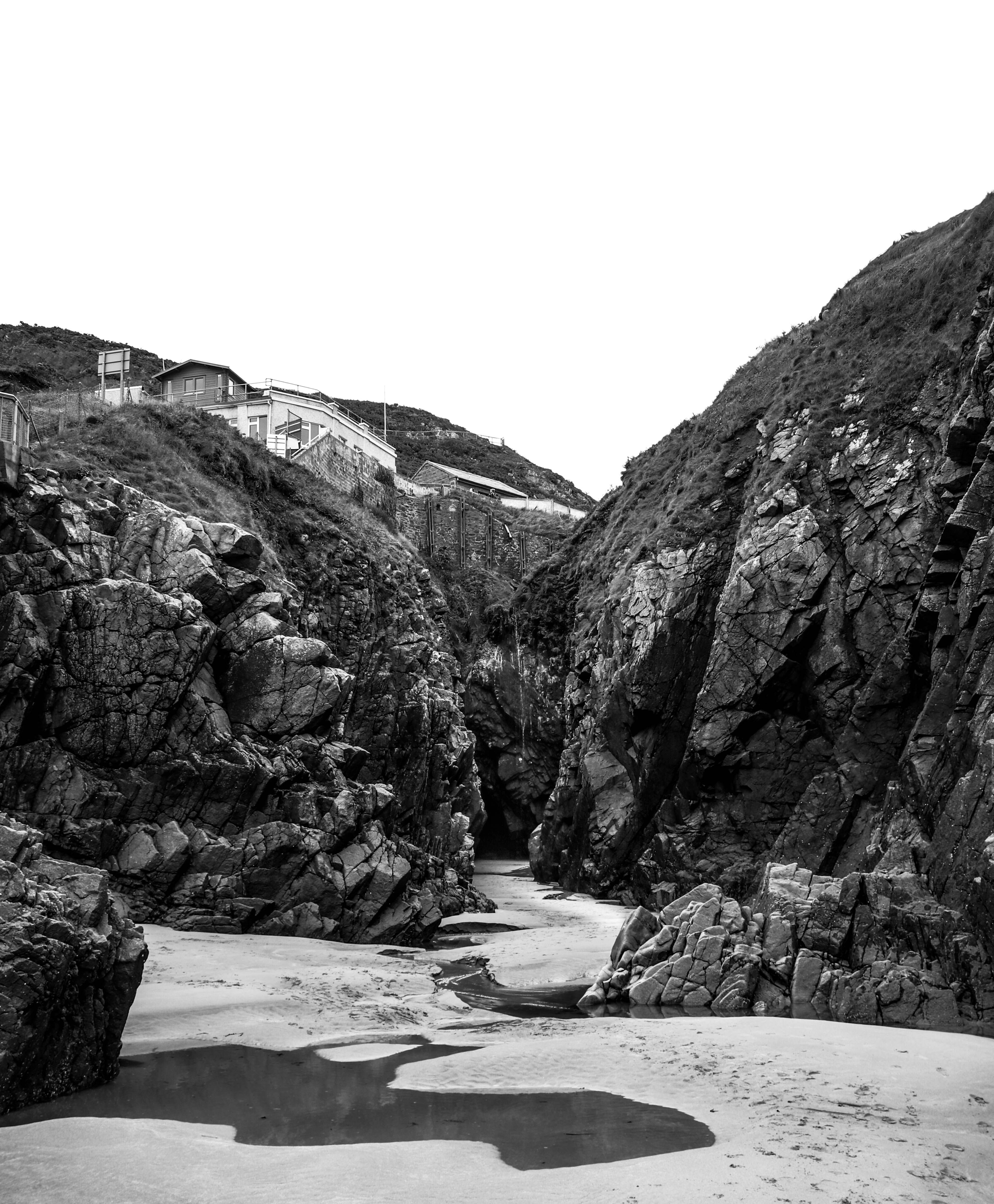
My second shoot is a direct juxtaposition to  Guillaume Bression and Carlos Ayesta and is inspired by the landscape photographer Fernando Maselli. Through his art projects he explores different aspects of formalism, deepening on the concept and aesthetics as essential values. In his latest work there is a  specific interest in the relationship between man and unspoiled nature and the role it plays in the conception of ideas such as religiosity or knowledge. The main focus of his work revolves around  the concept of the Sublime, the restrained fear facing the beauty of steep landscapes and the majesty linked to divinity which directly contrasts with my previous artists that looked at the ruined landscape by humanity. Below is an example of his work which has influenced my shoot.

Image result for Fernando Maselli

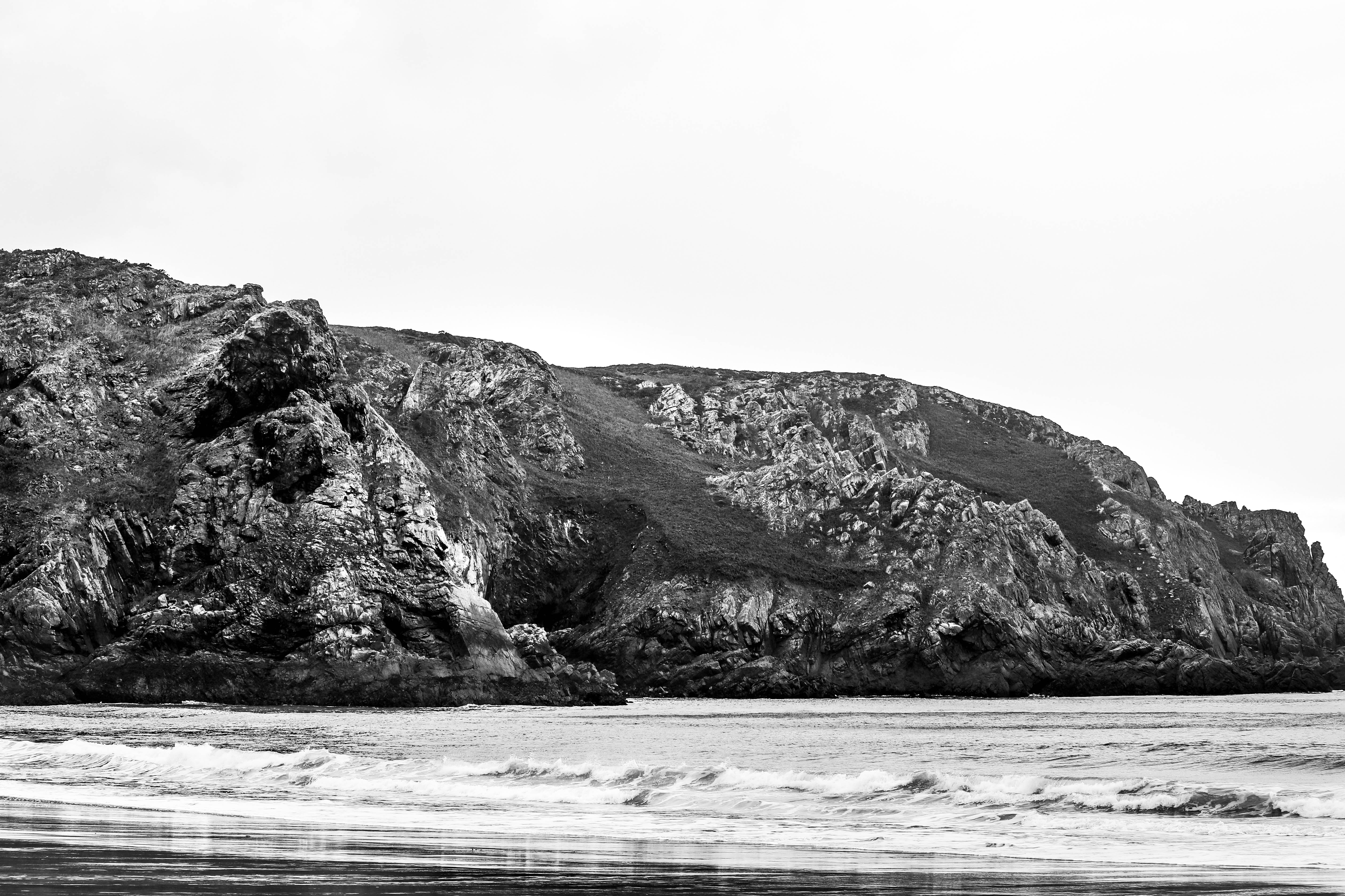
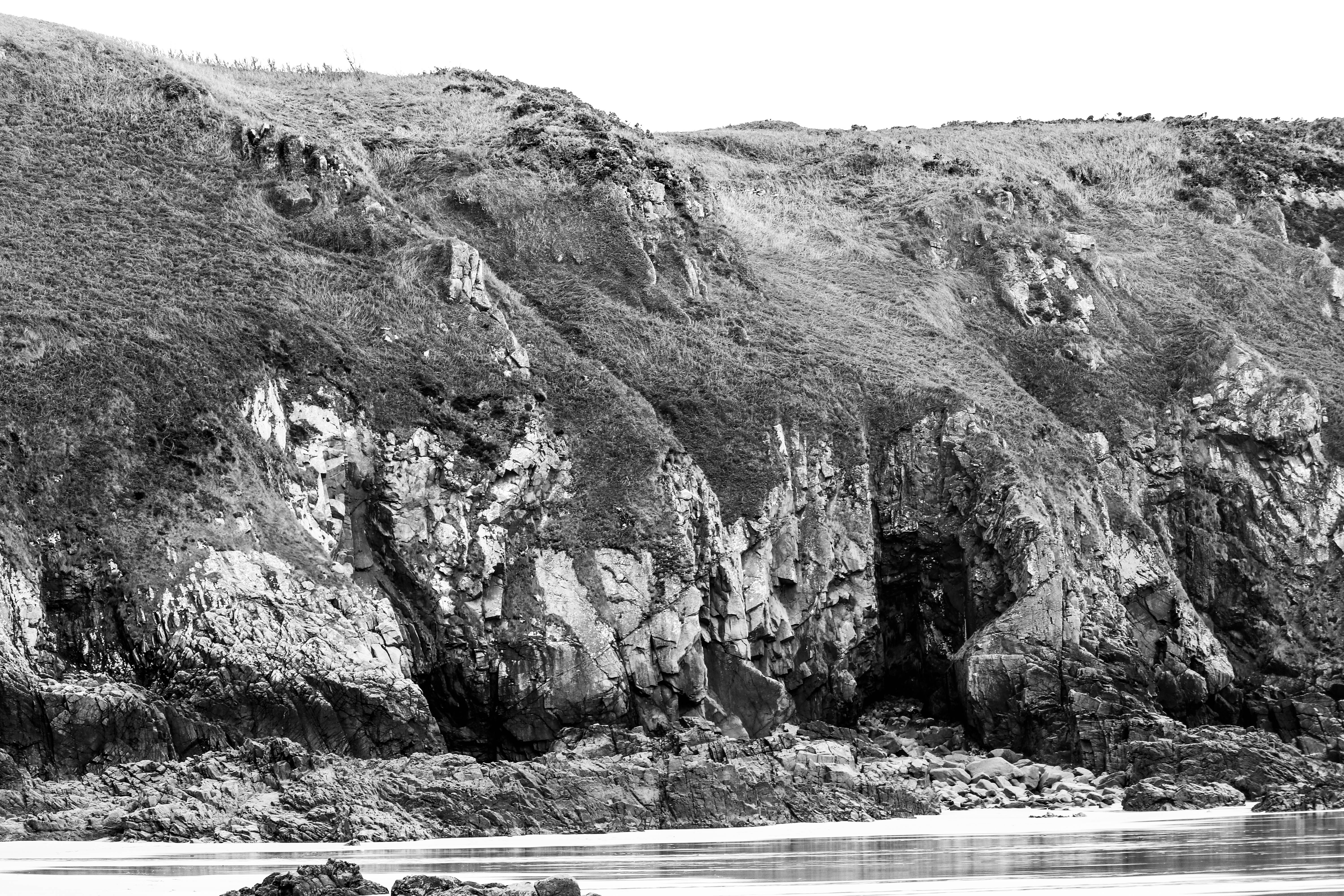
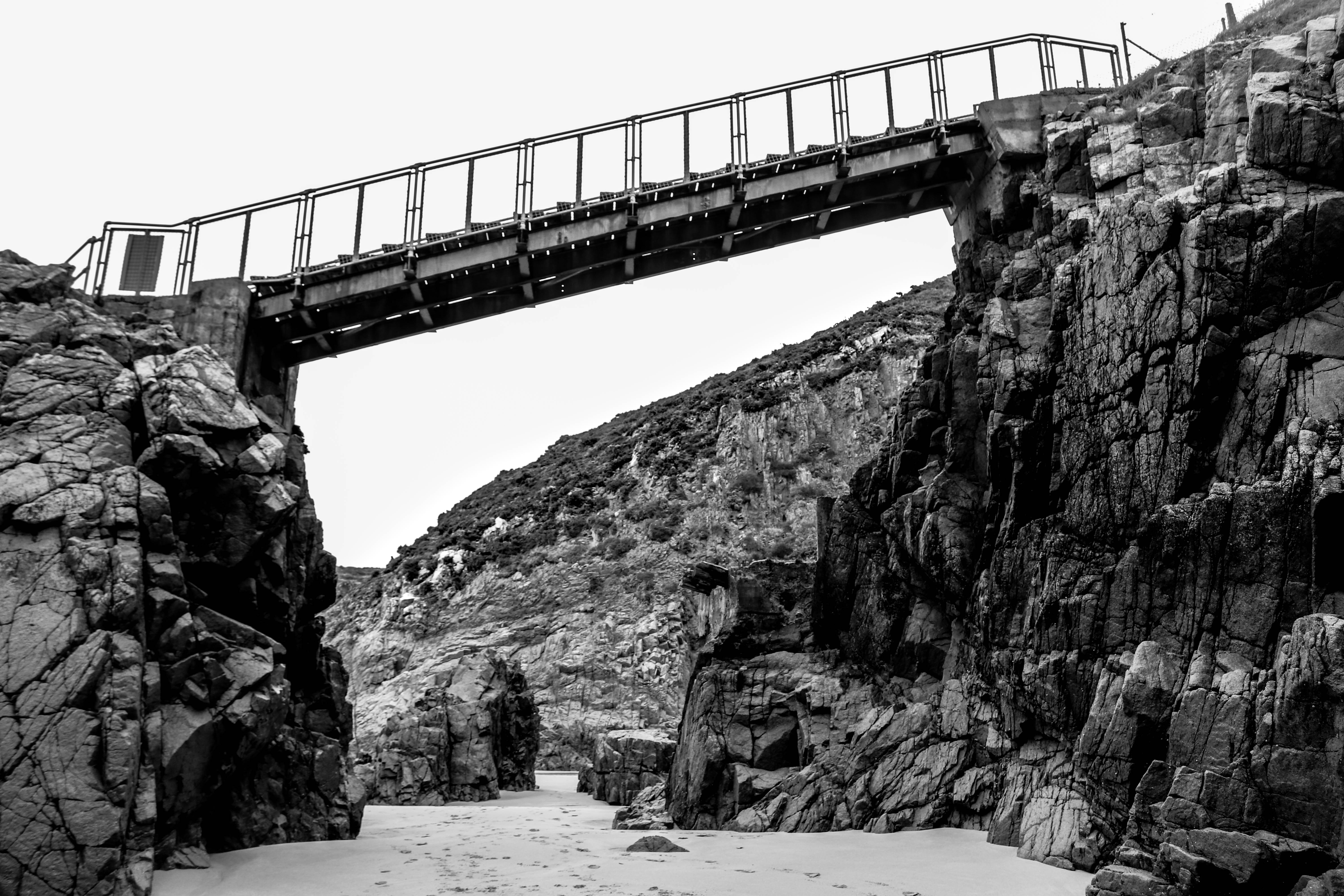
I plan to go to Plemont Bay and Gronez area by the coast to capture images inspired by Maselli. The coastal areas will provide an aesthetic area which will ensure i can capture the beauty of our earth. By using simple editing techniques such as colour adjustments and lighting i can easily exaggerate the sublime environment and portray our earth as beautiful.

My Edited Images

Further Experimenting

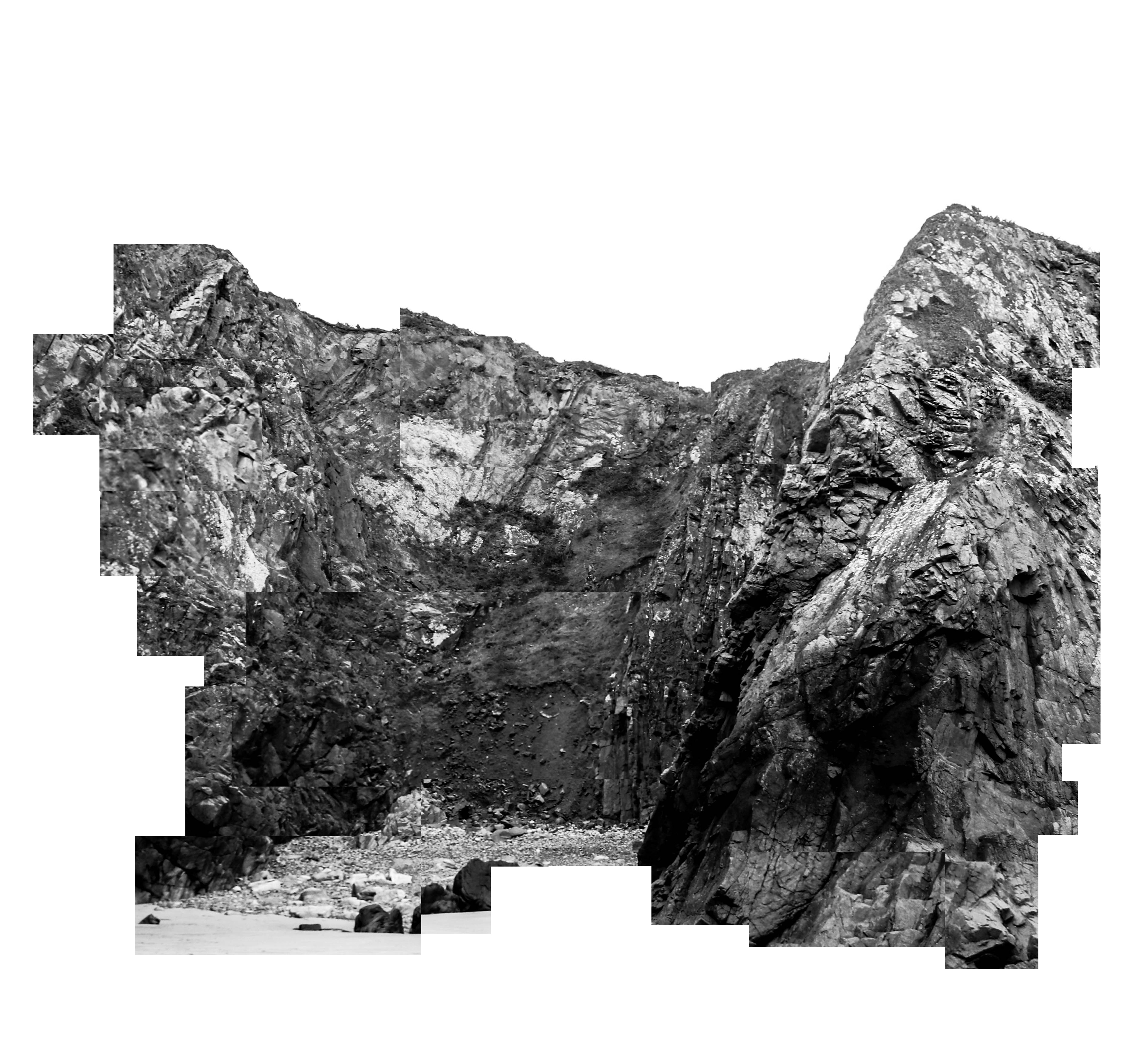
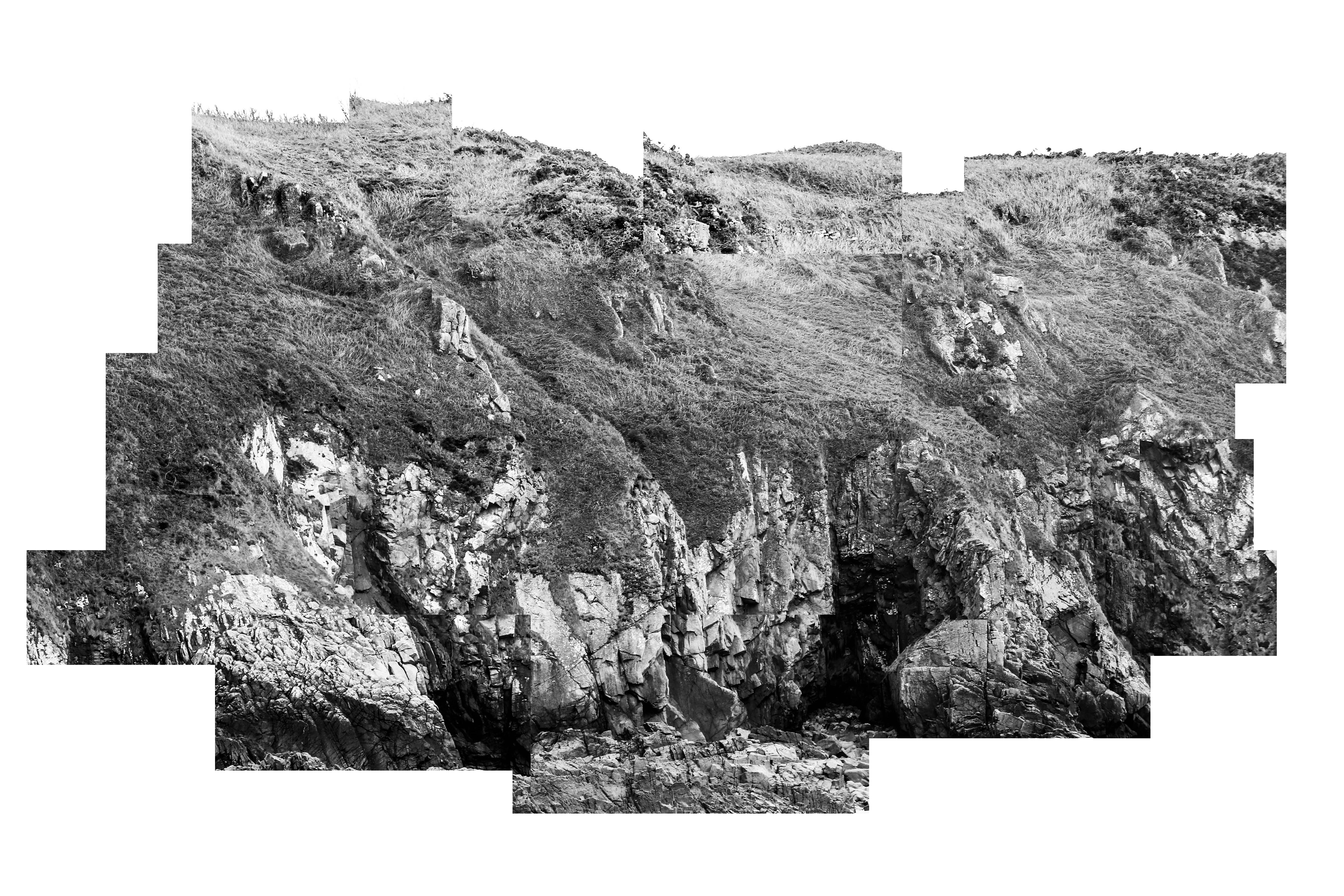
These altered images in the style of Maselli leads directly onto my ideas for a future shoot. I intend to try and document the altered landscape which  is a political issue in the sense that we are harming our environment. Although this photoshoot was primarily aimed to focus on the sublime environment i believe that these further experiments in the style of Maselli have connotations of the destruction of the landscape in the way the image has been destroyed and altered in photoshop. Following on from this shoot i intend to gather a range of portrait images to show how people interact with the environment and to portray that people can appreciate the sublime without ruining it. This will too be contrasted with images in a derilict area to portray how we too are destroying our land and this will show my two points of view on society. 1 view being that we have a sublime environment that we should appreciate and look after and another view that looks at the frustration i have with society destroying our land and wasting it.

Analysis

I believe this image shows a clear understanding of Masellis work and depicts the untouched sublime environment that is present. It has clear intentions to show off the natural beauty through the range of tones and textures that is inviting for the viewer to look at. The location is similar to Masellis work and not only does it follow his style but also shows my own view on the environment in the way that I am trying to show off the beauty to the community to perhaps make them think about how they are treating it. The black and white edit was mainly used to bring a different perspective to the location. Often, especially living in a place surrounded by amazing scenery, people will ignore what the island has to offer but by putting the image in this format it gives the viewer a different take on the nature and may inspire them to appreciate it a bit more. From personal experience I am aware that people do not respect and appreciate the environment to what it deserves and through this project i aim to bring an awareness of the beauty of our world and allow people to change their mindset through viewing my images. Overall i believe this image has the ability to hinder someones views on the nature that surrounds them and therefore allow them to respect it and positively impact the earth as a whole.

Photography & Truth

Can a Photo lie? Photos are used for many purposes from conceptual art to documentary are often viewed d as truthful without the viewing questioning what they are seeing. In a society which is becoming more an more reliant of visual images it is hard to tell what is real and adapted. We see a good example of this on Instagram where many influencers are known to adapt their photos to make them ‘perfect’ or visually satisfying. Although we may think this is innocent it does bring up questions about how more important images can be manipulated.

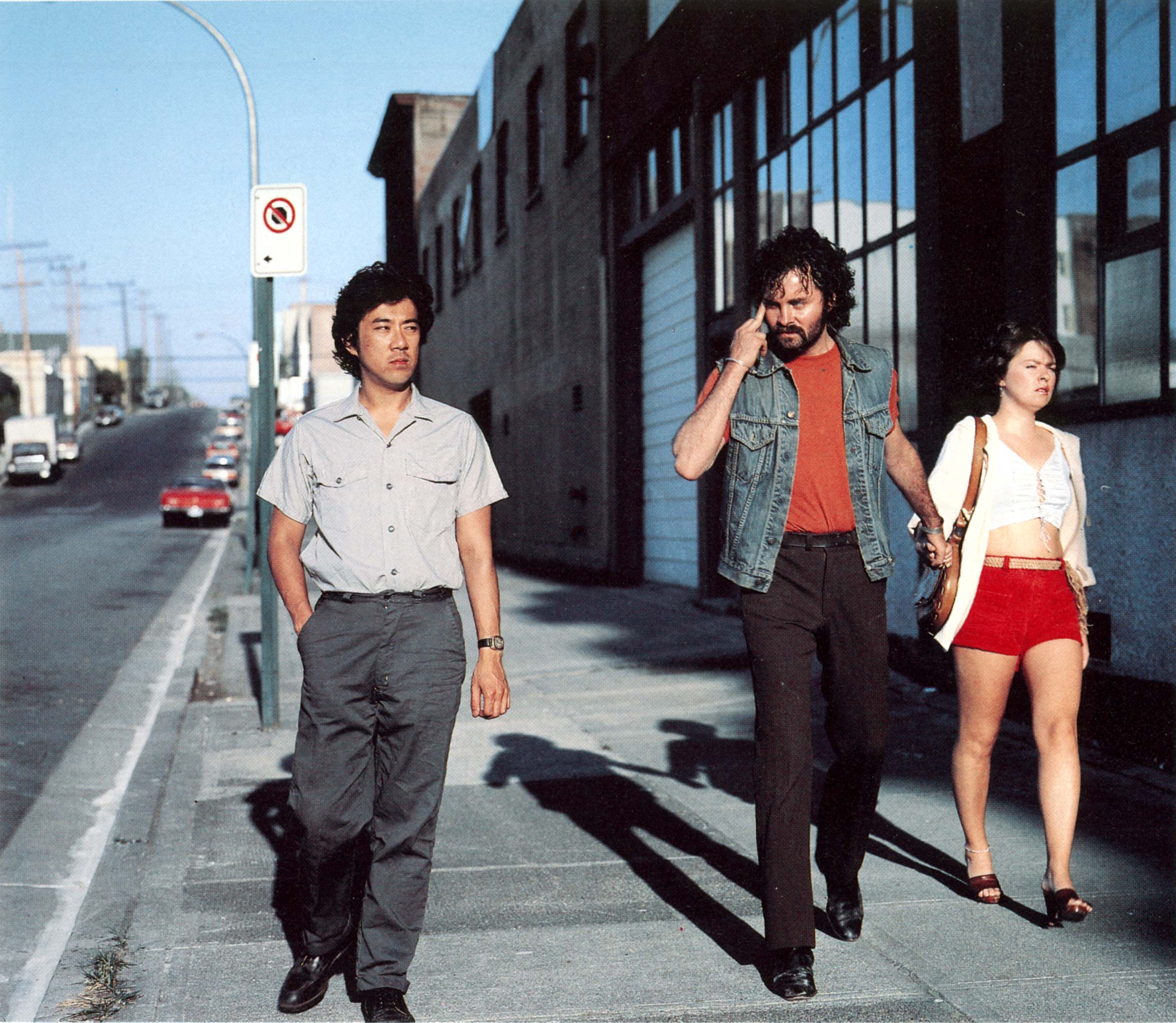
My choice: I chose this image by Jeff Wall named mimic taken in 1982 due to initial impact with striking colours and intriguing narrative. At a first look I was unsure if the image was documentary or tableau. As we look closer into the image we start to understand what is happening, the caucasian man in the denim jacket and red top is making a racial slur towards the asian man walking next to him on the pavement. The scene looks as though it was around the 80’s in America where at the time racism was still a big issue. I think this image perfectly displays a familiar scene from the era and highlights problems in the society at the time.

After researching this image I have discovered that it is tableau, taken in 1882 and based on everyday situations that he has witnessed first hand. It focuses on the ‘micro- gestures’ made by people which create tension in society. he calls the ‘cinematographic photographs’ in which he constructs photos styled like street photographs which actors to re create a moment of racial abuse which he witnessed. By making these photos he can show stories which would have been tampered with by the presence of a camera, and also makes them aesthetically pleasing to catch tension and draw people in to the true meaning.

Experimentation in Photoshop – Surveillance and Stalking

Overview/Plan

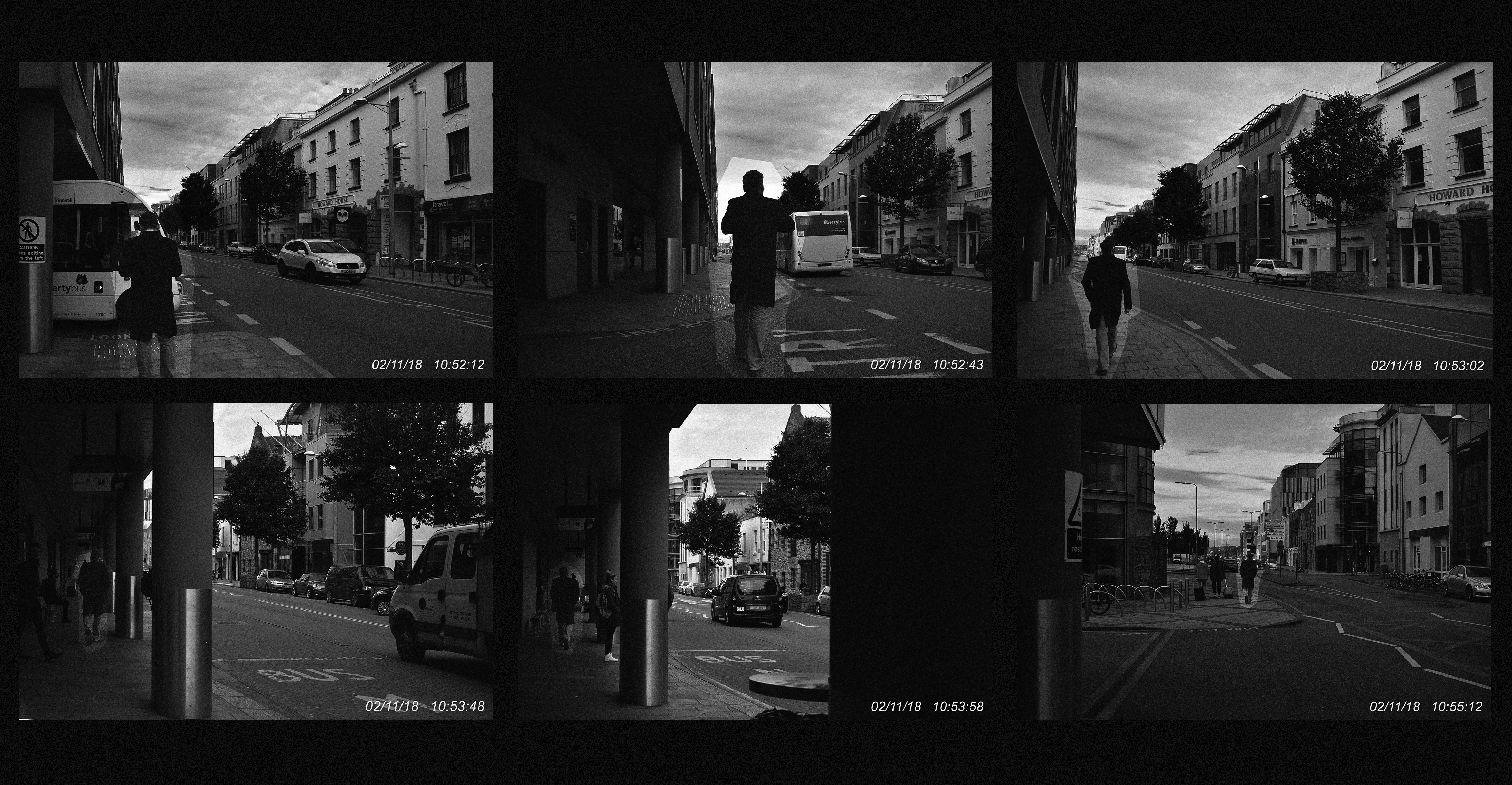
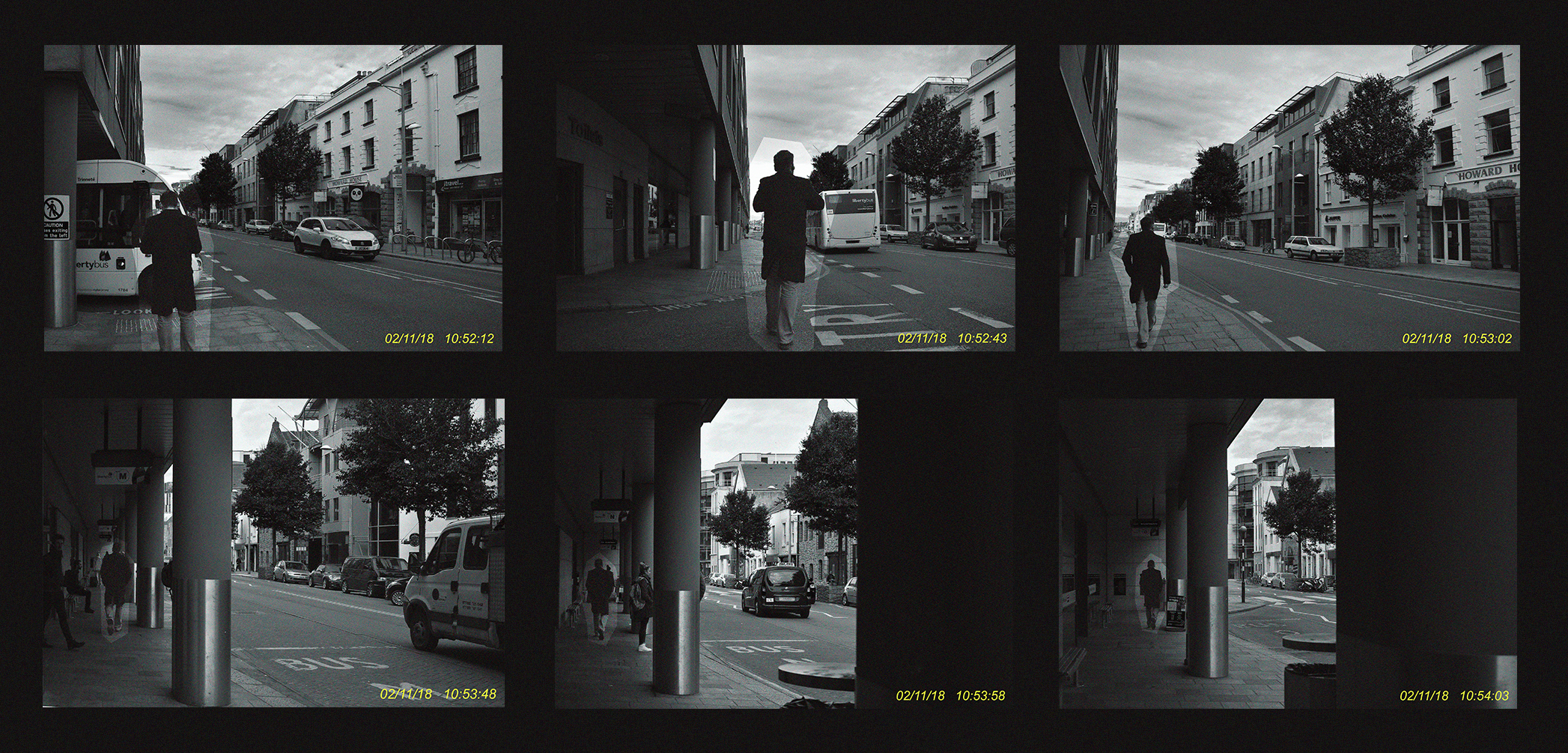
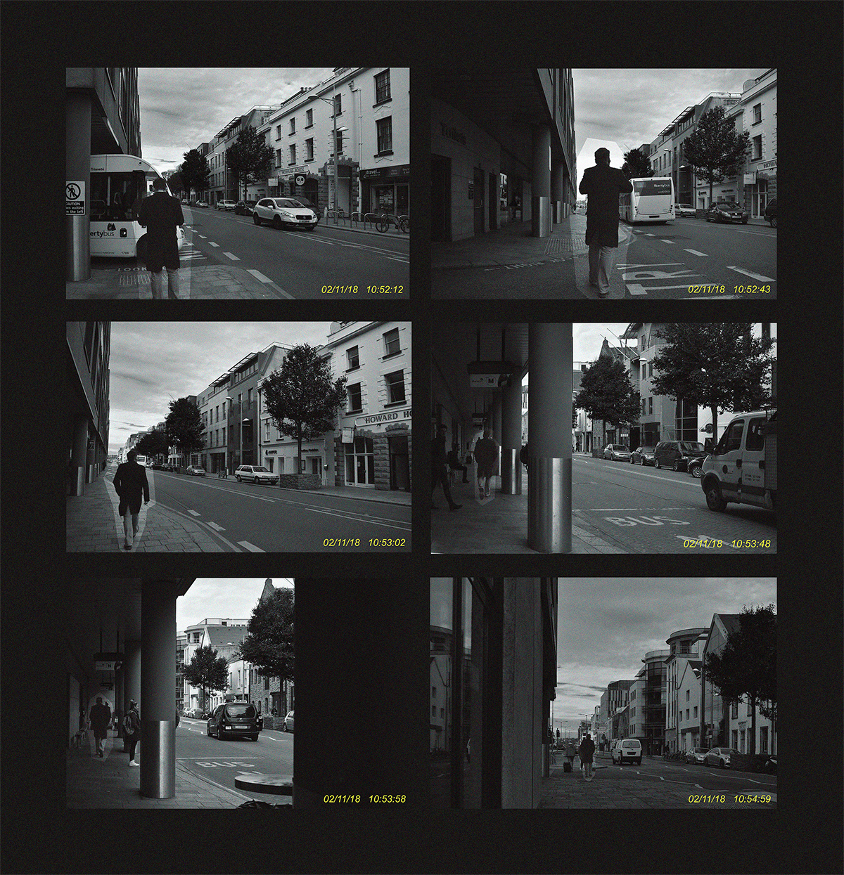
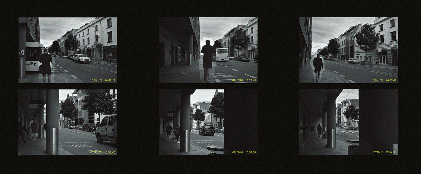
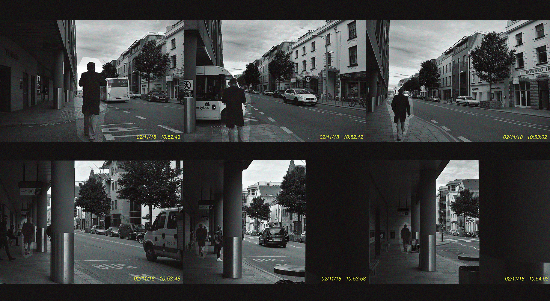
For this experimentation I will use the photographs I’ve taken in the style of Sophie Calle; photographs that depict the journey’s of unknown strangers. I aim to edit these photographs in a way that merges the concept of stalking and invading that Sophie Calle explores in much detail, with this idea of surveillance that I have also began to explore in the earlier stages of this project. I want to find a way to age the photographs/lower their quality to mimic surveillance cameras and the footage that they produce. I also want to add dates and times to add character and realism to my ‘surveillance footage’. After the photographs are edited in a way that I like, I want to test different methods of presenting the images; try out grid formats – similar to ones used in typology (Bernd Becherand Hilla Becher) or perhaps try presenting the images in a row like a sequence or comic strip that will showcase the progression of events.

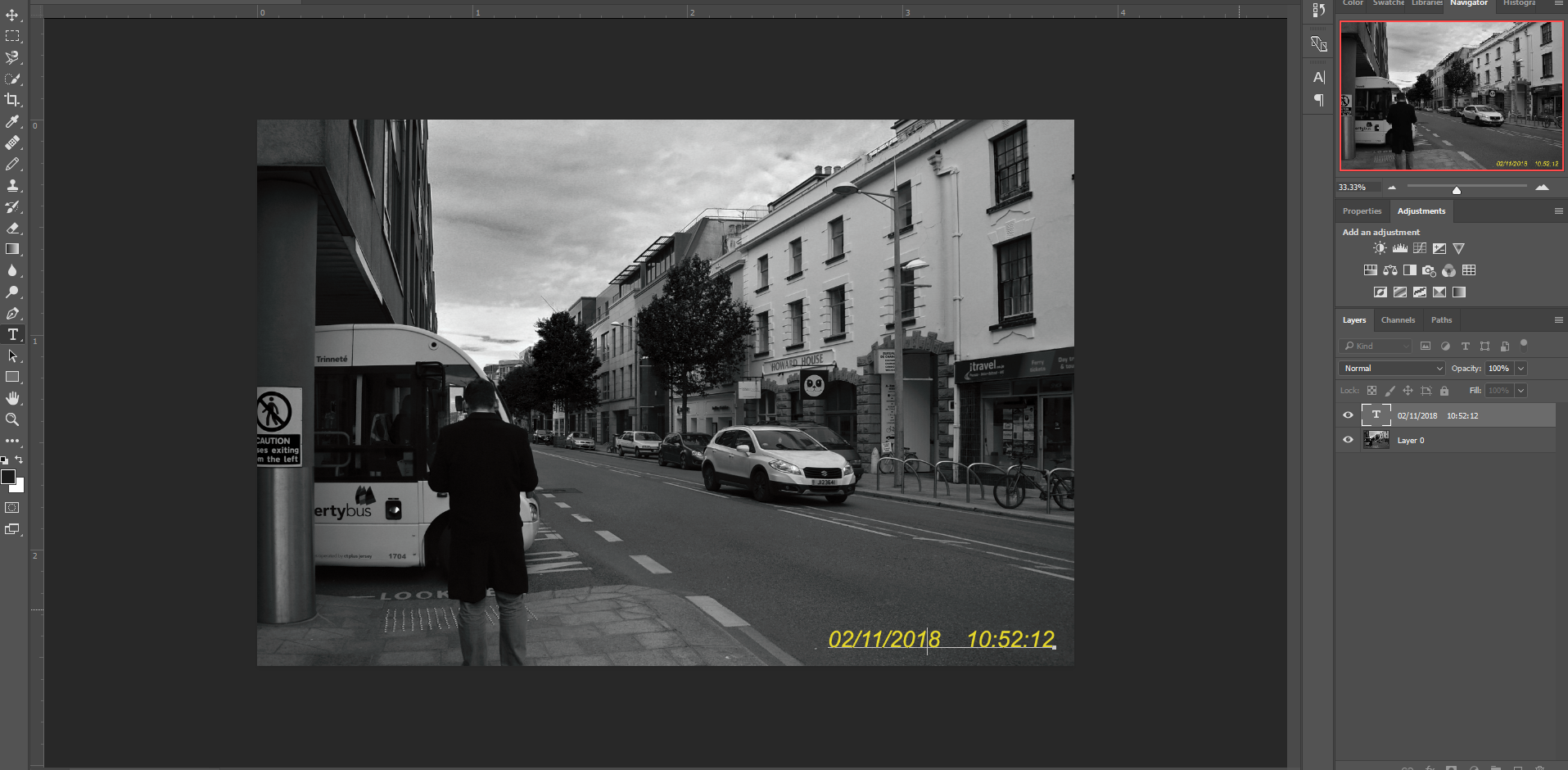
I started by inserting the image; unlocking the layer on the side so that I can make permanent changes to the image. I then went onto the details of my image by selecting ‘file’ and then ‘file info’ – this displayed the exact date and time the image was taken and I copied this value. After that, I selected the text tool and pressed paste; from here I experimented with the positioning of the text, the size, the colour and the font until I reached an equilibrium. I was aiming for something simple but also easy to replicate.

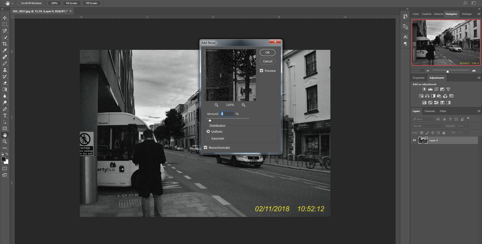
In order to process to the next step I needed to make the different layers one; I did this by converting the text layer into a smart object and merging it down onto the picture layer. Then, I went into ‘Filter’, ‘Noise’ and ‘Add Noise’ to reach this interface. I moved the slider around until I was satisfied and applied the said filter to my overall image.

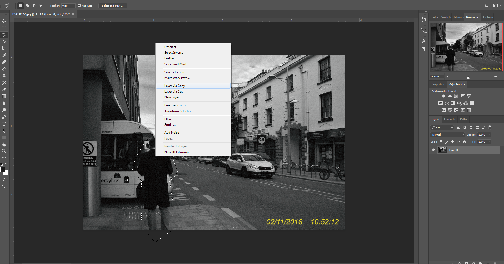
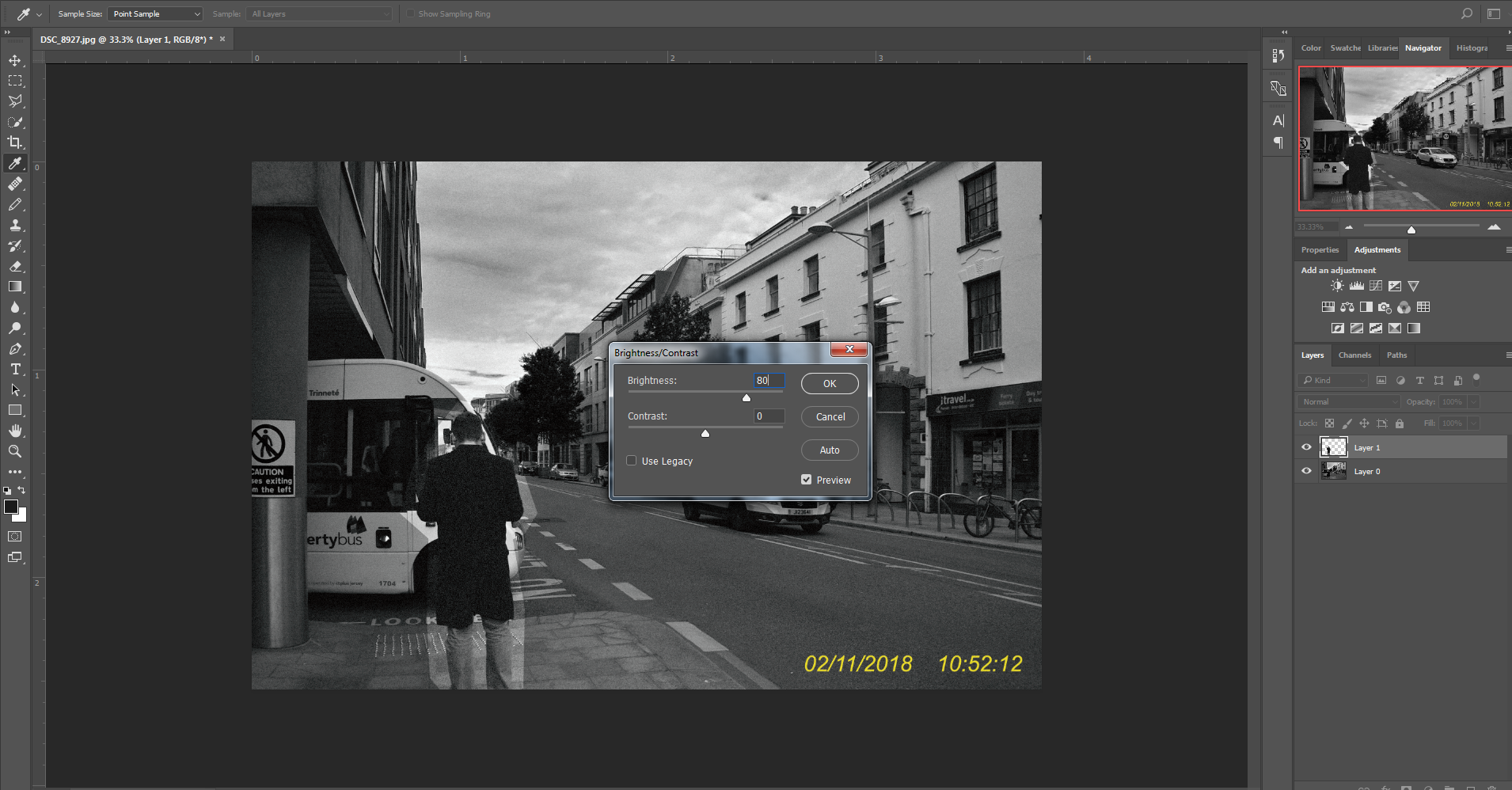
Using the Polygonal Lasso Tool, I traced around the man, I then right clicked and copied the image onto a new layer using ‘Layer Via Copy’. This transferred the area I highlighted onto a separate layer where I could make adjustments. I went into ‘adjustments’ and then ‘Brightness And Contrast’ and edited the brightness, creating a stark contrast and in a sense, highlighting the man from his surrounding.

Presentation

A wider layout; One the first image I added a black and white filter over the image to eradicate the blue/green hue that the photos contained. On the second I did the same steps but didn’t add a black and white filter and therefore keeping the hues.

This photograph is longer vertically, I didn’t apply a black and white filter, this results in the photographs having a hue and the yellow text is much more prominent and visible in the image.

In this example, I opted for a much bigger space between the images; I also didn’t use the black and white filter and even made the background colour more brown to compliment and contrast the hues in the images.

This experiment was the opposite of the one before; instead of leaving huge space between the images I left none.

Exploring The Sublime: Tim Walker

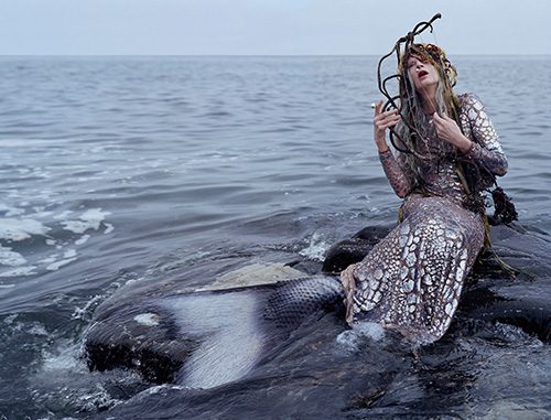
I was told to study Tim Waker as I decided I wanted my images to be incredibly interesting and always have an important view to each and every photo developed. Because of this I was told to study Tim Walker and the way his images are full of such strong imagination and could possibly say the sublime. Walkers photographs have entranced the reader of many vogue magazines rapidly month after month, for over a decade now. His images are viewed as extravagant and a typically seen being staged and through romantic motif and character how are deemed to be unrecognisable by style and hugely inflectional to fashion and the way in which photography is developed.  His concentration on photographic stills for 15 years enabled himself not to be moving on to making short films and movies. To be this is of great importance because it poses the ideas of how photography can also be viewed though a sense of cinematography, and the ways in which I could make a short movies showing the sense of the sublime through my own images. walker was born in England in 1970, and his interest in photography  began in the London library where he was able to work on the Cecil Beaton archive for a year before university. After a three-year BA Honors degree in Photography at Exeter College of Art, Walker was awarded third prize as The Independent Young Photographer Of The Year. This was a monumental moment fro him as it allowed himself t be power done by his own ambitions and form a relationship of what he is doing is successful.

Walker worked as his own freelance photographic assistant in London before moving to new York. When he arrived in New York he became the assistant to Richard Avedone. Walker use to have a strong concentration on his woe being more primarily filled of portraiture and documentary work for the British Newspaper. Although not long after he had his first shoot with vogue and with many editors and soon he was taking in conversational cues and stray bits of wisdom with a mind that whirs incessantly, much like the camera he carries wherever he goes.And that may be why, as he stood gazing seaward during a shoot last year on the northern coast of England, he was all ears when Kristen McMenamy, his model and muse, confided that she had long been enchanted by mermaids. She told Mr. Walker, as he recalled, “This is the one character I’ve never been able to play,”I believe his work is whole unique and extravagantly innovative. He has an ability to capture so many styles and narratives within a piece especially evident within his recent works, which can currently available in somerset house. Yet he has soon moved onto a new styles encapturing more fantasy aspects of fashion using his works to tell a story.Oddly, his tendency to obscure clothes in favour of elaborately staged, dreamy narratives has only endeared him to the art and fashion set. His works are in the permanent collections of the Victoria & Albert Museum and the National Portrait Gallery in London.

This piece is wholly magical and a substitution to that of the pain of what is expected to be only beautiful. The mermaid itself is a purely fantasised and fictional character, yet walker has bought her into this world  filled with that of reality and the inspiration from fantasy and na altered reality. He combines an interesting new attitude that . constitutes what sublime is and can be formed into something less expected. I think it is quite innovate that he uses a address with scales in order to evoke the mermaid and fish texture, as this allows his fashion forward ways to be used and effectively present within the composition. The mermaid is not overall sexualised and I belive this is important as otherwise This would not be possibly viewed as sublime but would be seen as too perfect and not allowing a sense of pain to come through the image. The way in which he body is held is also an interesting way to view this image as you can almost see a sense of pain within the image itself, the way the hands are surrounding the face connotes attitudes and relations to fear and escapism. Interestingly many of the colours are ether faded or pushed back, this has implementations  of a focus point in the image itself, however contrary to many sublime images it does not have the sensory of colour, however these grey undertones could possibly aspire a more solemn and possibly painful mood to the image but still conveys themes of sublime but presented in a more abstract an divided manner. I believe this image is perhaps too staged and slightly tablo for what i want to incorporate into my work at the moment, however I think the overall themes could be interesting to work with. 

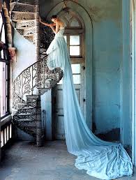
To my mind this piece does capture a more fashion stylistic outlook on what purposes that of the sublime. I belive the contradiction fo the ballgown to that of the industrial and rustic looking stairwell posses that of the pain and reality of a set and yet still hold a composition to display such a beautiful dress. This composition and overall isolated surrounding is perhaps more sublime. There is such a strong contradiction of beauty and also pain and suspended alteration within the image thatI believe would work well and successful come into and under my themes of my work. The stance of the image could be seen as very high fashion in the way of the leaning over the railing and the long exaggeration of how tall she is. The concentration of light also illuminates specific angles to the image and brings shadows to those sections that are more dingy. This shoot has somewhat inspired me to do a photoshoot in an abandoned area, and perhaps also add in an aspect of beauty within the area itself, as this division of ideas would shows aspects of the sublime.

Essay- Lewis Bush and Clare Rae

 In what way can the work of Lewis Bush and Clare Rae both be considered political?

For my essay I intend to explore how the photographers Clare Rae and Lewis Bush can be considered political. Clare Rae is a photographer, based in Melbourne, Australia, who herself engages with the landscape she is photographing to represent an underlying themes or concept often relating to feminism, whereas Lewis Bush is a British photographer who explores themes of power and inequality in the world, questioning who holds power and how it is used.  Both these photographer explore themes that are relevant and being considered political in their own ways.

Clare Rae

In March 2017 Archisle invited Clare Rae to a research residency project studying the Claude Cahun collection held by Jersey, engaging with images in the photographic archives of the Société Jersiaise. She explained: “I was primarily interested in viewing the Cahun photographs held at Jersey Archive, and I knew I also wanted to make some photographs on the island. This is where her exhibition ‘Entre Nous’  was created, bringing together photographs by the French artist Claude Cahun and her contemporary work  almost 70 years apart.
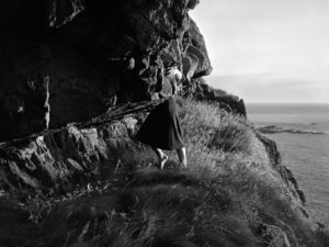
Claude Cahun’s  was an avant-garde queer artist who’s photographic self-portraits, in which she assumed a variety of personas, were associated with the Parisian surrealist movement in the 1920s, before she moved to Jersey in the 1930s where she lived most of her life. Her work was both political and personal, and often undermined traditional concepts of static gender roles. She once explained: “Under this mask, another mask; I will never finish removing all these faces.”   While many male Surrealists depicted women as objects of male desire, Cahun staged images of herself that challenge the idea of the politics of gender. She was exploring her identity, not defining it. Her self-portraits often interrogates space, such as domestic interiors  and Jersey landscapes using rock crevasses and granite gate posts.

When I see this image I interpret it as Clare Rae representing the femininity surrounded by  a vast landscape perhaps portraying how herself and woman feel in society. Throughout this series she incorporates Jersey Neolithic history, dolmens and stone remains, being inspired by the work Claude Cahuns’s produced in Jersey. I think this use of stone in her images is representing masculinity in the world, the contrast of her fluid body positions to the structured .. stone shapes being deliberate and political. In the particular image above, her use of tableaux photography where she places herself looking around at the surrounding environment, positioned on top the stone, I think further emphases her views of being a female in the world today, linking to Cahun’s work when she was undermining traditional gender roles in the 1920s. This can be considered political as she’s also addressing gender roles and identities, reflecting Claude Cahun when woman were always represented by male artists, never representing themselves. Clare Rae states ‘she’s not trying to reveal something other own personality, but more depict an experience of how being a women in our time is sometimes precarious and uncomfortable’, similar to Claude cajun exploring the male gaze and its relationship to both the female body and our imagining of the landscape. I think this is political it goes against the gender roles of the 1930s where women didn’t represent themselves, Clare Rae placing herself into a landscape, her body positions against and on top of rocks representing how being a woman is ‘sometimes uncomfortable’.

Claude Cahun defended woman’s rights and was pivotal in the movement for gender equality as she represented herself however she wanted as feminine, masculine and androgynous, defying all attempts to categorize her according to gender binary. Rather, she creates her own category, where she’s free to express herself according to her own desires. This work is very political as it goes against all the gender traditions in a society where these were rigidly enforced about how women where expected to act, helping change the political landscape and rights for women.

This political theme emulates through Clare Rae’s work as she surrounds herself or places her body around stone and structured objects that are strong and dominate within the image. This is then juxtaposed with her feminine body which many of the images only a small part is shown like her hands or legs in a way dehumanising her and representing all women.

‘Like Cahun’s, my photographs depict my body in relation to place”

Lewis Bush

Lewis Bush is a photographer, writer and researcher exploring themes such as power and inequality in the world. His exhibition ‘Trading Zones’ is the result of six months spent as the 2018 Archaise photographer in residence at the Société Jersiaise. It addressed the public debate about the activities of the ‘finance industry which he finds is an enormously complex field, spanning multiple practices, cultures, and jurisdictions.’ This area has gone largely unrepresented in documentary practice due to its complexity and difficulty to access. To do this he used  a wide range of photographic approaches, ranging from conventional photography, to appropriated imagery, cameraless photographs, public polling, and the reuse of data sources. He wanted examine different aspects of finance, highlighting aspects of Jersey’s past and present which have been conducive to the growth of finance, and inviting Jersey people to contribute their own thoughts about the industry.

This image portrays portraits of finance workers combining together creating two images representing the male and female identities within the finance industry. I think this can be considered political it’s essentially merging together all the individuals working in the finance industry and displaying them as one person, taking away their originality , perhaps representing the stereotype of some who works in an office. Bush draws attention to forms of invisible power that operate in the world and by representing people as merged could link to the idea of shaping individuals of finance as the industry changes.  His aim was ‘try and give viewers a hint of what finance is in a place like Jersey, but also the strange nature of it’, the merging of the faces being a part of that. He describes finance as ‘profoundly ancient and highly modern’ as it’s a product of event going back thousands of years but is still highly relevant today in Jersey. Expressing this makes his work political as he uses information historic and new and documents the changing of peoples opinions on the industry. He does this by allowing visitors at his exhibition to comment their views, giving a platform for people to express their thoughts negative or positive.

‘Trading Zones’ also includes a series of photos taken around the island as Lewis was pointing his camera towards other financial centres. “I wanted to connect faraway places with the local industry,” he explained.

Comparison

Both photographers work can be considered political, Clare Rae’s work expressing views on gender roles by representing herself in her images emphases her views of being a female in the world today, whereas Lewis Bush’s work documents the finance industry and forms of invisible power in relation to the employees and history. Clare Rae uses a tableaux approach, placing herself in the landcape where shes surrounded by structured objects, such as furniture and stone. Lewis bush on the other hand uses documentary photography portraying the effects on the developing finance industry

Links

behind the scenes video link:
https://ccp.org.au/about/news/behind-the-scenes-of-entre-nous-claude-cahun-and-clare-rae

http://www.clarerae.com/work/never-standing-on-two-feet

https://www.bailiwickexpress.com/jsy/news/entre-nous-contemporary-artist-collides-avant-garde-photographs/

http://www.bbc.com/culture/story/20160629-claude-cahun-the-trans-artist-years-ahead-of-her-time

https://www.theartstory.org/artist-cahun-claude.htm

https://www.theguardian.com/lifeandstyle/2018/feb/05/the-1920s-young-women-took-the-struggle-for-freedom-into-their-personal-lives
Lewis Bush
http://www.archisle.org.je/

https://www.bailiwickexpress.com/jsy/news/trading-zones-new-exhibition-explores-finance-industry-culture/#.W-s7Pi2cbUo

Trading Zones