Essay – Clare Rae and Lewis Bush

In what way can the work of Lewis Bush and Clare Rae both be considered political?

At first glance, the work of Lewis Bush and Clare Rae is very different and in that sense, the two exhibitions seem more than distant from each other. Though they do share a very major similarity as both artists are influenced by, make a statement about and (whether intentionally or not) include political aspects. In this essay I’ll be exploring the recent work of Lewis Bush and Clare Rae, I aim to compare and contrast their political approaches and how evident this is in their photography, their projects and final exhibition.

‘Trading Zones’ by Lewis Bush focuses solely on the finance industry. As part of the project, the photographer took up residence on the heavily finance orientated island of Jersey; here Bush was able to experience the significance of finance and how its extensive impact affects the everyday people. The final exhibition compiles a variation of media and techniques, making it very visually and mentally stimulating to the audience.  He explores finance both from the inside and out; he collected employee photographs and merged them together to create a ‘perfect employee’ or an ‘average employee’ depending on how you view it. The technique was originally developed by Francis Galton⁴, who used it for anthropology (the study of ancient and everday societies). He also collected raw data from the overall population – composing and creating a wall display of quotes, opinions and images that people associate with the word ‘finance’ in Jersey. The idea and inspiration came from an artist called EJ Major who developed this idea for her project, she handed out little templates to strangers; the words written on them were “love is…”³ and she asked bypassers to fill it in with their own words, thoughts and feelings. Lewis Bush adapted this concept slightly; he used the words “finance is…”. Bush mentioned that the inspiration and driving force behind his work was this idea of how the majority of London, Lewis Bush’s home city, is owned offshore. He mentions in an interview that the “value of U.K property [is] at over £92 billion held in Jersey”¹, that alone is an astonishing statistic but it is also what influenced Bush to start this project. The concept of ownership of land and taxation is certainly political, there are many ongoing debates and law adjustments to prevent the abuse and loopholes that larger co-operations and people with money could use to their advantages.

‘Entre Nous’, translating to ‘Between Us’, is a project by Clare Rae that exhibits and brings together her photographs and the work of Claude Cahun. The exhibition contrasts the two sets of work, showcasing the similarities and giving life to normally archived and locked away imagery. Cahun, alternately known as Lucy Renee Mathilde Schwob, is well known for their political controversies. Clare Rae also took up residency on the island of Jersey, once home to the famous Claude Chahun. Claude Cahun was a surrealist and an alter ego of sorts, Lucy Schwob adapted this name as a disguise, her motive behind this was to be taken much more seriously as a supposedly male artist and start a movement of her own. Cahun’s photography promoted the surreal movement, it explored the queer culture, gender identity, gender fluidity and allowed Schwob to take control of her own body and represent gender in photography as a whole. Clare Rae’s exhibition is a response to that movement, her photographs depict her engaging with the Jersey landscape; which was once home to Cahun who moved here in the 1930s in hopes of escaping Nazis. In the final exhibition, Cahun’s photographs are showcased on a ‘white wall’,² whereas ‘her work is on a grey wall’². Clare Rae wanted this to be presented in such a way so that it becomes possible to ‘distinguish the [two] works’². Due to copyright laws, the copies of Cahun’s work must be destroyed once the exhibition is over. Undoubtedly, this exhibition is political, it centers all around controversial topics and breakthrough movements.

In conclusion, the work of Clare Rae and Lewis Bush is absolutely political, both artist take inspiration from political subjects that have influenced their lives and surrounding. Both artist target political aspects and political controversies in their projects and produce photographs, composite images and other media that expresses political opinions and values the artists may own. Even though the artists gave existence to two, very different  bodies of work, the overall motivation comes down to the reason why all photographers take and create images; to make a difference in the world- though it may be minor and almost insignificant at the start; as long as it causes a person to rethink something, causes an emotion, evokes a feeling or even stimulates the audience, the purpose of a political (or any photograph) is achieved.

Sources:

¹= quote from this interview.

²=Quote from Michelle Mountain, video about the exhibition

³= EJ Major, “love is…”

⁴= Francis Galton, Composite Portraits 

Photography and Truth Analysis

In this photo provided by Georgian Public Broadcaster and photographed by Ketevan Kardava two women wounded in Brussels Airport in Brussels, Belgium, after explosions were heard Tuesday, March 22, 2016. A developing situation left at least one person and possibly more dead in explosions that ripped through the departure hall at Brussels airport Tuesday, police said. All flights were canceled, arriving planes were being diverted and Belgium's terror alert level was raised to maximum, officials said. (Ketevan Kardava/ Georgian Public Broadcaster via AP)

This photograph is clearly a shocking and emotional image that immediately connects to the audience in a horrific way that makes the audience think about the disasters that are occurring. Through a variety of ways this image is effective in connecting with the audience and telling a story and the image can provoke such emotion and story through the technical, visual, contextual and conceptual factors.

The technicality  is a vital aspect in creating an image and in particular within this image it is key to portray the real events. The natural lighting used to construct this image is significant in portraying the event as realistic and truthful manner. The natural light used shows a clear documentary approach to the photography as appose to a tableaux style where artificial light is used and the photograph is staged. The technicality of the picture doesn’t appear to be very good and this shows a correlation between the rush and chaos of the location in which meant the photographer was unable to sort out the best settings on her camera for the shoot. There is a slight blur within the main subjects and the shutter speed appears to have been on for a bit too long with a slight over exposure which appears to be present. Also, the ISO seems to be at around 400-800 due to the noise and grain that is incorporated. Whether intentional or not i believe that this is effective in showing the chaotic and emotion within the area.

Visually, this image is empowering in creating the story of what happened within the Brussels terror attack. To me, the stand out visual aspect is the variety of textures that show the utter destruction that has occurred and injuries as a result too. Mainly rough textures are involved which highlight the suffering and misery within the scene. Further rough textures that are present can be seen on the women’s clothing and the hand of the women on the left and foot of the women on the right. I believe these aspects of the image can influence an emotional response with the audience as they will feel sympathy for the suffering that the people in the attack are experiencing.

This photograph was captured by the photo journalist Ketevan Kardava in Bruseels Airport, Belgium. It was taken after the explosions were heard Tuesday, march 22, 2016.   Ketevan Kardava, a special correspondent for the Georgian Public Broadcaster network has had her  photograph published and shared across the world including on the front page of the New York Times. Kardava was on her way to Geneva to report on talks between Russia and her home country, Georgia, when the first of two suicide bombers detonated his explosive vest. “Doors and windows were flying,” Kardava tells TIME. “Everything was dust and smoke. Around me there were dozens of people without legs, lying in blood.” Her first instinct was to look down at her own legs. “I couldn’t believe I still had my legs. I was in a state of shock.” “I wanted to run to a safe place too, but I also wanted to take pictures. As a journalist, it was my duty to take these photos and show the world what was going on. I knew I was the only one at this spot.”  The photo above is thought to have been the first photo that she captured on the location.

This photograph is a clear representation of the truth of the horrific events that took place in Brussels. In contrast with some photo journalism, this is a truthful representation and has no signs of photo manipulation or hidden subject matter. The journalist took a realistic and truthful approach to trustfully document the attacks that were occurring. Although the images are in some peoples views insensitive and too graphic, i believe that photojournalism is supposed to be impact and essential to allow knowledge for the community to see what is happening in our world. Without these powerful images impacting individuals and creating an emotional response, it is likely that the consumers are unable to realise the impact of these events and there will be less help and support for situations like so.

Photography and Truth

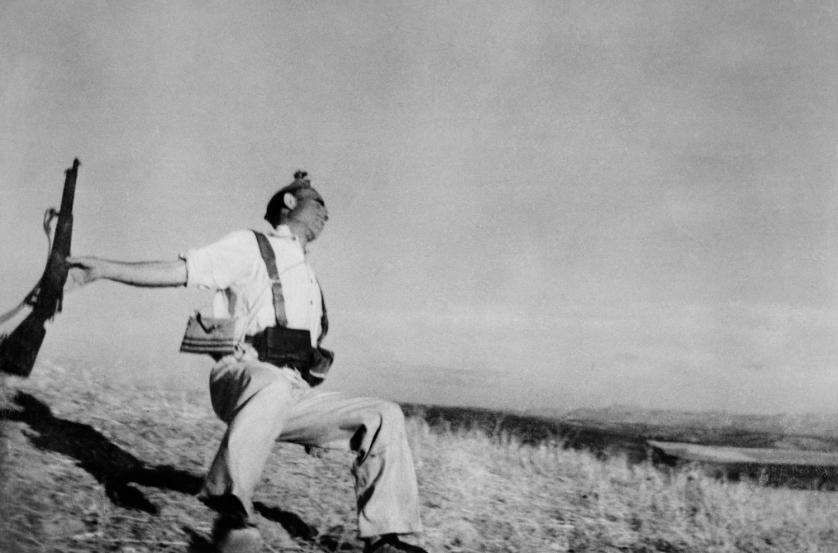
Death of a Loyalist Soldier

robert-capa-falling-soldier

‘Death of a Loyalist Soldier’ is a photo taken by war photographer and photojournalist  Robert Capa and is claimed to have been taken on September 5, 1936. It depicts the exact moment of death when a republican soldier in the was shot in Battle of Cerro Muriano in the Spanish Civil War. Picture Post, a pioneering photojournalism magazine published in the United Kingdom, had once described then twenty-five year old Capa as “the greatest war photographer in the world” and his ‘falling solider’ photo is said to be the most iconic image of the Spanish Civil War.

The composition of this image makes it look like the moment was unanticipated because of how the horizon isn’t straight and how the soldier feet are touching the bottom of the image. If the moment was anticipated than Capa would have set up a better composition in the photo, but because it was unexpected he didn’t have time. This is also indicated through the blurriness in some parts of the image where Capa had to take the photo quickly. The photo is black and white because it was taken in 1936 making the image more formal and leads the audiences eye to the soldier straight away. The foreground of the image shows the soldier being shot and falling back towards the ground and the background displays mountains out of focus, showing how the image was unanticipated.

Doubts have been raised since 1975 in relation to the authenticity of the image. In José Manuel Susperregui’s 2009 book “Shadows of Photography”, he concludes that the photograph was not taken at Cerro Muriano, but at another location about 30 miles away. He said this meant that the Falling Soldier photograph ‘was staged, as were all the others in the same series, supposedly taken on the front.

This position the solider is in makes the image seem authentic as his arm holding the gun has been thrown backwards like he’s just been shot. But the likelihood of catching the exact moment a soldier was shot is very unlikely making the claims against Robert Capa more believable, but still isn’t evidence. But the environment surrounding the soldier doesn’t look like it was taken in the ‘heat of the battle’ said Mr. Hartshorn making the image looked like it’s staged.

This photo above is of another man from the same sequence as “The Falling Soldier.” A researcher has used the mountains to identify what he says is the picture’s correct location. Cynthia Young, curator of the Robert Capa Archive at the I.C.P “very possibly didn’t remember” where he took the picture, probably leaving his agents and editors back in Paris to make a guess when they developed his film, defending the authenticity.

Capa described how he took the photograph in a 1947 radio interview:

I was there in the trench with about twenty milicianos … I just kind of put my camera above my head and even [sic] didn’t look and clicked the picture, when they moved over the trench. And that was all. … [T]hat camera which I hold [sic] above my head just caught a man at the moment when he was shot. That was probably the best picture I ever took. I never saw the picture in the frame because the camera was far above my head

Richard Whelan, in This Is War! Robert Capa at Work, states, ‘It is neither a photograph of a man pretending to have been shot, nor an image made during what we would normally consider the heat of battle.’

Although Capa’s image could have been staged, the exposure he gave to the public about war by portraying a soldier the moment he was shot was effective and displays the turmoil that’s experienced in war.

“Which ever way you view the authenticity of his work and the identity he created, the impact that Capa has had cannot be denied. Every photograph taken represents a metaphor that will eternally last in the viewer’s mind, depicting a time riven with devastation that is still felt today. It is these timeless reverberations his photography has created that made him ‘the greatest war photographer in the world’.” (Andrew Kingsford-Smith)

In his July 1998 article, Phillip Knightley deniedthe importance of Brotóns’s discovery and stated “The famous photograph is almost certainly a fake—Capa posed it.” He went on to argue, “Federico could have posed for the photograph before he was killed.” Richard Whelan sought the advice of a forensic expert, Captain Robert L.Franks, the chief homicide detective of the Memphis Police Department. to my request. In his analysis, he said that the first thing that struck him as odd about The Falling Soldier was that the man in the photograph “had been standing flat footed when he was shot. He clearly was not in stride when he was shot.”  He went on to write, “Was this picture posed? I think not, based on the human reflex response. You will notice that the soldier’s left hand, which is partially showing under his left leg, is in a semi-closed position. If the fall was, in fact, staged, the hand would be open to catch his fall.  The deduction that the man had been carrying his rifle in a was suggesting that he did not expect to use it soon led Richard Whelan  to reconsider the story.

 “They were fooling around,” [Capa] said. “We all were fooling around. We felt good. There was no shooting. They came running down the slope. I ran too and knipsed.”                             “Did you tell them to stage an attack?” asked Mieth.
“Hell no. We were all happy. A little crazy,
maybe.”
“And then?”
“Then, suddenly it was the real thing. I didn’t
hear the firing—not at first.”
“Where were you?”
“Out there, a little ahead and to the side of
them.”


https://www.metmuseum.org/art/collection/search/283315