Experimentation in Photoshop – Surveillance and Stalking

Overview/Plan

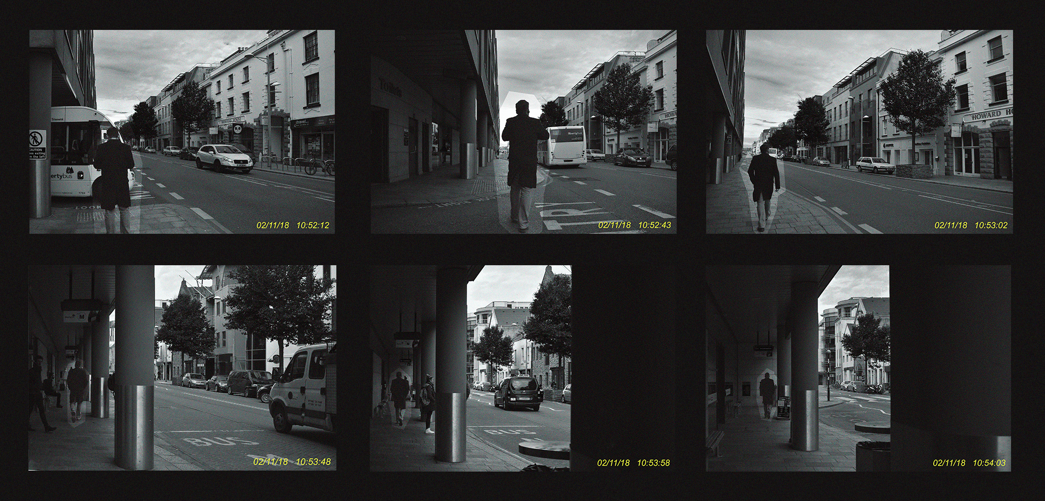
For this experimentation I will use the photographs I’ve taken in the style of Sophie Calle; photographs that depict the journey’s of unknown strangers. I aim to edit these photographs in a way that merges the concept of stalking and invading that Sophie Calle explores in much detail, with this idea of surveillance that I have also began to explore in the earlier stages of this project. I want to find a way to age the photographs/lower their quality to mimic surveillance cameras and the footage that they produce. I also want to add dates and times to add character and realism to my ‘surveillance footage’. After the photographs are edited in a way that I like, I want to test different methods of presenting the images; try out grid formats – similar to ones used in typology (Bernd Becherand Hilla Becher) or perhaps try presenting the images in a row like a sequence or comic strip that will showcase the progression of events.
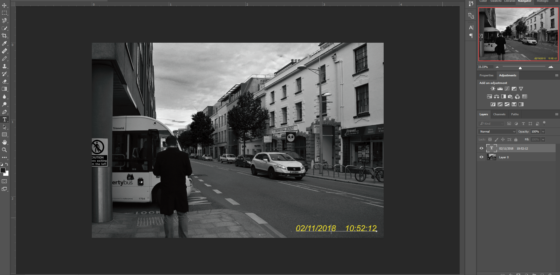
I started by inserting the image; unlocking the layer on the side so that I can make permanent changes to the image. I then went onto the details of my image by selecting ‘file’ and then ‘file info’ – this displayed the exact date and time the image was taken and I copied this value. After that, I selected the text tool and pressed paste; from here I experimented with the positioning of the text, the size, the colour and the font until I reached an equilibrium. I was aiming for something simple but also easy to replicate.
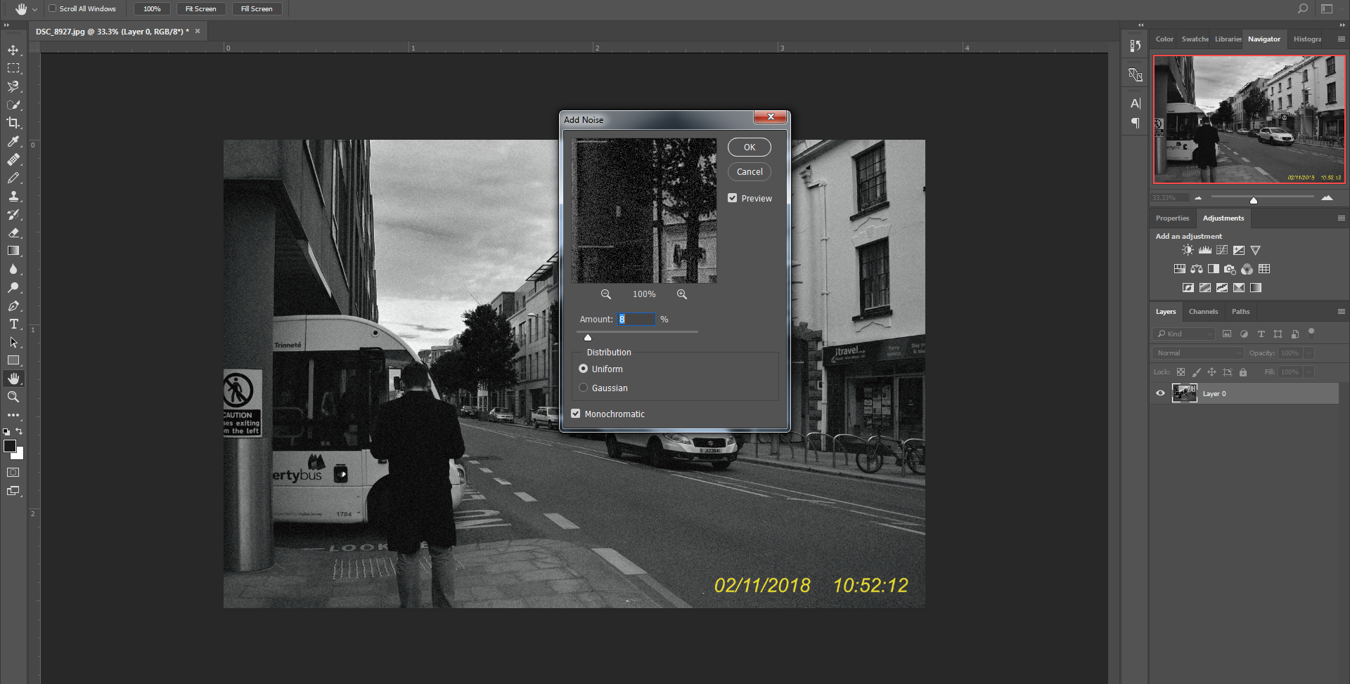
In order to process to the next step I needed to make the different layers one; I did this by converting the text layer into a smart object and merging it down onto the picture layer. Then, I went into ‘Filter’, ‘Noise’ and ‘Add Noise’ to reach this interface. I moved the slider around until I was satisfied and applied the said filter to my overall image.
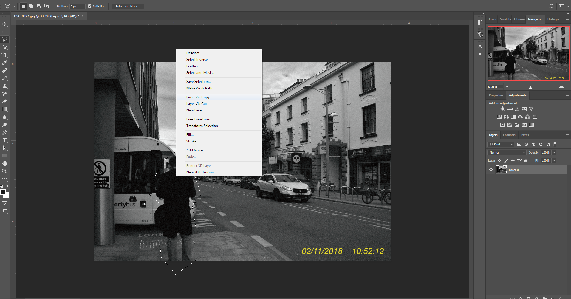
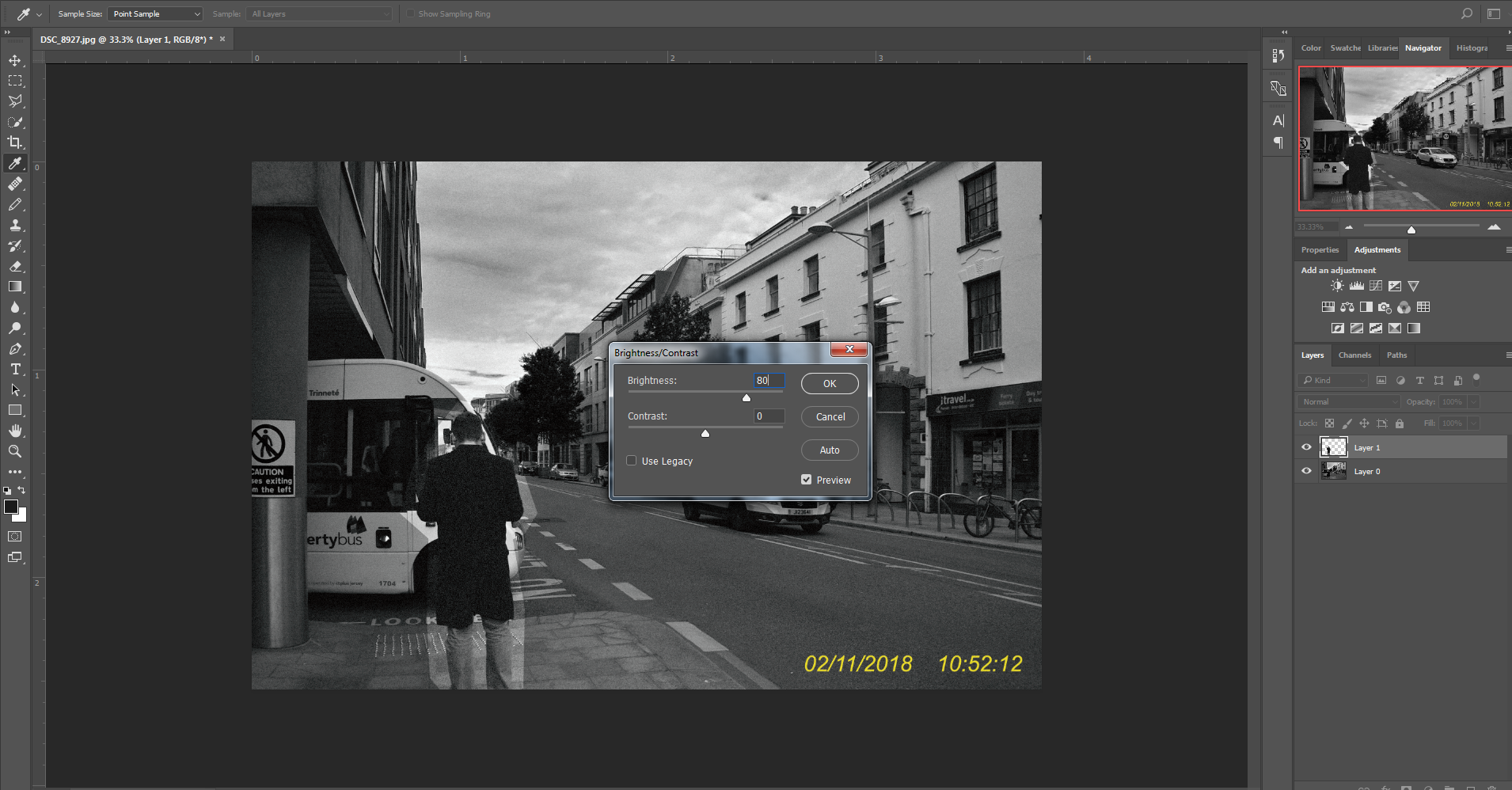
Using the Polygonal Lasso Tool, I traced around the man, I then right clicked and copied the image onto a new layer using ‘Layer Via Copy’. This transferred the area I highlighted onto a separate layer where I could make adjustments. I went into ‘adjustments’ and then ‘Brightness And Contrast’ and edited the brightness, creating a stark contrast and in a sense, highlighting the man from his surrounding.

Presentation
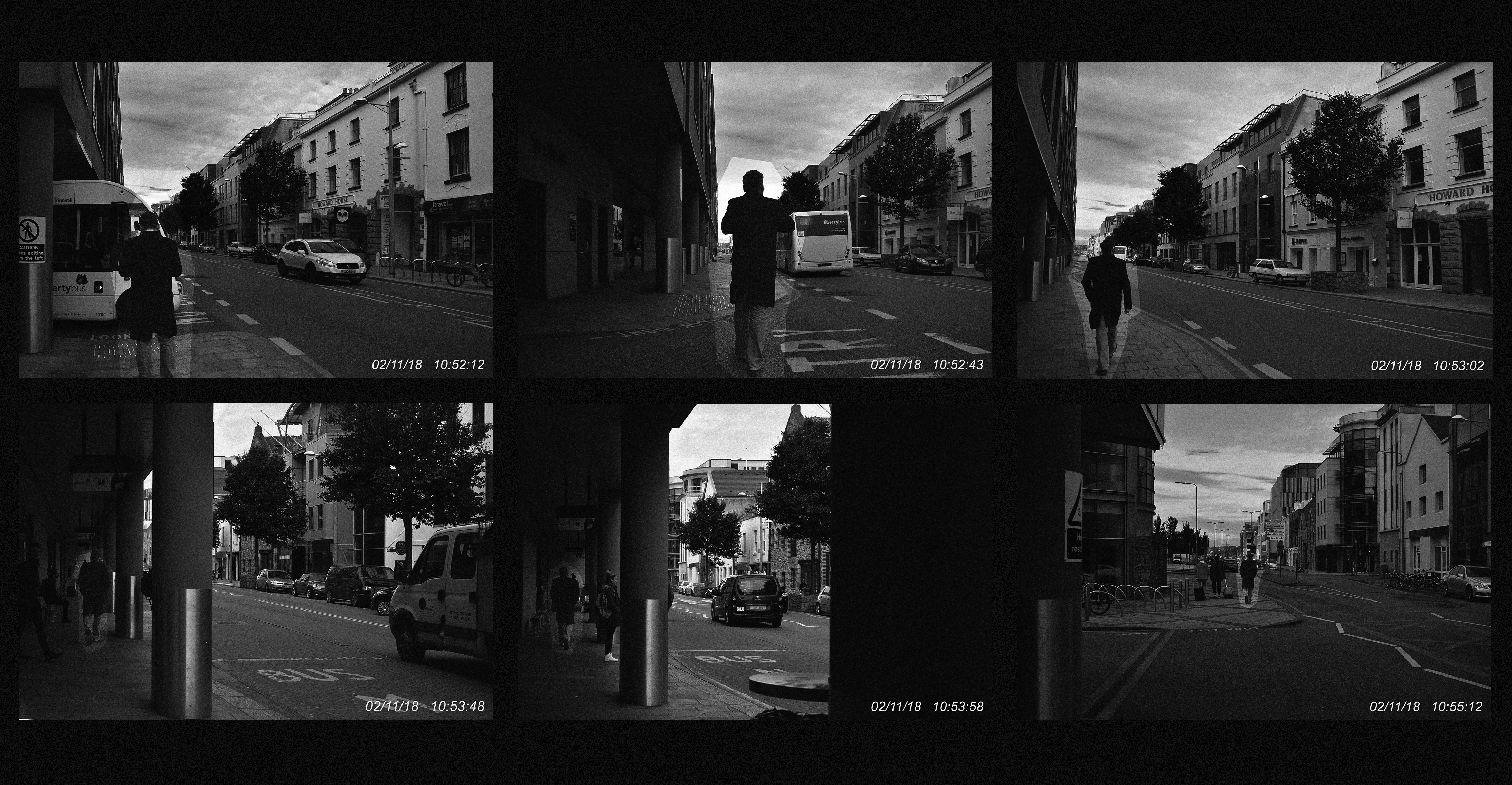
A wider layout; One the first image I added a black and white filter over the image to eradicate the blue/green hue that the photos contained. On the second I did the same steps but didn’t add a black and white filter and therefore keeping the hues.
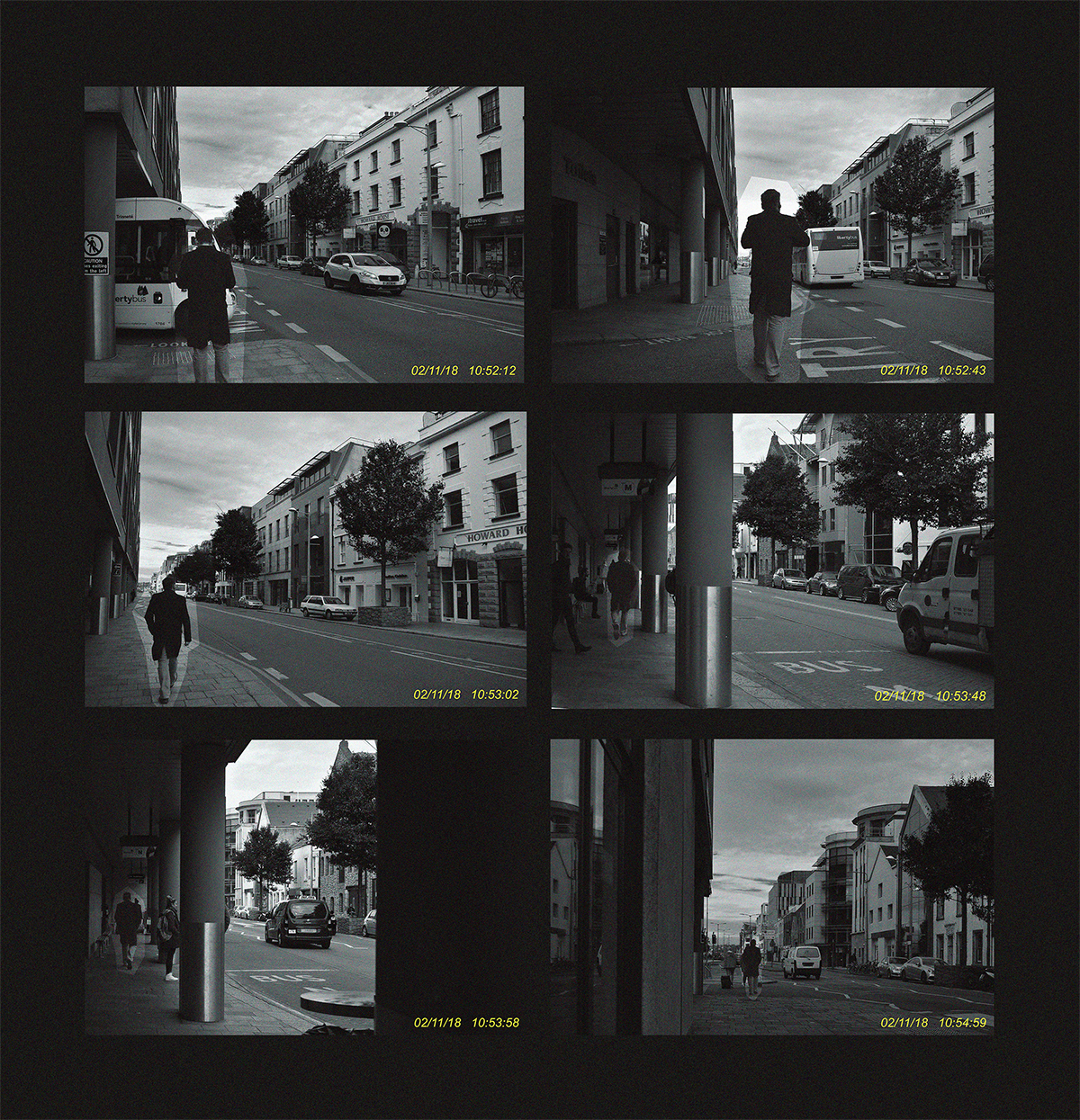
This photograph is longer vertically, I didn’t apply a black and white filter, this results in the photographs having a hue and the yellow text is much more prominent and visible in the image.
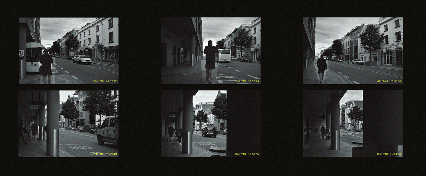
In this example, I opted for a much bigger space between the images; I also didn’t use the black and white filter and even made the background colour more brown to compliment and contrast the hues in the images.
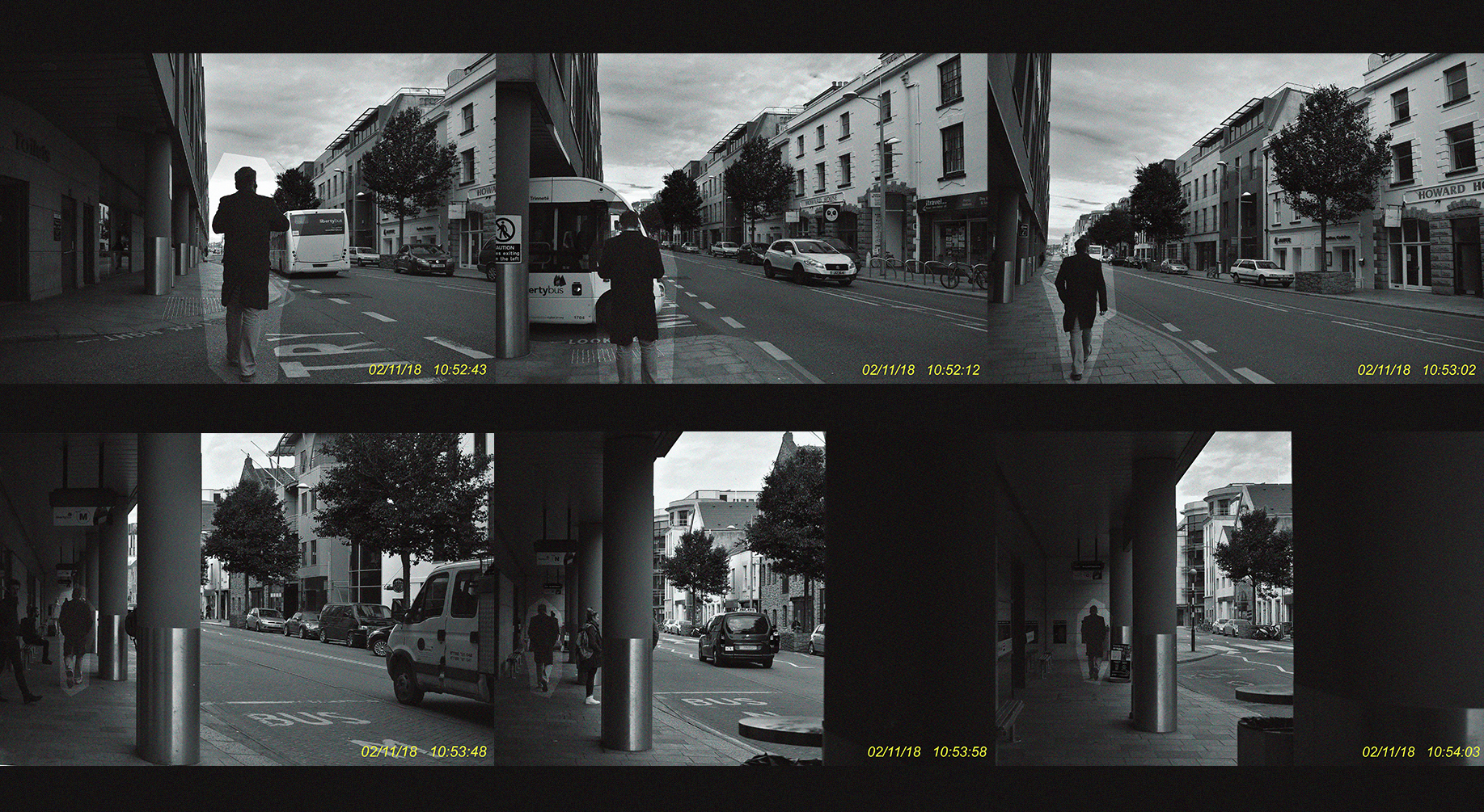
This experiment was the opposite of the one before; instead of leaving huge space between the images I left none.

Exploring The Sublime: Tim Walker

I was told to study Tim Waker as I decided I wanted my images to be incredibly interesting and always have an important view to each and every photo developed. Because of this I was told to study Tim Walker and the way his images are full of such strong imagination and could possibly say the sublime. Walkers photographs have entranced the reader of many vogue magazines rapidly month after month, for over a decade now. His images are viewed as extravagant and a typically seen being staged and through romantic motif and character how are deemed to be unrecognisable by style and hugely inflectional to fashion and the way in which photography is developed.  His concentration on photographic stills for 15 years enabled himself not to be moving on to making short films and movies. To be this is of great importance because it poses the ideas of how photography can also be viewed though a sense of cinematography, and the ways in which I could make a short movies showing the sense of the sublime through my own images. walker was born in England in 1970, and his interest in photography  began in the London library where he was able to work on the Cecil Beaton archive for a year before university. After a three-year BA Honors degree in Photography at Exeter College of Art, Walker was awarded third prize as The Independent Young Photographer Of The Year. This was a monumental moment fro him as it allowed himself t be power done by his own ambitions and form a relationship of what he is doing is successful.

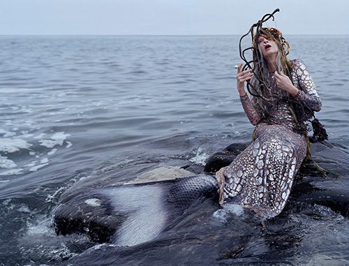
Walker worked as his own freelance photographic assistant in London before moving to new York. When he arrived in New York he became the assistant to Richard Avedone. Walker use to have a strong concentration on his woe being more primarily filled of portraiture and documentary work for the British Newspaper. Although not long after he had his first shoot with vogue and with many editors and soon he was taking in conversational cues and stray bits of wisdom with a mind that whirs incessantly, much like the camera he carries wherever he goes.And that may be why, as he stood gazing seaward during a shoot last year on the northern coast of England, he was all ears when Kristen McMenamy, his model and muse, confided that she had long been enchanted by mermaids. She told Mr. Walker, as he recalled, “This is the one character I’ve never been able to play,”I believe his work is whole unique and extravagantly innovative. He has an ability to capture so many styles and narratives within a piece especially evident within his recent works, which can currently available in somerset house. Yet he has soon moved onto a new styles encapturing more fantasy aspects of fashion using his works to tell a story.Oddly, his tendency to obscure clothes in favour of elaborately staged, dreamy narratives has only endeared him to the art and fashion set. His works are in the permanent collections of the Victoria & Albert Museum and the National Portrait Gallery in London.

This piece is wholly magical and a substitution to that of the pain of what is expected to be only beautiful. The mermaid itself is a purely fantasised and fictional character, yet walker has bought her into this world  filled with that of reality and the inspiration from fantasy and na altered reality. He combines an interesting new attitude that . constitutes what sublime is and can be formed into something less expected. I think it is quite innovate that he uses a address with scales in order to evoke the mermaid and fish texture, as this allows his fashion forward ways to be used and effectively present within the composition. The mermaid is not overall sexualised and I belive this is important as otherwise This would not be possibly viewed as sublime but would be seen as too perfect and not allowing a sense of pain to come through the image. The way in which he body is held is also an interesting way to view this image as you can almost see a sense of pain within the image itself, the way the hands are surrounding the face connotes attitudes and relations to fear and escapism. Interestingly many of the colours are ether faded or pushed back, this has implementations  of a focus point in the image itself, however contrary to many sublime images it does not have the sensory of colour, however these grey undertones could possibly aspire a more solemn and possibly painful mood to the image but still conveys themes of sublime but presented in a more abstract an divided manner. I believe this image is perhaps too staged and slightly tablo for what i want to incorporate into my work at the moment, however I think the overall themes could be interesting to work with. 

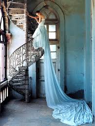
To my mind this piece does capture a more fashion stylistic outlook on what purposes that of the sublime. I belive the contradiction fo the ballgown to that of the industrial and rustic looking stairwell posses that of the pain and reality of a set and yet still hold a composition to display such a beautiful dress. This composition and overall isolated surrounding is perhaps more sublime. There is such a strong contradiction of beauty and also pain and suspended alteration within the image thatI believe would work well and successful come into and under my themes of my work. The stance of the image could be seen as very high fashion in the way of the leaning over the railing and the long exaggeration of how tall she is. The concentration of light also illuminates specific angles to the image and brings shadows to those sections that are more dingy. This shoot has somewhat inspired me to do a photoshoot in an abandoned area, and perhaps also add in an aspect of beauty within the area itself, as this division of ideas would shows aspects of the sublime.