PAOLA PAREDES

PAOLA PAREDES MELANCHOLIA OF VIRGINS

This image is from Paola Paredes body of work ‘Melancholia of Virgins’, a selection of experimental pieces raising awareness of the humiliation of misdiagnosed women in Salpêtrière Hospital Paris for ‘Hysteria’ during the 19th century – a time when medicine subjected women to abhorrent treatment. The term ‘Hysteria’ is now recognized as a diagnosis stemming from pseudo-science, intrinsically linked to misogyny and man’s dominance. These ‘Hysteric’ women were put on display for audiences consisting of medical contemporaries, students and members of the public. One front-runner in Hysteria science was Jean-Martin Charcot he was charged with Hysteria treatment at the Salpêtrière Hospital in Paris, where he would use his camera as a tool for recording patient’s attack symptoms for later analysis.  These pictures were then published and used as ‘evidence’. Paola Paredes then took these images and redeveloped them with the use of modern technology, stitching and handmade collages to produce animations and to magnify the humility and penalization that the institution forced on these women.

Conventionally speaking, the quality of the picture is poor due to the age of the photograph, with no depth in contrast, or wide spectrum of shades and

Image from Paola Paredes’ body of work ‘Melancholia of Virgins’

the noise that the camera has picked up in the darker tones of the image. However if you look at the image conceptually the poor quality of the image carries connotations of poor quality of life, respect and empathy for these women, which gives more depth to the context of the image. The rework of the image  encourages viewers to  to look at the image in a different way and interpret feelings and emotions throughout the whole of the frame, as the subjects face is completely covered making it impossible to read her emotions, so therefore applying an interpreted context to the image. The rework and manipulation of the image grasps the viewers attention on the feeling of being watched and recorded, being subjected to humiliation and being stripped of dignity.

This image is one of her still images which contrasts the effect of one of Paredes’ moving images where there is a sense of input of intensified emotion. However each of her still images convey the feeling of a forced or submissive silence. The use of the string covering the face and hiding the identity of this woman reinforces the idea of that these women were dehumanized, silenced and belittled. This simple technique unveils more about the context of this picture than if it was left untouched or the subject’s face was left on show. However, my interpretation of the reason why Paredes decided to cover her face is the possible referencing of the automatic invalidation of their opinions and dismissal of their freedom of choice and speech because of a ‘higher’ or ‘stronger’ force – in this pictures case the flash of the camera is the force acting against these imprisoned women, which could be interpreted as the misogynistic men that took advantage of them.

Photo Shoot – I want to experiment with Paola  Paredes experimental approach to redevelop old images and give them new meanings and context to provide a thought provoking piece that encourages an audience to interpret an image with my political message. I want to take the idea from Paola Paredes of reworking, experimenting and manipulating existing images, carrying on the theme of my political landscape topic; the agriculture industry and its effect on climate change, being responisble for destruction of land and the mass usage of limited resources that don’t have enough value to raise concern like water and again, land.

Environmental Issues – Photoshoot Plan

Photoshoot Plan Inspired by Guillaume Bression and Carlos Ayesta

My first shoot is inspired by Guillaume Bression and Carlos Ayesta. Their photos stimulate thought at the consequences of human activity on the earth and this definitely interests me as it is interesting to see how rapidly the world is changing and to imagine how it will become in the future. There are many aspects to the world which are changing for the better however also many for the worse too. I think it would be interesting to explore both of these changing worlds, for the better and for the worse. For both of these approaches i will use a photo manipulation method to over exaggerate the changing world and the social/political issues in relation to the environment.

Image result for Guillaume Bression and Carlos Ayesta

For this shoot I will follow the similar approach to my artist reference of Guillaume Bression and Carlos Ayesta by looking at the negative impacts on our earth due to human activity. This could be a variety of different issues such as air/noise/ light pollution, habitat loss and plastic in seas. I think it would be interesting to look at an abandoned/derelict area and incorporate  a similar aspect to my artist such as wrapping up an object in cling film or perhaps have a person wrapped up escaping the harsh conditions. Also it would be engaging to have my model using the abandoned place as it would have been used when it was functional. This will give the image a clear juxtaposition and exaggerate the poor conditions in its current state.

I intend to show the viewer a glimpse of places long forgotten through the my images and allow them to serve as an eerie reminder that nothing lasts forever. I want to produce examples of humanity’s wastefulness and the impact society has on nature. By doing this i can engage with the audience and influence them to change the way in which they think about and treat the environment.

Clare Ray / Claude Cahun and Lewis Bush essay

In what way can the work of Lewis Bush and Clare Rae both be considered political?

Recently along with fellow photography students I visited Lewis Bush’s ‘Trading Zones’ exhibition and Clare Rae’s ‘Entre Nous’ exhibition in response to the late photographer Claude Cahun. Now the work that makes up both of these exhibitions is definitely something that can strongly be considered as political. How so is what takes some explaining.

Lewis Bush
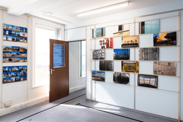
Trading Zones Exhibition
Room 1

My initial thoughts and feelings on the work of these 3 photographers from the exhibitions that we visited was not that the work stood out as particularly political, instead I was just intrigued and taken by how visually interesting and conceptual the images being displayed were. It was immediately clear with the Entre Nous exhibition that both Clare Rae and Claude Cahun’s work had obvious visual links and similarities, a running theme somewhat; however after initially being exposed to Lewis Bush’s Trading Zones exhibition, his works didn’t all share a similar visual theme or aesthetic and instead they were more in sets or projects under one overhead theme of the finance industry. Despite this, after looking into all 3 of these photographers’ work in terms of the exhibitions in much more depth, it was very evident that each of their collated works had a strong political theme / issue running throughout.

Clare Ray & Claude Cahun
Entre Nous Exhibition
CCA Gallery
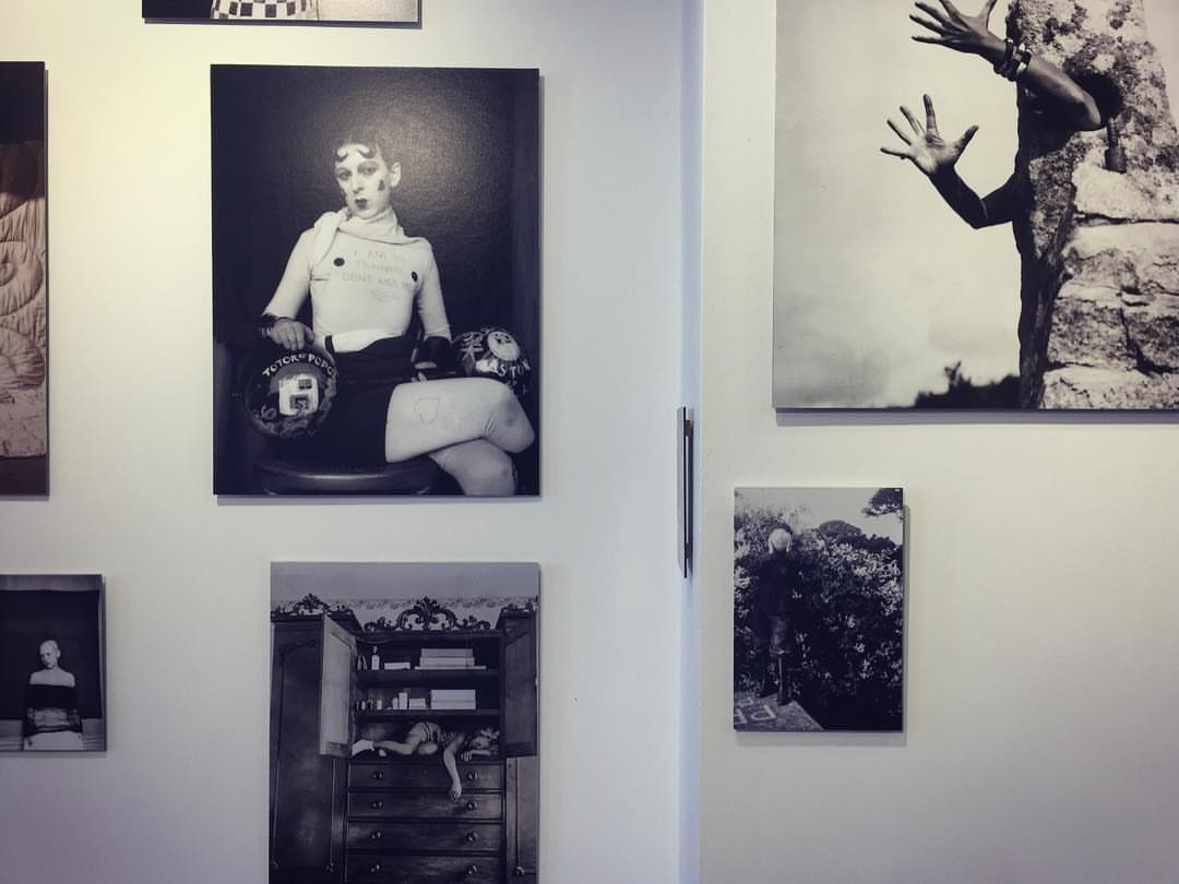
(Work of Claude Cahun)

In order to get a good enough understanding of where each of the photographers’ work is coming from it would only be right to take a brief look at the background of the three photographers…

Lewis Bush is a photographer, writer and educator, born in London in the year 1988. With a Master’s degree in documentary photography, he is a lecturer of photojournalism and documentary photography at London College of Communication (LCC.) His main beliefs and aims of his photography are “to draw attention to forms of invisible power that operate in the world” believing that “power is always problematic” because it is inherently “arbitrary and untransparent.” This says a lot about how Lewis Bush approaches photography in a documentary fashion, with a strong belief on the topic of power and how that is effective upon society and people individually. Specifically looking at his Trading Zones Exhibition which was located at the old police station in the royal square of St Helier, that took place in September. This was a body of work which was a result of Lewis Bush’s time as a photographer in residence at the Societe Jersaise in Jersey, exploring different aspects and topics surrounding the theme of finance.

Work of Lewis Bush


Clare Rae is a photographer / artist who is based in Melbourne, Australia, who completed a Master of Arts by research in 2014 at Monash University, and received first class Honours in Fine Art in 2009 at RMIT University. Her approach to photography is very unorthodox as she experiments with performance and the use of her own body and figure as a subject of the images which she produces. ” Her work is informed by feminist theory, and presents an alternate and often awkward experience of subjectivity and the female body.” One of Rae’s main interests within her individual practice of performance photography is how ”the camera can act as a collaborator, rather than mute witness, to the performer.” As a self-proclaimed artist as well as being a photographer, this incorporation of performance within her photography is something which could be considered as a more artistic than photographic matter, in terms of lens based imagery. Specifically looking at Clare Rae’s work from the Entre Nous exhibition, this was a response to the work of Jersey based photographer Claude Cahun who explored similar themes and issues, predominantly that of feminism and gender stereotypes, within her work. Although the photographic practices or these two photographers are separated by 70 years they have a lot of similarities. Claude Cahun was an avant-garde artist and writer, who in the 1920s, was associated with a creative movement known as the Parisian surrealist movement. She was not a stereotypical citizen of Jersey, and probably still wouldn’t be classed as one to this day. She was a lesbian who was in a relationship with her half sister, she was also Jewish and she was  activist who protested against the German occupation. To sum up the effects of her work ”Cahun’s subversive self-portrait photographs and texts have become highly influential for artists dealing with questions of gender identity and representation of the female body.”

Work of Clare Rae

In terms of how Lewis Bush and Clare Rae’s work is considered political, it is very evident after looking at their photographic intentions and ideas that they both cover very political matters within society. Although very different matters, they are certainly political, Bush’s being that of the finance industry which is very intertwining with politics, and Rae’s being that of feminism, equality and gender stereotypes which are also very politically discussed topics. These are political matters that all effect society somewhat in positive ways, and on the other hand sometimes not so much.

Bush covered various aspects of what finance actually is, specifically on the island of Jersey. These aspects showed different ways in which finance can be perceived, used and thought about by society. He approached the project in a very modern and experimental manner, with a range of subjects and topics linked to finance, whilst  not going overboard with the experimentation, in order to not create too much abstraction. He used a wide range of archival imagery within the exhibition in his own way in order to help display his findings and interests that he found along the way of completing the project. One of the most interesting parts of the exhibition was the fact that he had made part of it interactive. Allowing visitors of the exhibition (members of the general public) to create there own response to the words ”Finance Is…” On cards that were attached to part of the exhibition. This allowed for people’s views and opinions on the topic of the exhibition to be expressed and viewed by others. Overall I believe that Bush’s exhibition was very successful at portraying the finance industry for what it is in a visual way.

Lewis Bush, Trading Zones

In contrast to Lewis Bush’s work Clare Rae’s approach to her work that made up the Entre Nous exhibition was more contemporary, and has more of a discreet and hidden meaning. Although we are aware that her work covered topics such as feminism and gender stereotypes, the imagery displayed in the exhibition is fairly open for interpretation as it is making the audience/viewer have to think about what each individual image is trying to portray. One of the main and most blatantly obvious visual differences between Bush and Rae’s work is that Rae’s photographs are monochrome, this may be in order to remove any distractions or false meanings that could be caused by the use of colour. Overall I believe that Clare Rae executed a very impressive exhibition which was a great response to the work of the surrealist photographer Claude Cahun and the topics surrounding her work.

Behind The Scenes Of Entre Nous Claude Cahun & Clare Rae

In conclusion it is very evident to me that both Lewis Bush and Clare Rae’s work can be considered as political, as they both cover extremely political matters specifically within the two projects of work which they have recently exhibited.

(The sources that I have used for information are linked throughout this post in blue.)


Essay 2: Public/ Private Archives

What Are Archives?

In the course of daily life, individuals and organizations create and keep information about their personal and business activities. Archivists identify and preserve these documents of lasting value.

These records — and the places they are kept — are called “archives.” Archival records take many forms, including correspondence, diaries, financial and legal documents, photographs, and moving image and sound recordings. All state governments as well as many local governments, schools, businesses, libraries, and historical societies, maintain archives.

archives-016

Using the Photographic Archive as a Resource for Research and Ideas

For your Personal Investigation you have to engage with a notion of an archive. Archives can  be a rich source for finding starting points on your creative journey. This will strengthen your research and lead towards discoveries about the past that will inform the way you interpret the present and anticipate the future.

Public archives in Jersey

Jersey Archives:  Since 1993 Jersey Archive has collected over 300,000 archival records and it is the island’s national repository holding archival material from public institutions as well as private businesses and individuals. To visit click here

Jersey Archive can offer guidance, information and documents that relate to all aspects of the Island’s History. It also holds the collections of the Channel Islands Family History Society.

Societe Jersiaise: Photographic archive of 80,000 images dating from the mid-1840s to the present day. 35,000 historical images in the Photographic Archive are searchable online here.

Societe Jersiaise also have an extensive library with access to may publications and records relating to the island’s history, identity and geography. Click here

005721

Archisle: The Jersey Contemporary Photography Programme, hosted by the Société Jersiaise aims to promote contemporary photography through an ongoing programme of exhibitions, education and commissions.

The Archisle project connects photographic archives, contemporary practice and experiences of island cultures and geographies through the development of a space for creative discourse between Jersey and international practitioners.

Link: http://www.archisle.org.je/

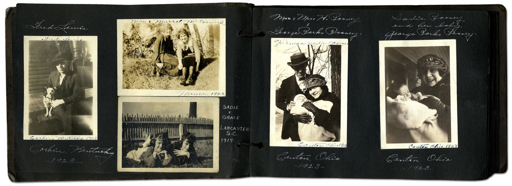
Private archives: Family photo-albums, objects, letters, birth-certificates, legal documents etc.

7151127821_271a21418a_b

Digital images stored on mobile phones, uploaded on social media etc.

Pictures appear on the smartphone photo sharing application Instagram on April 10, 2012 in Paris, one day after Facebook announced a billion-dollar-deal to buy the startup behind Instagram. The free mini-program lets people give classic looks to square photos using "filters" and then share them at Twitter, Facebook or other social networks. AFP PHOTO THOMAS COEX (Photo credit should read THOMAS COEX/AFP/GettyImages)

TASK

Write a 1000 word essay and answer this question: Whose Archive is it Anyway?

To answer this question you need to reflect on Photo-Archive’ talk by Gareth Syvret on Tue 12 June at the Société Jersiaise when we began the Future of St Helier project. Here is a link to Intro to the Photo Archive

Research at least two photographers from the list below in the photo-archive and choose one photograph from each that illustrates the themes of POLITICAL LANDSCAPES and include it in your essay

Read also the text by theorist David Batearchives-networks-and-narratives_low-res, make notes and reference it by incorporating quotes into your essay to widen different perspectives. Comment on quotes used to construct an argument that either support or disapprove your own point of view.

Watch the Youtube clips below and consider the following sub-questions:

How do archives function?
What are their purpose?
How do archives act as repositories of cultural memories of the past?
In what way does photography perform a double role within archives?
Reference some of the artists and photographers mentioned in the David Bate’s text and use as examples.
Imagine how you will look in your archive of adulthood and what type/style of pictures you want them to be?
How will looking at archival material enrich your personal study?
In what way has looking at archives been a resourceful exercise?
What have you learned?

DEADLINE: Publish blog posts by Mon 5 NOV (Monday after H-TERM)

INDEPENDENT STUDY > HOMEWORK
Choose at least one option

Explore public archives and find links to your research and project based around Political Landscapes. Make a blog post

1. Explore your own family/ personal archives over and make a blog post with some of the material and describe how it will inform and develop your Personal Investigation.  Ask parents, grand-parents and other family members to look through photo-albums, letters, boxes etc.

2. Plan at least one photo-shoot and make a set of images that respond to your research above and/ or Personal Investigation.

Extra research/ reading

Dr Gil Pasternak, Senior Research Fellow in the Photographic History Research Centre (De Montfort University, Leicester), will be part of a BBC documentary film exploring what family photographs say about Britain’s post-war social history.

Watch this Youtube clip where Dr Kelly Wilder, Director of Photographic History Research Centre, De Montfort University, Leicester delivers an academic paper,  ‘The View from Everywhere: Objectivity and the Photographic Archive’ at a symposium on Photographic Archives at the Getty Centre in Los Angeles where she talks about the notion of objectivity when it comes to the use of photographic images. Here is a  Review of symposium on Photo_Archives and Objectivity

Here is an essay example from previous A2 student, Rosanna Armstrong

Work by photographers in the collection at the Societe Jersiaise Photographic Archive. Use for further research

Badoux, Ernest
Dunham, Percy

Smith, Albert
Guiton, Emile F
Foot, Francis
William Collie
Laurens, Phillip Morel
Ouless, Clarence P
De Faye, Francis George
Dale, Edwin
Baudoux, Ernest
Martin Wyness
Charles Hugo
Claude Cahun
Martin Parr (Liberation)
Michelle Sank (Insula)
Yury Toroptsov (Fairyland)
Tom Pope ( I am not Tom Pope, You are all Tom Pope)
Jonny Briggs (Unpalatable Truths)
Tanja Deman (Sunken Garden)
Lewis Bush (Trading Zones)
Martin Toft (AtlantusMasterplan, The Seaflower Venture)

Critical image analysis

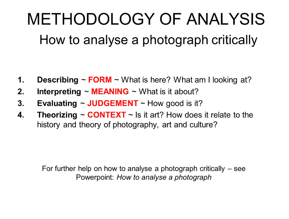
Read through this Powerpoint how to analyse a photograph + photographic theory for more help and guidance. Or use Photo Literacy as a method of analysis: of TECHNICAL>VISUAL>CONTEXTUAL>CONCEPTUAL

Political Landscapes Shoot #3

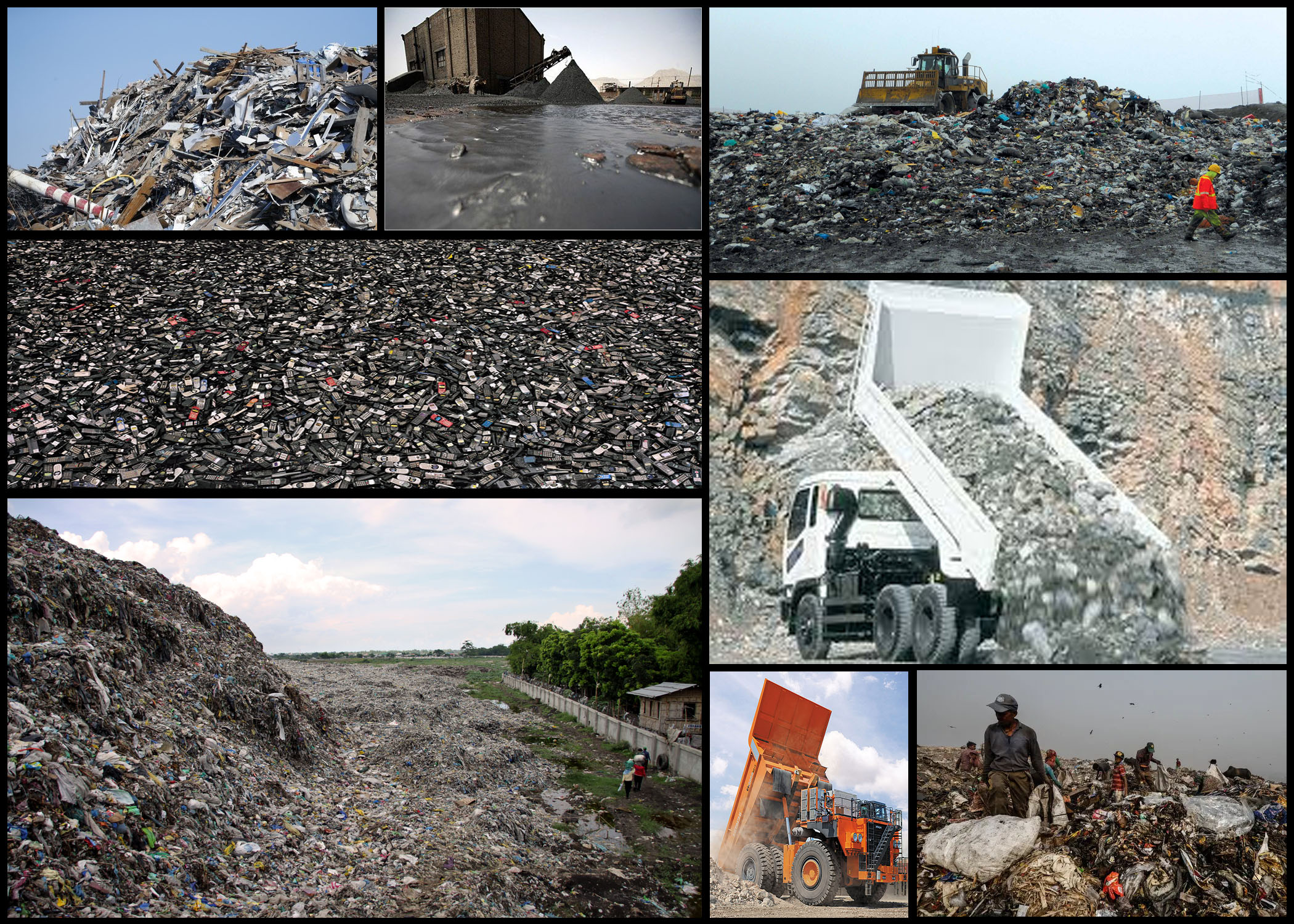
Once I had reviewed the idea of truth within photography, and the camera’s ability to warp perspectives and therefore the influence of opinions regarding what people see, I decided I should head back to the dump and attempt to over-exaggerate the sights present there to influence the viewers. I particularly felt inspired by the idea of exaggerated the truth and warping people’s opinions to support yours, regardless of it being a lie. The photographers I found to be of significant inspiration are Andrea Gursky Robert Capa, by using these photographers style and technique as a way of composing my photos it would allow me to produce imagery that accurately represented my vision regarding consumerism, changing the conventional style of photography I’m used to.

When commencing with the shoot I decided I should look at the objects themselves specifically to provide an insight into the general sighting that can be found in this particular environment. By looking into the materials dumped here I would be able to present how the landscape has been scarred but also this hidden aestheticism hidden beneath all this waste. Here is a mood-board to reflect my various intentions and goals when taking images:

Once I had finished I decided I would create a mind-map to portray and sum up the ideas I have for exploring the area. By doing this it would prevent me from wasting time thinking there and then about what to do, instead allowing me to head into the area with a clear mind focused on what I want to achieve. My ideas can be seen below:

Now that I was satisfied with my ideas I decided it was time to go out and take photographs. The area I wanted particularly to explore was the actual dumping ground of waste material, not the landscape surrounding it like the previous shoot, allowing for a more in-depth look of how out consumerism is handled and sectioned off into varying materials. Here are the results of the shoot: After the shoot was complete I decided to select the ten images I thought best reflected the intentions of the shoot both visually and implicitly. By doing this it would allow me to deduct other images that I thought didn’t portray the aim of the shoot correctly or were poorly taken, here are my choices:
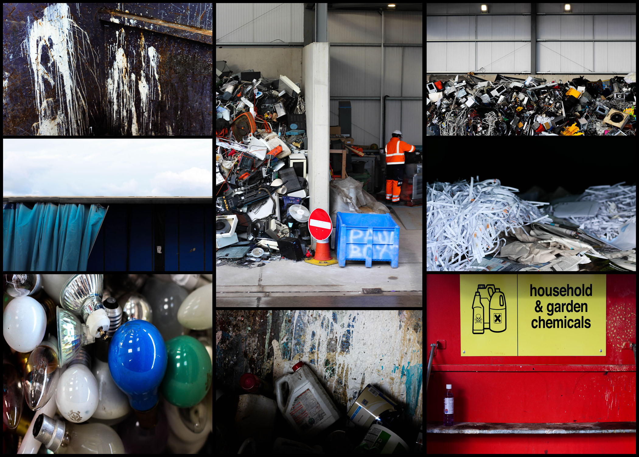
After I had completed organizing and separating all images into a top ten mood-board, I then decided to cut that once again into only five images. By doing this it would allow me to individually analyze each photo, viewing how they related to the topic and their looks as an overall image, here are my selections for the top images for this shoot:  I selected this image because of how I loved the positioning of the paint cans, this look of just the bottles careless thrown into the bin scattering paint everywhere creates an unusual background of random colours. I also really liked how the higher exposure allowed for a dark border across the bottom of the image, creating the impression of the unknown due to there being no evidence for how far these material stretch. The focal point seems to be the center paint can which is clearly defined from the backdrop by the shadows surrounding it producing an abstract effect from the area around it.  What I liked about this image was the clear contrast and separation of rubbish and everyday life working in the area. This contrast seen through the separation of the electronics and a construction worker show evidence of how the area has adapted to suit their life around the product of consumerism. The sheer mass of the electronics almost overflowing out of their section creates the impression of disorganization, where once used they are careless thrown to the side never to be seen again. Looking at this image it is clear how much space is required to hold the waste, especially after seeing how far into the hangar it stretches.  I found that the emptiness of this image was what attracted me to it, alongside the vivid colours which accompany it. The use of a singular chemical bottle on the shelf with the over half of the container sprayed with unknown chemicals provides a messy and unorganized look, where obviously dangerous liquids have been disposed of incorrectly, whilst the bareness of the shelf allowing an insight into how little we attempt to throw away these harmful materials. By the sign being there I feel like it breaks up the otherwise overpowering image which would otherwise be dominated by red.    This image was chosen because of how effective it is at providing evidence towards the sheer mass of things we throw out. Accompanied by the symmetry, the random electronics thrown into a pile can be seen as an almost abstract piece in itself, which various vivid colours breaking through the dull dark grays and blacks. For me this provides a huge insight into how we treat our ever-increasing consumerism, and how once used it’s simply discarded to be lost in the endless heap of other categorized objects. Finally I selected this image because of its contrast between the yellow mirror and the now dirty and broken glass window. I thought that this looked very symbolic, with the new mirror that had just been thrown away providing a clear contrast between that of an old broken window, that had obviously been thrown out a while ago and had deteriorated to an almost unrecognizable image of its former use. This contrast is defined through the use of the shadow which separates each piece of glass, stopping the other into blending with it and becoming eye sore.

Once I had analyzed each image I decided it was time to decide on which photo best represented the entire shoot as a whole. Here is my decision:

Final Image: The reason I selected this image as my overall best photo for the shoot is because of how I think it best represents our consumerism as a whole. By presenting the sheer size of our waste I found it to be particularly impacting due to there being no structure into the actual organization of anything placed into the area. I also really like the clear contrast between the surrounding area and the waste itself, seen through the side of a building which the rubbish is stacked against, whilst revealing the extent of the wastes size. As a result I found this photo reflected my intention well due to it giving awareness around how much we throw out and how our consumerism leads to this build up of random materials clustered into one pile.

FERNANDO MASELLI

FERNANDO MASELLI – Artist Reference

The photographic work of Fernando Maselli explores different aspects of the formalism, deepening the aesthetic and concept as core values. Born in Buenos Aires in 1978, Fernando Maselli studied Fine Arts and later moved to Madrid. His work has been exhibited in many museums and festivals like University of Navarra Museum.

Through his art projects he explores different aspects of formalism, deepening on the concept and aesthetics as essential values. In his latest work there is a  specific interest in the relationship between man and unspoiled nature and the role it plays in the conception of ideas such as religiosity or knowledge. The main focus of his work revolves around  the concept of the Sublime, the restrained fear facing the beauty of steep landscapes and the majesty linked to divinity.

There are many key features to the work of Maselli with such elements like the vastness, the darkness and the hugeness but especially an attribute that Burke called artificial infinite: an element that is repeated many times in a constant and uninterrupted configuration generates in the viewer a sense of infinity. To get this effect, Maselli spends several days in the mountains, taking pictures and later, in his studio, he rebuilds those parts into a new landscape through photo montage. 

“I face my job as a solo journey into vastness with constant references to classical painting, literature, philosophy and aesthetics. My ultimate intention is to put the viewer in front of a sublime and moving show that  makes him wonder about consciousness, the universe, beliefs and our own origin.”

Analysis

The generic conventions within  Maselli’s work is the untouched sublime environment . The photographer clearly has a positive view on the earth and is going on specific expeditions to portray the greatness of the world. However it could be interpreted that he has a negative view on the environment because the locations he goes to would not usually be seen by people without purpose and these locations are rare. Therefore he is trying to show society the difference between what they are seeing in everyday life compared to what is out there. This will give the viewer a realization of how they are treating the environment in their areas. I believe the photographers influence is the rapid urbanization around the world and he has responded to this by showing the beautiful nature that we are destroying with this urbanization.

I am influenced by the use of isolation involved within this image and the calmness/tranquil atmosphere. This could be an indication that without humans present, we could have this stunning imagery surrounding us everywhere. The tonal range is aesthetically pleasing to help us focus in on different aspects to the photo. The composition is well composed as the tall mountains on either side create a leading line through the middle of the photo to direct us to the lighter tones at the back of the photo. The bottom  parts of the photo appear to be dark and rather mysterious which may be a reference to hell being down there and a dark place where as the higher parts of the photo are bright which in contrast could link to heaven being up there and being a positive place. The textures within the photo as a whole are interesting with a contrast of rough textures within the rocks and the soft calm textures within the mist.

Breaking The Rules

In photography there are endless rules we are taught to follow to create successful images. These rules could be to do with technical, compositional or oven social context. Posing subjects, manipulating images and becoming over involved in the stories is often seen as wrong or unprofessional in documentary photography due to how the photos are used to inform people of real life events. in a creative context these photos have been manipulated to enhance their existing feature of even to make them into further experiments of art.

I am going to choose one of the following rules to research in detail an develop it by creating my own work which brakes the rule.

The Rule of Objectivity

The Rule of Audience

The Rule of Manipulation

The Rule of Reality

The Rule of Technicality

The Rule of Ownership

The Rule of Ownership

The Rule of the Camera

The Rule of Rule Breaking

I have chosen to look into the rule of ownership because in the age of the internet and mass media nothing is ever completely original. photographs are now taken for granted and are not as limited as they used to be meaning people can take as many photos a they want with their smart phones and share them all over the world. But once they are shared, who owns them? Around 1.8 billion digital images are uploaded to the internet every day, all for a variety of different purposes, so it is difficult to produce new, original and useful work. There is so much already out there which could be used why do we feel a need to constantly create new things. The solution could be in the change of creative attitude of the old fashioned idea of ownership and copyright.

Copyright is a legal term used to describe  the rights creators have over their work, it can include books, music, photography, paintings, copy, sculptures, logos, and many more. A copyright for original work lasts the lifetime of the artist and 70 years after their death. If someone copies a piece of copyrighted work and the original owner feel that they are making profit from their design it can become legal.

I am particularly interested in the ownership of the press (media convergence) which is where a concentrated group of people own and control the mass media. Although the news is meant to be fairly unbiased, we see it as a truth and fact distributer in society however there are many things that are missed and adapted. The Government is ultimately in controls of the media meaning they have the power to select and share what they want. newspapers can manipulate stories and bring them out of context to suit their own political views for example (daily mail very strong opinions)

I want to break the rule of ownership by reusing and manipulating existing images. I will find the images in newspapers, magazine, personal achieves and on the internet. my cutting out

this also links back to the overall theme of political landscapes because newspapers are such a big distributer of . information and are very political in their views on current topics i also want to take inspiration from a variety of places.


Political Landscapes – Andreas Gursky

Who is he?

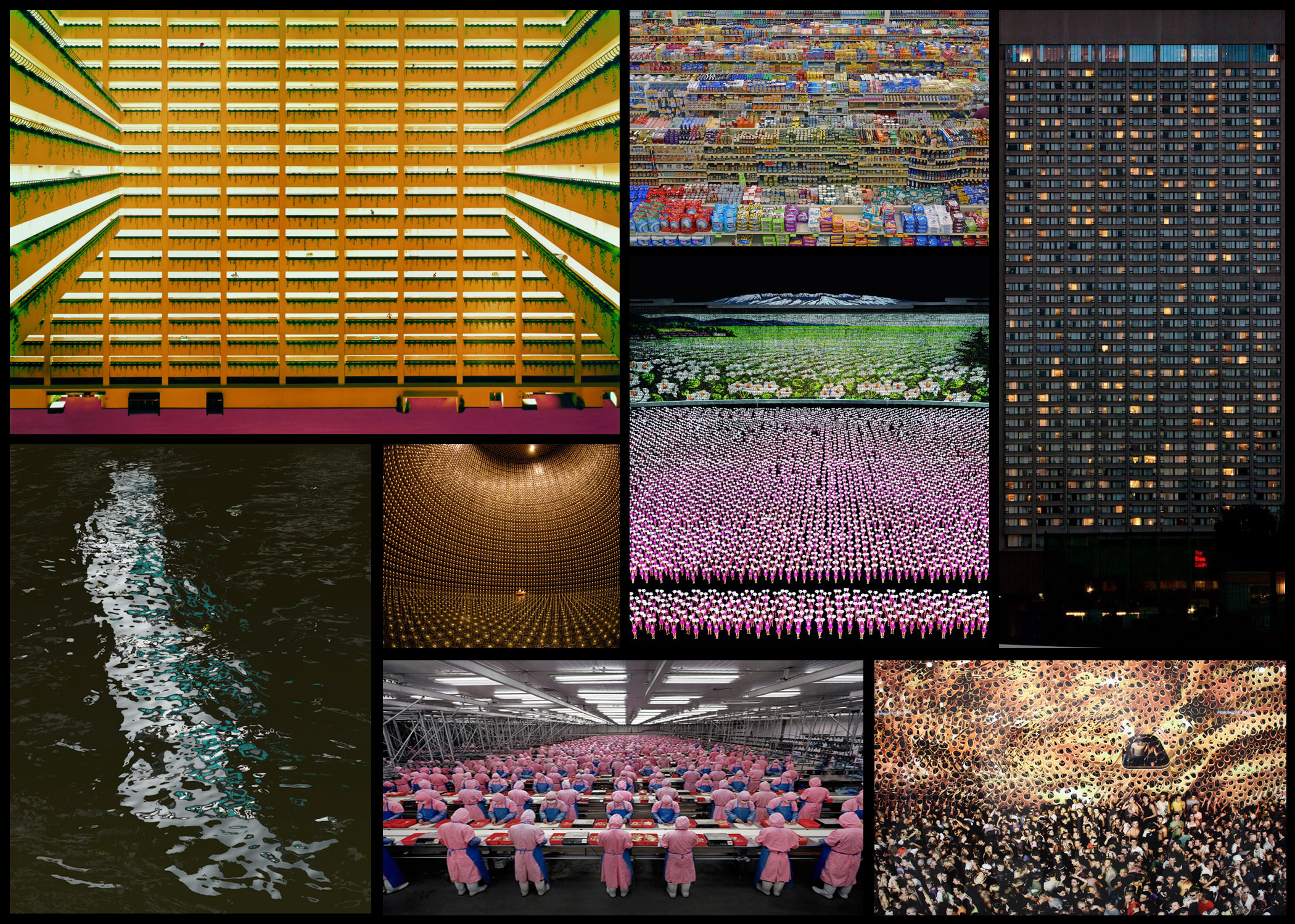
Andreas Gursky was born January 15th, 1955, Leipzig, East Germany. The son of a commercial photographer, Gursky grew up around photography, starting to photograph things with a black and white Leica camera. He soon started to go against the trend and began working with coloured imagery and tripods. Gursky started to focus more and more on detail in the composition of his photos, the style he is now most celebrated for. By 1980 Gursky was producing photographs so large that they could only be printed on commercial boards, leading him to print of the largest photo paper ever, which he then combined single sheets with to make even larger. From here he became best known for his monumental digitally manipulated photos that examined consumer culture and the busyness of contemporary life, using his unique composition strategies to result in dramatic images that walk the line between representation and abstraction.

Gursky soon became fundamental in redefining photography for a new generation of photographers. Using digital image manipulation forcing into debate a new version of truth within photography, becoming apparent that the truth manipulating abilities of the camera could distort reality and erode the viewer’s trust. This pushed people to consider the question of truth, with this new digital photography becoming more and more relevant. Some of his work can be seen below:Once I had reviewed a few of his works I decided to go on and analyse one of his photos, by doing this it would allow me to understand what made his photography so effective. Whilst giving me an insight into the techniques and focuses of the style of photography he uses, and the thought process behind it. The image I have chosen is called ‘99 Cent’, taken 1999 of a local convenience store: Visual: Visually this image is extremely aesthetic, with the broad variety of colours present in the shop providing a sea of rainbows to be looked upon by the viewer. This is stopped from being too consistent and overpowering through the use of obvious shelves which stops the packaging from merging with the next, the white poles which pop up occasionally also add to this through their symmetrical layout across the shop, providing clear coordination in the piece and an unseen structure in the shops structure. I love how the packaging of the food is countered by the texture of the ceiling, which seems to almost reflect the colours of the below, fading into the distance as if its never ending.
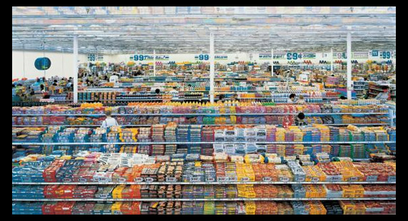
Technical: When looking over the photo, I notice that the image itself uses a relatively higher exposure than usual due to shadows and black areas not being to noticeable and through the faded effect of the variety of colours such as red and blue. However a low saturation could have been used, reducing the colour of the products, stopping them from being too overpowering and instead becoming aesthetic. Gursky has purposely angled the camera so that he picks up the symmetry of the entire shop, with the poles and heads being reference to how he has done so. Finally the inclusion of the wall on the left breaks up the shop from becoming purely focused on products, presenting consumer life in the picture as well.

Conceptual: The image itself is meant to be a spectacle of consumerism appearing as organised, rigorous and formal. However the photo actual is hyper real, where yes its rooted in reality, however there is no physical space like it. By portraying such heightened constructions of our existence from dollar stores to football fields and sprawling cities, Gursky’s photography acts as a symbol of contemporary life. Seen through the mirrored food flattened and the iconic work, over exaggerating the environment of the surrounding environment.

Photography and Truth

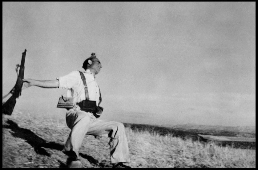
For this post I will be analyzing how a photo of my choice by a photographer can be interpreted and the story behind it that may be carried. The photographer I have chosen is called Robert Capa, a Hungarian war photographer, considered one of the greatest in history, here I have selected his famous ‘Death of a Loyalist Soldier’, 1936, which depicts the instant death that this loyalist has been captured through in mid shot. Here I will be looking at four factors that create such an impact when reviewing the picture; contextual, conceptual, visual and technical.Contextual: Taken during the beginning of the Spanish Civil War, showing the moment of a bullet’s impact on a loyalist soldier, Capa’s photograph has become the emblem for the medium’s unrivaled capacity to depict sudden death. The style of photojournalism became the mark that defined Capa’s work from there on, joining the company Magnum Photos in the late 1940s. The photo itself appear to capture a Republican soldier at the moment of death, the soldier is seen collapsing backward after being picked off from a distance by a sniper. The pictured solider is dressed in civilian clothing but wears a cartridge belt, and following its publication was acclaimed as one of the greatest photos ever taken. However since the 1970s there has been significant doubts about its authenticity due to its location, the identity of its subjects, and the discovery of staged photographs taken at the same time and place.

Conceptual: The idea behind the image was to capture one of the most shocking moments in war, death. Although it was supposedly an accident, the image itself was published because of its insight into the impact of war, and how one moment can lead to another resulting in tragedy. When taken the photographer wanted to capture life on the front line, and life between skirmishes, attempting to depict life in such an isolated region of the country.

Technical: The image itself uses a higher shutter speed to capture the motion of the solider without blurring either the subject and landscape, by doing this the result is crisper without any eye-sores created by faults. Within this image the contrast seems to have been lowered so that only the more dominantly dark objects are defined (such as shadows, gun, hair and dark grass), this leaves the rest of the photo as more bland and faded due to it only consisting of different shades of white, whilst creating a stark outline for the main focus of the picture, the soldier. The black and white result of the camera used produces a more sinister tone surrounding his death due to it being devoid of any other colours, this to me adds context to the image as it reduces your perspective on the story being portrayed, instead giving only the option of two viewpoints.

Visual: Visually the pieces incorporates an executioner, stark backdrop and dramatic nocturnal lighting. By doing so, this for the viewer zeroes on the instantaneous death received by the soldier which will be forever anticipated in the photograph. The image itself seems to resemble an equally famous picture of the civil war in Spain named “The Third of May, 1808” by Francisco Goya in 1814, this provides a narrative element for Capa’s image due to there being a story behind the position and landscape it was taken in. Because of the piece perfectly evokes both discrete moment and an epoch, where one encounters a distillation of the Fascist violence, and the brutally extinguished Republican sense of hope for a new, free egalitarian society, ultimately defining the Spanish Civil War.

GUILLAUME BRESSION & CARLOS AYESTA

GUILLAUME BRESSION & CARLOS AYESTA – Artist Reference

Since the tsunami and the nuclear catastrophe of March 2011, Carlos Ayesta and Guillaume Bression have made regular visits to the region of Fukushima, Japan, and especially to the “no man’s land” around the stricken power station. Achieved from their numerous visits is a six series of strongly aesthetic photographs which mix posed situations with a documentary approach. Their photos stimulate thought at the consequences of a nuclear accident on such a scale which connect with the audience on an emotional level.

Carlos Ayesta and Guillaume Bression have been working together since 2009. Their work has been exhibited in many festivals and institutions. Through their photographic approach, they have the ambition to show social issues, but always with a contemporary questioning of the image, thanks to the staging in the broad sense, they wish to show other facets of real life.

To me, their work has a strong purpose to show the world how we as humans are destroying our earth. It focuses on the destruction of buildings and how demonstrates how once used facilities have been left to decay and rot. I beleive their images are aesthetically pleasing however the actual concepts displayed are visually disturbing as it they create a realization of how our earth is in decline.

Analysis

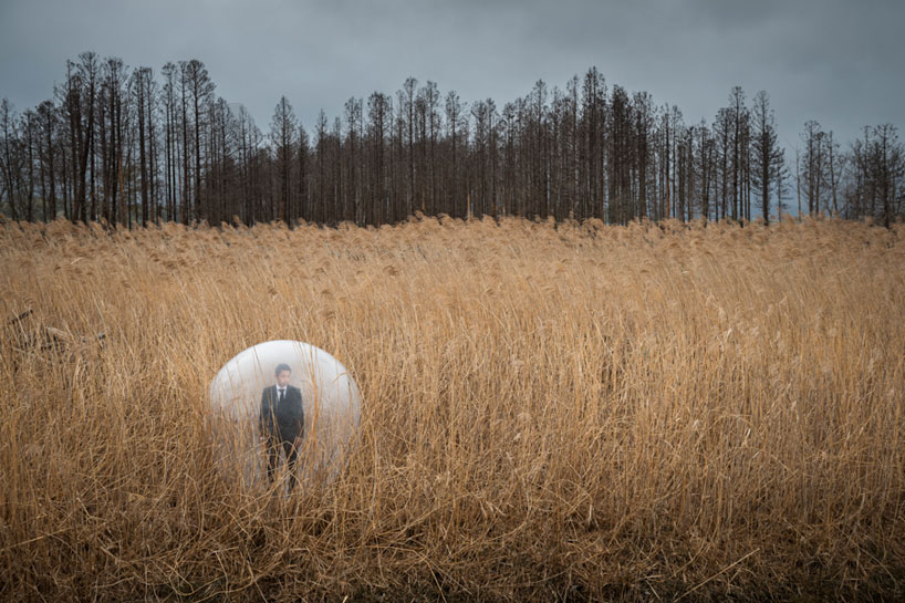
Responding to the devastating earthquake, tsunami, and nuclear disaster at the fukushima daiichi power plant which contaminated parts of japan in 2011, the french photographers have photographed a series that interprets the tragedy from the perspective of both the inhabitants and landscape. By traveling to these areas, the artists were able to react to the landscape, incorporating surreal dramatizations into the environment through the use of transparent props like bubbles and films. These clear elements symbolize the idea of contamination, acknowledging a problem currently facing residents of these devastated areas: what is safe and what is still polluted? the limits are increasingly more blurry, instilling a widespread sense of fear and uncertainty.

Personally, I believe this photo is visually pleasing due to the composition, contrasting colors and lighting which directs the viewer across the whole photo. The composition meets the rule of thirds which makes the photo easy to view and understand. The main focal point of the photo is the isolated man within the bubble and he is positioned on the bottom left hand point when talking about the rule of thirds. In addition, the photograph is split into thirds with the fields taking up two thirds of the photograph and the sky and trees taking up the final third. This rule helps draw the viewer’s eye into the composition, instead of just glancing at the center.

I believe the fields act as a leading line towards the deeper parts of the photo with the forest. The forest consists of very tall trees which illuminate the isolation of the small man towards the front of the photo. The trees could be seen as a metaphor looking down on the man, intimidating him which is a reference to the harsh climate there also. The bubble is effective in  conveying the conceptual ideas behind the photograph. This is because it is seen to be protecting him from the pollution and radiation that is active in that area.