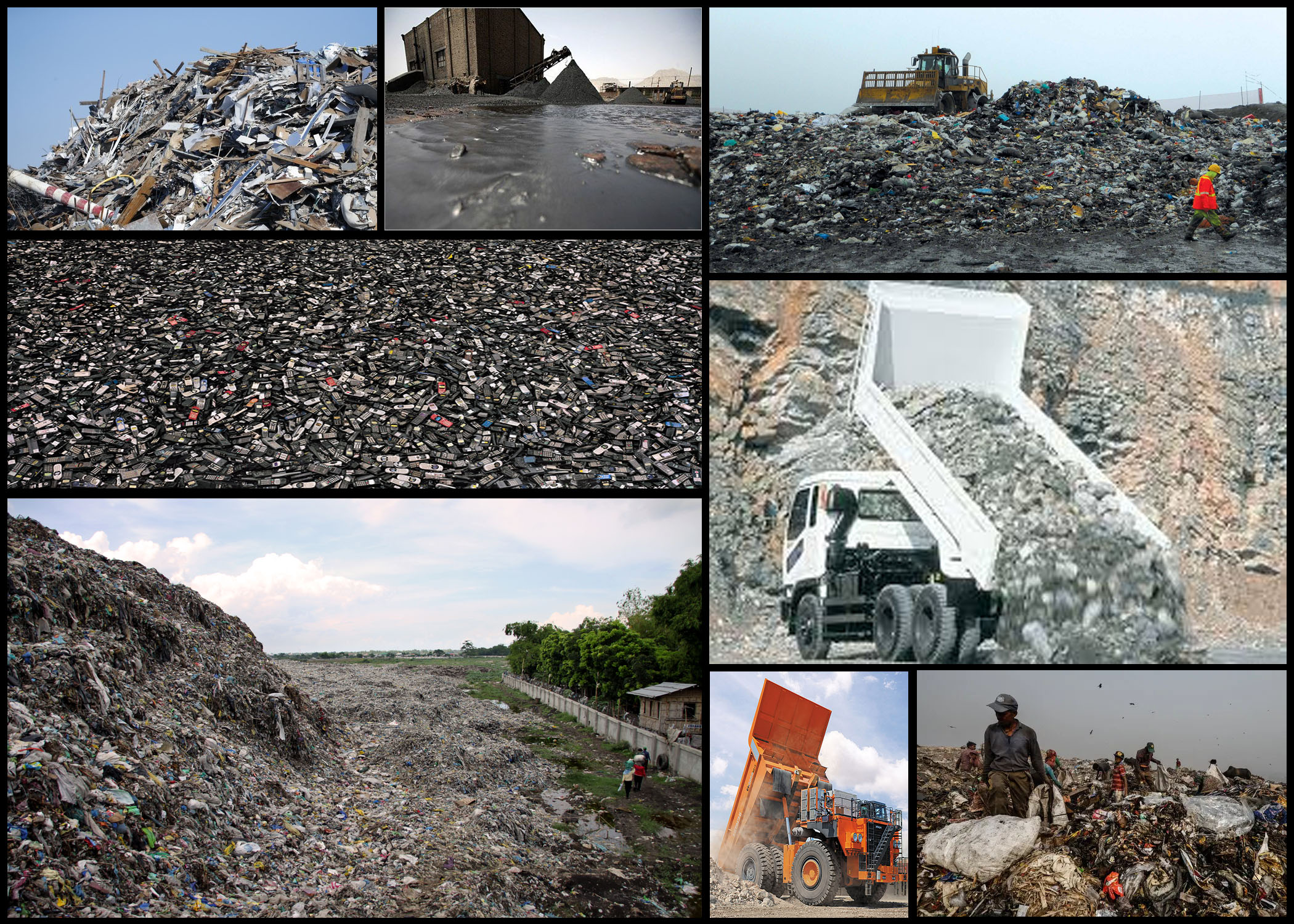
Once I had reviewed the idea of truth within photography, and the camera’s ability to warp perspectives and therefore the influence of opinions regarding what people see, I decided I should head back to the dump and attempt to over-exaggerate the sights present there to influence the viewers. I particularly felt inspired by the idea of exaggerated the truth and warping people’s opinions to support yours, regardless of it being a lie. The photographers I found to be of significant inspiration are Andrea Gursky Robert Capa, by using these photographers style and technique as a way of composing my photos it would allow me to produce imagery that accurately represented my vision regarding consumerism, changing the conventional style of photography I’m used to.
When commencing with the shoot I decided I should look at the objects themselves specifically to provide an insight into the general sighting that can be found in this particular environment. By looking into the materials dumped here I would be able to present how the landscape has been scarred but also this hidden aestheticism hidden beneath all this waste. Here is a mood-board to reflect my various intentions and goals when taking images:
Once I had finished I decided I would create a mind-map to portray and sum up the ideas I have for exploring the area. By doing this it would prevent me from wasting time thinking there and then about what to do, instead allowing me to head into the area with a clear mind focused on what I want to achieve. My ideas can be seen below:
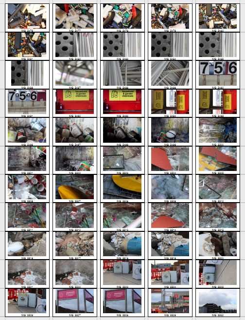
Now that I was satisfied with my ideas I decided it was time to go out and take photographs. The area I wanted particularly to explore was the actual dumping ground of waste material, not the landscape surrounding it like the previous shoot, allowing for a more in-depth look of how out consumerism is handled and sectioned off into varying materials. Here are the results of the shoot:


 After the shoot was complete I decided to select the ten images I thought best reflected the intentions of the shoot both visually and implicitly. By doing this it would allow me to deduct other images that I thought didn’t portray the aim of the shoot correctly or were poorly taken, here are my choices:
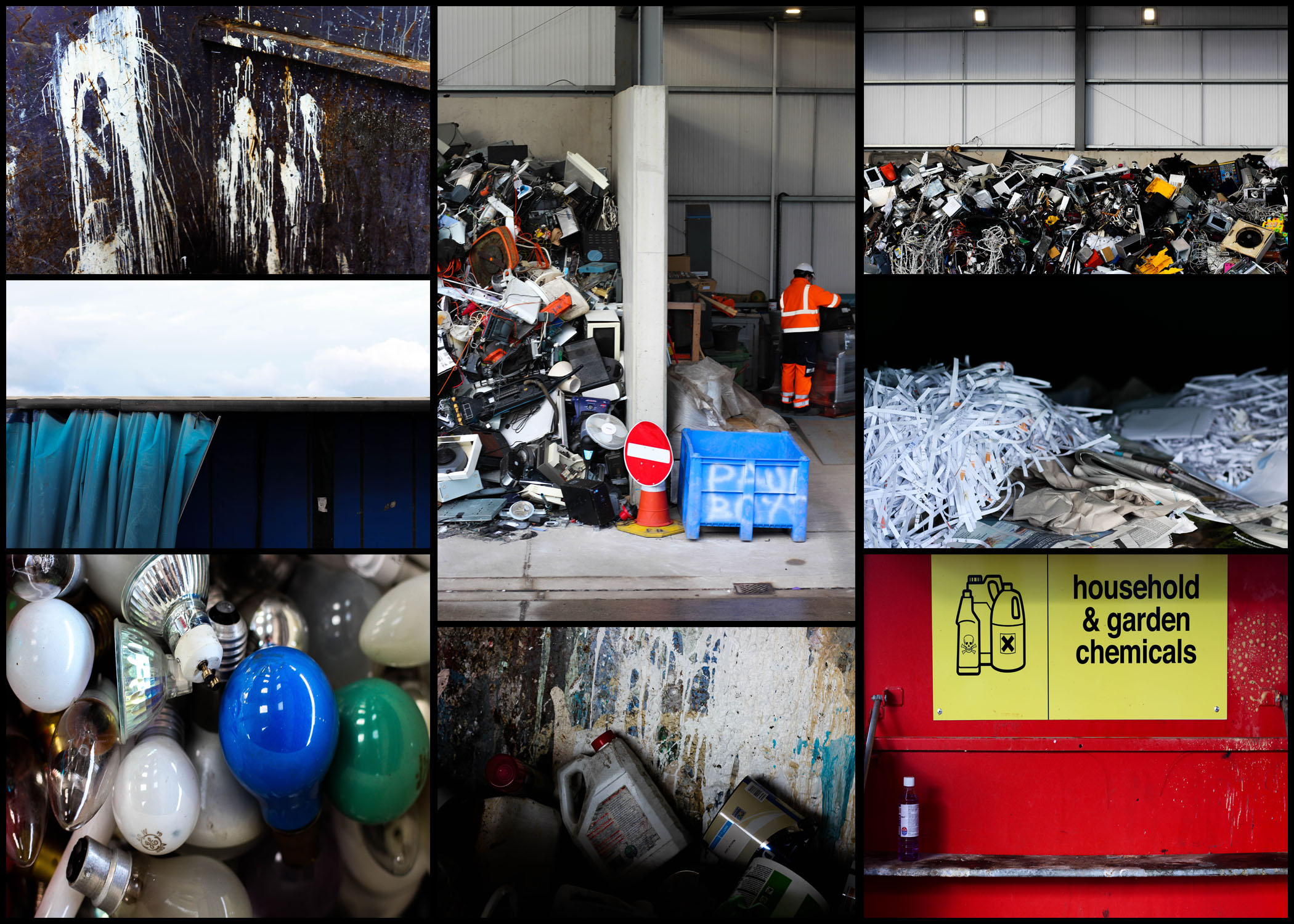
After I had completed organizing and separating all images into a top ten mood-board, I then decided to cut that once again into only five images. By doing this it would allow me to individually analyze each photo, viewing how they related to the topic and their looks as an overall image, here are my selections for the top images for this shoot:  I selected this image because of how I loved the positioning of the paint cans, this look of just the bottles careless thrown into the bin scattering paint everywhere creates an unusual background of random colours. I also really liked how the higher exposure allowed for a dark border across the bottom of the image, creating the impression of the unknown due to there being no evidence for how far these material stretch. The focal point seems to be the center paint can which is clearly defined from the backdrop by the shadows surrounding it producing an abstract effect from the area around it.
  What I liked about this image was the clear contrast and separation of rubbish and everyday life working in the area. This contrast seen through the separation of the electronics and a construction worker show evidence of how the area has adapted to suit their life around the product of consumerism. The sheer mass of the electronics almost overflowing out of their section creates the impression of disorganization, where once used they are careless thrown to the side never to be seen again. Looking at this image it is clear how much space is required to hold the waste, especially after seeing how far into the hangar it stretches.
  I found that the emptiness of this image was what attracted me to it, alongside the vivid colours which accompany it. The use of a singular chemical bottle on the shelf with the over half of the container sprayed with unknown chemicals provides a messy and unorganized look, where obviously dangerous liquids have been disposed of incorrectly, whilst the bareness of the shelf allowing an insight into how little we attempt to throw away these harmful materials. By the sign being there I feel like it breaks up the otherwise overpowering image which would otherwise be dominated by red.
  This image was chosen because of how effective it is at providing evidence towards the sheer mass of things we throw out. Accompanied by the symmetry, the random electronics thrown into a pile can be seen as an almost abstract piece in itself, which various vivid colours breaking through the dull dark grays and blacks. For me this provides a huge insight into how we treat our ever-increasing consumerism, and how once used it’s simply discarded to be lost in the endless heap of other categorized objects.
  Finally I selected this image because of its contrast between the yellow mirror and the now dirty and broken glass window. I thought that this looked very symbolic, with the new mirror that had just been thrown away providing a clear contrast between that of an old broken window, that had obviously been thrown out a while ago and had deteriorated to an almost unrecognizable image of its former use. This contrast is defined through the use of the shadow which separates each piece of glass, stopping the other into blending with it and becoming eye sore.
Once I had analyzed each image I decided it was time to decide on which photo best represented the entire shoot as a whole. Here is my decision:
Final Image:  The reason I selected this image as my overall best photo for the shoot is because of how I think it best represents our consumerism as a whole. By presenting the sheer size of our waste I found it to be particularly impacting due to there being no structure into the actual organization of anything placed into the area. I also really like the clear contrast between the surrounding area and the waste itself, seen through the side of a building which the rubbish is stacked against, whilst revealing the extent of the wastes size. As a result I found this photo reflected my intention well due to it giving awareness around how much we throw out and how our consumerism leads to this build up of random materials clustered into one pile.


