Political Landscapes – Edward Burtynsky

Who is Edward Burtynsky?

Born 1955, Ontario after his parents migrated to Canada, Burtynsky’s interest for photography came about after a widow sold her camera to his father, from here both of them practiced making monochrome photo prints. They later opened a small portrait photography business with his sister during the 1970s, where he soon started working at a printing press to then joining Niagara College to have a graphic arts diploma, with later in life enrolling into the Ryerson Polytechnical Institute in 1982.  He later started to use digital cameras with higher resolutions in 2007.

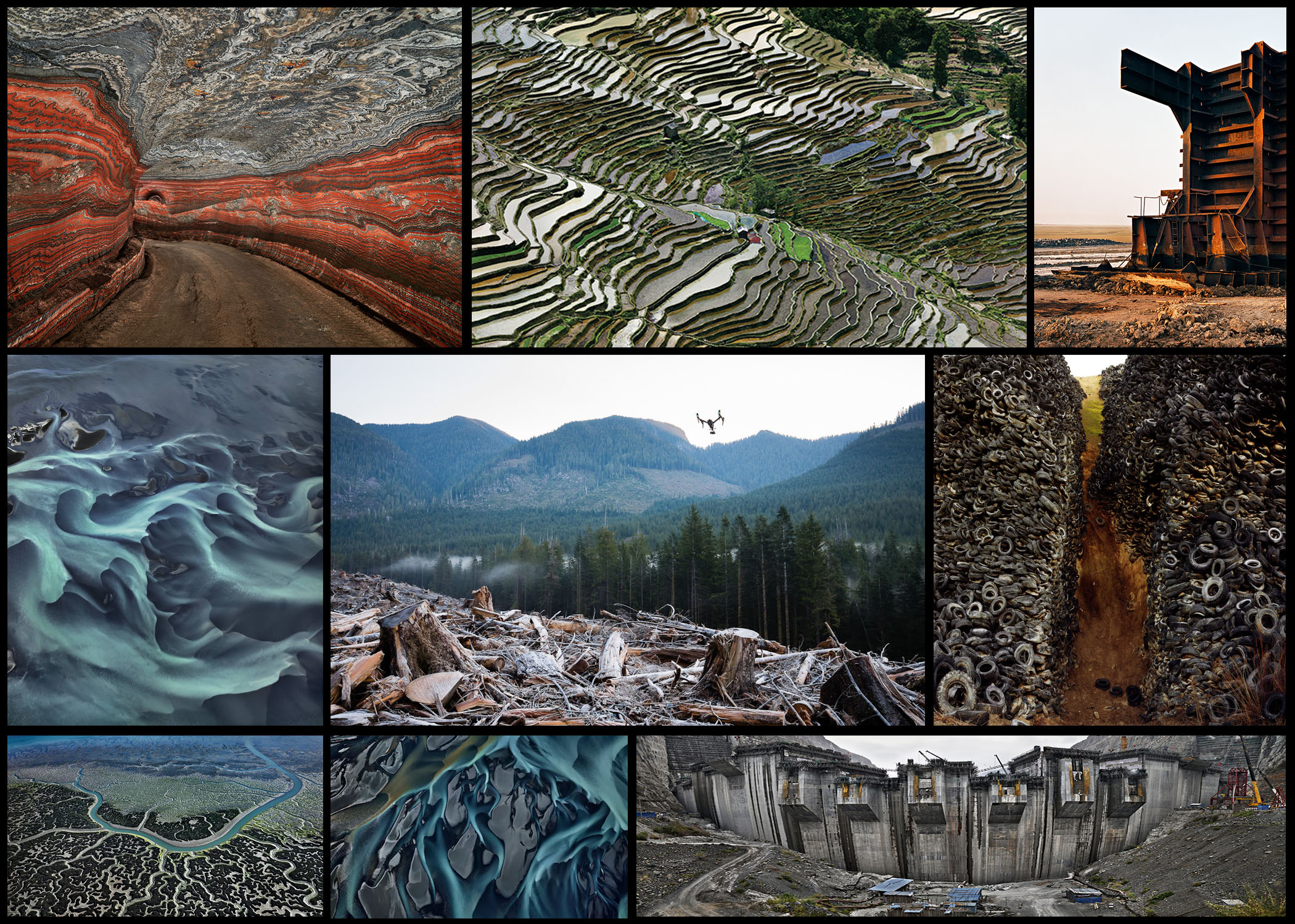
Most of Burtynsky’s photography are landscape views that have been distorted by piles of scrap, quarries and tailing mines, presenting nature as altered by the industries around them. Most of his trips were to China, photographic emerging industry settings such as the Three Gorges Dam, the largest engineering project in the world. Most of his influence comes from the works of Edward Weston, Carleton Watkins, Eadweard Muybridge and Ansel Adams, whose work he continual saw at the local Metropolitan Museum of Art. Most of Burtynsky’s work has been shot using a field camera with a large format, using an aerial approach mostly in his work to be able to gain a vantage point.

Following these Burtynsky produced some photo series named: Makrana Quarries in India, 2000; Iberia Quarries in Spain, 2006; Ship-breaking in Bangladesh, 2000 to 2001; Urban Mines: Metal Recycling, Canada Tire Piles, USA from 1997 to 1999; Australian Mines in West Australia. However in 1985 Burtynsky established Toronto Image Works, a rental facility for a darkroom and equipment, with a year later turning it into a gallery opened within the space that displays the work of international and local artists. Here is a mood board of various images taken by him that I thought to be of particular influence:After reviewing some of his works I decided to analyse a photography that I thought summed up his style of work the best. To do this I would be looking at three specific topics: visual aspects, technical aspects and conceptual knowledge. These would allow me to incorporate his working style into my work which I could use as influence. The image I chose was “Densified Scrap Metal” (1997):
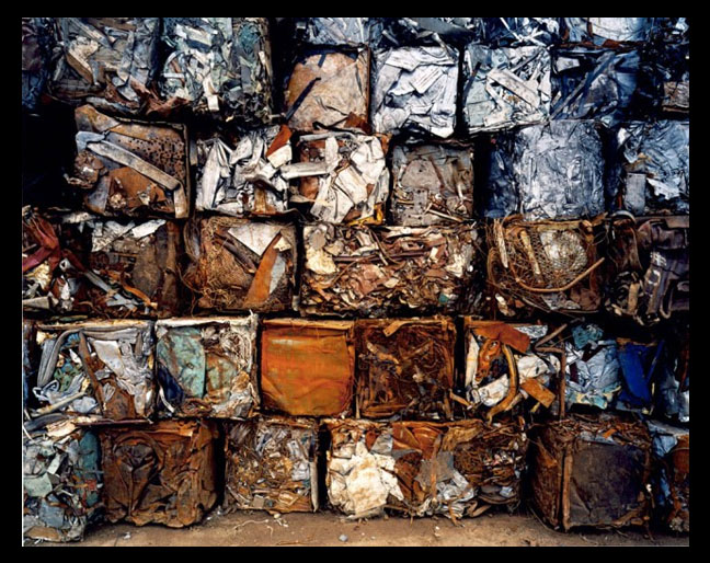
Technical: The image itself uses bold colours in a symmetrical pattern as its main means of putting the message of consumerism across. This is done through the use a vignette which boxes in the image to highlight the issue of the image present, whilst also being complimented by a higher saturation which brings out the oranges and silvers which make up most of the cubes. Because of this the majority of the image is more or less stock, with most of the colours and composition being left as it was taken, meaning not much work was done to it, with the only adjustments being the vignette and saturation. The image is more or less taken with a high resolution camera in order to capture the image to the best detail possible.

Visual: Visually the picture uses man-made symmetry as the main form of aestheticism. The use of creating a high definition image creates what would otherwise be ugly beautiful, due to the highlights and shade which accompany it, this present a new perspective towards the landscape with many seeing it as art instead of a scar. Symmetry is hugely present as the floor acts as a way of neutralization for any blank space which could potentially ruin the image and stopping the pattern from becoming too overpowering, preventing the photo from just consisting of scrap metal.

Conceptual: This photo was taken to raise awareness towards the impacts and result of consumerism, looking into how we respond to this overwhelming waste that we produce on a weekly scale. The image itself looks into the aestheticism but also devastation we cause towards our natural environments, attempting to shed light onto how we deal with our consumerism and how we can tackle the increase of waste.

2nd photoshoot on reality

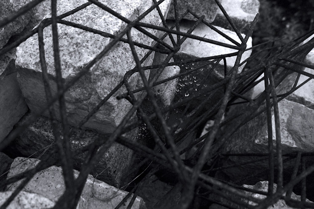
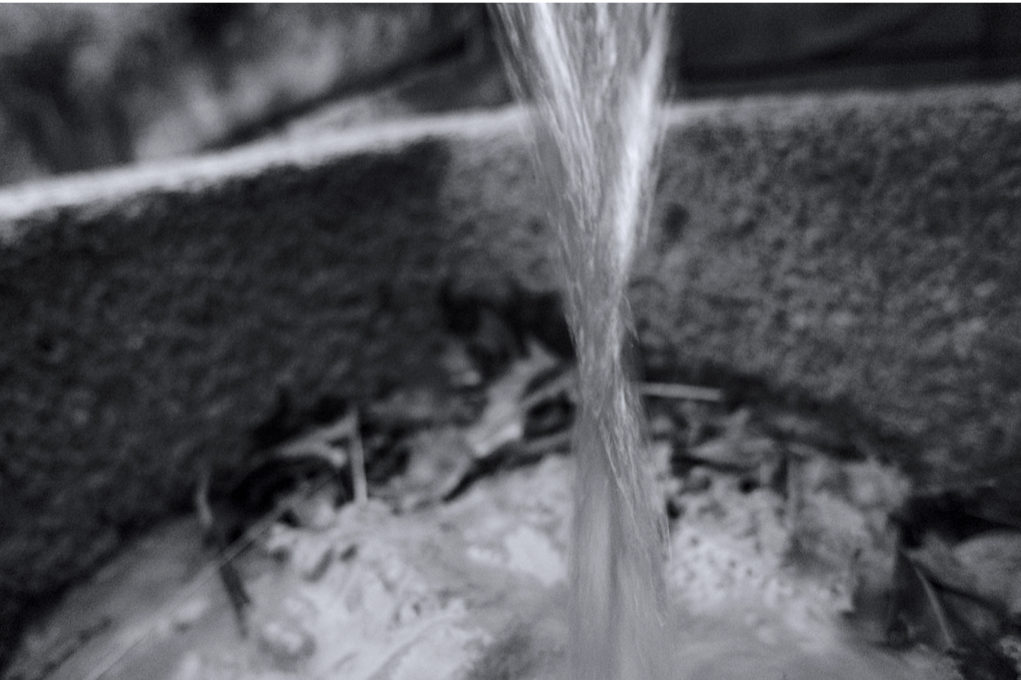
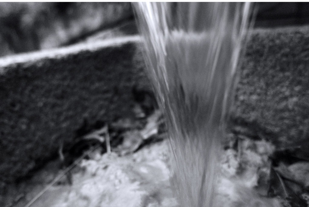
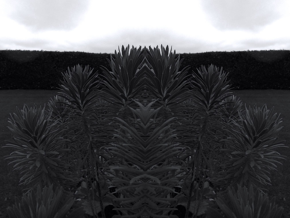
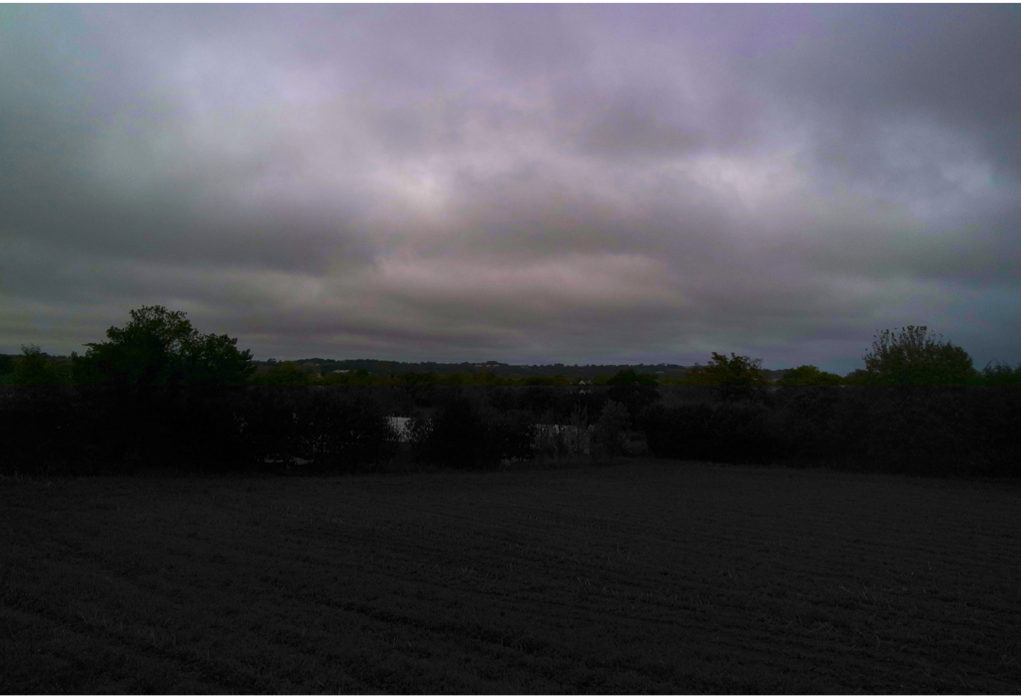
As said in my previous post I wanted to capture a almost less sentimental type of reality and include my next three main interests of, circumstances,dependency and chance. I wanted to use these conceptual ideas to relate to both my previously project on family and then also have a stronger level of signification to that of political landscape. My main original aims of this shoot was to show how to capture the movement of water as this contains many elements of the three words I am focusing on. I wanted to communicate many different angles and places which I would normally not venture. I decided it would be interesting to flip images and add lines into the images to add contextual methods into it.

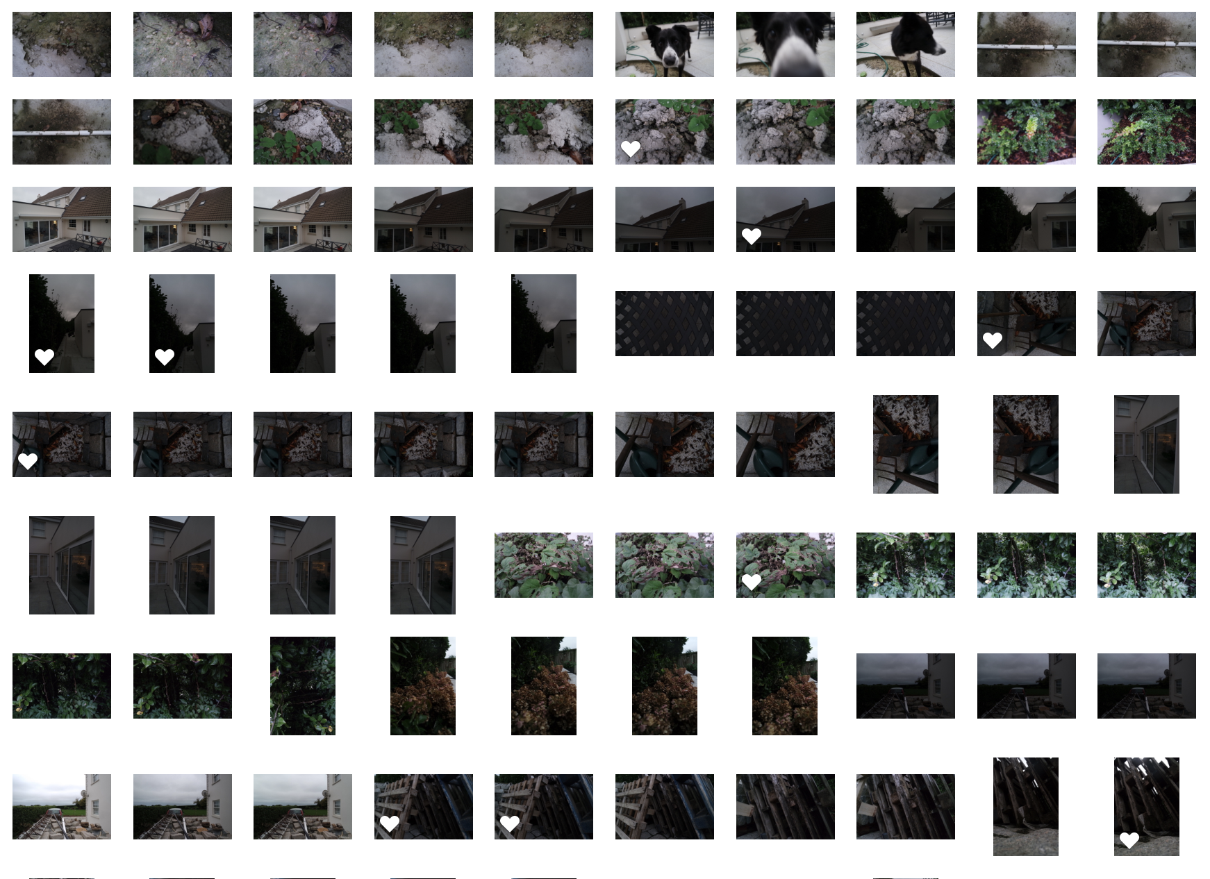
shoot:

edits:

I wanted to add in these small white dots as this is what I have done previously experimented with in my political landscape alternate conceptual editing. 

within here I found a really interesting old structure of bars in a highly interesting composition,Additonally I found a water covered web of water which I thought created an area of interest.

within these water shots I wanted to capture the movement of the water itself, and sometimes even repeatedly showing the drop of water repeatedly dropping. I decided to edit these images into black and white as I did not want the colour to be a distraction of the composition of the images itself. 

This is my third image where I mirrored and flipped the image itself, I wanted to do this as I think the final outcome it produces has an interest of simplicity yet intrigue. I wanted to capture this image originally as I though the suture of the plant was so repetitive and structurally well formed, and how this contrasted against the background,and the light tonal sky. 

anylsis:Overall this shoot was less so capturing a direct narrative and more about trying to communicate ideas of form and how to edit in interesting mannerisms to capture the conceptual of reality.

with this project I had two main artist inspirations of…one fo which was very family and pain orientated,it was quite philosophical in the questioning of no on knows what reality really is as we all have a different concept and view of our own lives and own realities. However the second artists wanted to create images which she wanted to happen or was surprised that was happening somewhere in the world in the modern 20th century, She purpose how large companies would demonstrate a country as being modern and forward thinking and ignoring the true reality of factors such as poverty and starvation.  Because of these two clear divisions of ideas of family and not knowing the reality of what people are feeling and they way in which trauma can effect you, to how chance and reality can be predicted.Although I wanted to add my won these into both shoot so using archival images from my past family and then forming reality,around my house and capturing the dependency and effector different relates and possibly adding in themes if conceptual manipulation. from this I decided to brainstorm and experiment with what I think breaking reality means to me.I then got the three main ideas of, dependancy, possibility and chance. I think my first shoot was successful, I think I successful recreated the structure of the artists form and also conceptually edited my photos and to have and area of interest wihtin them. My second shoot was much more conceptual wihtin the thought of the structure and an essence of abstract structure I order to strip away any sense of reality.

Breaking The Rules – Manipulation – Alice Wielinga

Breaking The Rules / Alice Wielinga

Photographer Lewis Bush has put together an article explaining how breaking the rules of photography can be a great way of working as a photographer. The article covers how breaking the rules of photography can be a way of finding new ideas and exploring areas of the creative subject which you would not otherwise, if you stuck to the rules. He goes on to talk about how the best ideas aren’t clearly visible and in order to find these new and innovative creative ideas, photographers must break the rules and take things to the next level. The article covers 8 rules within photography that can be broken in order to achieve this, these 8 rules are the rules of: Objectivity, Audience, Manipulation, Reality, Technicality, Ownership, Camera and The rule of rule breaking. Of these 8 rules I have decided that I will like to explore the rule of manipulation.

Here is a link to the article from Lewis Bush…

http://www.huckmagazine.com/art-and-culture/photography-2/eight-photography-rules-worth-breaking/

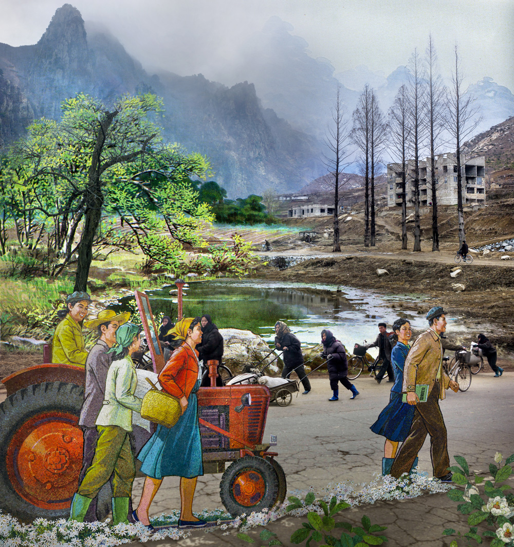
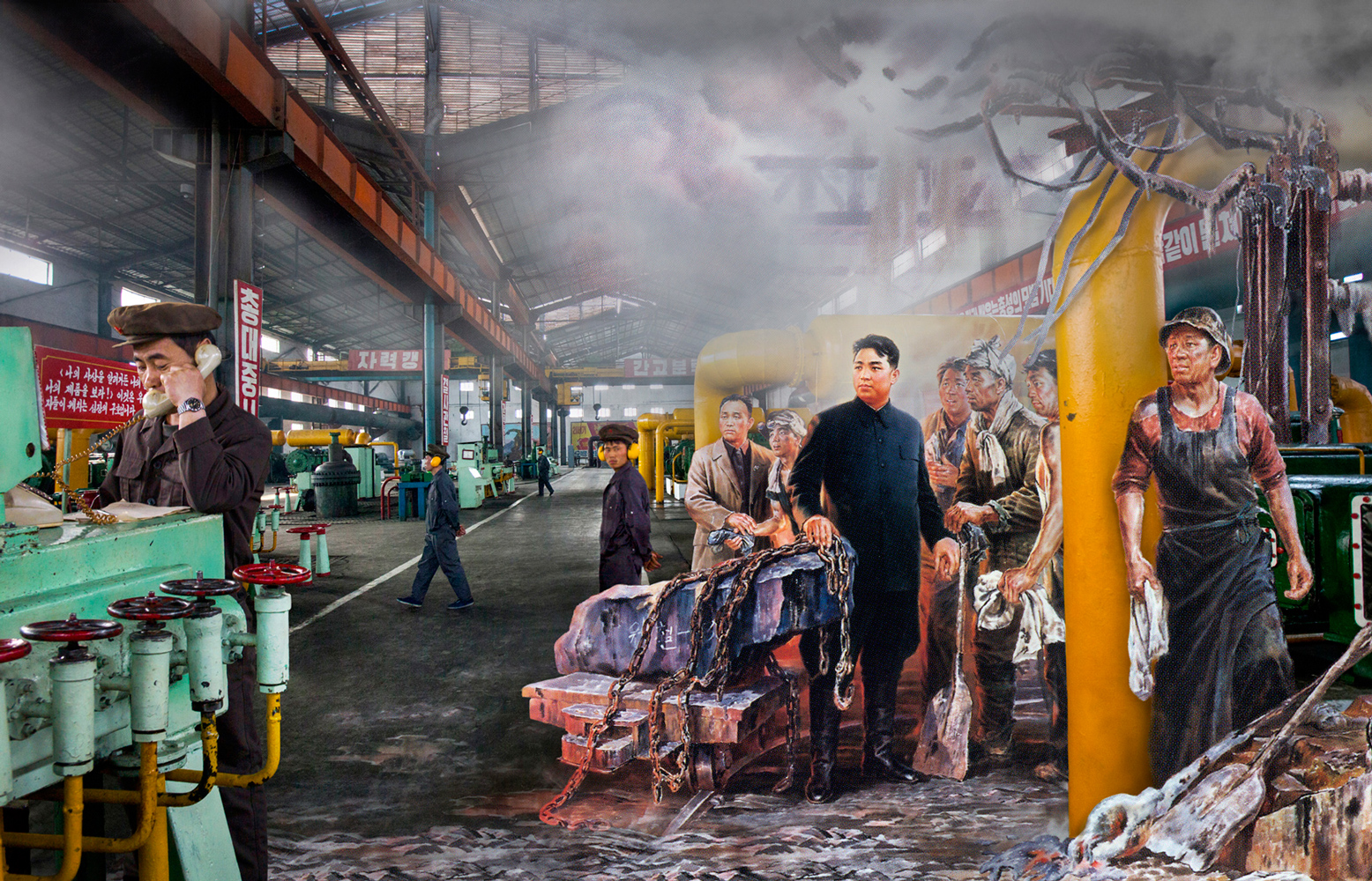
Within the rule of manipulation sub-section of the article Bush looks into the photographer Alice Wielinga who breaks this rule within her work. I took a particular interest in her work after seeing it for the first time as I found that the aesthetics of it were very individual and intriguing. Here are some examples of her work, the first of which has some context attached by caption…

From series: North Korea – A Life between Propaganda and Reality.
It is April 2013. While the Western media follows Kim Jong-Un’s steps during his missile test launches, I travel 2,500 kilometres through the North Korean interior. Once arrived, the images I know from my advance research correspond with the scenes my guides proudly show me during their propaganda tour. But seeing these scenes with my own eyes, I gradually discover that behind everything they present to me, a different reality is hidden. While I listen to my guides talking about what invaluable contributions the greatly admired leaders made to their country, I drive through a landscape that looks haggard and desolate. During my journey I collect propaganda material and take photographs of the reality I encounter. This material is the basis for my multimedia project ‘North Korea, a Life between Propaganda and Reality’. With the found propaganda images and my own photographs I compose a story that deconstructs the North Korean propaganda.

As Bush’s article talks about, this specific series of Wielinga’s work is executed using a combination of photographs from her visit to North Korea and North Korean propaganda. The combination of these two visual matters creates a brilliant juxtaposition which is very effective at putting across her political points.

Here is a section of Lewis Bush’s article, covering how Wielinga produced this project, including a couple of quotes from the photographer herself…

‘ When Dutch photographer Wielinga traveled to North Korea, she found her ability to photograph in the secretive state severely curtailed. “I felt that, with mere documenting, I wasn’t able to tell the story as I was experiencing it,” she says of the stage-managed excursions to which journalist-visitors are subjected. Her response was to digitally merge her photographs of official North Korea propaganda with her own images of workers and decaying factories. “I see propaganda and reality as two sides of the same coin,” she says. “Propaganda is an essential part of everyday life in North Korea, and because of that a reality in itself.” ‘