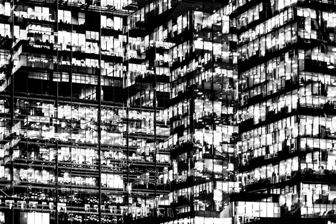
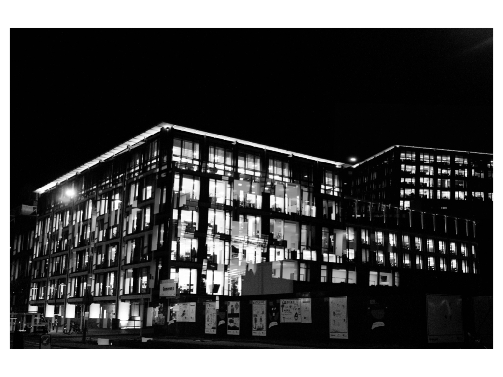
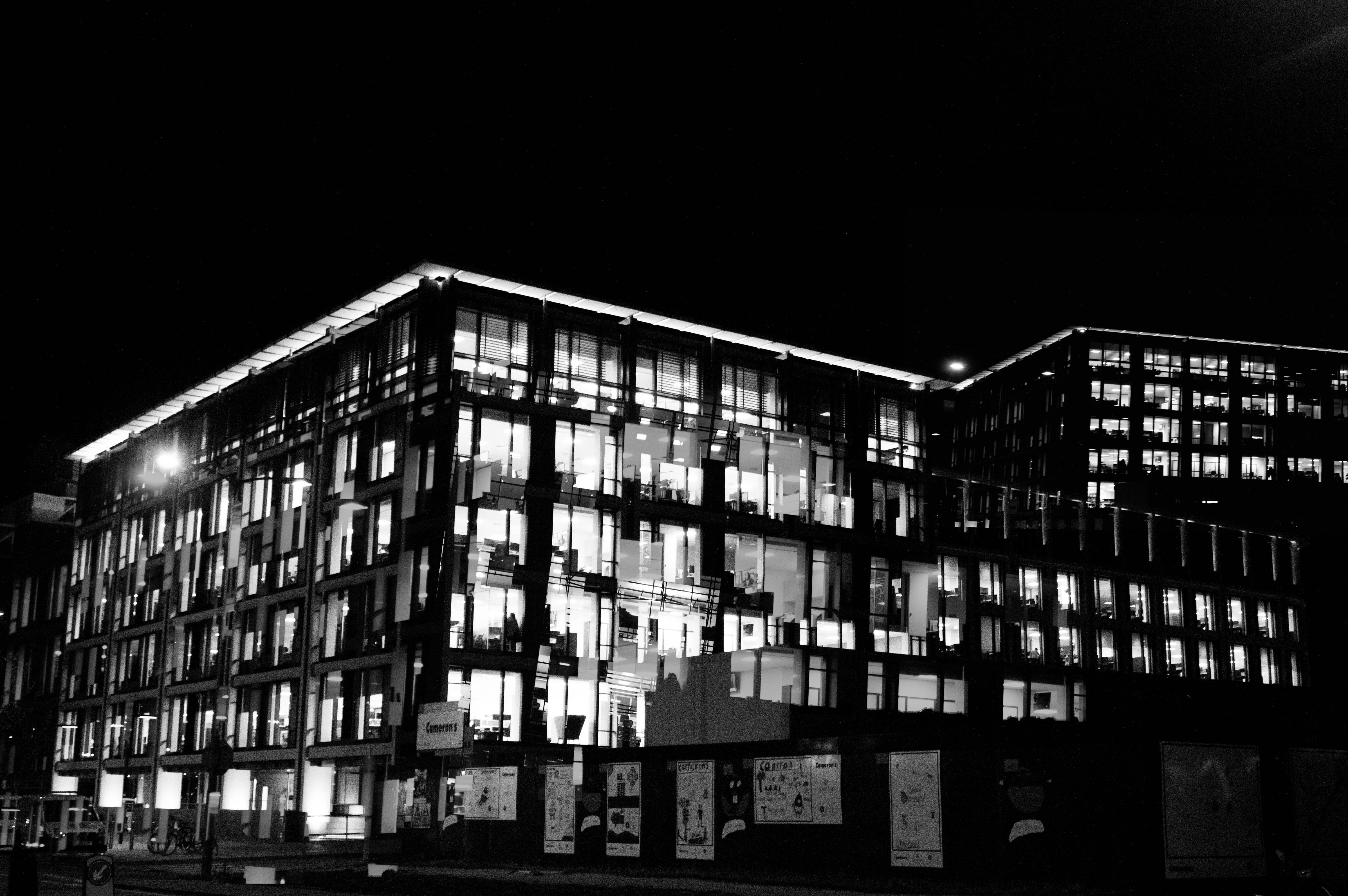
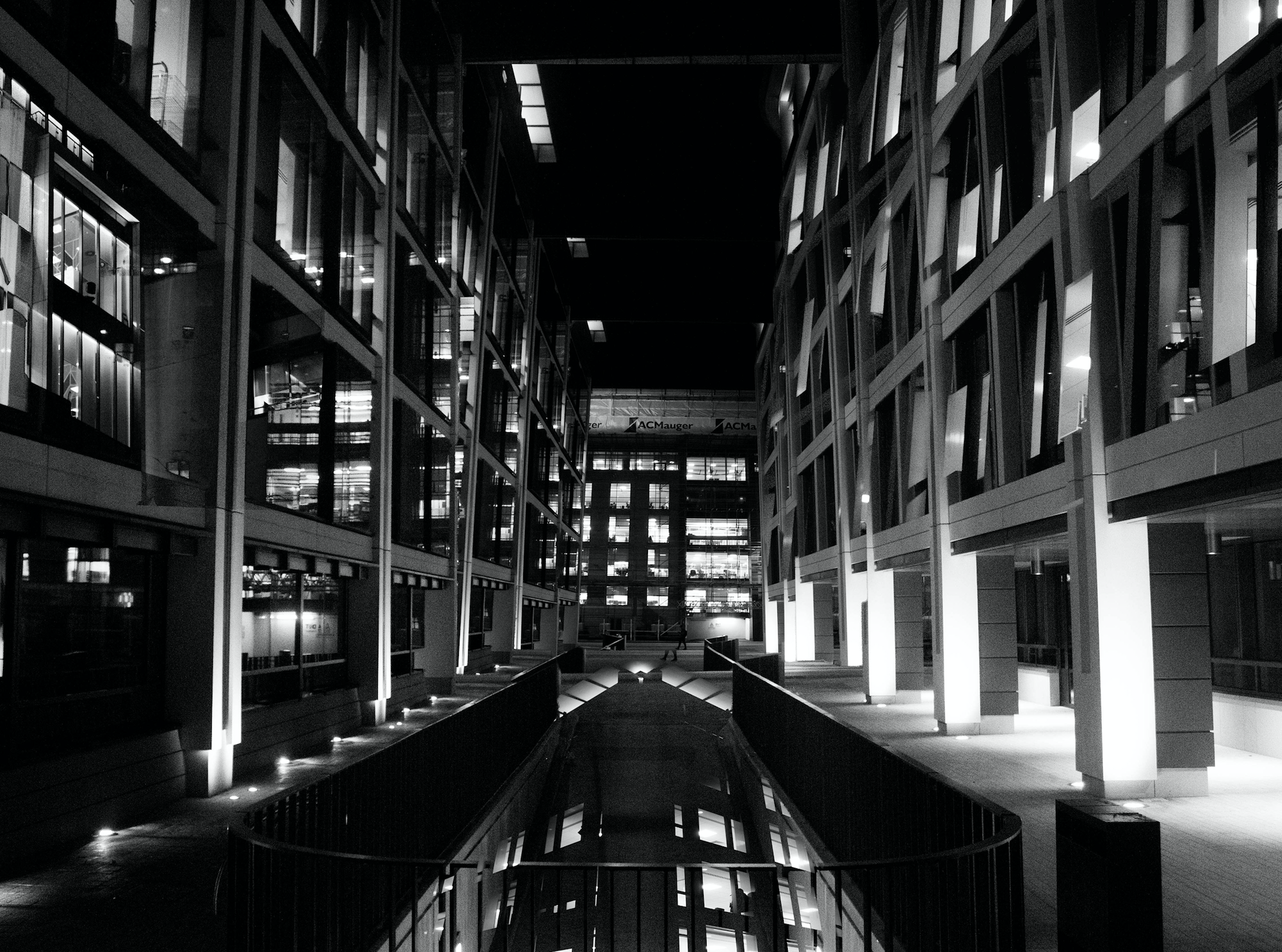
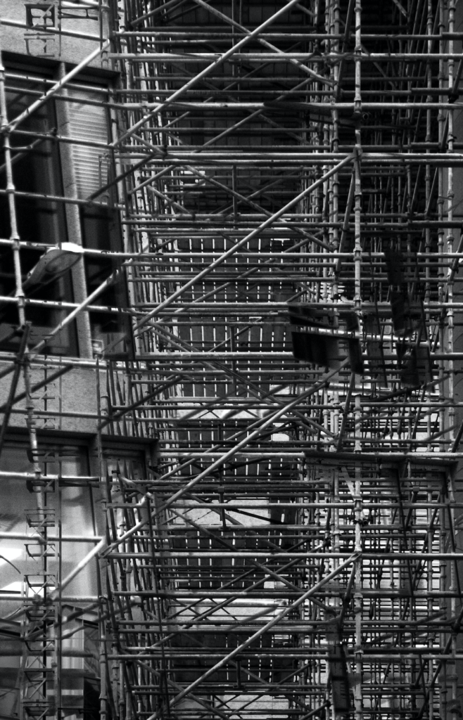
 In my response to Lewis Bush I am going to be photographing the financial sector within St. Helier in both day and night and then creating a double exposure effect with these photographs in photoshop. The inspiration for photographing the financial sector comes from Bush’s ‘Trading Zones‘ and the use of double exposure comes from his project ‘Metropole‘ in which he used this technique throughout. I will be carrying out two photoshoots for this response – one in the daytime and one at nighttime. This will allow me to be able to work with a wide variety of photographs in order to create different effects and settings within the edits.
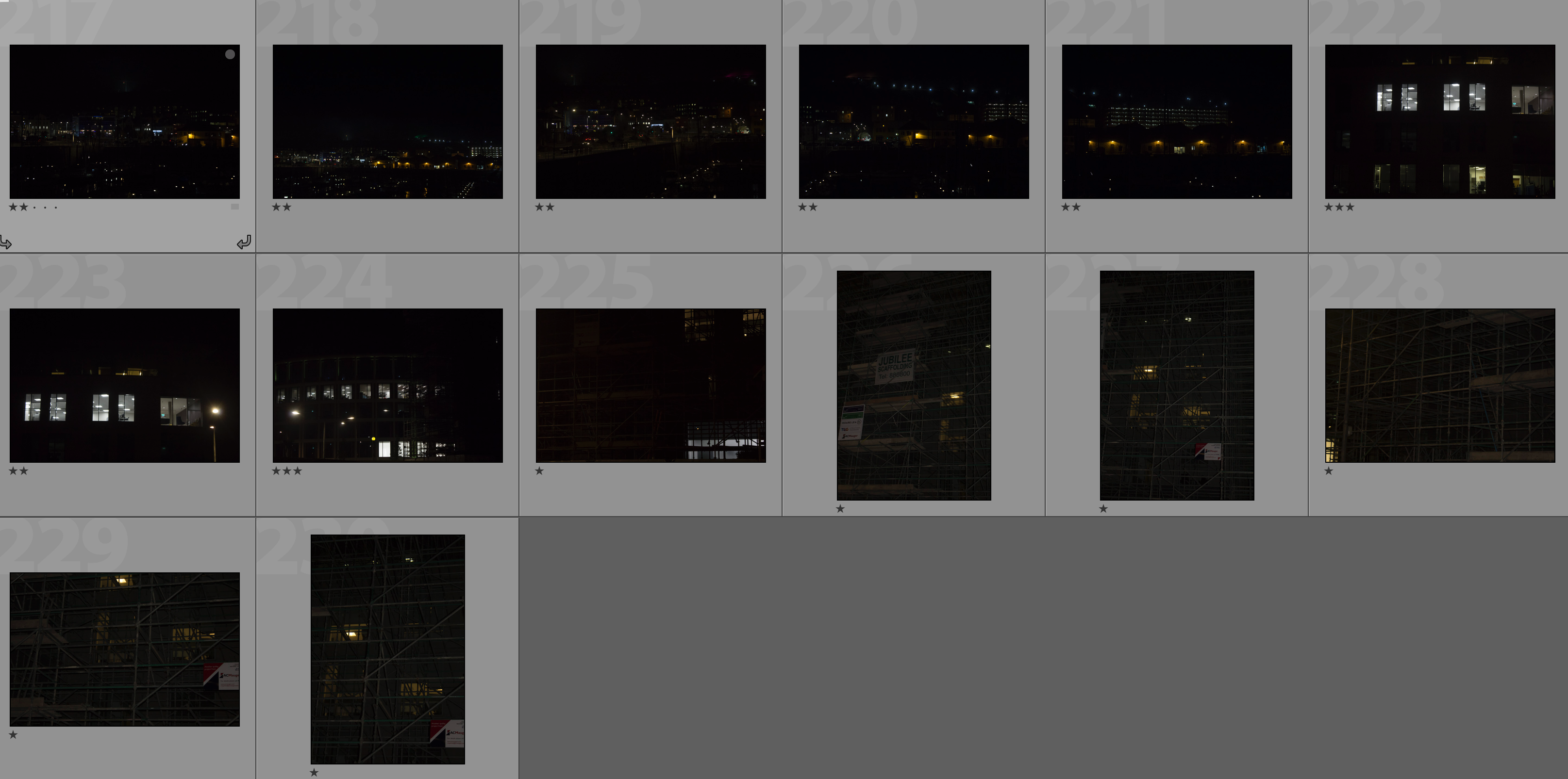
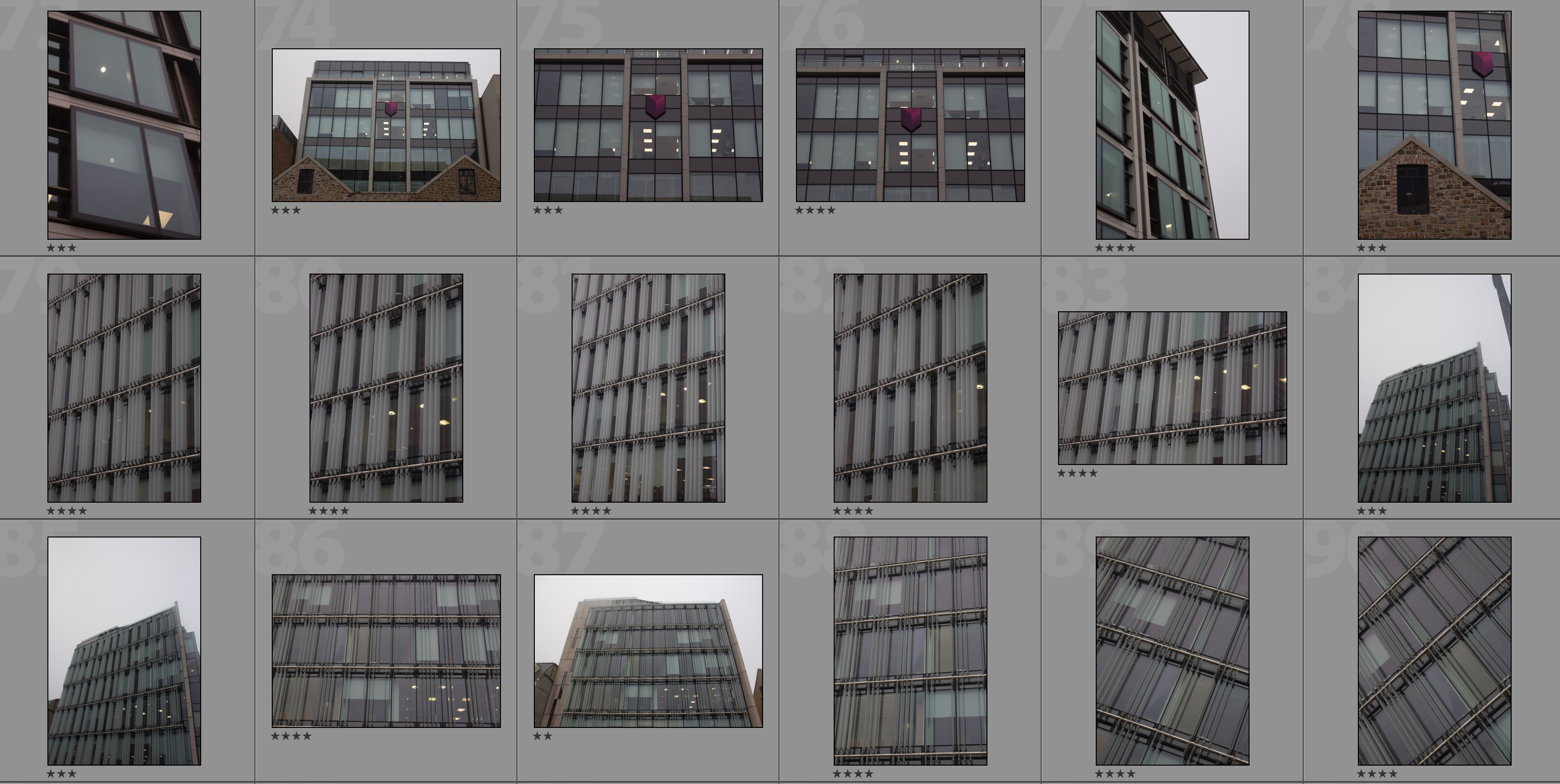
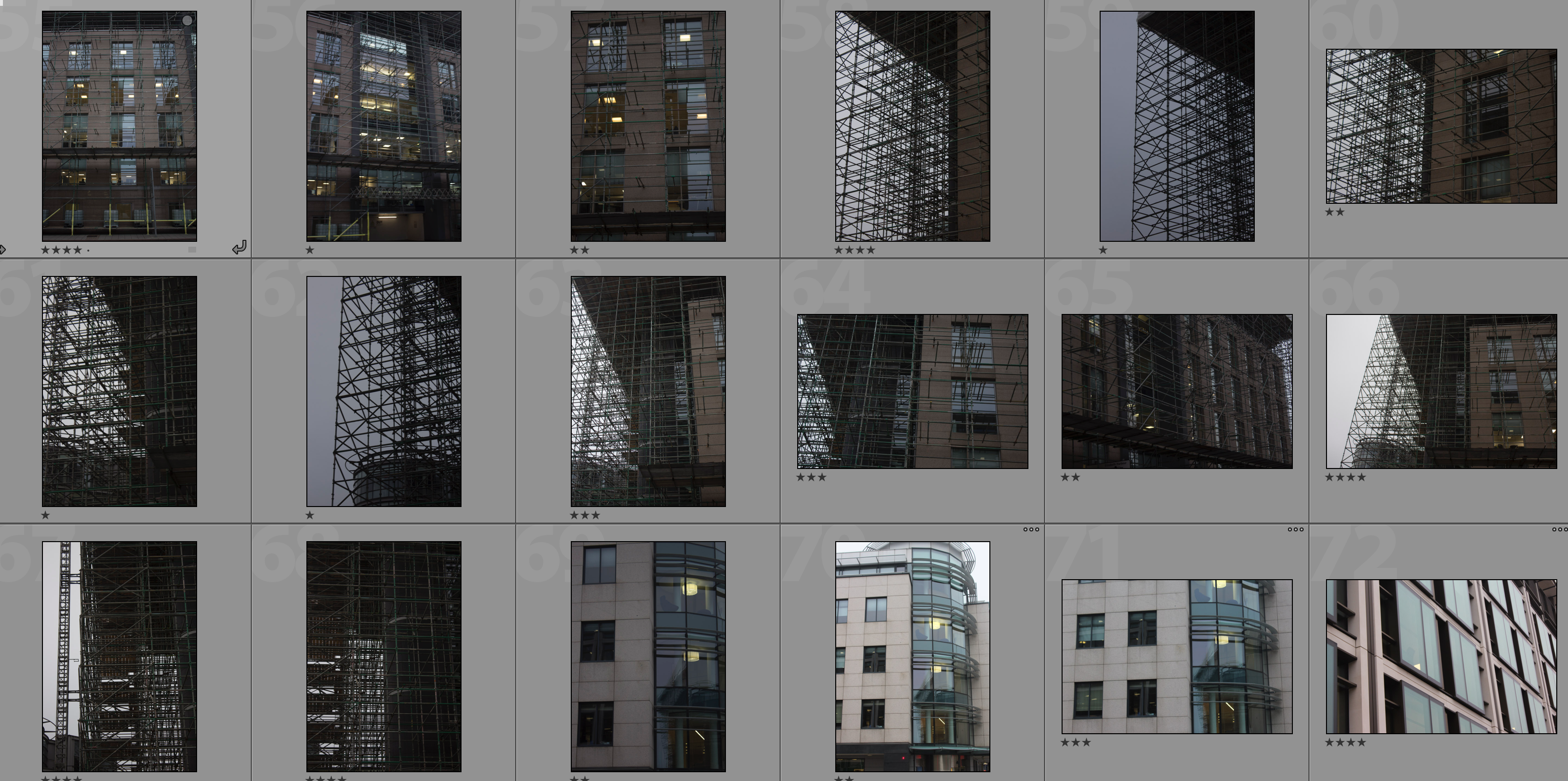
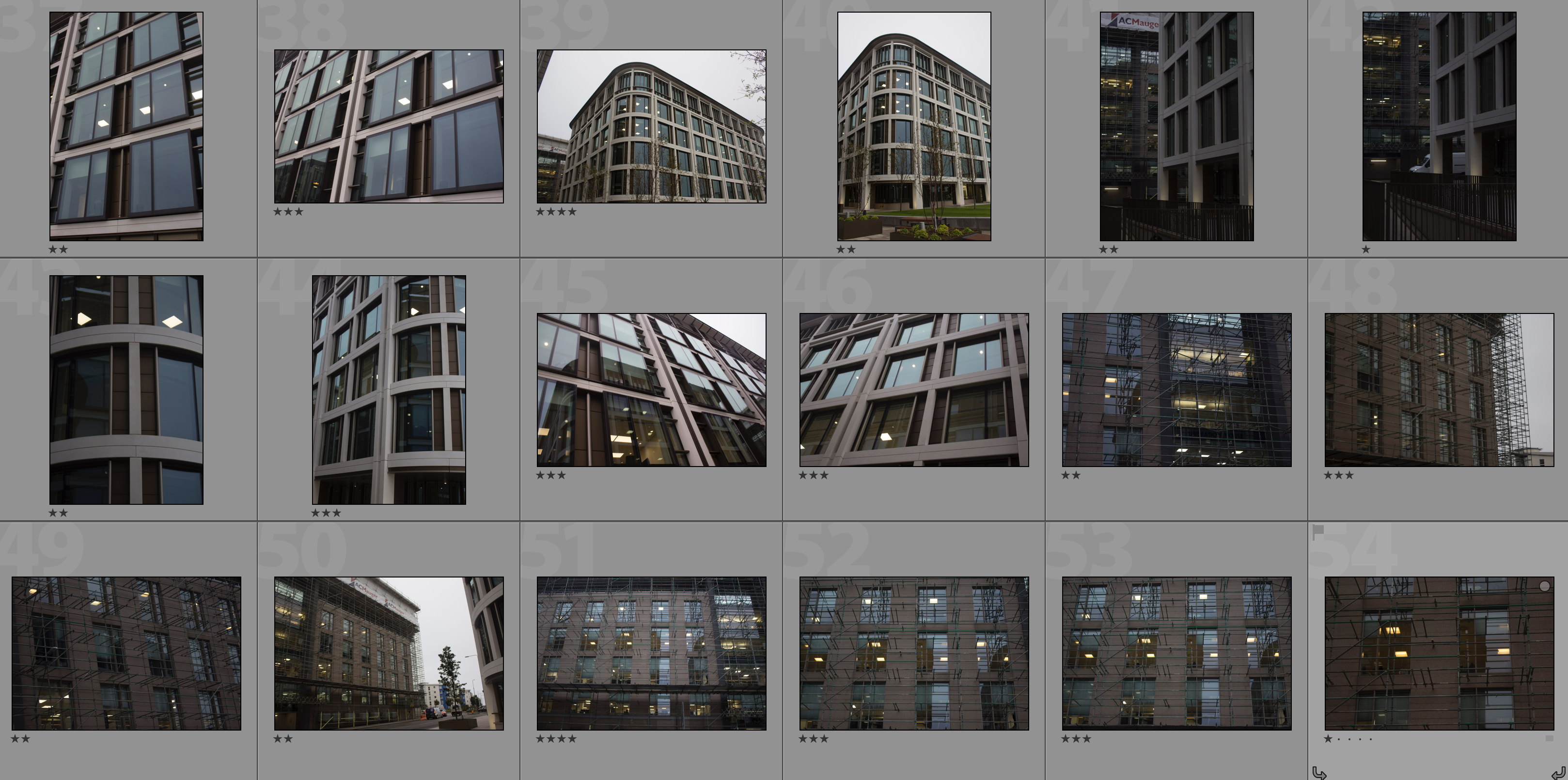
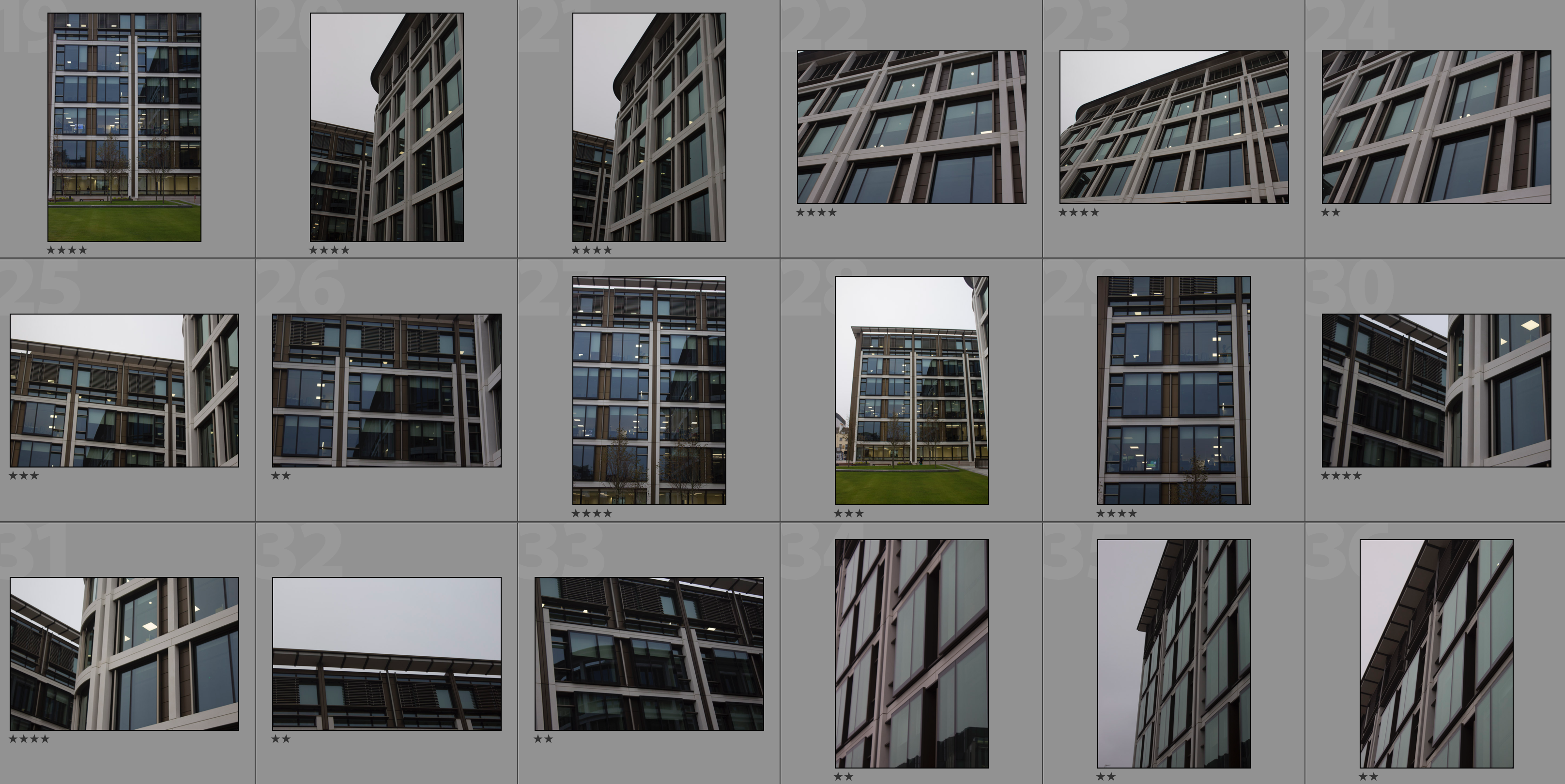
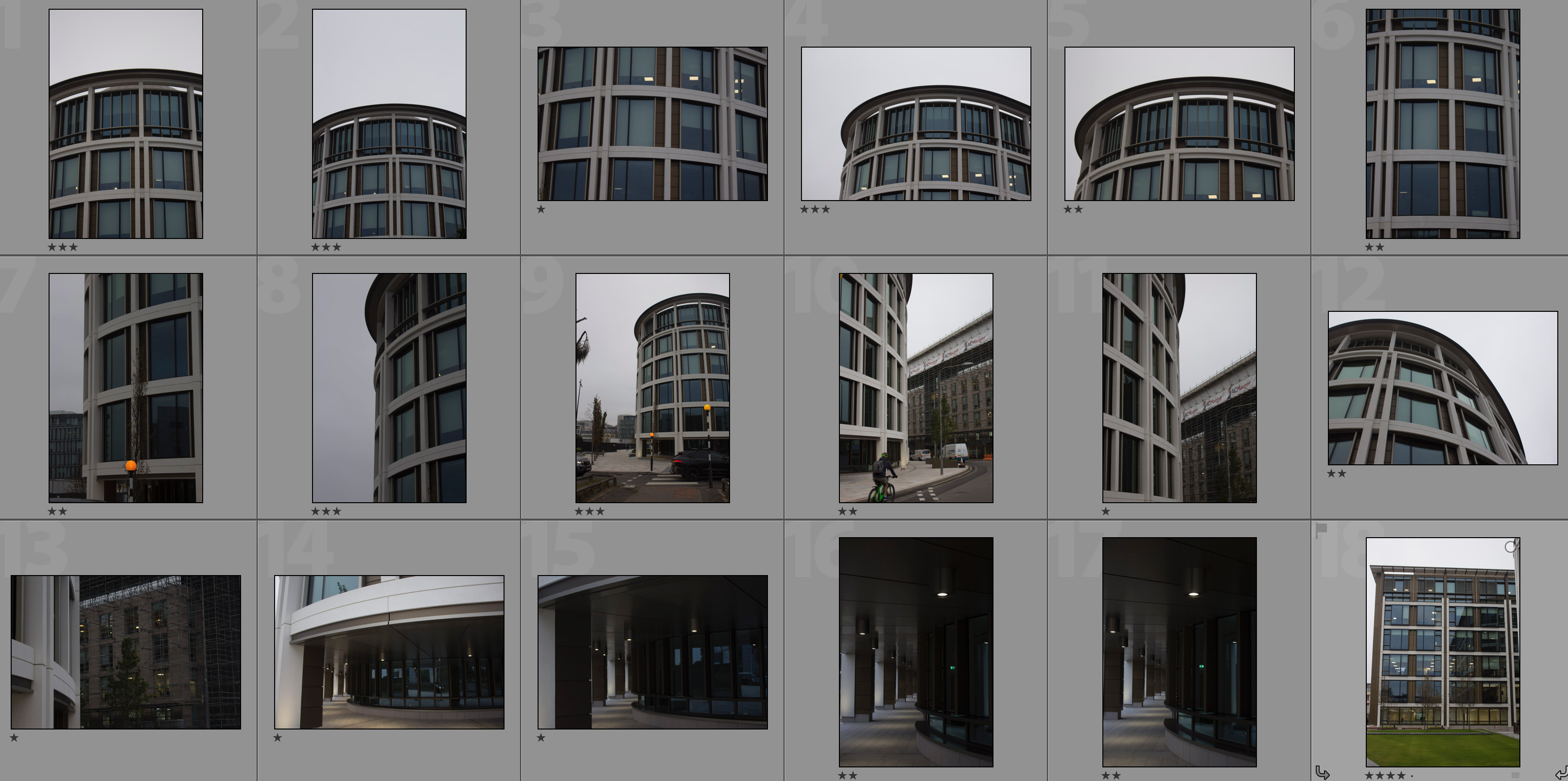
Contact Sheets
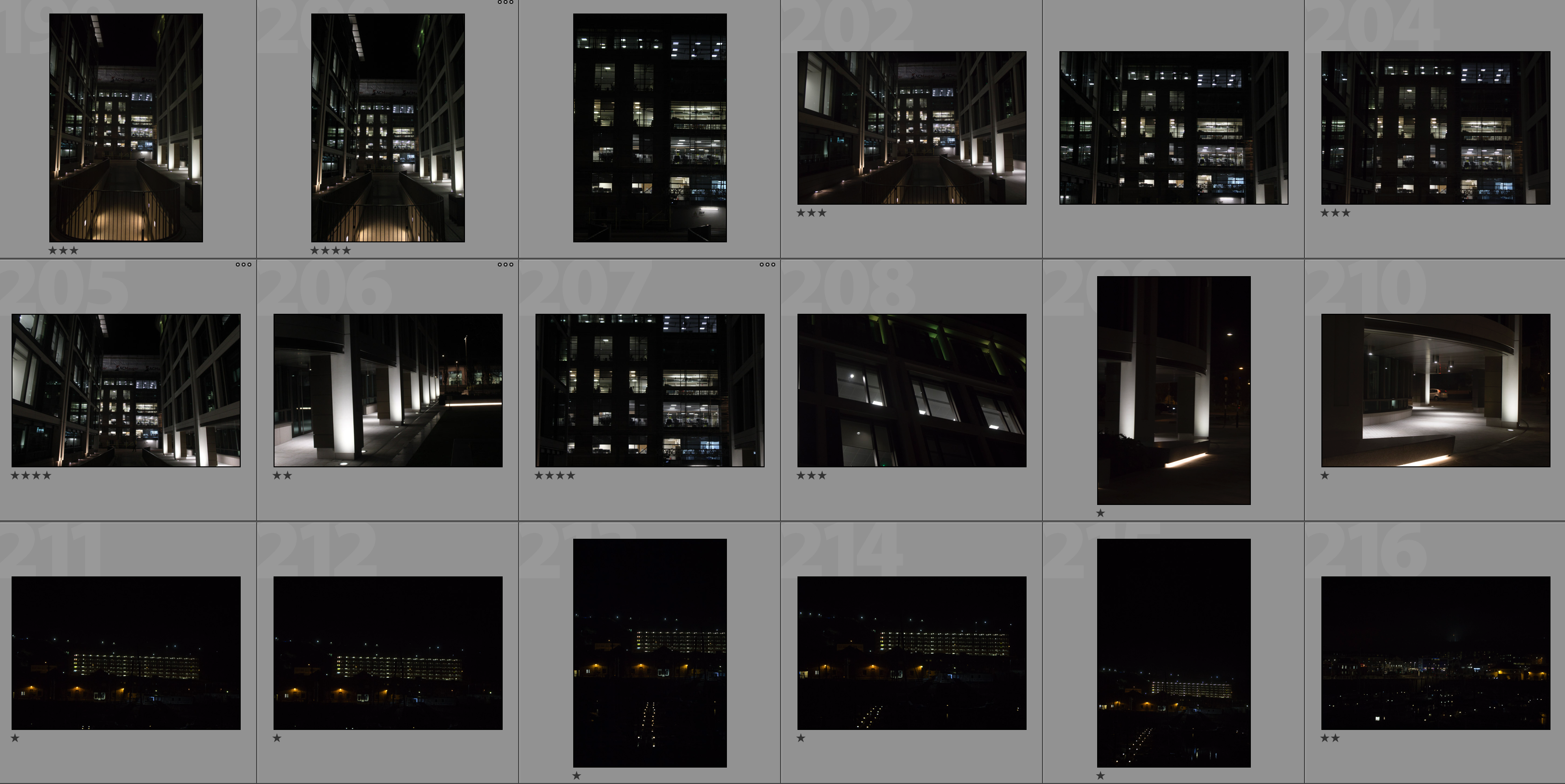
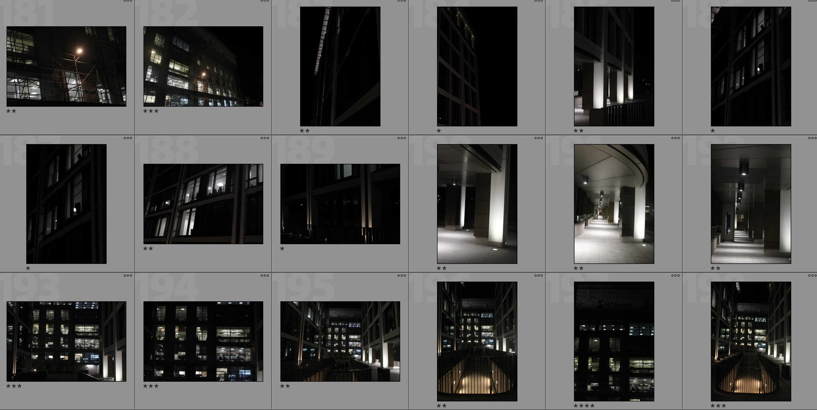
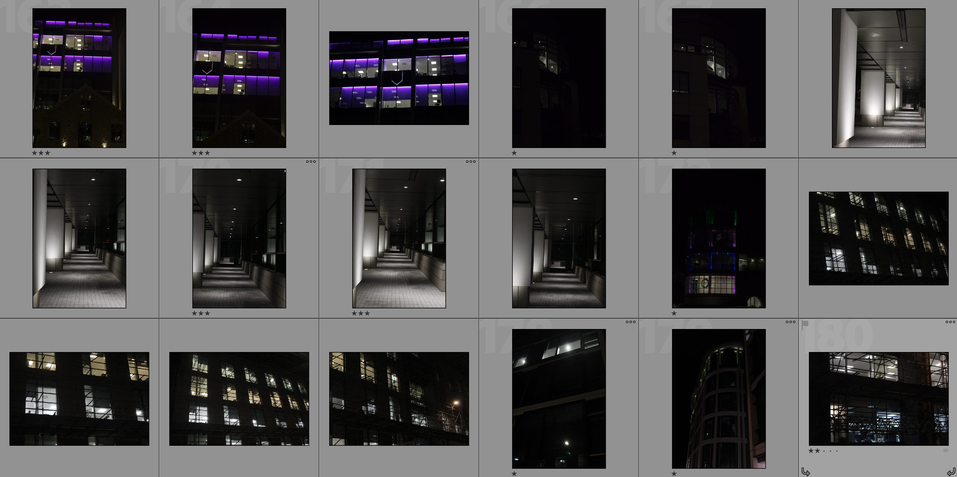
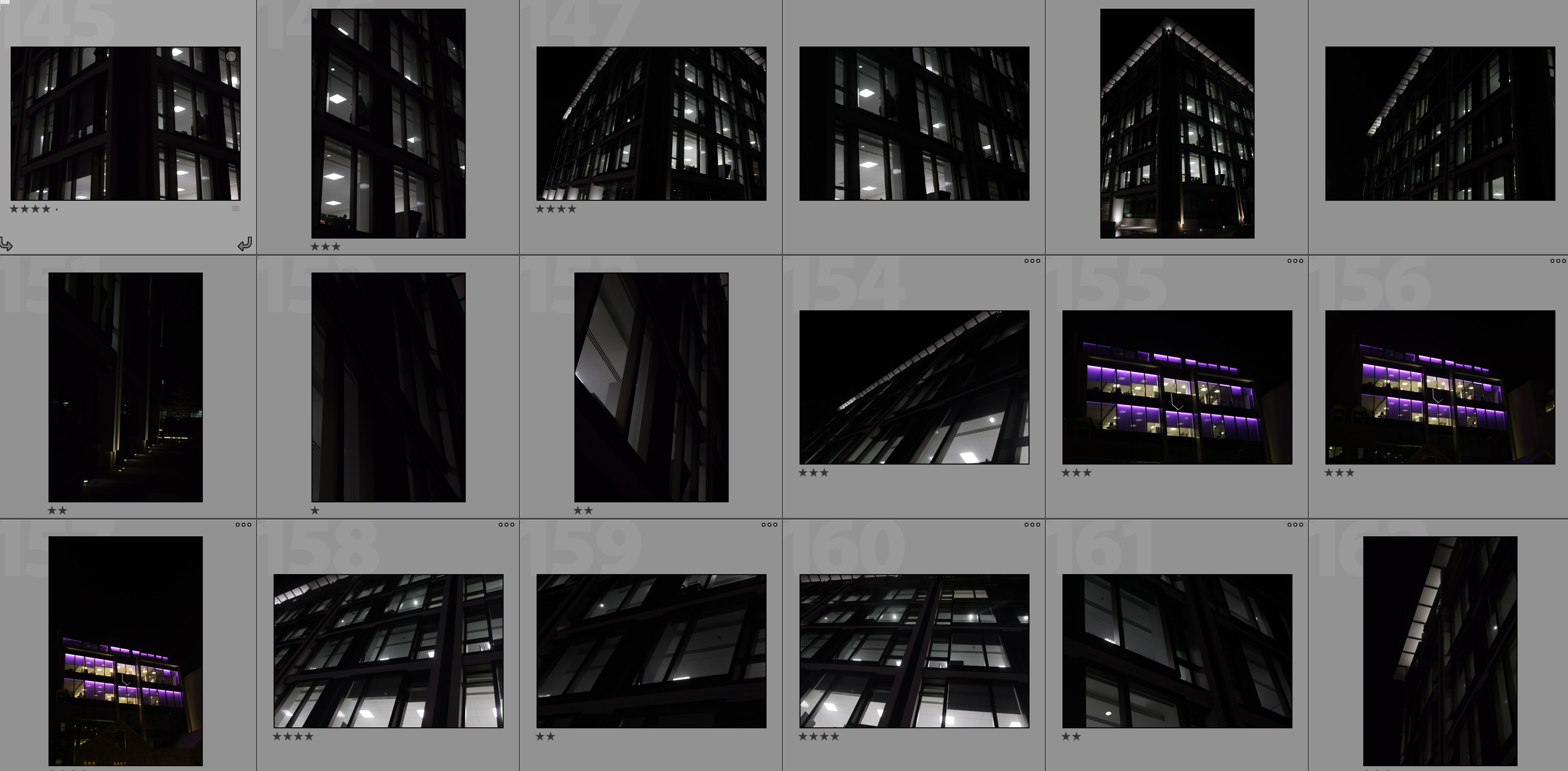
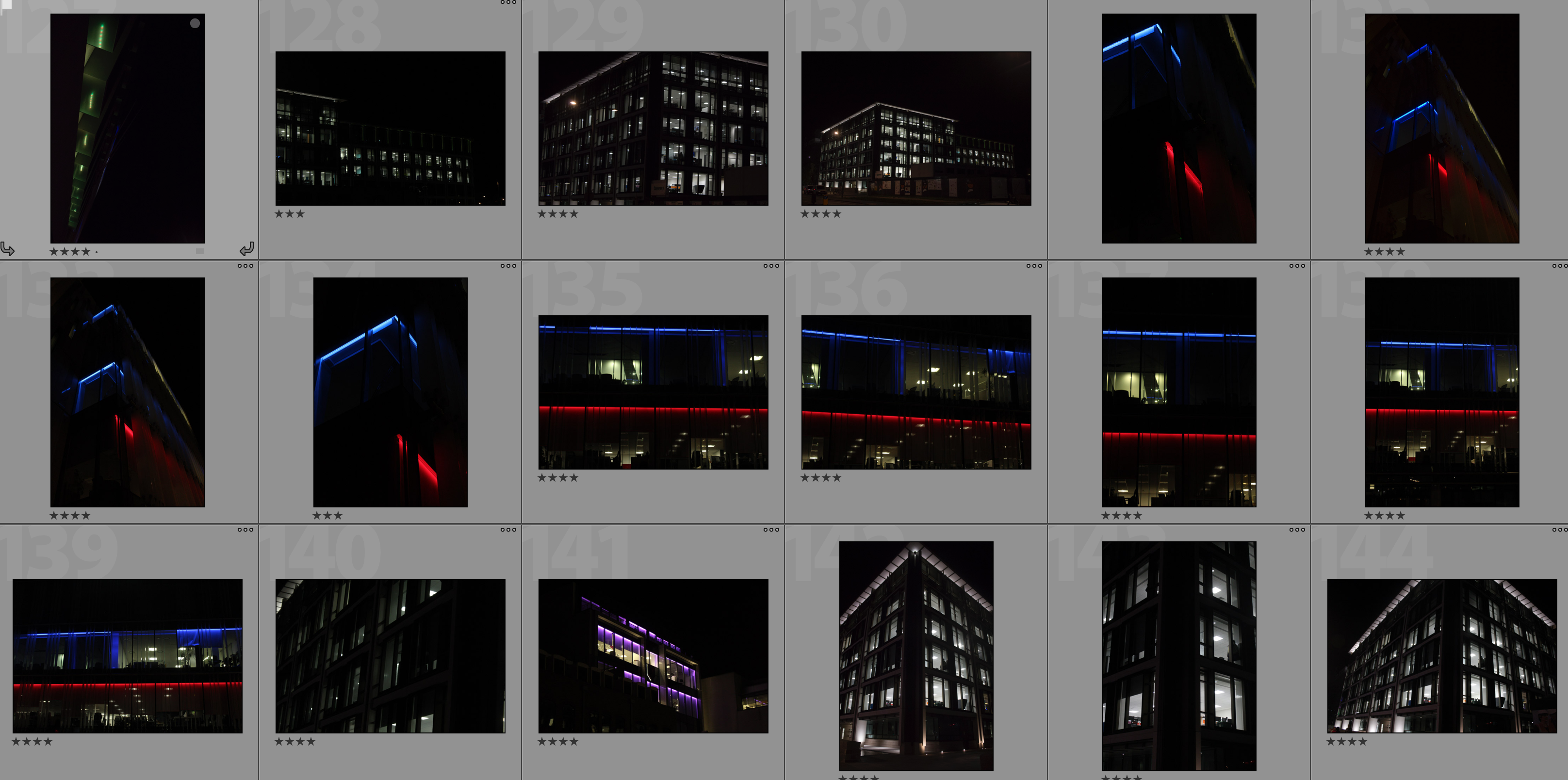
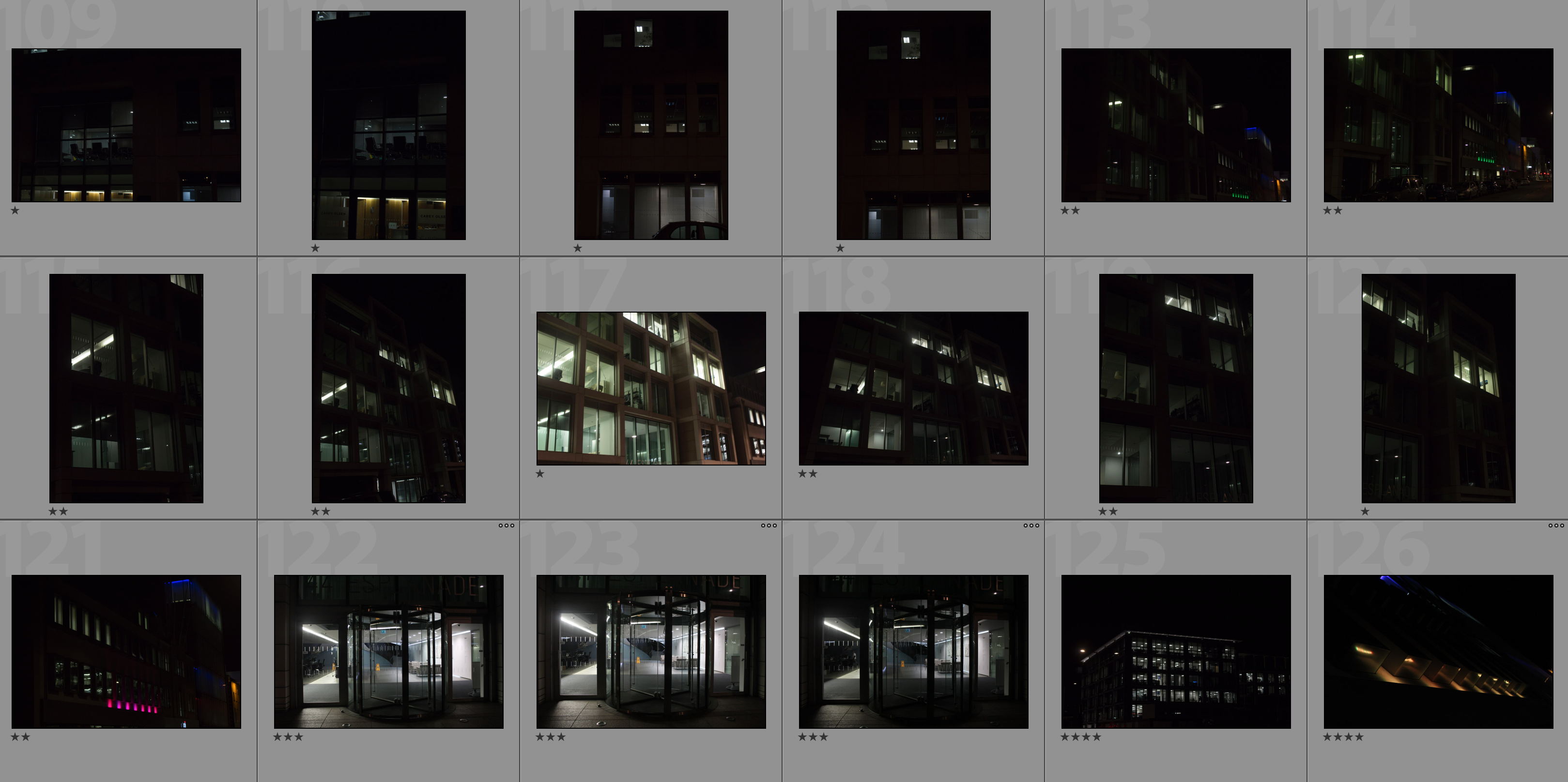
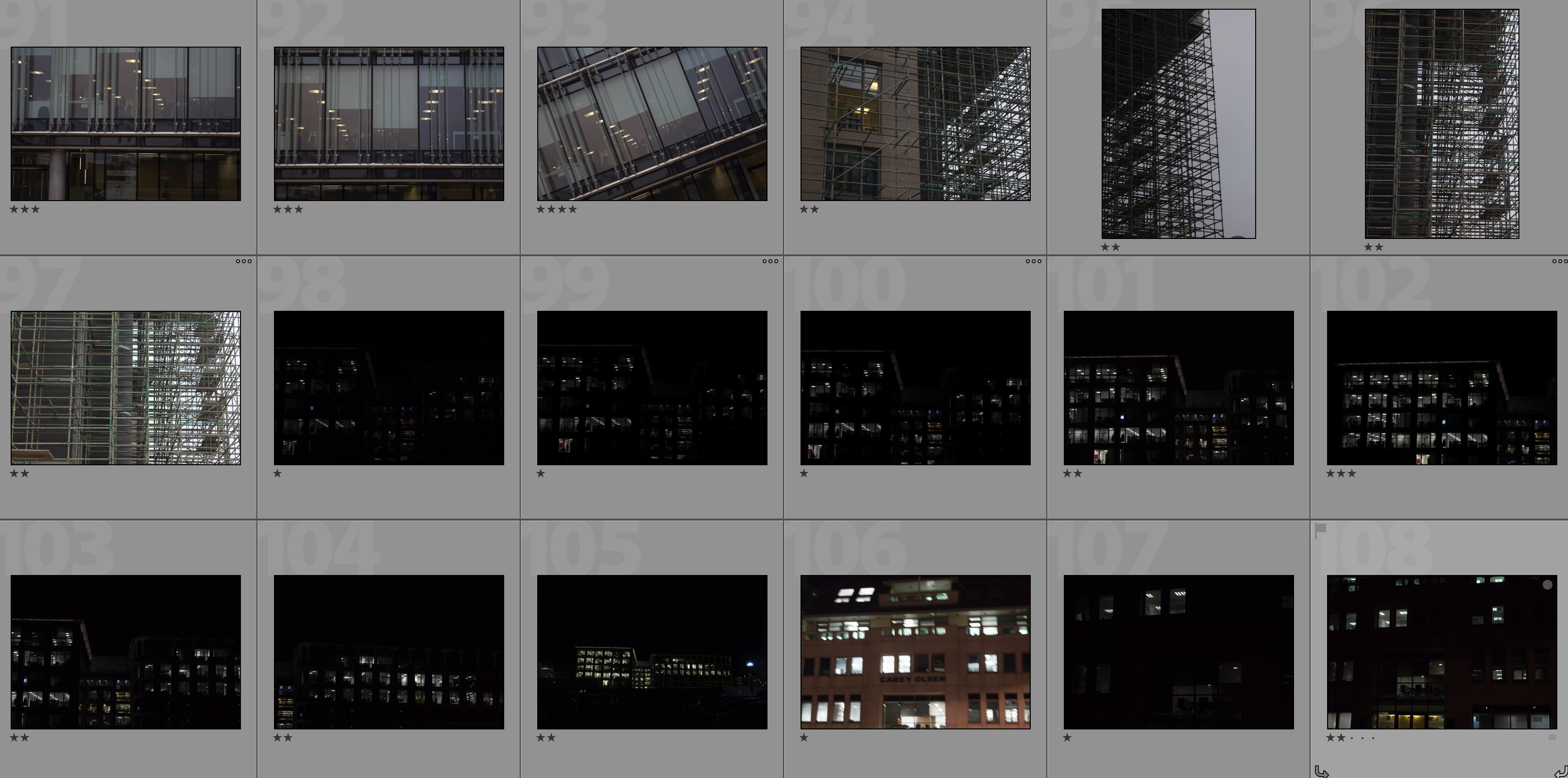
Editing Process
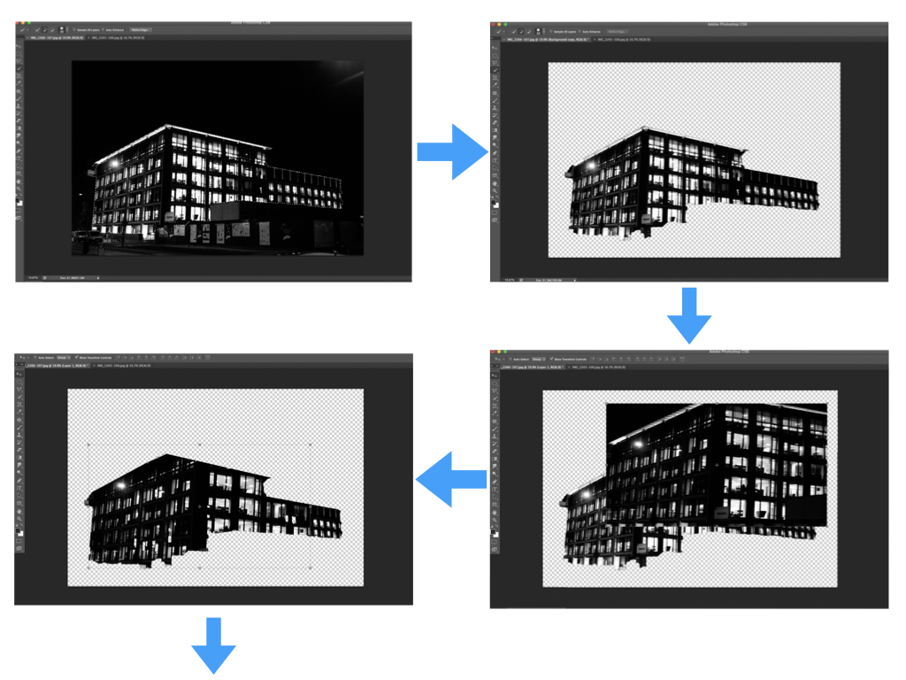
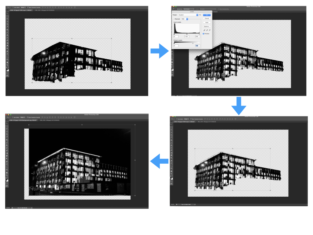
I carried out the double exposure editing on photoshop. I started by using the quick selection tool to separate the building from the rest of the photograph and clicked the ‘refine edge’ button to create a blank background. I then placed the second photograph over the base photograph and added a layer mask in order to shape the second photograph in line with the base photograph. After this I used command-L in order to edit the levels of the second photograph and so changing the black/white/grey properties. Next I selected the blending option as ‘lighten’ to allow the two photographs to merge. I repositioned the second photograph over the base photograph to create a double exposure effect then brought the background forward to reintroduce it to the composition. Finally I repeated this with multiple photographs to create a disorientating composition.
My Edits

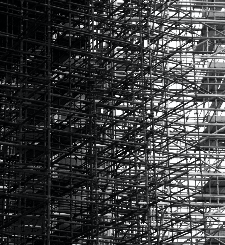
Analysis
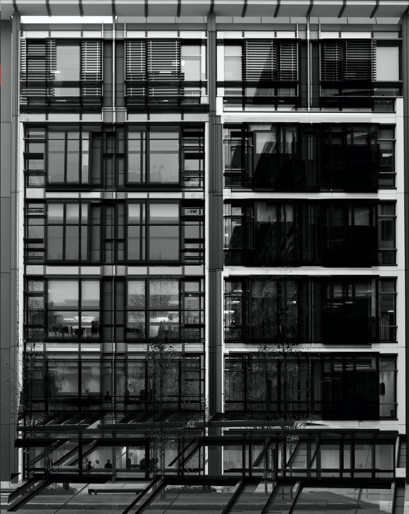
In this photograph I have used natural lighting in order to capture the natural shadows and contrast of the new finance centre in St. Helier. This natural lighting allowed for reflections in all of the windows which creates a variety of tones throughout the composition. This variety of tones creates contrast between the dark black frames and the grey tones of the windows. I used a deep depth of field to capture this photograph to ensure that every detail was in focus including the reflections in the windows. By layering multiple photographs over the top of the original I have been able to create dark frames and dark shadows to contrast with the lighter tones – I think that this create a much more dramatic and slightly abstract photograph. I used a shutter speed of 1/60 to capture the original photograph along with a fairly low ISO of 200 in order to ensure that the photograph is exposed enough but is as high quality as possible. This high quality photograph allowed for the similar photographs overlayed on top to blend in well to provide more contrast and structure to the photograph.
There is no colour in this photograph as I thought that the black and white filter really allowed the black dark tones to come out to provide more contrast and shadows within the photograph. The lack of colour also allows the viewer to focus on the dark lines and paths running throughout the composition and so emphasising the disorientating intent of the photograph. The tones throughout this photograph are mostly gray with streaks of black running throughout it – there are not many bright tones in this photograph which I think works well as the grey and black tones allow the original photograph and the photographs on top to blend well together to create a photograph that is familiar to someone from Jersey but unfamiliar at the same time. From the way that I have cropped this photograph using perspective crop it is a very 2D and flat photograph except for the photograph overlayed in the bottom third of the photograph. This bottom third of the photograph appears to come towards the viewer which sends the rest of the photograph to the back, ultimately creating a sense of confusion within the viewer. The windows and lines throughout the photograph are very aesthetically pleasing as they create a pattern of squares and lines, making the photograph more intriguing. There is no immediate viewpoint that they eye is led to due to the abstractness and pattern throughout the photograph. The line straight down the middle of the photograph creates a sense of division within the composition as well as a sense of satisfaction due to the organisation of the placement.
I took inspiration for this photograph from Lewis Bush’s project ‘Metropole‘ in which he looked at the collapse of the British Empire and how in its place globalised capitalism grew as London has been rebranded as “a city of demolition, cranes, and glittering new high rises”. ‘Metropole’ aims to record the effect of this on London through the form of documentary photography and I aim to show the effect of how Jersey has changed with the construction of the new financial centre and all the new flats and other offices within the area. St. Helier has changed drastically over the past couple decades and it may seem as if it is moving too fast for some of the residents that have lived through these stages. This photograph was taken as part of a shoot of the new financial centre, I took the original photograph and layered multiple photographs of the same centre over the top to create a disorientating effect.
I have attempted to recreate the double exposure that Bush used in his ‘Metropole‘ project in order to convey the idea that as the financial centre grows and as construction within the area goes on at the rate it is, the people of St. Helier are becoming more lost and disorientated as this is no longer the St. Helier that they’ve lived in for all of these years. Bush used this effect in order to create the “sense of loss that many Londoners feel” in the big city. This theme of a feeling of loss within the city links to the genre of ‘political landscape’ as it looks at both the present and past in St. Helier showing how it has changed and how the residents of St. Helier are feeling about it all. I think that the government of Jersey is focusing too much on construction and not what would really benefit and satisfy the people of Jersey.
