My inspiration for editing was to exaggerate the emotion possessed throughout the subject and landscape, either through colouring, or more conceptual editing of shape and overlapping of colour.My chosen images editing:
Happiness

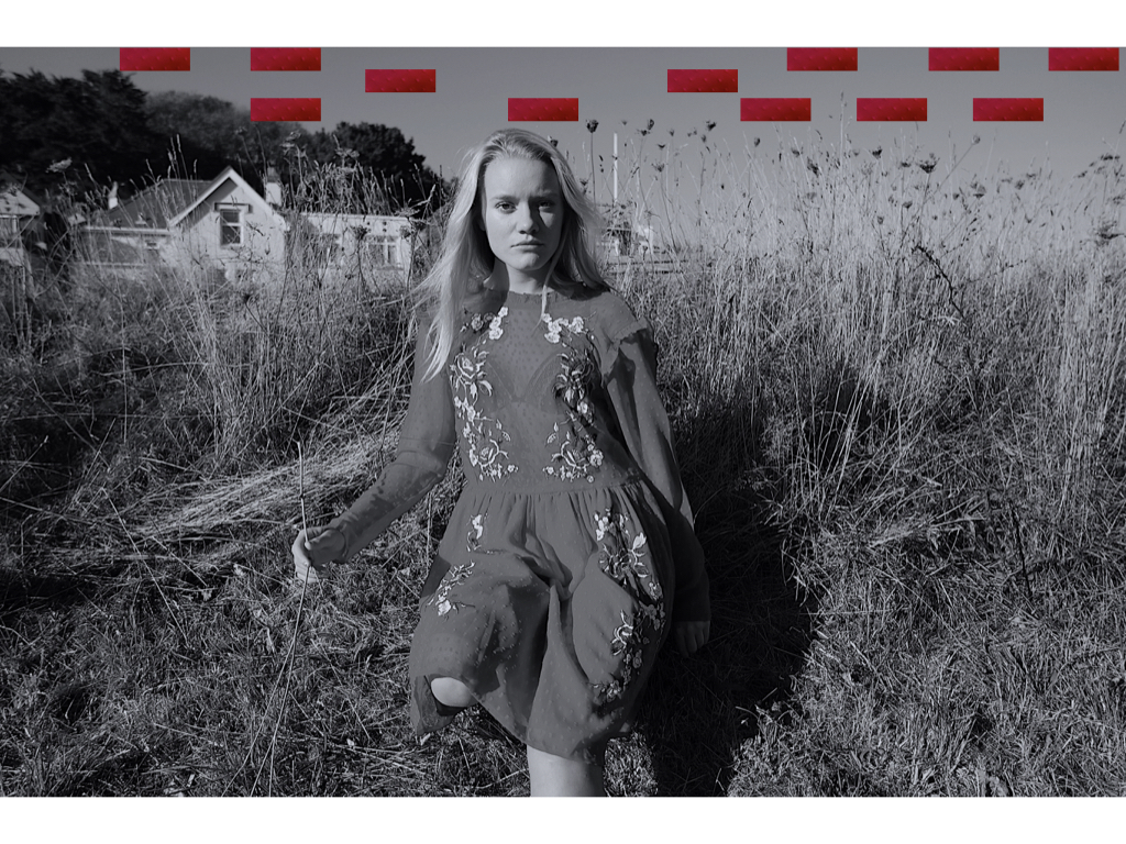
I chose to edit many of these images into black and white as it highlights a simplicity and exaggerates the natural light from the sun itself. I though due to the interesting composition of this images that I would add some interesting conceptual shapes in order to provoke more thought to the image itself. Due to this person having a positive connection to this landscape I wanted to express a naivety and exaggerate an ignorance is bliss type of feel. To my mind the circles connote a display of balancing work,oppitunities and commitments and the lines symbolises rising and becoming better and more connected to yourself and not worrying about political ideologies to consume us when in surrounded by our favourite landscape. The shapes also mimic the simplicity and provoke a ignorance is bliss quality. I believe it is evident that this shoot is more concentrated towards happiness and timelessness also mimicked throughout he free and life full movement of the dress.
 Within this image I think I have successful caught the light and captured the movement of the dress itself, this personifies the dress to form a positive entity and a sense of freedom. Perhaps to this person this landscape to them is freedom and a place in which they can escape the governmental oppression to which they might face elsewhere.

When experimenting with he images love I wanted to see how colour effects our emotions and so the effect to which we think about a photo and so what feel it ultimately communicates. I experimented within the saturation and also the conceptual contrast of vibrancy to show a sense of life, freedom and happiness.


anger

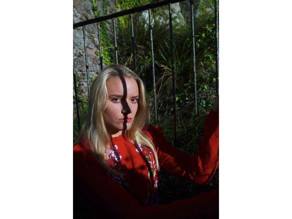
I decided the best way to convey anger would be through a darker ampeture and also a colour which clearly symbolises the emotion,this being red. I went to areas which show qualities of small confined spaces and making the subject feel small and powerless. I believe this successful demonstrates how they feel due to the way she is not allowed to make her own decisions but is powered by a governing group of higher people. The harshness of the rocks show an emotionless extent to which emphasis the governing bodies as being cut throat and an ignorance to peoples emotions and well being. 

Whever I have used a lighter tonal shade it is to highlight the irony to the possible future but that is kept through the bars of where she is. This is to communicate the opportunities not given to those depending on their social state ( poor education, not having enough money to pay for school)
 I wanted to use typical characteristics that you would find in a prison to once again emphasis the anger against the powerless state she and her family have been reduced to, due to having no choice in what happens to their future and money.


