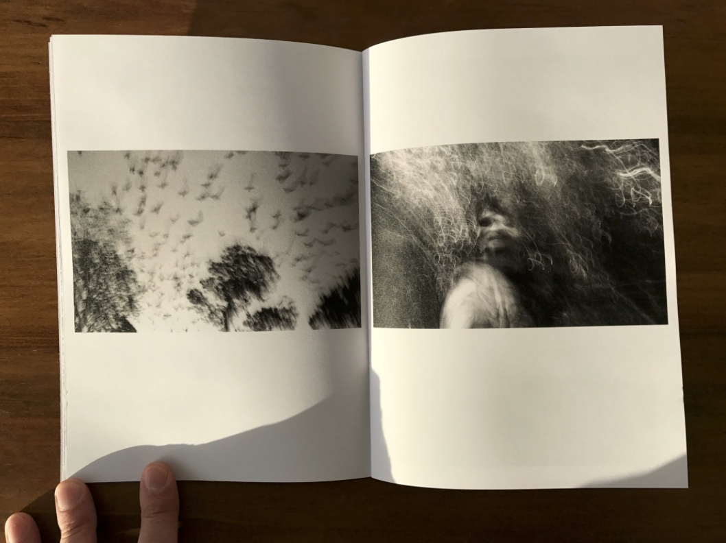
A zine is a small-circulation of self-published work of original or appropriated texts and images, usually reproduced via photocopier Zines are either the product of a single person, or of a very small group. Zines are used as an effective way of marketing and presenting ones work and often will stick to one small topic throughout all the pages. They incorporate a basic design layout with usually one image per double page spread and sometimes one image per page. Among the various intentions for creation and publication, the idea behind zines are to develop one’s identity, share a niche-skill or art, or developing a story, as opposed to seeking profit.
When researching visual inspiration to develop an understanding of a theme, i decided I was most interested in the zines which featured architecture. I am interested in exploiting derelict architecture however i also think it could be interesting to contrast this with new buildings such as the new finance center as well as buildings within the development stages. Within my zine i intend to create a narrative which tells the audience how the area of St Helier has been developed and also left to suffer. I want to capture photos at night time and portray St Helier as a vibrant chaotic place by using techniques such as slow shutter speed.
Other than just displaying a sense of the different buildings around St Helier i intend on reflecting on the people that live within these communities and show how they use the area of St Helier. I think that a narrative could easily be created throughout my zine by starting off with some of the buildings located in St Helier and then moving on with the people that live here and how they use the areas.

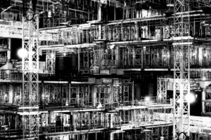
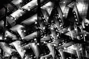


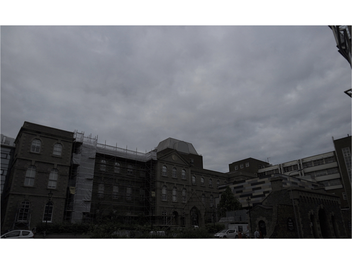

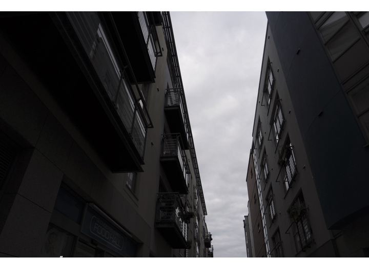
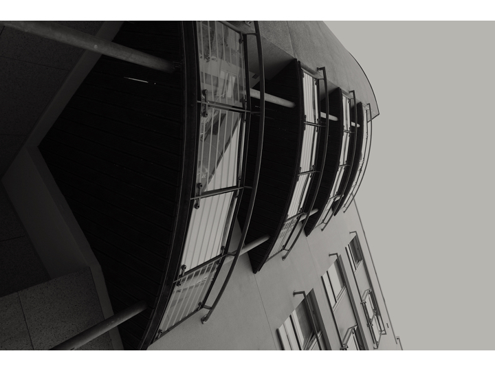


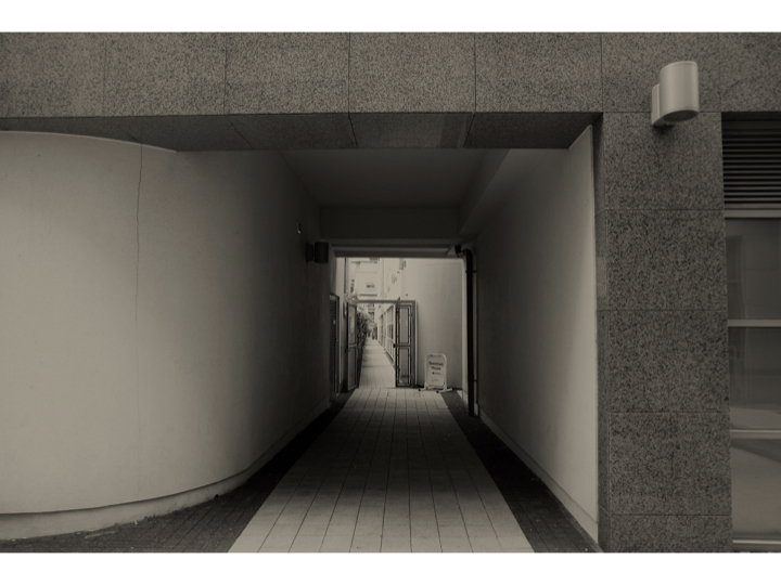


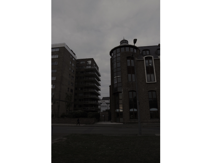
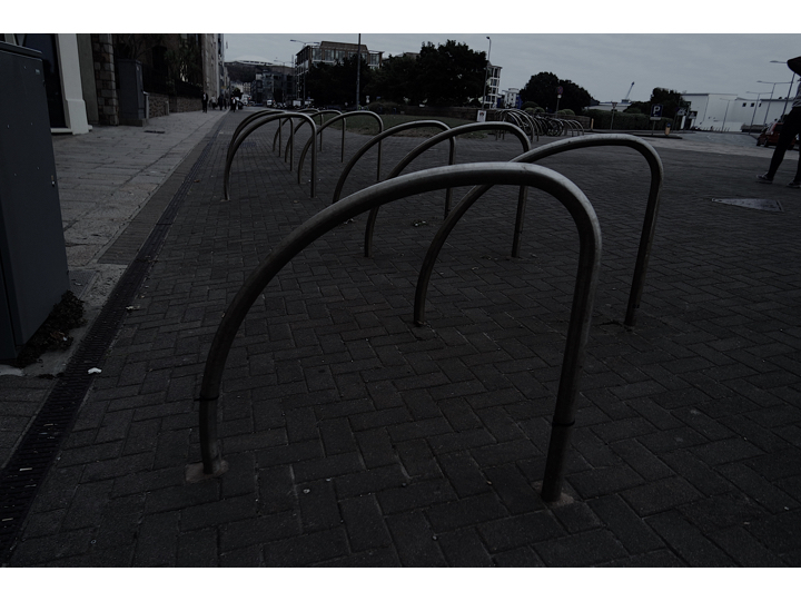


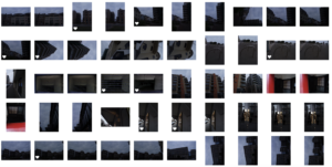
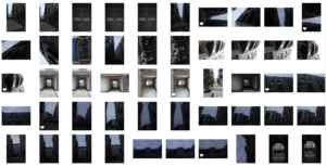
 Evaluation:For this shoot I wanted to finalise and make sure I have been to multiple areas In St Helier and reassure the images I have are the best way to capture St Helier in a successful angle altogether.I clearly focused more on the architectural side of my narrative within this shoot and wanted to display different angles that can be turned conceptually into an idea of character which each section holds. Within these images Morden buildings are the recurring them although you are able to see some significant monuments and buildings more neglected and so perceived as urban. When editing the images I wanted to enhance tonal features and so the composition of shadows and the angles of the edges and shadows of the building themselves. This shows a presence to the work and position the more built upon section of St Helier to have more power and authority over previous sections. Overall I will not use these images as my final and will continue to keep my previous red images as they show a more possessive narrative of destruction reconstruction modernisation and the community which lives among this constant time.
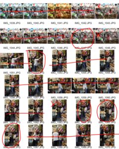
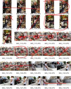
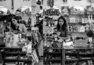
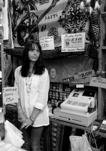
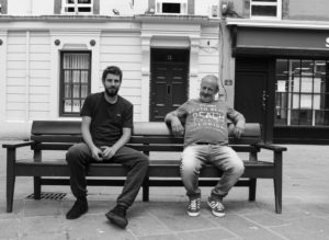
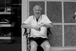
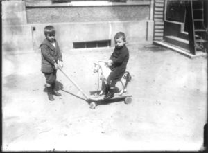
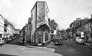
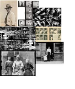 Each artist in this collection of images has provided me with inspiration for how I would like to capture the essence of St. Helier. I have selected images from the archive. I noticed a lack of portraits and the few I found were composed by Francis Foot, this has enabled the idea of capturing the people of town rather than architectural and landscape based pictures as I believe that what makes up St. Helier is the people and community.
Another artist I would like to base this project on is Walker Evans and his collection of photos of American workers - 'Labour Anonymous' set out in the style of typology. He used the method of standing still with his camera set up by his waist shooting passersby framed by the negative space of a wall in his location. The collection of images are all candid and even when the subject realised their photo was being taken, their expressions were still honest and they almost give a bigger insight of who they are as individuals. Although all the pictures are set up the same and look alike, each person creates a different mood and emotion.
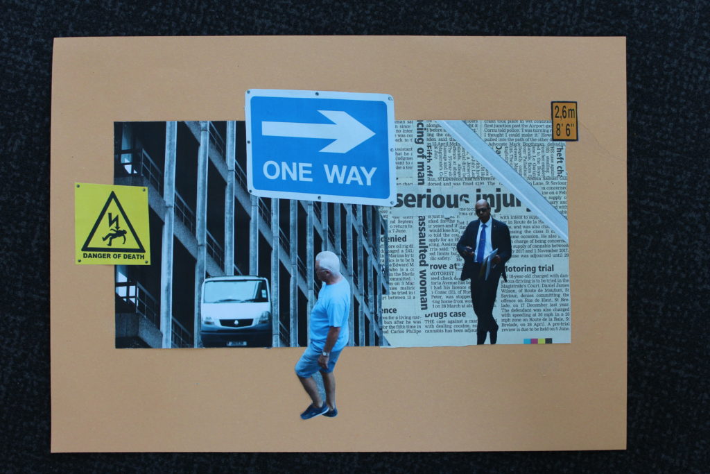
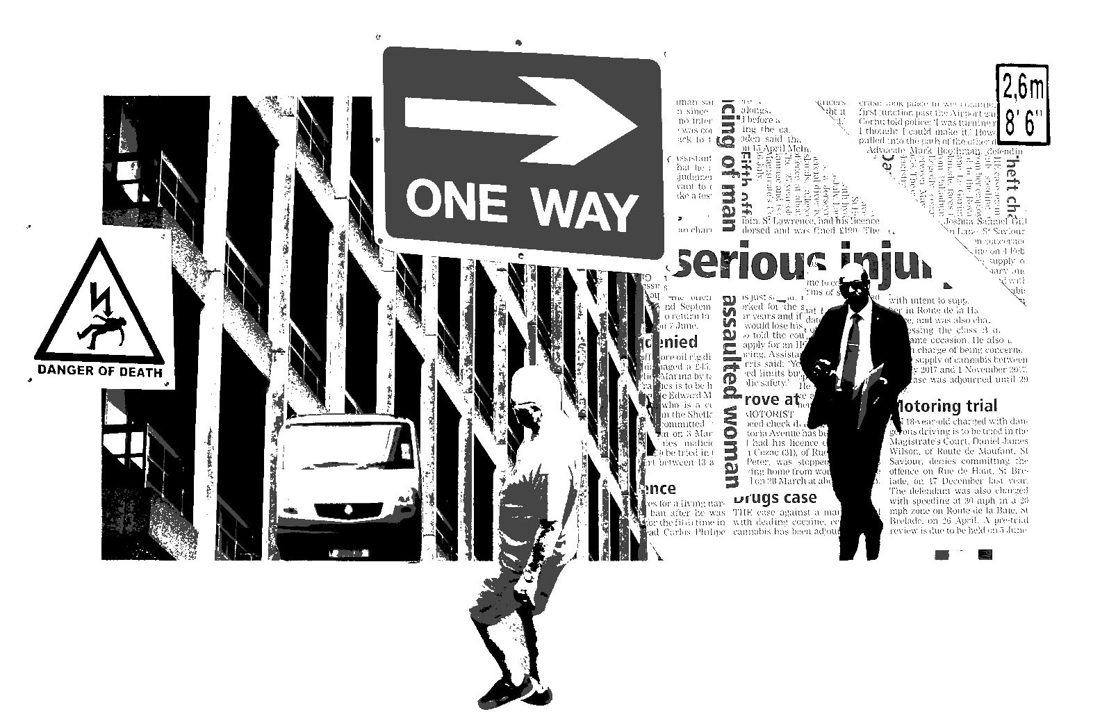
The last artist I drew inspiration from is Lewis Bush. The images I chose use a technique of cutting and pasting and repeating one image that creates an intense and overwhelming feeling. If I could apply this to portraits I would hopefully like to emphasise the emotion and individuality of each person I capture on the street by repeating key parts of their portraits that add flavour and insight to who they are and what their motives are in that moment.
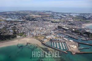 I think St. Helier has a lot of potential in areas of new construction, community and culture, especially because we are a small island with rich history and opportunity for improvement. Now, it almost gives me the impression as quite preservative with a need for change to improve life in 'town'.
Personally I think that we need to refine our community more than renew a concrete landscape.
In my view St. Helier is made up of the people who work and live in it. For it to become better, the sense of community and acceptance of all people needs to improve. However, the main focus of is construction, due to rise in population and demand for work spaces from the finance industry. I understand in order for the community of St. Helier to improve these steps must be taken, especially with the struggle to house the increasing population of Jersey. However I feel that Jersey thinks it has no room, time, or money for any creative art which essentially richens the islands culture and sense of community, not to mention boosting the tourism industry which once was one of the biggest industries in earlier years. St.Helier is dull and there is little art. Any time a proposal has risen to improve this, nothing has happened.
I feel that Jersey is trying to become something it has never been and this is essentially destroying the essence of the island. Jersey should improve on what we already have.
When we rebuild St.Helier it should enhance what we have in terms of landscape and history through art, photography and architecture, rather then try to be like an existing city.
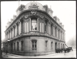
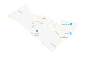 The area I have been assigned includes Broad Street which was St. Heliers first shopping area with many of the retail establishments opened up by English and French immigrants.
The side of the street that is now consisting largely of financial institutions was originally a row of houses. The opposite side of the street was made up of shop fronts which are now seen as the back entrances of shops on King Street. Overtime this has flipped around with the growth of town, as today the frontage of these shops face King Street. Many of the retail establishments were opened up by English and French immigrants, which leads me to focus on the people that make up St. Helier as inhabitants of Jersey have never been truly Jersey bred.