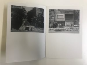
Zine 1
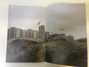
I find the content of this zine visually inspiring due to the narrative and messages it conveys. From my interpretations, I believe the photographer is using the juxtaposition between the rural areas and urbanized area. This allows the viewer to see what we are destroying and the potential locations to next be lost.
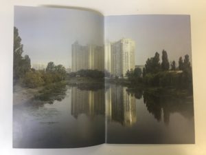
Zine 2
I was intrigued by this zine design due to the continuous theme running through. I like how the images are so similar yet different too and the night photography is pleasing to me. I like the bright colors and and reflections which I think give a futuristic feel to the images.
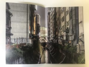
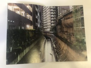
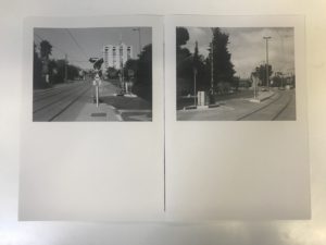
Zine 3
The main focus of me looking at this zine was to explore different ways of presenting my images other than the typical way of one image per page. I like how the zine has white space below the images which could be room for text or even room for the viewer to engage by imagining what could be there if the image was full size. It also gives the viewer a chance to stop and feel relaxed when looking through.
