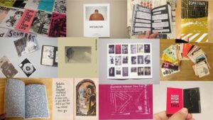
Mood Board For my Zine

Different Possible Layouts

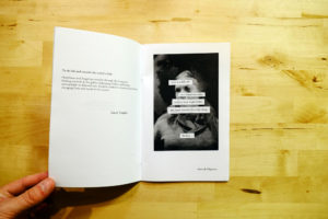
- Not sticking to the traditional page format and mixing text and images together. I think that this layout would be good if I wanted to give some context for an image. Or if an image was abstract and I wanted to give my reasons the changes that Ihave made to the image.

- Full Image bleeds over a double page spread, I really like the way that these images look, as I think that this layout allows the viewer to see all of the details in the image, so I think that for most of my landscape images I will display them in this format.

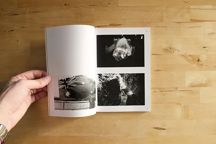
- Two separate images paired up next to each other.I think that this design layout will look good with some images, but with others will clash so this format will be a process of trial and error to see if I like the overall composition of the images together.

- Boarders. I think that I will use this design layout as it gives some breathing space to the zine as a lot of the images are full bleeds it can become a bit intense when viewing the images so have some blank space will help to give some contrast in the zine
