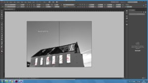
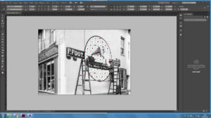
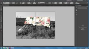
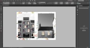
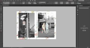
For most of the layout of the zine, I have decided to use the full bleed layout as I personally didn’t like the look of when there was lots of plain space. So on all of the landscape images, I have filled up all of the available spaces using the full bleed design layout which i think looks best for landscape images. On the four portrait images. I again got a ‘reto’ style of wallpaper that was relatively plain so it wouldn’t distract from the image which is meant to be the main focus of the page. I first went into Photoshop and brought down the vibrancy of the image and the saturation, so that the image of be less intense and easier for the viewer to focus on the main image, then places it behind the images. I wanted it to have the look as if the central image had been pinned up onto a wall. As the magazine is full on and there isn’t a lot of plain space I thought that having a subtle background behind the images gives it a nice finish.
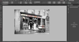
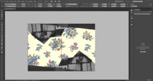
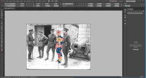
This is my final layout design for my zine, for this project I wanted to blend modern landscapes with more retro/old fashion wallpaper designs. Which was the idea that I got when on location in st Helier and what I noticed from my photos. That St Helier is trying to push its self-forward to become and very advanced tow., but you can still see the older parts of st Helier clinging on. Using this idea, I then I wanted to combine archival images, with the ‘retro’ styles that I had found, so in my images there would be a contrast of two and old which was the main idea that I wanted to portray with this project.
