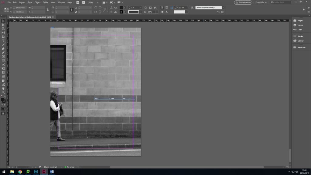
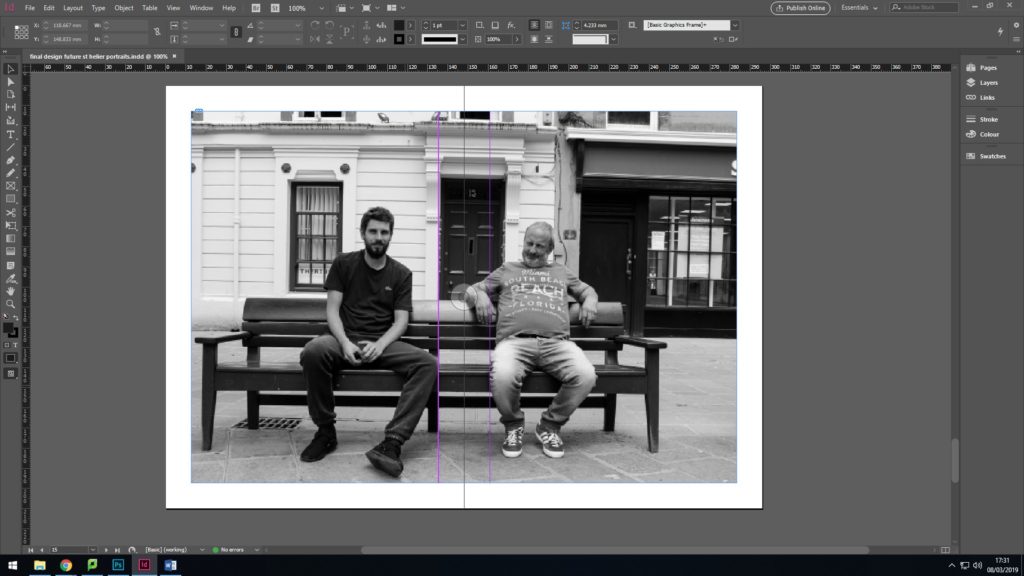
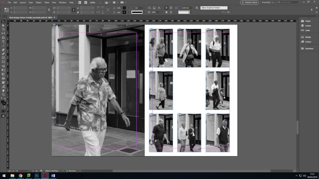
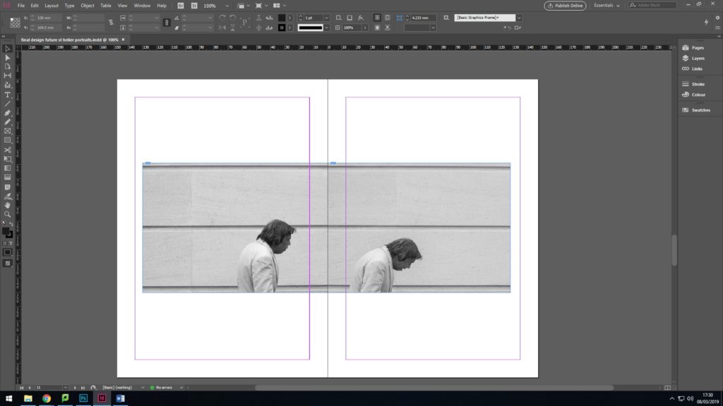
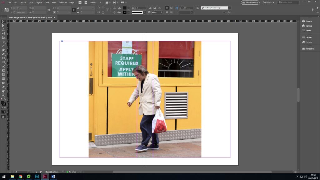
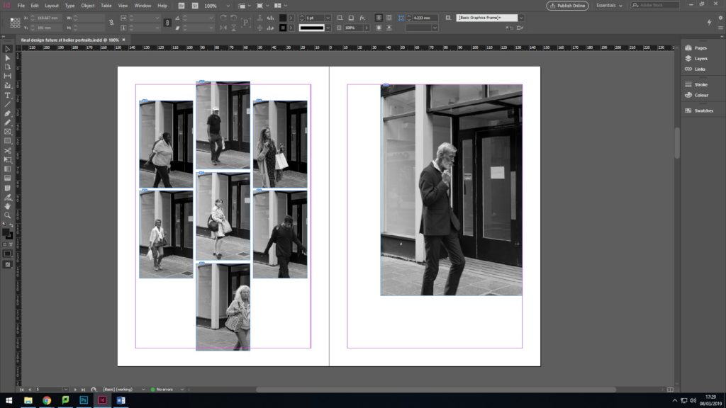
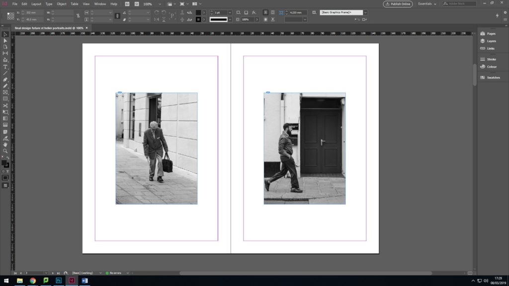
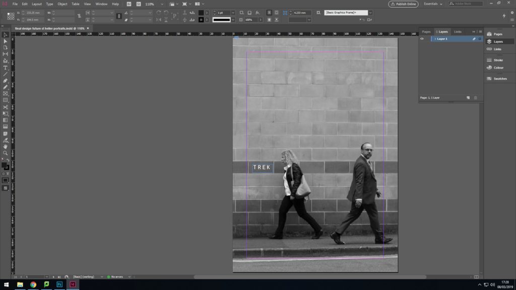
Below is my final Zine layout for the Future of St. Helier project. My first attempt of my zine had no structure, flow or theme and was a meesy outburst of colour that was too much to take in. Most of my didn’t link to any of my inspirations from the project so I had to re-think about artists that I had taken inspiration from. To relate to my initial ideas of photographing the people that make up St. Helier, I went back to artist Walker Evans and adopted his overall house style of editing. I then selected my strongest images from each of my photoshoots and edited them all black and white to correlate to Evans and also to simply display each photograph. I then explored layout and referenced contact sheets in some of the pages by arranging rows of images into the same format as contact sheets and shapes. I kept one photo in colour to; my strongest picture to break up the theme and let it stand out from the other pages.
