Who is Lewis Bush?
Born 1988, London, Bush studied history at the University of Warwick, to which he later studied photography and gained a master’s degree in documentary photography from the London College of Communication. This passion for a documentary approach caused Bush to take up The Memory Of History in 2012, where he explored the ten European Union countries to examine the effects of the European debt crisis. Here Bush intended to show the process of how it happened, and where unresolved history is reappearing and repeating itself “with the economic pain of the present”, using photography to show “connections between history and the present”
One of his most recent projects called Trading Zones looks at the financial sector of Jersey and the varying opinion that each of them have. To do this Bush has used various techniques such as topographies, landscapes, portraits and old archival imagery to present this work in his exhibition, because of this Bush intended to alert Jersey’s society to the dependence regarding the financial district and its history with how it could be possibly rejecting other aspects of creativity and independent businesses present within the island.
Some examples of his work from the Trading Zones exhibition I visited can be seen below: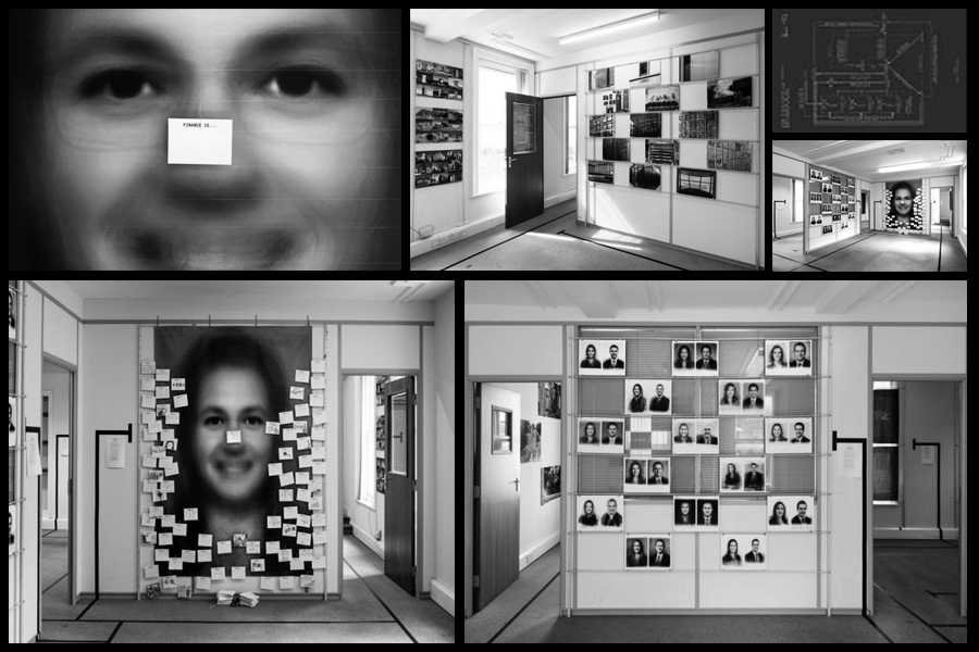 Within his article, Rule Breakers, Bush uses an idea of ‘eight rules’ to describe the rules and conventions of photography and how they are made to be broken. This was split into the seven sections of: The Rule of Objectivity, The Rule of Audience, The Rule of Manipulation, The Rule of Reality, The Rule of Technicality, The Rule of Ownership, The Rule of the Camera and The Rule of Rule Breaking. These are where I drew inspiration from regarding my previous shoot and research about The Rule of the Camera, where I created a photo-shoot and analysed the topic of conventions. However here I have decided to analyse one of the photographs taken by Lewis Bush to find what really create a political picture which breaks the rules of conventional photography. The image I chose for this is a photo from a series named Metropole which looked at how London’s new buildings show how the city is facing a terminal decline.
 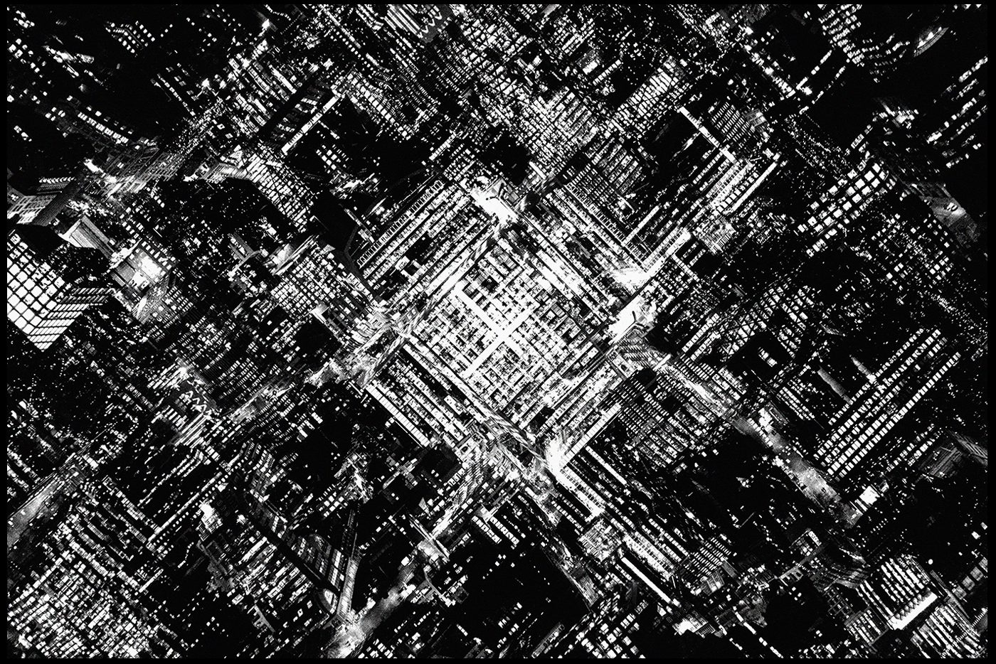 Technical: The image itself uses a threshold to create a purely black and white product which emphasizes any light present within the photo. By doing so this creates a more aesthetically pleasing result due to there now being a perfect mix of shade, with neither becoming too overpowering for the next. This is also complimented by the symmetry which the piece has been composed in, by placing the city square in the center of the piece it produces an insight into the design of that city and how it can almost be interpreted as pattern like in its layout. When taking the picture it looks like a low shutter speed was used in order to capture and illuminate any light present to the camera, this resultantly makes streams of light along roads, removing any presence of cars whatsoever.
Visual: Visually the piece is extremely aesthetic, this is down to how there are only two shades present in the photo, black and white, which are both composed in a symmetrical and visually drawing way. The focal point of this image is the city square which becomes the main focus of attraction for viewers due to the lighting in that area being the most congregated and overpowering, due to this it almost neutralizes the rest of the image from becoming too vague and generic, instead breaking it up to become a broken-pattern.
Conceptual: The series that the piece comes from called Metropole, where it wishes to highlight how social housings now become luxury flats, and their inhabitants are forced out into the suburbs, resultantly making the inner zones become even more humongous and expensive, but also equally dull. This is what the Metropole series wishes to shed light on, a project that aims to visualise and change the skyline of London, to image how the city will come to look in the future and most importantly seek to recreate the sensation of feeling lost in a city that was once familiar. The series itself is a take on the city symphony movies taken in the 1920s which show the benefits of living in urban environments, however Lewis Bush subverts this into one which provides the negatives.


 Within his article, Rule Breakers, Bush uses an idea of ‘eight rules’ to describe the rules and conventions of photography and how they are made to be broken. This was split into the seven sections of: The Rule of Objectivity, The Rule of Audience, The Rule of Manipulation, The Rule of Reality, The Rule of Technicality, The Rule of Ownership, The Rule of the Camera and The Rule of Rule Breaking. These are where I drew inspiration from regarding my previous shoot and research about The Rule of the Camera, where I created a photo-shoot and analysed the topic of conventions. However here I have decided to analyse one of the photographs taken by Lewis Bush to find what really create a political picture which breaks the rules of conventional photography. The image I chose for this is a photo from a series named Metropole which looked at how London’s new buildings show how the city is facing a terminal decline.
  Technical: The image itself uses a threshold to create a purely black and white product which emphasizes any light present within the photo. By doing so this creates a more aesthetically pleasing result due to there now being a perfect mix of shade, with neither becoming too overpowering for the next. This is also complimented by the symmetry which the piece has been composed in, by placing the city square in the center of the piece it produces an insight into the design of that city and how it can almost be interpreted as pattern like in its layout. When taking the picture it looks like a low shutter speed was used in order to capture and illuminate any light present to the camera, this resultantly makes streams of light along roads, removing any presence of cars whatsoever.


