The term ‘Zine’ was coined in an October 1940 and stems from the shortening of the word magazine and was developed as a rejection of commercialism and mainstream publications. In stark contrast to the mass media industry, zine artists don’t seek to make a profit. Instead, they are designed to share ideas, stories, and artistic work.
- It’s a tool that photographers can use to tell a visual story, to inform an audience about a specific topic or issue, to showcase and advertise a new idea.
- The constant evolution of technology mixed with older, more traditional techniques means that zines continue to intrigue with highly individual and versatile methodology.
Photographer James Moreton Interview://www.thephoblographer.com/2017/05/05/why-photographers-should-create-zines/
‘I believe the photographic book is the best medium for photography. The ability to create impact by pairing, juxtaposing and sorting pictures into a flow in order to tell a story or instill an emotion in the viewer is unsurpassed by any other photographic medium. Having something tactile in your hands that you can keep and look at on your own terms is also very important. A zine is an accessible way for someone to create this object and they can take on many different forms – from a very DIY aesthetic to high end magazine print quality.’
Different Zine designs:
John Darwell:
The British photographer John Darwell is an independent photographer working on long-term projects that reflect his interest in social and industrial change, concern for the environment and issues around the depiction of mental health.
To date he has had seventeen books of his work published. As a photographer, Darwell “roots himself in neglected landscapes”.[1] His early work, published in Working Lives and The Big Ditch, was in black and white, but he moved to colour soon thereafter and has not used black and white since.

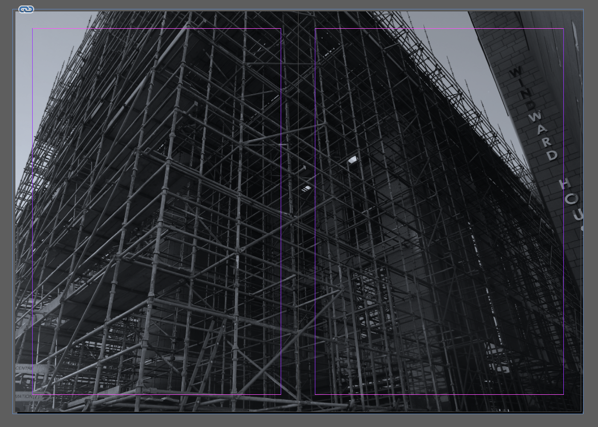
From series ‘Scratching the Surface’ that looked both at the extractive industries of Cumbria and also asking the question as to whether we photographers can ever do more than scratch the surface of our subject matter.

I first discovered the photographer John Darwell in class where I read his zine called ‘Sheffield in Transition’. He uses a roll of colour negative film which is different from his previous work which is in black and white, and looks at a more contemporary approach looking at contemporary issues, in terms of post industrialisation and often problematic redevelopment schemes. ‘Much of the work I produced in Sheffield had a strong and explicitly political edge that gad only been been hinted at in mt earlier works.
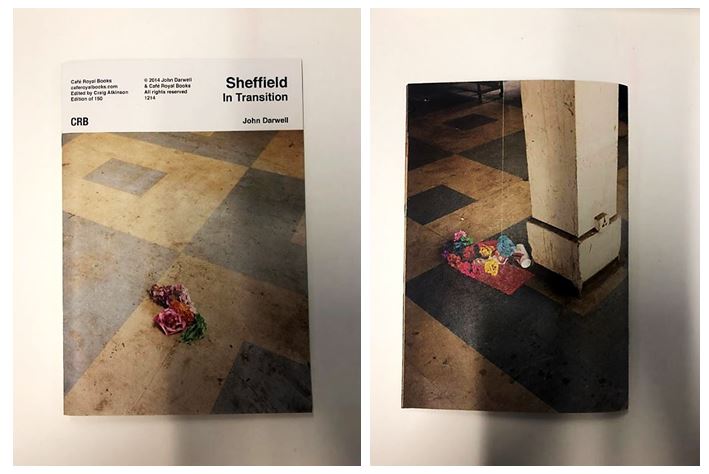
The front and back of his zine contain images taken in the same place but at different times. It clearly states the name of the zine ‘Sheffield in Transition’ on a white background creating a professional appearance.
His work has been exhibited, and published, widely both nationally and internationally, including numerous exhibitions in the UK, the Netherlands, Italy, the USA, Mexico, South America and the Canary Islands, and is featured in a number of important collections including the National Museum of Media/Sun Life Collection, Bradford; the Victoria & Albert Museum, London and the Metropolitan Museum of Art, New York.

- This page earlier on in the zine was my favourite as it includes the use of text as well as images to explain his concept. I also liked the used of the yellow background behind the black text to emphasise it and to link the the page on the right which shows an image of rubbish and plastic surrounding one area and hanging on a tree.
- The yellow plastic bag is highlighted through the use of the same colour yellow background on the left page, linking the two together but still juxtaposing, going from lots of detail on the right to hardly any on the left.

- As the zine continues it displays landscape images across double page spreads throughout. I like this layout as it forces the reader to compare one image to another and to be surprised by the contrasts between each one when they turn the page.
- For example, the image above show a more industrial looking image with bold structures and lines juxtaposed containing colours with similar neutral tones. This is juxtaposed with the chaotic image of a pile of paper and plastic rubbish on the next page with different patterns and contrasting colours.
- Having this image after a more simple and structured image emphasises the chaotic and disordered nature as it’s two extremes one after another.
David Johnston:


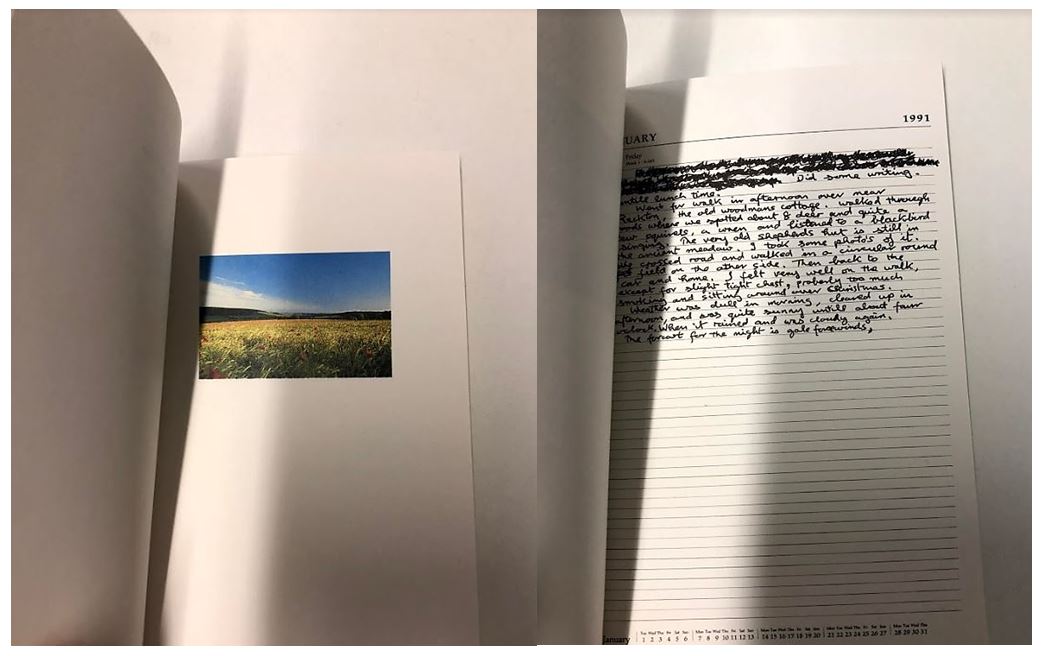
I then looked at another zine by the photographer David Johnston called ‘Long walk’ where he displayed single images of the country side alongside side diary entries of what he experienced on his journey. For example the first diary entry reads: ‘Did some writing until lunch time. went for walk in afternoon over near Rackton, the old woodmans cottage. walked through woods where we spotted about 8 deer and quite a few squirrels, a wren and listened to a blackbird singing.’ The layout of the diary entries are messy like he quickly wrote them after he did or encountered something which gives the whole zine a more authentic feel. He also includes the crossings out and mistakes grammatical mistakes he made like no one would be reading his entries, which makes the zine more personal as he’s sharing his thoughts and feelings with the reader. The front cover is the only full page image in the zine making the reader expect find more inside but only contains small images in the top half of one page on a double page spread.
David Johnston has for many years made photographs during walks through the West Sussex countryside. His work constitutes a private archive of thousands of images, a personal and highly detailed account of seasonal and social change across a specific rural landscape. The Country Life series, curated by Val Williams, invited artists to respond to the George Garland Collection, archived at the West Sussex County Records Office. Like George Garland, David Johnston is committed to the preservation of the rural landscape, and is assiduous in making photographs in which no traces of the modern world are evident. The publication and exhibition of Long Walks expresses the commitment of the Country Life project not only to commission new work, but to also explore existing archives and to recognise the value of non professional photography within the community.
The end of the zine contains ‘Forms of Blossoms’ giving information about the form and parts of flowers expressing David Johnston’s interest and passion for nature. It also contains a glossary listing 55 names of parts of flowers, the contrasts with the start of the zine where David Johnston expresses his experiences to facts about the forms of flowers linking back to the Country Life Project.