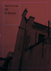
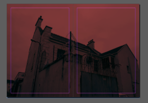
This will be the front page of my zine,I chose this due to the impact of the red and through the interesting composition allowed a clear title to be effective wihtin the top left corner. I chose a bold but yet elegant text, overall I think this is an effective for a cover and the rest of the building to carry onto the back will be effective. Due to me also wanting to make a hard cardboard cover with a strong colour and clear visual stimulus it shows a clear connection from all the front covers.
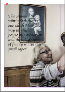
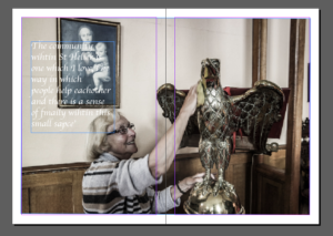
I decided it would be effective to use a quote of a lady to whom I interviewed in St Helier. I think this gives a story to the zine itself and a sense of community and really brings in the aims of presentation wihtin the Morden and older areas of St Helier. The text I chose was more twirly,I chose this as it connotes age of the lady and also demonstrates a fitting composition as this was taken inside a church. This is a double page image but I have given it a boarder as it has a lighter undertone. This at the end will make it smaller than other images but due to the different areas of interest such as the text, face and statue attention will still be drawn to the photo.
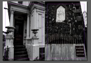
I wanted more harsh black and white pieces to cover all of the page.I chose these two images as I did not use them much previously and think they both demonstrate aspects of deterioration and contain a strong composition to the previous image. The strong white in the left image and the white in the centre right show a synritity to the images and I think the direct divide is successful in a simple display of the images.
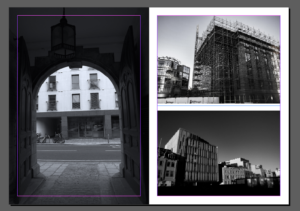
As said in my previous post I want to experiment within different layout. I wanted to choose images which all chose the stature and impact of buildings in slightly different compositions. Again I have edited all of the images into black and white this then shows a strength to the images and also shows implications to look at the buildings structure and not the images themselves.
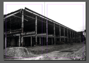
I chose this piece due to the interesting composition and how on a large size of glossy paper the strong impact this would have. It also has a clear convention to being connected to the construction,destrcution and remodernisation of St Helier. I think the angle and harsh composition really creates a successful piece. Although this piece is very dark tonally It creates a very strong impact altogether.
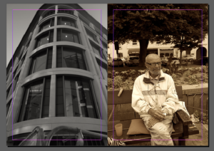
I am not sure however about this double page. In my mind I think the colours or specifically the tonal shading of the black and white does not site each-other. I wanted to show a contrast within the older community and people living within St Helier versus that of the new modern buildings. I think this is an interesting idea when done correctly but I will need to do further experimentation into this piece.
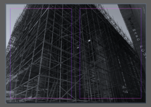
This is now one of my favourite images so I have decided to give it a double page spread. I like the way in which it is cut off as this implies its huge stature,I think the image itself is enhanced though the tone and the way in which the scaffolding creates a three dimensional atmosphere.
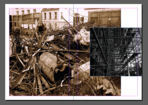
Lastly I wanted to experiment even more so within composition so making a miss matched composition. I think this is interesting as it presents two different types of rebuilding and the different tonal of warmth and coolness contradicting is highly interesting.
