What is a Zine?
The main difference between a magazine and a zine is that zines are not out there to make a profit but, rather, to add other, often unheard voices into the mix.
Historically, zines have been self-published as pamphlets or leaflets as early as the 1700s. They were circulated independently by socially-marginalized groups to give voice to their opinions and beliefs. Over time this developed into an array of other topics, with the first “boom” of zines starting in the 1930s. Known as “fanzines” and “perzines,” these were started by fans of science fiction magazines who self-published zines about both science fiction and the connected fandoms behind them.
Moodboard:
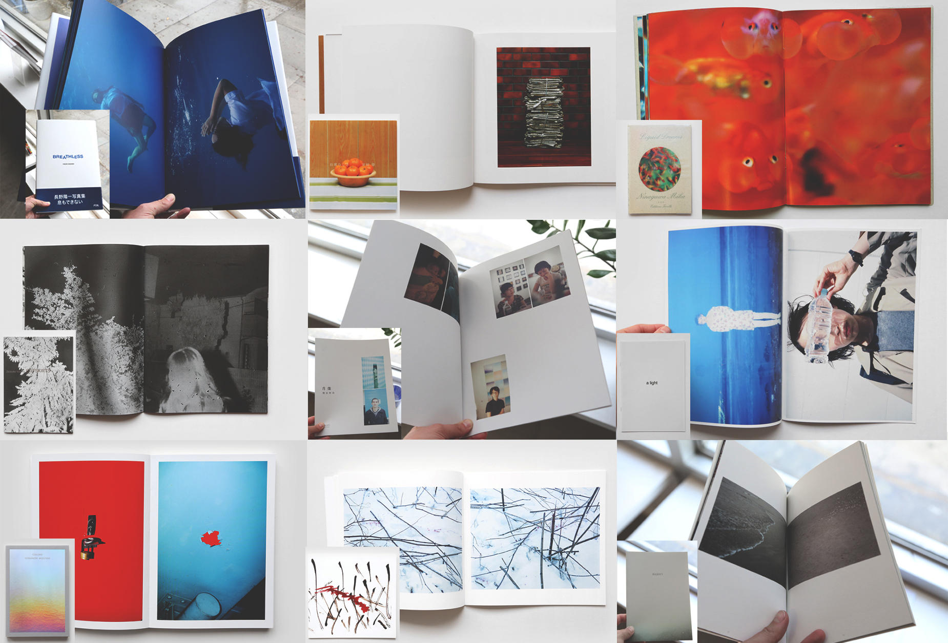 I created this moodboard to showcase a variety of different zine types, this is because I want to experiment with multiple designs before picking a final selection.
Evaluation of Zine: ‘Turves’ by Christopher Days
Turves, a remote village amidst the Cambridgeshire fens, is home to a unique and profound world that, until now, has been little documented. This series showcases the world of greyhound racing, and its struggle in today’s society to withhold mainstream appeal. Christopher’s unique approach observes relationships between greyhound and trainer, and explores an absolute intimacy that exists beyond the race track.
I really like this zine, the photographer manages to document everything happening at the greyhound training house in an unbiased matter, however,he still manages to comment on the circumstance with his use of the camera. The photos are dark, stark and cold; they’re deliberately shot in this way to portray feelings of sadness and sorrow the photographer probably feels towards the topic. In terms of design and arrangement, there is a lot of blank space in this zine, the photos aren’t arranged in any clear pattern or manner; this further reinforces his views and adds a sense of disorder to the zine.

