J A Mortram

J A Mortram is a British social documentary photographer and writer. He is the photographer that produced the first zine in my previous post – the zine is from his ongoing project titled ‘Small Town Intertia’. Mortram records the lives of the disadvantaged and marginalised, making repeated visits with a number of people living within three miles of his home. The project tells stories of “isolation, poverty, drug abuse, homelesness, self-harm, mental illness, juvenile crime, and epilepsy”, that Mortram believes are otherwise under-reported.

I chose to study J A Mortram because he looks at individuals in the present tense but he also goes back and visits to see development and change, as we are doing in the ‘Future of St. Helier’ project.  His photographs appeal to me as they are very bold and look at sensitive subjects such as mental illness and drug abuse. The high contrast photographs all blend together well to create a strong collection of photographs.
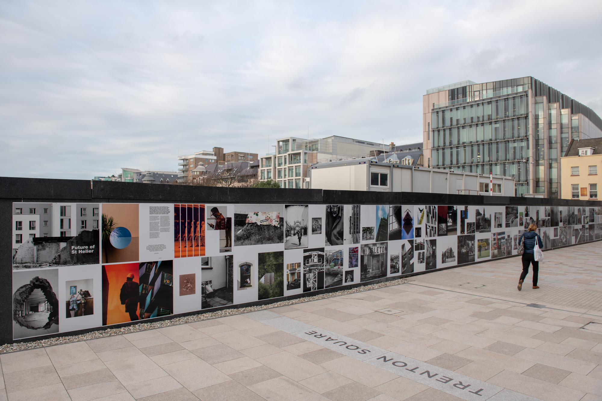
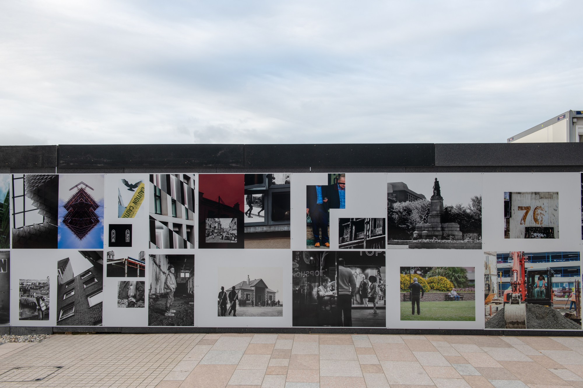
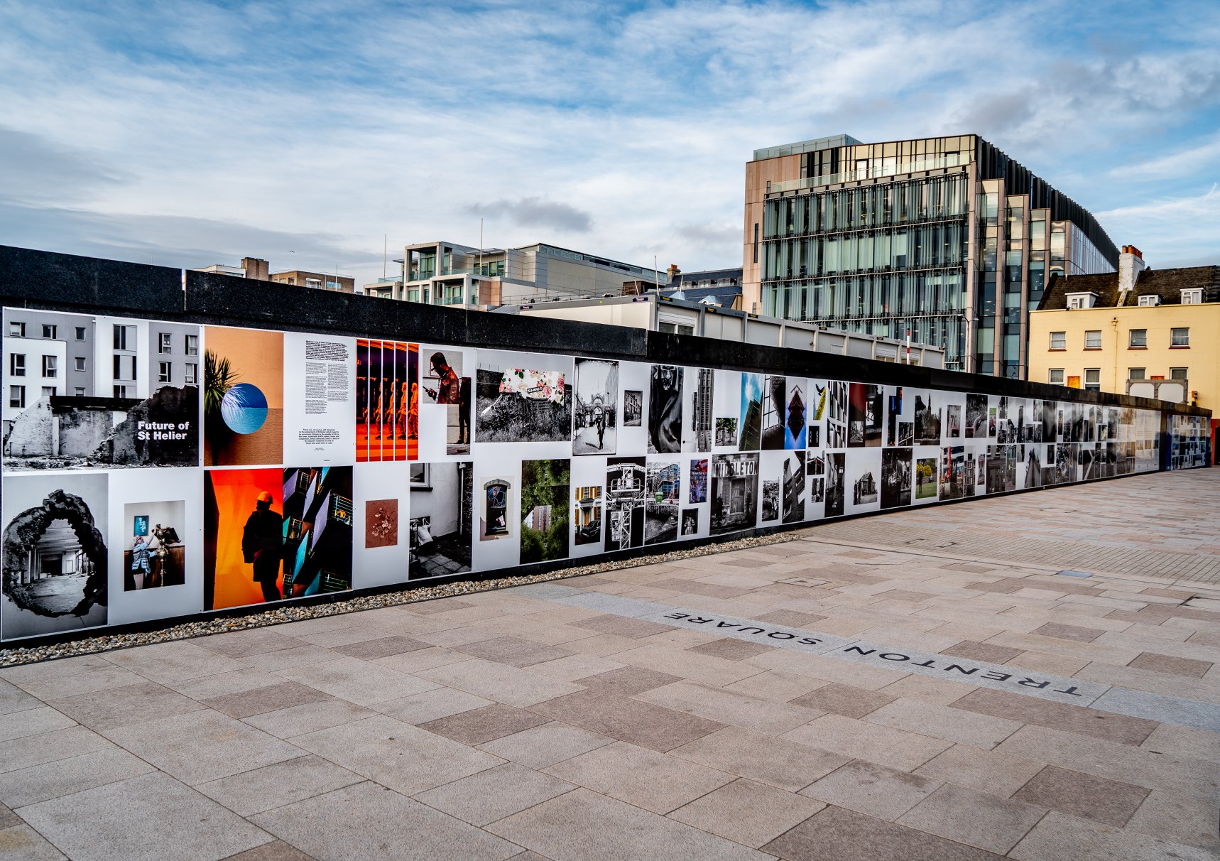
Mood Board

Image result for J A mortram

Image result for J A mortram

Image result for J A mortram

Image result for J A mortram

Image result for J A mortram

Analysis

Image result for J A mortram

This photograph appears to use the dim natural lighting within the household in order to create a dark and contrasting atmosphere. This contrasting atmosphere creates some areas in the photograph where the subject is over-exposed such as the body of the man hugging the dog – this goes towards creating an even more dramatic feeling to the photograph. A short-medium depth of field seems to have been used as the photograph starts to fade out towards the edges – possibly due to the vignette effect. A quick shutter speed no slower than 1/60 appears to have been used as well due to the dark nature of the photograph, this dark nature may have further been emphasised by the use of a low ISO.

The photograph is also in black and white which creates an idea that there isn’t much happiness or positive energy in the subjects, it makes the setting seem very dark and draining. There is a very wide range of tones within the photograph as in parts it is nearly fully black where as in others it is bright white. There are many subjects in the photograph to lead the eye too but the initial subject that caught my eye was the table in the middle – possibly due to it being at the forefront of the photograph presenting the mess in the photograph. This gives the photograph a slightly 3D effect.

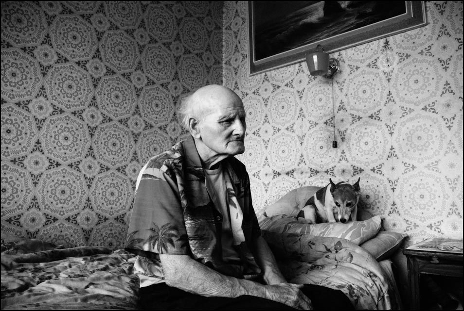
This photograph is from his zine titled ‘Diary Entries’ from his ongoing project ‘Small Town Intertia’ in which Mortram records the lives of the disadvantaged and marginalised, which can clearly be seen in this photograph as there is mess everywhere and it is obviously not a pleasant place to be living in.

I feel that Mortram is trying to shed some light on the disadvantaged and how they live by showing the rest of the world through his photographs and zines. Mortram says that these topics such as drug-abuse and homelessness are under-reported so this is his attempt to show people how privileged they are.

Image result for J A mortram

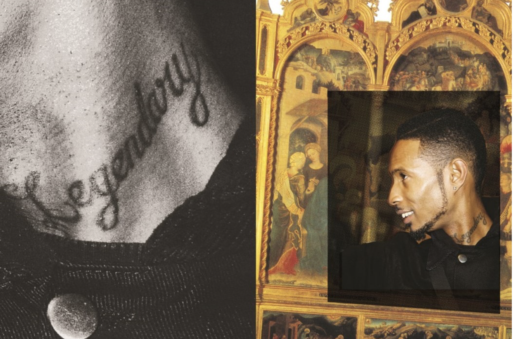
This photograph using natural lighting in order to convey the fact that this photograph is in the style of documentary street photography. The natural light ties in with the idea that these are just normal people living their lives and the photographs are not staged. It is quite a contrasting photograph in order to create a dark/glum atmosphere – which the setting in the background does itself. A deep depth of field has been used to take this photograph as the whole of the photograph is in focus. A quick shutter speed of around 1/60 will have been used to take this photograph due to the natural daylight. A low ISO has most likely been used here as the photograph is quite dark but not underexposed.

The photograph is also in black and white which shows how bleak and possibly hopeless the life of the subject it. There is a wide range of tones within the photograph due to the high contrast within it. The eye is lead straight away to the tattoos on the subjects back, which seem like a bad decision to most people and so further pushing the idea of what setting this is in. The photograph does not have many layers to it – only the man in the foreground and the walls in the background so there isn’t a major 3D effect within this photograph.

This photograph is another photograph from his ongoing project ‘Small Town Intertia’ in which Mortram records the lives of the disadvantaged and marginalised. Here Mortram shows someone that has made bad decisions and doesn’t seem to be in a pleasant setting to emphasise the idea that they are marginalised.

I feel that with this photograph Mortram is trying to show that everyone has their own unique properties and stories – he is emphasising that the marginalised and disadvantages are no different to the privileged in the sense that they make their own memories but in their own way.

Draft Zine Layout

Here is my first draft layout of my zine design. I believe my choice and sequencing of photographs and my use of basic text is very effective and clean. I have tried to keep things as minimal as I can as i didn’t want to draw any attention away from the photographic content itself. However something that I am not too sure on at this point is the layout in terms of alternation and sizing of the images, I think if I was to experiment with alternative layouts using full bleed spreads and maybe overlapping images this could make for a more visually interesting sequence of images. So this is something which i will try when coming up with my final design for my zine. I may also experiment with the placement of the text used in the zine because at this point it is all very central rather than alternating or randomly placed etc.

FUTURE OF ST HELIER NEWSPAPER AND INSTALLATION

My Final Spread – Newspaper

My final image that I put forward for this newspaper was this:

The image was too big to place as a whole on a single spread so I opted for a double spread design. It was a montage of multiple images I had taken over the course of this project, juxtaposed against an old photograph I obtained from the archive. The image is conveying how new building, and essentially a new version of St.Helier (new photographs) is being built on the foundations (old archival image) of the old St. Helier. The overall project was interesting; though, as someone who had only moved to jersey 3 years ago, I didn’t feel as much of a connection with the city and island and in that sense, my approach was very different and almost like one of an outsider. Portraying the capital in a way that people who have lived here all their lives may have not thought of.

Hoarding Installation

The unveiling of the Future of St Helier Hoarding at the International Finance Centre on the Esplanade in St Helier took place on Thursday 13 Dec 2018.

First published as a 52 page newspaper supplement in September by the Jersey Evening Post the work produced by A-Level Photography students at Hautlieu School have been transformed into a 34m outdoor installation as part of Masterplan Community Arts and Education Project

We were challenged with responding to specific areas, streets and neighbourhoods divided up along the urban vingtaines of St Helier and to explore through research, archives and photography the built-environment, urban living, diverse communities, town planning, land use and re-generation projects.

We thank all sponsors and collaborators for making this a successful contribution to the island’s cultural records and historic archivesJersey Development Company, Camerons Ltd, MJP ArchitectsArchisleLewis BushPhoto-Archive Societe-Jersiaise, Kevin Pilley,States of Jersey and Connétable of St Helier,Simon Crowcroft

Earlier today we unveiled the Masterplan Future of St Helier hoarding display at the International Finance Centre. Lots of local media interest from Jersey Evening PostITV Channel TVand BBC Jerseywho broadcasted live on radio talking to photography students at Hautlieu School, Constable of St Helier, Simon Crowcroft and sponsors Jersey Development Company, Camerons Ltd, MJP Architects about the future of the island and its capital. An excellent example of how a community arts and education project can generate a debate that affects all those who either live, work or visit St Helier.

If you are interested in our views of young people tune into BBC Radio here (listen from 3:18:30 onwards or watch the six o’clock news tonight on ITV.

https://www.bbc.co.uk/sounds/play/p06rlpdw

If you missed the news last night at ITV Channel TV you can catch up here with Hautlieu students talking (15m.12s) about their images on display at the Masterplan Future of St Helier hoarding on the International Finance Centre.

See link here

The outdoor installation on the hoarding around the construction site is a great way to engage the public in art and debates concerning the future of the island’s capital but, what we need in Jersey is a new contemporary art space that will provide a new venue to showcase art produced in the island, but equally also bring international art to Jersey for the public enjoyment of its residents and visitors alike.

The recent Culture, Arts and Heritage Strategic Review, commissioned by the Government of Jersey makes 20 new recommendations that will revitalise the island’s cultural infrastructure and achieve a wide range of social and economic objectives from tourism, to health and well being to external relations, to planning and environmental developments – in the hope that in partnership with Government it will enrich and enhance Jersey’s quality of life.

Let’s hope those in power who can make real changes to St Helier’s build environment will include such a new art space in the revised Masterplan of the Waterfront. All we need is political will and re-prioritising public funding for the arts. States of Jersey

Future of St Helier Newspaper

The outcome of students work was first published on Tuesday 18 September 2018 as a 52 page newspaper supplement, Future of St Helier that was printed in 14,000 copies and inserted into a daily edition of the Jersey Evening Post and distributed island wide.


Here is a video browser of our Future of St Helier supplement printed and distributed in today’s edition of the Jersey Evening Post. Hautlieu photography students were challenged with responding to specific areas, streets and neighbourhoods divided up along the urban vingtaines of St Helier and to explore through research, archives and photography the built-environment, urban living, diverse communities, town planning, land use and re-generation projects. Each student designed a page spread which was then split in half producing a fragmented image reflecting on the nature of experience and diversity of St Helier.

Here is a video browser of our Future of St Helier supplement printed and distributed in today’s edition of the Jersey Evening Post. Hautlieu photography students were challenged with responding to specific areas, streets and neighbourhoods divided up along the urban vingtaines of St Helier and to explore through research, archives and photography the built-environment, urban living, diverse communities, town planning, land use and re-generation projects. Each student designed a page spread which was then split in half producing a fragmented image reflecting on the nature of experience and diversity of St Helier. Make sure to get your copy before the shops close!Thanks to everyone involved in the creative process Archisle Lewis Bush, Jamie Cole, Simon Crowcroft, Kevin Pilley – States of Jersey and our sponsors Jersey Development Company and Camerons Limited.

Posted by Martin Toft on Tuesday, 18 September 2018

Analysis of a zine picture book

Joseph Patterson created a zine in order represent underground music as a creative renaissance of generations.The grime and hip hop scene was flourishing and he wanted to develop emerging themes and allow them to flourish within his work. The mainstream coverage of this work is typically poor and actively neglecting the scene and portraying a harmful approach to the music by the conservative media. His work shows a space that was ‘actually invested in underground music in youth centre’ they described as wanting their images less formal so a zine would be a unique format to enhance their work.

His images are a mix between a shoot on location and rarely people on stage as they do not want a featured person to be perceived a certain way in which they would not deem themselves. They use a mixture of overlapping imagery within their displays and writing quotes on some pages, usually the images have a strong contrast of time periods and the colours connecting them are overlapped between vibrant and black and whites.

This particular artist and group are typically based online which is why they launched this zine issue as it features a Longform and creates something in which you can look back at in years to come. lots of their work was inspired by DIY culture and stripping back and keeping the core elements of a photo and celebrating a passion and making your work personal by the intricate way In which you put it together and the people you surrounded yourself with. They want to highlight the importance of interconnectivity between the worlds of online creativity and physical when coming to photography.

Analysis;

I think this zine has conceptually a really interesting subject matter and narrative,although their is no chronological order or a method to which the story is being told but a representation of a current state of living for people within the underground crime music industry.It demonstrates a subjectivity of community within passions of people and the importance and influence music can have upon young people. The images itself develops the narrative construct of time and the comparison of having two highly different timeframes being presented as one (renascence and modern day) the images have an interesting composition of overlapping images to be placed upon older original works of art, these allow the placements to look more abstract and be Random in their framing but close up allow a intertwined structure to the narrative. The colours while are light do not reflect any vibrancy and come across as dim, this is to symbolise a similarity when forming to the older more dim and reserved older images. Overall I think this zine is highly effective with its message and is highly unique in comparison to many other zines.