Zine; A Zine is an effective method of marketing and presenting your photography, they have been created for years there is a creative athletic collaborated wihtin the making of zines. it creates the ability to create a impact of juxtaposing and sorting images into a story in order to enhance emotion.There is an energy and ability to show yourself through the work as you make it yourself. This aesthetic enables a tactile creative freedom. I believe that zines look and feel professional and achieve a high quality when out onto thick paper and good printing, it allows a completed piece and presentation without the harsh formality to take away from the piece itself. its expressive and shows a desire of photography throughout.
When gathering my visual inspiration I wanted to concentrate on the themes of narrative, subject,design and concept. When choosing the theme of my Zine I want to have a constant theme throughout and so not having a segregated feel to the piece as a whole narrative concept. I wanted the narrative to be the history and time present throughout St Helier, I wanted emotion and periods of time to be expressed through the modernisation and deforestation of St Helier and the people who have inhibited St Helier for long or short periods of time and the cultural impact of the area on them as a whole. This embodiment of time, emotion and urbanisation forms St helier in a unique frame which would be intriguing wihtin the prevention of a zine.
When questioning the theme of the piece I want to show how neglecting periods of significant historical moments such as ww2 and the occupation had upon old buildings and families within The red section of St Helier,The deep urbanisation and neglect for buildings shows a historical significance of abandonment and reflection of past times, which some elders say shares community and ethnicity within people and the reflection upon each other. However between my photos you can see a current distinction between the modern building up or architectural developmental impact upon the people and the money in comparison to the people within this section. When using this theme of history of time to use a comparison of people and community effect and wether work or community is enhanced wihtin the specific section of St Helier.
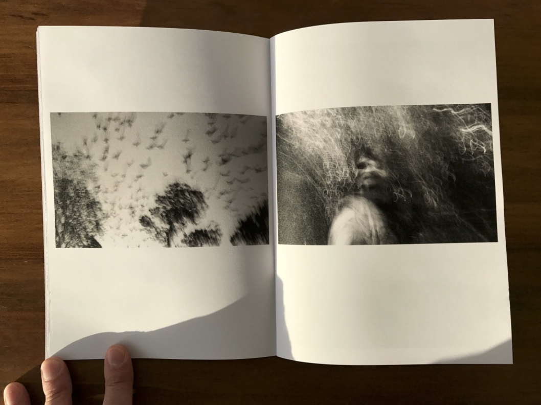
My subject matter at the start of this project was more projected upon the buildings of St helier and the different narratives of building destruction and neglect, this then illuminated the possibilities of reflecting the people who live among these communities. I think my most successful images are of the subjects of construction of buildings such as piles of rubble and construction. The thematic colour of red also connotes a historical reflection of war and how the buildings being taken should be a reflection of a movement or however an ignorance go past history.I believe in this 16 page booklet the buildings would be more conceptually pleasing and also creative a narrative more available to the reader. My whole concept overall for the Zine would be a time frame of chronological demolish rebuilding and relation fo people living in the various areas itself.
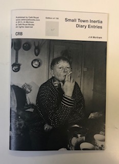
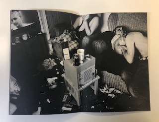
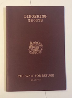
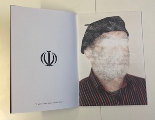
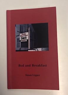
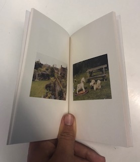
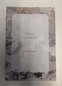
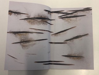

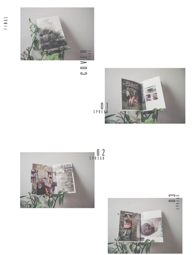
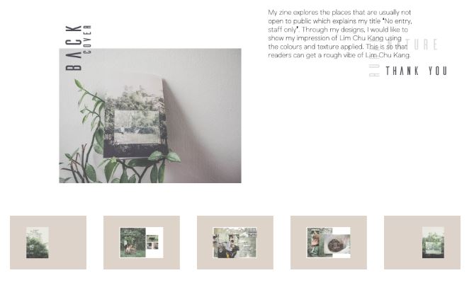
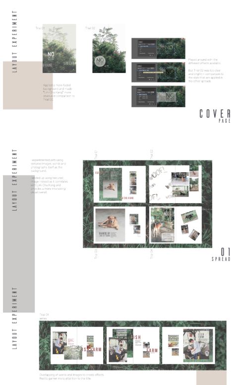
 I believe that this zine is a very successful outcome as it covers various different compositions and layouts of images whilst remaining minimalistic. I also like the basic fonts used in the zine as they do not distract of draw attention away from the images themselves, this is something which I hope to do in my own zine.
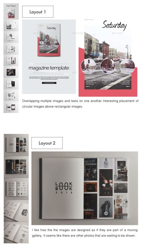
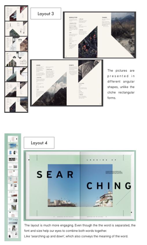
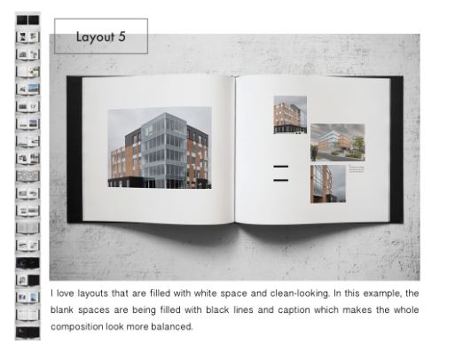 I believe that it is good to look at many different examples of what it is that you are creating, as it will give you as much creative inspiration as you may need.
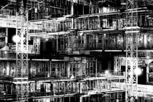
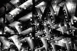


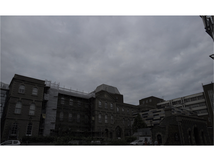

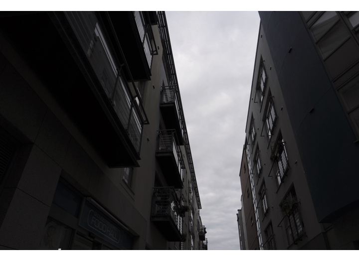
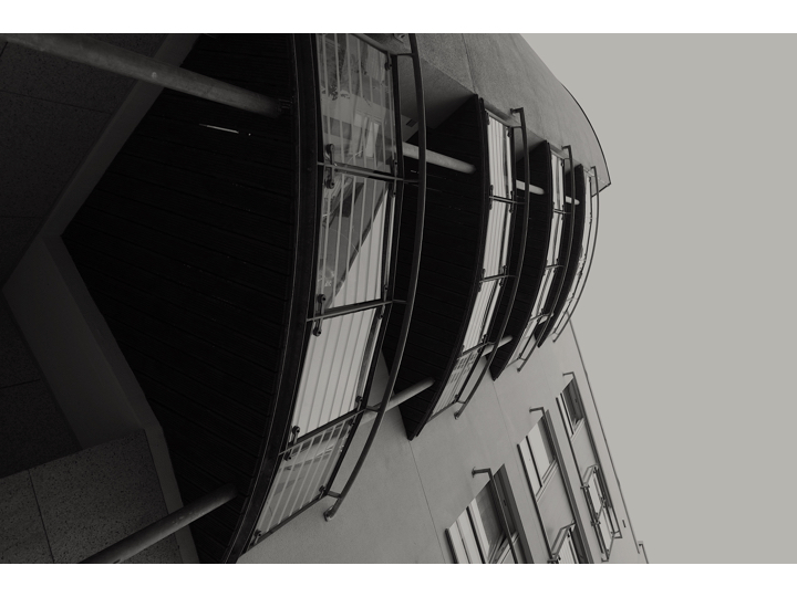


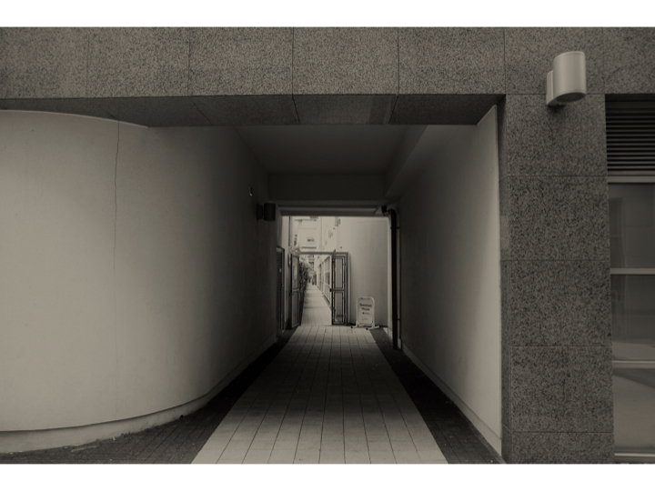


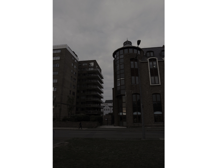
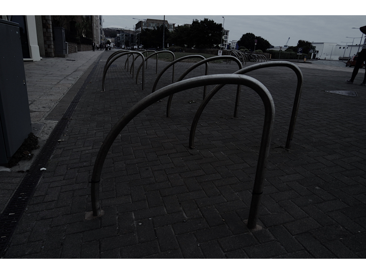


 Evaluation:For this shoot I wanted to finalise and make sure I have been to multiple areas In St Helier and reassure the images I have are the best way to capture St Helier in a successful angle altogether.I clearly focused more on the architectural side of my narrative within this shoot and wanted to display different angles that can be turned conceptually into an idea of character which each section holds. Within these images Morden buildings are the recurring them although you are able to see some significant monuments and buildings more neglected and so perceived as urban. When editing the images I wanted to enhance tonal features and so the composition of shadows and the angles of the edges and shadows of the building themselves. This shows a presence to the work and position the more built upon section of St Helier to have more power and authority over previous sections. Overall I will not use these images as my final and will continue to keep my previous red images as they show a more possessive narrative of destruction reconstruction modernisation and the community which lives among this constant time.