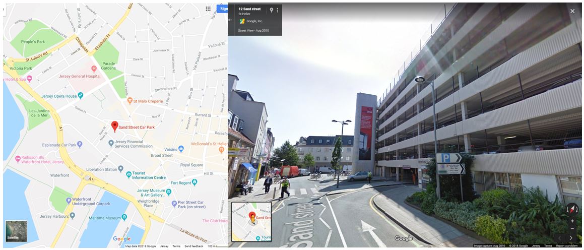
For my third photoshoot I wanted to focus on the more of the industrial aspects of buildings in this shoot. I first visited Sand Street car park which is surrounded by houses and buildings being near the centre of town. I also wanted to walk around and explore the roads in that area to fins more industrial buildings and structures. I narrowed my images down to 60 and displayed them below in a contact sheet.
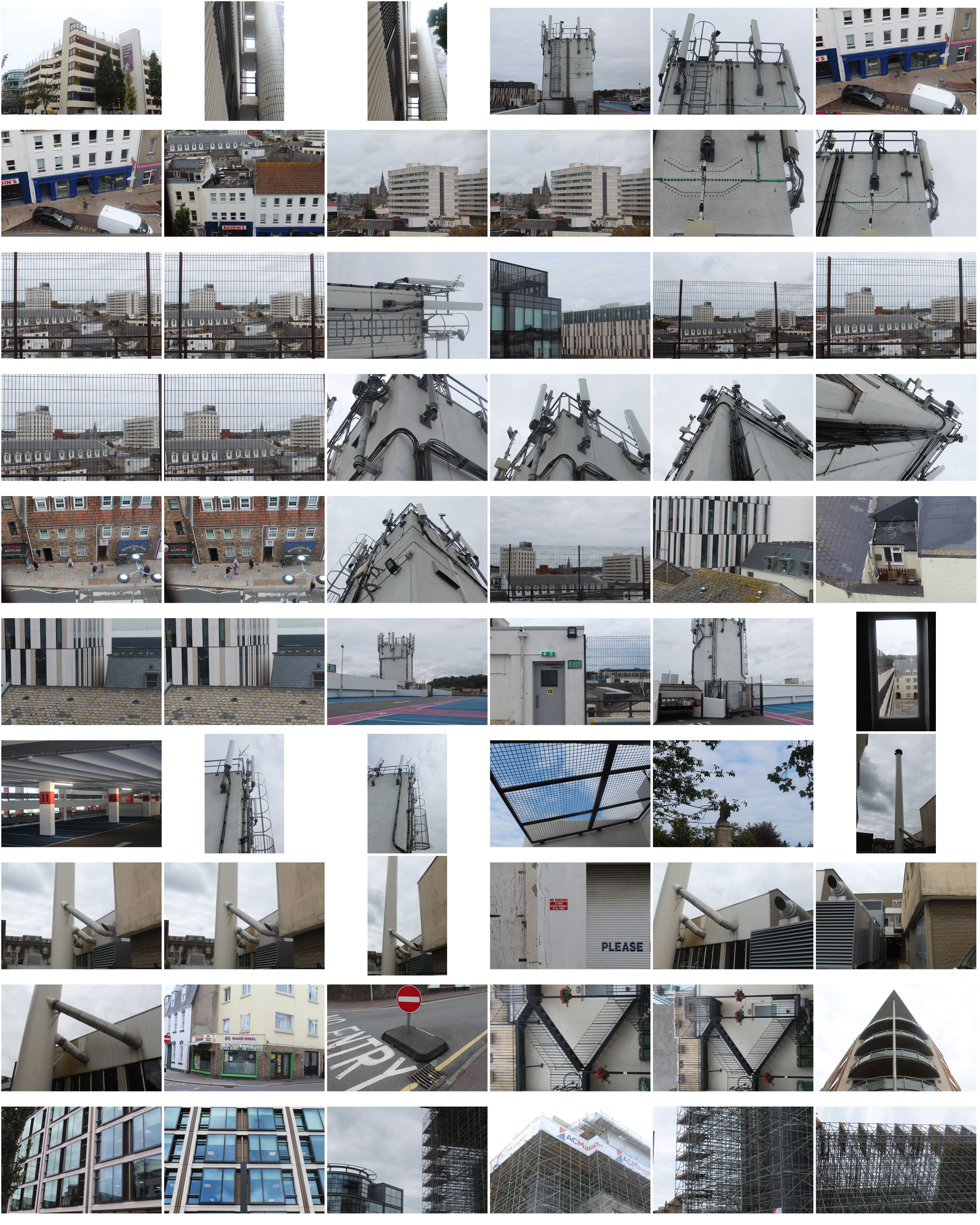
For this photoshoot i went to an location outside of the area i was assigned to find different buildings and structures in St helier that link to my previous ones.
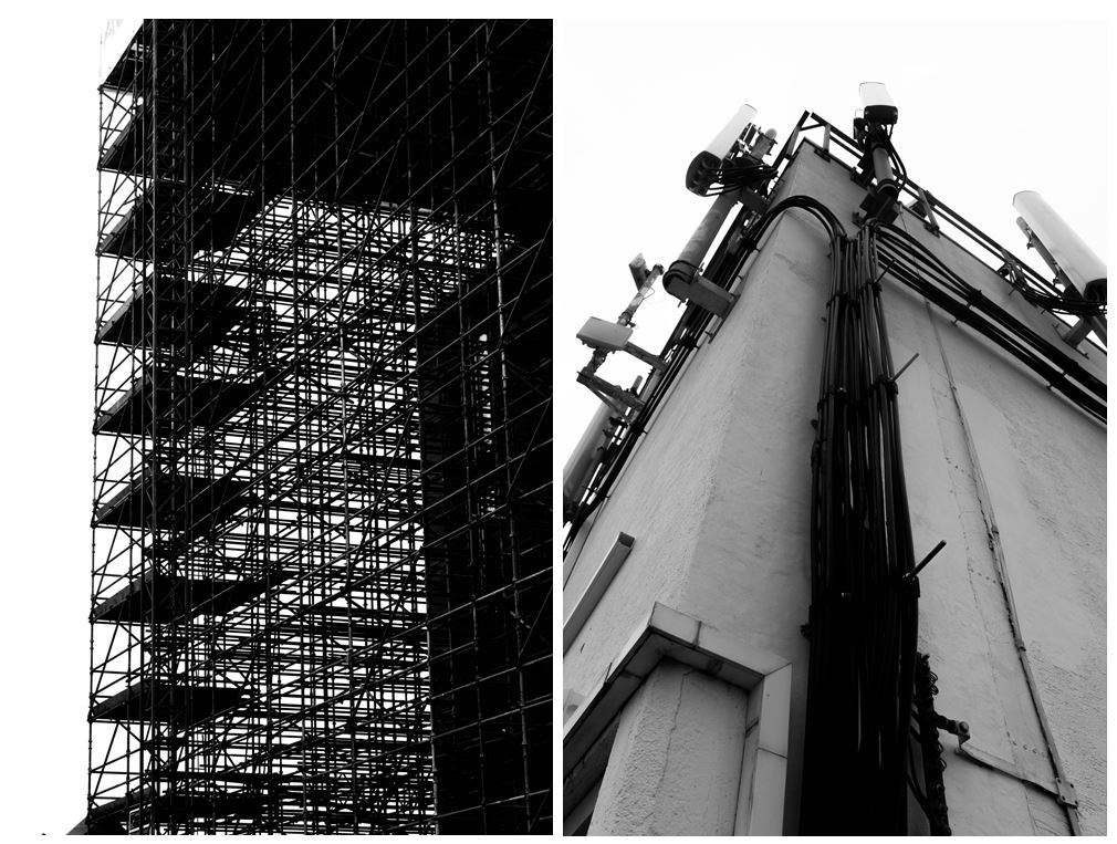
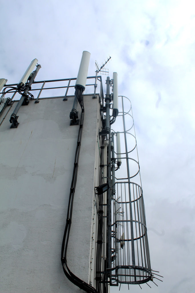

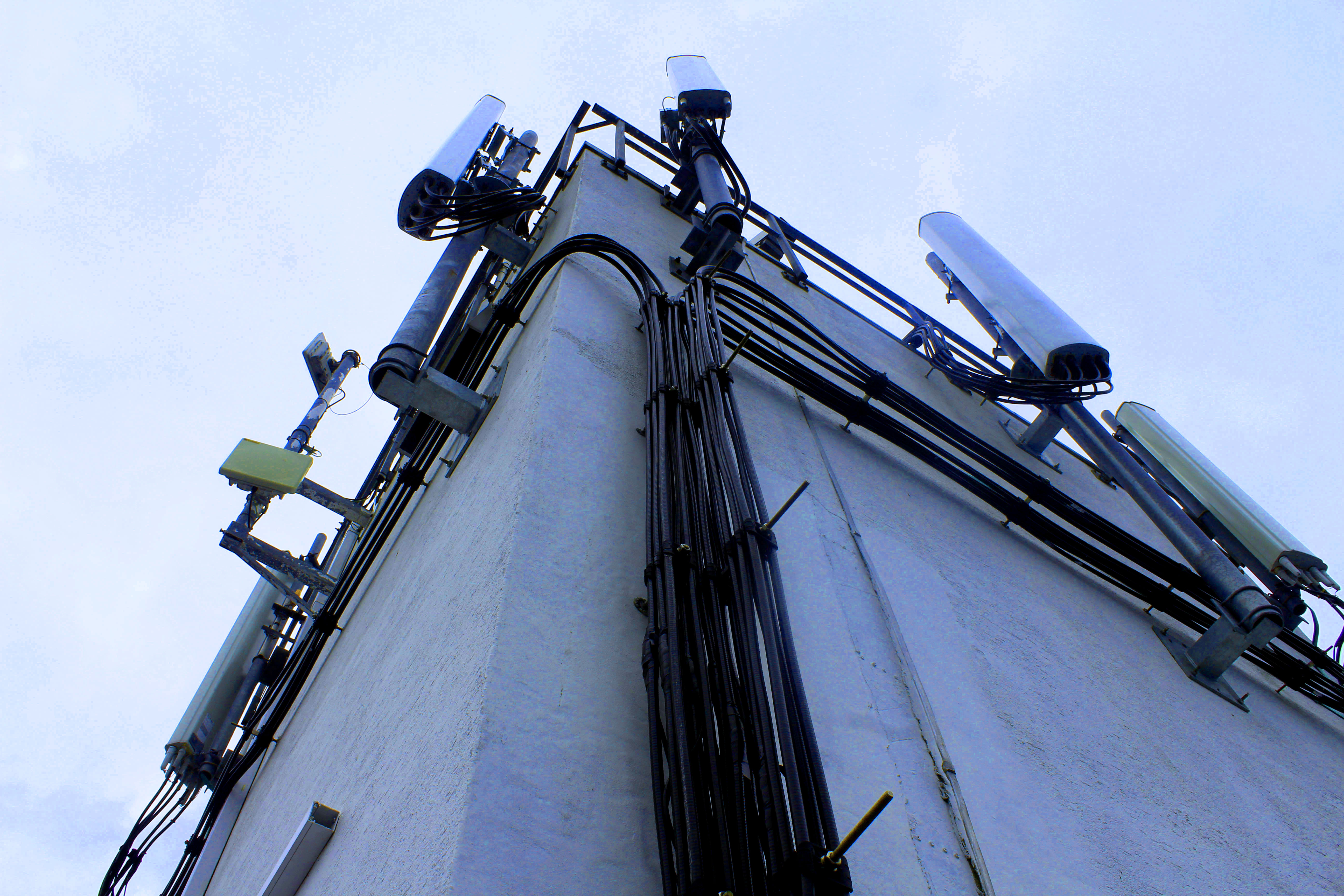
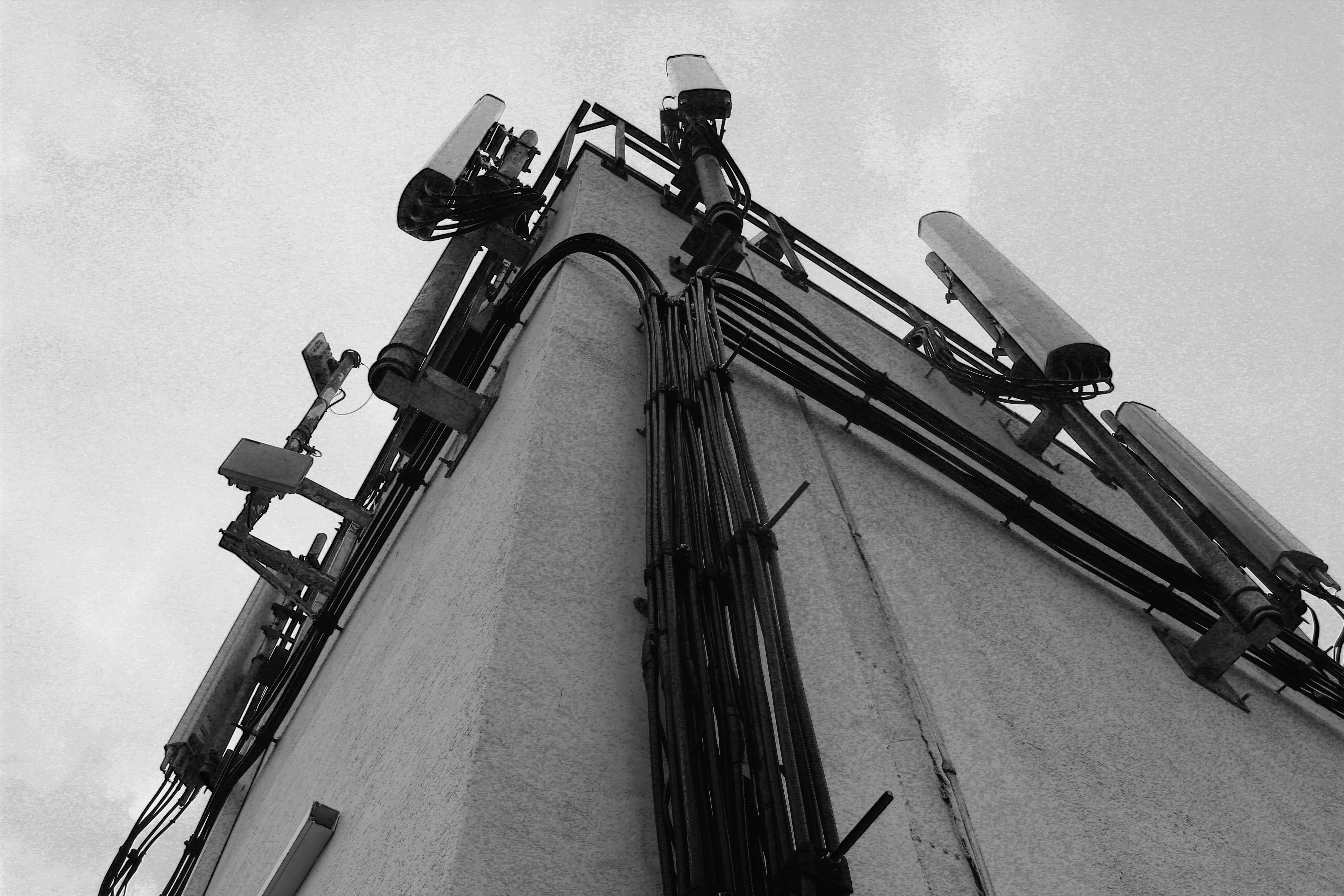
When walking around Sand Street car park I found this building structure that had wire and lamps on it giving a very industrialised appearance. I particularly liked this image as tones and colours in it are many black, grey and white even though i haven’t edited it this way. This means that building looks like its been edited in black and white in real life, representing how the industrialisation in Jersey is taking away the colour and culture. The cloudy sky gives a white background to the grey and black building in the foreground creating a hostile appearance. The angle this image is taken at emphasises the bold black wire running up the side of the building. I chose this photo as one of my final images as you cannot tell that it was taken in Jersey and could be anywhere industrial in the world, representing how Jersey is losing its heritage and culture by new constructions and starting to look like other towns and cities.
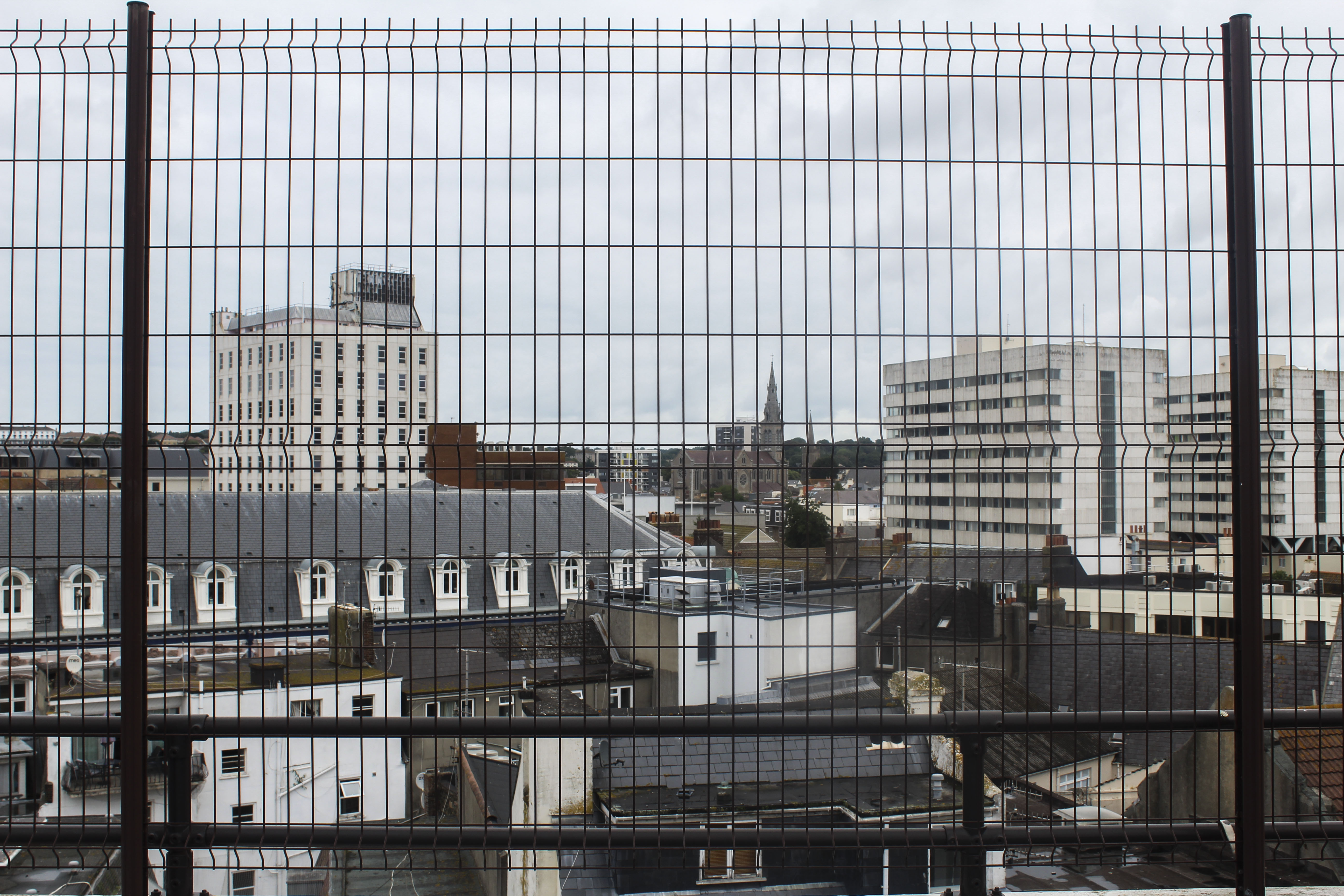
I like this image as it gives an overview of an area in the center of St Helier, showing the different and mismatched styles of building like tower blocks and smaller town houses. The angle which the photo was taken in a car park gives people a different perspective of St Helier than they might normally see. The way the buildings are arranged in this image to me looks like the buildings are being stacked and layered on top of one another. The smaller groups of older looking houses looks like how St Helier wanted housing to look like when they were first being built. Other buildings, like the flats, look like they’ve been stacked on top of the previous buildings, representing how St Helier keeps adding more buildings to the land when there isn’t much room, resulting in the overcrowding of buildings and a mismatched style of old and new. The black, structured fencing in the foreground adds another more interesting aspect to the image which looks like the buildings and town have been caged, giving the image a more industrial and hostile appearance. This makes the front of the image very symmetrical and ordered, which is juxtaposed with the mismatched buildings in the middle ground and background. The land only goes up half the image and is contrasted with the white/grey sky emphasising the whiter parts of the rest of the image and contrasting with the black fence in the foreground. Cool colours like grey, white and black with blue tints gives the overall image a dull and spiritless appearance. I did this on purpose so the idea to bring more vibrancy and culture into St Helier is emphasised.
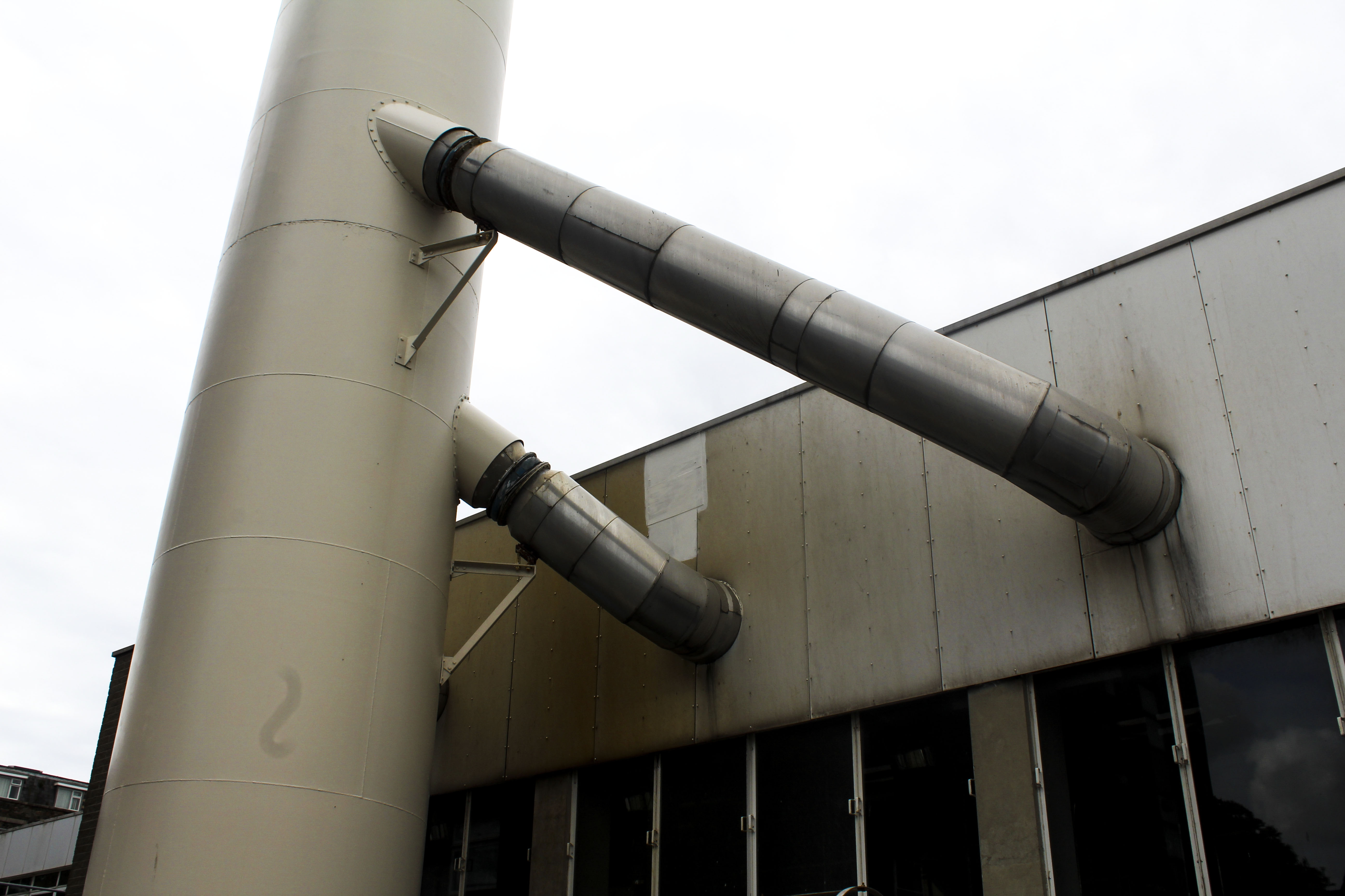
I also chose this photo as one of my final images as I like how it’s only showing an industrial metal structure with no signs of life. The yellow/brown tint on the metal gives the impression that it is rusting. What makes this an interesting image is that its simplistic but contains many different tones of metal from white to black to yellow. I think this image would work best as a part of a series rather than by itself as I think it could be apart of telling a story as now it doesn’t have any obvious meaning behind it when looked at.
Edits
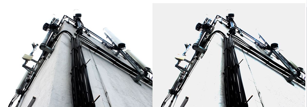
When editing this image I wanted to see if I could change overall appearance. So i experimented by increasing the exposure and increasing the brightness in one of the images so all the colour was taken out of it and was left with a stripped down version. This changes the appearance of the image making it look decolourised and bleached.

For these two image I edited them in black and white as well as increased the gradient in them so they give off a more historical and archival appearance. I like this as it makes them look more authentic like they’ve been cut out of a newspaper. The black and white edit takes out any remaining colour giving them a lifeless and desolate appearance emphasising just on the buildings and not on the lives of people who live in St Helier.

I also experimented by editing different colours to see if one was more aesthetically pleasing or had more of an effect. Although the coloured versions may be more interesting as an image, I prefer the images edited in black and white as it makes them look more authentic, which the colour doesn’t.
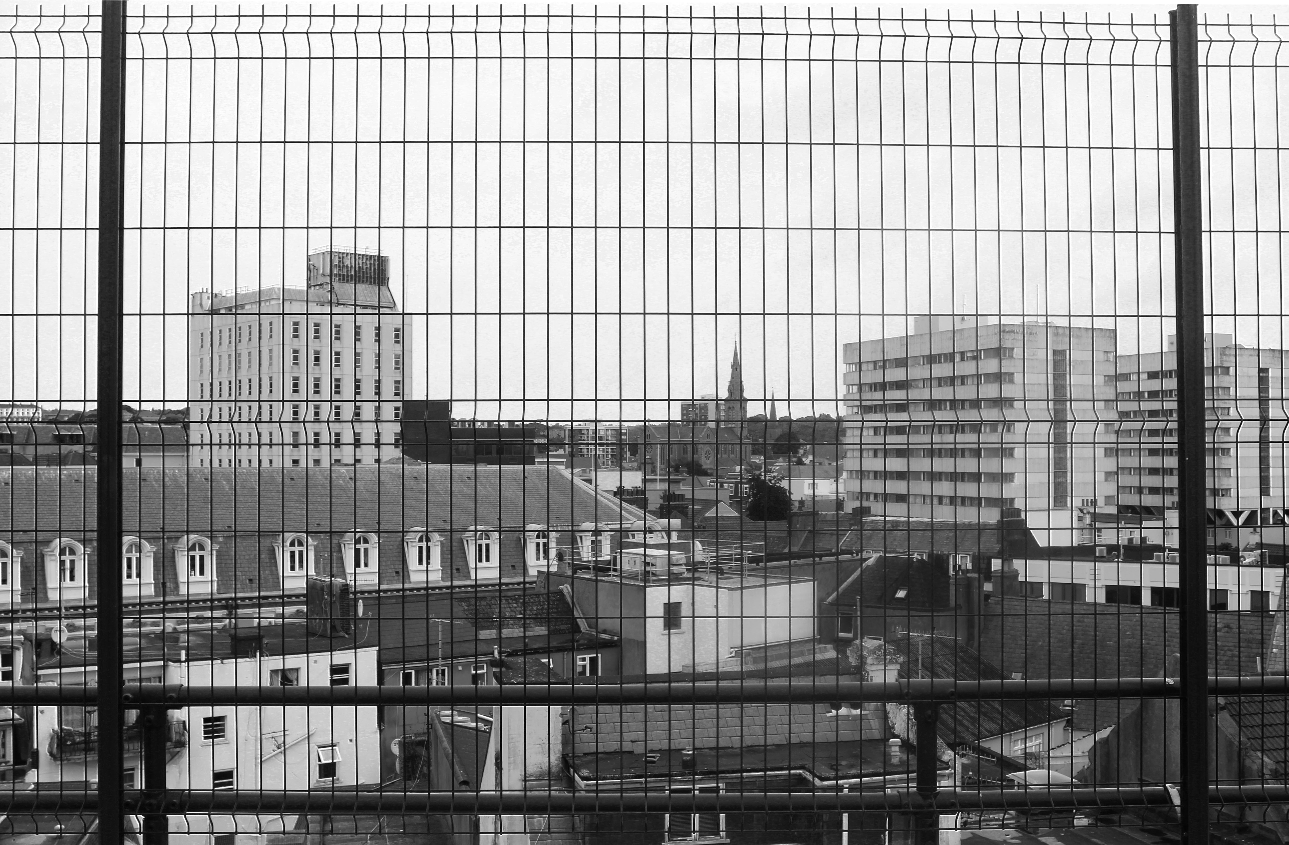
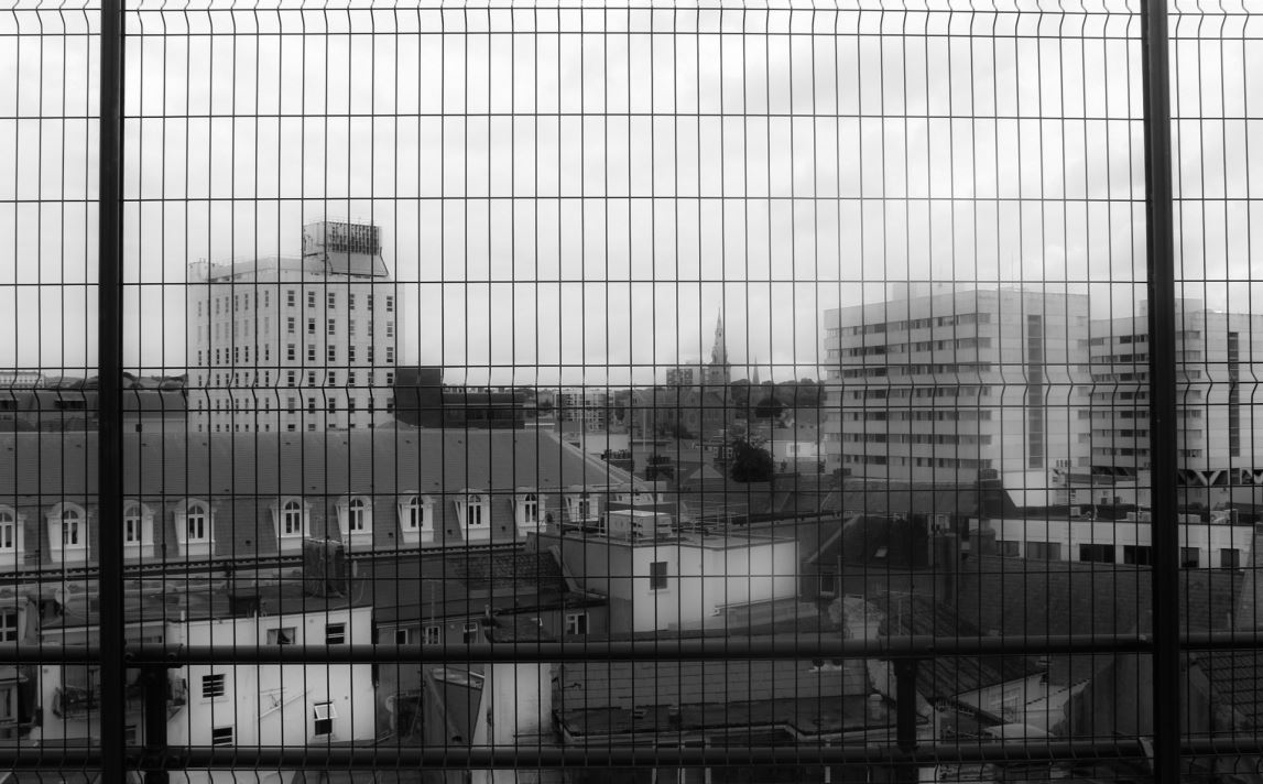
I edited this image in black and white and experimented with the exposure and contrast. In the first image I focused on emphasising the harsh black lines of the fencing in the foreground of the image and tried to show the different in the buildings by highlighting the lighter and darker tones. Whereas in the second image I focused on creating a blurred effect so the distinction between the buildings wasn’t as clear and the harsh fencing in the foreground was softened. The blurriness creates a mist-like appearance like something has been put on the lens when the image was taken. I prefer the blurred image out of the two black and white edits as it gives the image another aspect that makes it more interesting to look at and makes it seem as like there is a meaning behind it. This could be that the blurriness is a representation of how the perception of St Helier is confusing as people don’t know what it will look like in the future with the increasing number of constructions being built.
Shoot Conclusion
I think this shoot was successful at capturing the increasing industrialisation of St Helier, focusing on metal structures and buildings with cooler tones to create a lifeless appearance. The editing also emphasising this by taking the colour out of the images and presenting the buildings and structure simplistically. For my next shoot I could perhaps focus on how St Helier could bring back some of Jersey’s culture and liveliness and portray a solution to distract from the continuous industrialisation.

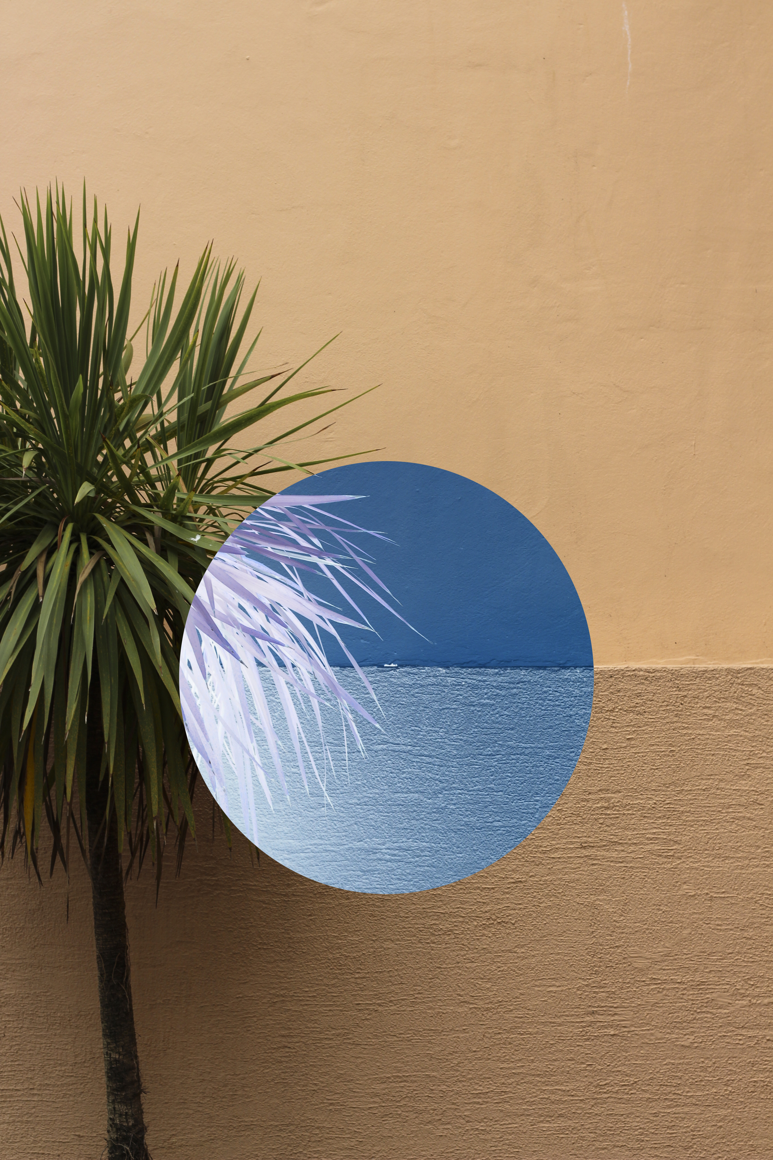
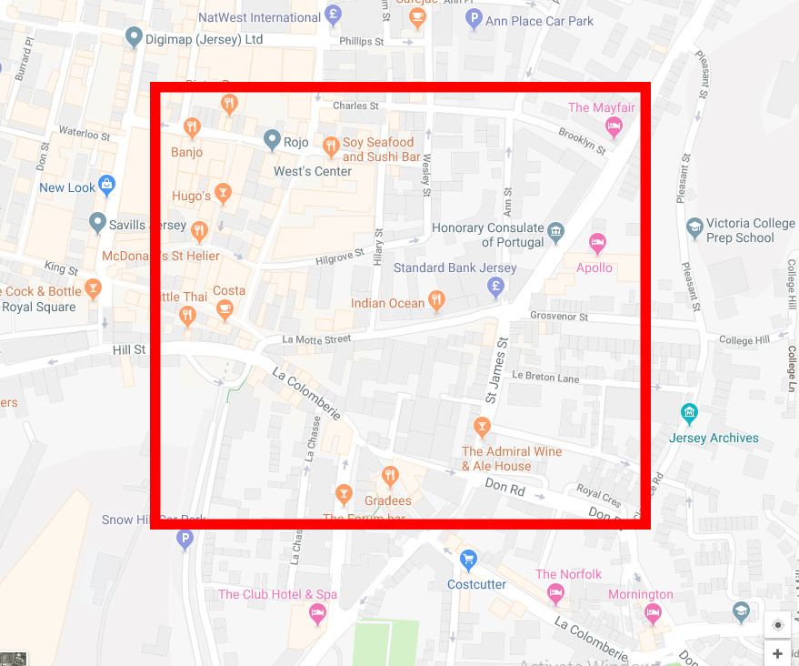
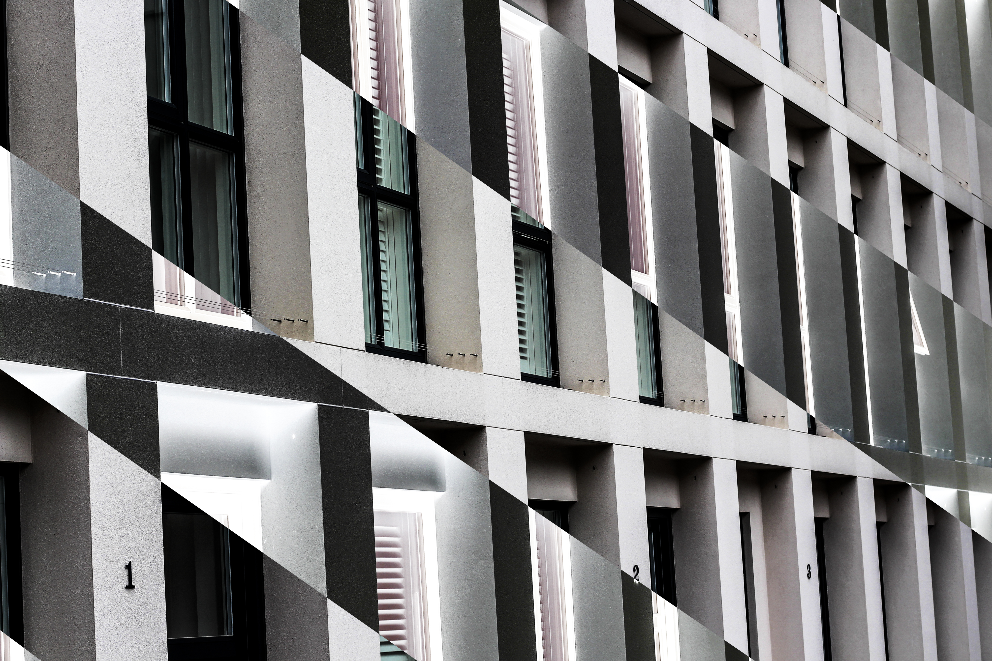 I edited the images in Photoshop, using an inverted technique which inverts the colour of the selected area, as a result changing them into an almost alien like landscape not previously recognisable. The images are actually both of the side of an apartment in which I found to consist of contrasting colours, grey and orange, something not usually associated with each due to them not mixing. Here is an aerial map of the area of the images taken:
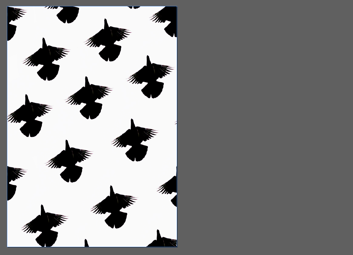
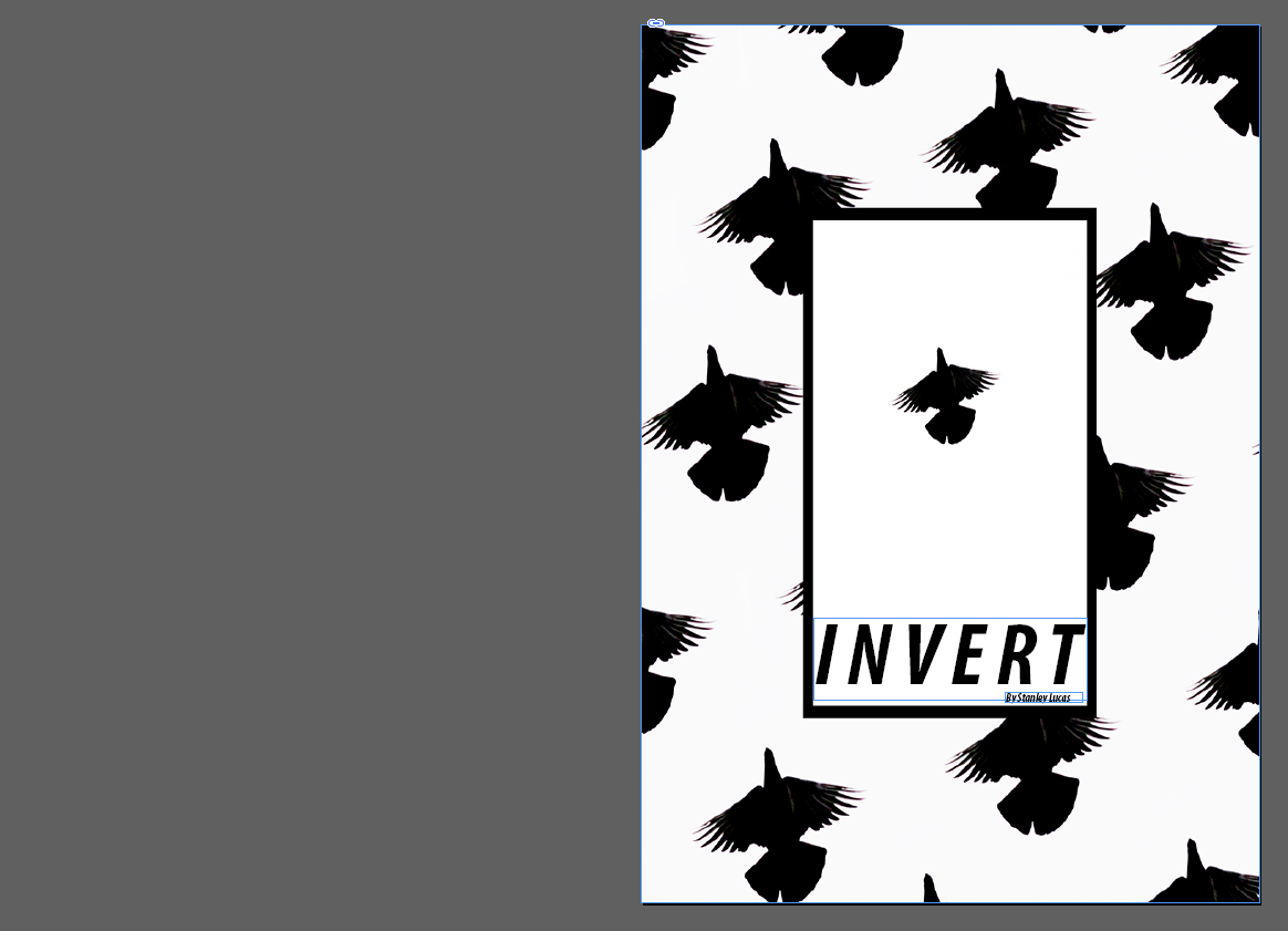 For the front cover I used the Reitam font which I separated the distance between each letter to fill any blank space in the titles area. By placing it at the bottom of the page I thought it would reduce it being the center of attention and instead make the main focus the bird design, this font compliments the stencil like outline of the birds matching the symmetrical pattern. The black box in my opinion within the middle acts as a way of bringing the whole piece together, deterring the bird pattern from being too overpowering and strong.
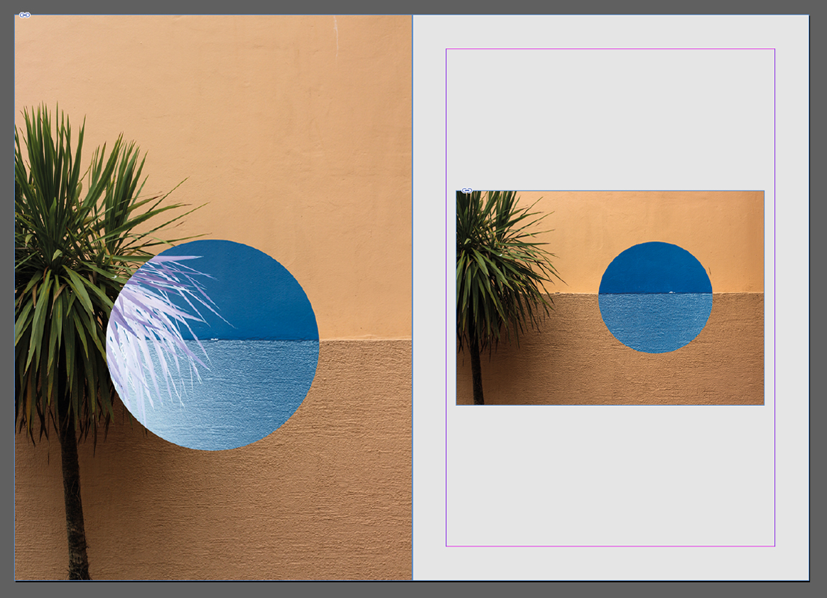 For the first two pages I found that palm tree imagery was most effective. This is because of how I thought they represented the message of inversion and the unseen world the most out of all shoots, with using two different compositions for stopping the receptivity becoming too overpowering. This was done through the use of blank space which separated the two pictures from each other whilst showing the similarities both had.
  Here I used dark lighting and unseen patterns as my main theme for the two page spread. I used this because of it reflecting the hidden beauty that can be seen in everyday objects in different light, such as lights and chairs. The added inversion created further symmetry and aestheticism which produced contrasting colours that I thought worked well with the overall pieces.
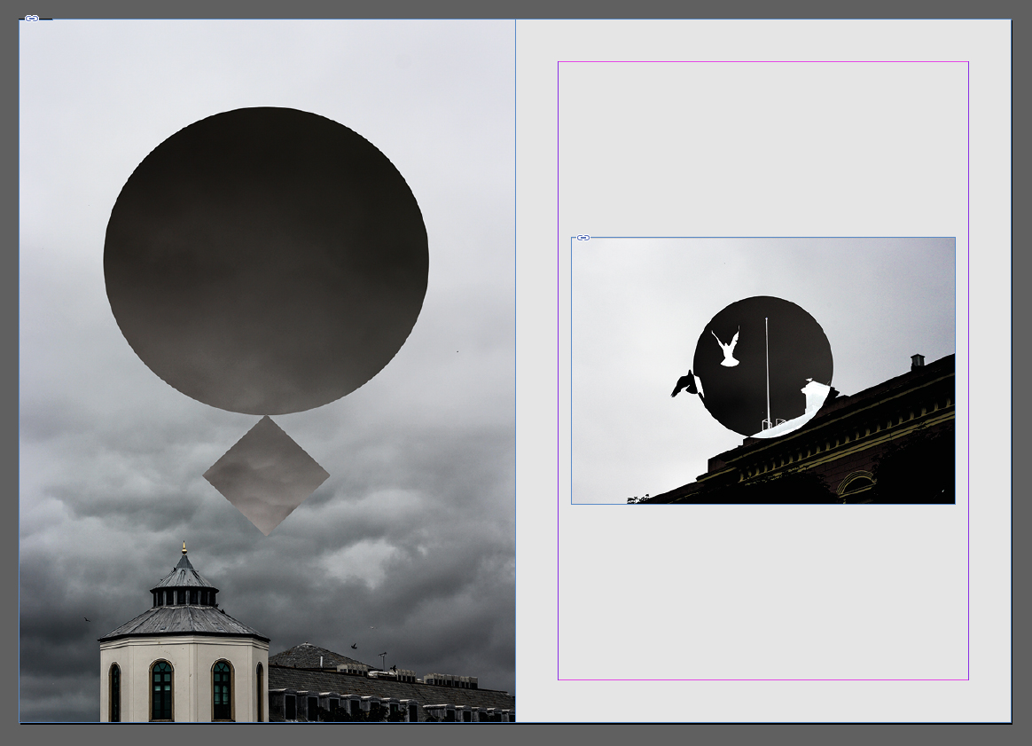 This spread explores the theme of the sky and the silhouettes created by buildings and the contrast they have between them and the environment. To do this I used two images that I thought incorporated gloomy and dull imagery highlighted through using inversion, seen through the birds and the clouds. By using nature in this spread I thought it highlighted the hugely contrasted environment that our urban world has with nature.
  The idea behind this double page spread was to highlight specifically the interior architecture that the majority of the buildings in St Helier possessed. By inverting the majority of the image I found that it reflected the beauty in the individual placement of beams and fabrics, which completely contrasted the previous pages which highlighted beauty in individual objects instead.
 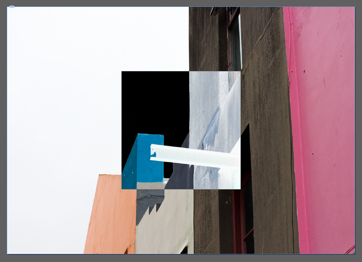 I chose this image as the second double page spread because of its effectiveness of summarizing the random structure and colour sequence that most of the exterior of St Helier has. The use of inverted square presents us with the completely contrasted difference that the structures have with their surroundings, putting across my opinion of how I perceive that town had become ill planned.
 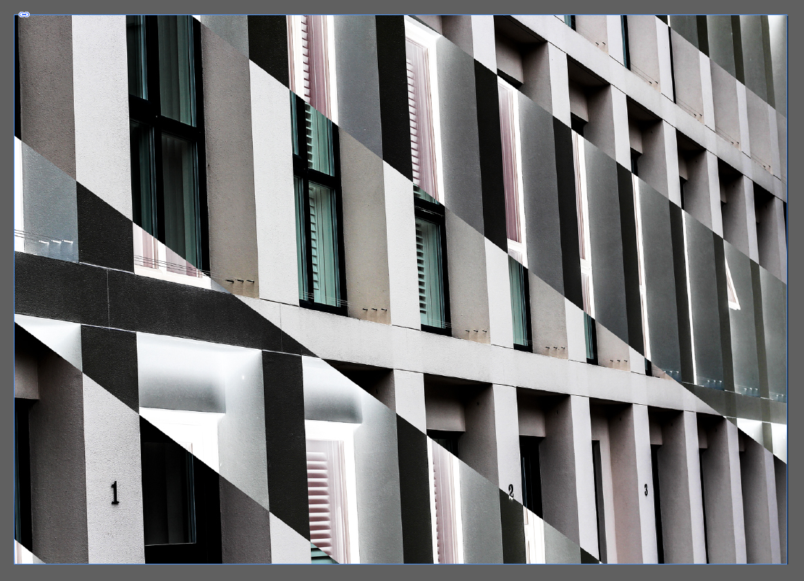 My aim for this image was to provide an insight into the symmetry and lack of development most buildings have in Jersey, where much of St Helier looks the same with continual investment into financial structures. The use of black inversion is to show how the financial industry can be seen in a black and white perspective, either loving or hating it.
 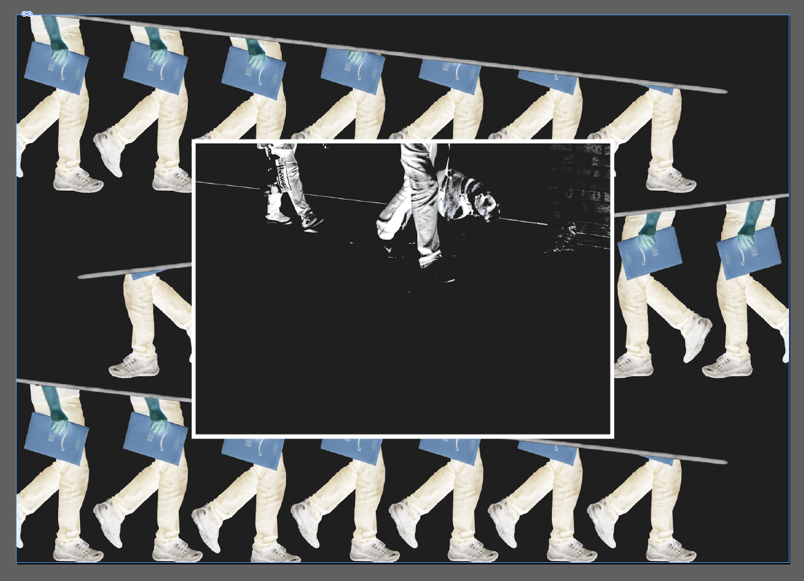 Here I created a collage of people travelling towards work, I wanted to highlight here the repetitiveness that occurred in their everyday lives, and so manipulated their pictures so that an impression of endlessly walking was created. Inside this collage I added another picture, this was to add more context from the two people walking in a line showing subtle indoctrination from the financial sector.
  Overall I was really pleased with the outcome of the zine as I thought it reflected my views about the development of St Helier. Done through the subjective topics about individual aspects of town such as the buildings, people, night life and development, I found there to be a constant recurring theme that allowed for a smooth transitioning between pages, whilst the use of composition for certain pages put across stronger ideas than others.
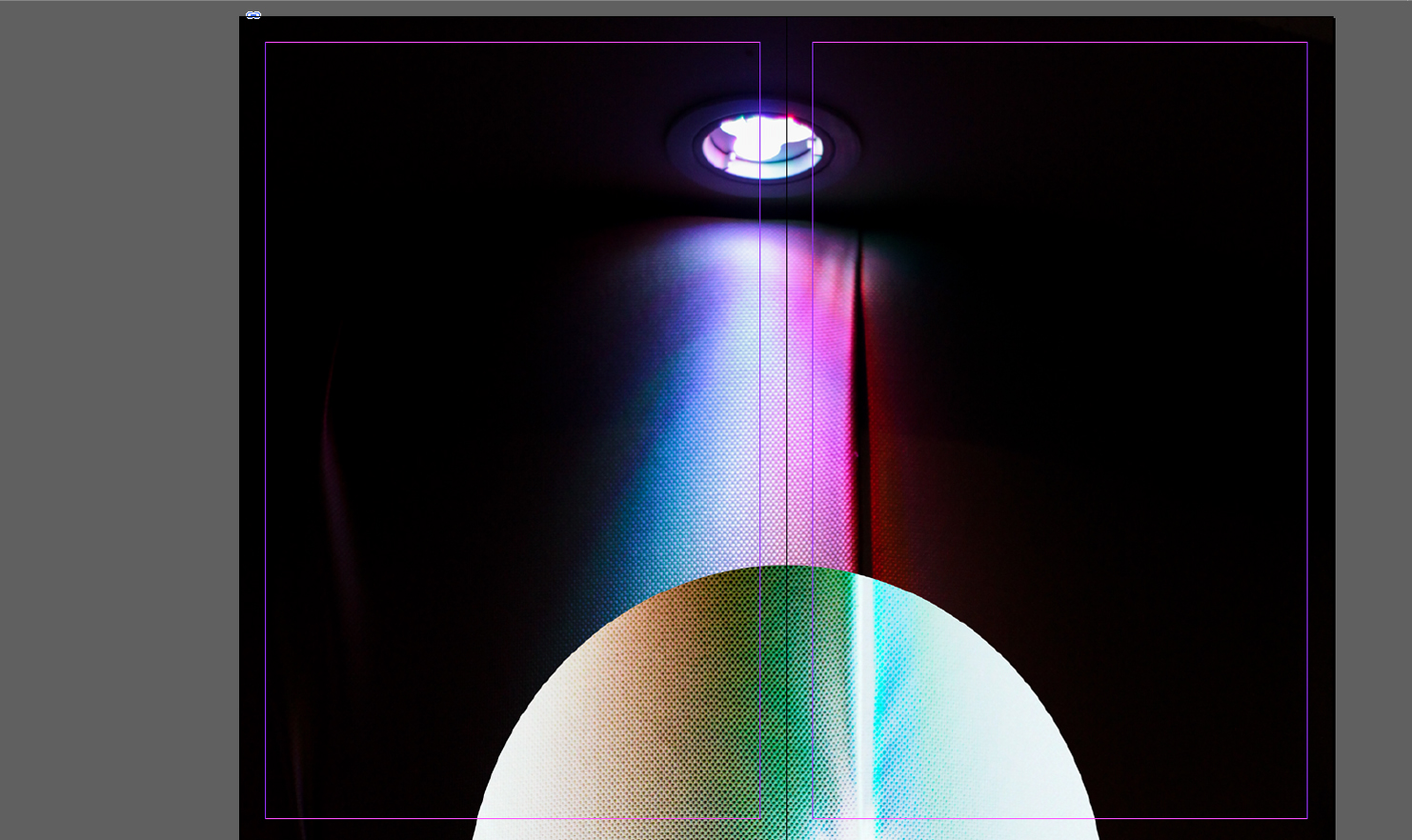
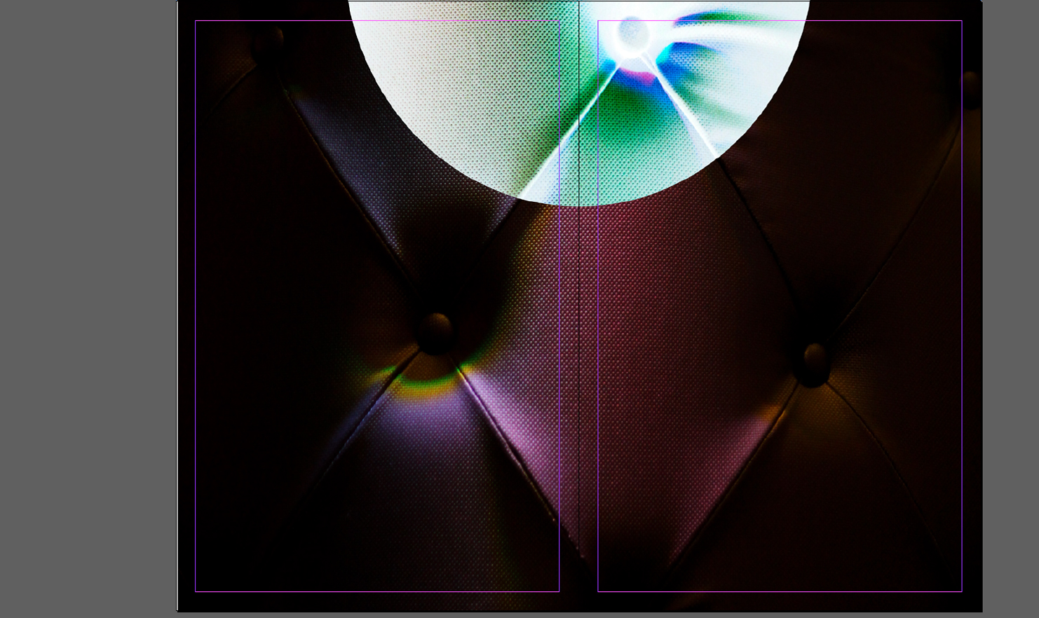 For the first layout I wanted to experiment with simplicity, to do this I thought the addition of only two images could work. By using one image as a cover page and the second as a four page poster page filler I aimed to see what a multi-use book would be like, where you could read it and convert it to a poster page. When deciding the pictures to select I had to take into account what pictures I thought best reflected the shoots so far, putting across my idea of inversion.
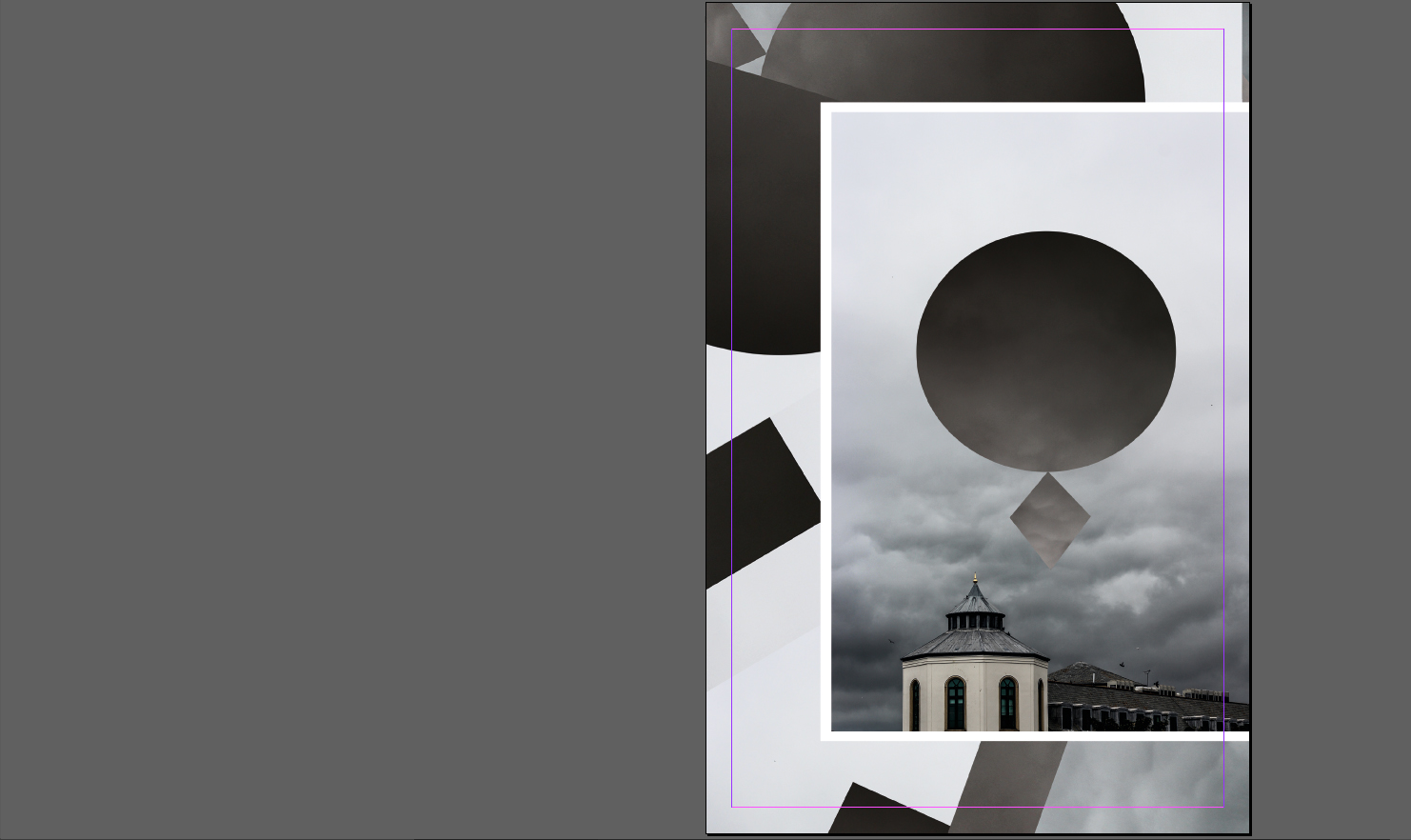

 My main focus for this layout were collages, incorporating a picture and manipulating it until the outcome was different to the original product. This is linked into the unusual presentation of the second and third page, where the images don’t match up and aren’t as aesthetically pleasing to us as viewers, however the topic of each page and the setting neutralizes this as it section is dedicated to some aspect of Jersey. Here I tried to use white and black borders effectively on certain pictures, by doing so I hoped to create a contrast between backdrop and photo, eliminating the background from becoming to overpowering.

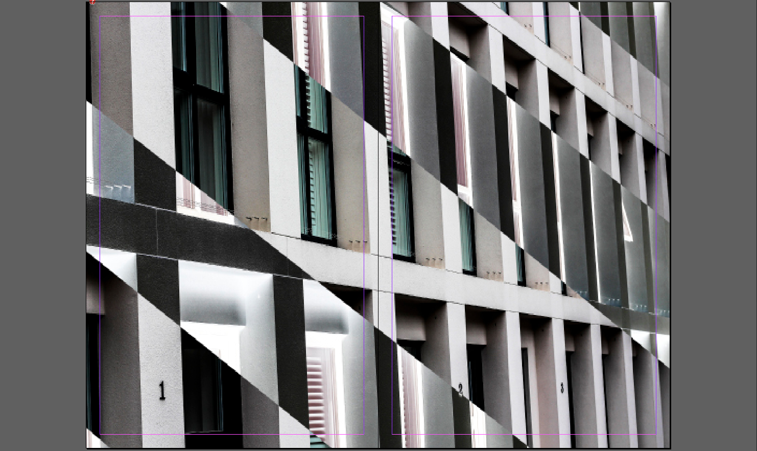 For this design I tried to mainly focus on introducing aestheticism and varying designs. To do this I used the final page as a double spread whilst using the first three as topical subjective pages, focusing on night life, buildings etc of Jersey. When making it I made sure to use white borders as I found that they were most effective when wanting to look solely at certain images, as it implicitly boxed in photos.
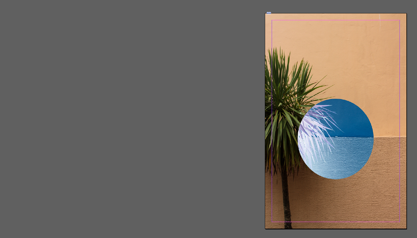
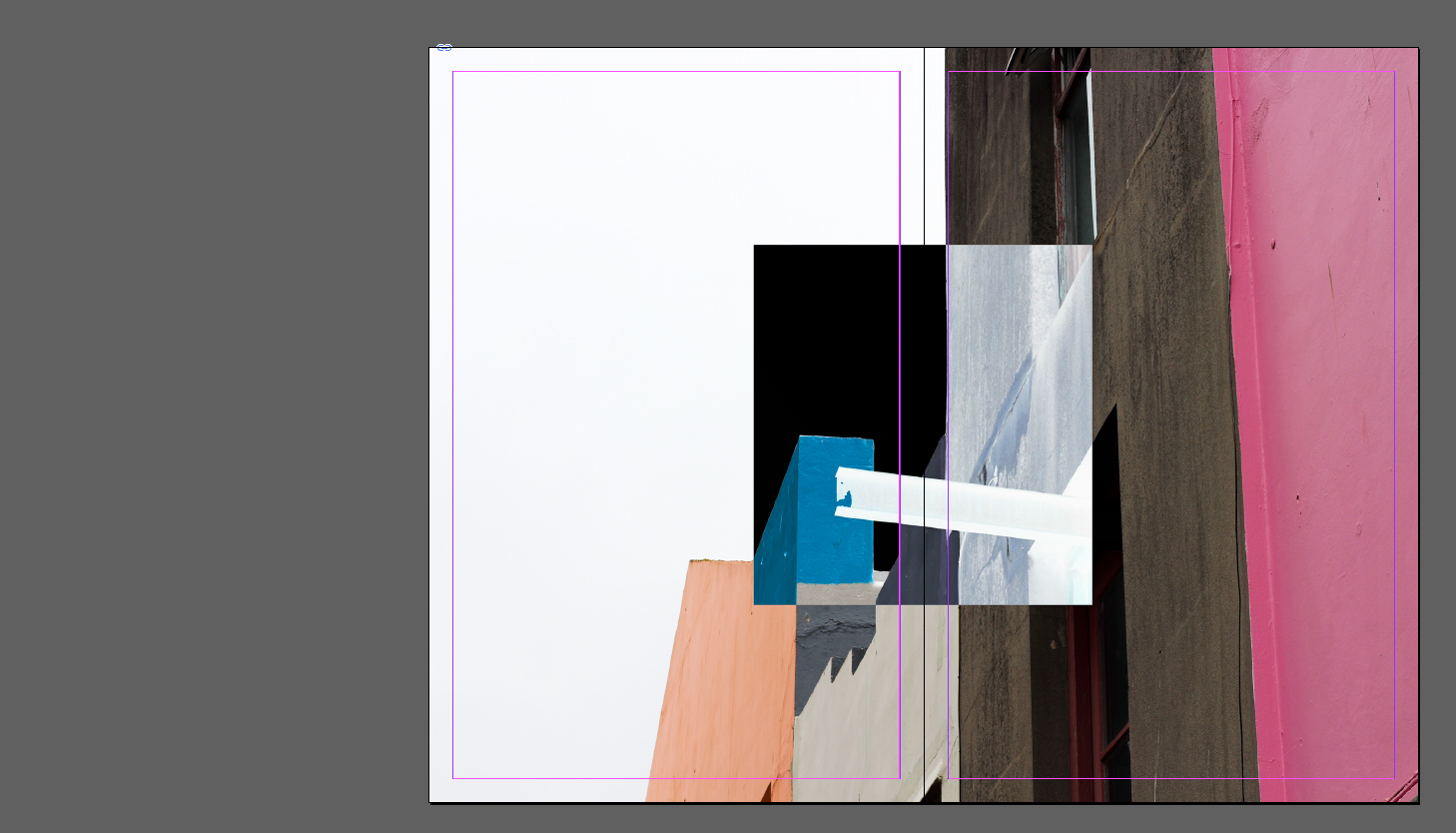
 Here I attempted to find how effective using two double page spreads and just a cover photo would be. This to me was the least effective design as there was an overwhelming lack of content and design, as the finished product just looked thrown together in a hurry with no actual idea behind it. However the idea behind it was to give the users two miniature posters which could be assembled out of the book.
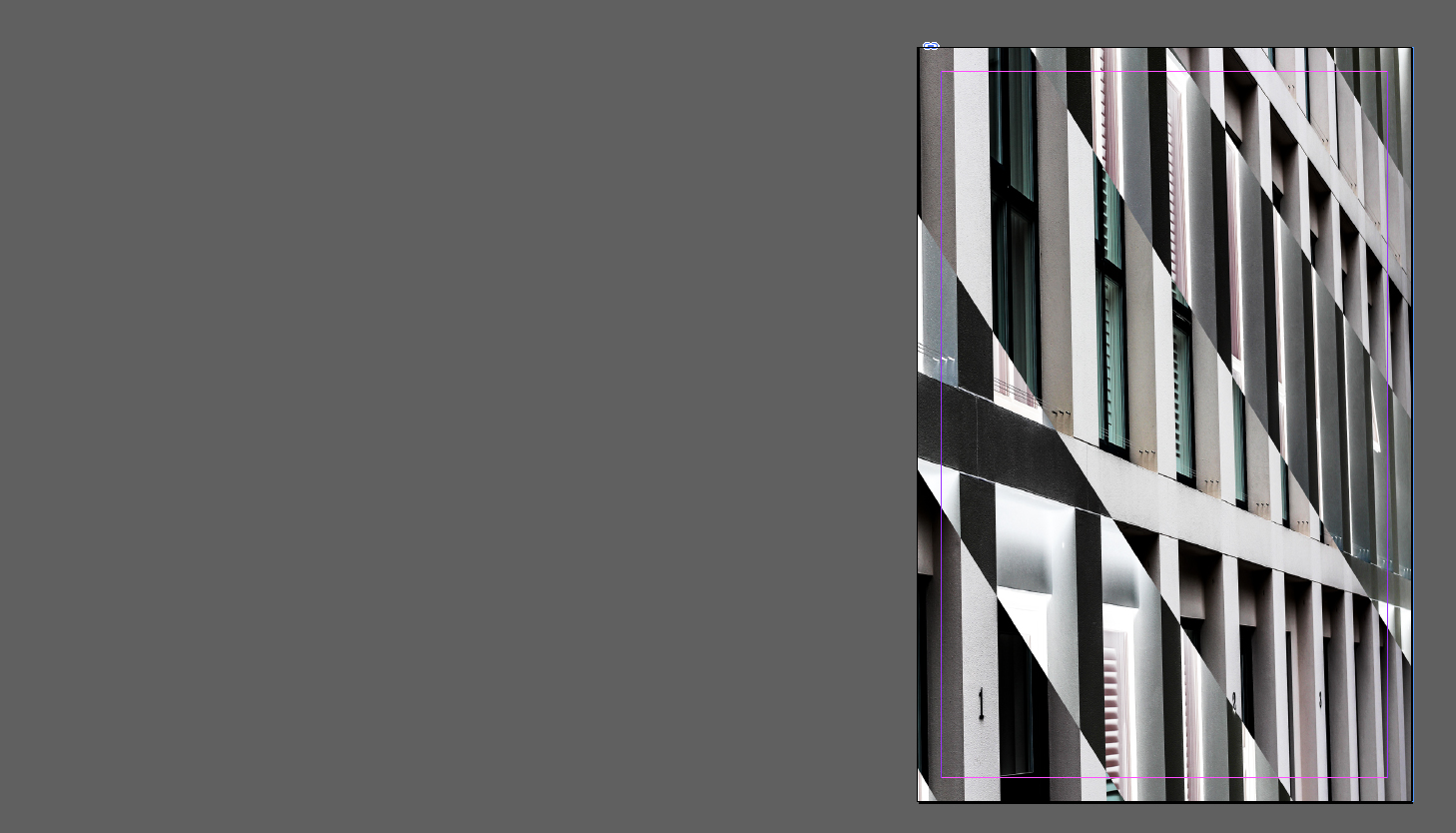
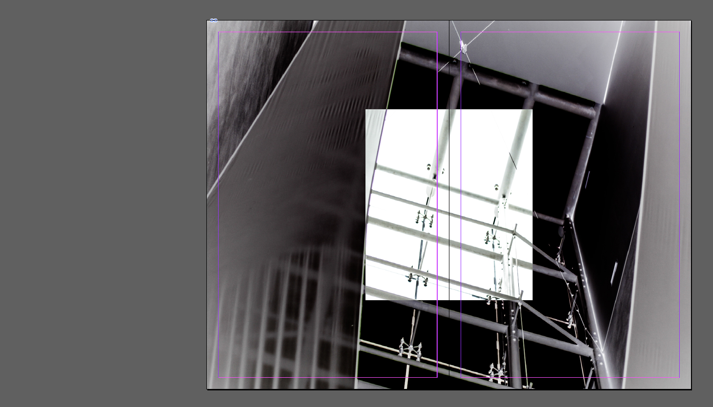
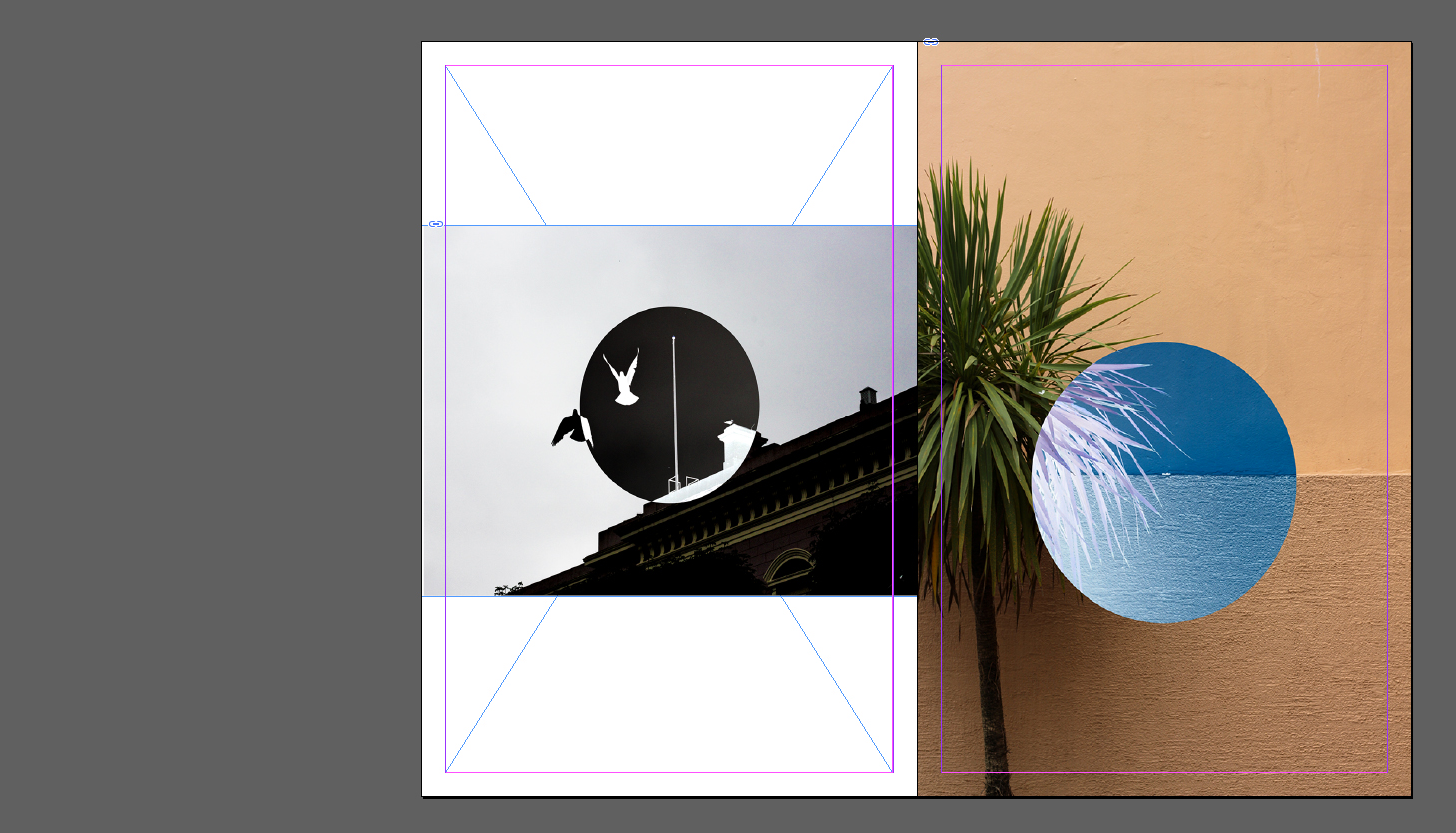 For my final design I tried moving around the layout of my previous design, this meant switching the double page spread with the two individual images on either side. I didn’t find it to be as effective however as the original as I found that the spread worked best as a last page design as it looked more like a final photograph, and the individual pictures being presented as a build up to the last piece.
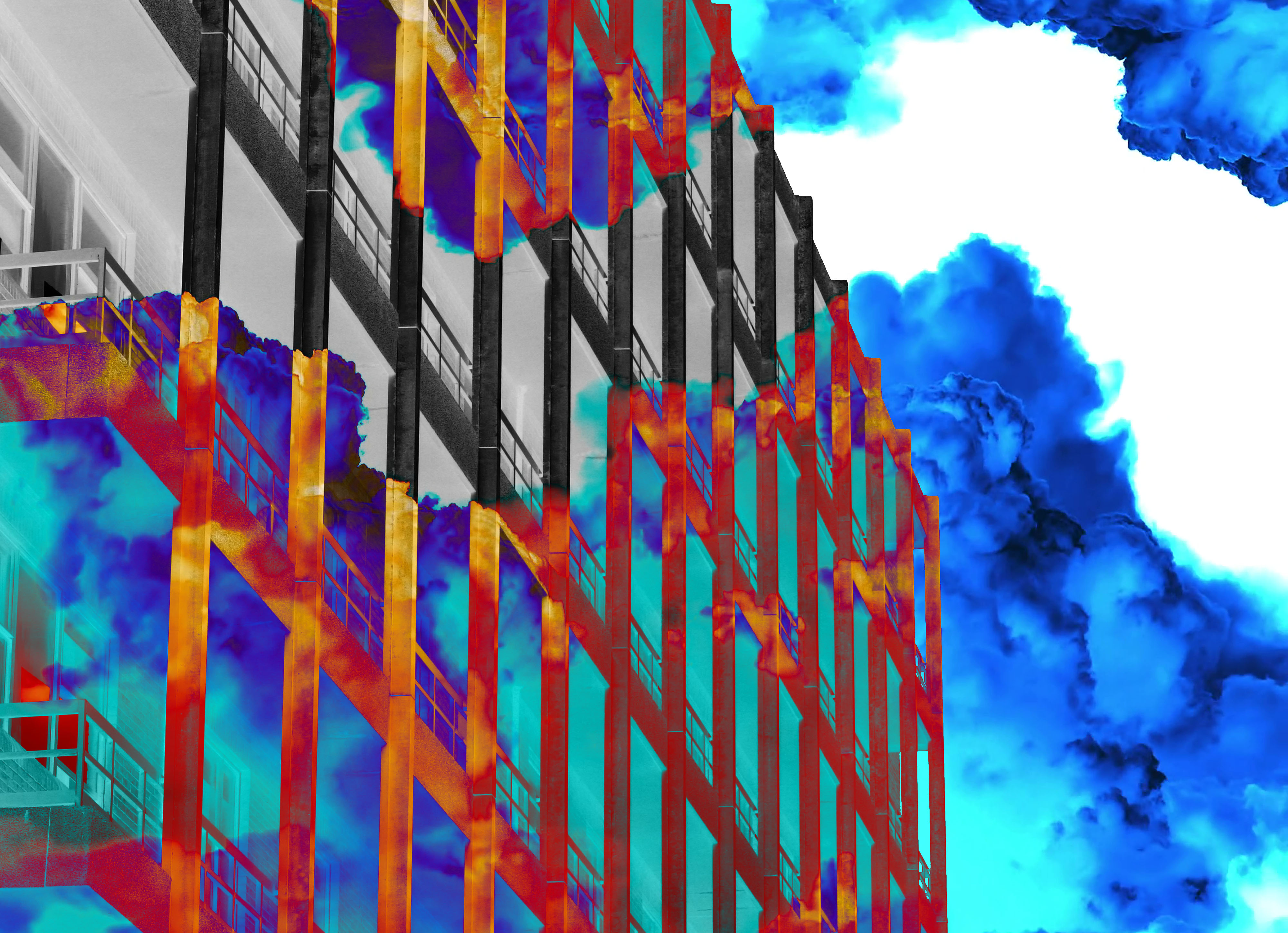
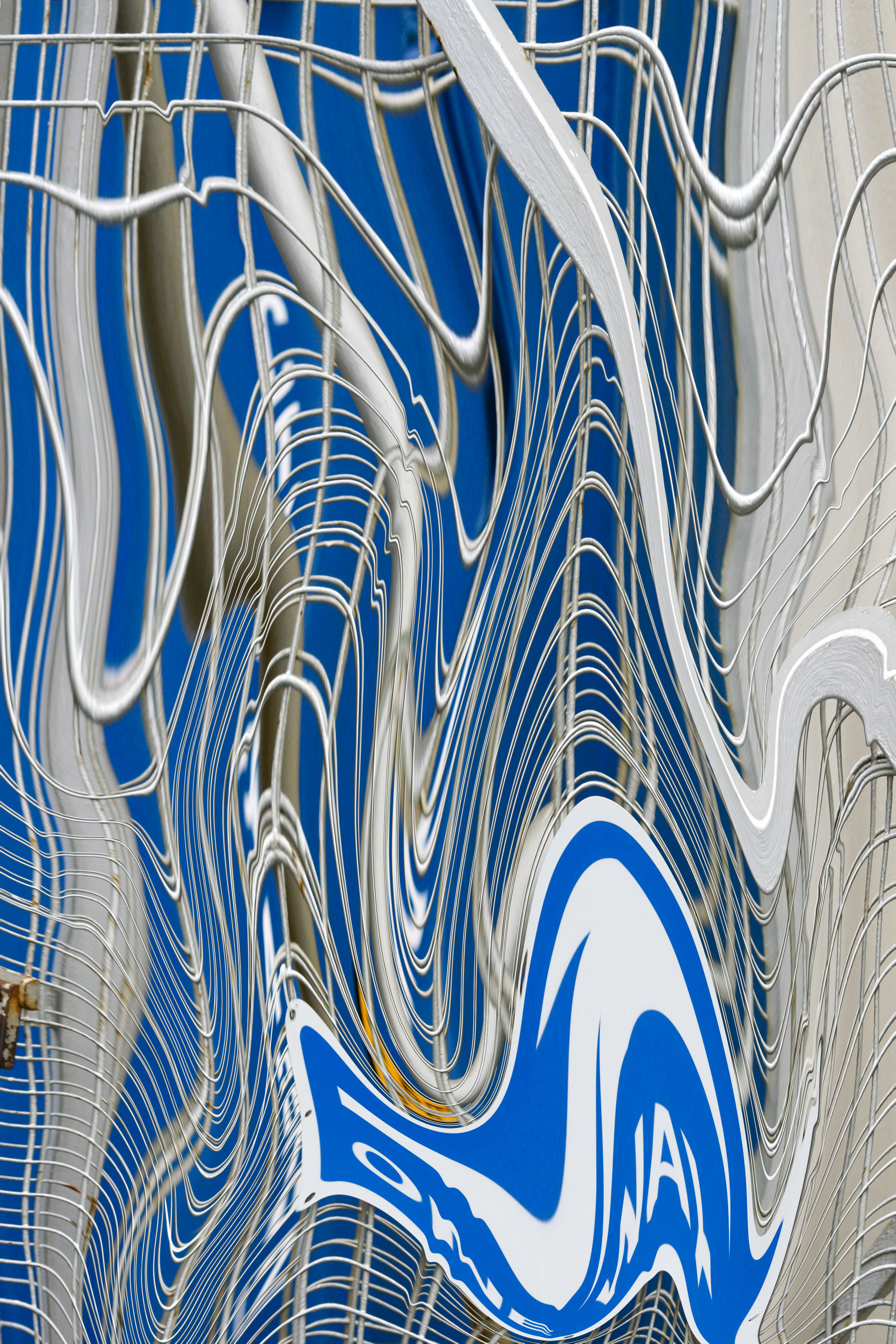

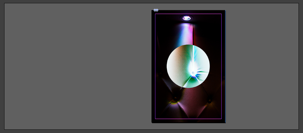
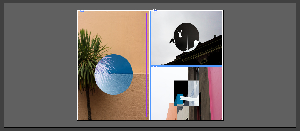
 When considering the page layouts I wanted to use a variety of types consisting of a double pages, multiple imagery and a single page to find the design most effective for what I want. Once I finished experimenting with how the zine could look I decided to create a front cover for it, to do this I would use a single picture and manipulate it on Adobe Photoshop to something I’m happy with such as a pattern. This was my result:
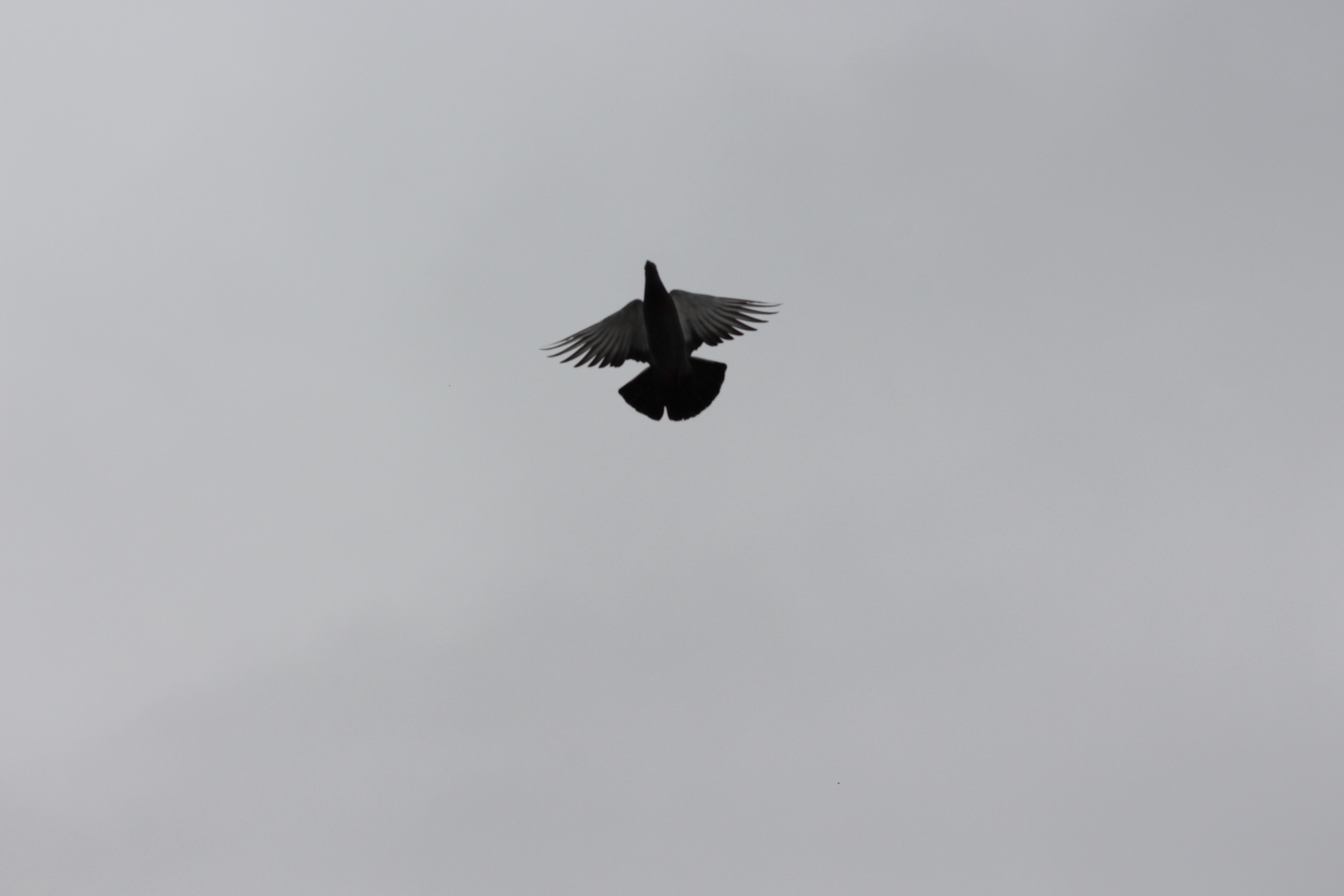 Step 1: Choose an image that could be used to create a simple graphic out of my photo shoot.
 Step 2: Using the stamp tool produce multiple prints of the bird in a symmetrical pattern.
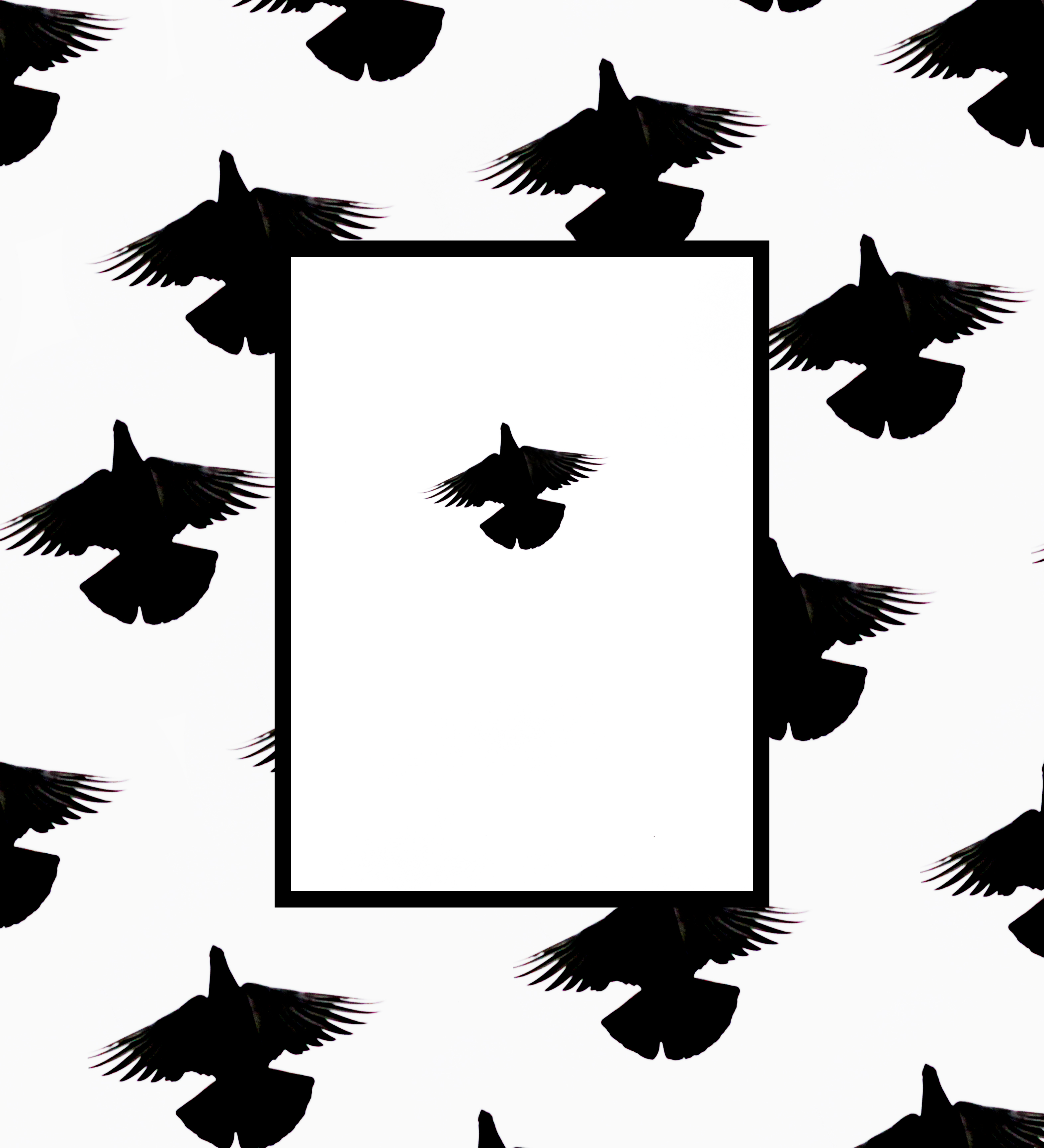 Step 3: Add a white box with a thick black border to create contrast between the original image and the design in the backdrop.
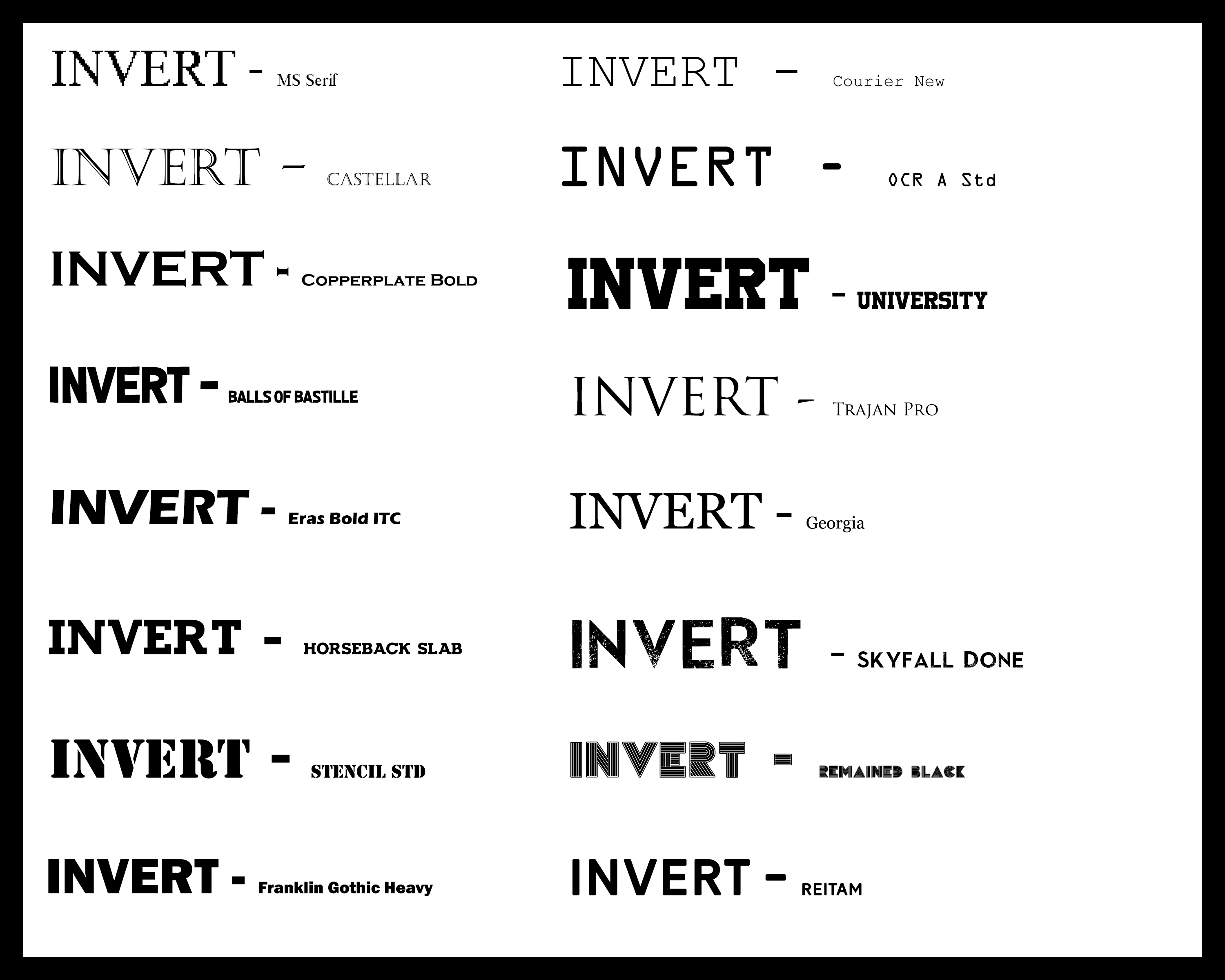 Once finished discovering different styles of font for the text within the zine I was fairly certain on the one I would choose. This was the Reitam font, I chose this because of the simplicity but effectiveness of the overall result, with the black and sharp-edged symmetry posing as an ideal thing that would draw in the attention of any viewer’s gaze straight away.