Critical Selection
This blog post covers my critical selection of images which I have made using Adobe Light room from all 3 of my photo shoots which I took in my allocated area of St Helier. These are the raw images before any editing and I have chosen them based on various aesthetic aspects such as the simplicity, colours, textures, and with the portraits based on the physical content of the images such as the expressions of the subjects of their surroundings. The images which I believe need to be slightly altered or manipulated I will caption with those needed changes, most of these slight alterations needing to be an increase in contrast, but i personally don’t believe that any of my favorite images which I have chosen need major changes to be made.
Shoot 1 Favorite images :
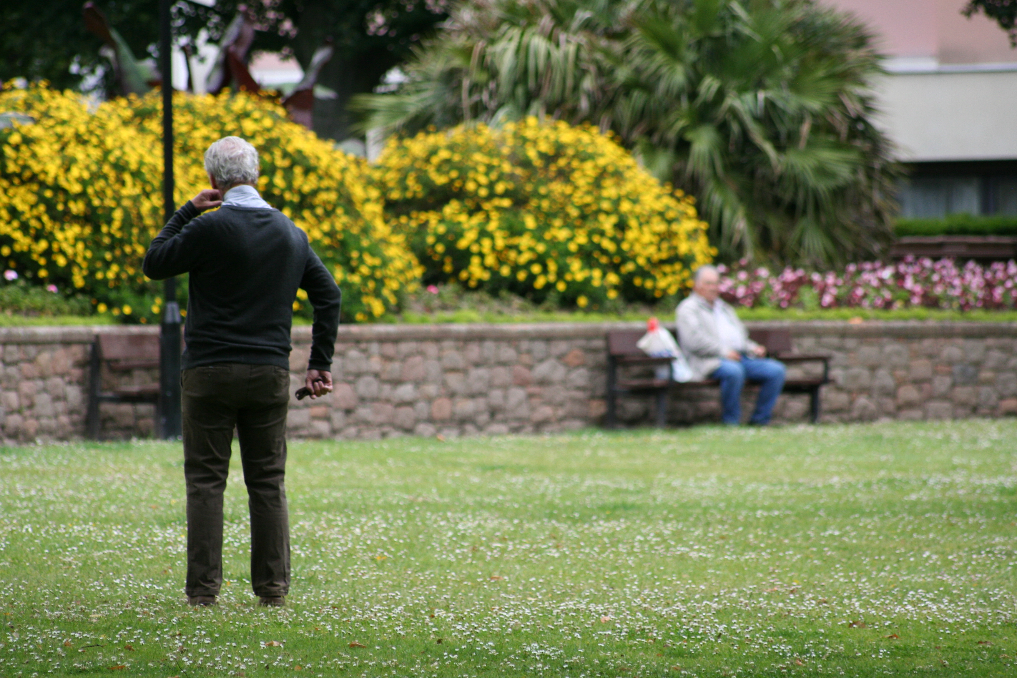
Could be slightly increased in contrast
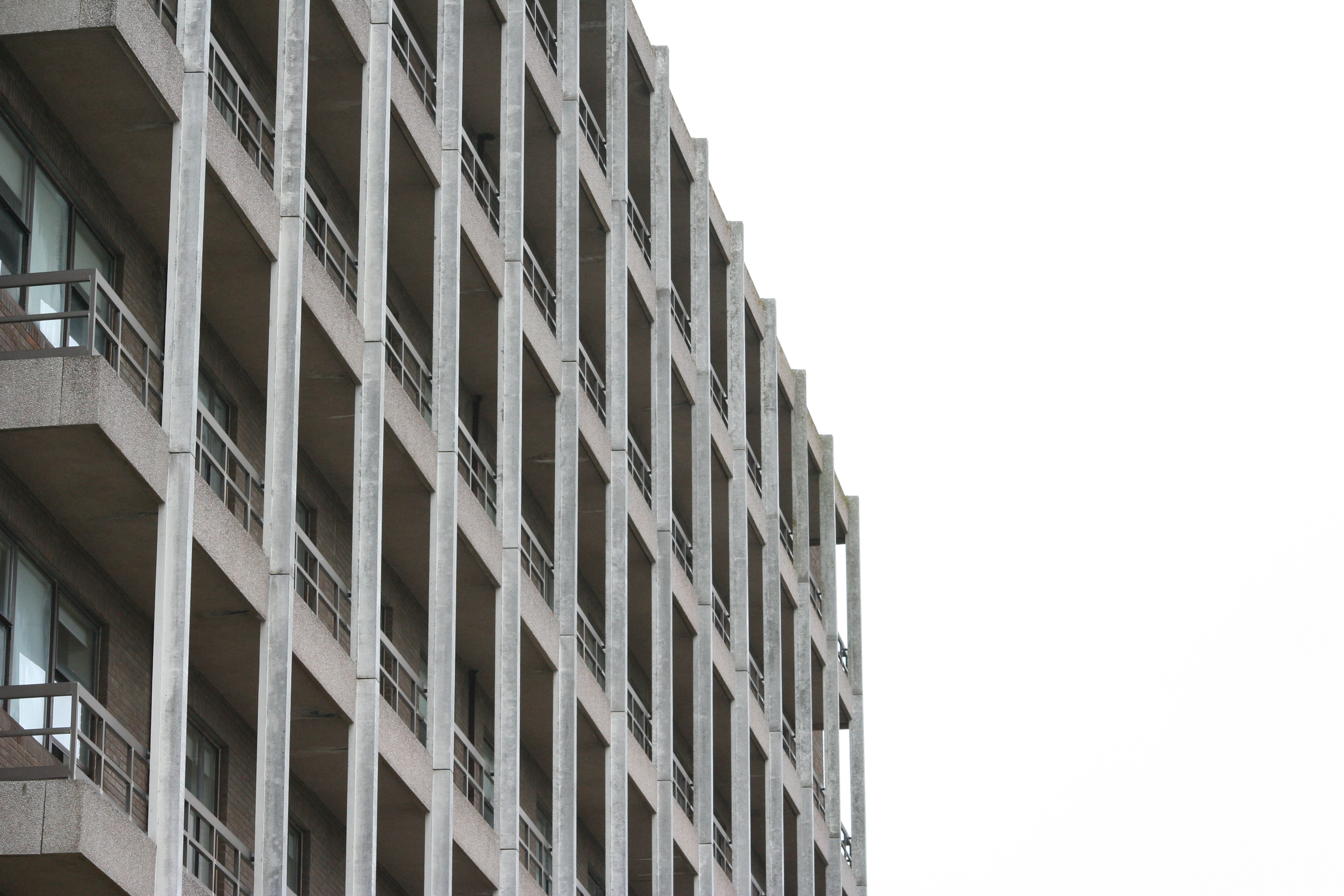
Possible black and white, definitely increase contrast
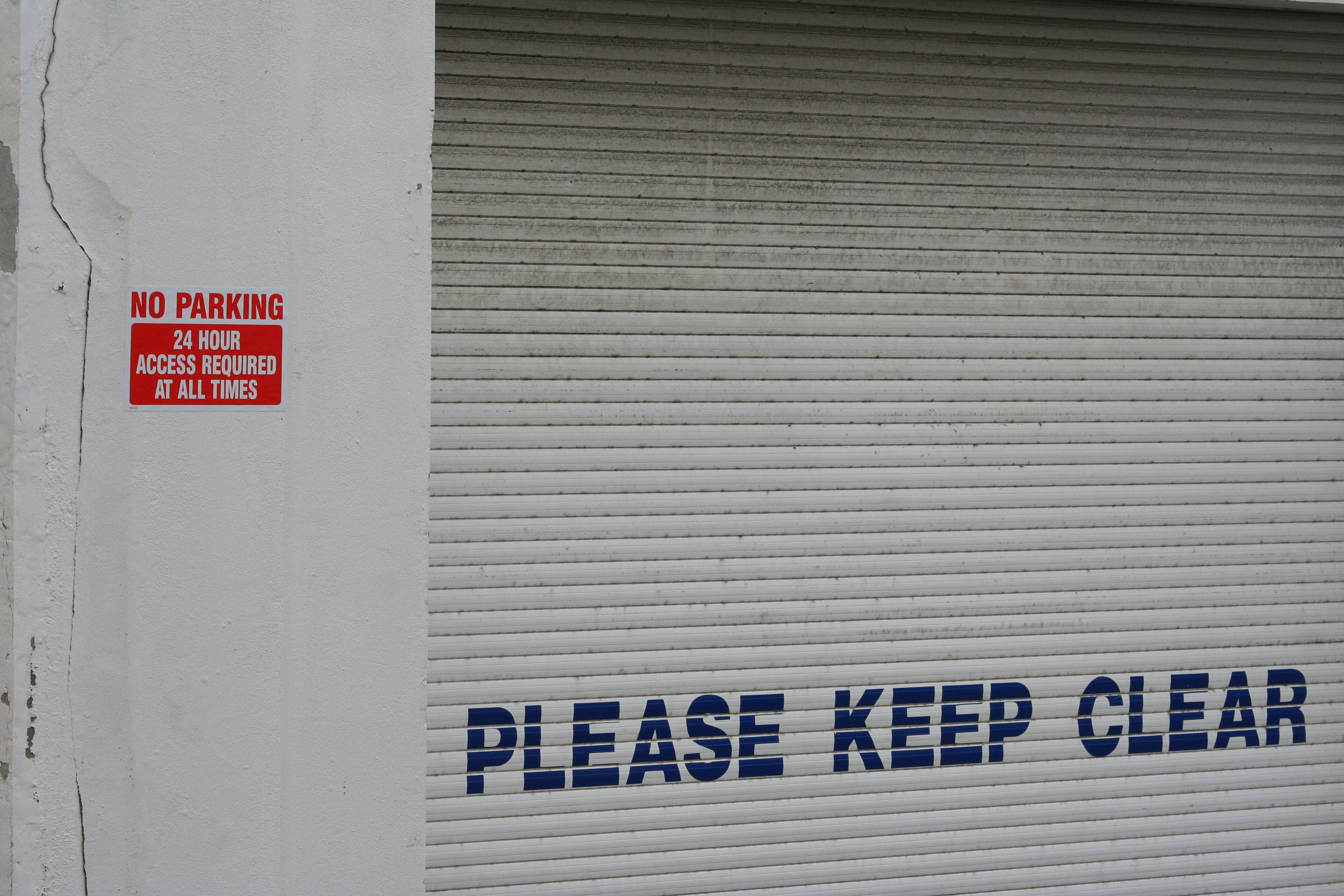
Increase brightness and contrast to enhance the white
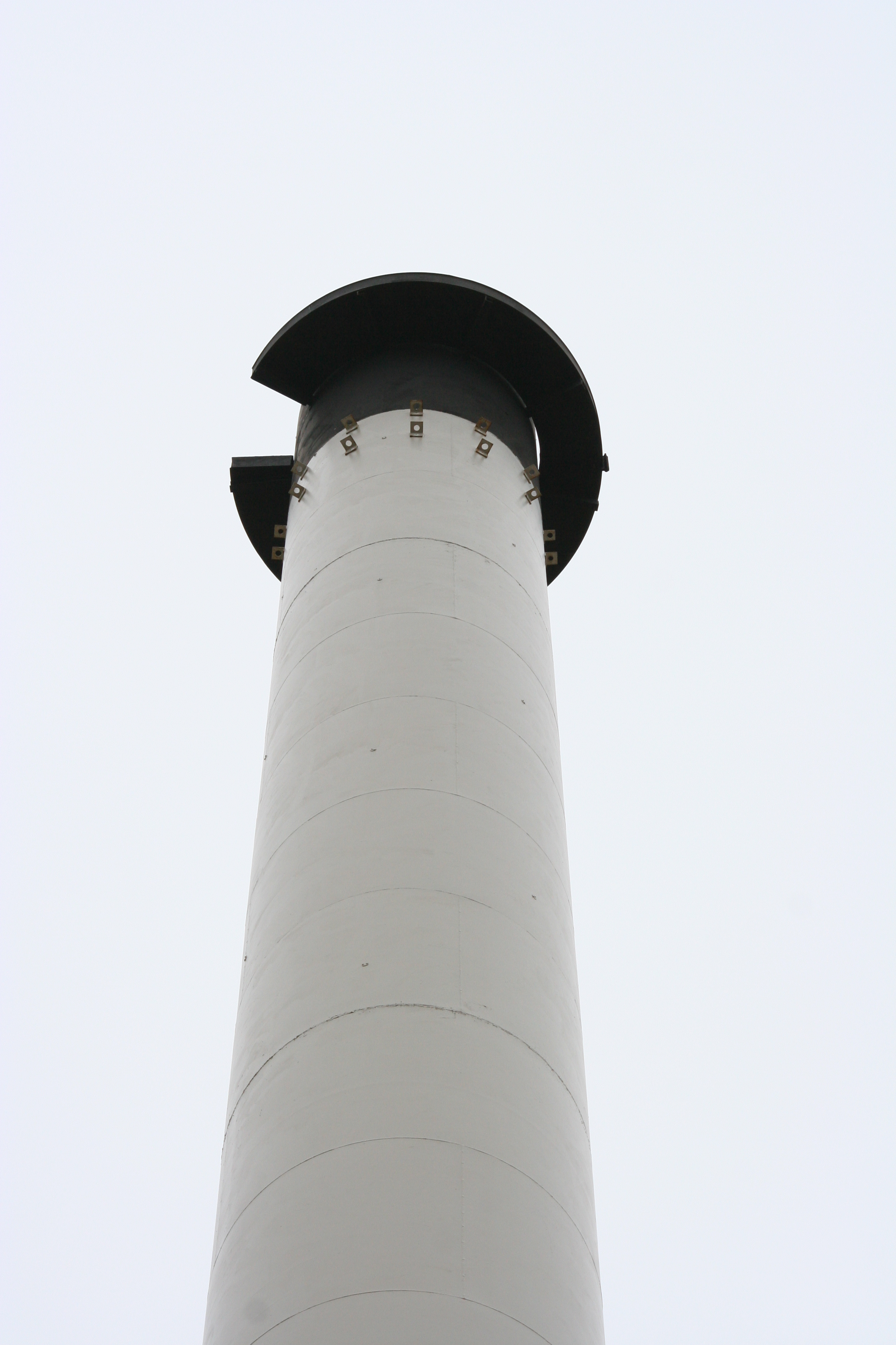
Black and white, possible increase in contrast
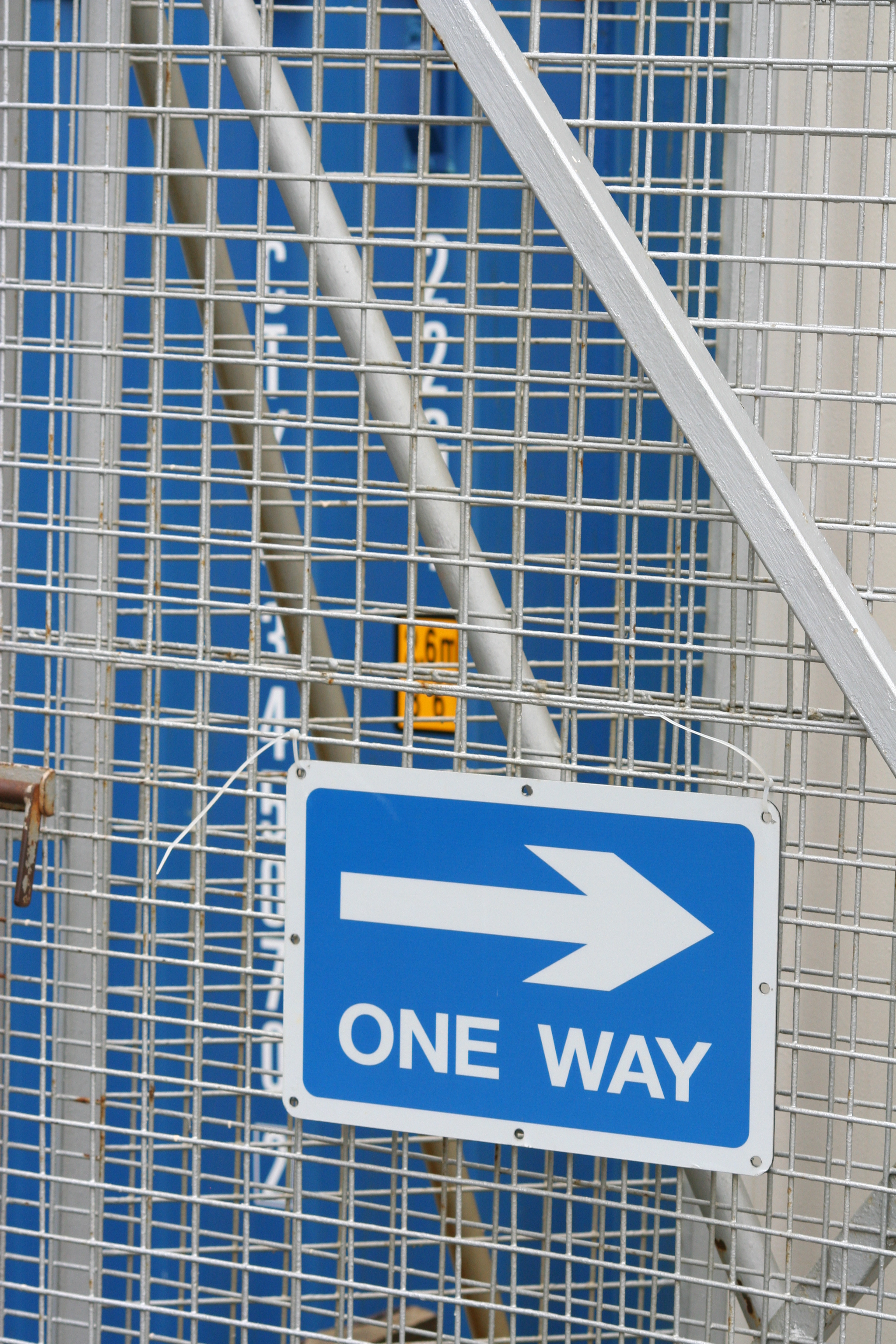
Enhance and darken blue tones
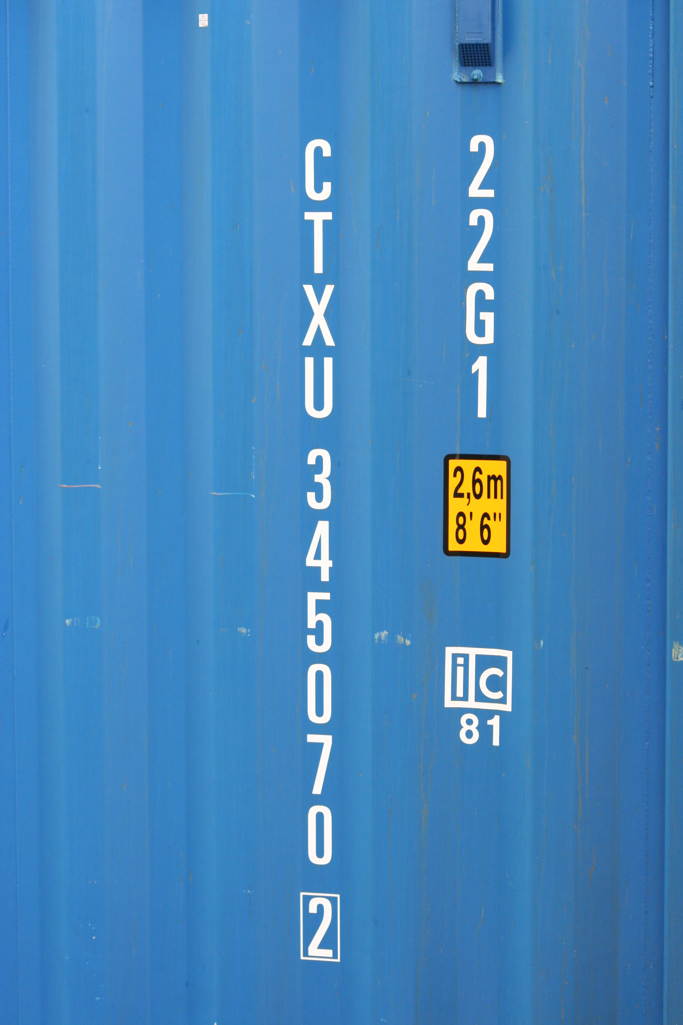
Experiment with saturation and hue of tones
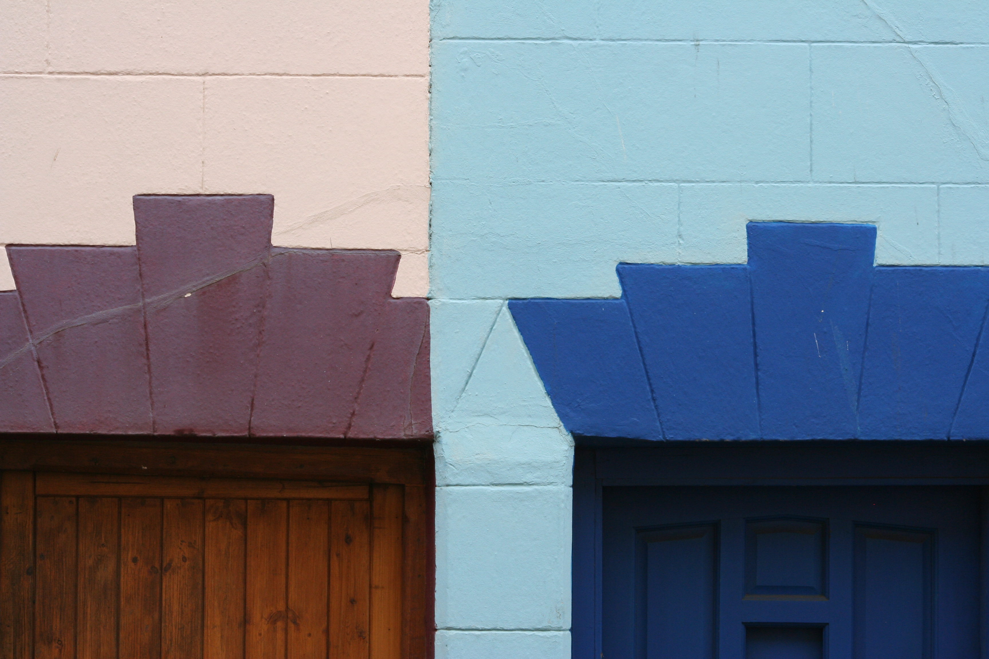
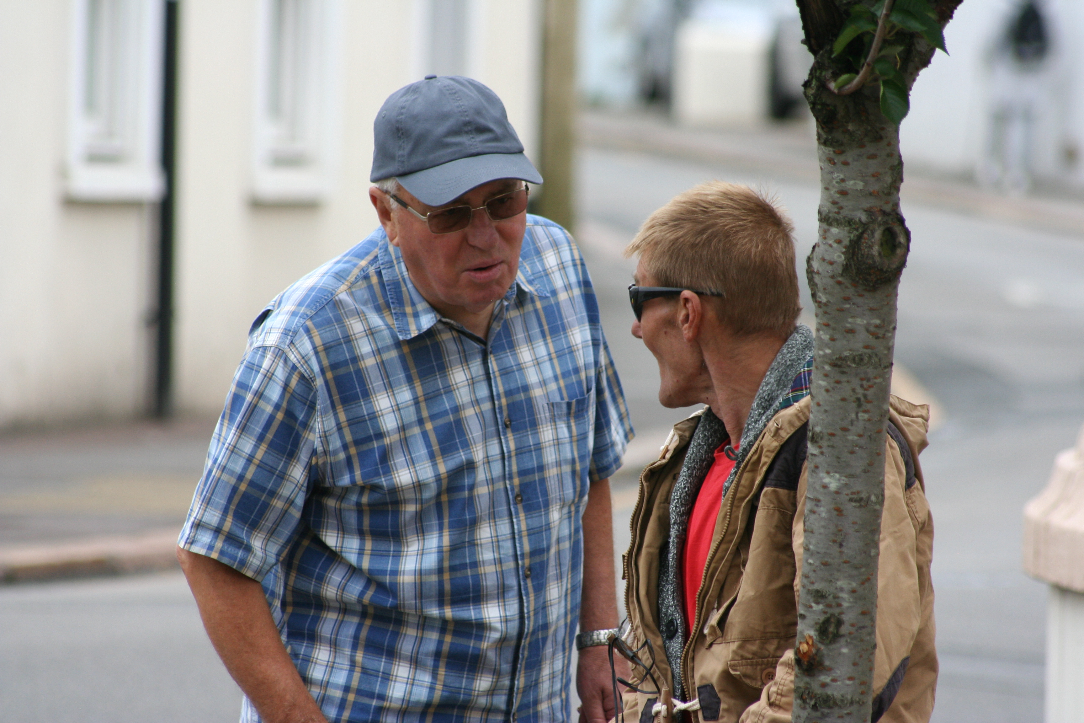
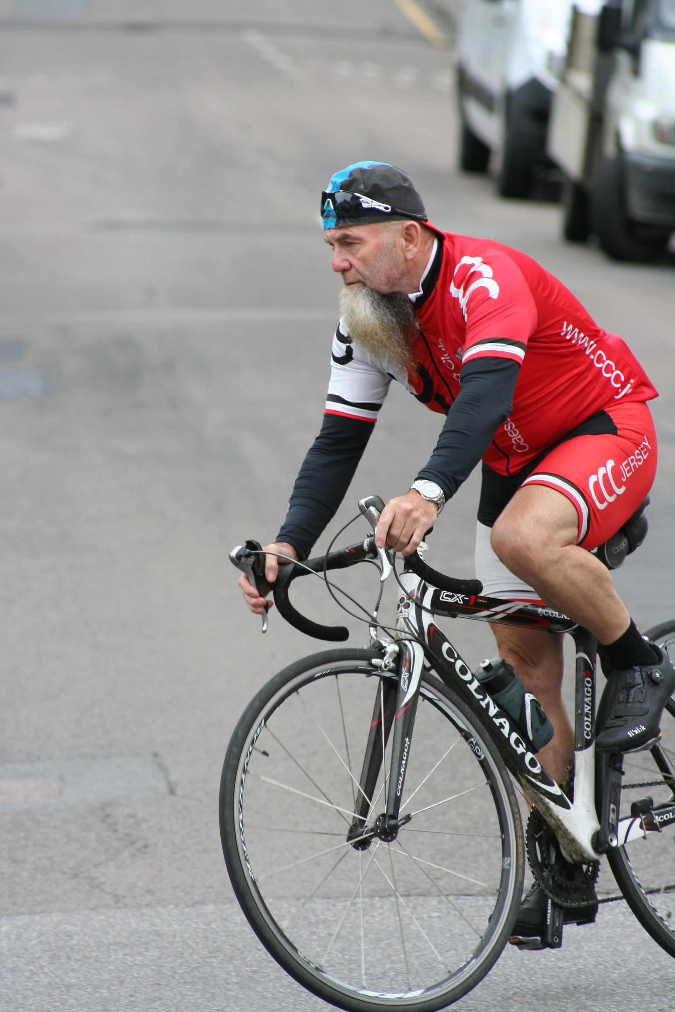
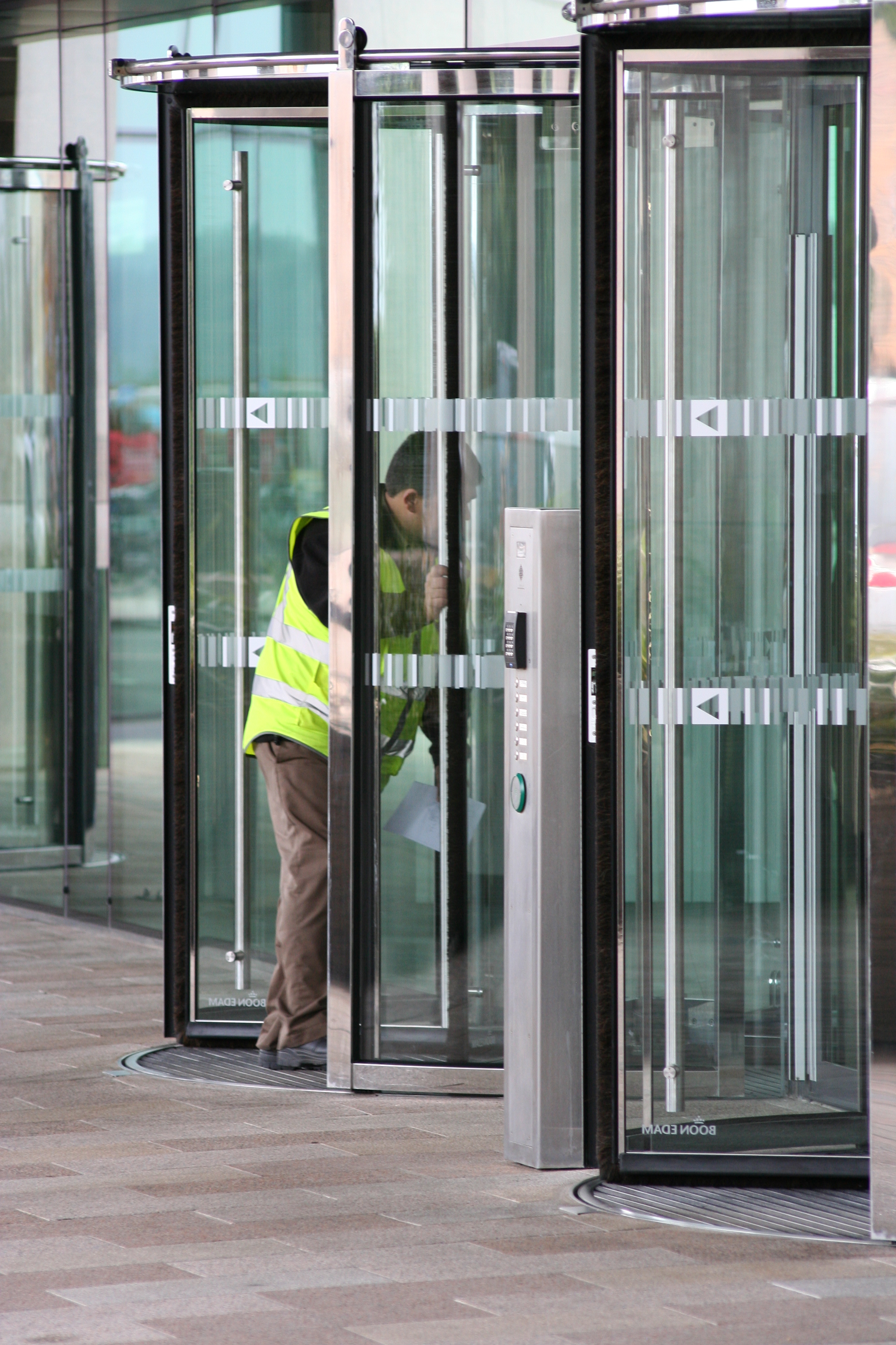
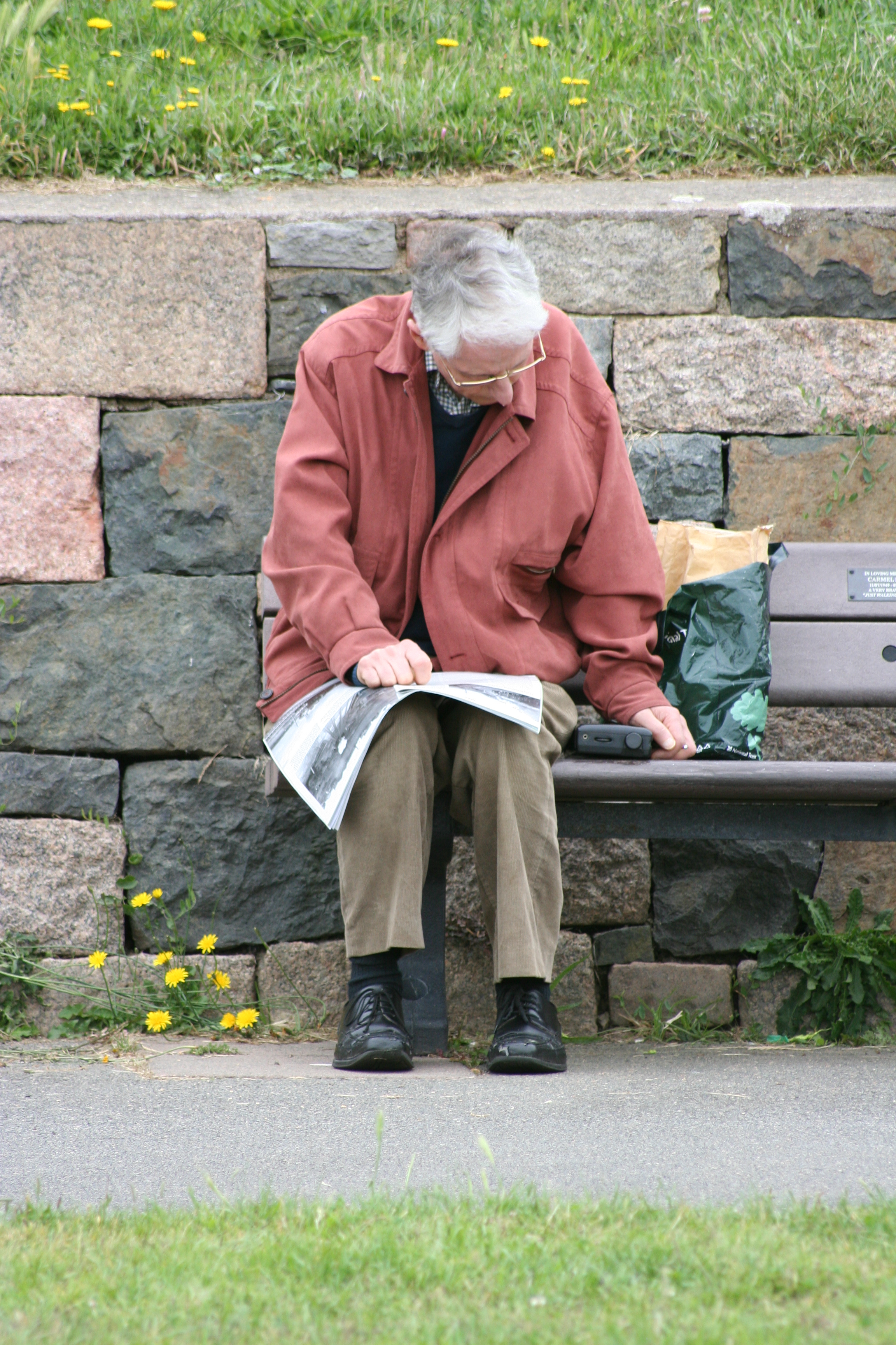
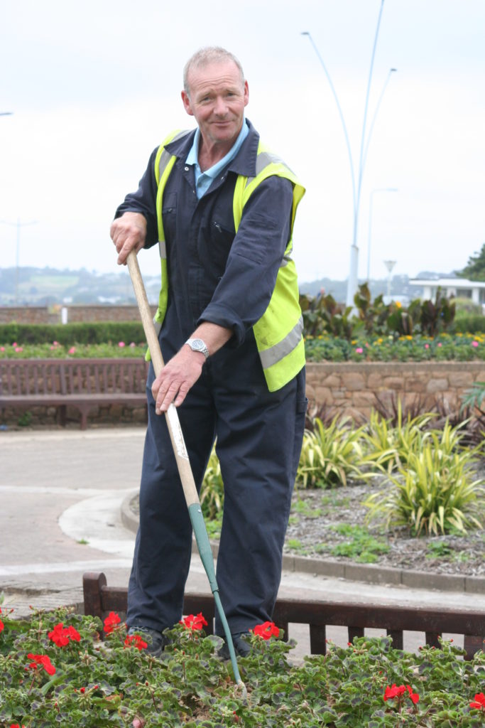
Increase in contrast and slight decrease in brightness
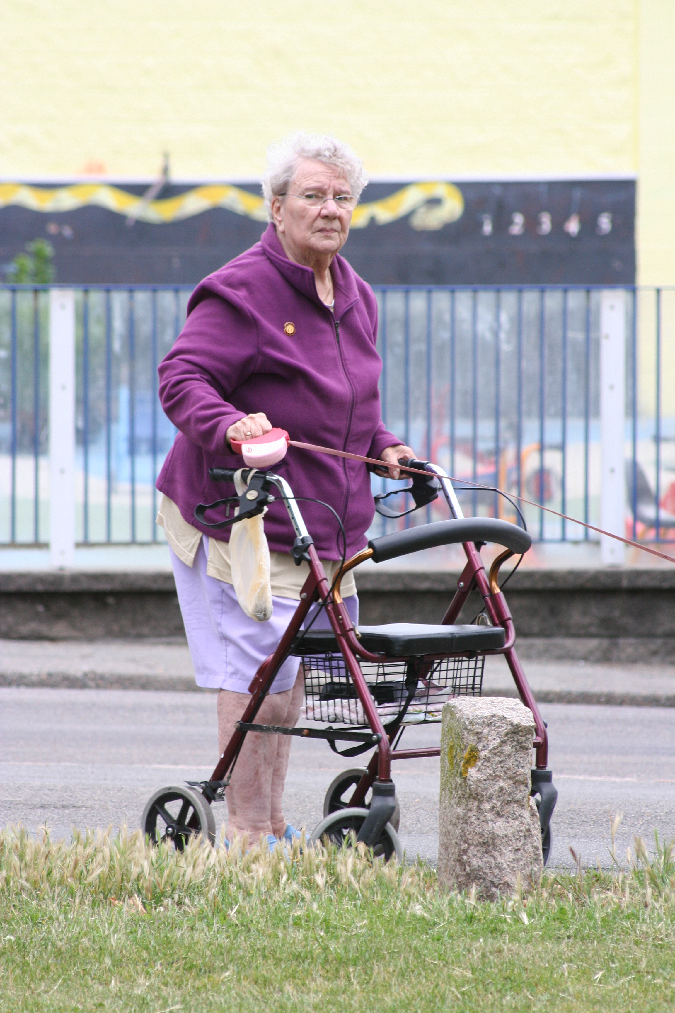
Slight increase in contrast
Shoot 2 Favorite images :
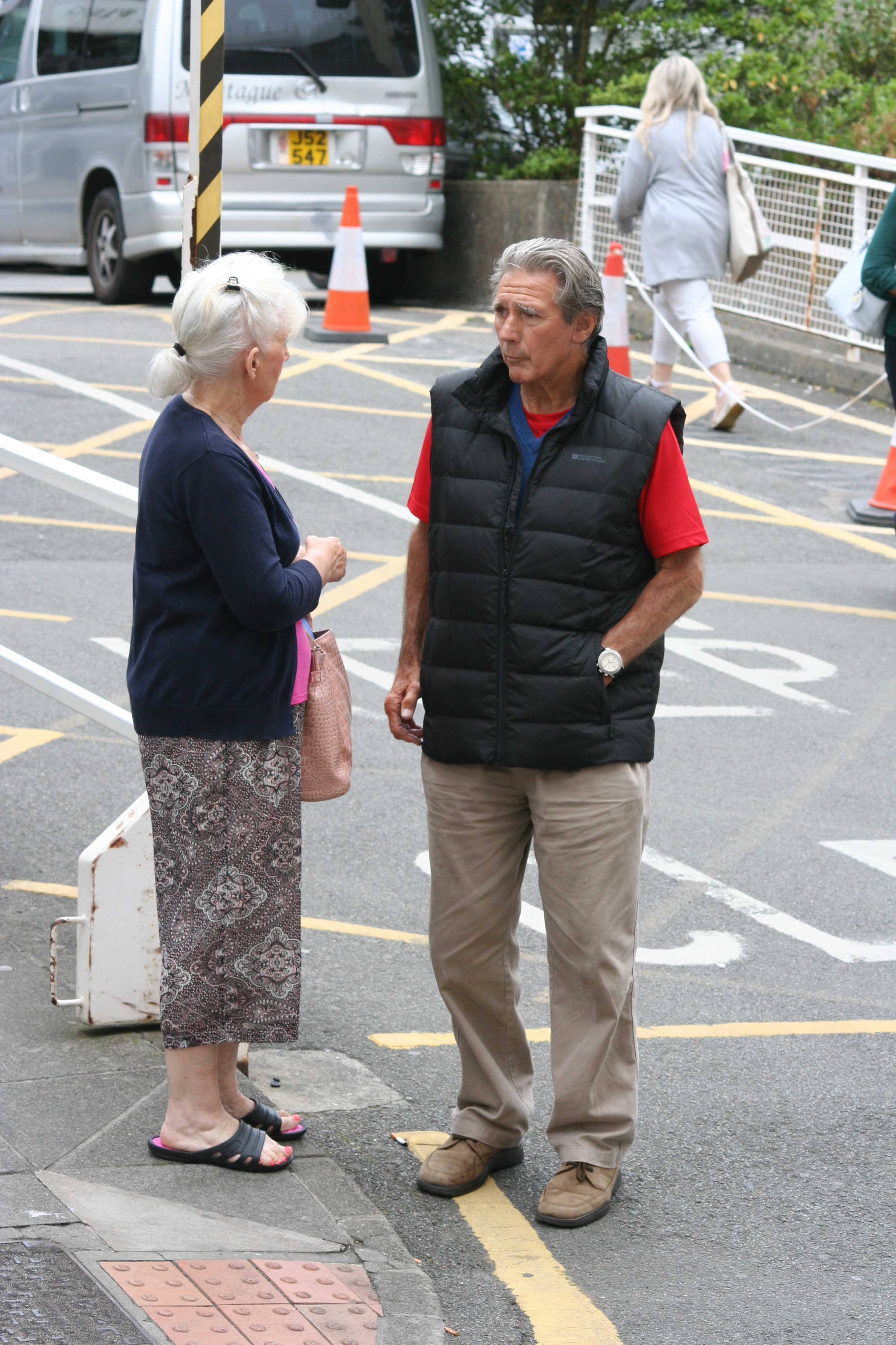
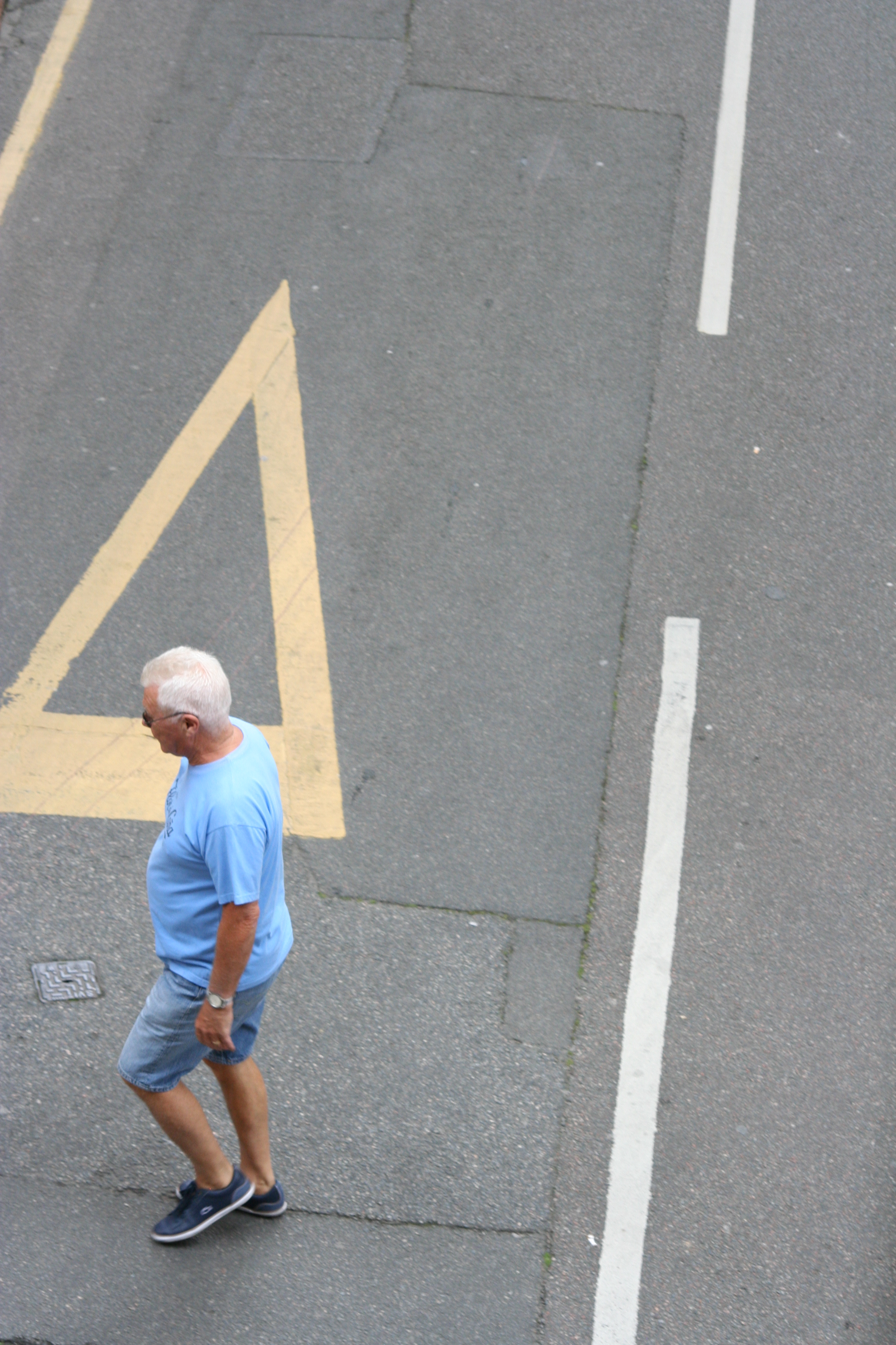
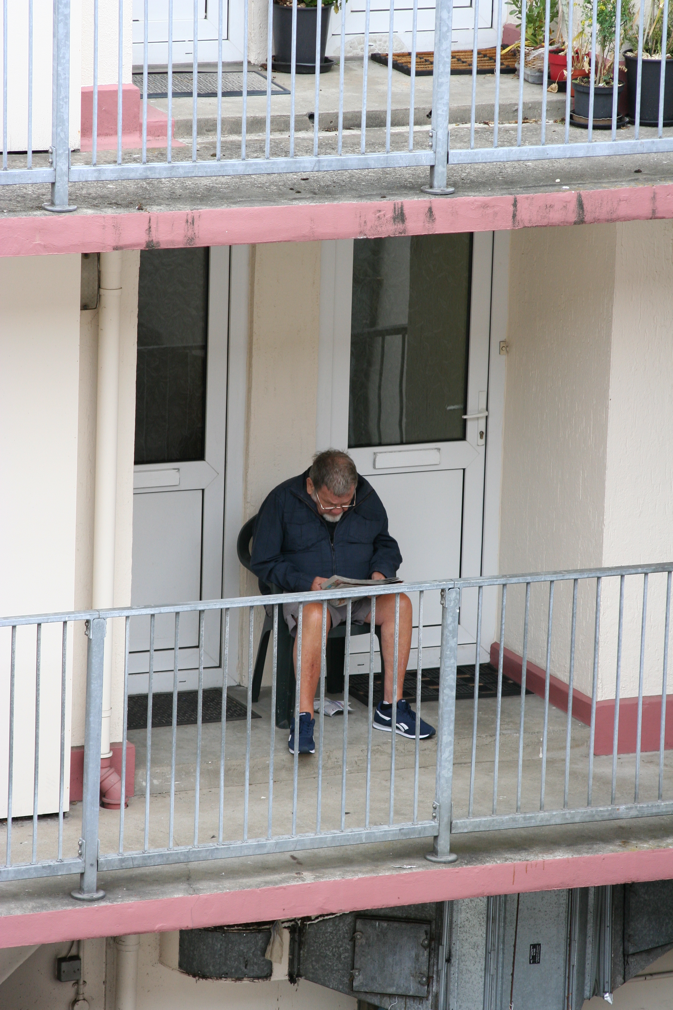
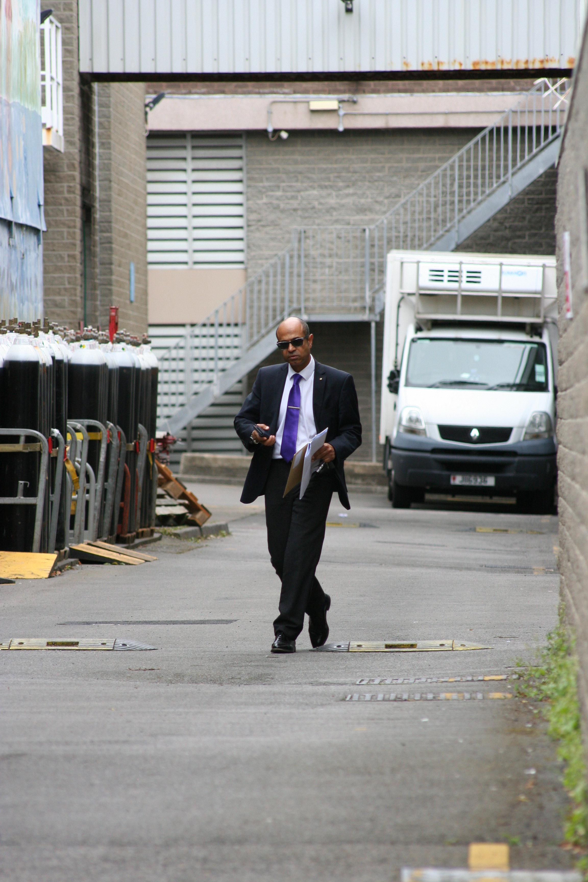
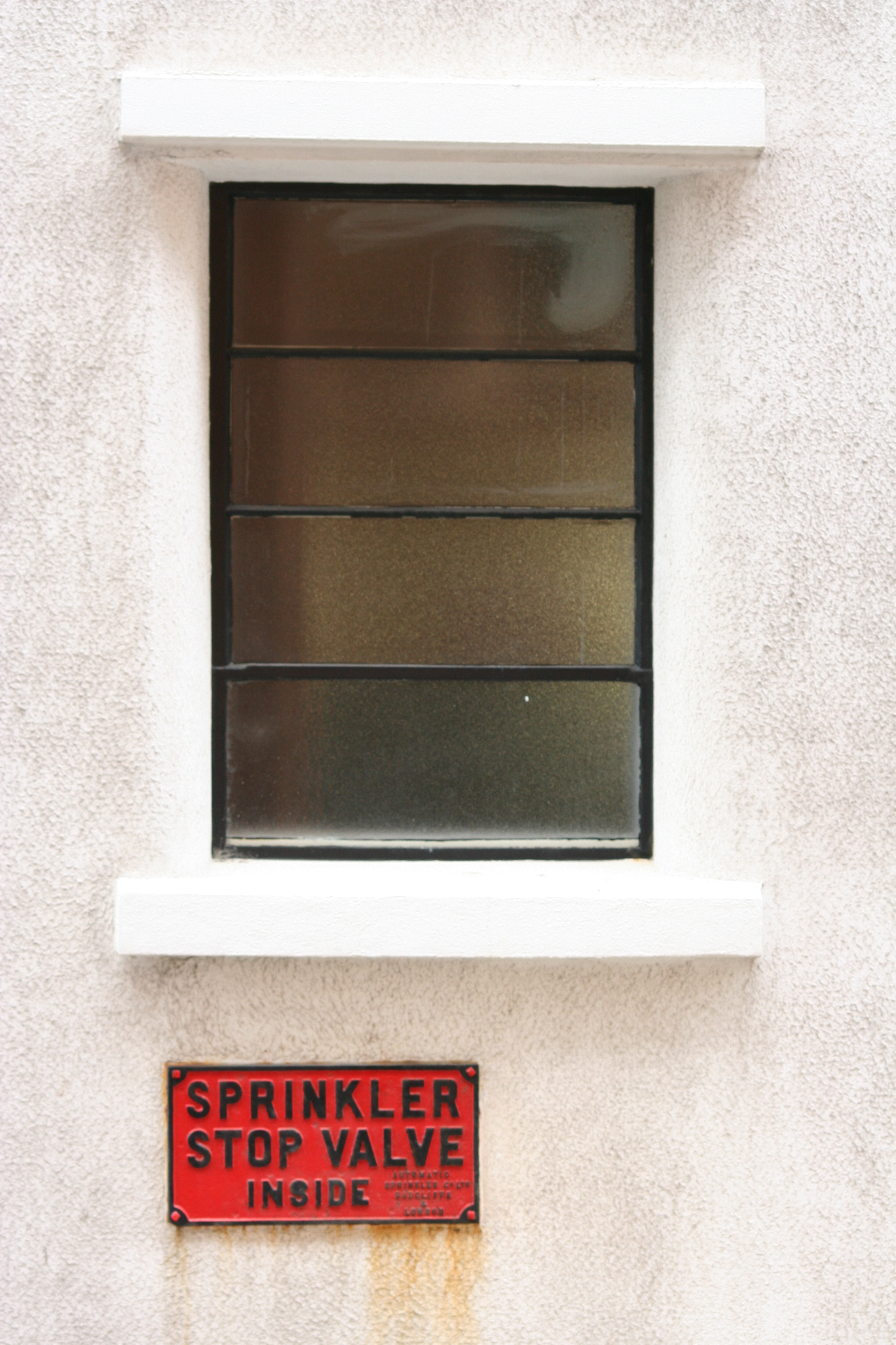
Slight increase in contrast, maybe alter hue of red tones
Shoot 3 Favorite images :
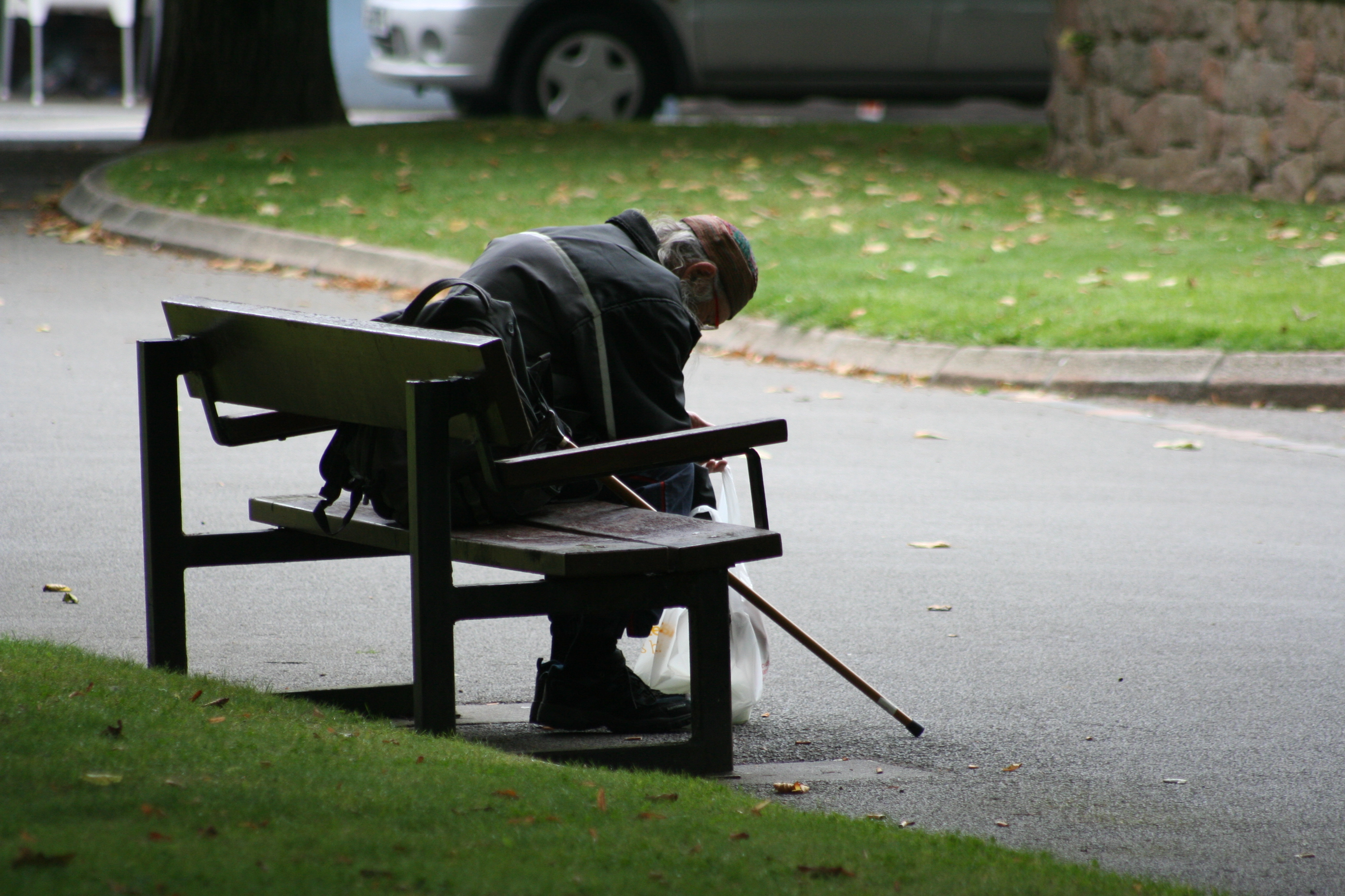
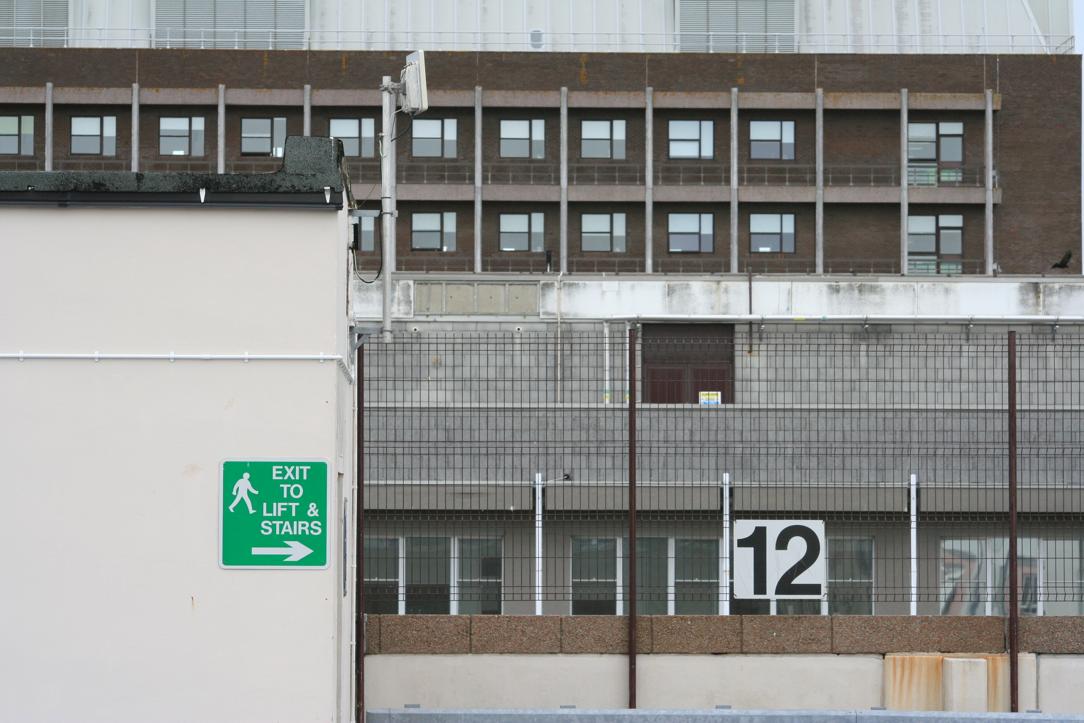
Cropping, Increase contrast, possibly black and white
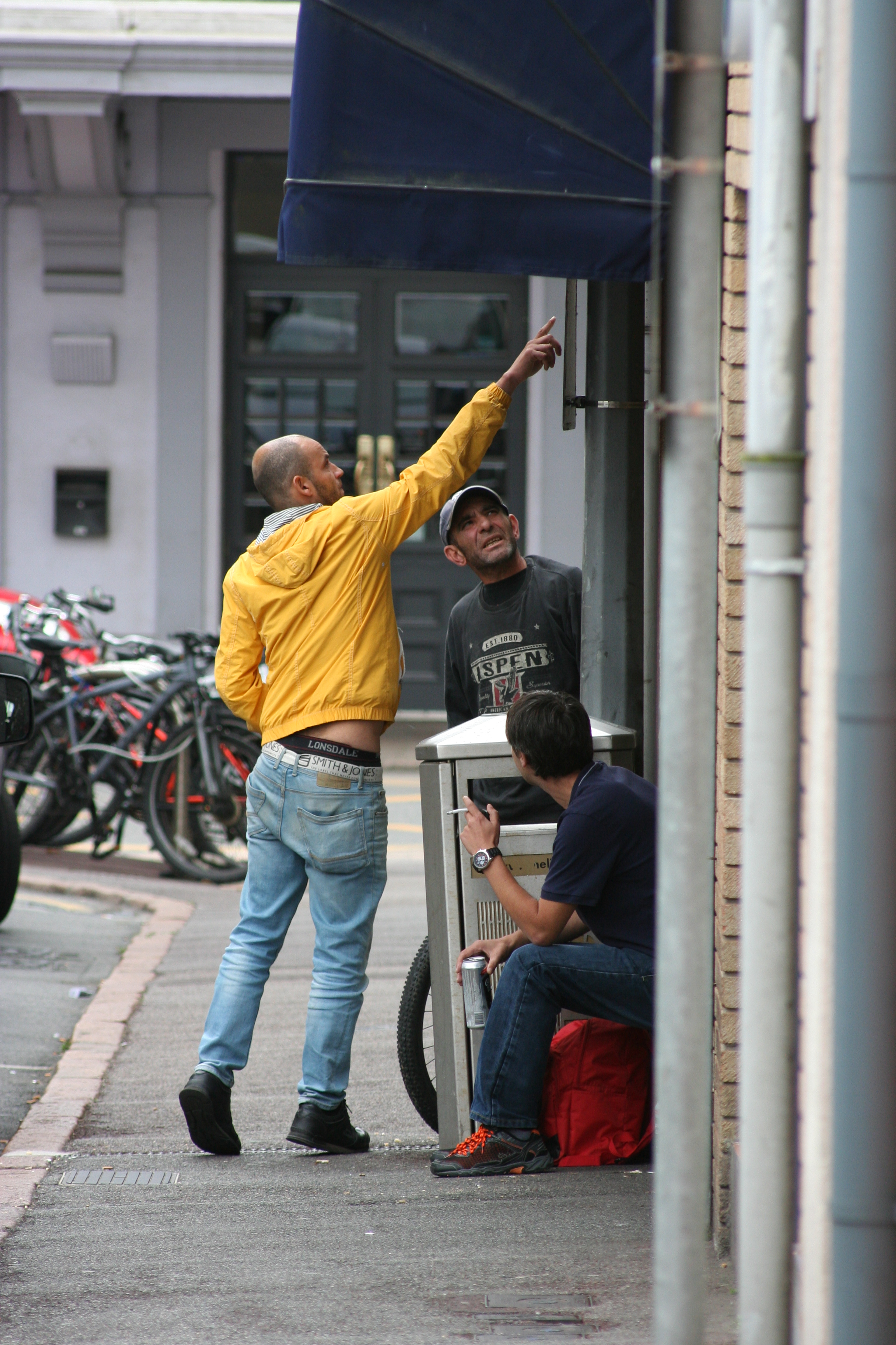
Cropping, slight increase in saturation
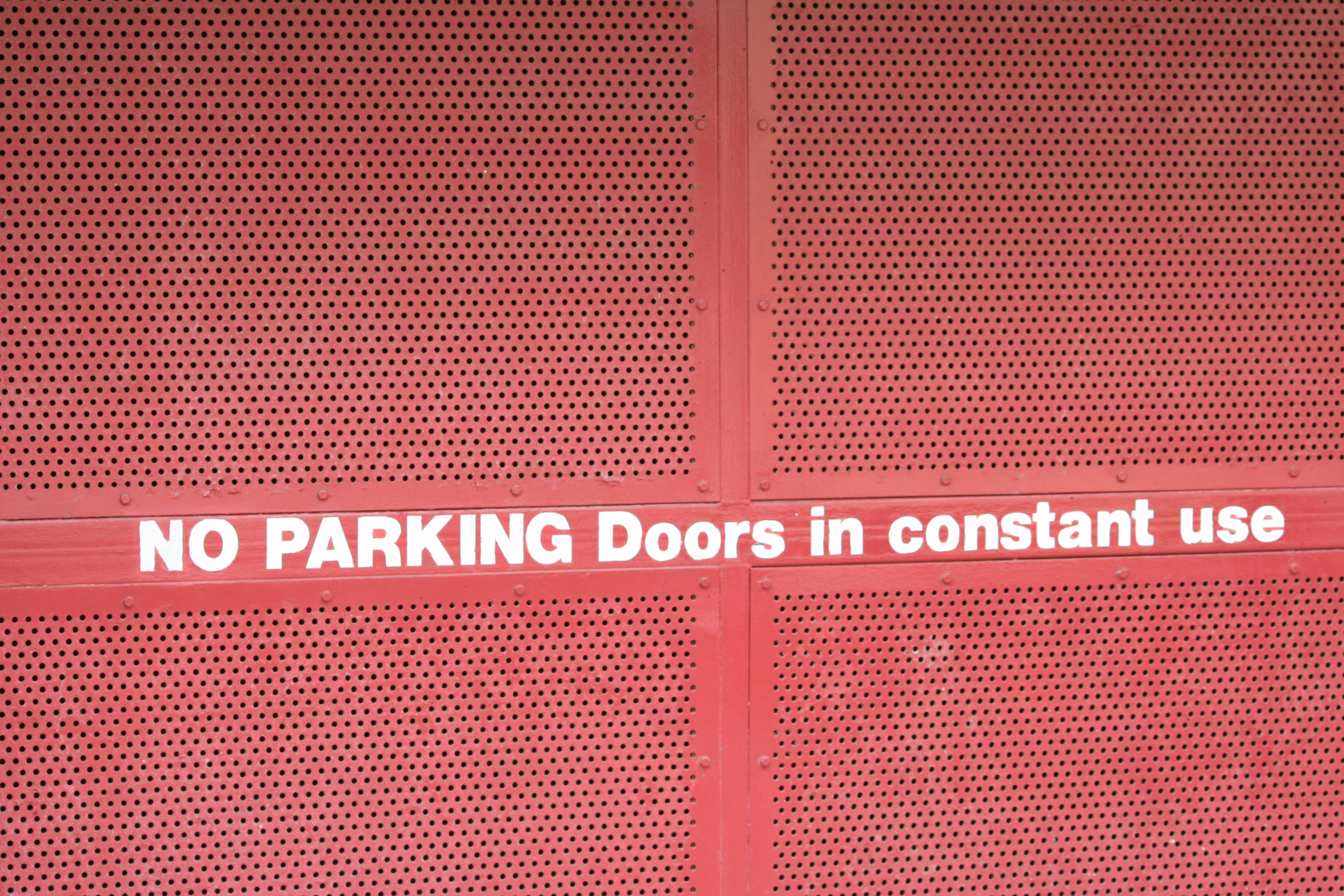
Slight decrease in brightness, maybe alter the hue
