Future Of St Helier Newspaper And Installation

Future of St Helier

Overall I found my chosen pieces in the newspaper to be particularly effective due to them representing my best work from the shoots. I found that these images represented the vibrant colours of town and the architecture that surrounds it, whilst using the contrast to provide an insight into how these buildings are portrayed. I really liked how the images selected both portrayed my stance on how St Helier has been constructed, a mismatched area where there is not real coordination into its display.

Hoarding Installation

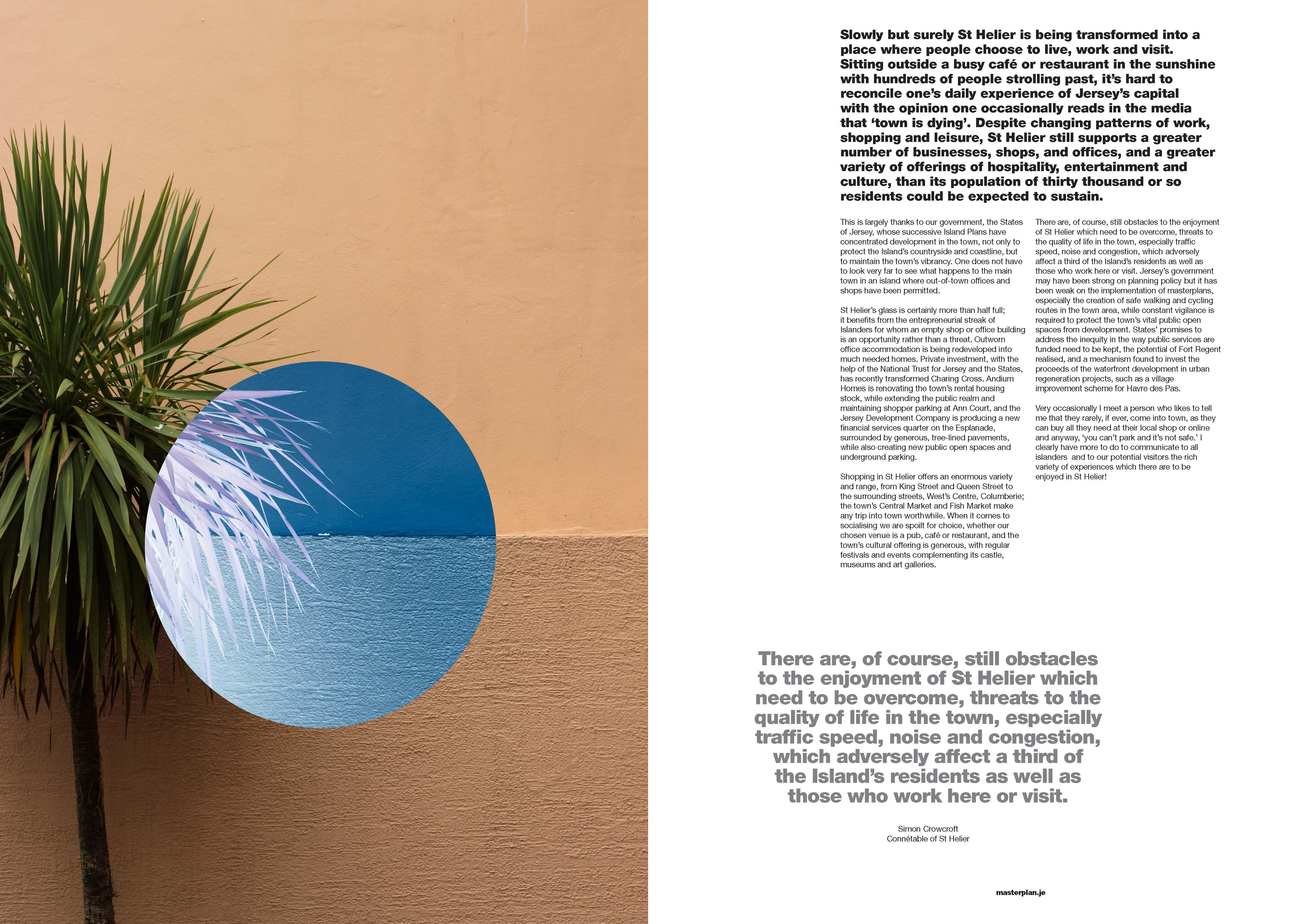
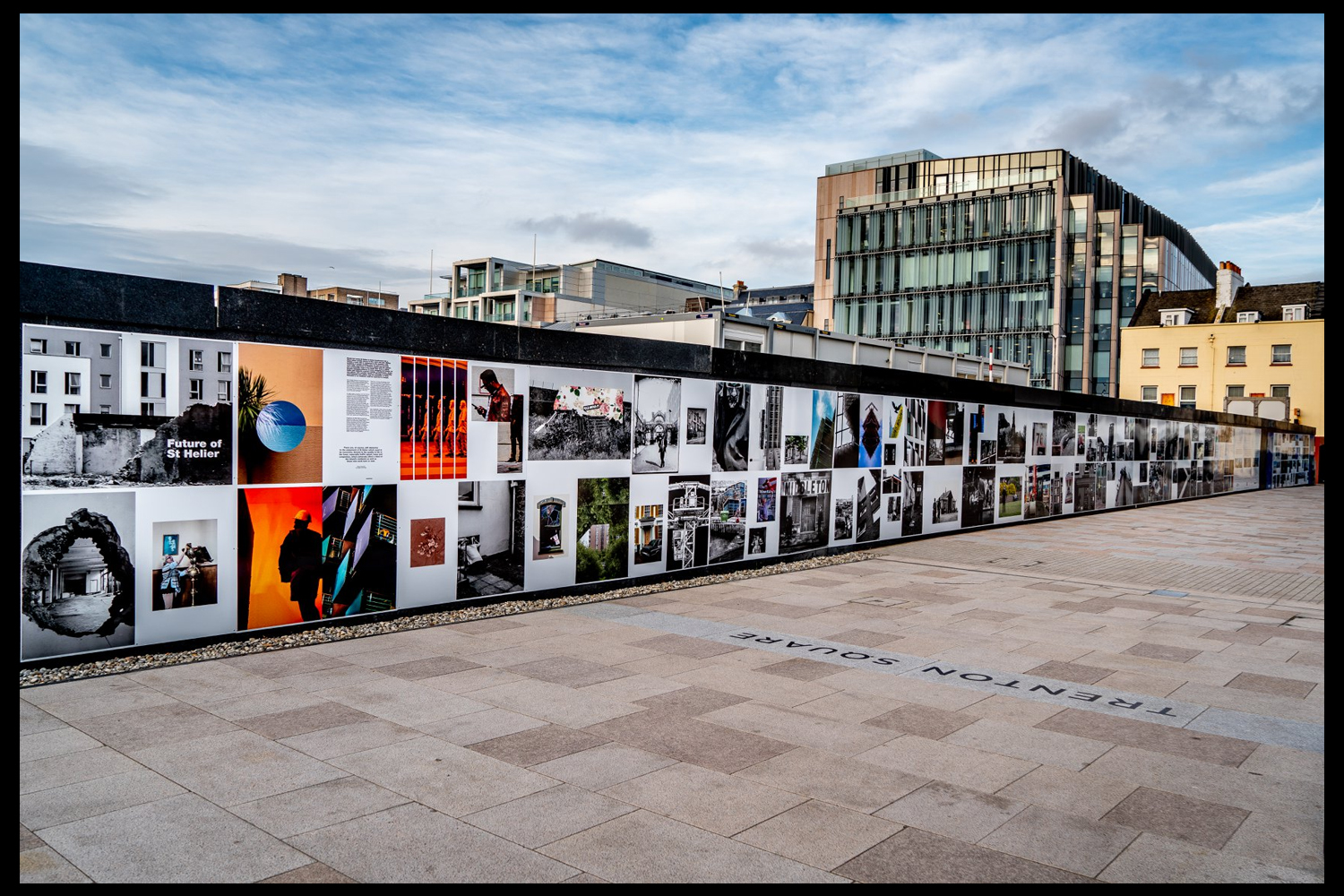
The unveiling of the Future of St Helier Hoarding at the International Finance Centre on the Esplanade in St Helier took place on Thursday 13 Dec 2018.First published as a 52 page newspaper supplement in September by the Jersey Evening Post the work produced by A-Level Photography students at Hautlieu School have been transformed into a 34m outdoor installation as part of Masterplan Community Arts and Education Project
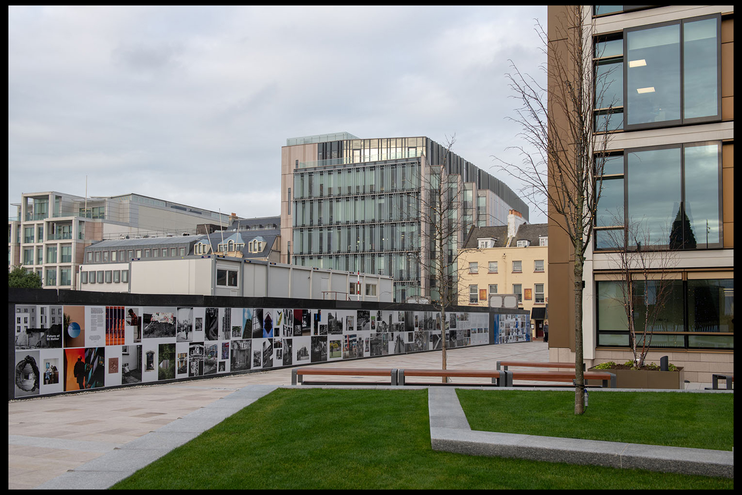
We were challenged with responding to specific areas, streets and neighbourhoods divided up along the urban vingtaines of St Helier and to explore through research, archives and photography the built-environment, urban living, diverse communities, town planning, land use and re-generation projects.

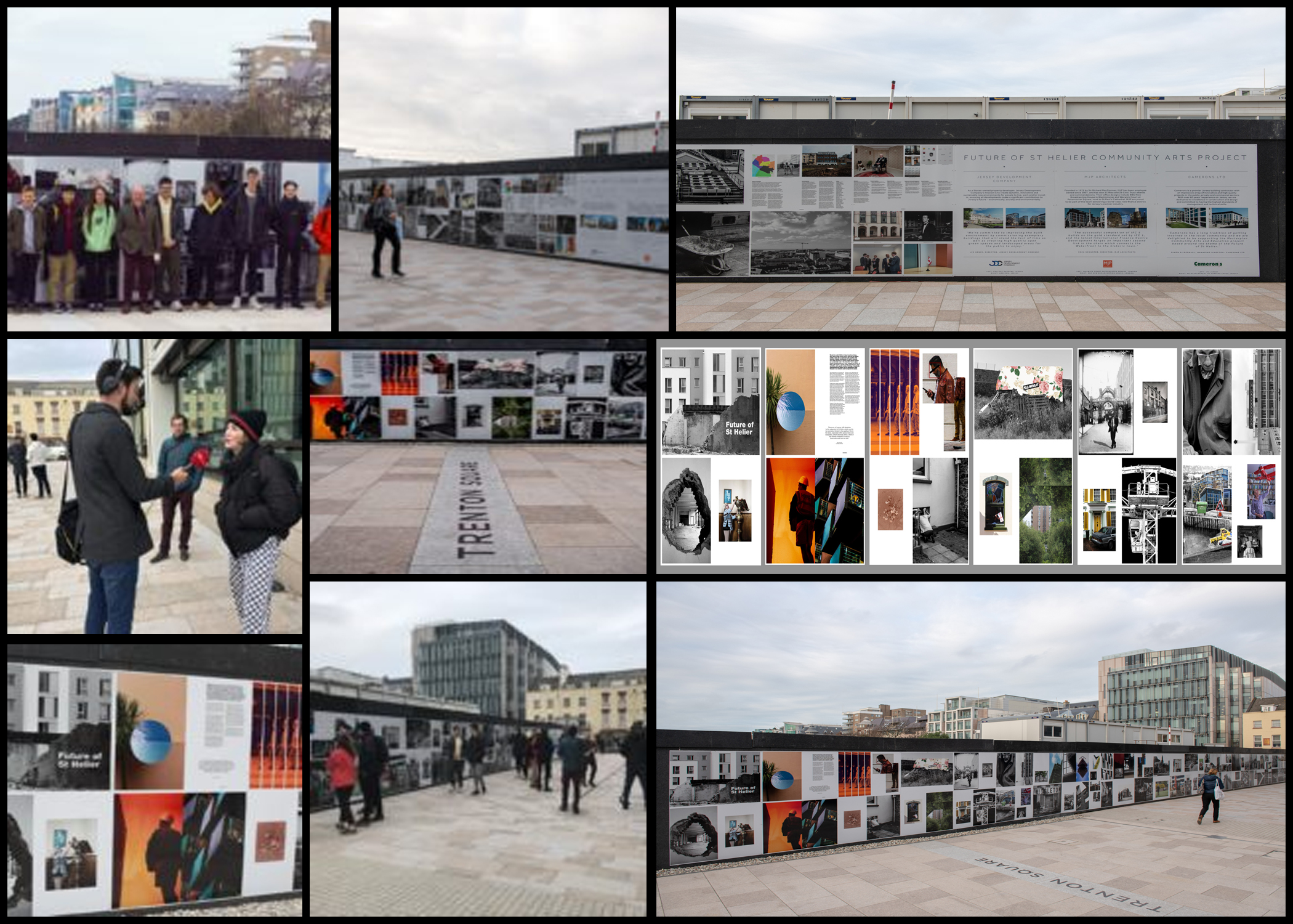
We thank all sponsors and collaborators for making this a successful contribution to the island’s cultural records and historic archives Jersey Development Company, Camerons Ltd, MJP ArchitectsArchisleLewis BushPhoto-Archive Societe-Jersiaise, Kevin Pilley, States of Jersey and Connétable of St Helier, Simon CrowcroftEarlier today we unveiled the Masterplan Future of St Helier hoarding display at the International Finance Centre. Lots of local media interest from Jersey Evening PostITV Channel TV and BBC Jersey who broadcasted live on radio talking to photography students at Hautlieu School, Constable of St Helier, Simon Crowcroft and sponsors Jersey Development Company, Camerons Ltd, MJP Architects about the future of the island and its capital. An excellent example of how a community arts and education project can generate a debate that affects all those who either live, work or visit St Helier.
https://www.bbc.co.uk/sounds/play/p06rlpdw
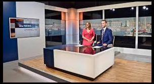
If you missed the news last night at ITV Channel TV you can catch up here with Hautlieu students talking (15m.12s) about their images on display at the Masterplan Future of St Helier hoarding on the International Finance Centre.

See link here
The outdoor installation on the hoarding around the construction site is a great way to engage the public in art and debates concerning the future of the island’s capital but, what we need in Jersey is a new contemporary art space that will provide a new venue to showcase art produced in the island, but equally also bring international art to Jersey for the public enjoyment of its residents and visitors alike.

The recent Culture, Arts and Heritage Strategic Review, commissioned by the Government of Jersey makes 20 new recommendations that will revitalise the island’s cultural infrastructure and achieve a wide range of social and economic objectives from tourism, to health and well being to external relations, to planning and environmental developments – in the hope that in partnership with Government it will enrich and enhance Jersey’s quality of life.

Let’s hope those in power who can make real changes to St Helier’s build environment will include such a new art space in the revised Masterplan of the Waterfront. All we need is political will and re-prioritising public funding for the arts. States of Jersey

Future of St Helier Newspaper

The outcome of students work was first published on Tuesday 18 September 2018 as a 52 page newspaper supplement, Future of St Helier that was printed in 14,000 copies and inserted into a daily edition of the Jersey Evening Post and distributed island wide.

Here is a video browser of our Future of St Helier supplement printed and distributed in today’s edition of the Jersey Evening Post. Hautlieu photography students were challenged with responding to specific areas, streets and neighbourhoods divided up along the urban vingtaines of St Helier and to explore through research, archives and photography the built-environment, urban living, diverse communities, town planning, land use and re-generation projects. Each student designed a page spread which was then split in half producing a fragmented image reflecting on the nature of experience and diversity of St Helier.

Independent Study 2

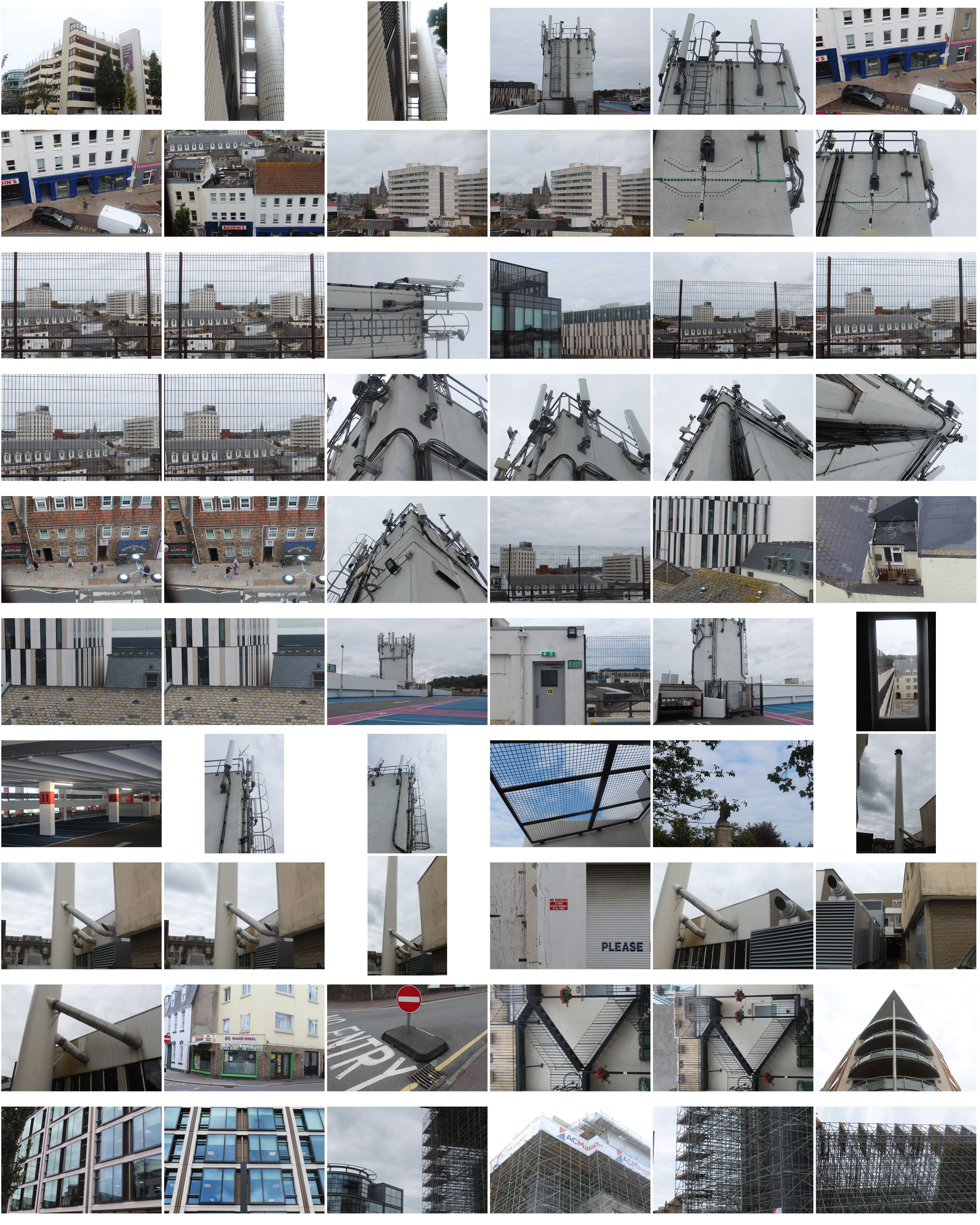
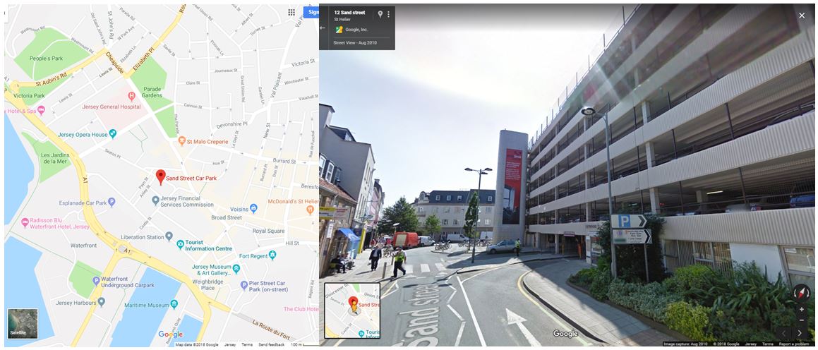
For my third photoshoot I wanted to focus on the more of the industrial aspects of buildings in this shoot. I first visited Sand Street car park which is surrounded by houses and buildings being near the centre of town. I also wanted to walk around and explore the roads in that area to fins more industrial buildings and structures. I narrowed my images down to 60 and displayed them below in a contact sheet.

For this photoshoot i went to an location outside of the area i was assigned to find different buildings and structures in St helier that link to my previous ones.

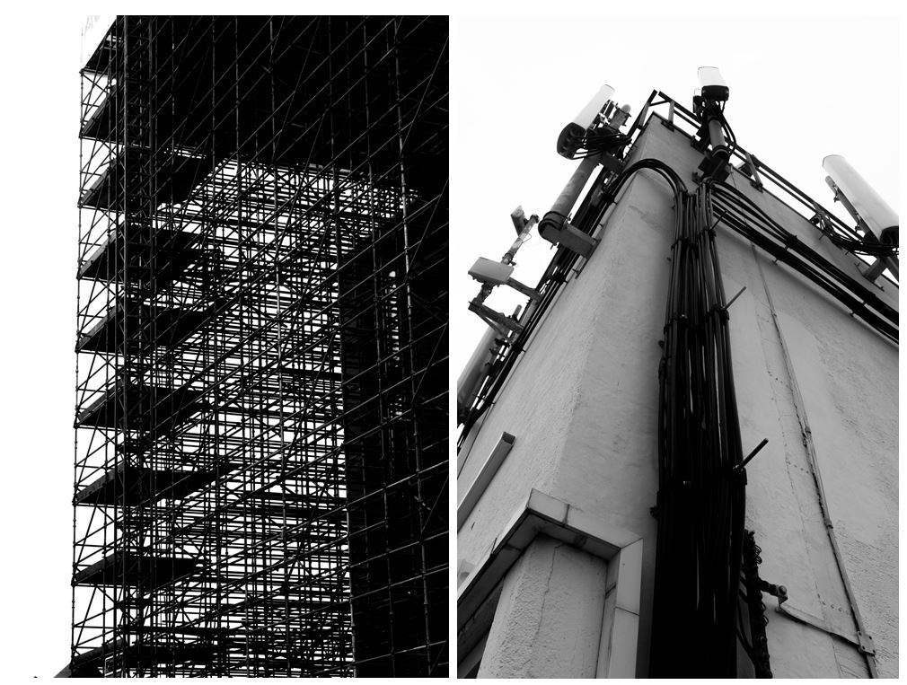
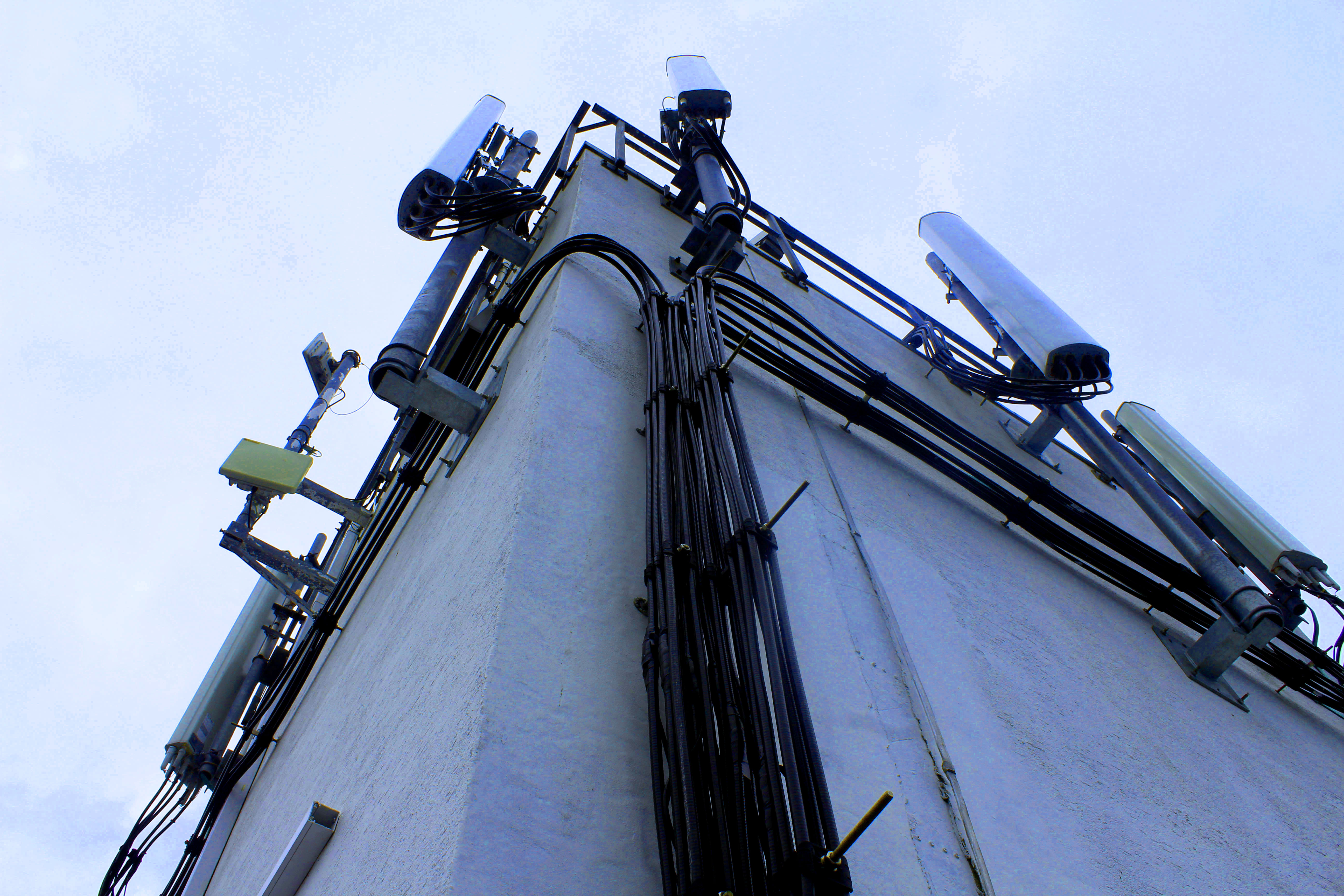
When walking around Sand Street car park I found this building structure that had wire and lamps on it giving a very industrialised appearance. I particularly liked this image as tones and colours in it are many black, grey and white even though i haven’t edited it this way. This means that building looks like its been edited in black and white in real life, representing how the industrialisation in Jersey is taking away the colour and culture. The cloudy sky gives a white background to the grey and black building in the foreground creating a hostile appearance. The angle this image is taken at emphasises the bold black wire running up the side of the building. I chose this photo as one of my final images as you cannot tell that it was taken in Jersey and could be anywhere industrial in the world, representing how Jersey is losing its heritage and culture by new constructions and starting to look like other towns and cities.

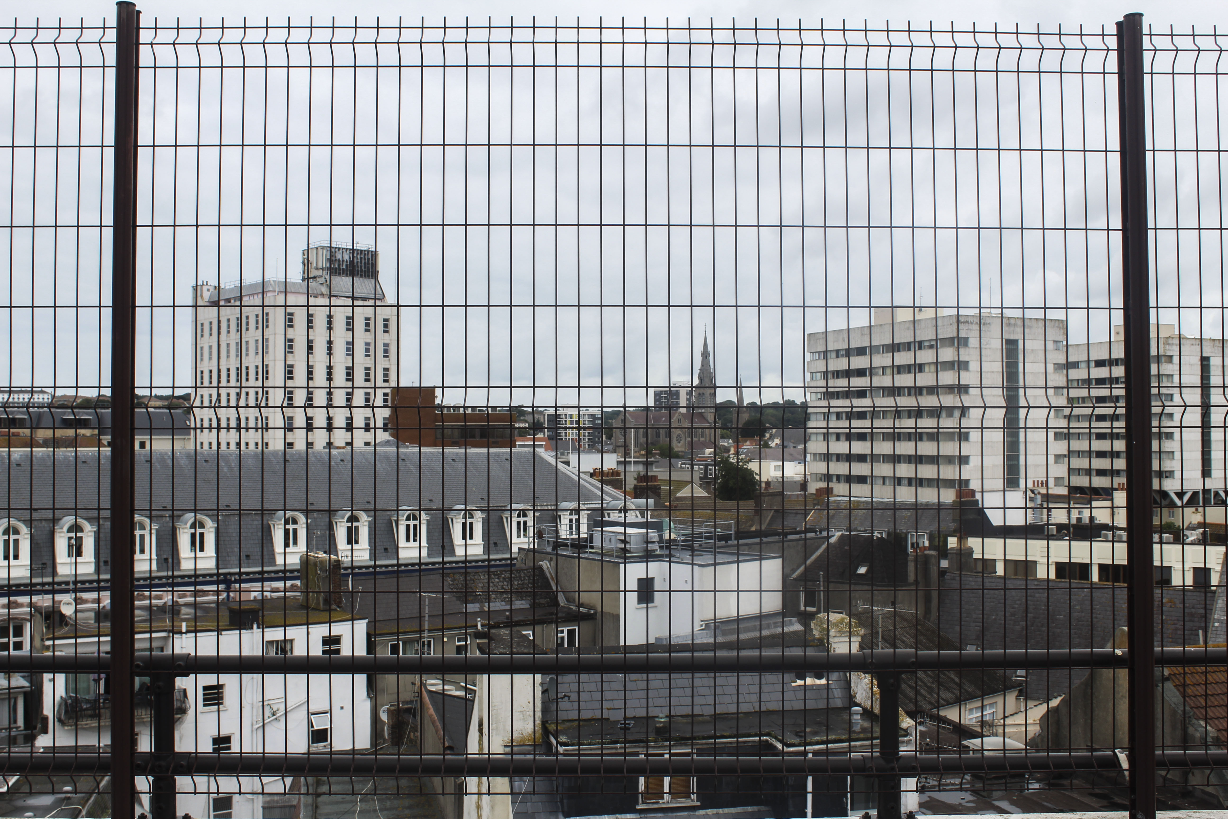
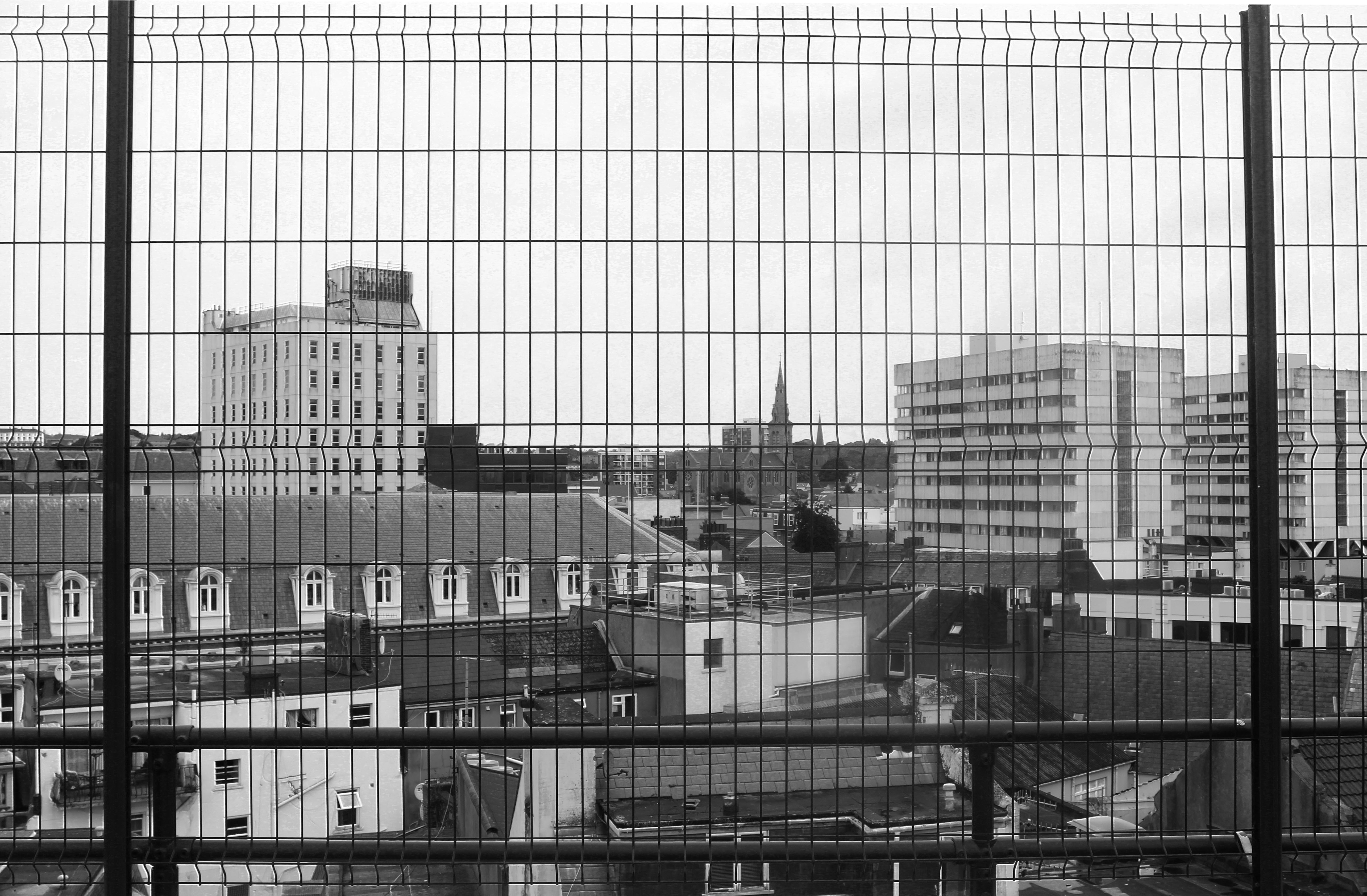
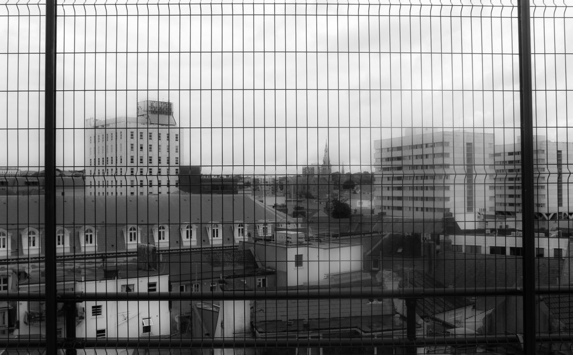
I like this image as it gives an overview of an area in the center of St Helier, showing the different and mismatched styles of building like tower blocks and smaller town houses. The angle which the photo was taken in a car park gives people a different perspective of St Helier than they might normally see. The way the buildings are arranged in this image to me looks like the buildings are being stacked and layered on top of one another. The smaller groups of older looking houses looks like how St Helier wanted housing to look like when they were first being built. Other buildings, like the flats, look like they’ve been stacked on top of the previous buildings, representing how St Helier keeps adding more buildings to the land when there isn’t much room, resulting in the overcrowding of buildings and a mismatched style of old and new.  The black, structured  fencing in the foreground adds another more interesting aspect to the image  which looks like the buildings and town have been caged, giving the image a more industrial and hostile appearance. This makes the front of the  image very symmetrical and ordered, which is juxtaposed with the mismatched buildings in the middle ground and background. The land only goes up half the image and is contrasted with the white/grey sky emphasising the whiter parts of the rest of the image and contrasting with the black fence in the foreground. Cool colours like grey, white and black with blue tints gives the overall image a dull and spiritless appearance. I did this on purpose so the idea to bring more vibrancy and culture into St Helier is emphasised.


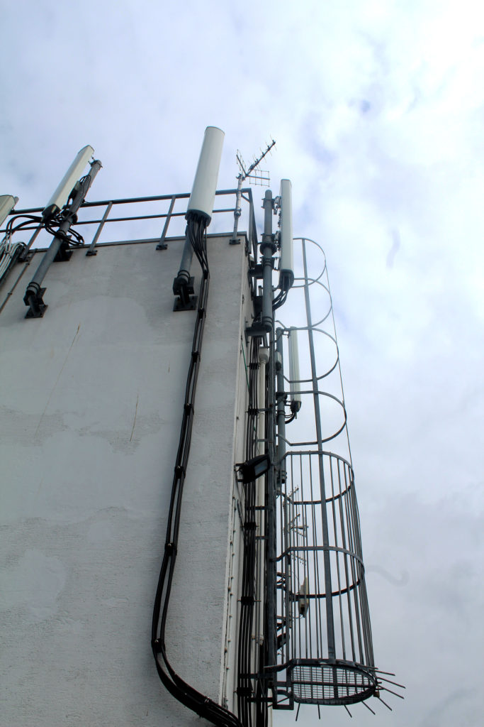
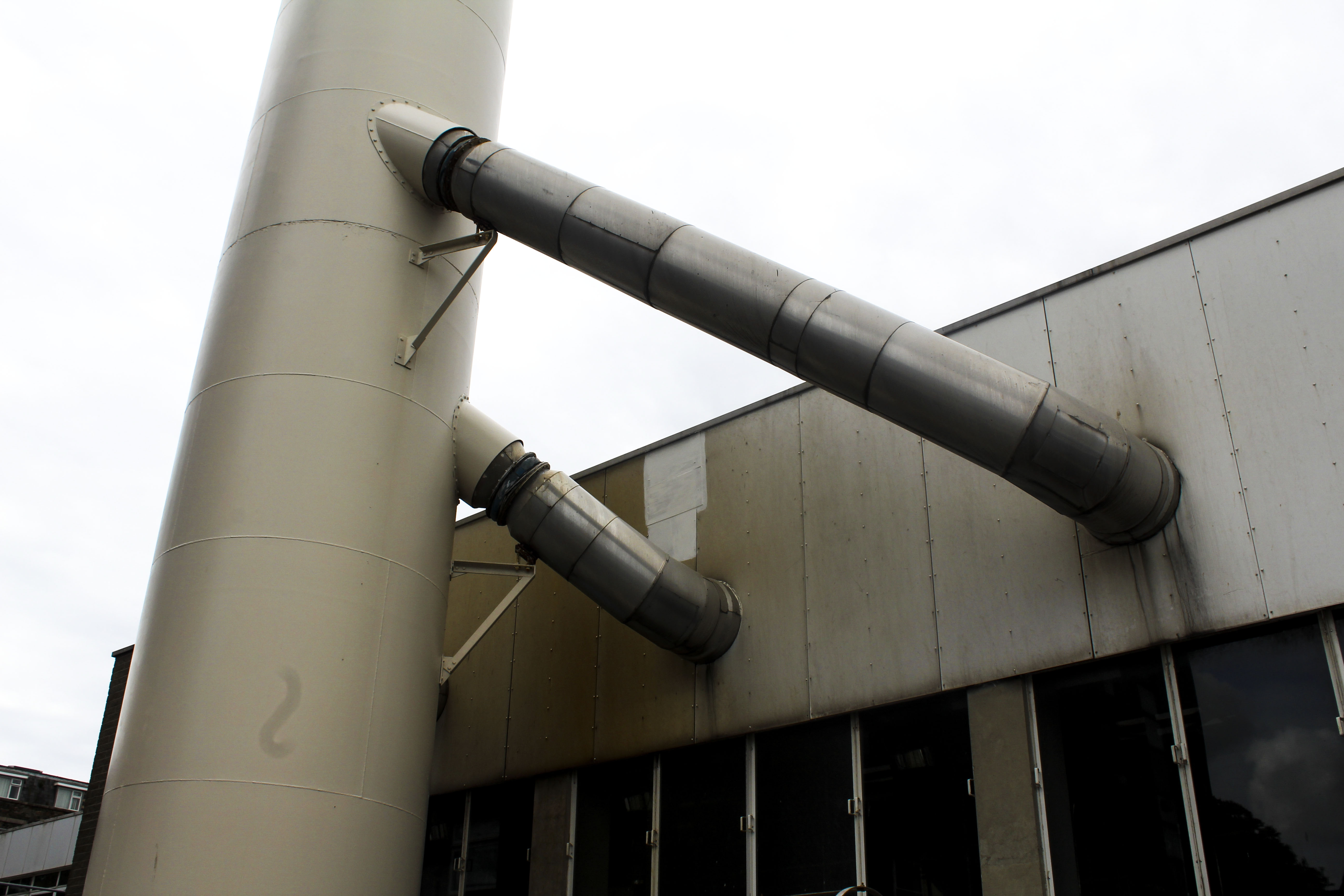
I also chose this photo as one of my final images as I like how it’s only showing an industrial metal structure with no signs of life. The yellow/brown tint on the metal gives the impression that it is rusting. What makes this an interesting image is that its simplistic but contains many different tones of metal from white to black to yellow. I think this image would work best as a part of a series rather than by itself as I think it could be apart of telling a story as now it doesn’t have any obvious meaning behind it when looked at.


Edits

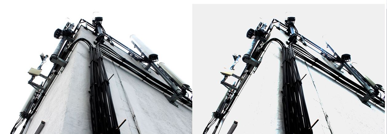
When editing this image I wanted to see if I could change overall appearance. So i experimented by increasing the exposure and increasing the brightness in one of the images so all the colour was taken out of it and was left with a stripped down version. This changes the appearance of the image making it look decolourised and bleached.


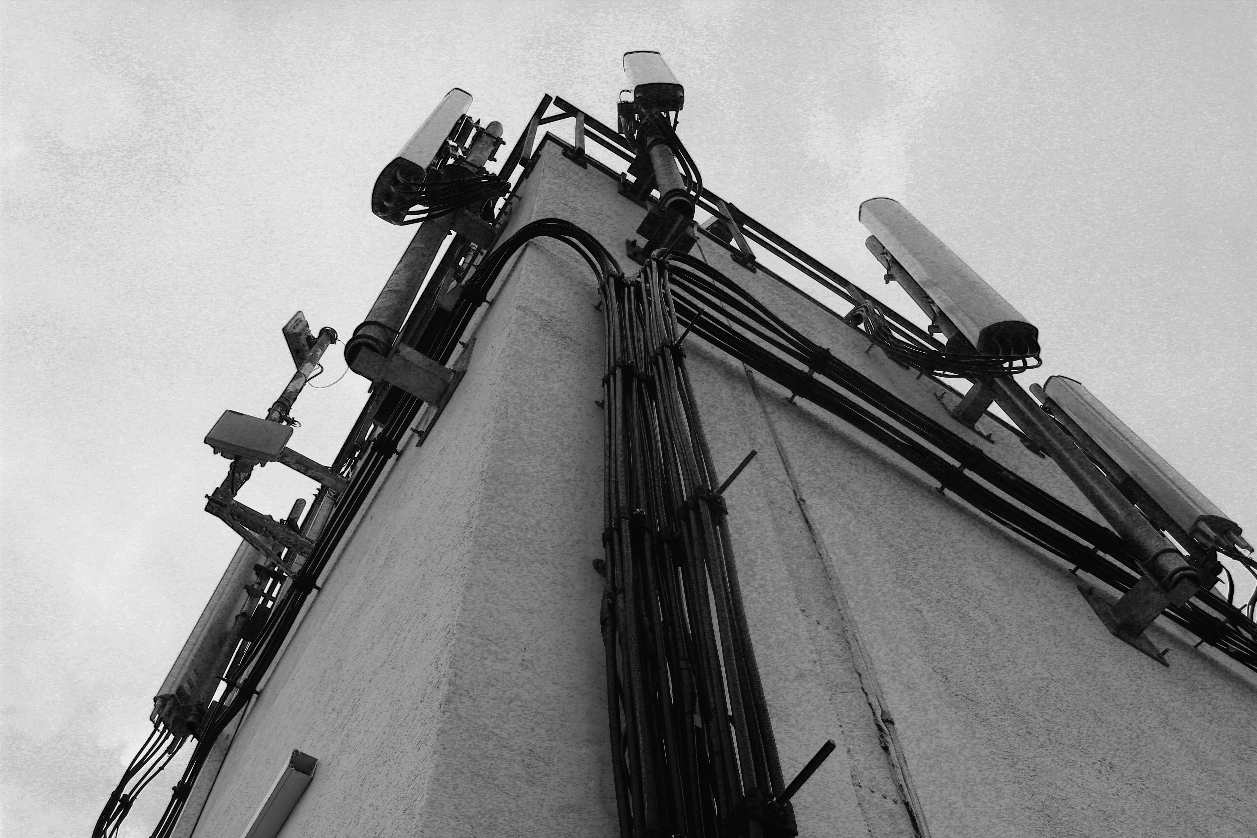
For these two image I edited them in black and white as well as increased the gradient in them so they give off a more historical and archival appearance. I like this as it makes them look more authentic like they’ve been cut out of a newspaper. The black and white edit takes out any remaining colour giving them a lifeless and desolate appearance emphasising just on the buildings and not on the lives of people who live in St Helier.


I also experimented by editing different colours to see if one was more aesthetically pleasing or had more of an effect. Although the coloured versions may be more interesting as an image, I prefer the images edited in black and white as it makes them look more authentic, which the colour doesn’t.

I edited this image in black and white and experimented with the exposure and contrast. In the first image I focused on emphasising the harsh black lines of the fencing in the foreground of the image and tried to show the different in the buildings by highlighting the lighter and darker tones. Whereas in the second image I focused on creating a blurred effect so the distinction between the buildings wasn’t as clear and the harsh fencing in the foreground was softened.  The blurriness creates a mist-like appearance like something has been put on the lens when the image was taken. I prefer the blurred image out of the two black and white edits as it gives the image another aspect that makes it more interesting to look at and makes it seem as like there is a meaning behind it. This could be that the blurriness is a representation of how the perception of St Helier is confusing as people don’t know what it will look like in the future with the increasing number of constructions being built.

Shoot Conclusion

I think this shoot was successful at capturing the increasing industrialisation of St Helier, focusing on metal structures and buildings with cooler tones to create a lifeless appearance. The editing also emphasising this by taking the colour out of the images and presenting the buildings and structure simplistically.  For my next shoot I could perhaps focus on how St Helier could bring back some of Jersey’s culture and liveliness and portray a solution to distract from the continuous industrialisation.