My images below are the photos from my various shoots that I have selected to be used in the news paper spread for the Future of St Helier project newspaper article, which consists of various landmarks in town being photographed in an abstract manner to be then inverted using shapes. This idea behind the images were to bring awareness to the randomness of St Helier’s landscape, and how the design is overall a mess with no real coordination to how town would look like as a final result. I believe that these images will be great in the newspaper as they provide an aesthetically pleasing result which compliments the title Future of St Helier, whilst drawing the viewer’s attention from afar. 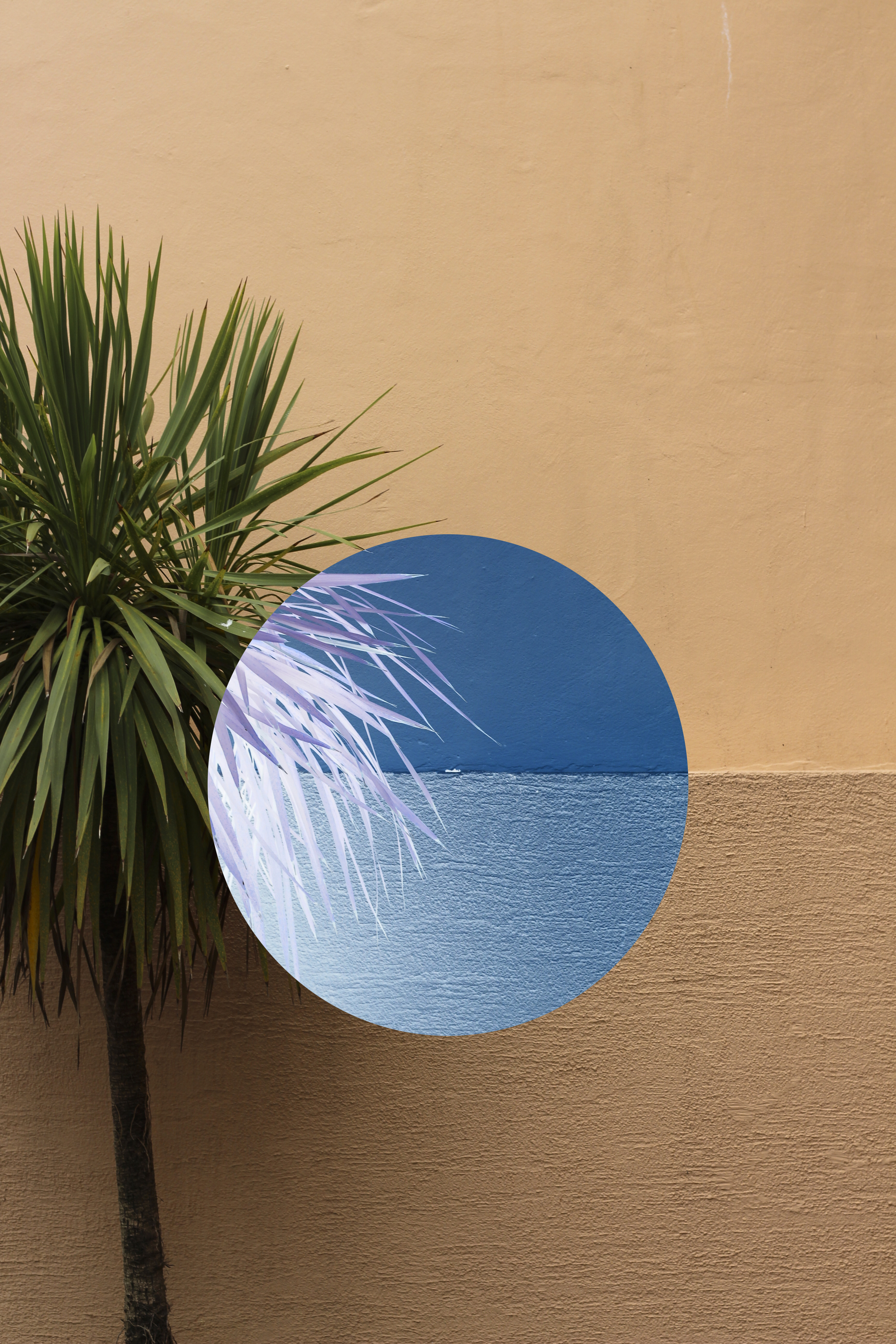
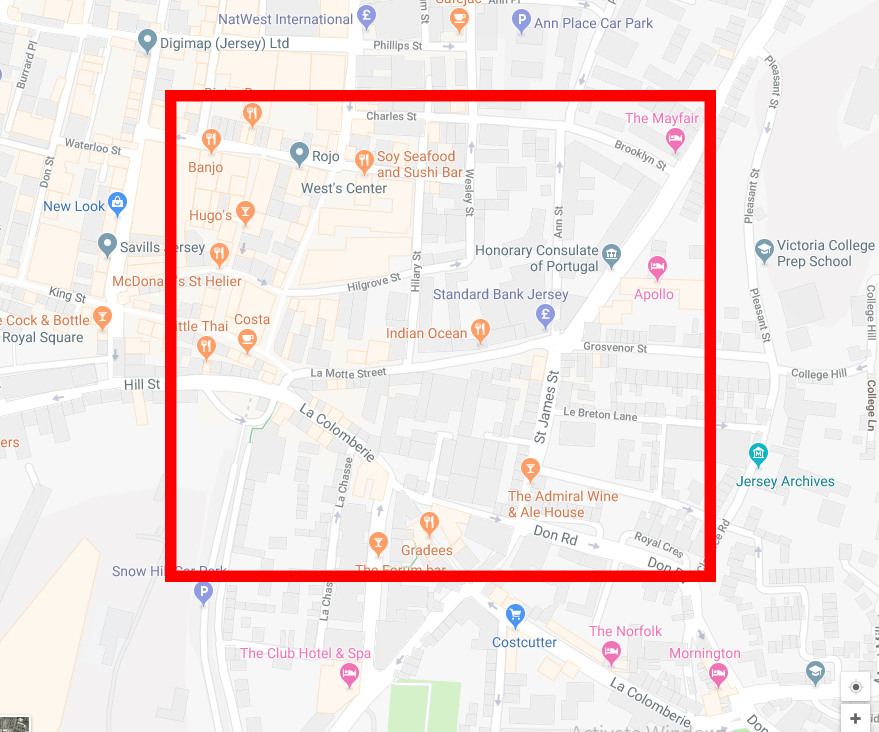
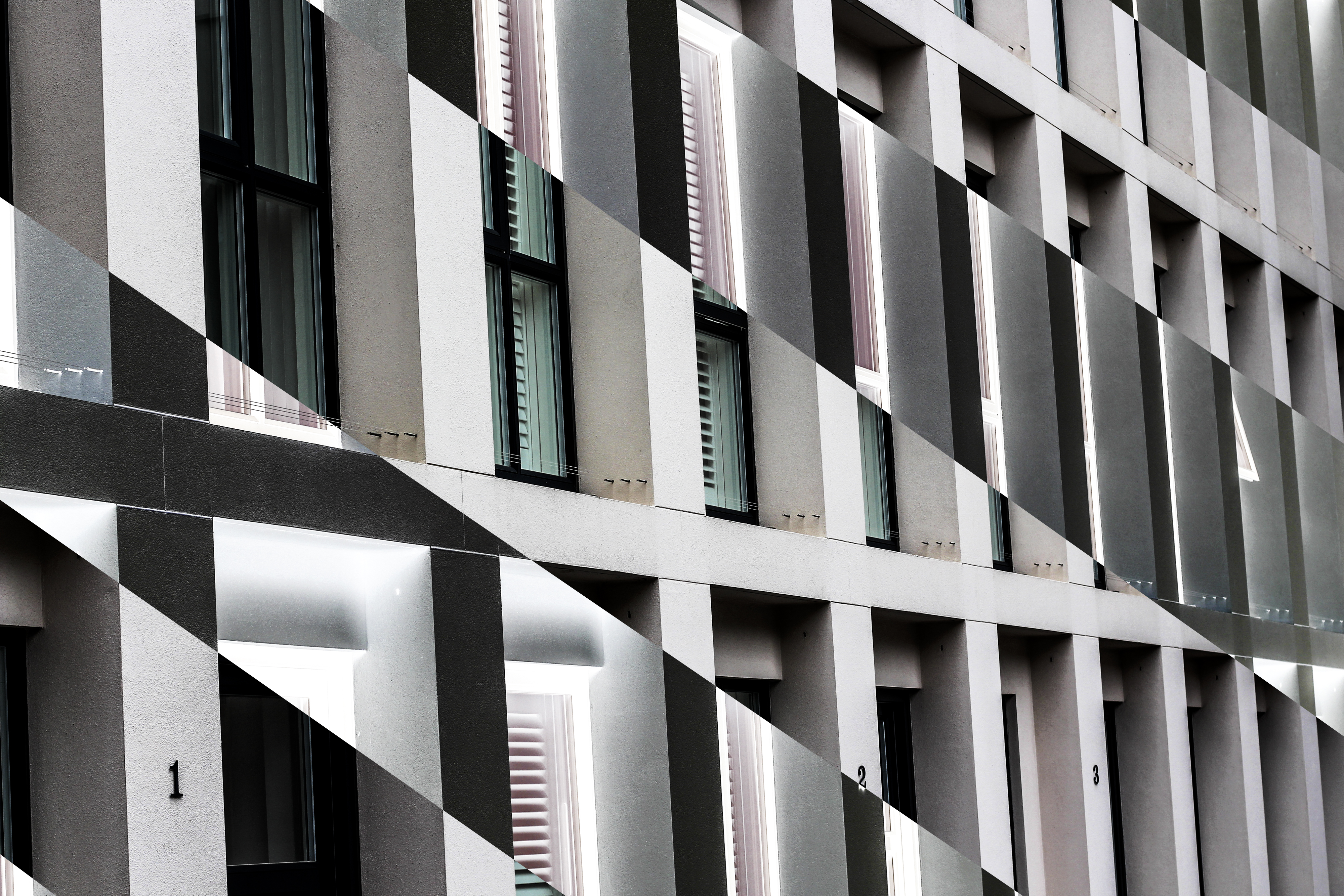 I edited the images in Photoshop, using an inverted technique which inverts the colour of the selected area, as a result changing them into an almost alien like landscape not previously recognisable. The images are actually both of the side of an apartment in which I found to consist of contrasting colours, grey and orange, something not usually associated with each due to them not mixing. Here is an aerial map of the area of the images taken:
Daily Archives: August 5, 2018
Filters
Zine Final Result
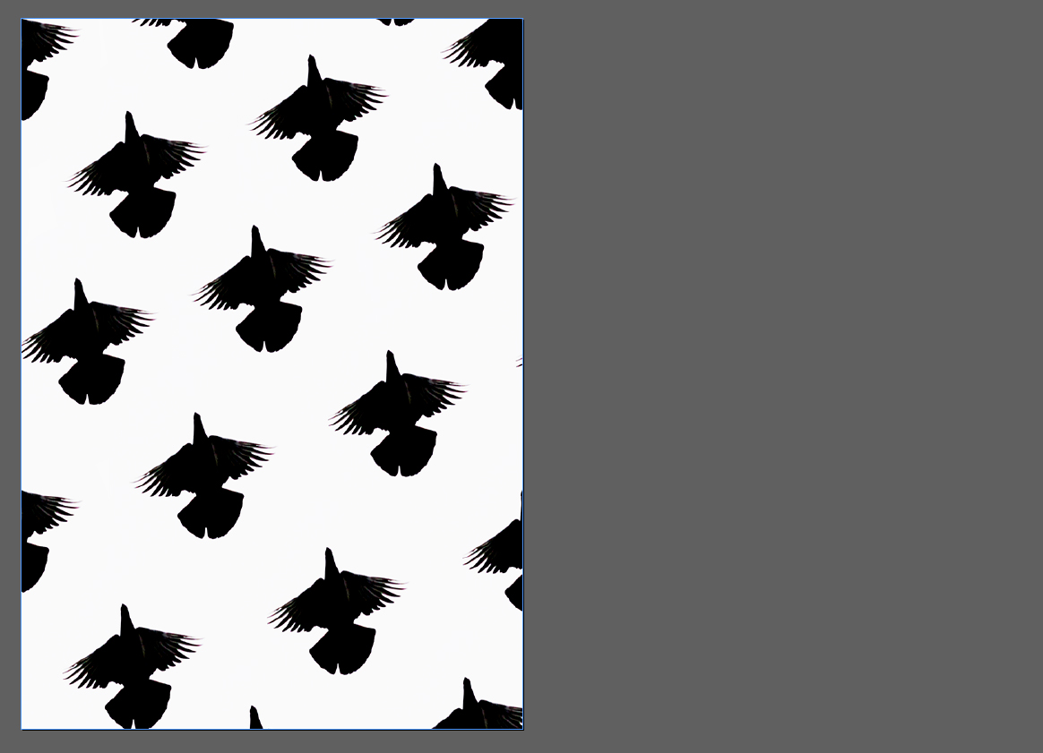
After my experimentation with various layouts for zines I had come to a conclusion on what I wanted the design to look like. When making the zine I decided to go along an illustration path, here it to me would allow for more creativity and flexibility within the zine. The zine would consist of sixteen pages including the front and back cover, I concluded that I would try to make use of the blank space around certain images to bring out other photographs that I wished to bring into the viewer’s attention more. Finally when choosing each image I found that the inverted shape imagery was the best choice for the pictures as they has their own sense of uniqueness to each one, whilst making them aesthetically pleasing as a result. Here is my final design: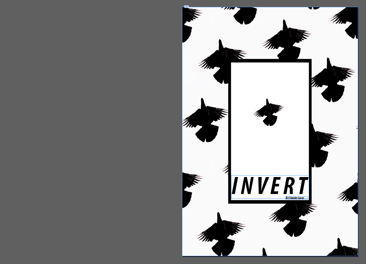 For the front cover I used the Reitam font which I separated the distance between each letter to fill any blank space in the titles area. By placing it at the bottom of the page I thought it would reduce it being the center of attention and instead make the main focus the bird design, this font compliments the stencil like outline of the birds matching the symmetrical pattern. The black box in my opinion within the middle acts as a way of bringing the whole piece together, deterring the bird pattern from being too overpowering and strong.
For the next six pages I decided that I would incorporate related imagery on each double spread, done by displaying two remotely relevant images together that represented similar things. By doing this it would create page spreads that worked well together rather than against each other.
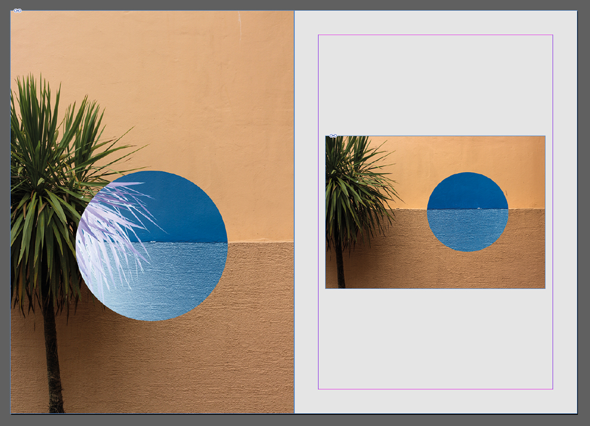 For the first two pages I found that palm tree imagery was most effective. This is because of how I thought they represented the message of inversion and the unseen world the most out of all shoots, with using two different compositions for stopping the receptivity becoming too overpowering. This was done through the use of blank space which separated the two pictures from each other whilst showing the similarities both had.
  Here I used dark lighting and unseen patterns as my main theme for the two page spread. I used this because of it reflecting the hidden beauty that can be seen in everyday objects in different light, such as lights and chairs. The added inversion created further symmetry and aestheticism which produced contrasting colours that I thought worked well with the overall pieces.
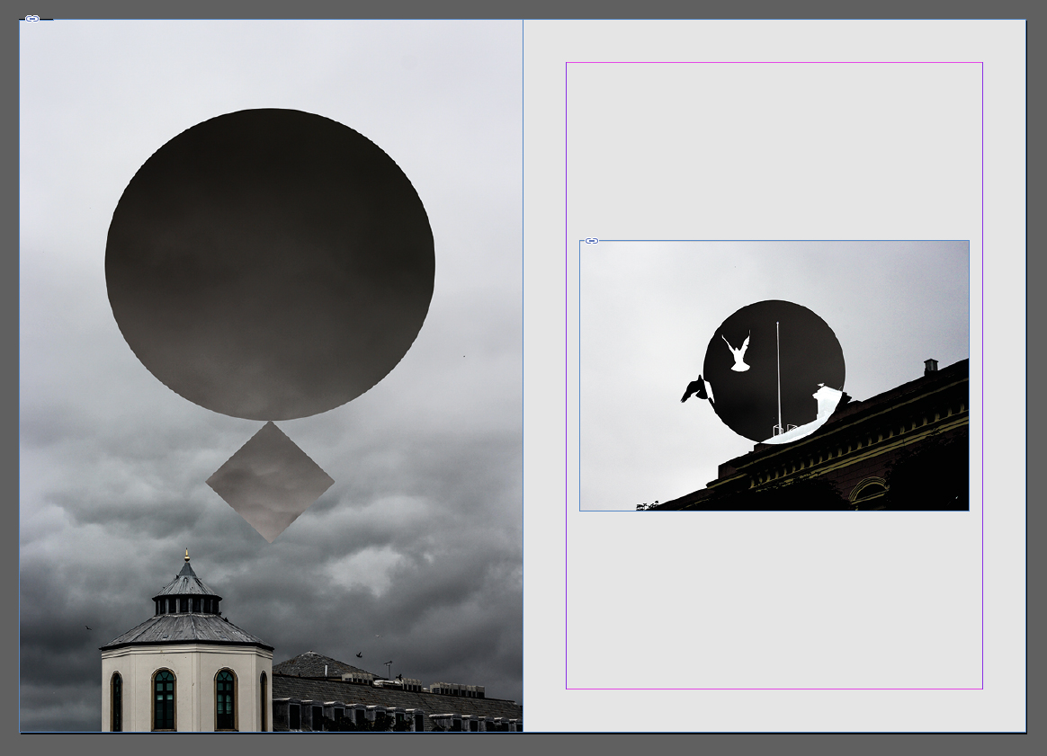 This spread explores the theme of the sky and the silhouettes created by buildings and the contrast they have between them and the environment. To do this I used two images that I thought incorporated gloomy and dull imagery highlighted through using inversion, seen through the birds and the clouds. By using nature in this spread I thought it highlighted the hugely contrasted environment that our urban world has with nature.
  The idea behind this double page spread was to highlight specifically the interior architecture that the majority of the buildings in St Helier possessed. By inverting the majority of the image I found that it reflected the beauty in the individual placement of beams and fabrics, which completely contrasted the previous pages which highlighted beauty in individual objects instead.
 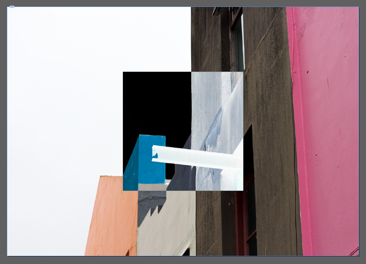 I chose this image as the second double page spread because of its effectiveness of summarizing the random structure and colour sequence that most of the exterior of St Helier has. The use of inverted square presents us with the completely contrasted difference that the structures have with their surroundings, putting across my opinion of how I perceive that town had become ill planned.
 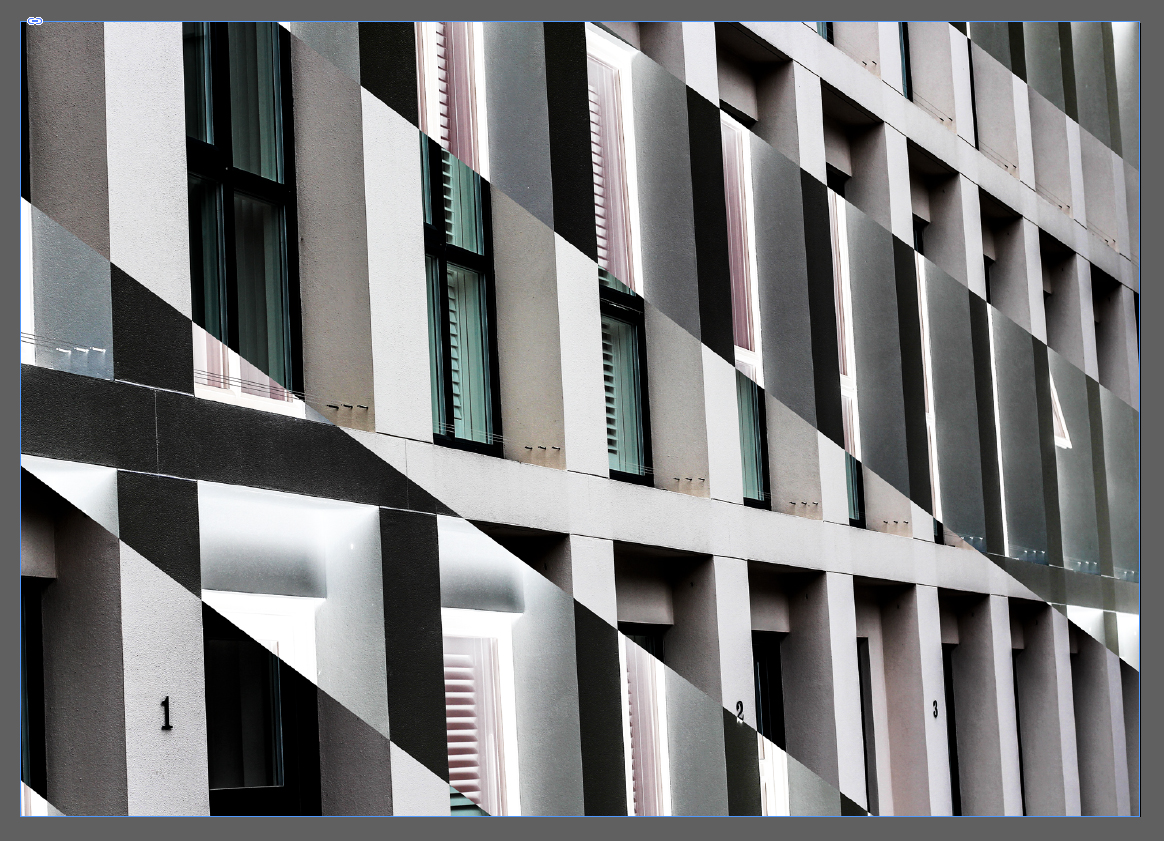 My aim for this image was to provide an insight into the symmetry and lack of development most buildings have in Jersey, where much of St Helier looks the same with continual investment into financial structures. The use of black inversion is to show how the financial industry can be seen in a black and white perspective, either loving or hating it.
 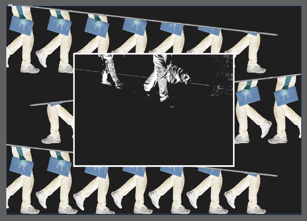 Here I created a collage of people travelling towards work, I wanted to highlight here the repetitiveness that occurred in their everyday lives, and so manipulated their pictures so that an impression of endlessly walking was created. Inside this collage I added another picture, this was to add more context from the two people walking in a line showing subtle indoctrination from the financial sector.
  Overall I was really pleased with the outcome of the zine as I thought it reflected my views about the development of St Helier. Done through the subjective topics about individual aspects of town such as the buildings, people, night life and development, I found there to be a constant recurring theme that allowed for a smooth transitioning between pages, whilst the use of composition for certain pages put across stronger ideas than others.
