This blog post shows some of the experimental Photoshop edits which I have done on some of my favourite photographs from my first shoot…
This first image is a combination of a photograph from the Societe Jersaise photo-archive and some of the images from my first photoshoot. The idea behind this piece was to show how the aesthetics of the modern town are considerably less visually pleasing that those of the old urban landscape, and when imposed upon the old photograph take away the charm from the photo.

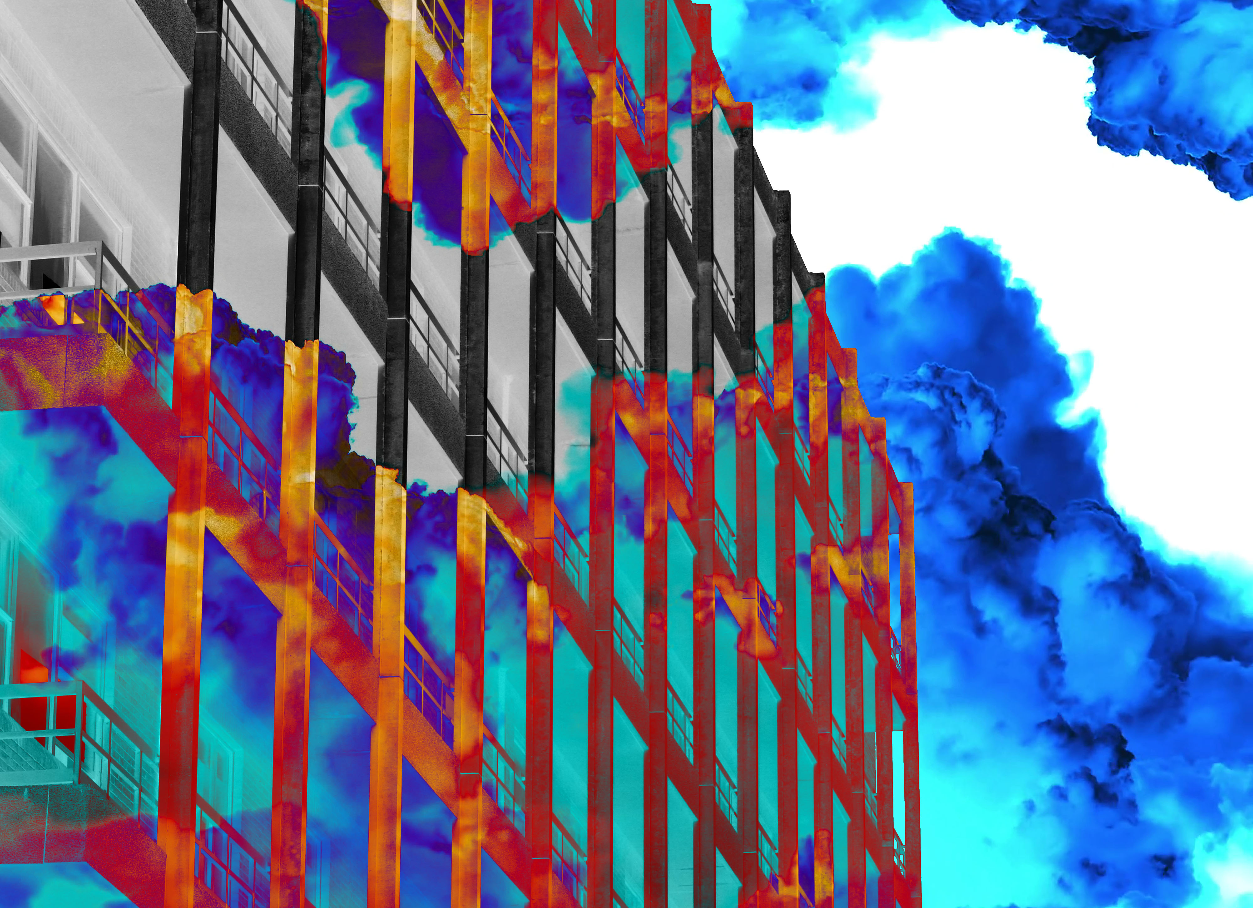
The idea for the second edit, which I produced on top of an image of the current hospital building, was looking at the indecisiveness involving the situation with the construction of the new hospital. The coloured mist represents the covering up of the important details in the situation and behind that the image/situation is in black and white, showing that once the details are exposed it can be dealt with in a much more basic manner.

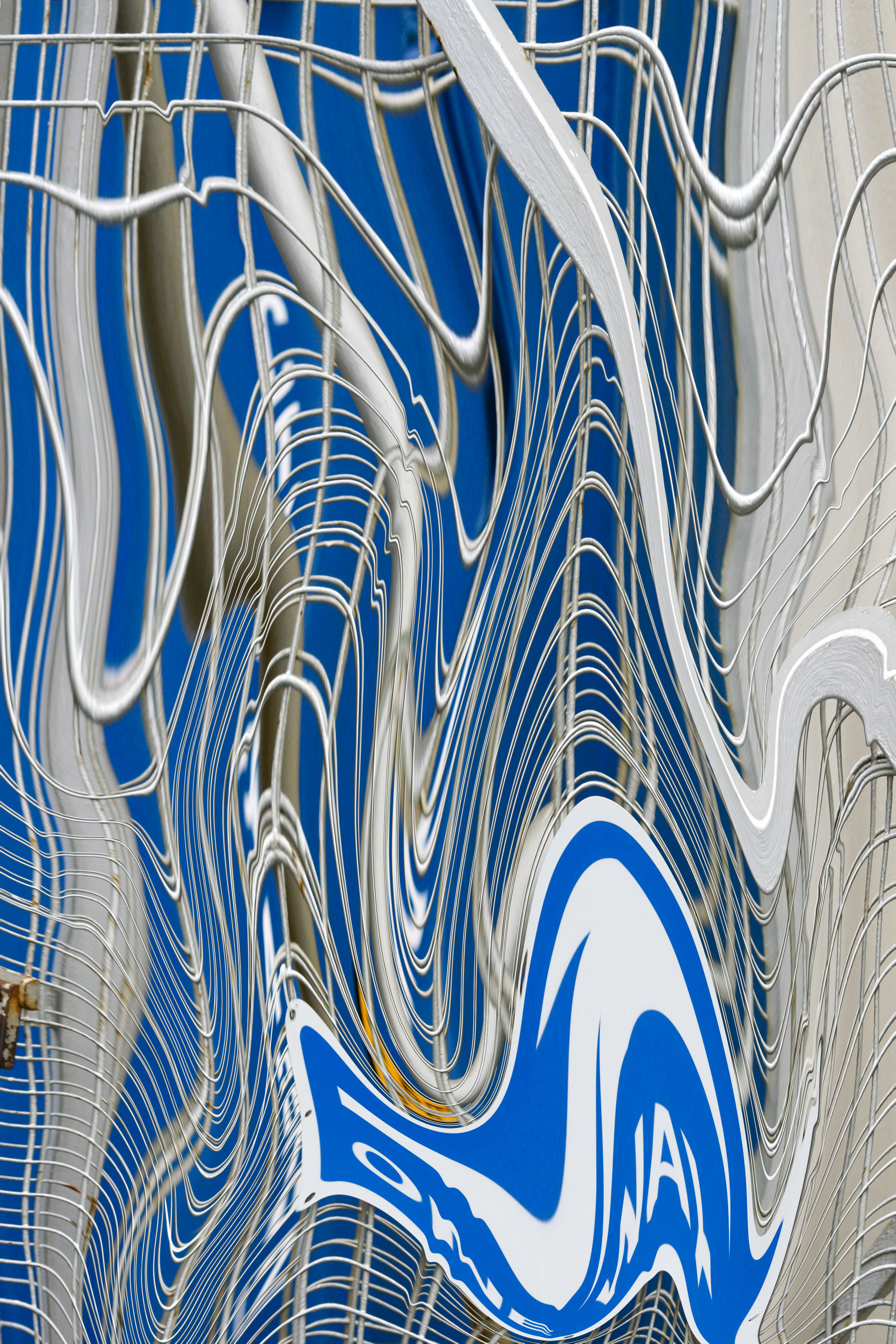
The next two following edits were experiments using the liquefy tool in Photoshop, I thought that the textures and text elements of these photos would work really well with this effect, as once the photo is liquefied these parts of the images will become distorted and stretched.


