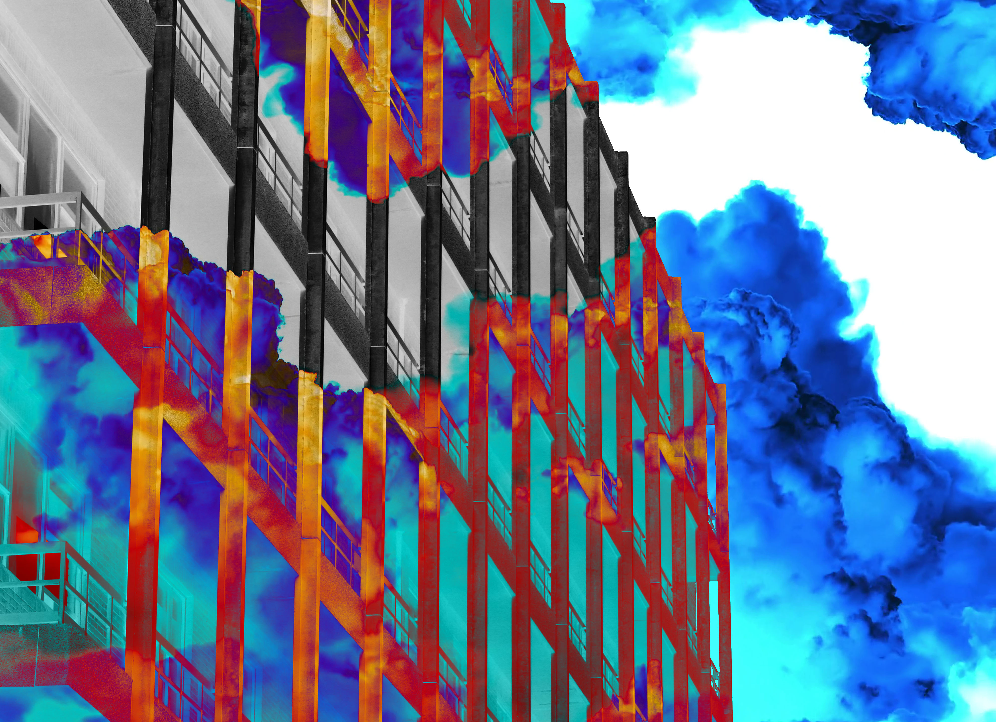
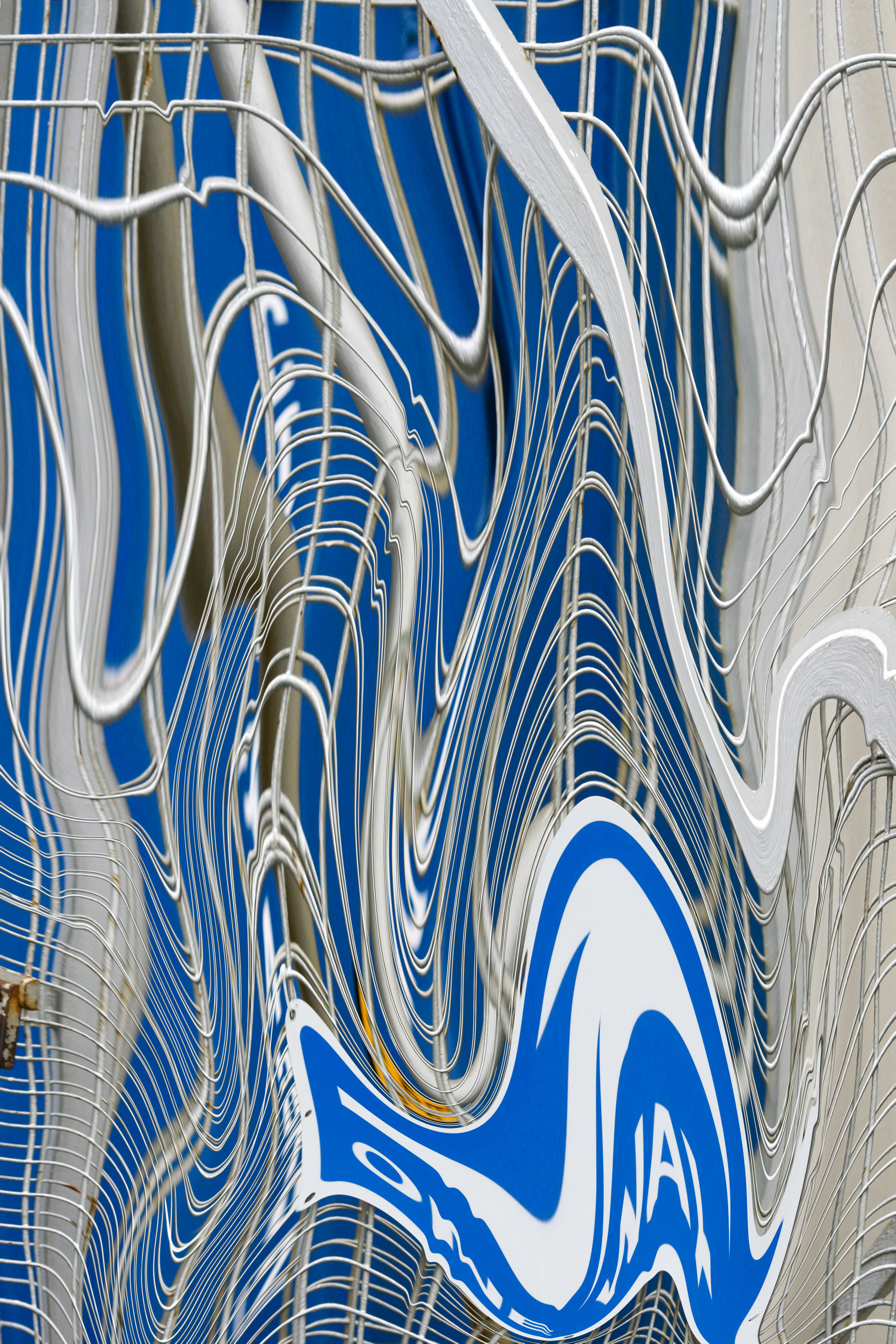
Before going ahead with the final layout for my zine I decided to come to some sort of resolution for the design I found best fitting for the topic. To do this I would have to create five individual layouts in order to find what would interact the viewer whilst posing as an aesthetically pleasing piece. I will be using the software Adobe InDesign to produce the final product as I found that the tools and settings that accompanied it allowed for the best possible result I wanted, giving me previews of what the final piece would look like. Here are the five layouts that I found to be most effective:
Layout 1:
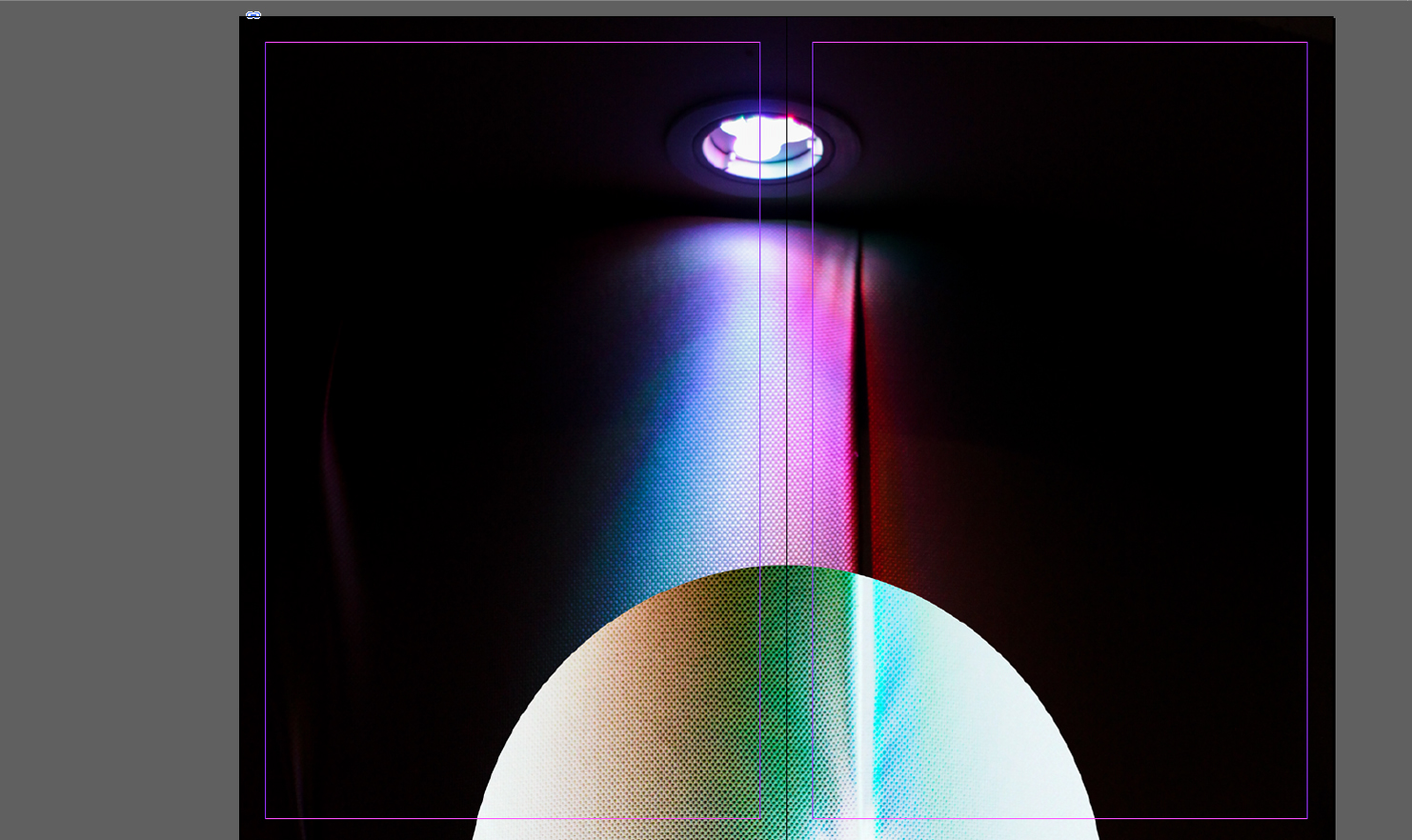
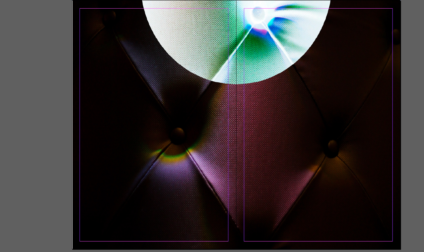 For the first layout I wanted to experiment with simplicity, to do this I thought the addition of only two images could work. By using one image as a cover page and the second as a four page poster page filler I aimed to see what a multi-use book would be like, where you could read it and convert it to a poster page. When deciding the pictures to select I had to take into account what pictures I thought best reflected the shoots so far, putting across my idea of inversion.
Layout 2: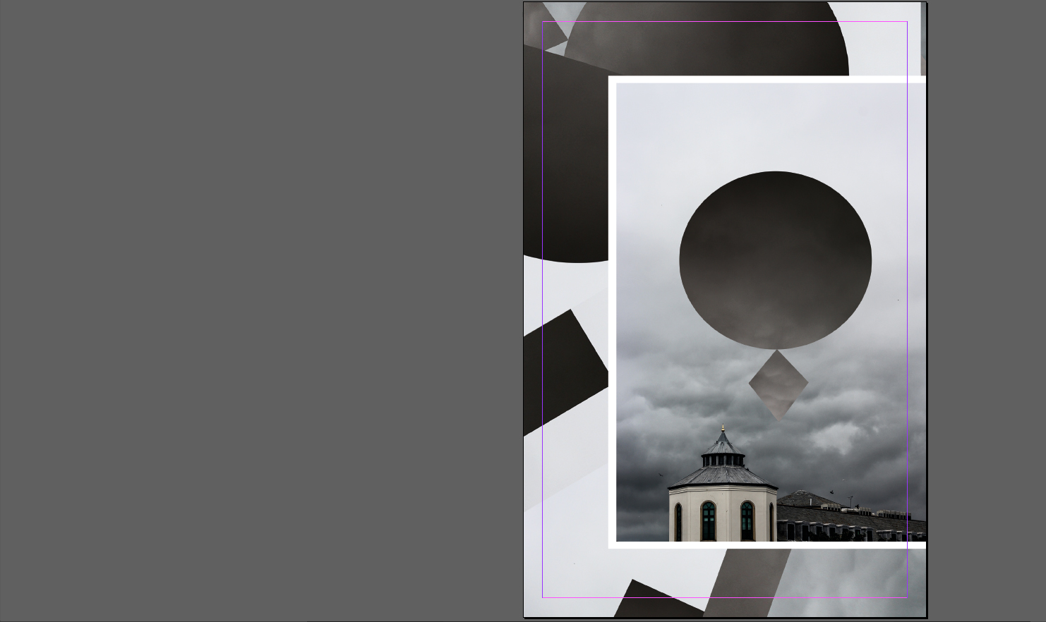

 My main focus for this layout were collages, incorporating a picture and manipulating it until the outcome was different to the original product. This is linked into the unusual presentation of the second and third page, where the images don’t match up and aren’t as aesthetically pleasing to us as viewers, however the topic of each page and the setting neutralizes this as it section is dedicated to some aspect of Jersey. Here I tried to use white and black borders effectively on certain pictures, by doing so I hoped to create a contrast between backdrop and photo, eliminating the background from becoming to overpowering.
Layout 3:

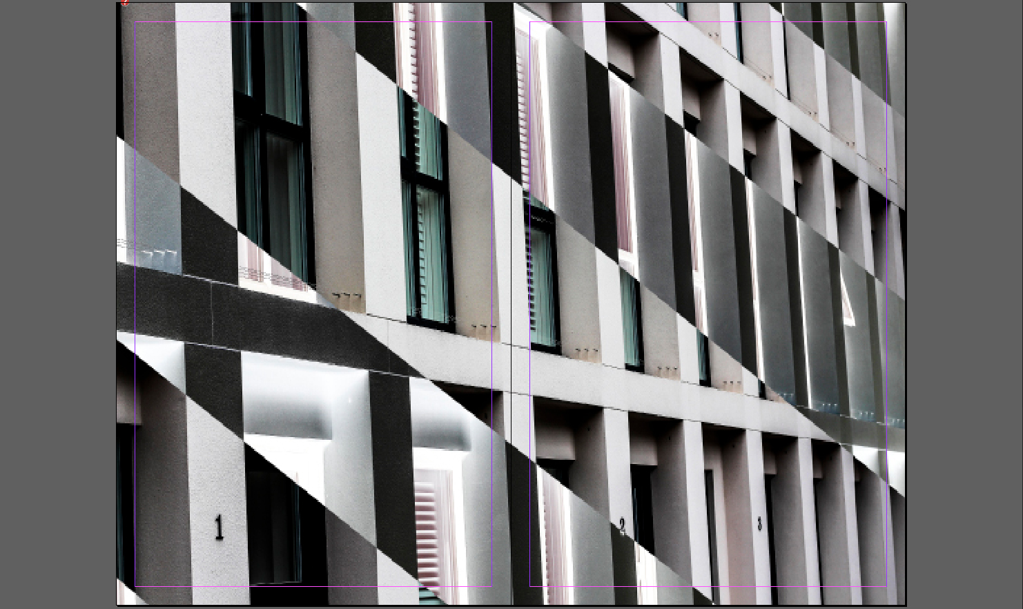 For this design I tried to mainly focus on introducing aestheticism and varying designs. To do this I used the final page as a double spread whilst using the first three as topical subjective pages, focusing on night life, buildings etc of Jersey. When making it I made sure to use white borders as I found that they were most effective when wanting to look solely at certain images, as it implicitly boxed in photos.
Layout 4:
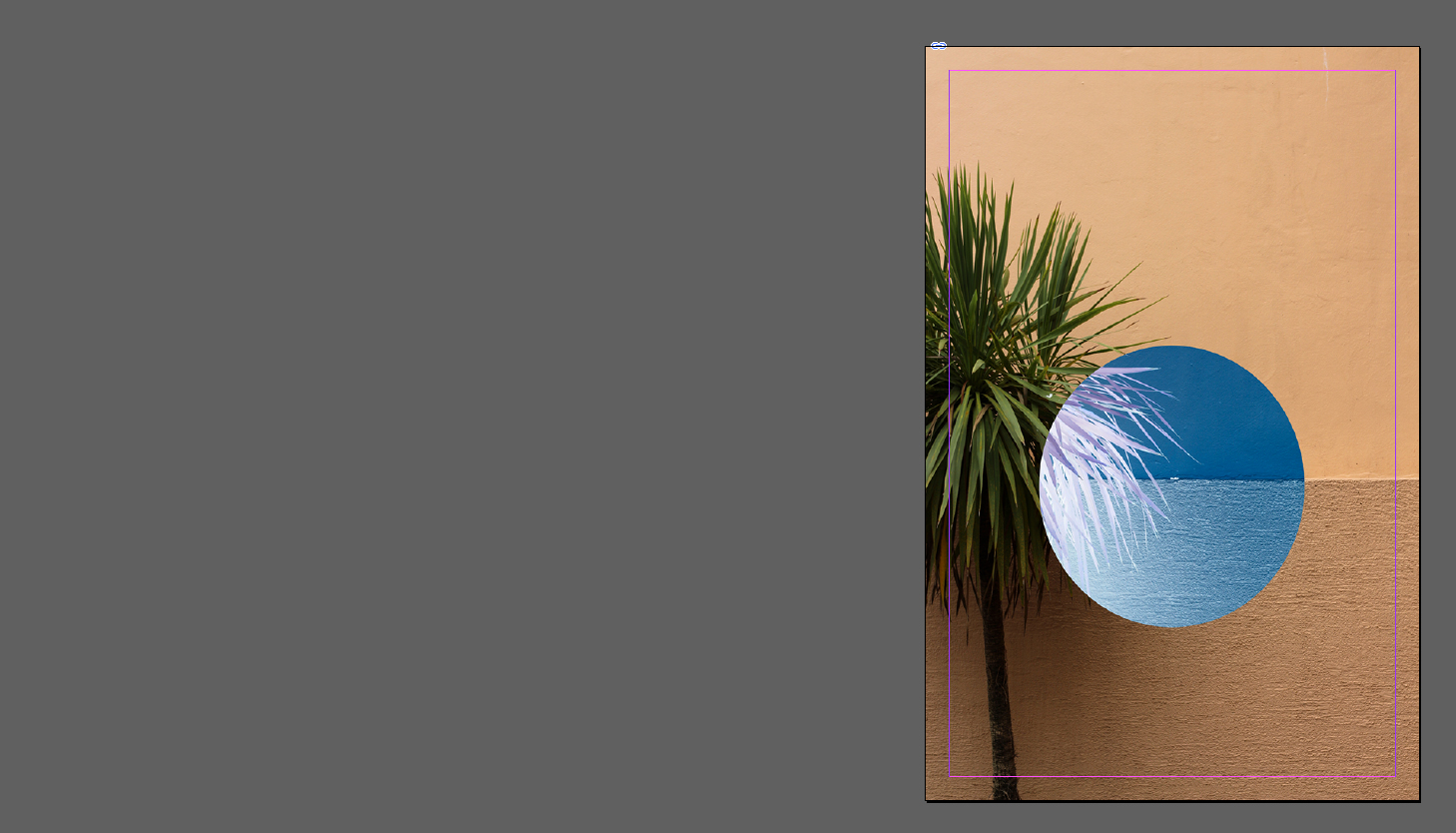
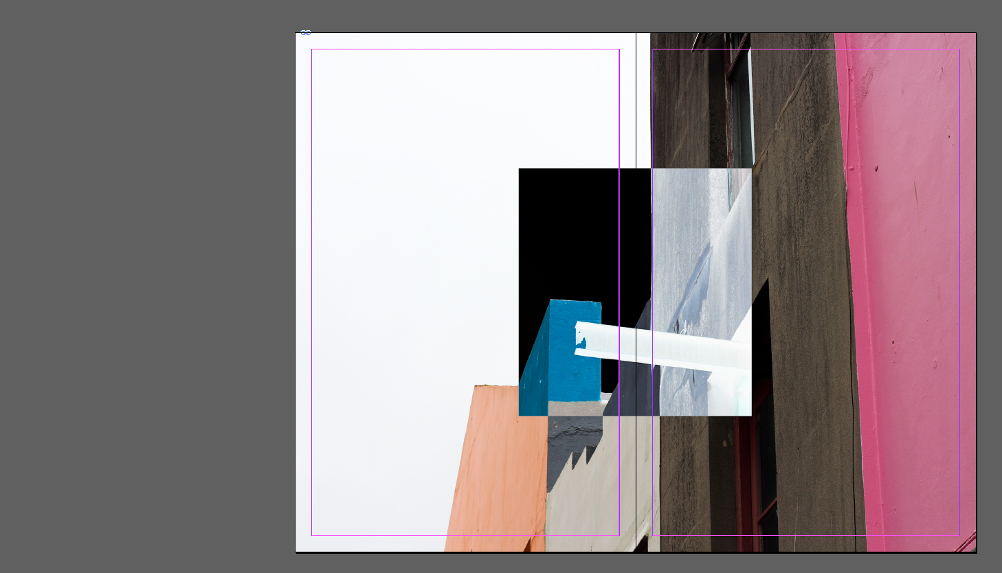
 Here I attempted to find how effective using two double page spreads and just a cover photo would be. This to me was the least effective design as there was an overwhelming lack of content and design, as the finished product just looked thrown together in a hurry with no actual idea behind it. However the idea behind it was to give the users two miniature posters which could be assembled out of the book.
Layout 5:
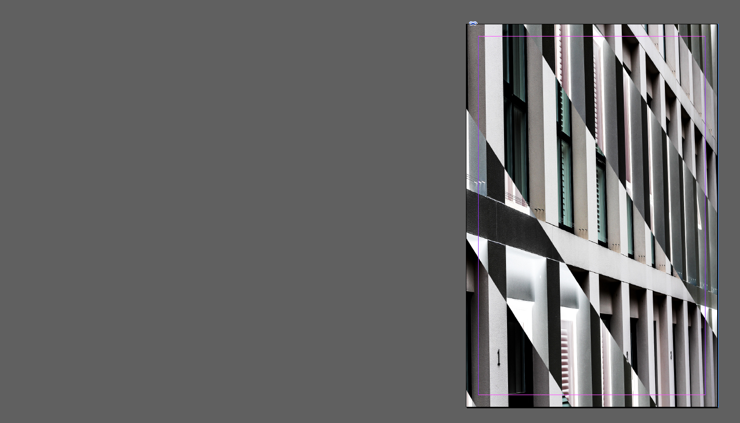
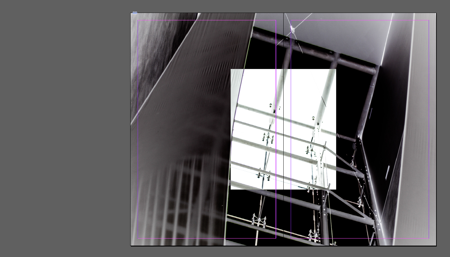
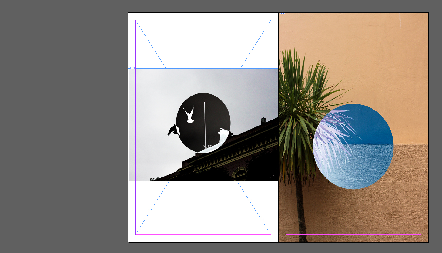 For my final design I tried moving around the layout of my previous design, this meant switching the double page spread with the two individual images on either side. I didn’t find it to be as effective however as the original as I found that the spread worked best as a last page design as it looked more like a final photograph, and the individual pictures being presented as a build up to the last piece.
Final evaluation of layout three as my choice.
Once I had finished looking at the possible five designs that I could then use for the layout of my final zine piece, I decided that I would have to choose my third layout at the most effective. I chose this because of how I found that each page incorporated a different element of design into it, such as the use of a double page spread, borders and white space. When analysing why I made this decision I found that when regarding future aspects of potential newspaper and book covers, design number three used more elements of photo-manipulation and experimentations than the rest of the layouts, this would enable me to use the design as a template for near-sighted projects of interest or other photography shoot presentations. When looking over the layout I found that by adding each category of my opinion over the development of St Helier: architecture, nature, contrast and nightlife, it enabled me to use the five-page spread to its full use, as each image represented a certain topic of opinion that I had over Jersey. The theme of my zine layout was the inversion of out everyday life, and seeing everyday objects through an otherwise invisible perspective only available by photo-manipulation. By doing so I wished to highlight the contrasted elements that are displaced and unmatched throughout St Helier, creating a vision in my eyes of an uncertain future to head towards.
The use or borders surrounding particular imagery to me prevented the overall effect of the zine layout from becoming too overpowering to the eye, as it created a sense or order and aestheticism to that page. This was contrasted on the double page spread where I went against the use of this border, because of how I found the only useful aspect of the border was in singling out a photo from the rest, it was not needed for the double page spread as the image there was the only image present. My ideas regarding the double page spread was to add diversity to the zine as I wanted to be able to dissect the book and convert it into other uses like small posters, however I could only do this through the creation of a separate double paged spread that would be de-attached from the other photographs.


