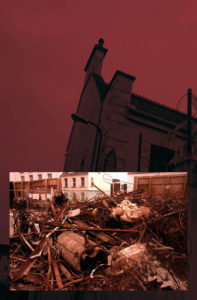
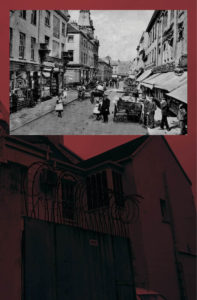
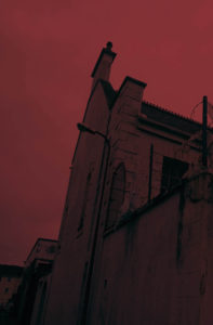
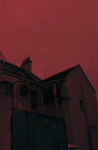
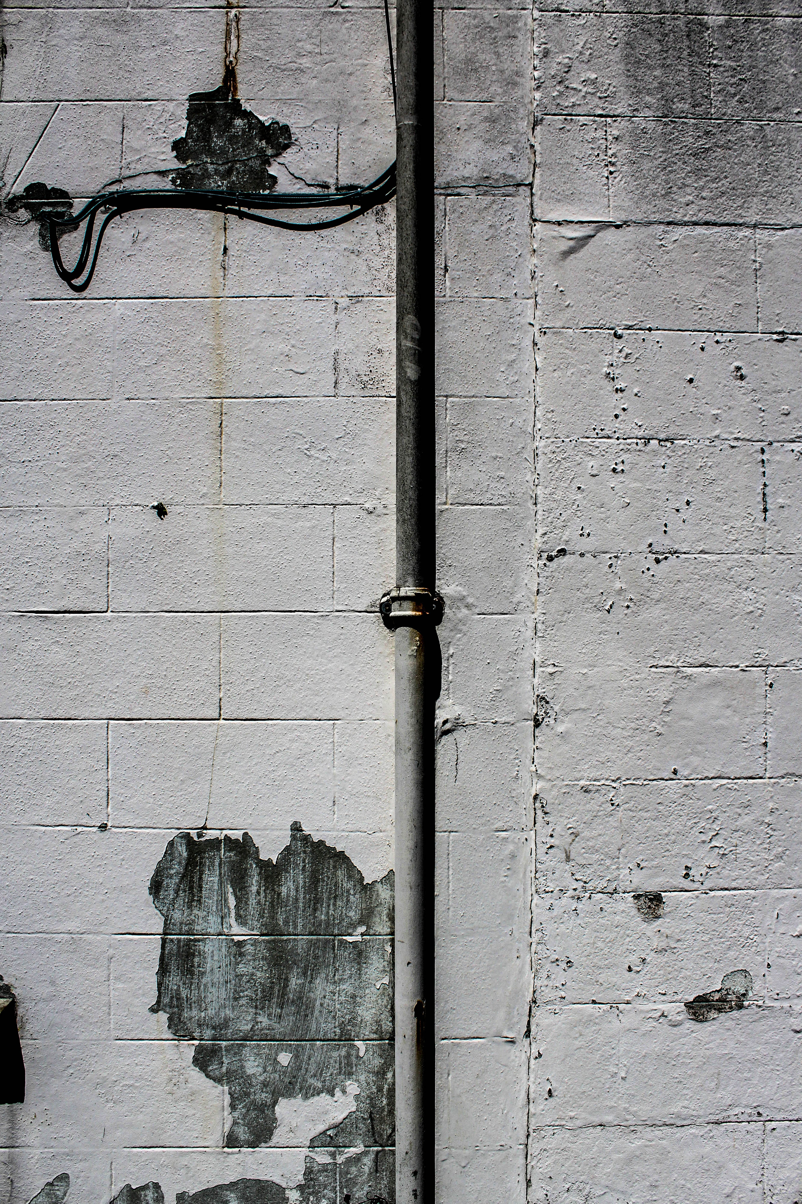
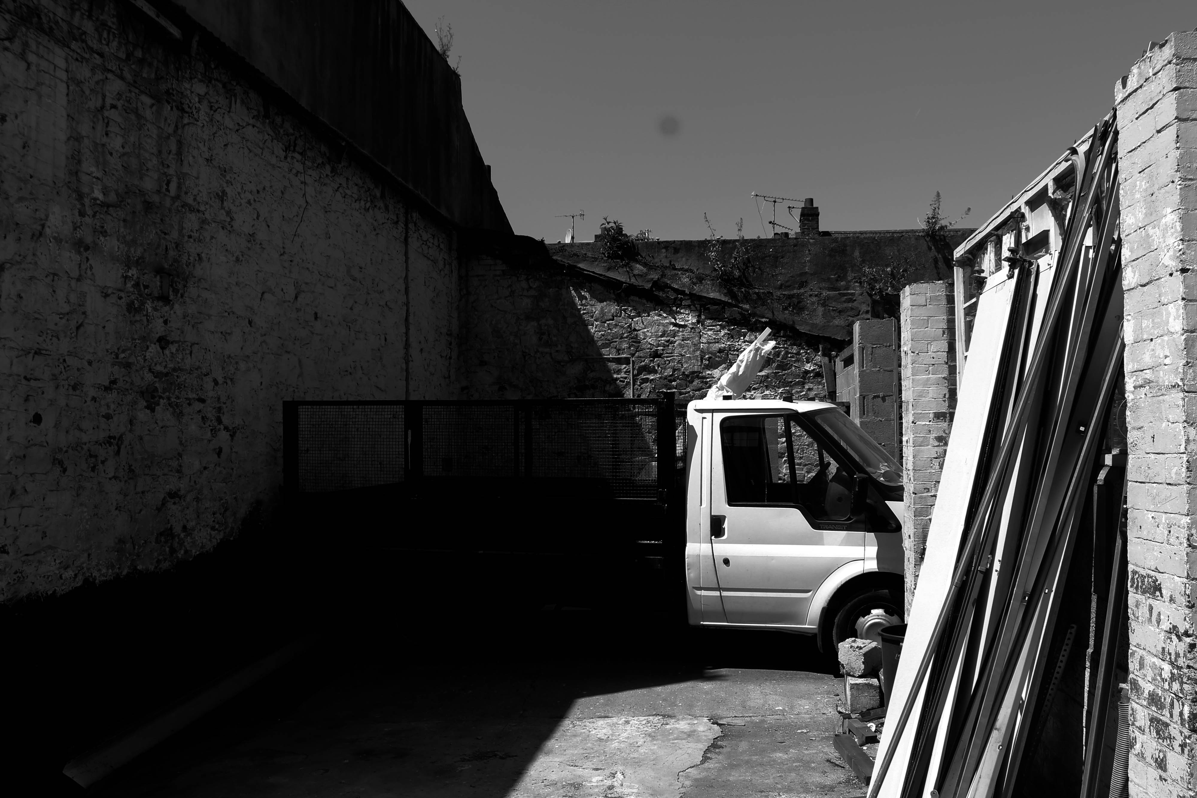
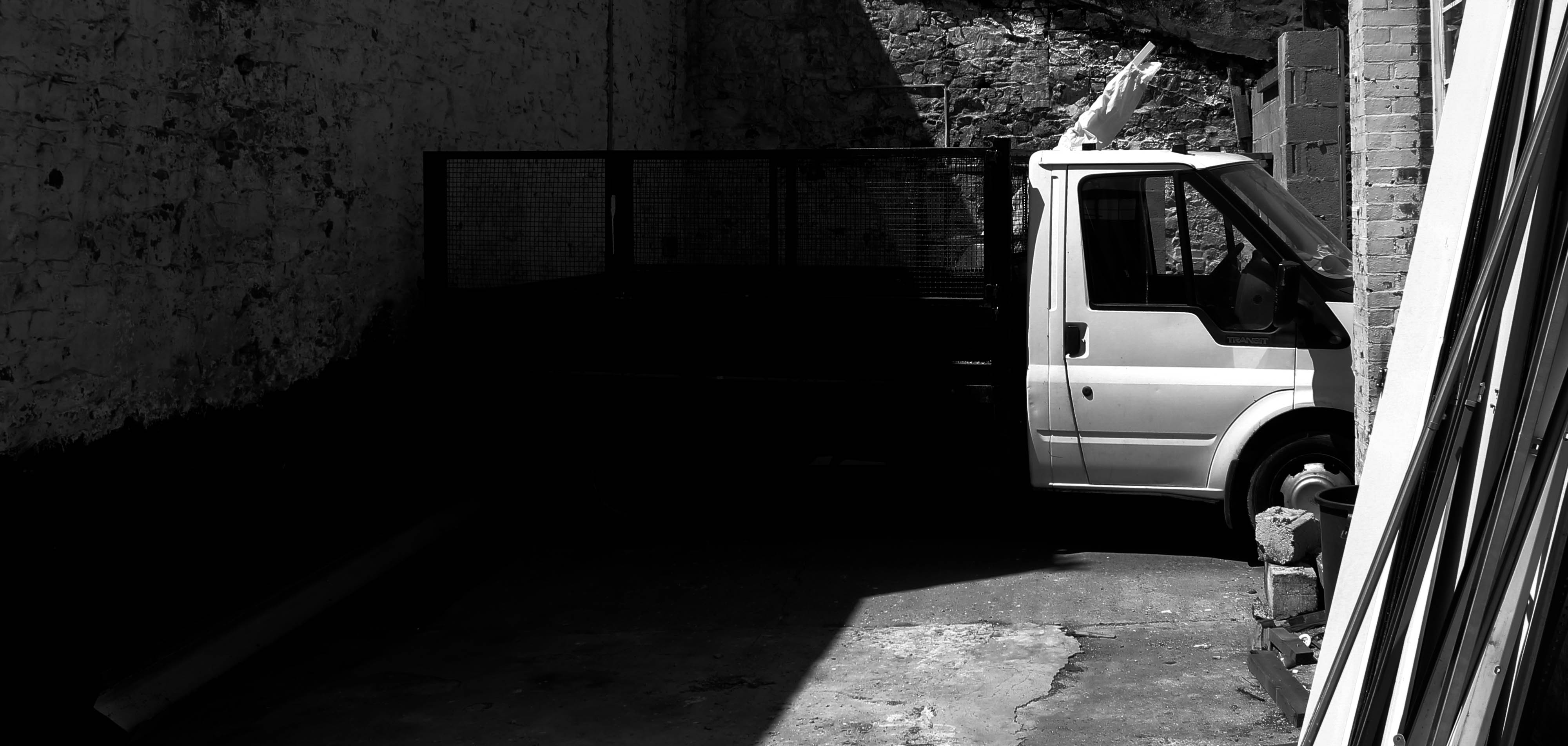
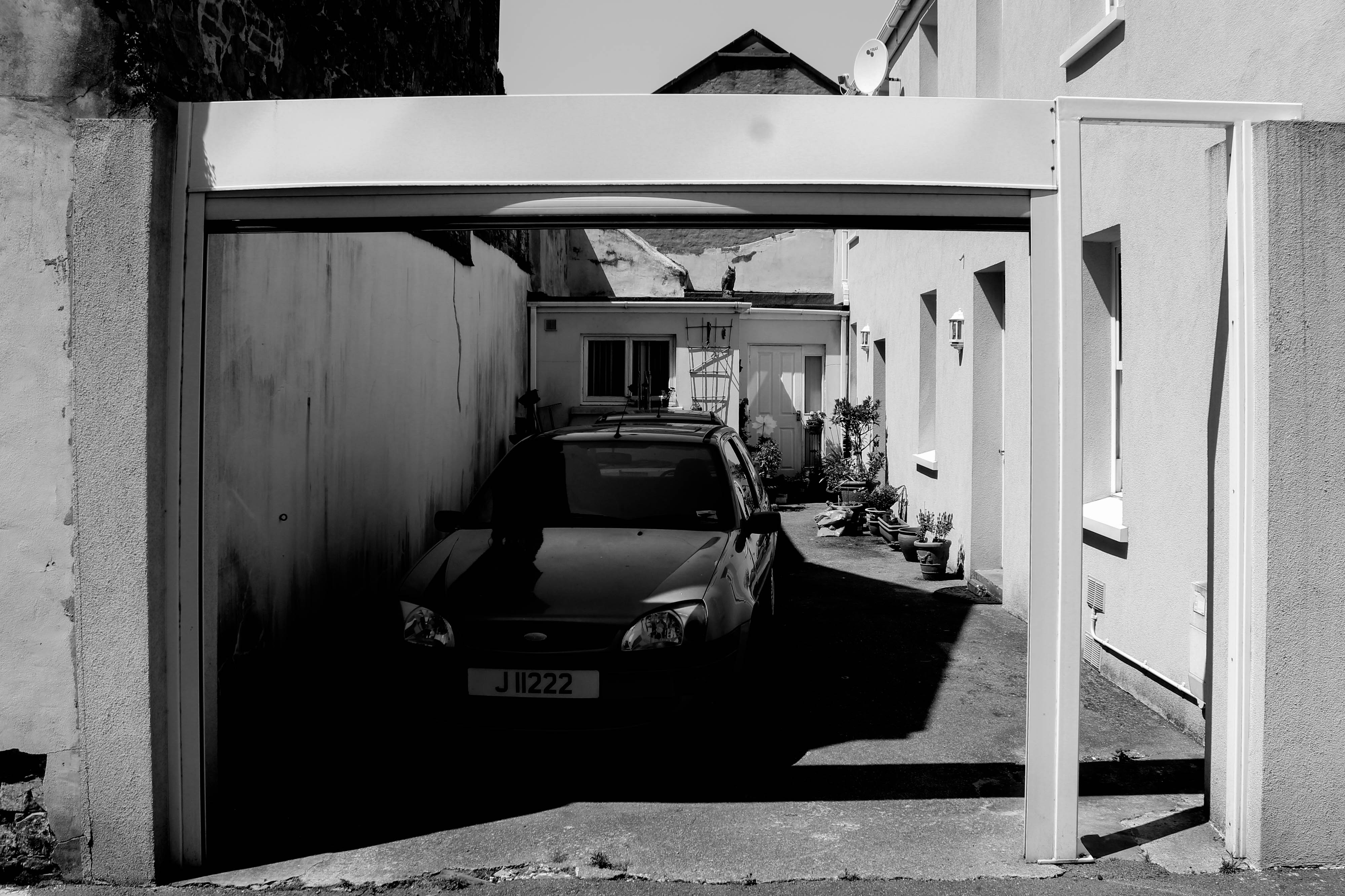
Final images and jersey archive inspiration

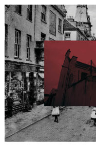
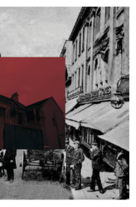
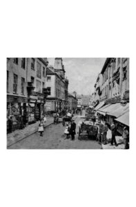
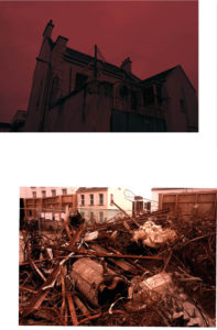
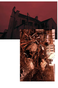
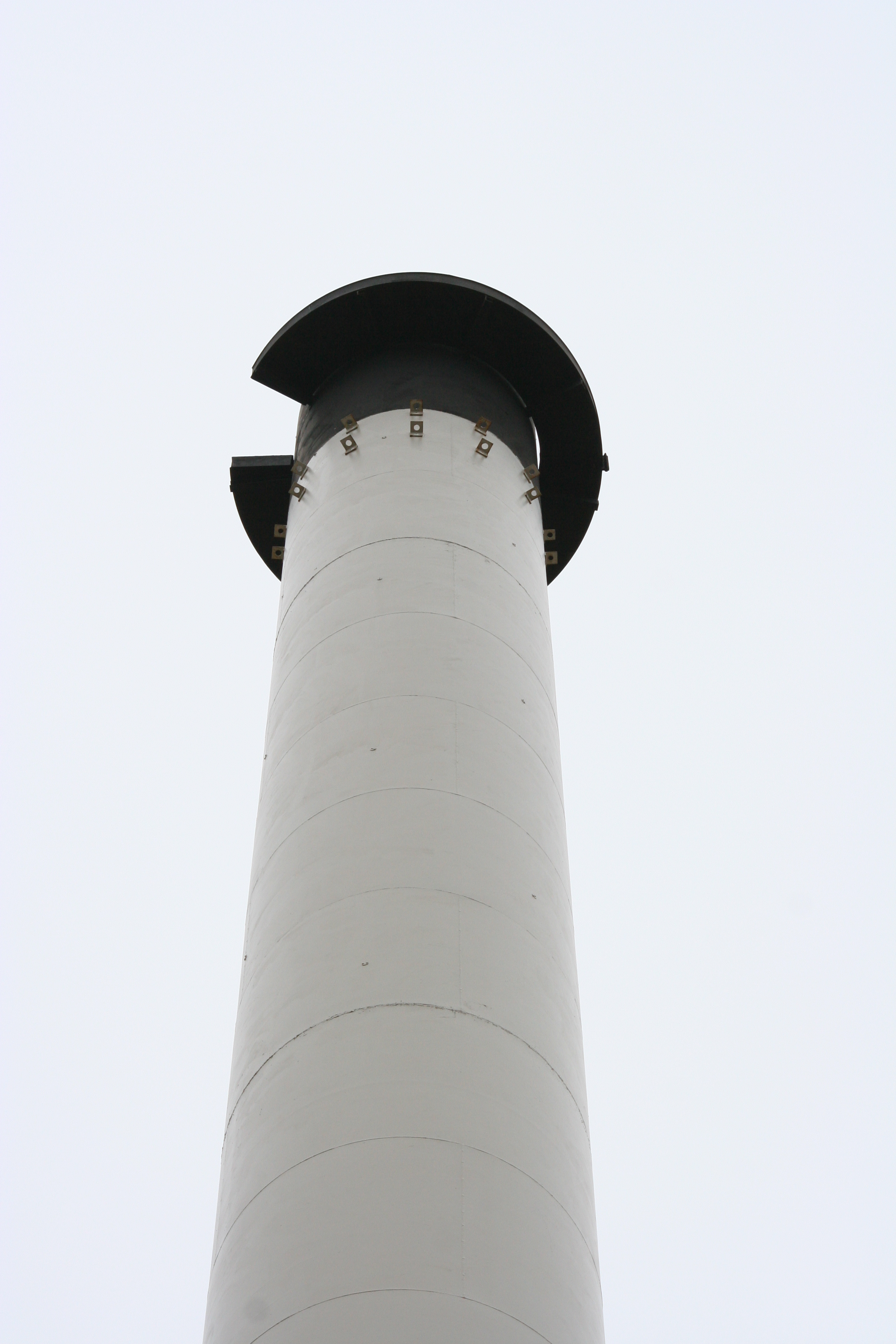
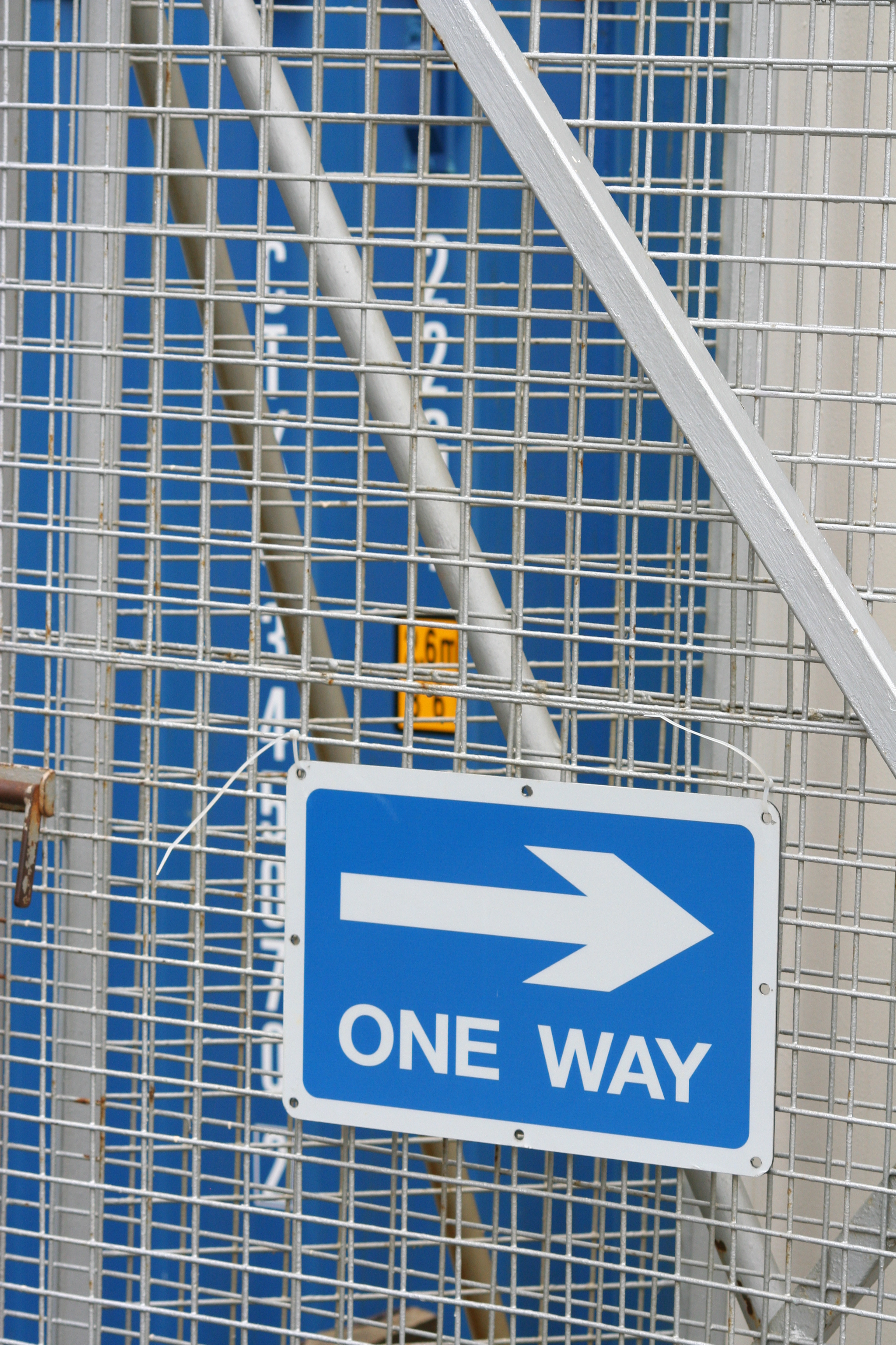
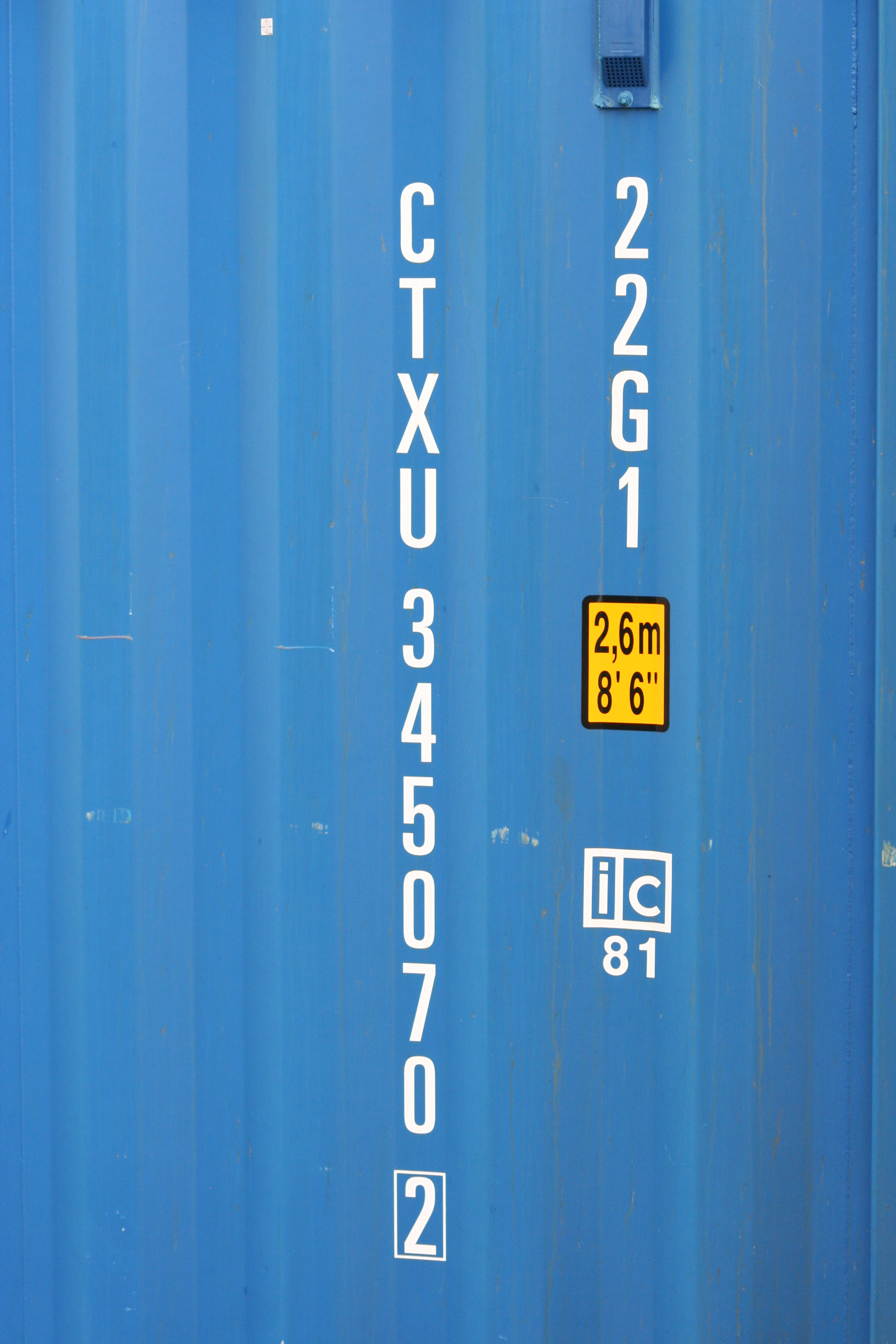
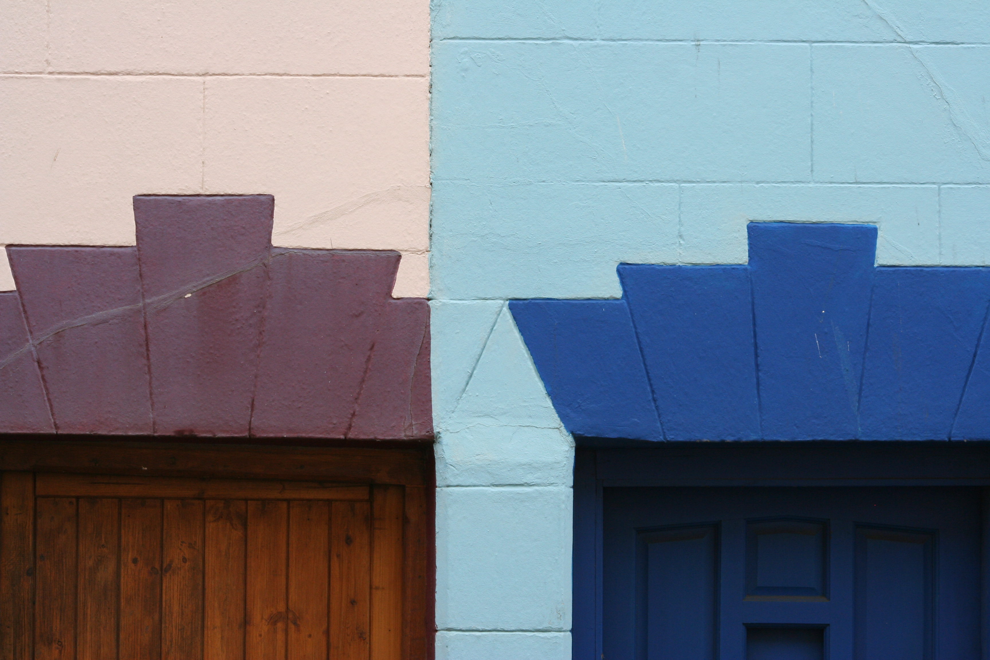
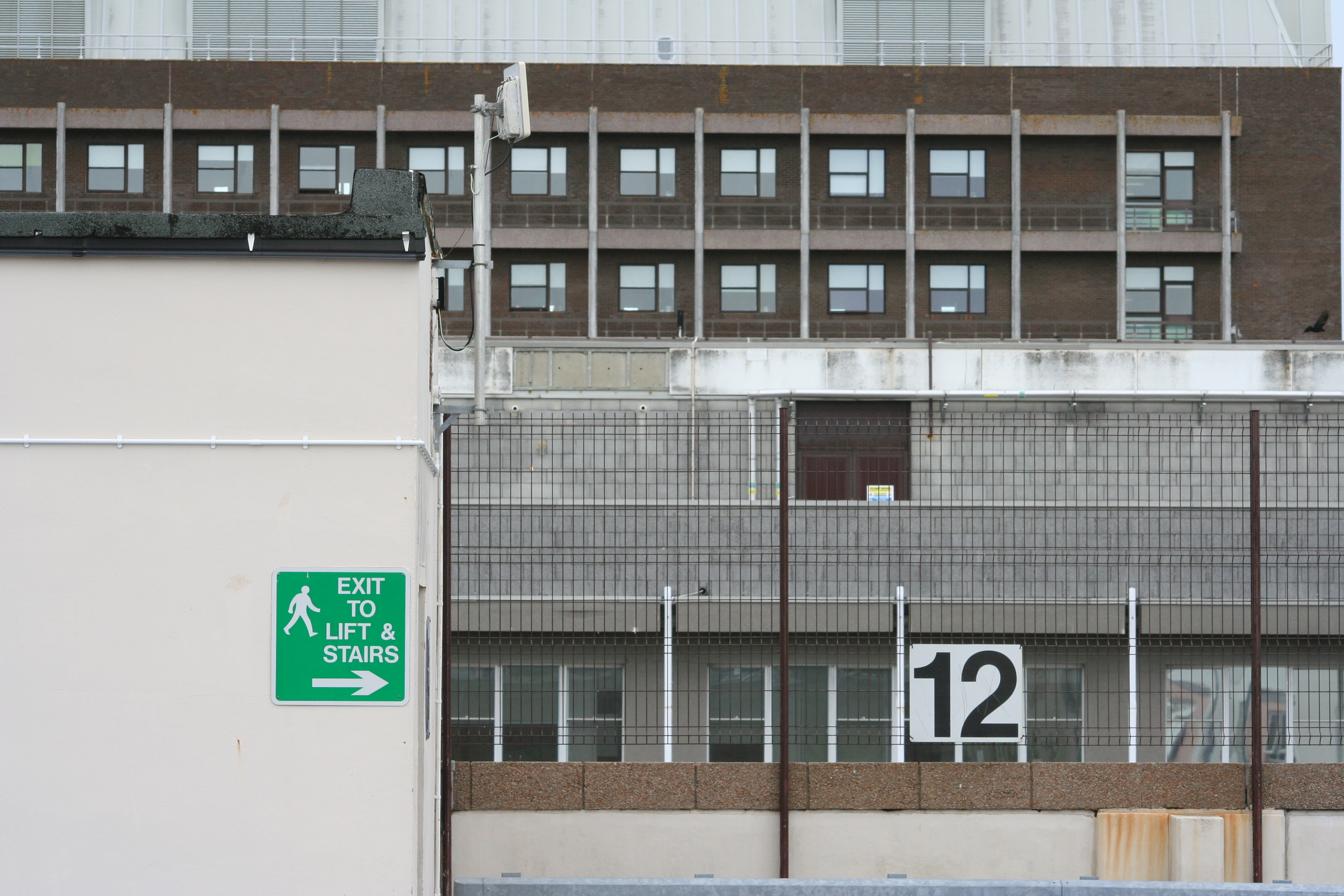
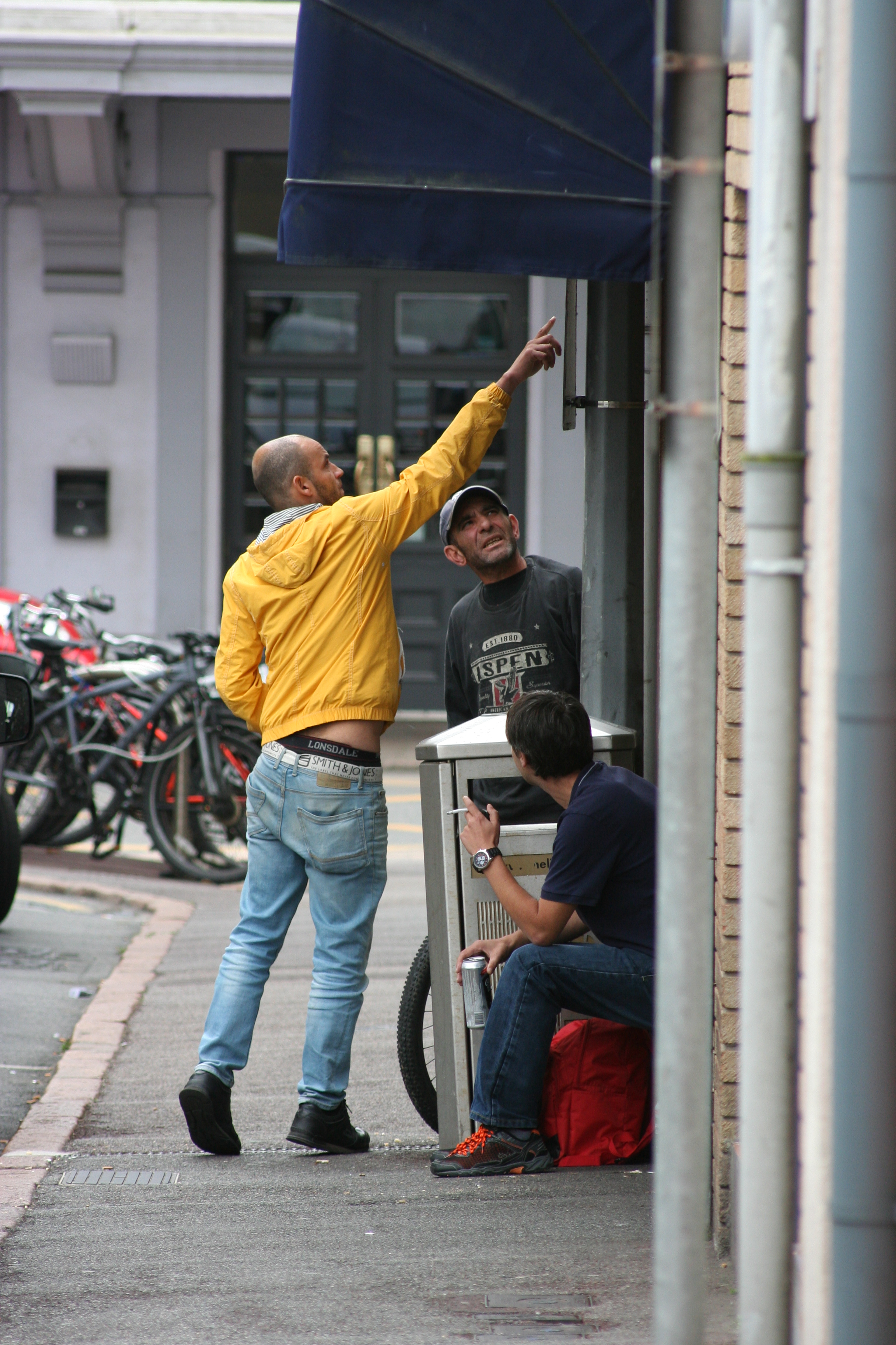
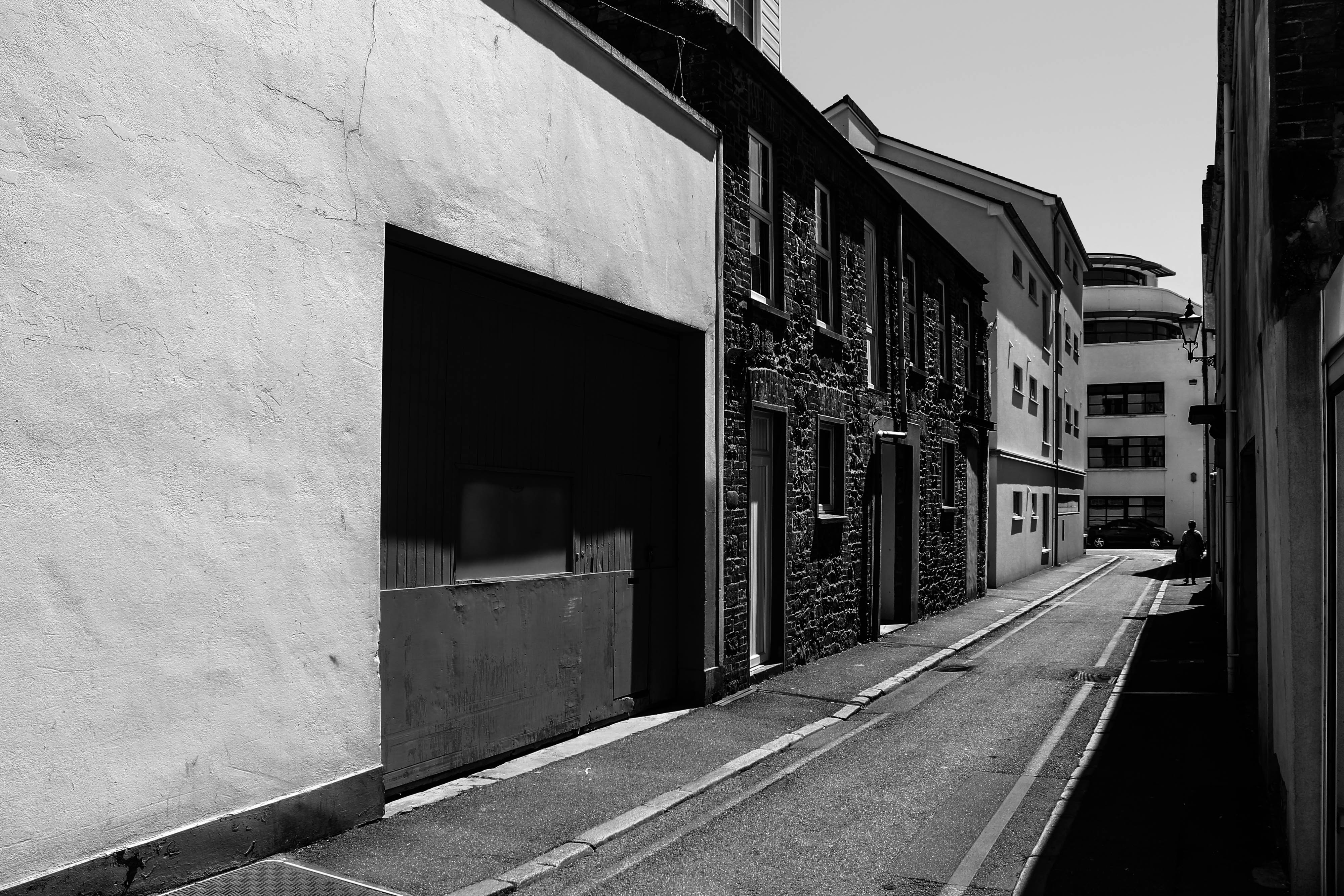
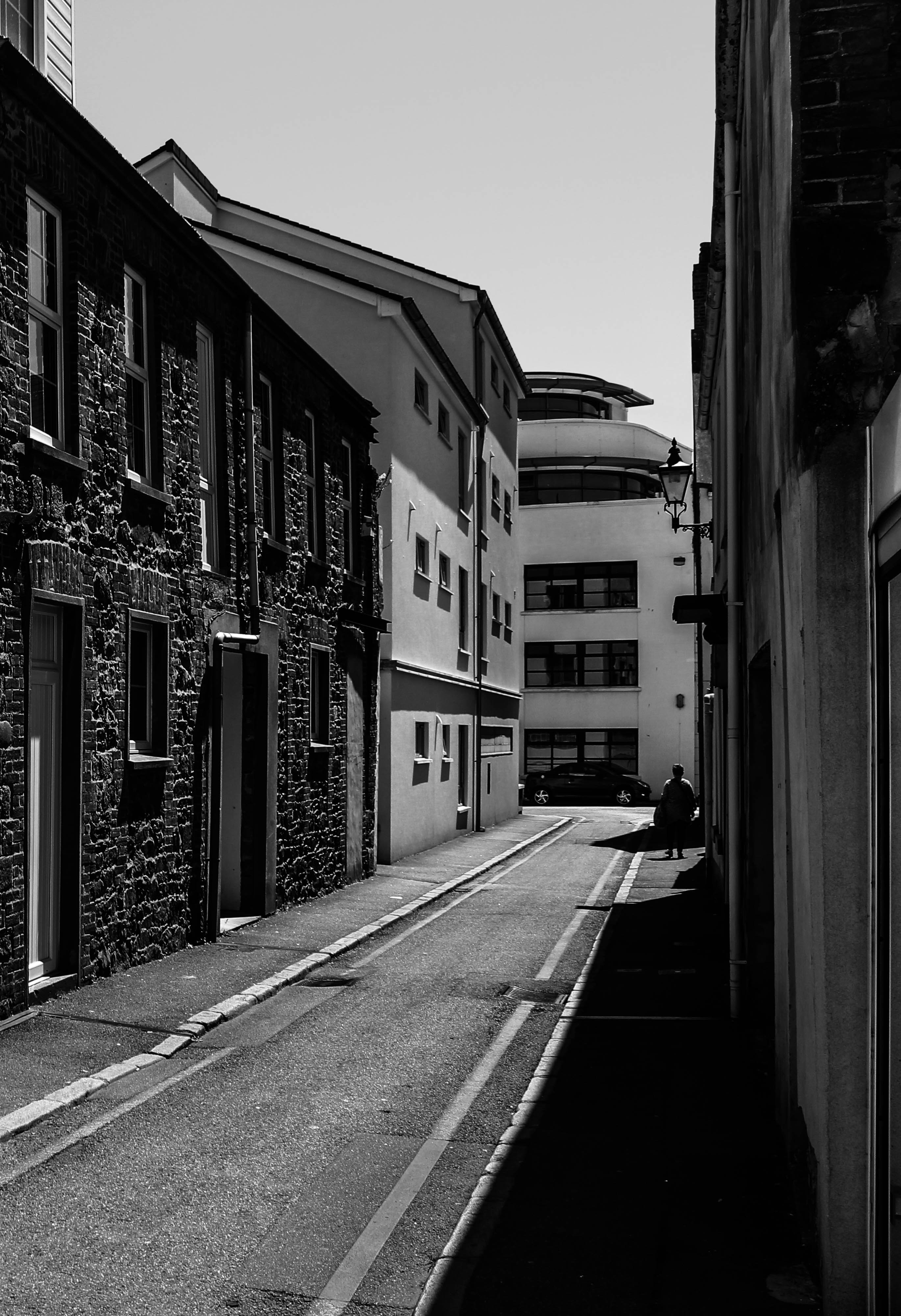
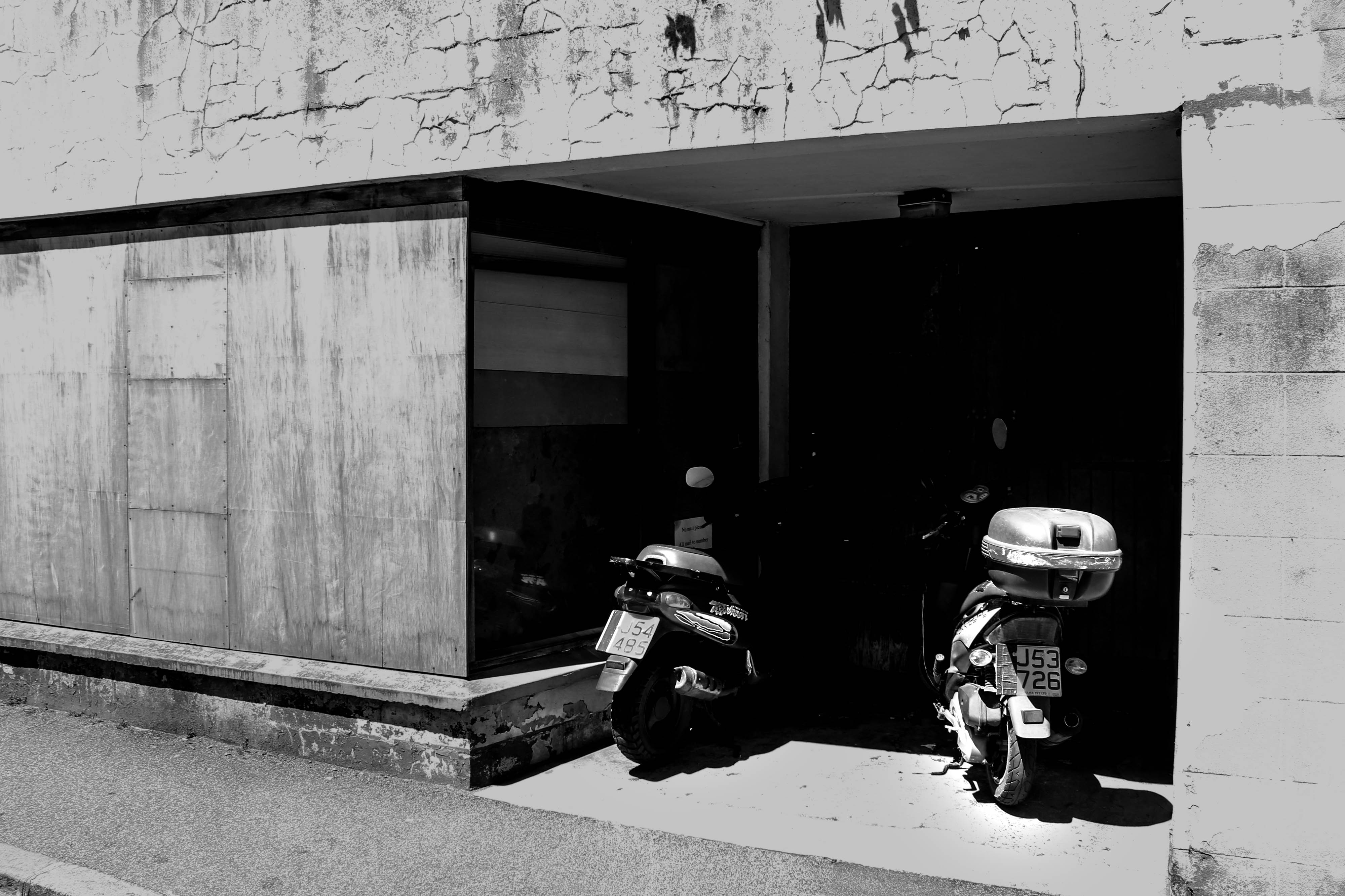
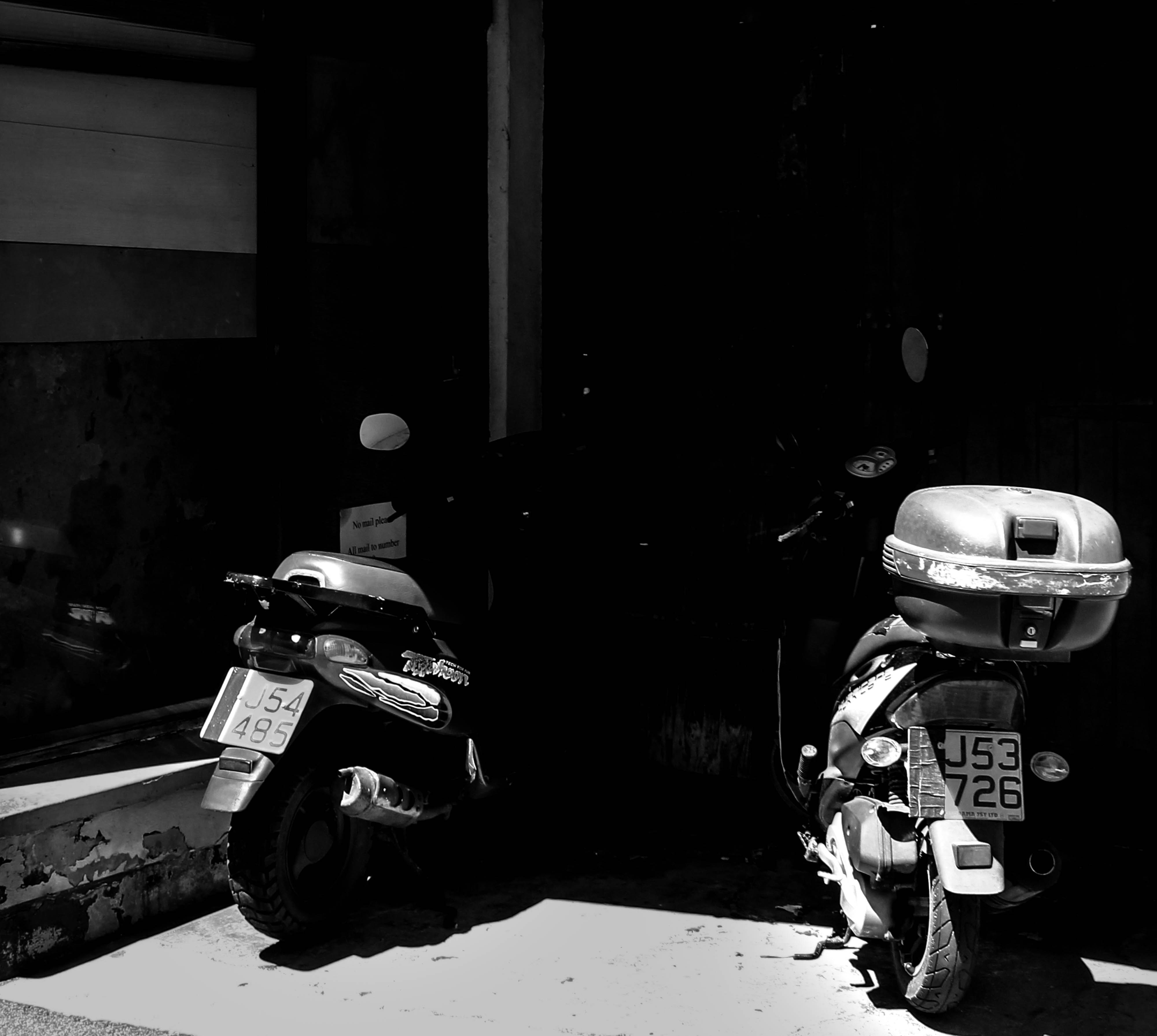
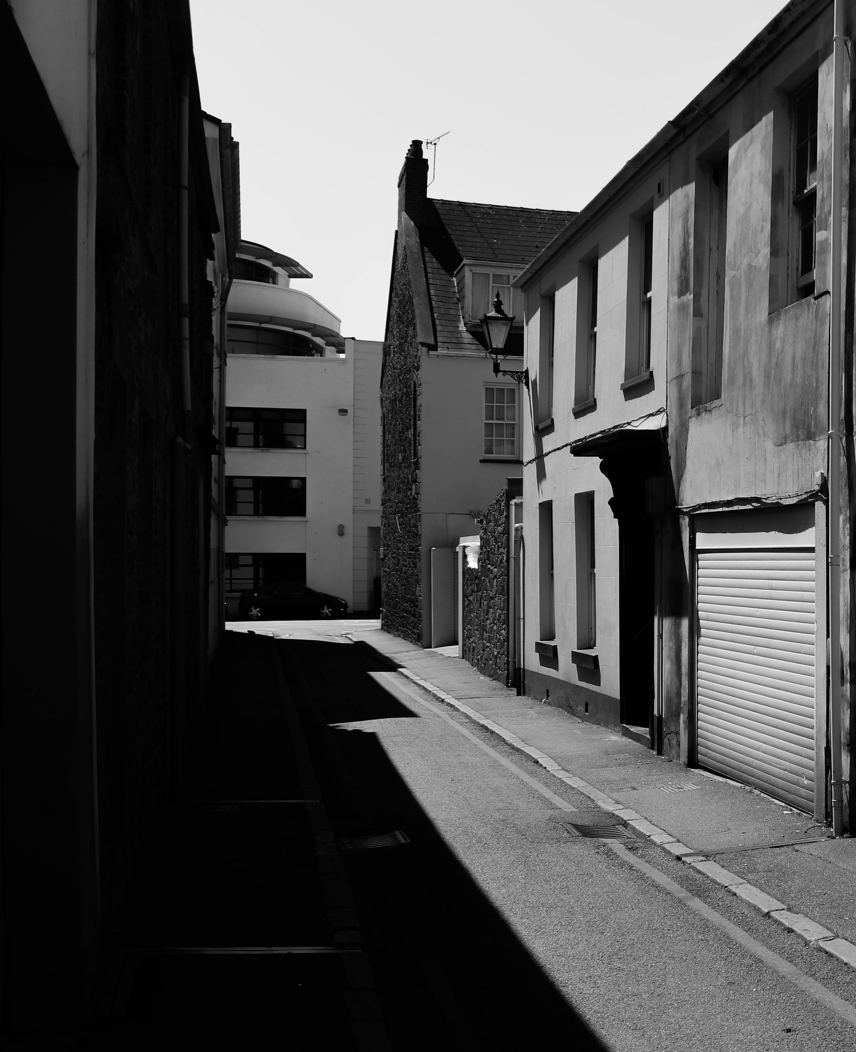
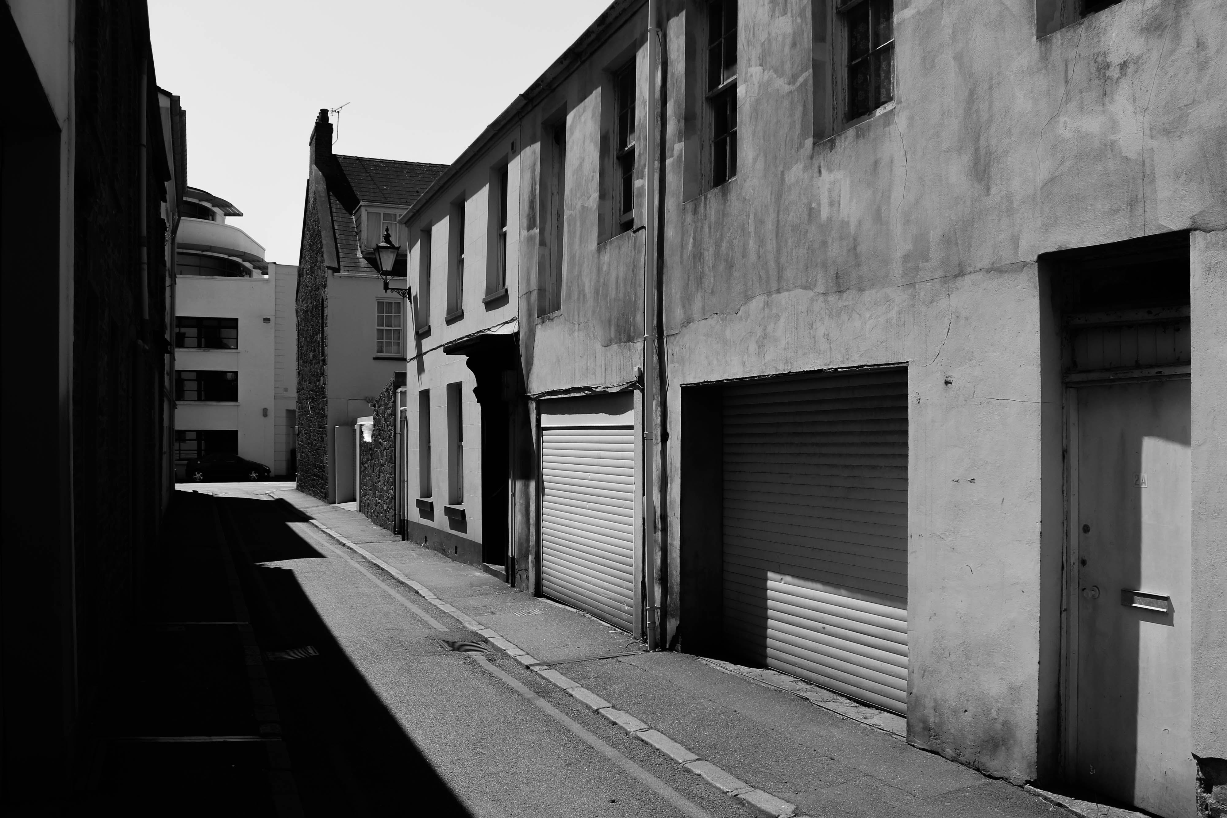
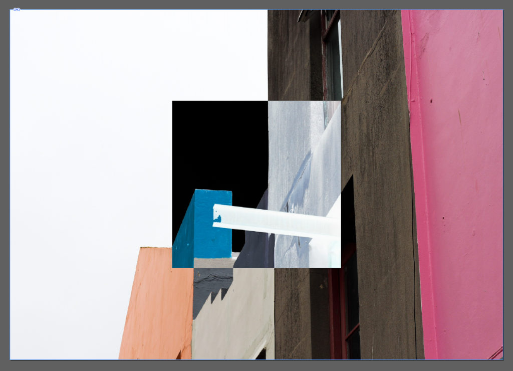
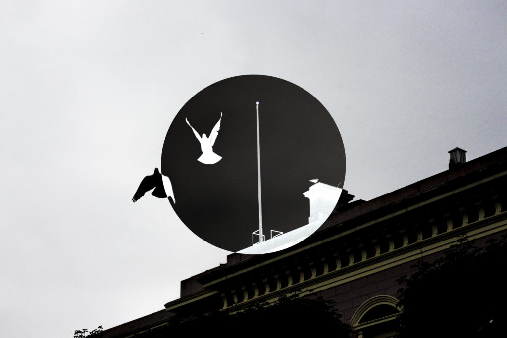
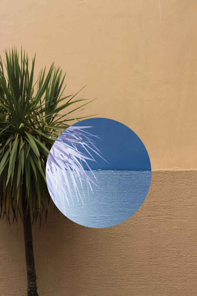
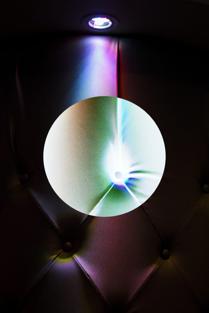
  • For my final presentations I not only wanted to incorporate my themes of the progression and modernisation of st helier but also the way in which I could demonstrate the history and st helier through the archives. I through I could express these themes tonally and show intentions of what the original images would’ve been similar to. I was inspired by themes of documentary photography, this seemingly objectivity should be the ability to convey the impression of an unmitigated image. 
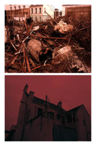
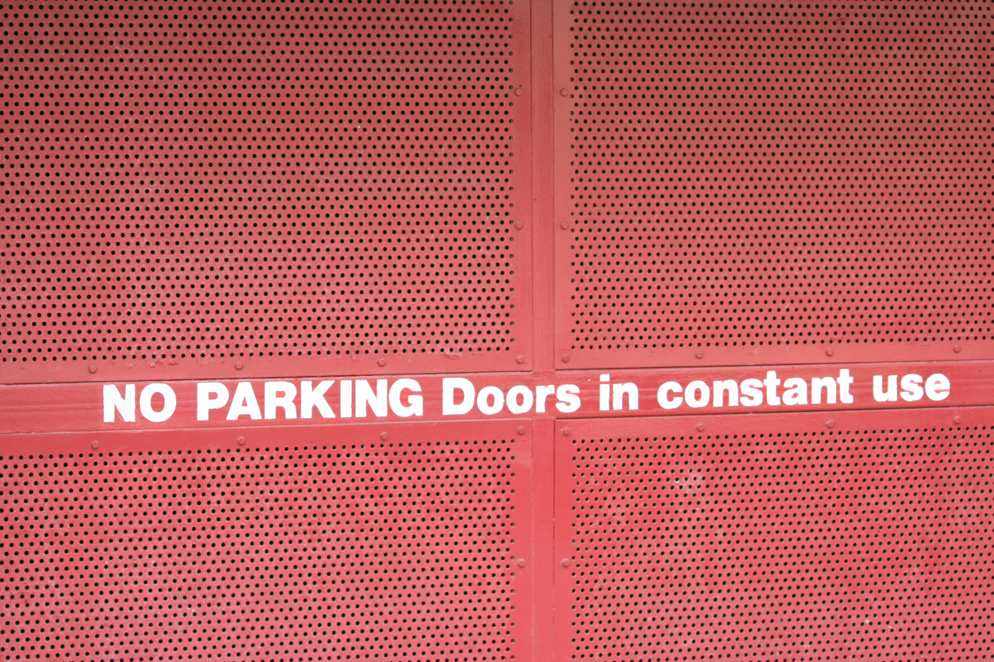
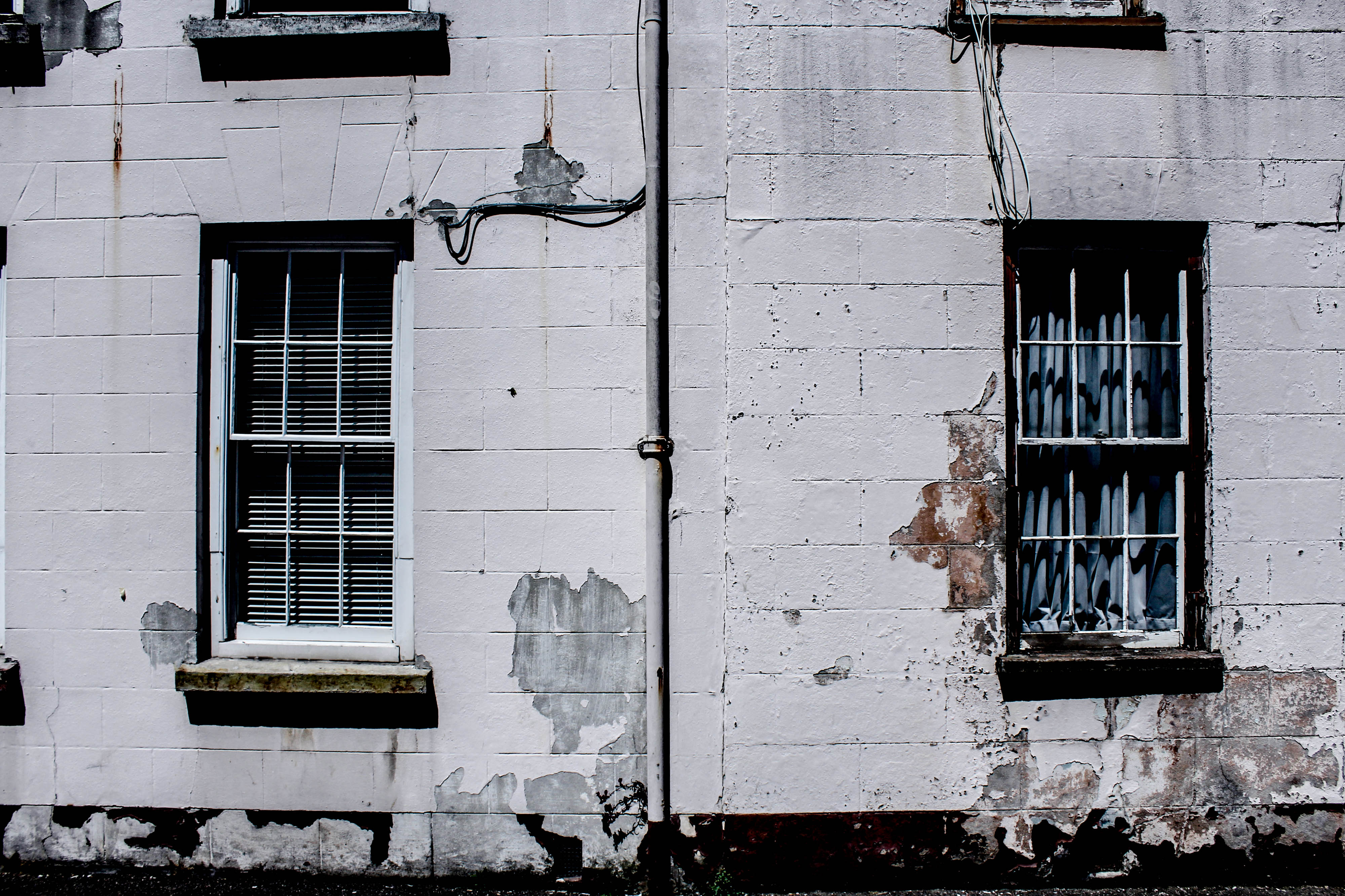
  • The images have  a range of colour overlay experimentations to show a vibrancy and show a senses of life to st helier itself. I was inspired by previous work as colour allowed a free expression and eye catching attentions to the composition nd layout of the images. Howver I think my work has many features of arcjitextual and urban landscapes better complimented wihtin cooler tones, these simplest comparisons present a pre occupation to different sides of st helier and the community and architectural interest wihtin the areas. 

Jersey archive:When thinking about jersey archive I wanted to visit area of great prominence to st helier,i think it is interesting of how time shows the development and also deterioration of an area and allows the community to be subjective upon what they think about it.

overall:My aim was to achieve a complimentary colour, composition and overall feel I want to convey of st helier.When speaking to teachers and other photogohers they agreed the most successful and complimentary images are those which represent jersey archive through the time difference of old and modern while still representing the area and mostly in an urban way. the colours I have chosen I have edited in such a way to be similar in their tones and have the same red themes throughout. all of these images demonstrate a process of destruction and reconfiguration of a landscape to form a comparison of St Helier itself.It shows a evolution of an area, time and the people living within the area itself. lastly I wanted to concentrate on the composition of he piece and experimentation within how the images can be presented to the audience with the most effective way.
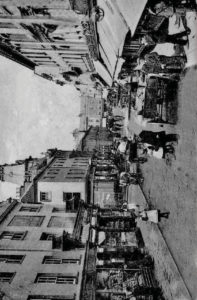
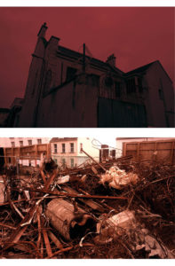
 

The lower compositions are too segregated and do not have the correct flow to what a double age would need in a magazine. I have further experimented within that could be my final composition.i could incorporate more experimentation within the architectural construction pieces I have as these also further develop a sense of work ethic and a life to st Helier and the property development within St Helier itself.I will definitely grout and develop an additional shoot for my St Helier project in order to grab a different angle or St Helier and the modernisation and constraint changing to St Helier itself

Critical Selection (Lightroom)

Critical Selection

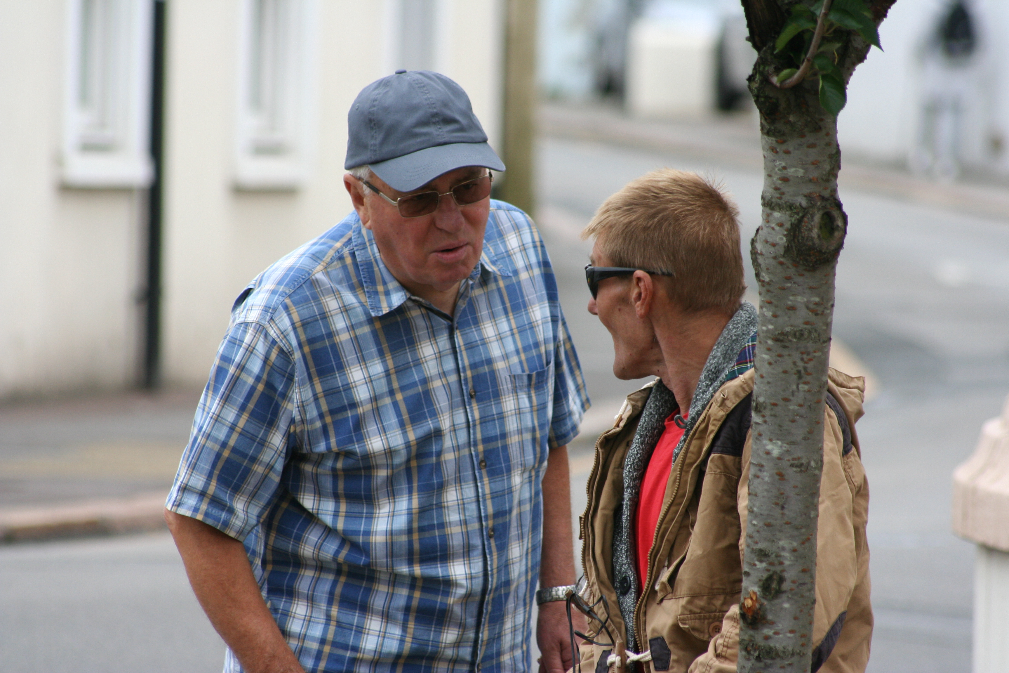
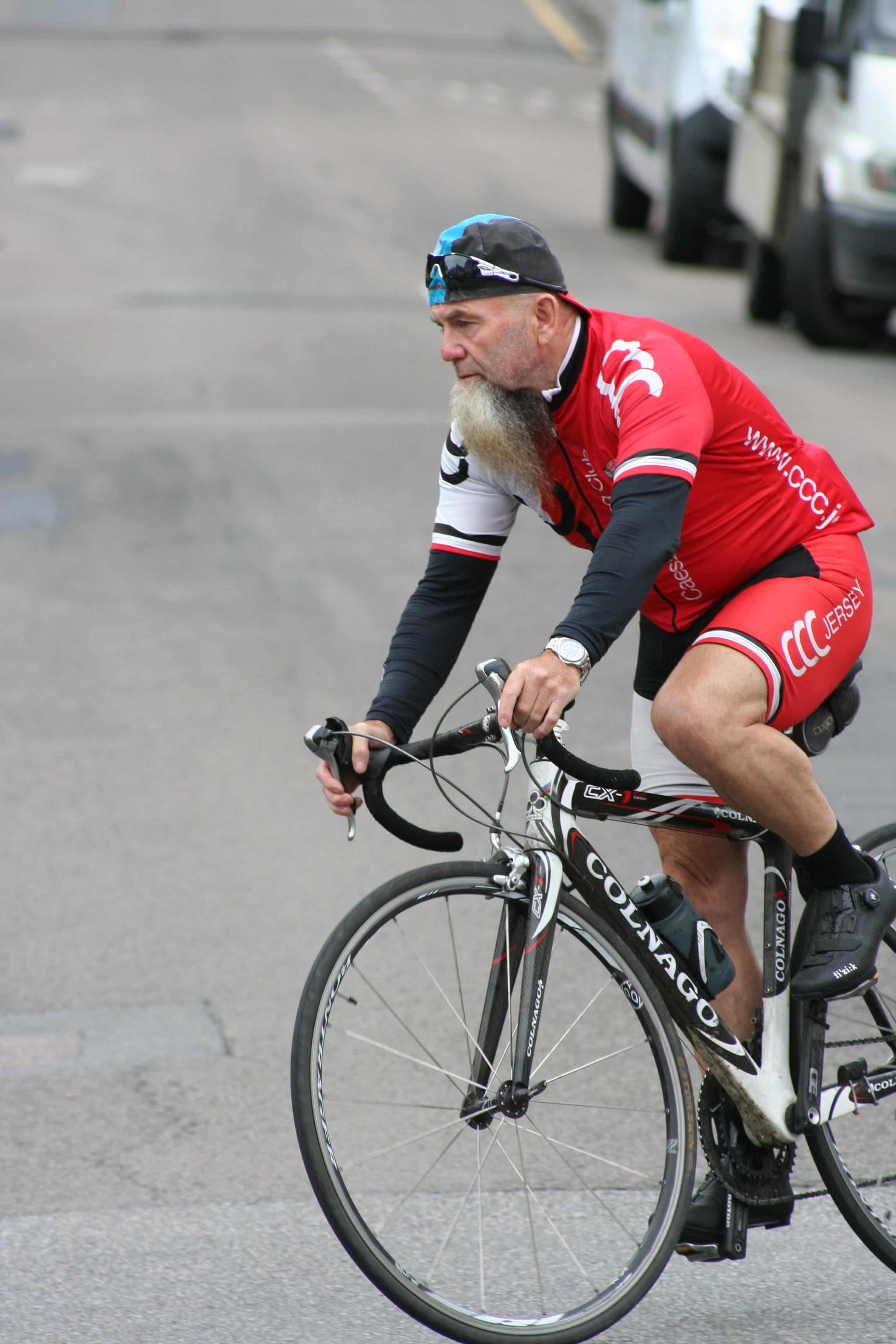
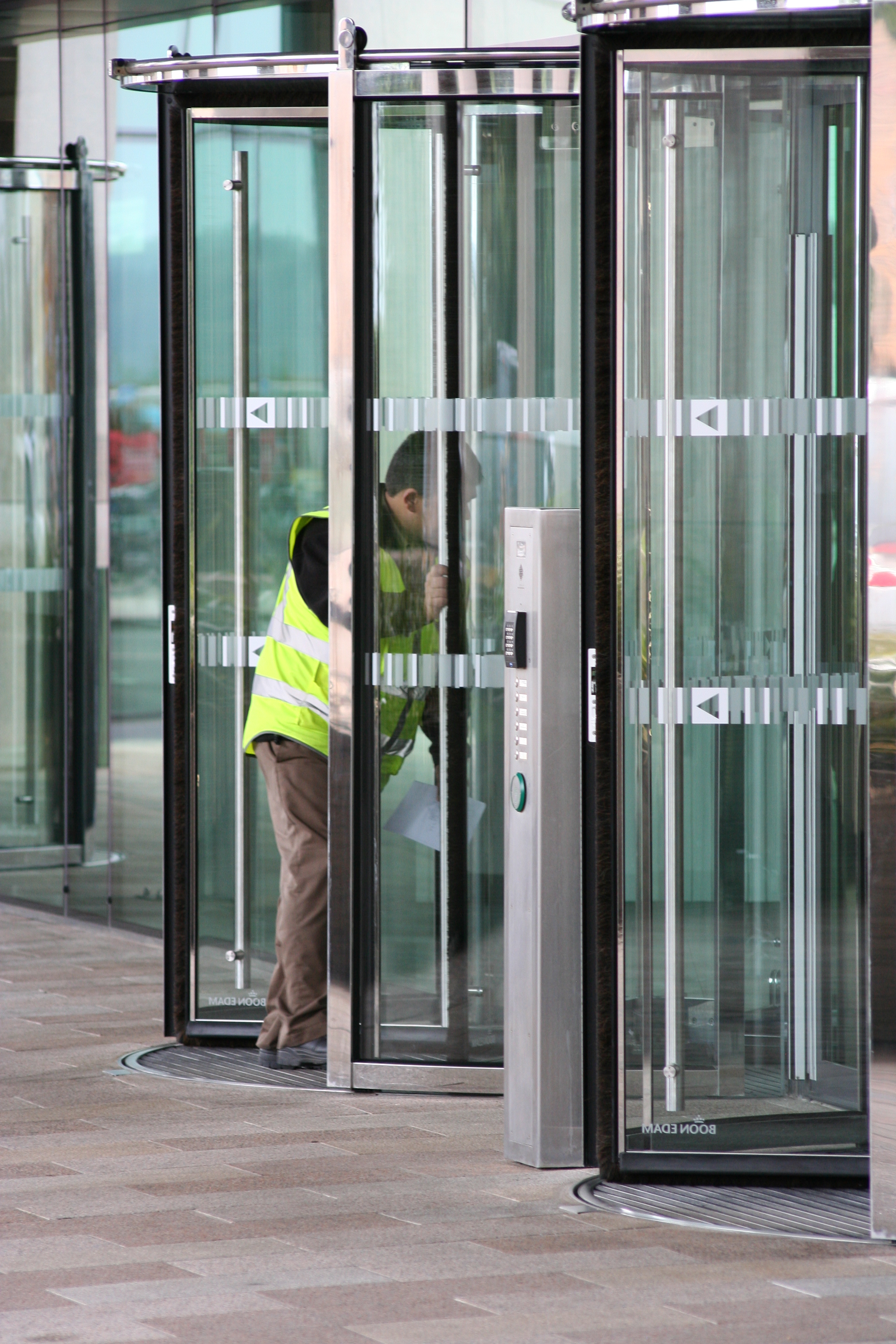
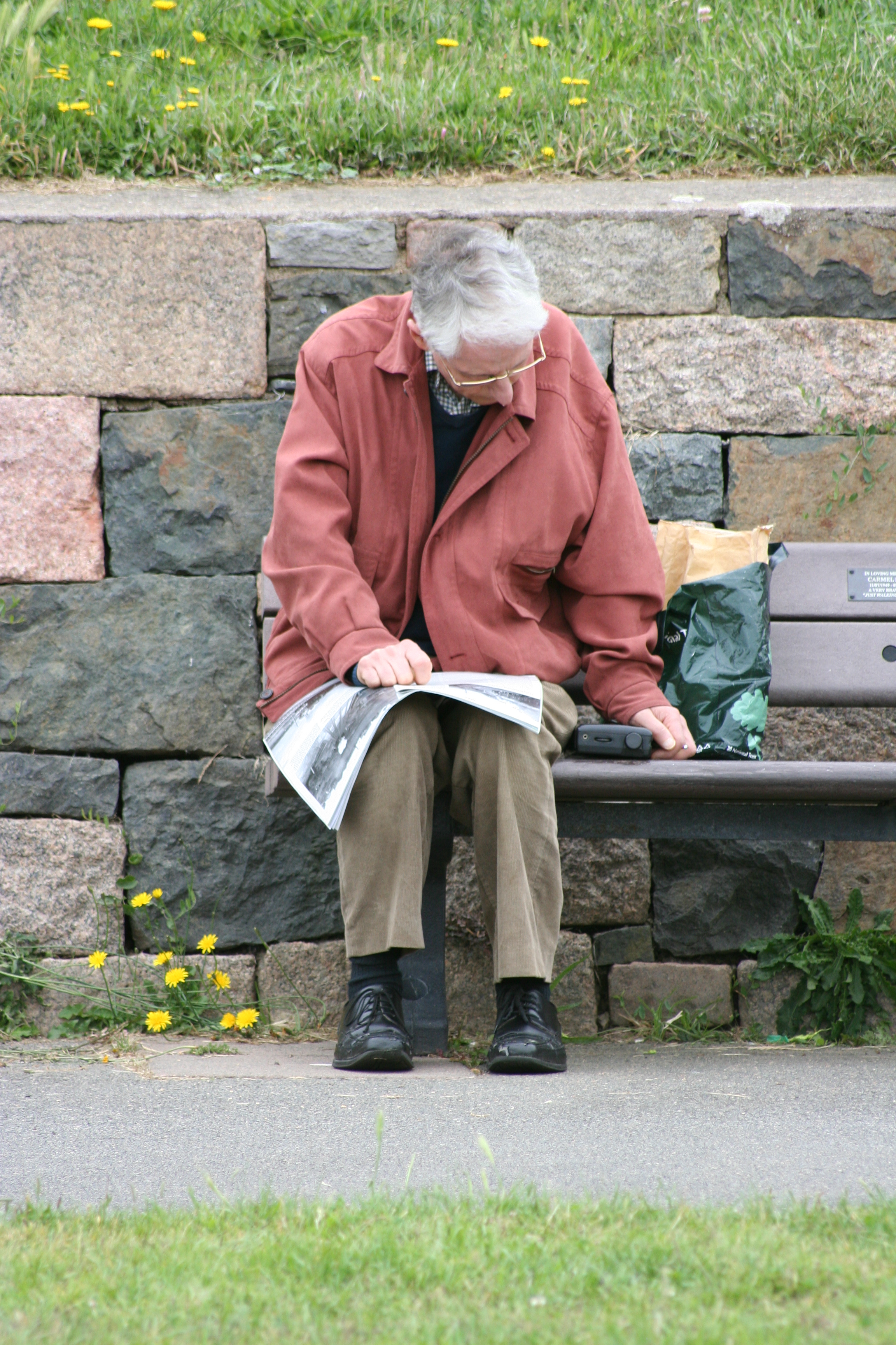
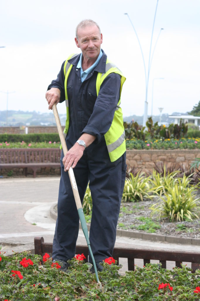
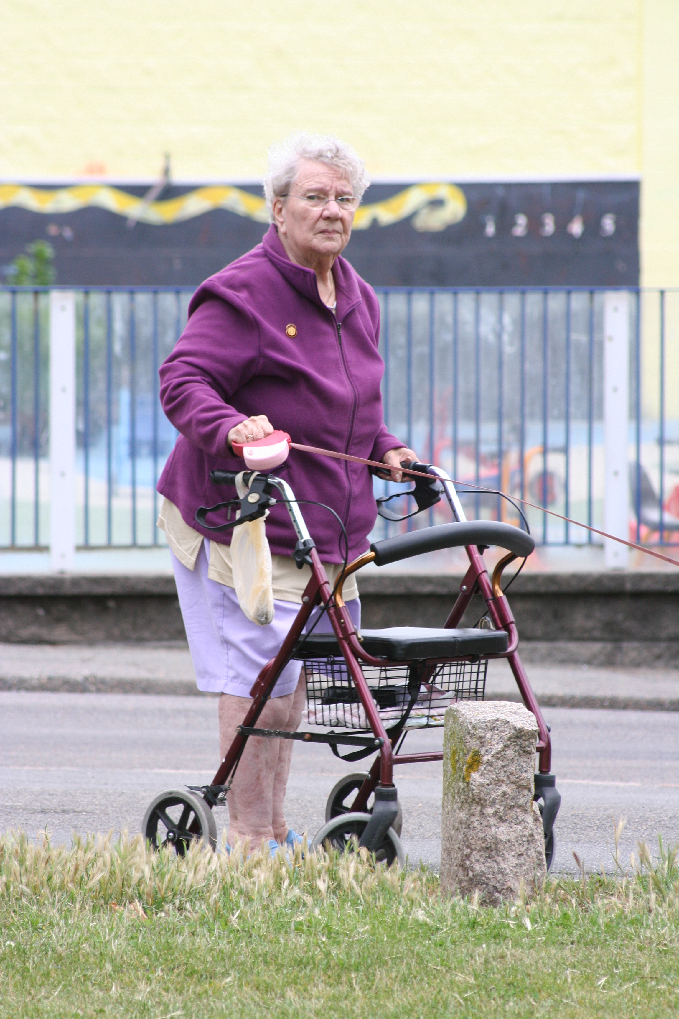
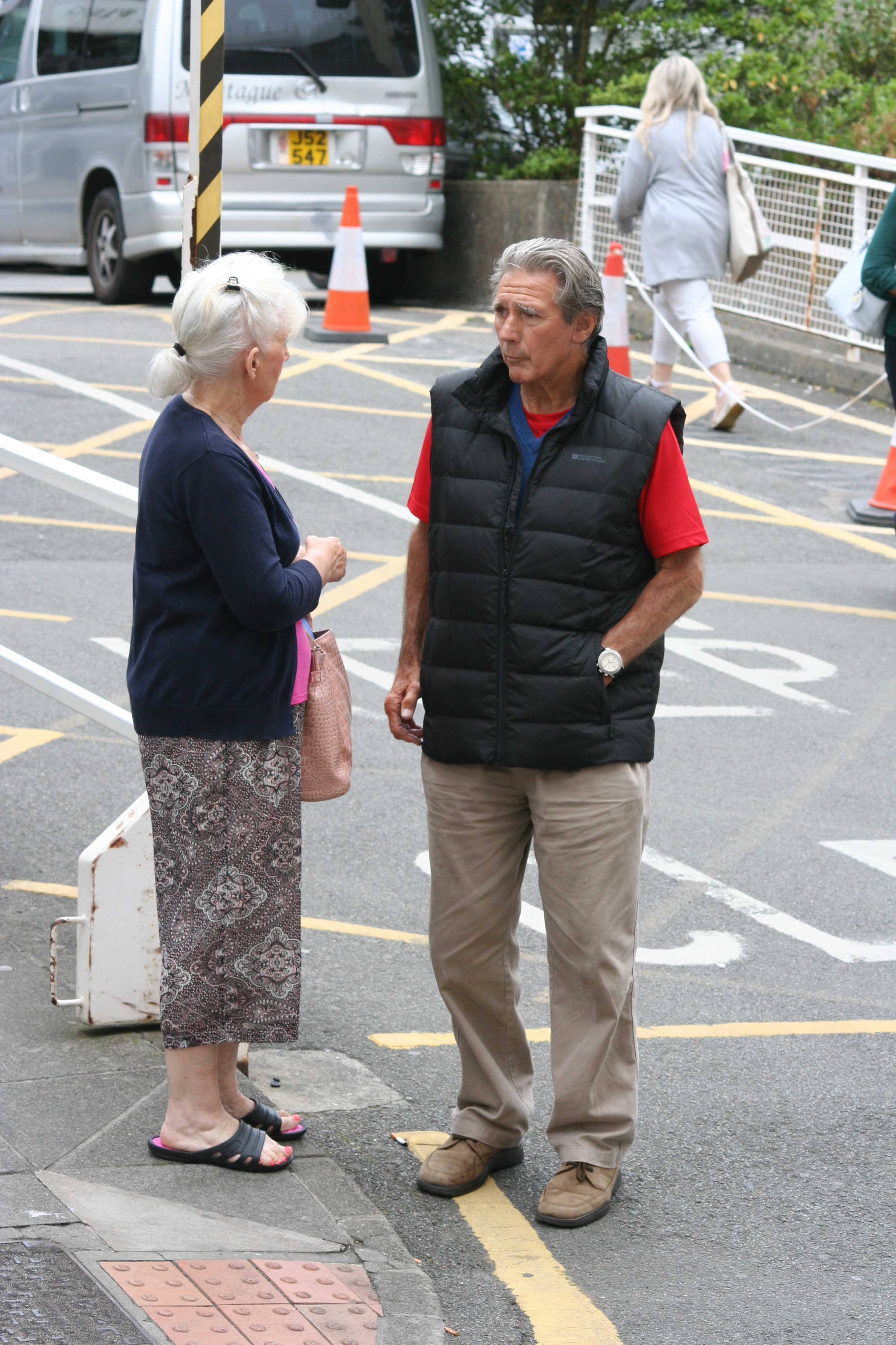
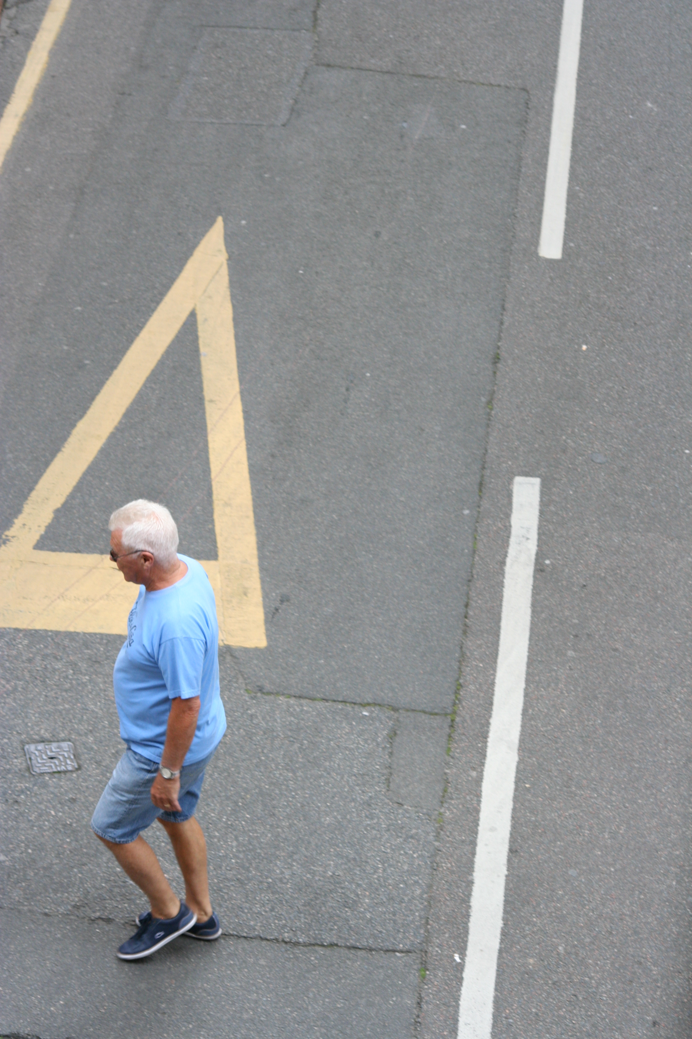
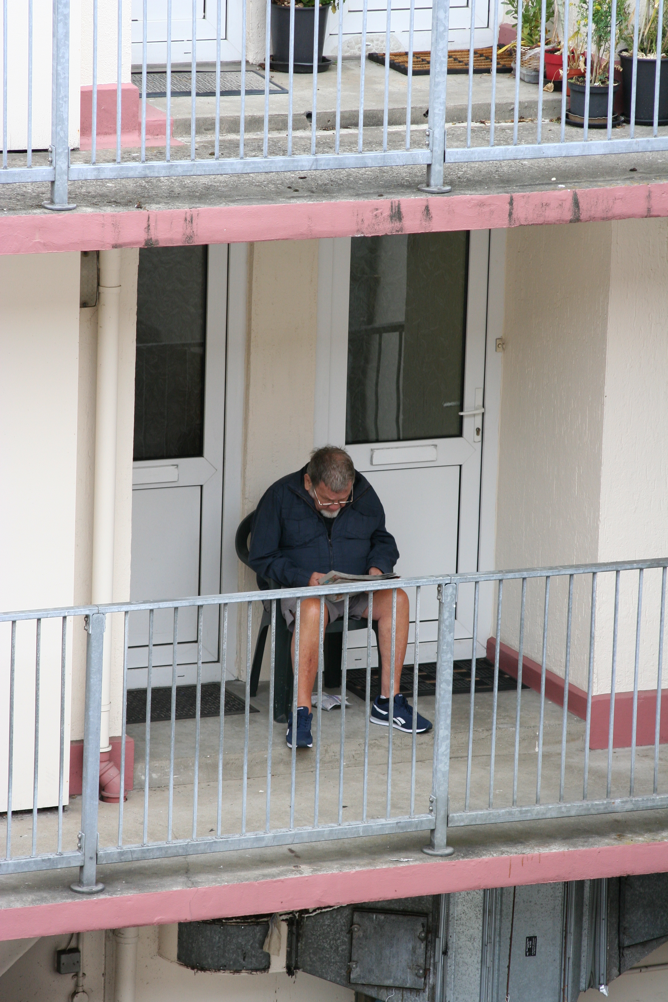
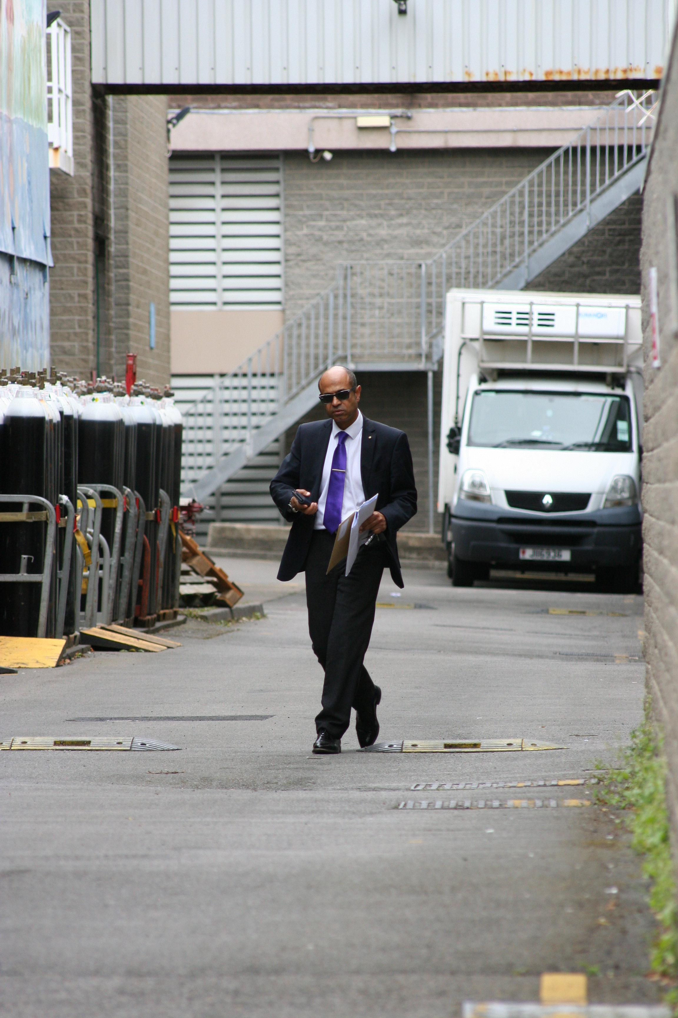
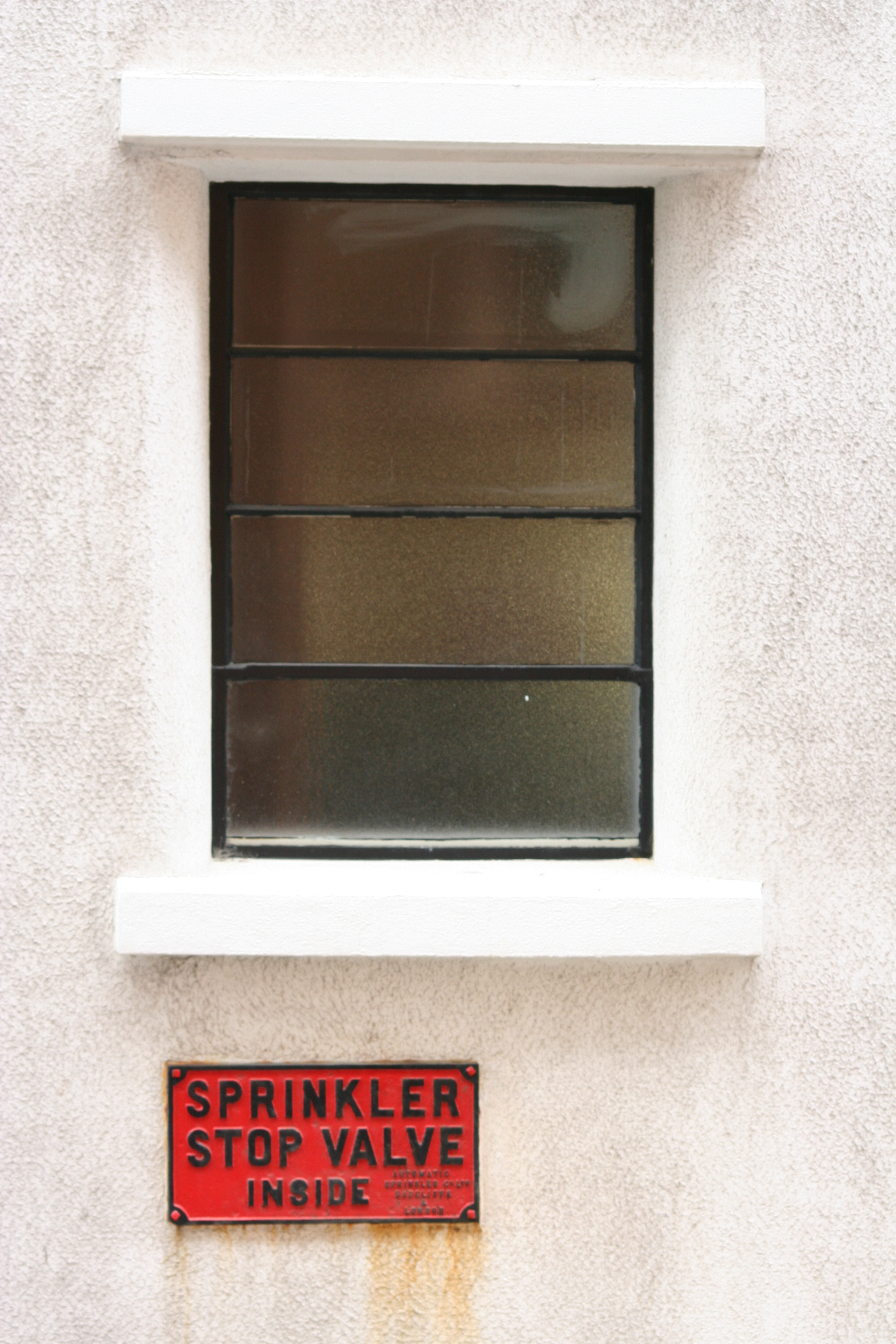
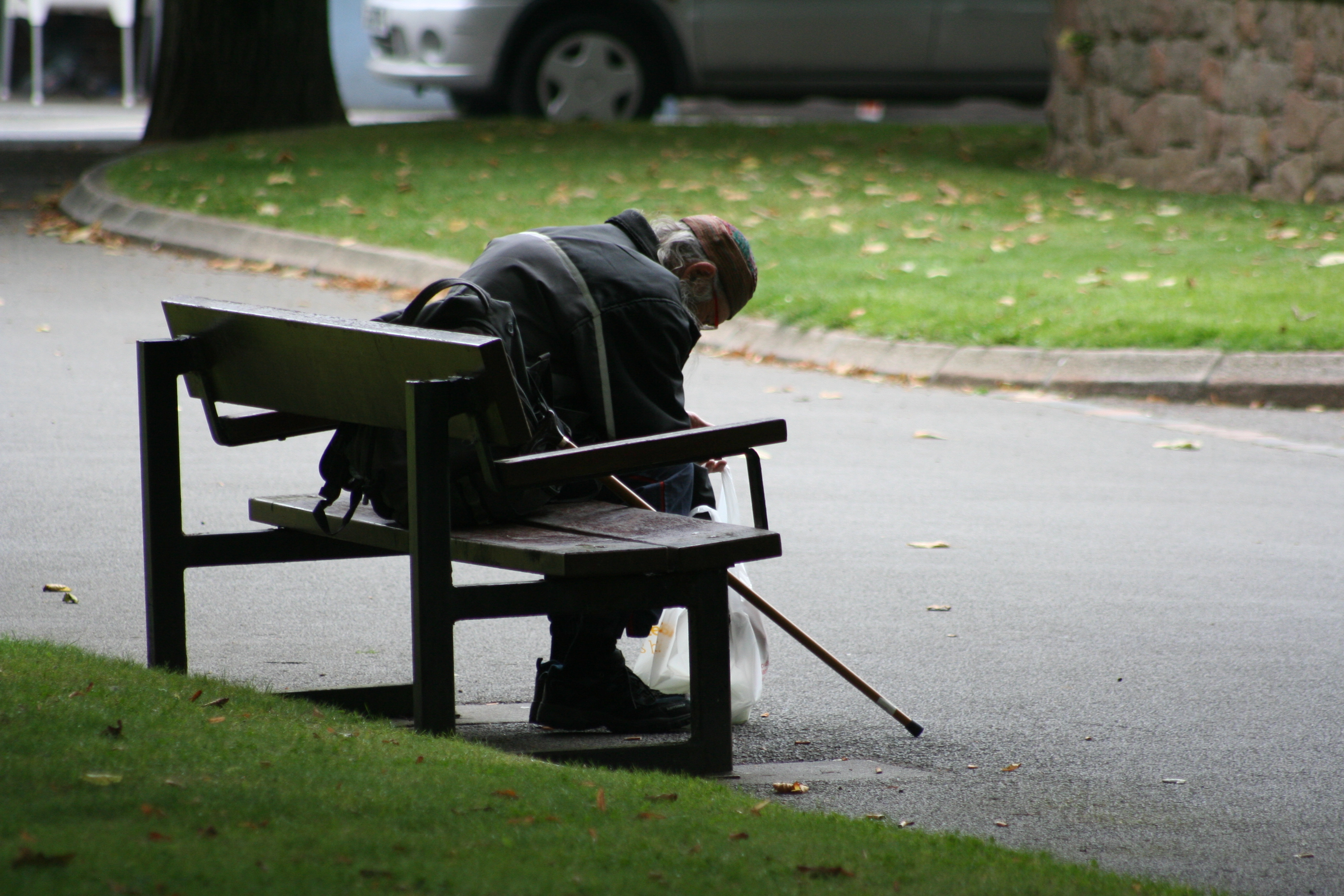
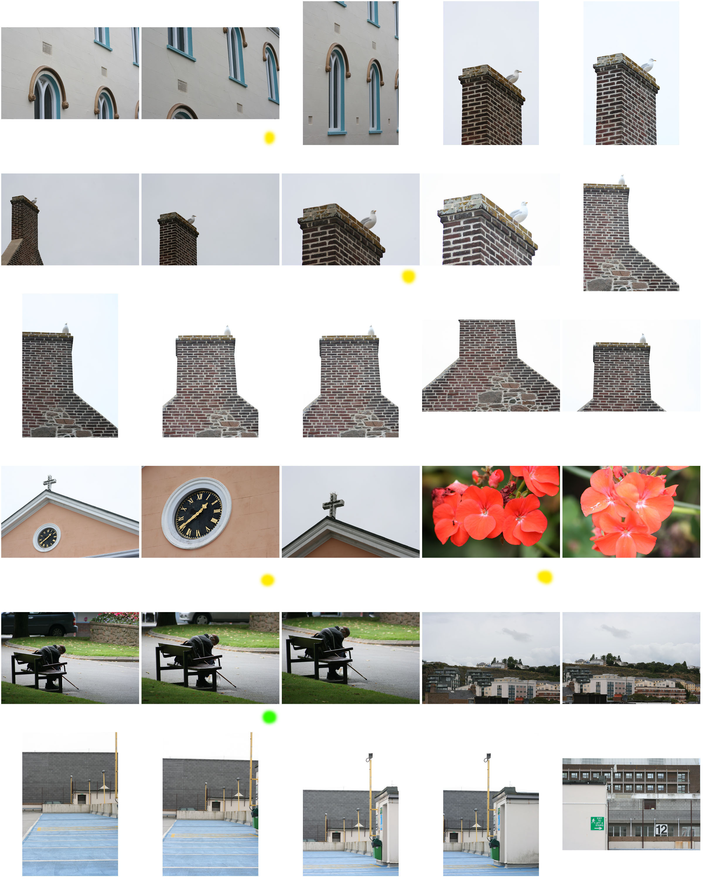
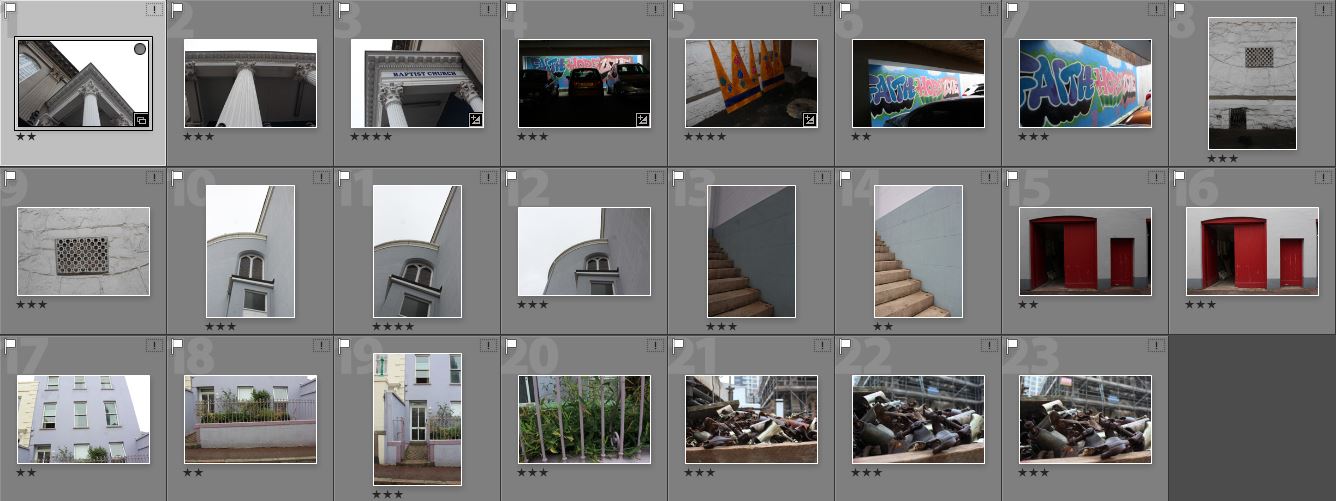
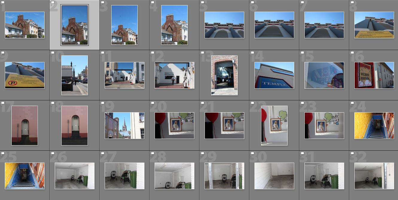
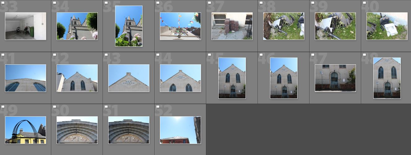
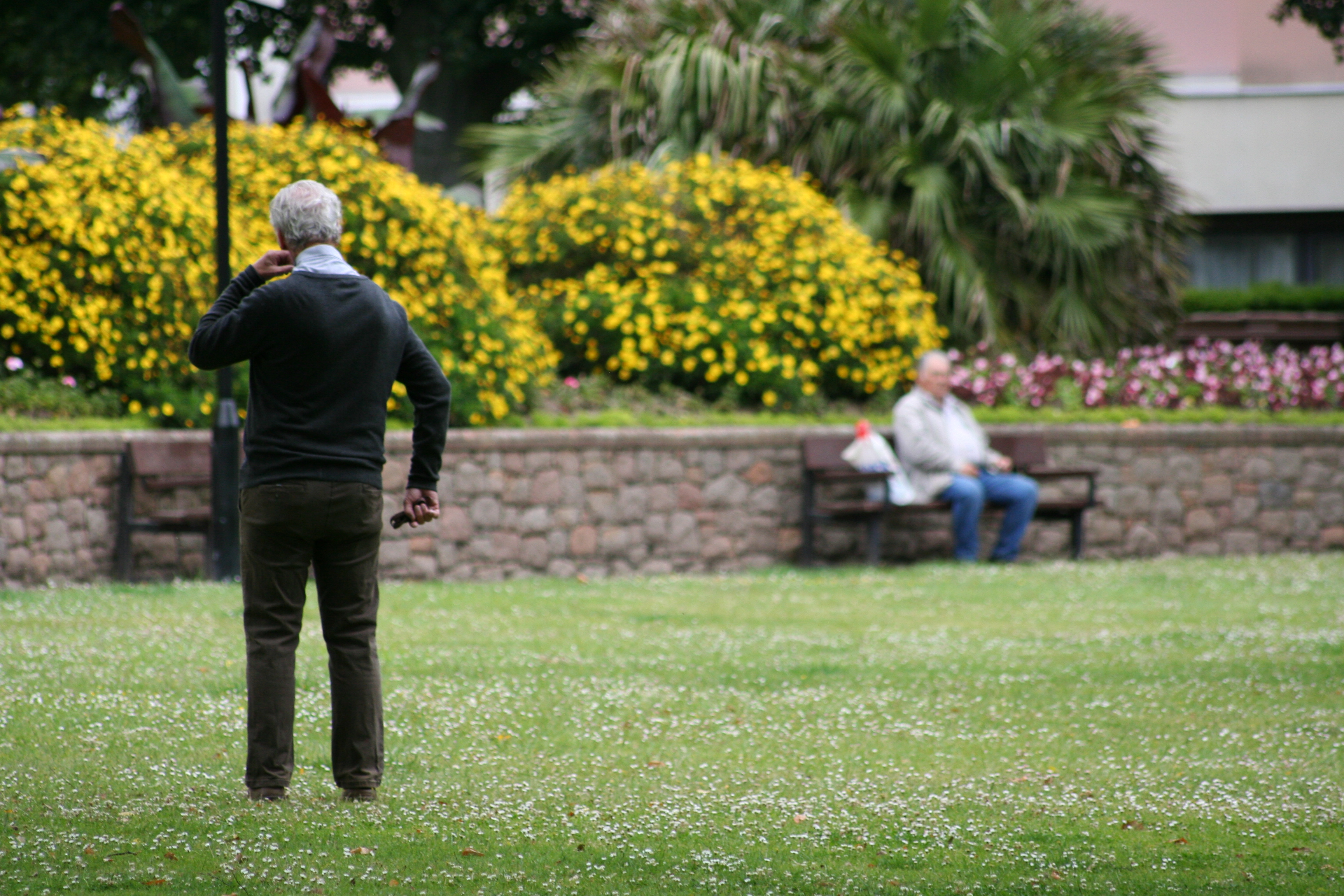
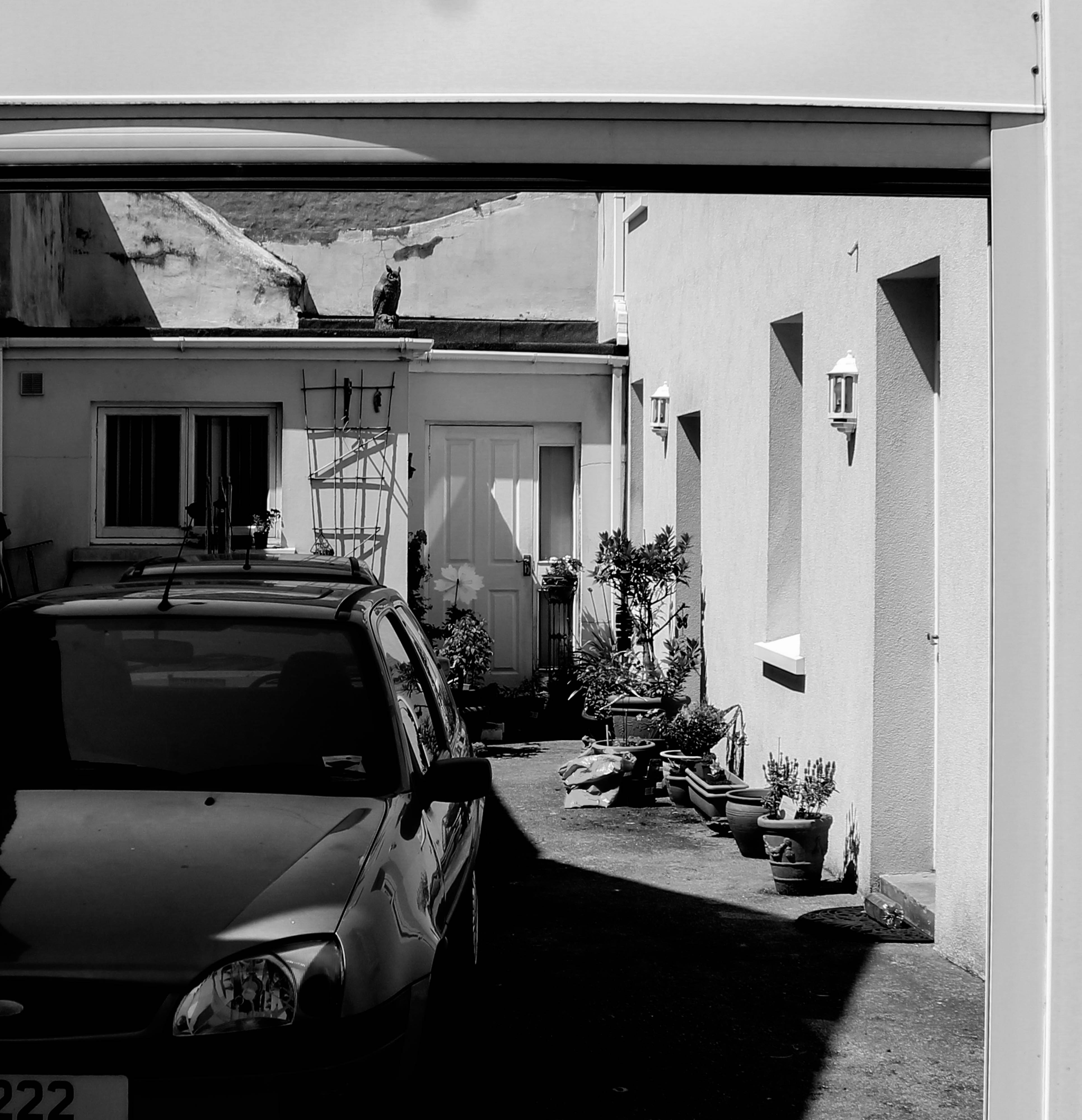
This blog post covers my critical selection of images which I have made using Adobe Light room from all 3 of my photo shoots which I  took in my allocated area of St Helier. These are the raw images before any editing and I have chosen them based on various aesthetic aspects such as the simplicity, colours, textures, and with the portraits based on the physical content of the images such as the expressions of the subjects of their surroundings. The images which I believe need to be slightly altered or manipulated I will caption with those needed changes, most of these slight alterations needing to be an increase in contrast, but i personally don’t believe that any of my favorite images which I have chosen need major changes to be made.

Shoot 1 Favorite images :

Could be slightly increased in contrast

Possible black and white, definitely increase contrast

Increase brightness and contrast to enhance the white

Black and white, possible increase in contrast

Enhance and darken blue tones

Experiment with saturation and hue of tones

Increase in contrast and slight decrease in brightness

Slight increase in contrast

Shoot 2 Favorite images :

Slight increase in contrast, maybe alter hue of red tones

Shoot 3 Favorite images :

Cropping, Increase contrast, possibly black and white

Cropping, slight increase in saturation

Slight decrease in brightness, maybe alter the hue

Further experimentation – Cropping

Cropping

These images I have decided where the most suitable to crop as I found there where areas that mad more going on then others. When cropping these images there were multiple different alternatives that I thought would look good however,  these final outcomes came out the strongest. By cropping these different images I felt it emphasized the images in different ways by focusing on areas that are the strongest and allowing them to stand out over the originals

Original                                                                                                                   Cropped

St Helier Framing

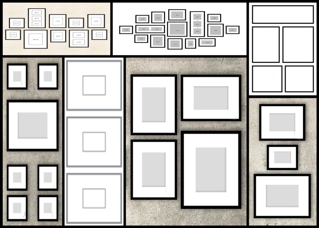
Once the installation for the Future of St Helier had been complete I then decided to move onto the framing of some of the images I had previously printed off. However before I moved onto it I wanted to explore the composition of some of the piece so that I new what I wanted when it came to the actual thing. Here are some examples of the various compositions I would like to consider for the final design:

The photos that I then selected to frame up I wanted to make sure best reflected the overall shoot and had the best aspects both visually, technically and conceptually. These were the photos that I selected to be in the frame I will be creating:

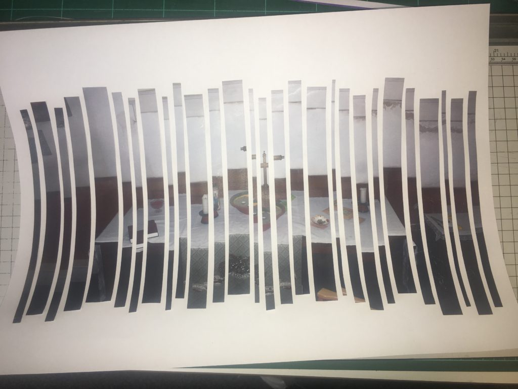
Once I had selected the chosen images I then went onto the actual frame up, to do this I wanted to create a 3D effect and so had to cut out the selected areas which I had drawn out, to then carefully place the images under each hole so that it produced a sunken effect where the card itself is closer to the viewer. Here are the outcomes:
Future Of St Helier Newspaper And Installation

Future of St Helier

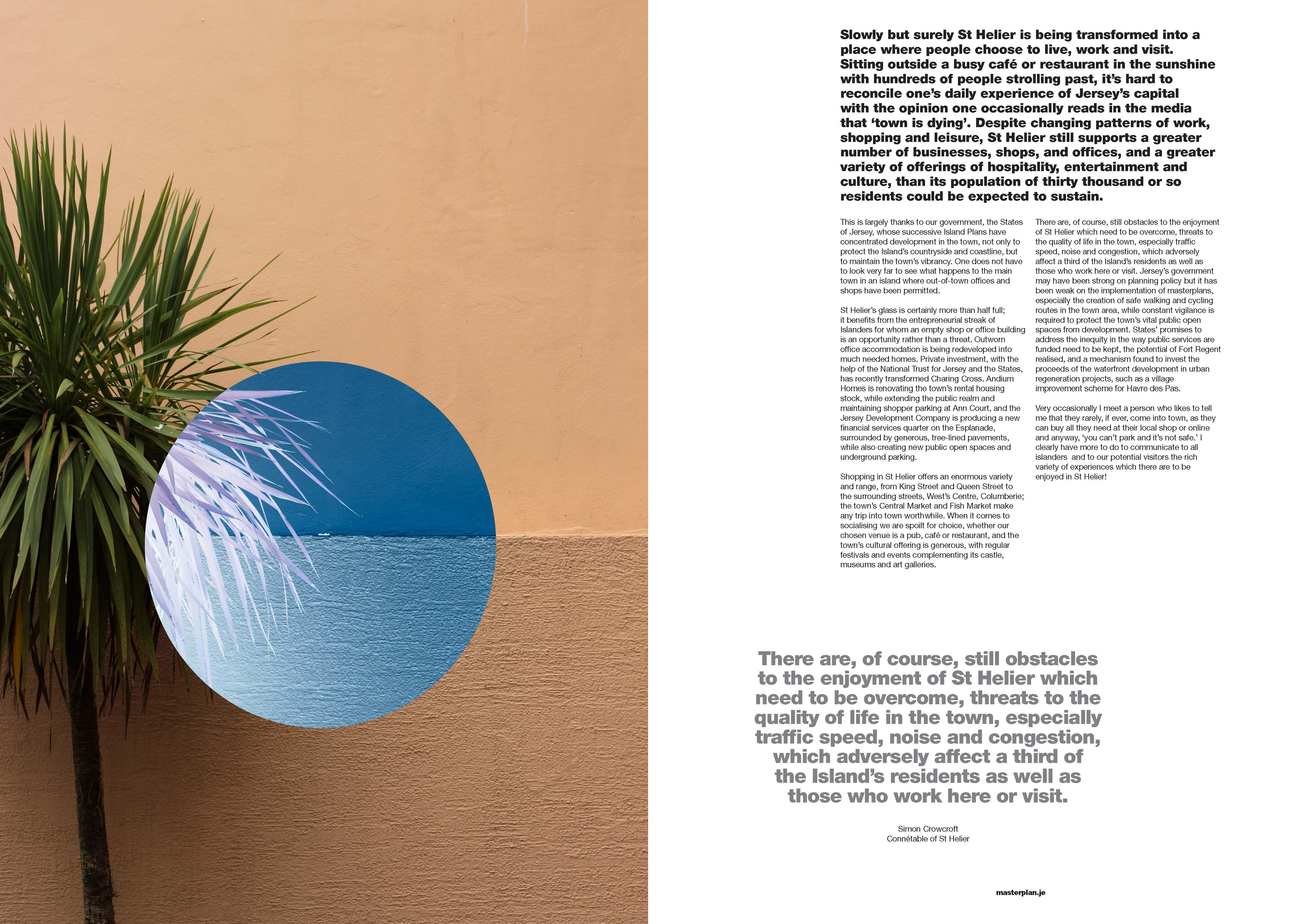
Overall I found my chosen pieces in the newspaper to be particularly effective due to them representing my best work from the shoots. I found that these images represented the vibrant colours of town and the architecture that surrounds it, whilst using the contrast to provide an insight into how these buildings are portrayed. I really liked how the images selected both portrayed my stance on how St Helier has been constructed, a mismatched area where there is not real coordination into its display.

Hoarding Installation

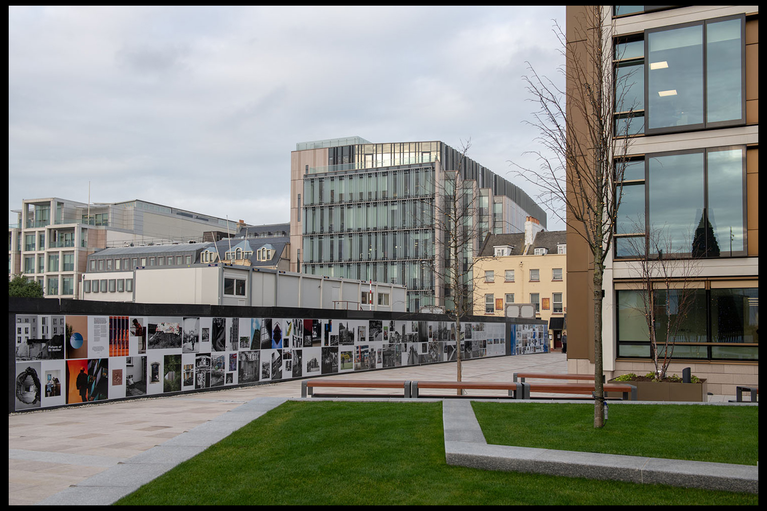
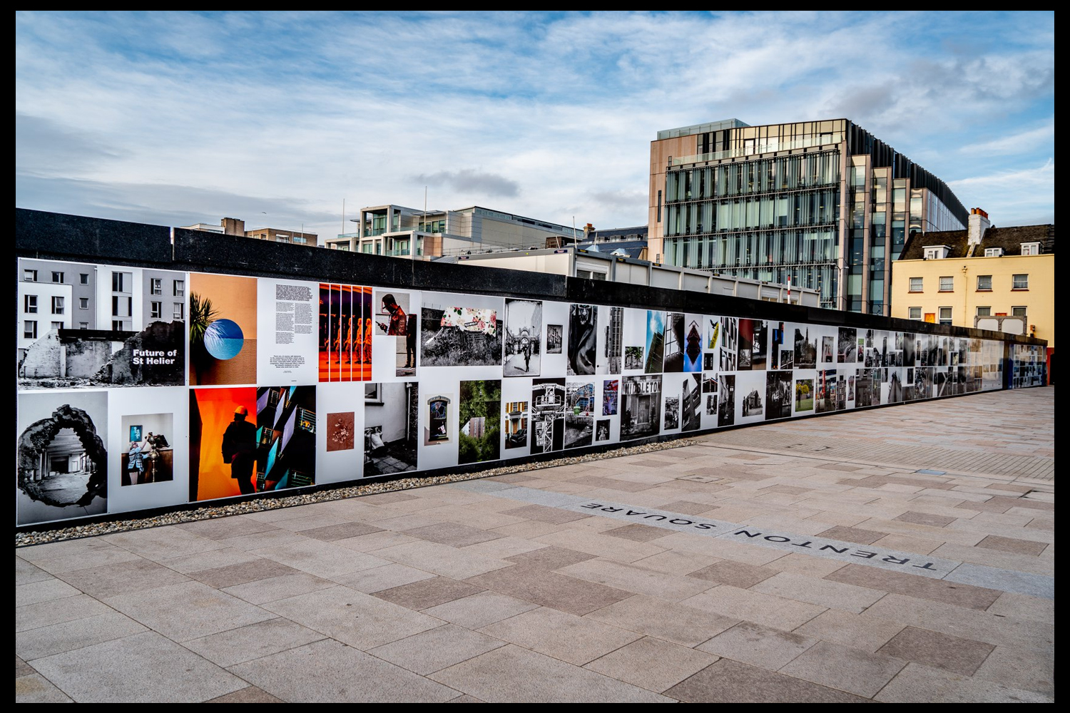
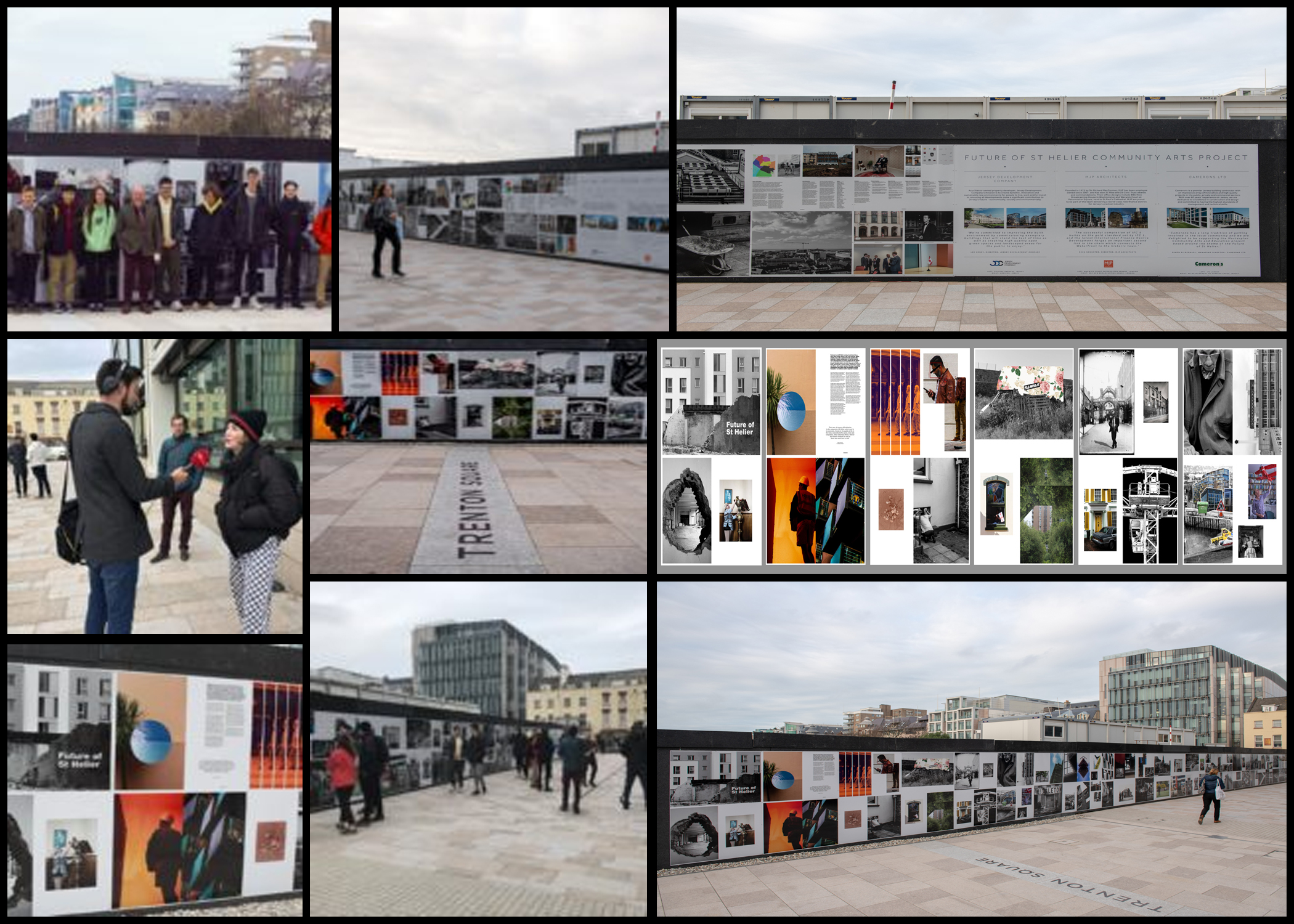
The unveiling of the Future of St Helier Hoarding at the International Finance Centre on the Esplanade in St Helier took place on Thursday 13 Dec 2018.First published as a 52 page newspaper supplement in September by the Jersey Evening Post the work produced by A-Level Photography students at Hautlieu School have been transformed into a 34m outdoor installation as part of Masterplan Community Arts and Education Project

We were challenged with responding to specific areas, streets and neighbourhoods divided up along the urban vingtaines of St Helier and to explore through research, archives and photography the built-environment, urban living, diverse communities, town planning, land use and re-generation projects.

We thank all sponsors and collaborators for making this a successful contribution to the island’s cultural records and historic archives Jersey Development Company, Camerons Ltd, MJP ArchitectsArchisleLewis BushPhoto-Archive Societe-Jersiaise, Kevin Pilley, States of Jersey and Connétable of St Helier, Simon CrowcroftEarlier today we unveiled the Masterplan Future of St Helier hoarding display at the International Finance Centre. Lots of local media interest from Jersey Evening PostITV Channel TV and BBC Jersey who broadcasted live on radio talking to photography students at Hautlieu School, Constable of St Helier, Simon Crowcroft and sponsors Jersey Development Company, Camerons Ltd, MJP Architects about the future of the island and its capital. An excellent example of how a community arts and education project can generate a debate that affects all those who either live, work or visit St Helier.

https://www.bbc.co.uk/sounds/play/p06rlpdw
If you missed the news last night at ITV Channel TV you can catch up here with Hautlieu students talking (15m.12s) about their images on display at the Masterplan Future of St Helier hoarding on the International Finance Centre.

See link here

The outdoor installation on the hoarding around the construction site is a great way to engage the public in art and debates concerning the future of the island’s capital but, what we need in Jersey is a new contemporary art space that will provide a new venue to showcase art produced in the island, but equally also bring international art to Jersey for the public enjoyment of its residents and visitors alike.

The recent Culture, Arts and Heritage Strategic Review, commissioned by the Government of Jersey makes 20 new recommendations that will revitalise the island’s cultural infrastructure and achieve a wide range of social and economic objectives from tourism, to health and well being to external relations, to planning and environmental developments – in the hope that in partnership with Government it will enrich and enhance Jersey’s quality of life.

Let’s hope those in power who can make real changes to St Helier’s build environment will include such a new art space in the revised Masterplan of the Waterfront. All we need is political will and re-prioritising public funding for the arts. States of Jersey

Future of St Helier Newspaper

The outcome of students work was first published on Tuesday 18 September 2018 as a 52 page newspaper supplement, Future of St Helier that was printed in 14,000 copies and inserted into a daily edition of the Jersey Evening Post and distributed island wide.

Here is a video browser of our Future of St Helier supplement printed and distributed in today’s edition of the Jersey Evening Post. Hautlieu photography students were challenged with responding to specific areas, streets and neighbourhoods divided up along the urban vingtaines of St Helier and to explore through research, archives and photography the built-environment, urban living, diverse communities, town planning, land use and re-generation projects. Each student designed a page spread which was then split in half producing a fragmented image reflecting on the nature of experience and diversity of St Helier.