Inspiration For My Newspaper Design

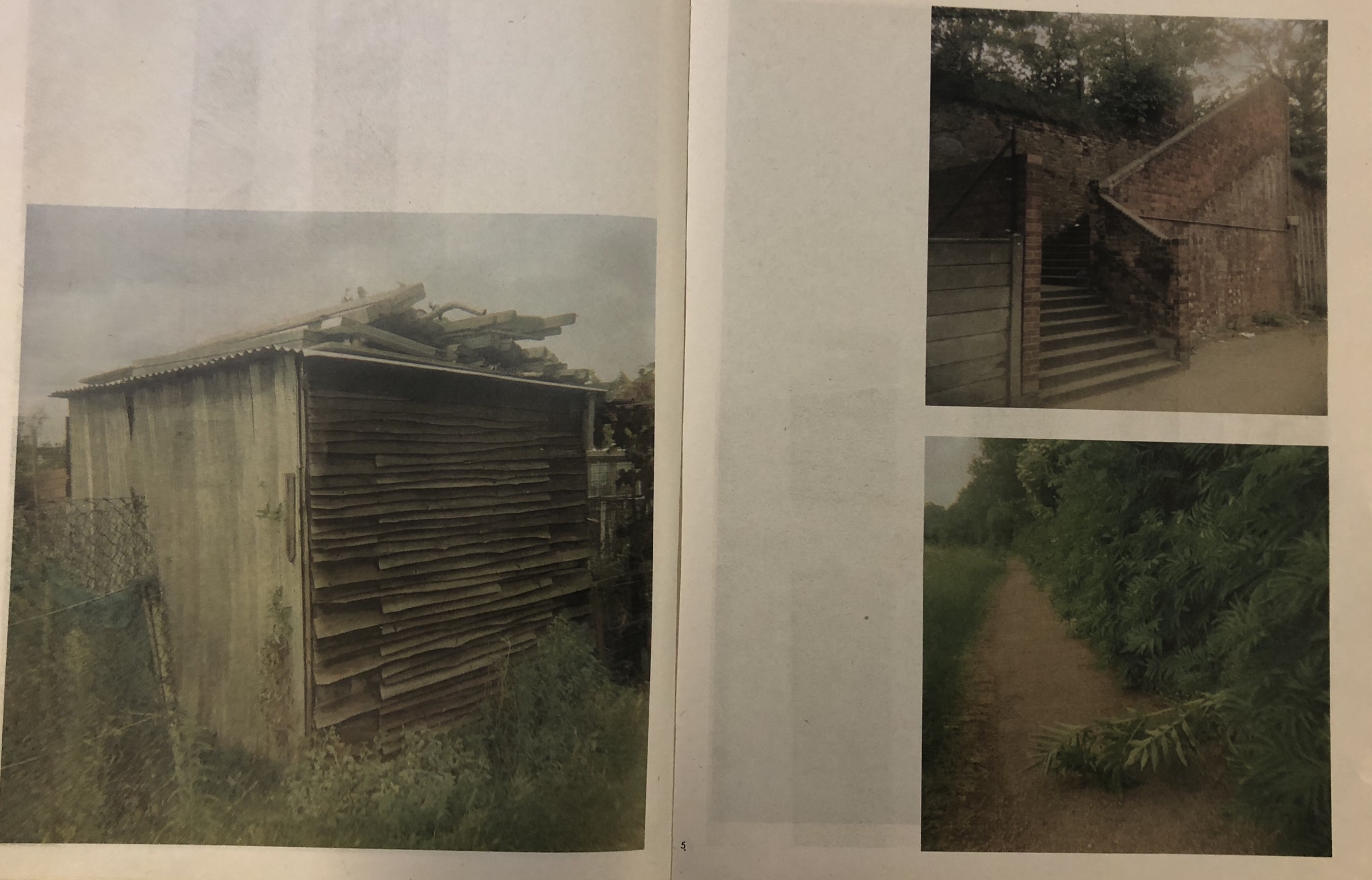
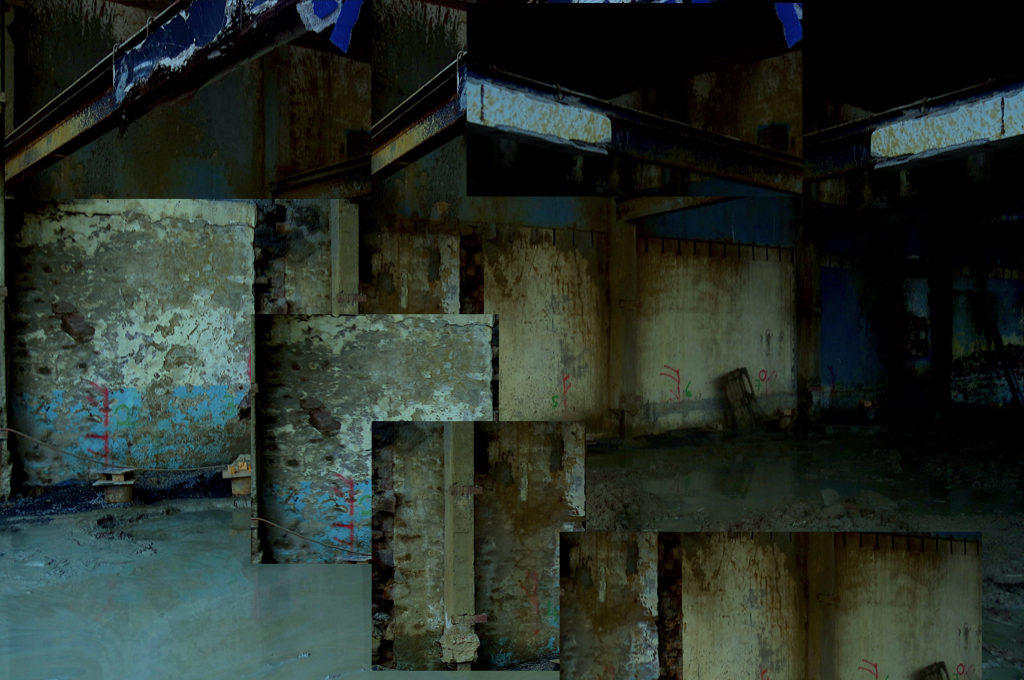
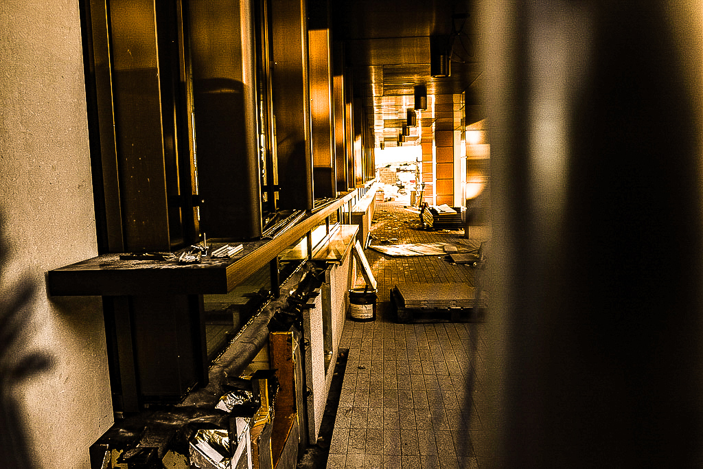
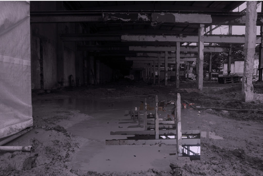
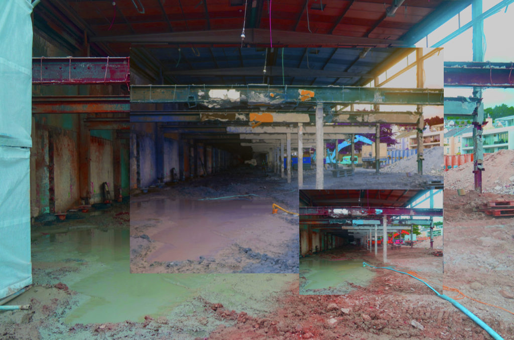
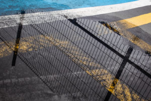
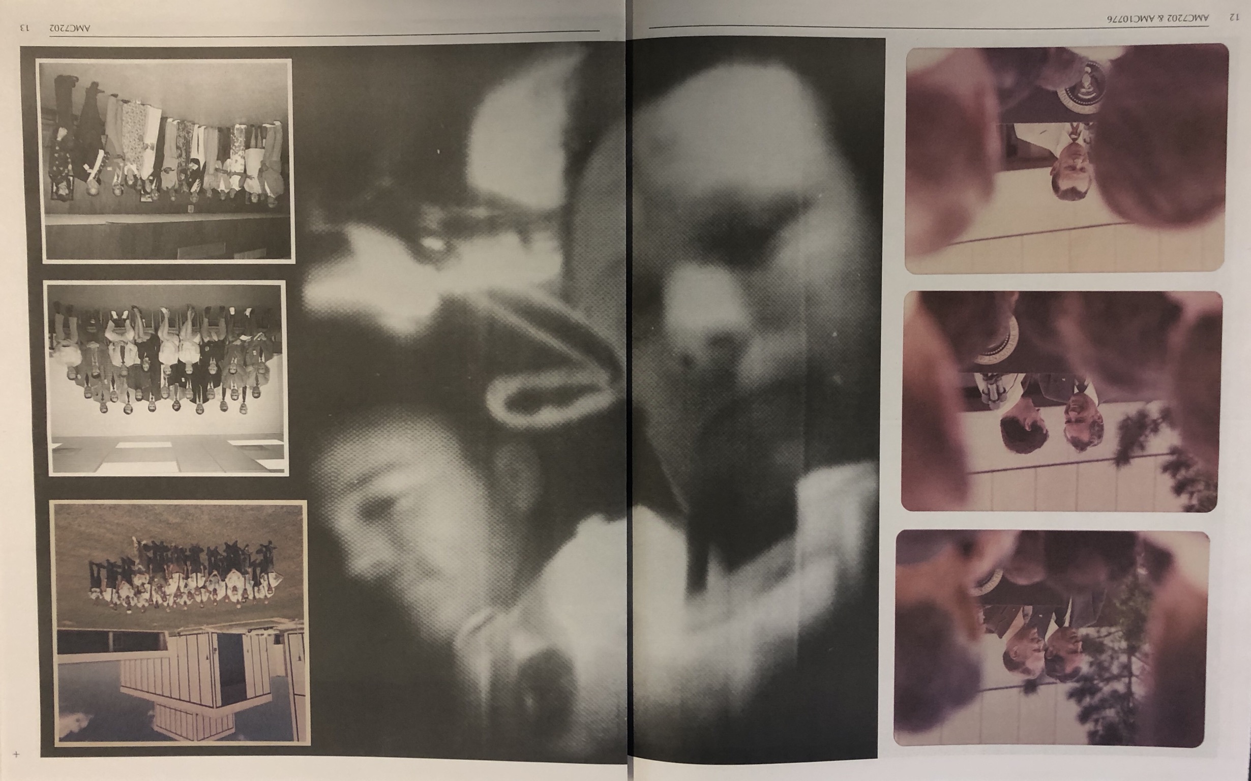
The below design layout is interesting because it uses one photograph over a double page spread which is against the conventions of design. The photograph also has multiple smaller photographs in front of the image to create a montage-style design whilst creating contrast between the colour and the black and white.


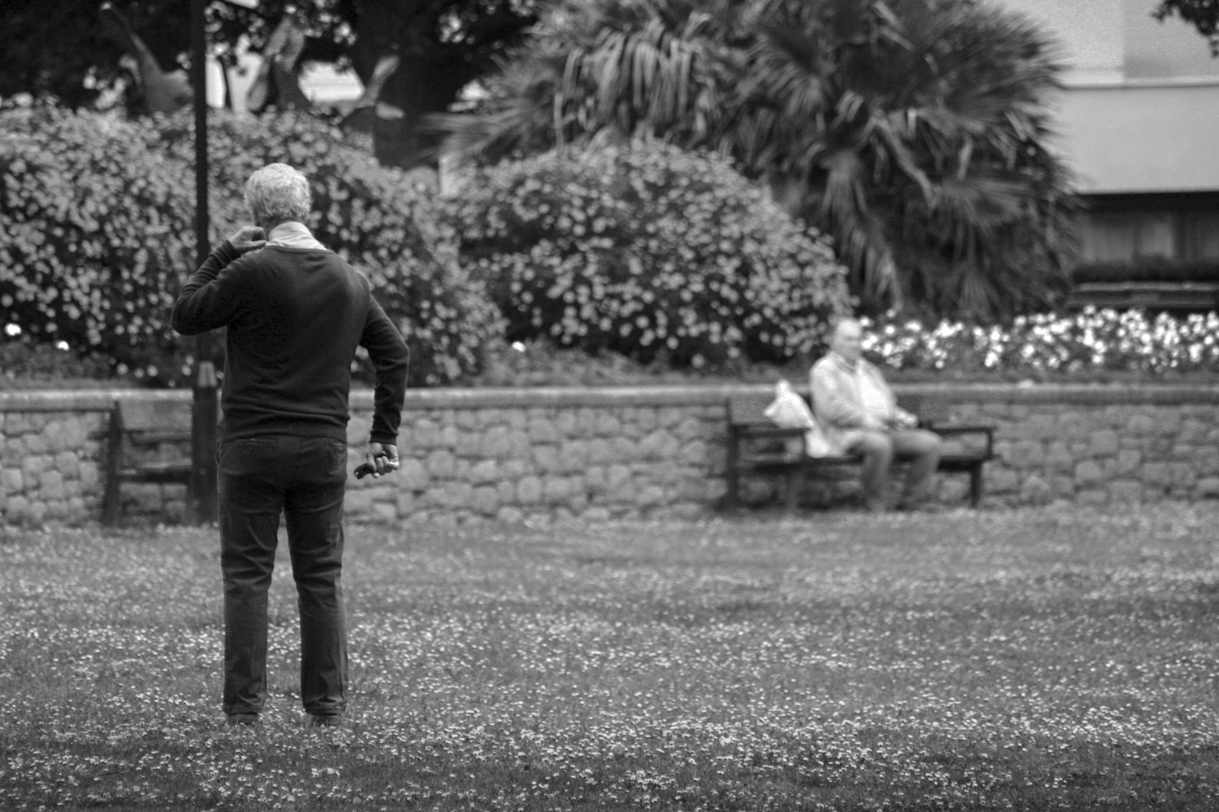
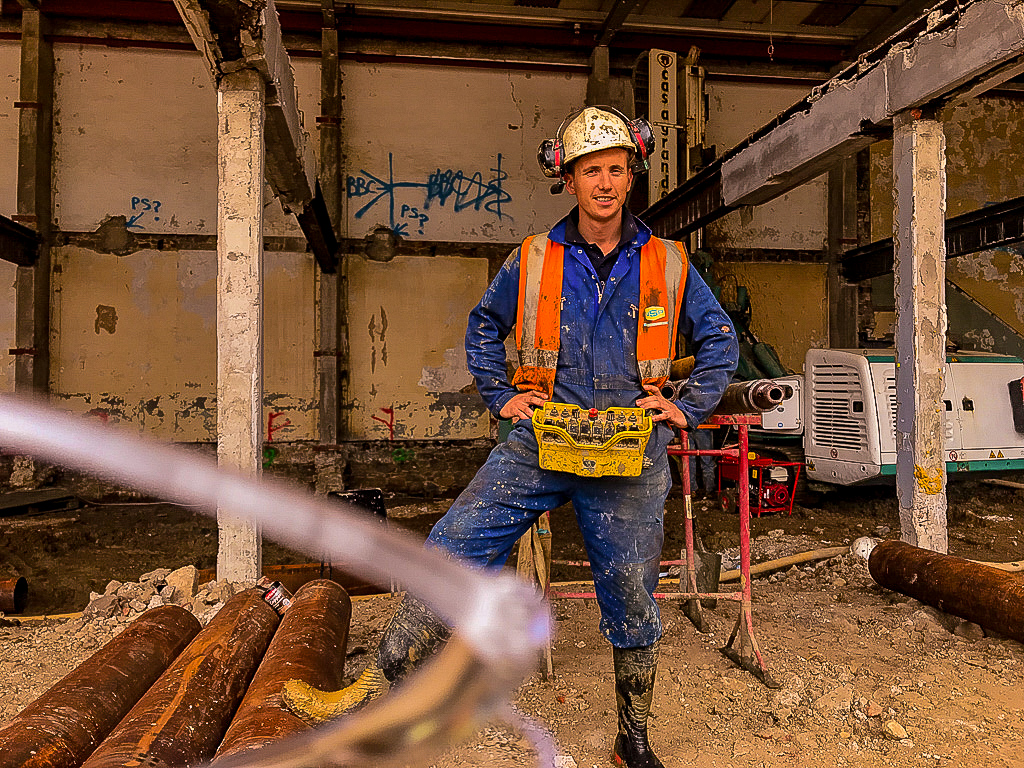
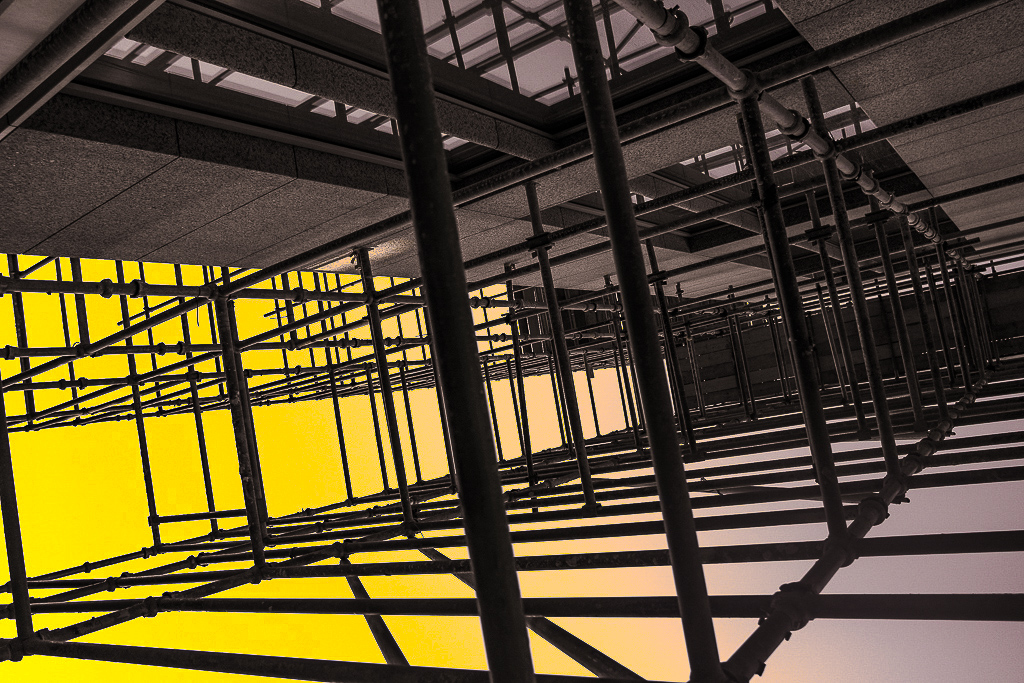
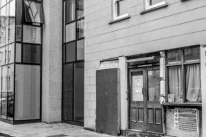
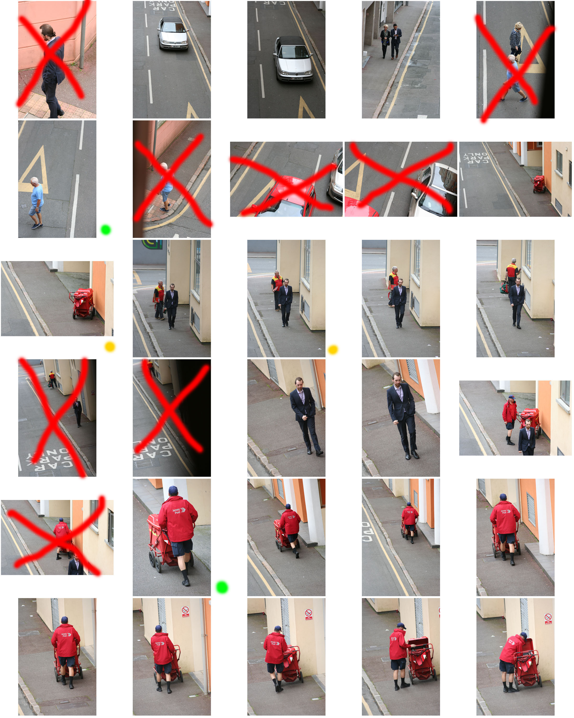
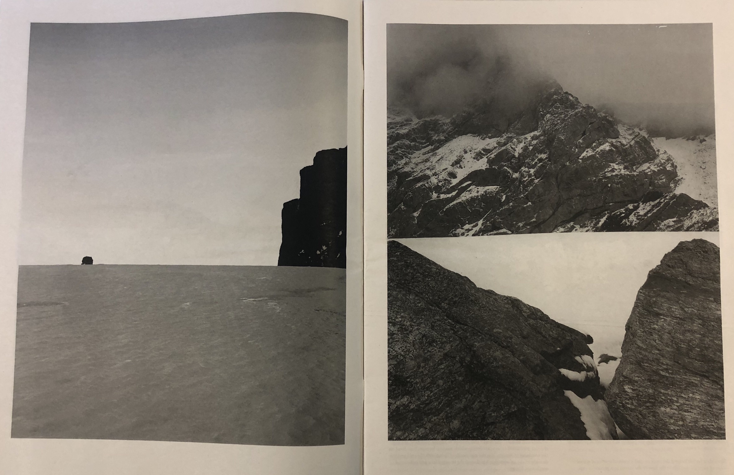
This design layout is more conventional and simple. I like this layout because of the clean borders around the photograph and how it uses larger, blockier designs to create more of an impact. This method helps the viewer to focus on the shapes and tonal ranges in the photographs by looking at the photographs individually.


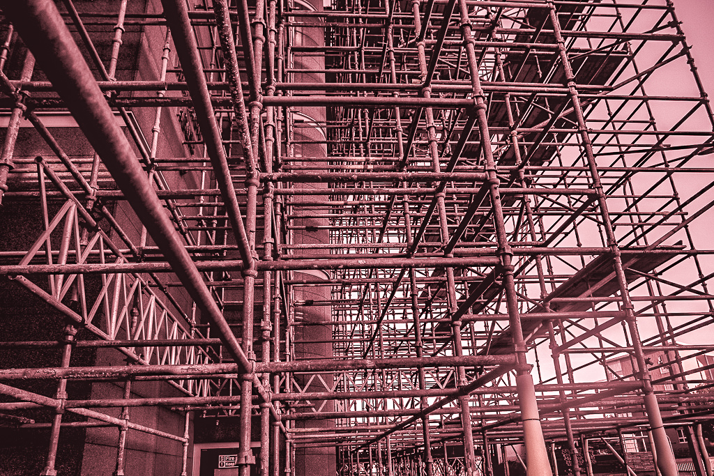
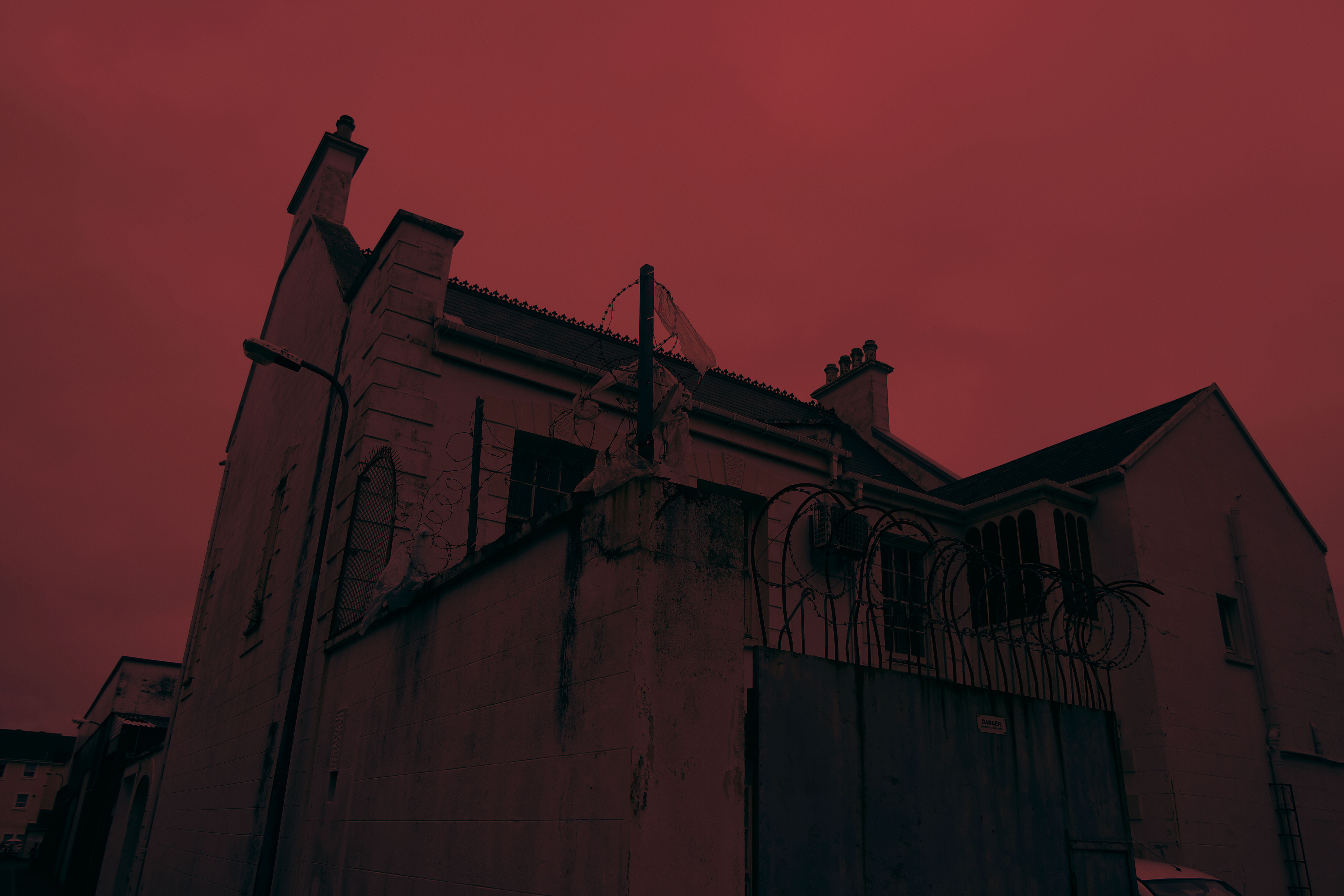
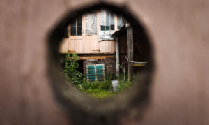
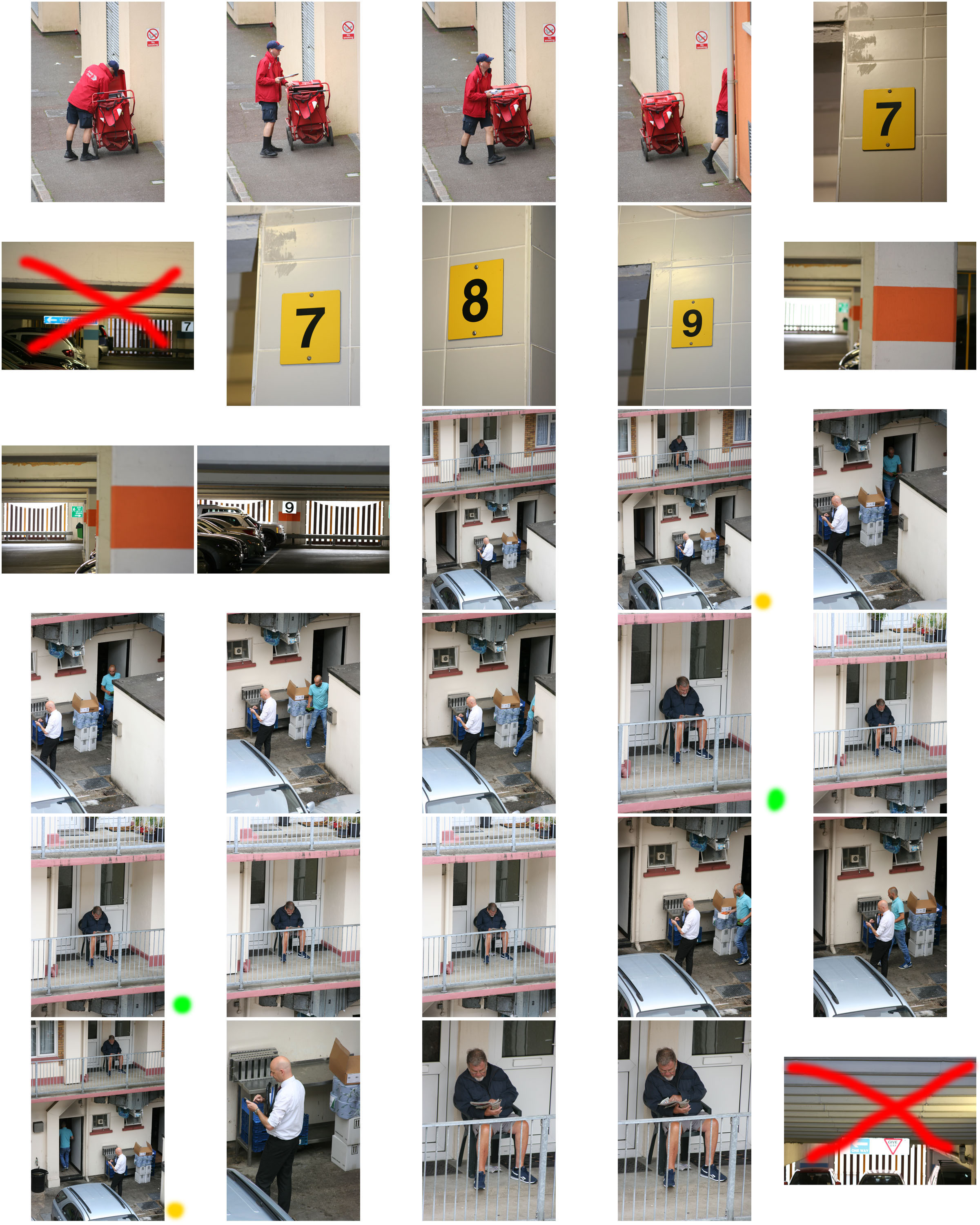
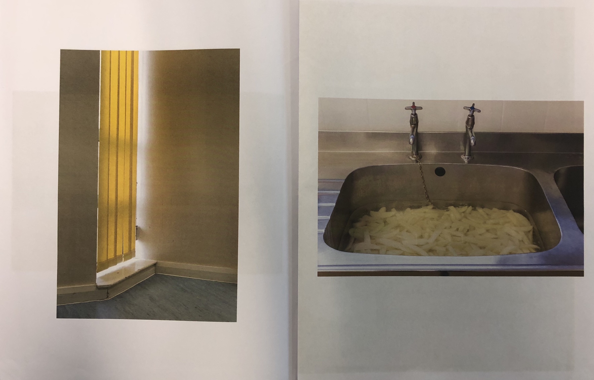
This design layout is similar to the above design layout and has a similar, simplistic effect. The difference is that this layout restricts the design to one photograph to a page. As with the above layout, it creates a structured and effective layout.


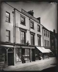
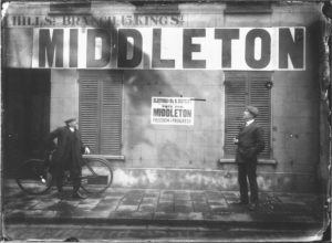
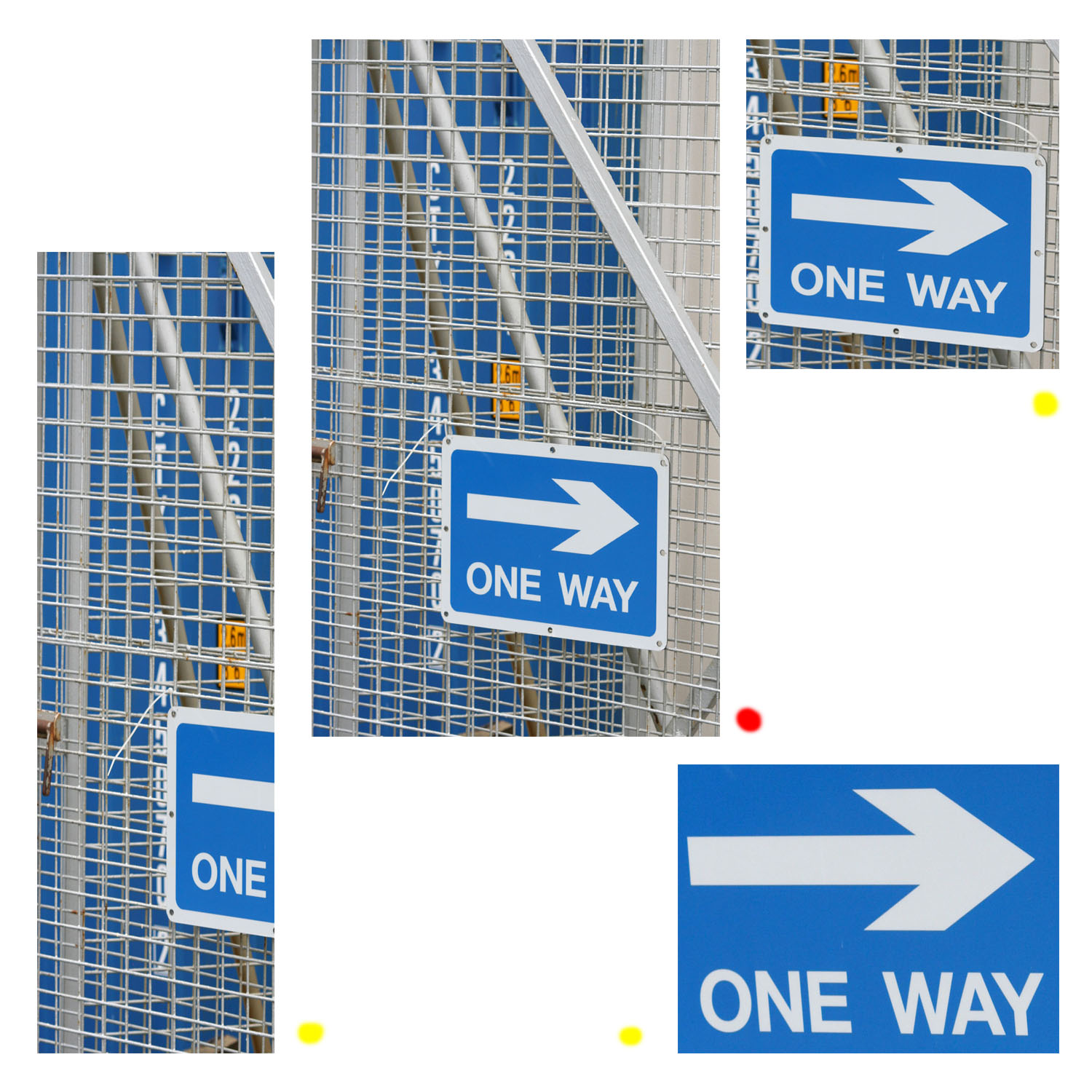
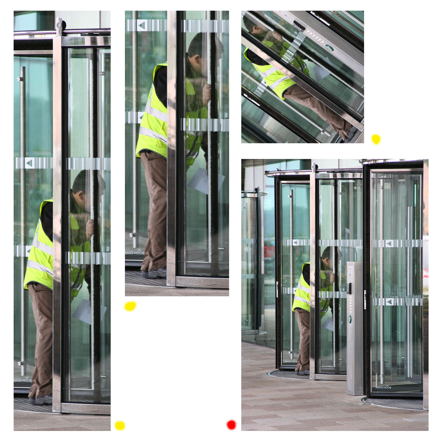
This design layout is interesting because it organises lots of similar photographs – in a typographic style – to create an organised but busy design. The colours in the layout all mix well due to them mostly being primary colours. The structure within the design appeals to me.


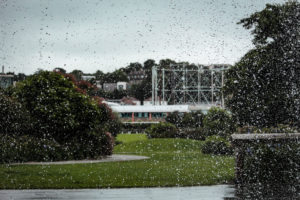
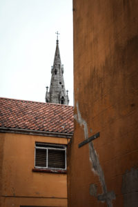
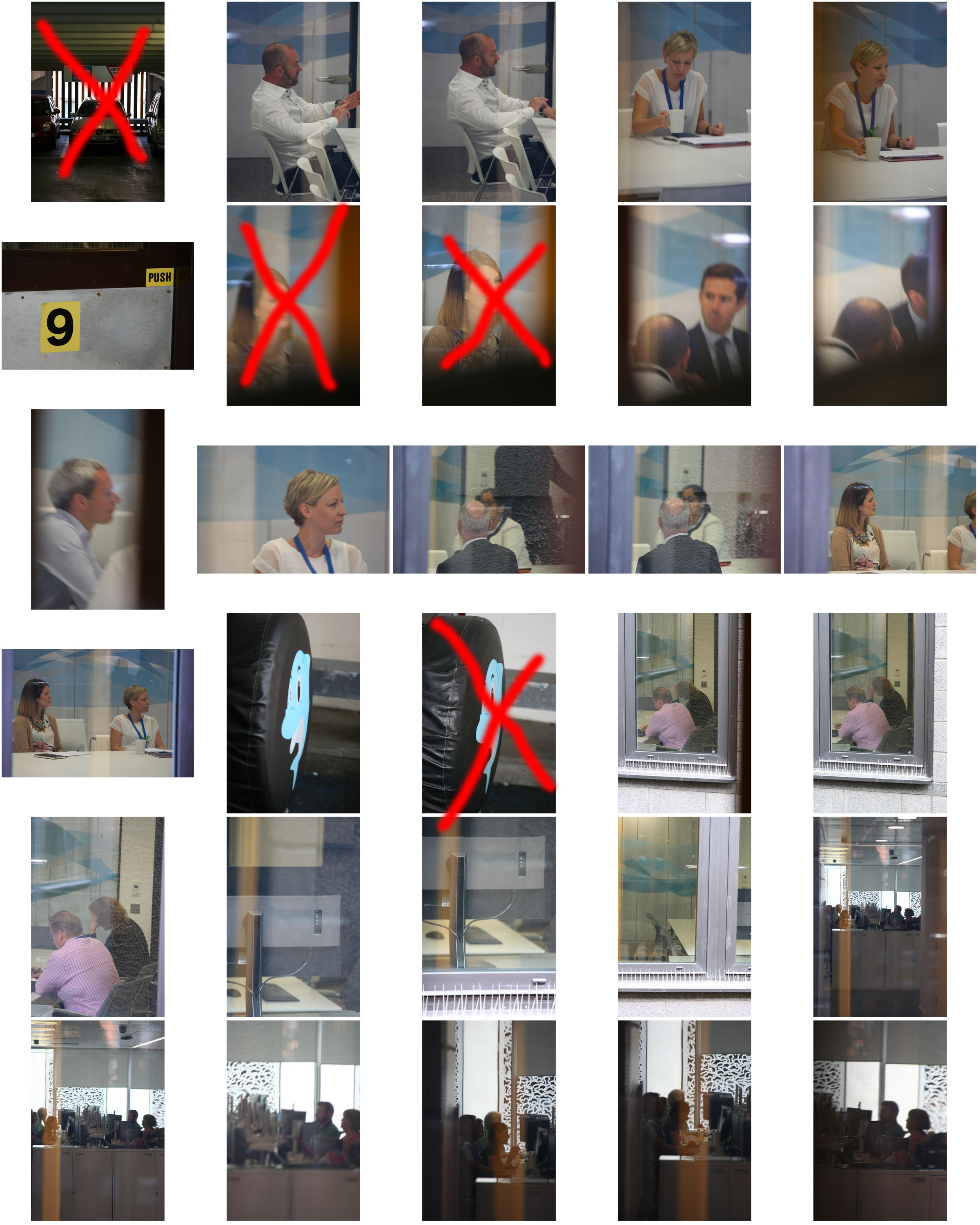
This design layout is similar to design layout two and three in the sense that it uses borders and is simplistic, however this layout goes slightly against the conventions of typical design as the designs are not central, borders are not equal and the design does not seem to gel together well.

Experimenting with Montage

Within these edits  I have merged some of my photography into the archival imagery. This  creates a strong message that our capital is in decline through the architecture that has been left to become abandoned. The archive images are old images yet the buildings look modern and clean however the images that i have incorporated  are new however look old and abandoned. This gives a strong contrast between how St Helier used to be compared to how it has become in the future/present.

Narrative and Sequence of Photos

Narrative structure is about story and plot: the content of a story and the form used to tell the story.  Narrative structures within photography contain a set of photographs which tell a story or explore a theme through either similar photographs or ones that lead onto each other. Below are some experiments of the narrative structures that I have produced with my own photographs.

This narrative structure looks at the dereliction and destruction that is present within St Helier. My purpose for this sequence was to bring awareness to the amount of wasted space that there is within St Helier and portray it as a run down town.

This narrative structure follows on from the previous one and could work well along side it. It looks at the development present within St Helier and emphasizes the change that is occurring within St Helier. Viewers may see this as a positive thing as we are modernizing our town however others would see this as a negative thing as it could lead to the removal of historically important buildings.

Again, this narrative could follow from the previous one. It conveys the contemporary modernization which is present within St Helier and shows what the construction workers have  accomplished.

Black And White Editing Experimentation

Black & White Experimentation

This post displays some of my favorite images from my first and second shoots that I have manipulated in black and white on Lightroom. I believe that the absence of colour in these edited images is successful as it gets rid of any visual distractions that may prevent the viewer from looking at the whole image and missing important elements of the photographs which add to their meaning and context.

From these outcomes I personally believe that images 1,3,5,11,16 and 17 are the most successful of these edits as I believe in monochrome the images are an improvement upon their originals.

1
2
3
4
5
6
7
8
9
10
11
12
13
14
15
16
17

Vibrant Colour Edits

For the colour editing I wanted to ensure all of the images had strong abstract colour effects that were complimentary to the original images themselves. I wanted the colder tones to be on the images with darker shadows and lighter tones on those with stronger highlights.

SAMSUNG CAMERA PICTURES


SAMSUNG CAMERA PICTURES

Final Shortlist of Photos

These are the top 10 images which i have come to the decision that would work best to create a sequence and narrative with. Not only are these some of my strongest images but i have selected them due to the fact they will best help me convey the messages about St Helier which i am passionate about. These messages include the dereliction that is clearly present in St Helier, which makes the town unpleasant. I have also selected some images that demonstrate the construction present to show how this should be occurring on the sites that have been left abandoned.
   

Final Edited Photograph Sequence

The below photographs are the final sequence that I will be using, I feel that the photographs all link into eachother and are edited in a way that strengthens this bond. The sequence starts off with a teddy bear in the shell of a house – this makes the viewer ask questions such as ‘what is the story behind this?’. The next photograph provides a bit more context; it shows that it’s on a building site and is about to be destroyed. The third photograph foreshadows what is to become of the destroyed building as you can see a similar project in the background. The fourth photograph shows the rebuilding of the site. The fifth and sixth photographs show progression throughout the building of the project.

I feel that this sequence of photographs shows the cycle of destruction and rebuilding that St. Helier is going through and shows that this is very much what the future of St. Helier is revolving around.