Narrative and Sequencing Workshop

During this workshop, we learned the importance of the sequencing of images in order the tell a story.  Some of the images I will take may be simplistic on their own but make more sense when partnered with another image.

Above are two examples of a sequence of images by Duane Michals. Changing the order of the images would change the narrative which is why it is important to get the sequence right.

In my project, I want to capture the signs of living such as things people leave behind on the streets or everyday tasks that they complete. For example, clothes hanging out on a washing line is a sign of life as it shows that someone is living there but you don’t know anything about this person.

The theme will not be clear if I choose to partner the wrong images, therefore I want to sequence my images on their pages based on the different aspects of life.

Second St Helier Shoot

For my second shoot, I will revisit the same area from the first shoot but with the aim of capturing a different effect from the different lighting or weather conditions that may occur. I am hoping to visit the area at around 6 – 7pm as there is still natural daylight but shadows will also appear as the sun is close to setting.

It is also important to keep a sharp eye as there may be details that I missed from the first visit or an event may have occurred to cause the environment to look different.

I decided to focus on the large buildings such as the tower block and the churches as I thought the light would hit them better and shadows would become more visible.

The area was not busy which meant I could get wider shots to capture the whole of the buildings.

Experimentation with Colour, Cropping and Montage

Cropping


My main aim when cropping my images was to ensure the focus was on whatever the important subject was in the image so as to draw the viewers attention to it.

I took the same image and cropped it into to create 3 different versions that focused on different aspects of the original image. The top two images demonstrate the buildings abstract structure whereas the bottom image focuses on the detail of the window and what is inside.

I also explored changing the image into a negative to see what tones would be emphasized. In this edit, the cracks of the walls stood out.

Colour


For this image, I first increased saturation to bring out the luminosity caused by the blue blur of the bar just outside the right side of the image. The green and blues on the left and right side of the photo puts focus on the man wearing the neon jacket in the centre. I cropped this image into a square so as to present the lined architecture that spirals into the subject in the centre.

Changing the hue of the photos gave a more abstract feeling where in the first image I desaturated it and increased contrast a small amount to give a softer effect for the theme of hanging out laundry in everyday life. In contrast, the second image has an increased saturation to represent the psychedelic theme of alcohol and other substances that appear.

Montage


Using a selection of images in colour, I cut up sections of scaffolding from Convent Court, the tower block across the road from St Thomas’s Church and placed them over the church itself. The contrast in colour reflects the two important and different aspects of the future of St Helier, construction and religion.

St Helier First Shoot

For my first shoot, I want to explore the area given to me. I am already familiar with the area as I live in it meaning that I have an understanding of the daily events that occur there.

I will use the flash on my camera in the same way Tom Pope did in order to achieve a strong vibrance of colour in my images. I want my images to have a high exposure but not overexposed, so that I can choose to edit them into black and white images like Albert Smith’s work if I feel that it suits the image.

At this stage, I have no clear intentions of what the meanings behind my photographs will be. Instead, I will focus on details that I see in the subjects I photograph. I will compose my images carefully depending on the way I want to portray these subjects.


Classic and Contemporary Photographer Inspirations

Albert Smith


Albert Smith is the best known and probably the most prolific of Jersey’s early photographers, although a significant number of pictures attributed to him, and particularly those used for his postcards, were taken not by him, but by employees or by Ernest Baudoux, whose business he acquired when he arrived in Jersey from London.

Not all of Albert’s photographs were taken by him personally, however they are all attributed to his business. Many are overtly commercial, but others constitute a fascinating documentary of life in Jersey in the late 19th and early 20th century. Although an early advertisement promoted portrait photography in clients’ homes, Smith, unlike many of his contemporaries in Jersey was not predominantly a portraitist. He preferred to work out of doors, photographing groups on carriage and charabanc outings.

Image Analysis

This image shows the Royal Visit of King George V and Queen Mary in 1921 where they were presented with the Jersey cow at a cattle show at Springfield. The Jersey Cattle Breed is famous for its high butterfat content of milk and lower maintenance costs attending its lower body weight, as well as its genial disposition. The image appears to be over exposed, allowing the dark tones to become more contrasted. The focus is maintained on the cow as it is in the forefront and is shown to be observed by the other subjects in the image. The image is in black and white as it wasn’t until 1935 when Kodak brought out Kodachrome, a 16mm color film, that colour photography became more common.

Tom Pope


Tom Pope is an award winning photographer born in Bristol, UK in 1986. Acting as the 2015 Archisle International Photographer in Residence for Jersey, he produced the work “I Am Not Tom Pope, You Are All Tom Pope”.

“The work I intend to carry out in Jersey will explore notions of play and how we conduct ourselves in public. Gathering inspiration from the Société Jersiaise Photo Archive and collaborating with the Jersey community, performances and situations will be initiated where the act of taking and making photographs becomes a social event.”

Image Analysis

The image features a figure chopping wood with an axe. This is mysterious and intriguing to the viewer as the image is cropped to not reveal who the person in the image is. This similar technique is used in many of Tom Pope’s other works. A vignette appears across the top left side of the image due to the use of a flash which places the focus on the subject. The image feels almost dynamic due to the scarf hanging down before the swinging axe.

Pope’s use of flash brings out the contrast of colour in all of his images, allowing for the subject to become more important in the foreground.

When producing my work to represent the future of St Helier, I want to use the flash in the same way Pope used to bring out the same vibrance and contrast of colour.

History of St Helier and My Chosen Area

Saint Helier is Jersey’s capital town and the most populated of its 12 parishes. It is home to the States Chamber, where the island’s parliament meets, the Royal Court building and most major administrative departments. It also has the island’s main port, public markets, a number of major public parks, most of the important public monuments and statues. Although for some time before the development of St Helier Harbour, Saint Aubin was arguably the most important town in the island, St Helier has always been the capital, and since the early 19th century it has grown into a bustling town and commercial centre and, until the advent of air travel in the mid-20th century, the island’s principal gateway.

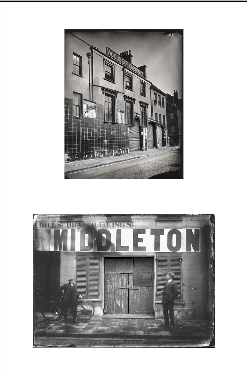
King Street is the heart of St Helier and its main shopping area. This was not always the case, because it was once a back street (Rue de derrière) with open marshland behind. Today it is a thriving commercial precinct, its Victorian properties commanding substantial rents.

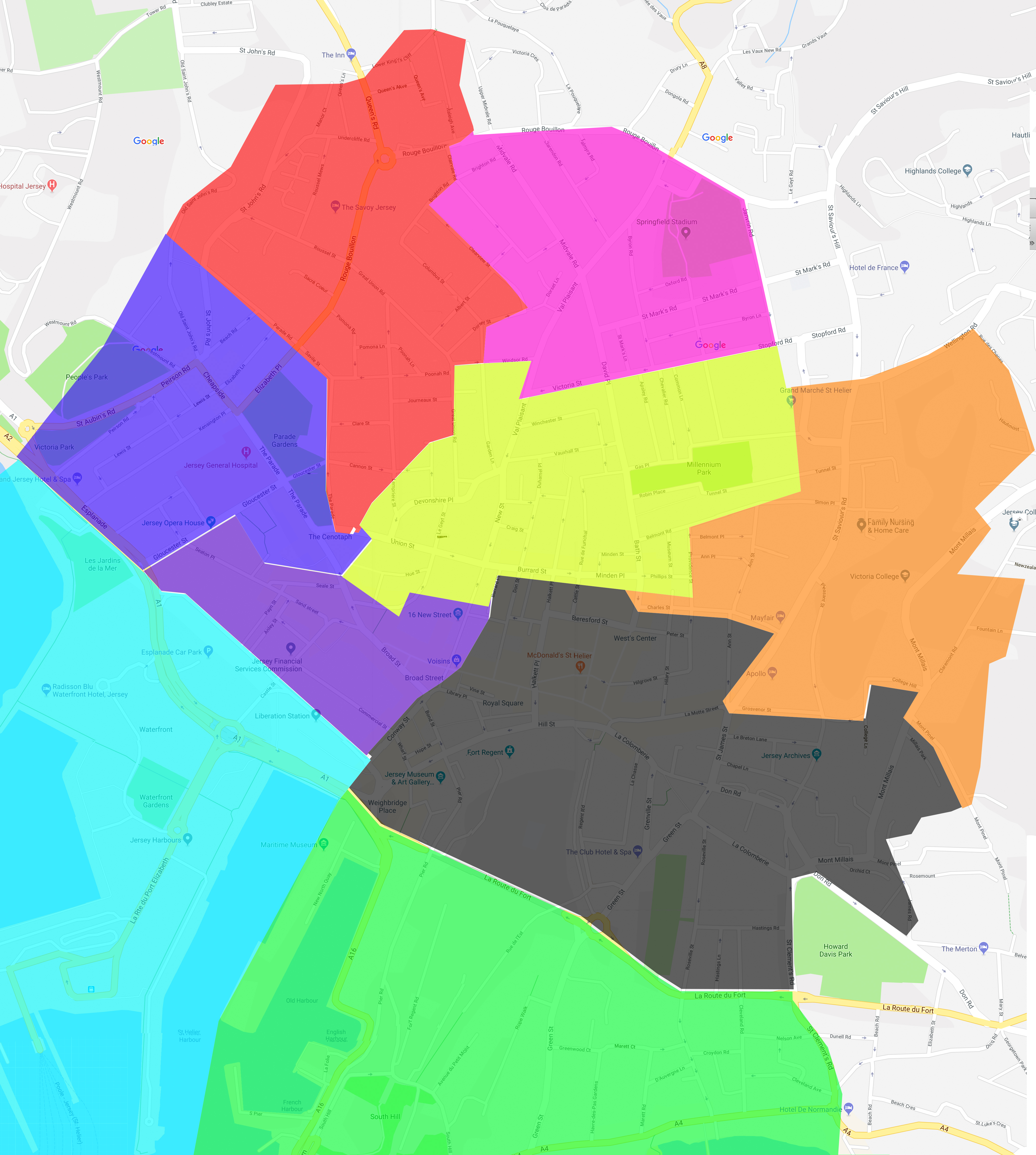
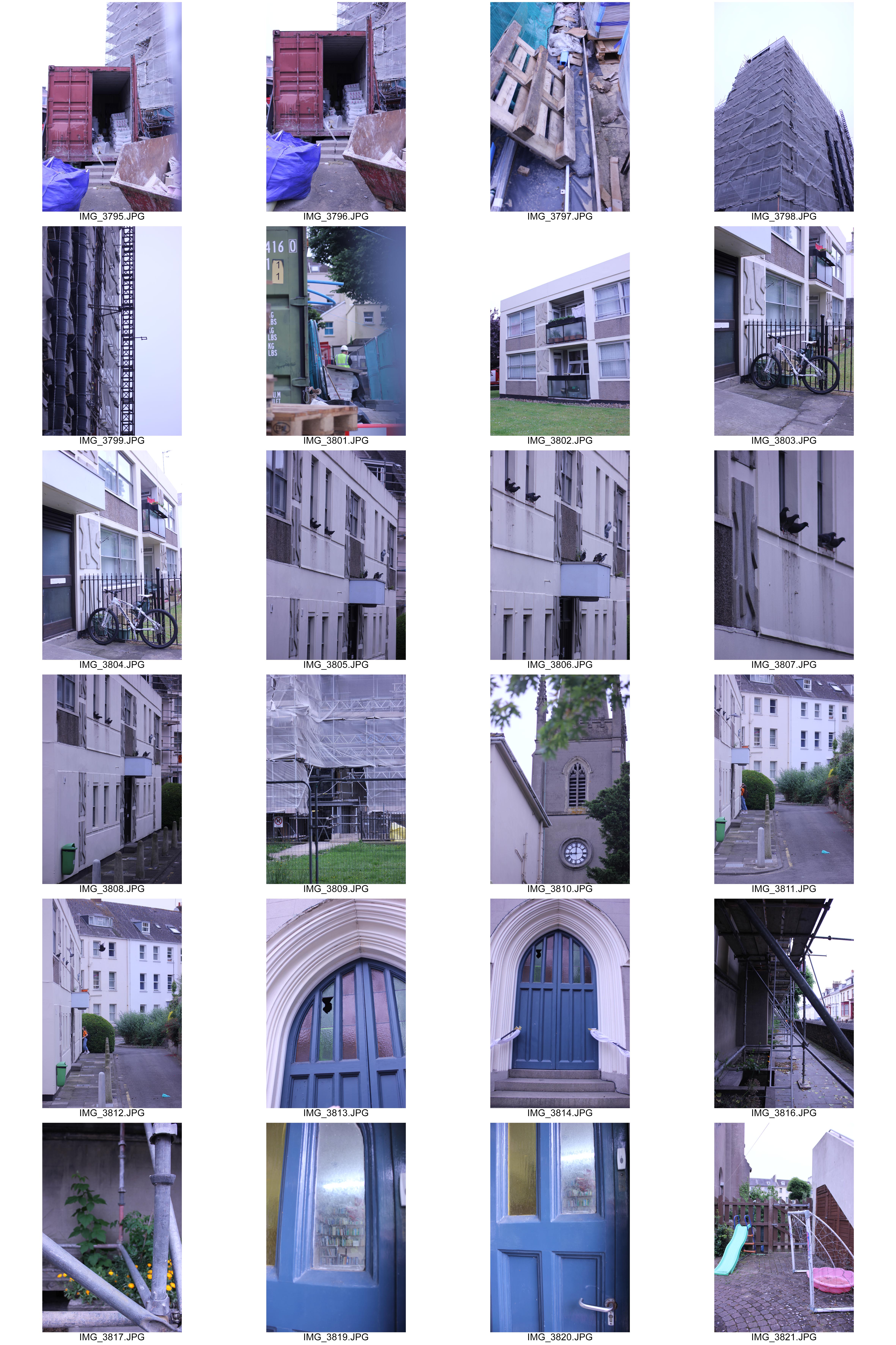
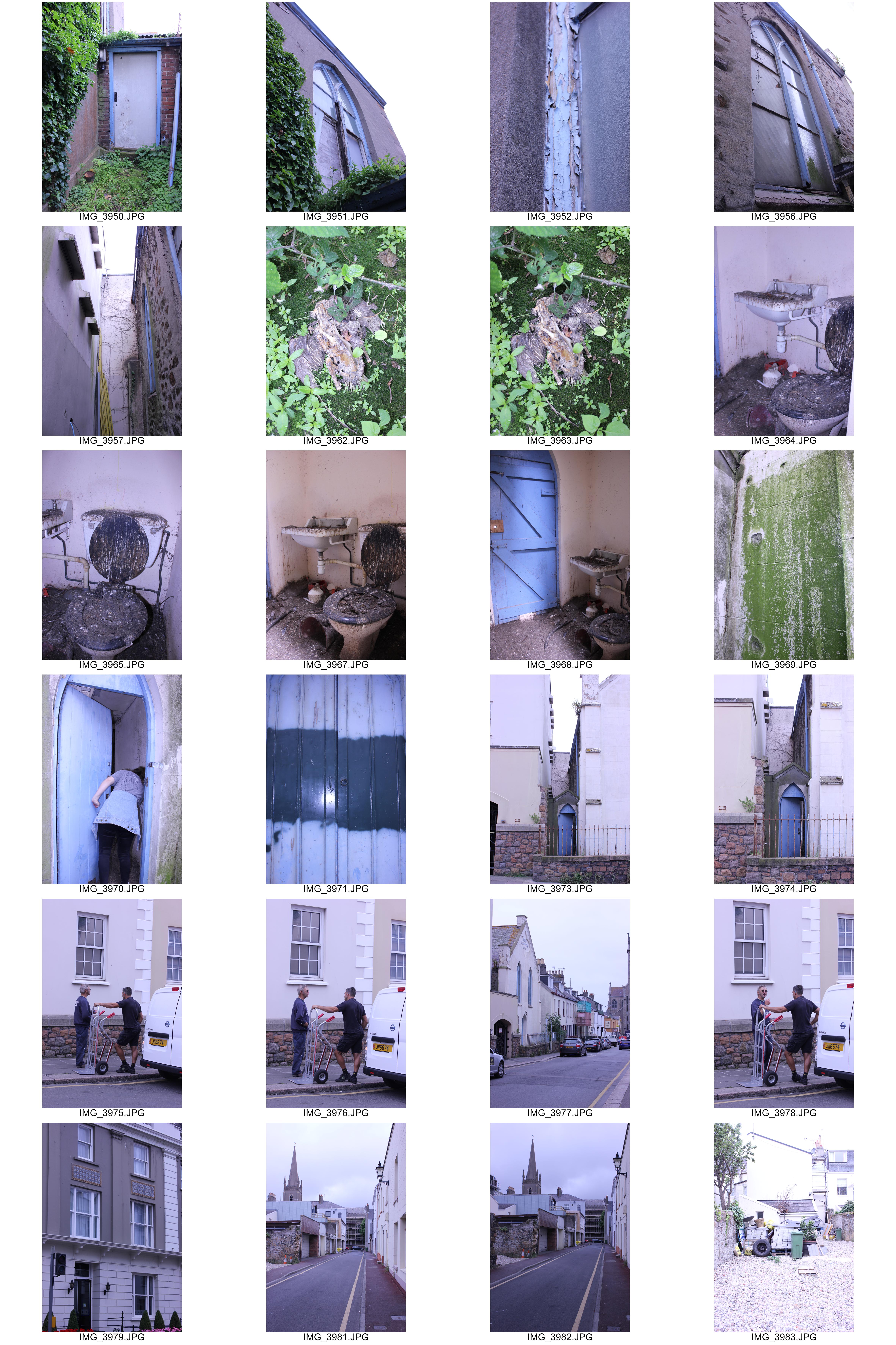
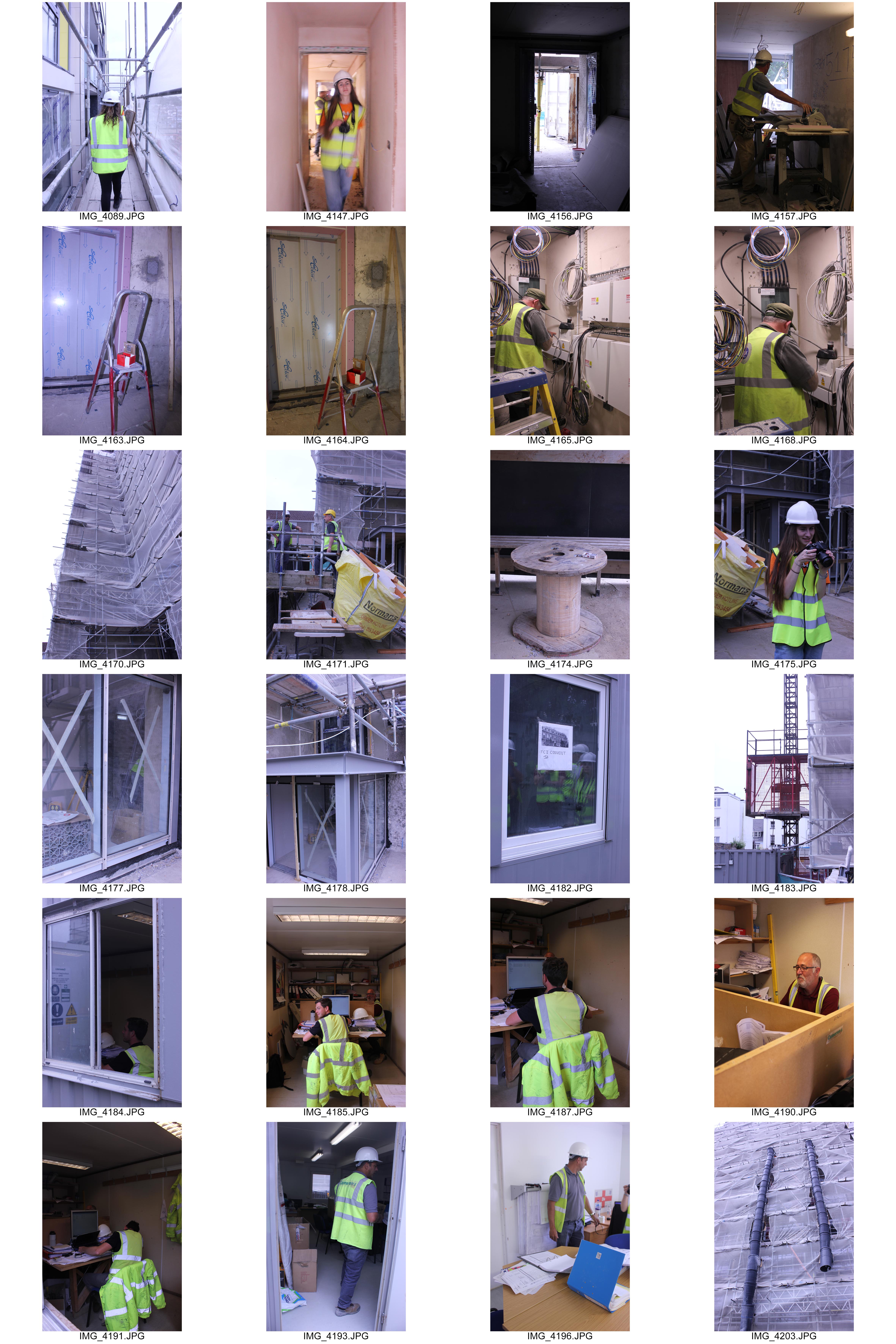
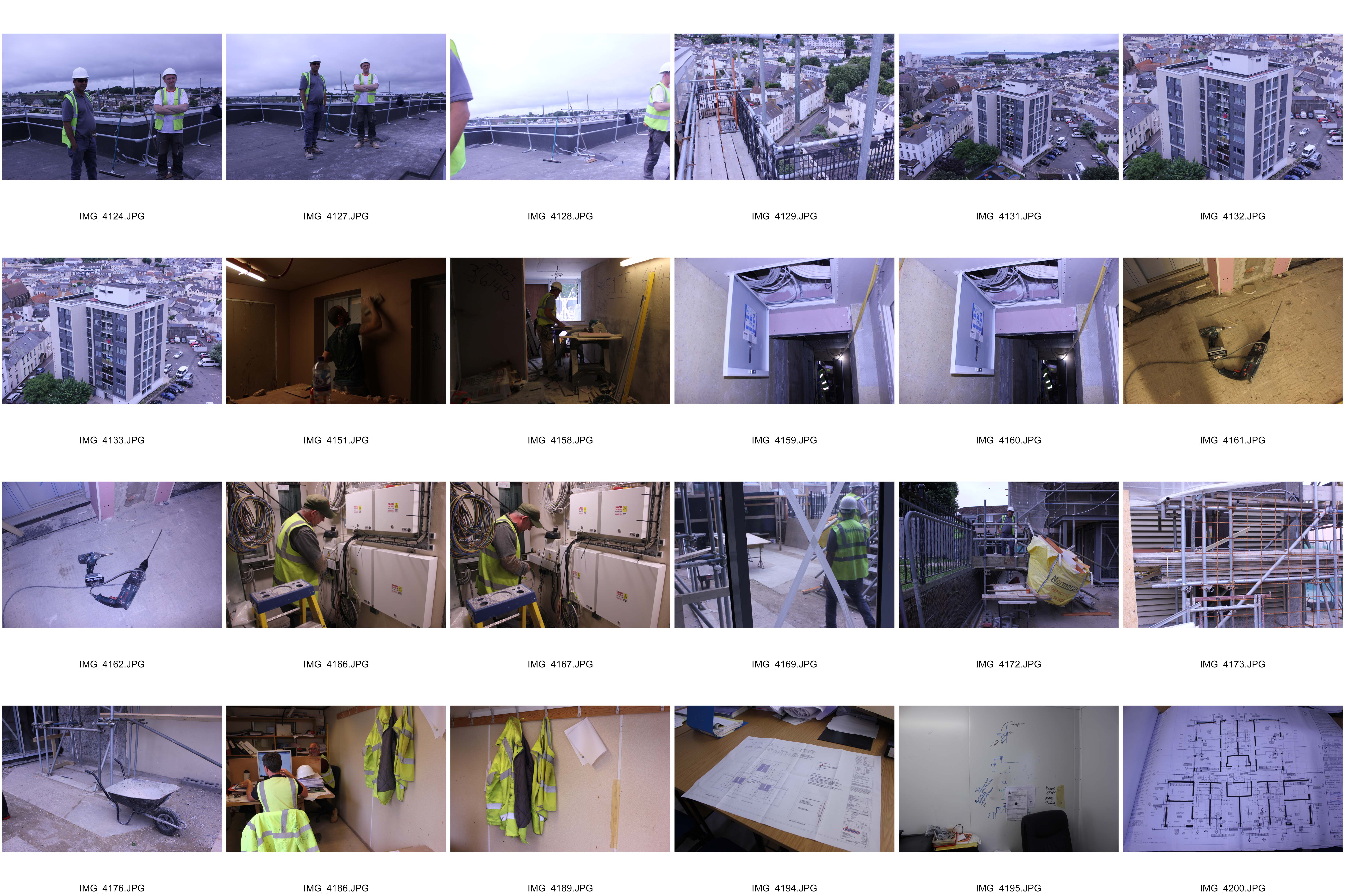
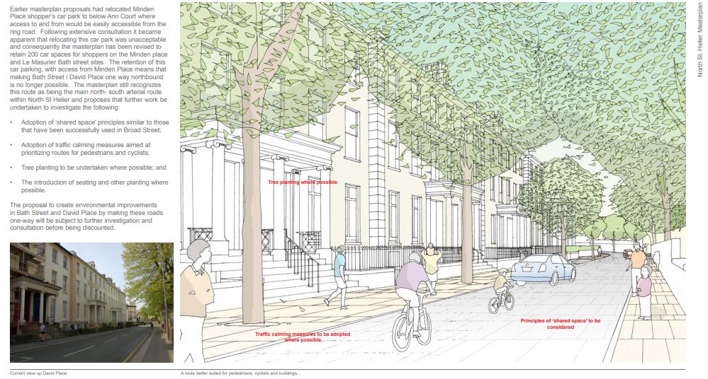
The area given to me was the pink section, this area features roads such as Midvale Road and Val Plaisant and landmarks such as Springfield Stadium and St Thomas’s Church.

St Mark’s Church

St Mark’s Church, located on St Mark’s Road, was opened in 1844 after recognition of the need for a new church in the area by Francis Jeune, the dean of Jersey at the time.

The licence for the opening of the church read:

‘Know ye that whereas the population of the Town and Parish of St Helier has greatly increased and that many faithful persons are deterred from worshipping God…..certain members of the Church of England desirous of promoting the glory of God…..have at full cost erected and completed a suitable building by the name of St. Mark’s Church’

For the first fifty years of its existence, St. Mark’s was always full and often there was a waiting list of people anxious to secure seats. The Dean worked out all this and calculated that 70 shares of £50 each would provide a worthy building and at a meeting called on 16th May 1842 he laid out his plans. He offered to take up 16 shares (a considerable outlay for those days of £800) and to make the pews that came to him from six of those shares free. The plans were accepted; all the shares were disposed of in the next few weeks and, on 1st August the foundation stone was laid by the Lieutenant Governor.

A few weeks after its consecration by the Bishop of Winchester on 6th August 1846, the visit of Queen Victoria brought the church into the limelight. A triumphal arch of welcome was built across David Place.

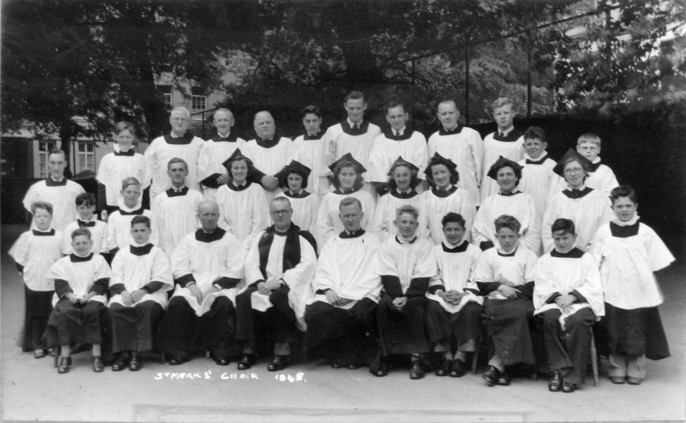
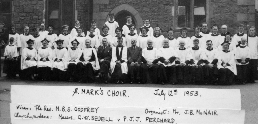
>Members of St Mark’s Choir in 1953 and 1948

>Previous Vicars at St Mark’s Church
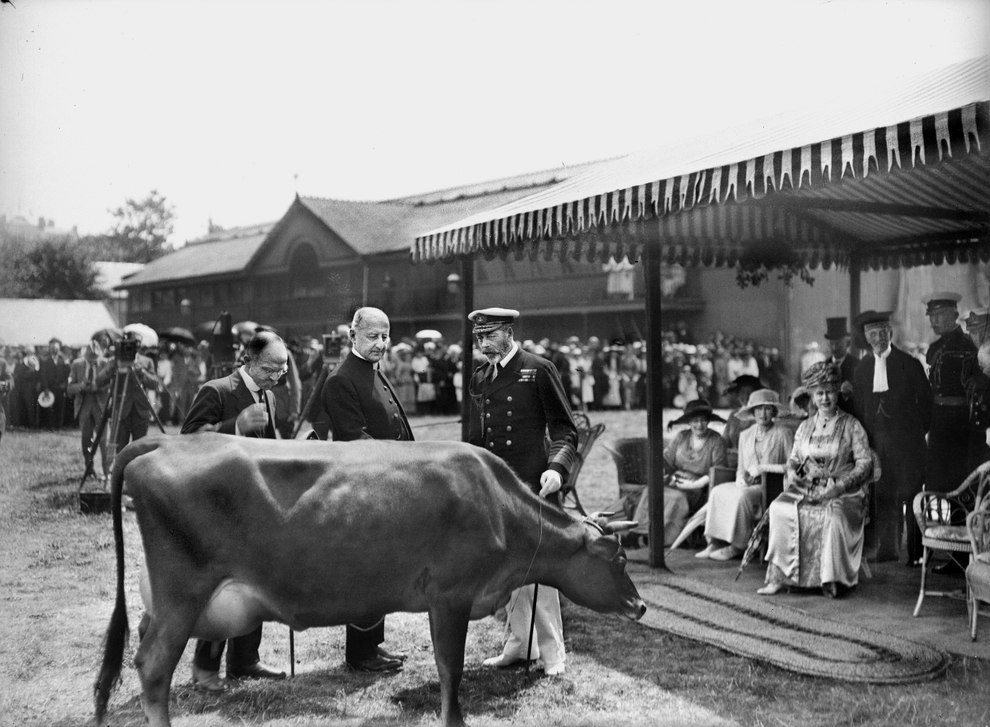
Springfield Stadium

Springfield opened in 1885 and began as the venue for agricultural shows, as well as hosting social and sporting events, including the Battle of Flowers. The Royal Jersey Militia used the ground as a parade ground from the early 20th century, and the hall was taken over by the military at the outbreak of the First World War.  The Springfield Ballroom was venue for concerts in the 1960s for acts such as The Beatles and Rolling Stones. In Modern Use, Springfield’s main pitch is used mostly for football matches and is the headquarters of the Jersey Football Association.

>Island Cattle Shows taken place at Springfield.

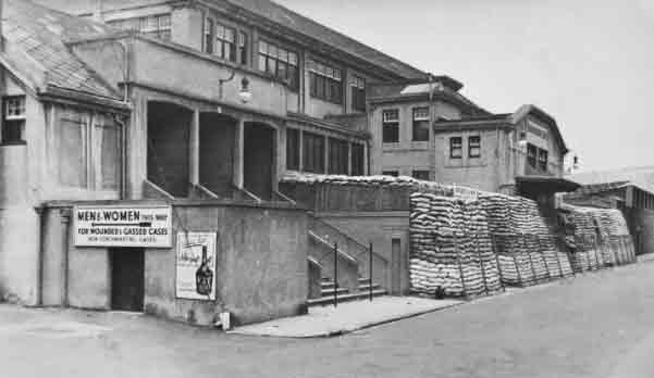
>Springfield during the War.
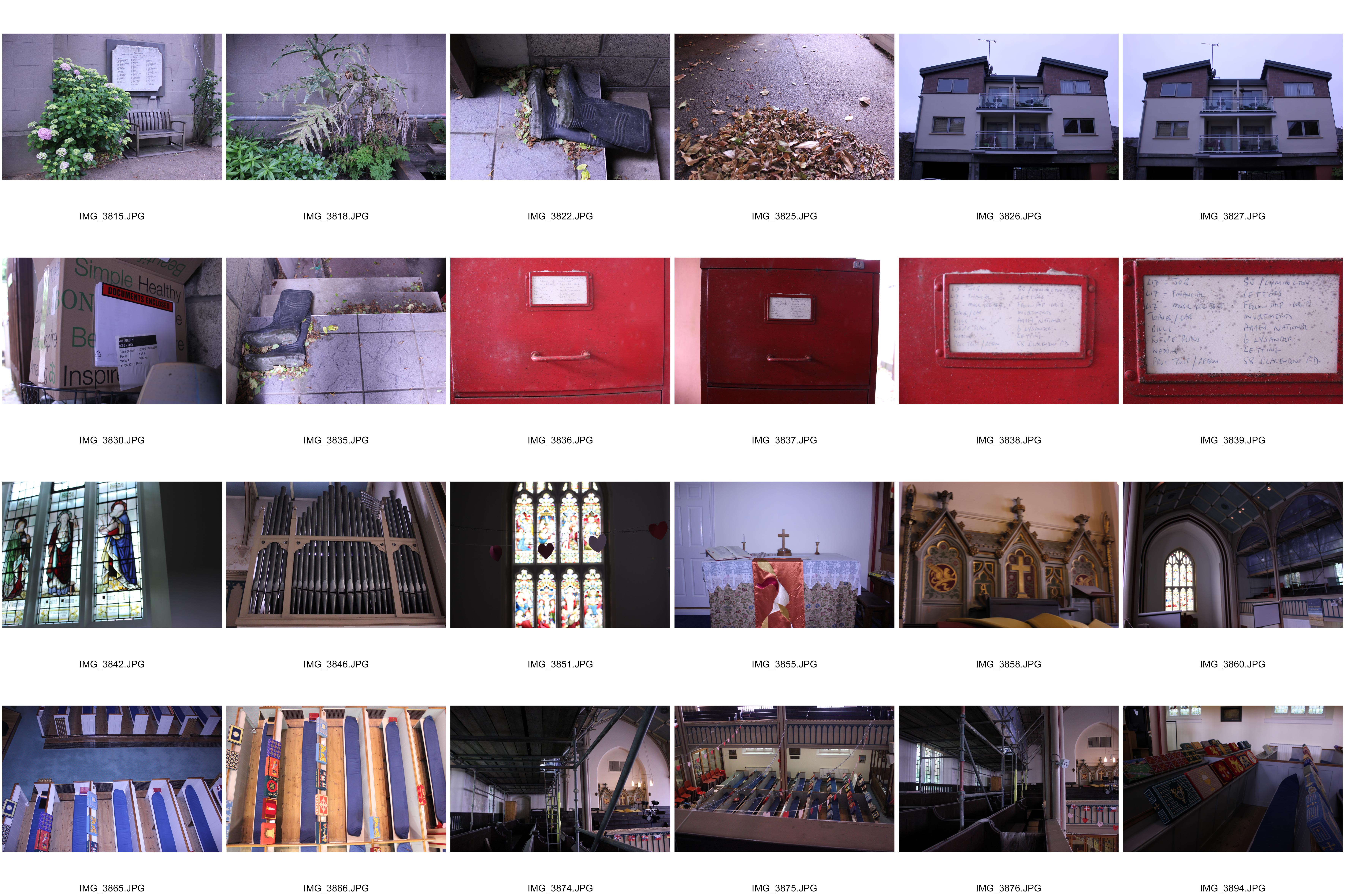
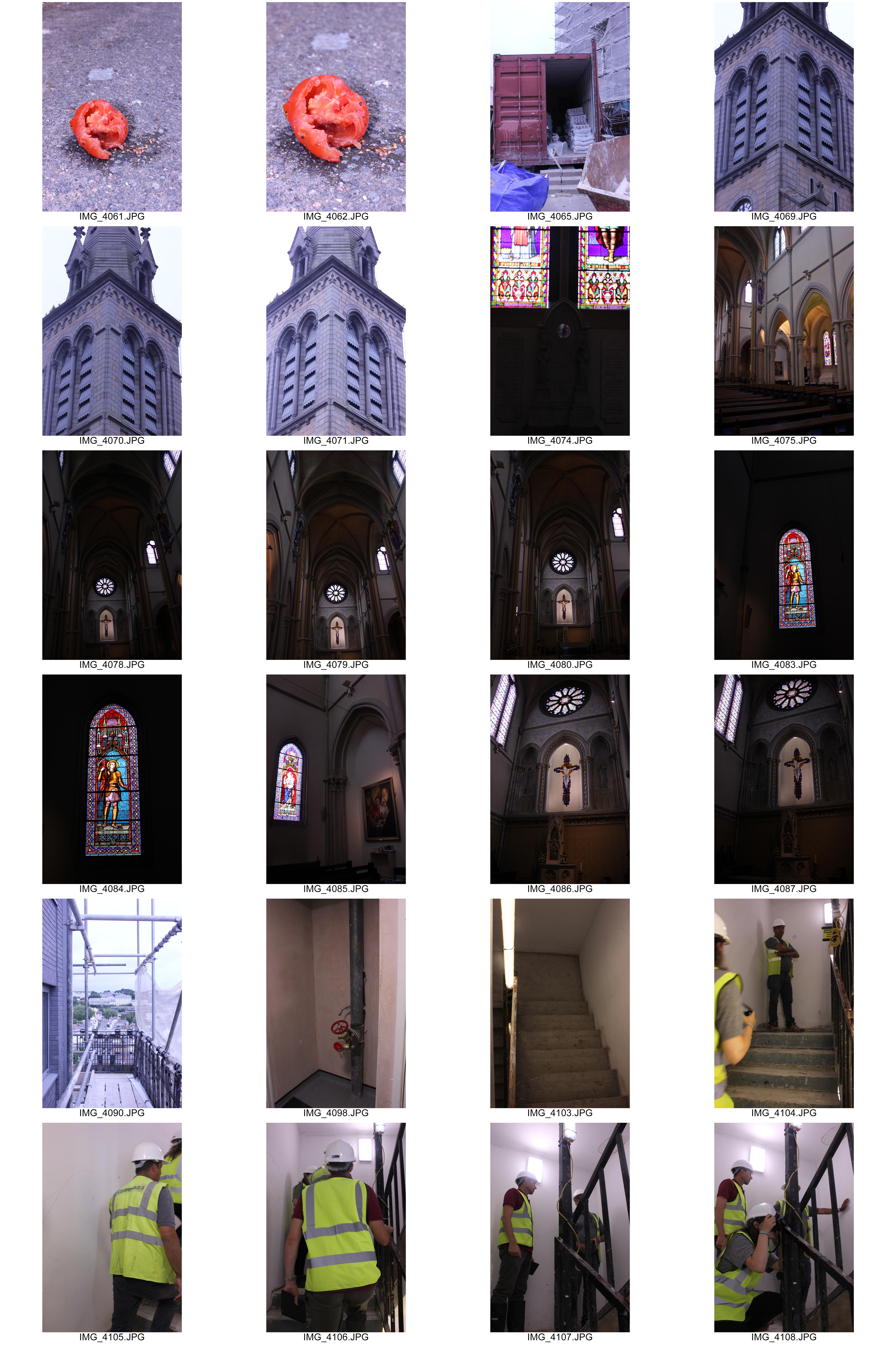
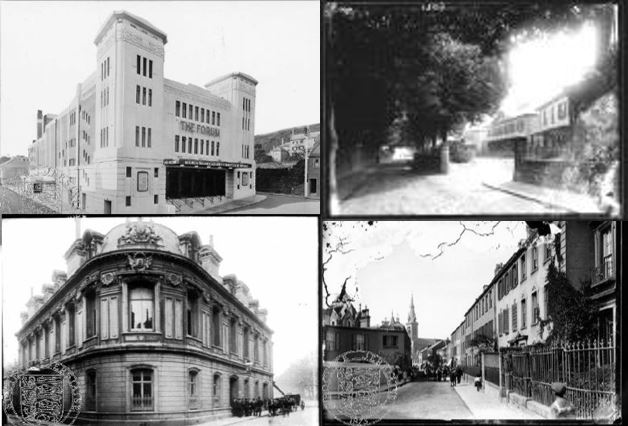
St Thomas’s Church

St Thomas’s Church opened in 1887 but was consecrated in 1893.

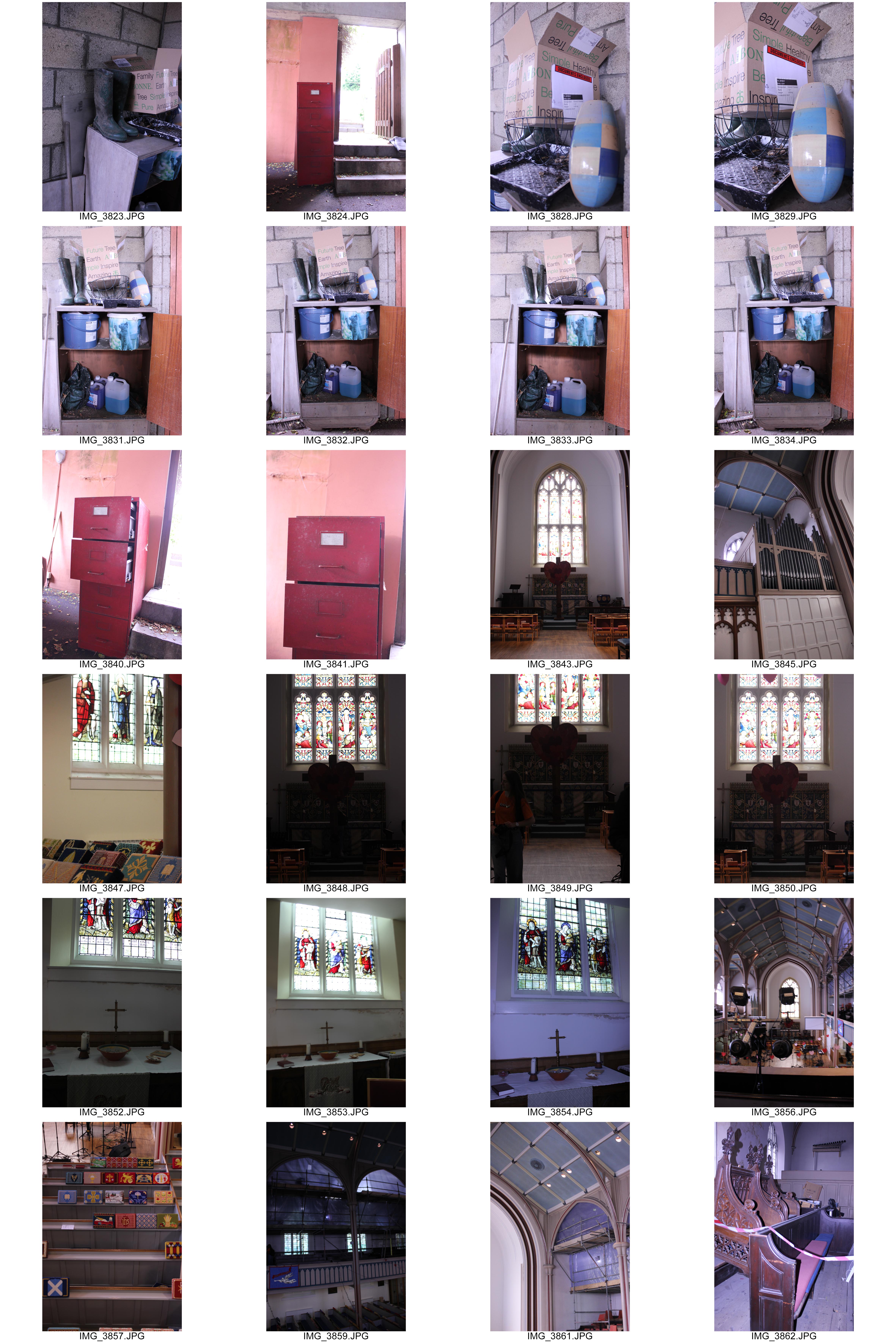
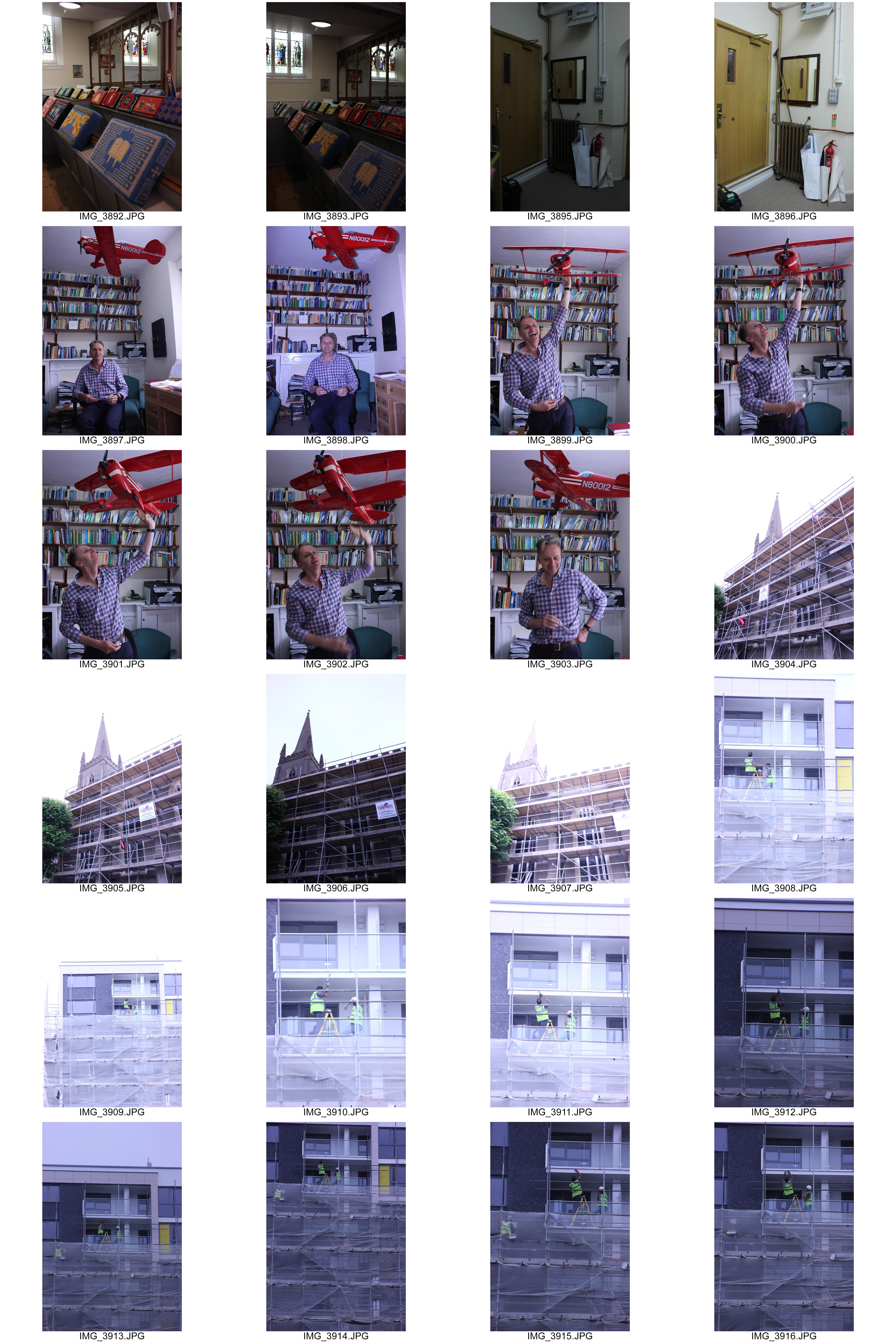
St Thomas’ Church is constructed in the 13th century style and comprises nave, aisles, transepts with chapels forming the arms of the Cross, and a chancel. Two small chapels lengthening the lower sides westward have the appearance of chancels to either aisles. On each side of the tower are two other chapels with groined vaults of a very pleasing effect, that at the south end having a deep recess in the centre of which stands the baptismal font.

>An architect’s drawing of the church published to coincide with the laying of the foundation stone in September 1883

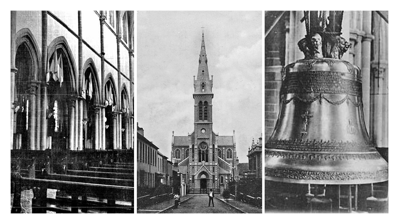
>Images of the church, including a frontal shot taken by Albert Smith


What is a Masterplan?

A master plan is a dynamic long-term planning document that provides a conceptual layout to guide future growth and development. Master planning is about making the connection between buildings, social settings, and their surrounding environments.

Masterplan’s of St Helier influence the development of more housing and apartments to cater for the growing population. They propose pedestrian improvements that allow for connections of streets and calmer traffic.

Above are two examples of masterplans for the David Place and Town Park Area.

My Views on the future Of St. Helier

Finance Industry


Taken from the Most Recent Census of the Island, Jersey in 2011.

Jersey’s biggest industry is in Finance, with 25% of full time working adults being employed in that area. The decision to introduce new financial buildings in the area of St Helier is to cater for the increasing employment levels. I believe that by introducing all these massive financial buildings, that may be impressive to those that will use them, it destroys the history and culture already present.

~Phase 1 Masterplan of the JIFC Buildings

The first thing tourists will see when they enter the island via a boat will be the distracting financial buildings along the waterfront. Do we really want people to view St Helier like everywhere else?

~St Peter Port, Guernsey shares similar features with St Helier, without the additional Finance Buildings

Final Design Layout – NEWSPAPER

For my final design layout I have primarily focused on the dereliction side of St Helier which is often walked past by members of public without notice. I have incorporated some archival imagery which i believe has great impact through the messages and story they convey. I have merged some of my photography into the archival imagery which creates a strong message that our capital is in decline through the architecture that has been left to rot. The archive images are old images yet the buildings look modern and clean however the images that i have incorporated to the archive images are new however look old and abandoned. I think the composition of each page works well to aesthetically please the audience and i have used similar coloring for each page.

Experimenting With Design Layout

Design Layout 1

In this design layout I have focused on using borders and keeping space between photographs in order to create a simple and tidy composition. I think that this composition is effective because the photos are large to show the detail within them and the style of the photographs means they compliment eachother.

On the below page, I have looked at filling white space by transforming the photograph. I flipped the photograph horizontally twice to create a confusing composition. I like the idea of this but I believe that it does not fit in with the rest of the composition due to its complexity.


Design Layout 2

In this design layout I have looked at doing full bleed spreads along with images overlapping onto the full bleed spread. I think this composition is very effective as it makes the photograph more imposing and bold. The overlapping photographs are subtle but create an alternative look to the composition.


Design Layout 3

In this design layout I have stuck to one photograph per page. This created a simplistic and effective look due to the centralised photographs. I like this design as it is easy to look at and drags the viewers attention to individual photographs but I think that there is too much white space in this design.


Design Layout 4

In this design I have looked at putting all of the photographs onto one page and using the photographs more than once to erase all white space. This has created a design that is quite abstract but also quite messy – I do not think that it is as effective as my other designs due to this.

Design Layout 5

This design is similar to the first design but it lays out the images in a way that is not conventional. It leaves white space rather than making an effort to fill it in. I think that this creates too much contrast between the background and the photographs that I have used.