
When researching inspirations for my zine I decided to reference my ideas to a photography who had in their career produced a zine them self. To do this I would firstly look up any inspirations for zine designs and layout before actually looking into people who made them, I would need to make a moldboard of potential ideas that could influence my mind-set about what I wanted the final outcome to look like. Looking online these were the results I found most effective due to their composition and overall effectiveness: 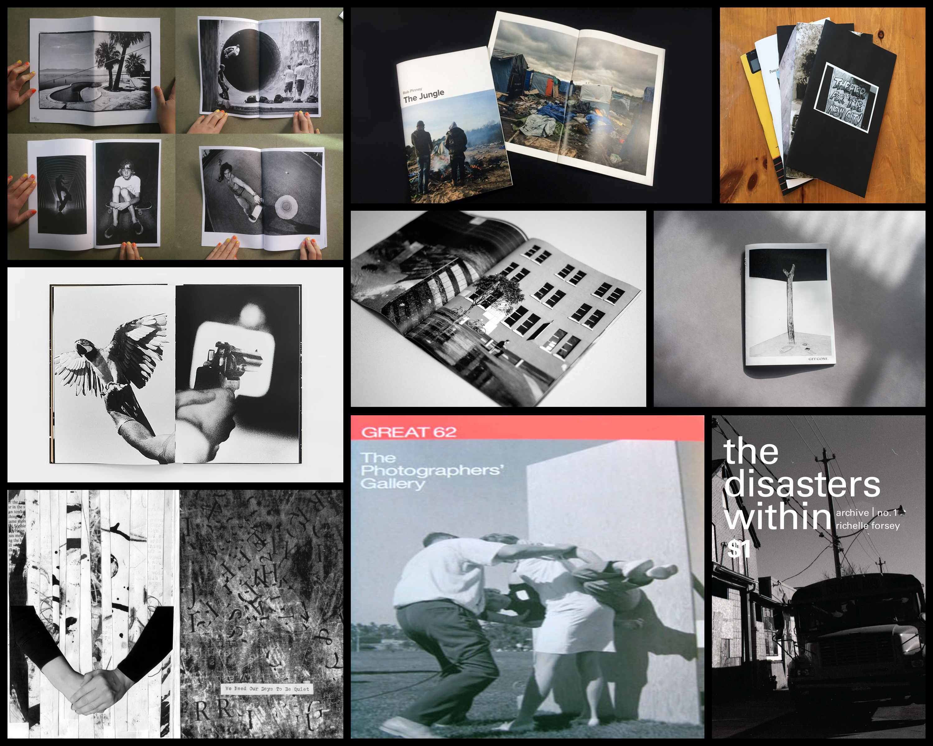 I found the overall thing that drew me into these designs and layouts were the effective use of black and white imagery, borders, and fonts which created a sense of aestheticism on front covers and pages within. A photographer that I found to be particularly useful when looking at zines was Alexis Maryon, a portrait and landscape photographer who has photographed famous and influential figures such as Amy Winehouse, Fatboy Slim, Alicia Keys, travelling world-wide as a photographer for magazines, record covers and long-term projects. Maryon’s zine called Port of Newhaven I found to be an interesting take on his perspective of circumstances regarding the conditions around the people.
To understand what made it in my opinion such an effective zine I would have to analyse three factors regarding the design and layout of it. Technical aspects, visual aspects and conceptual ideas behind the piece will be my main focal point of the analysis due to finding that they sum up the development and process behind the photographers thought.
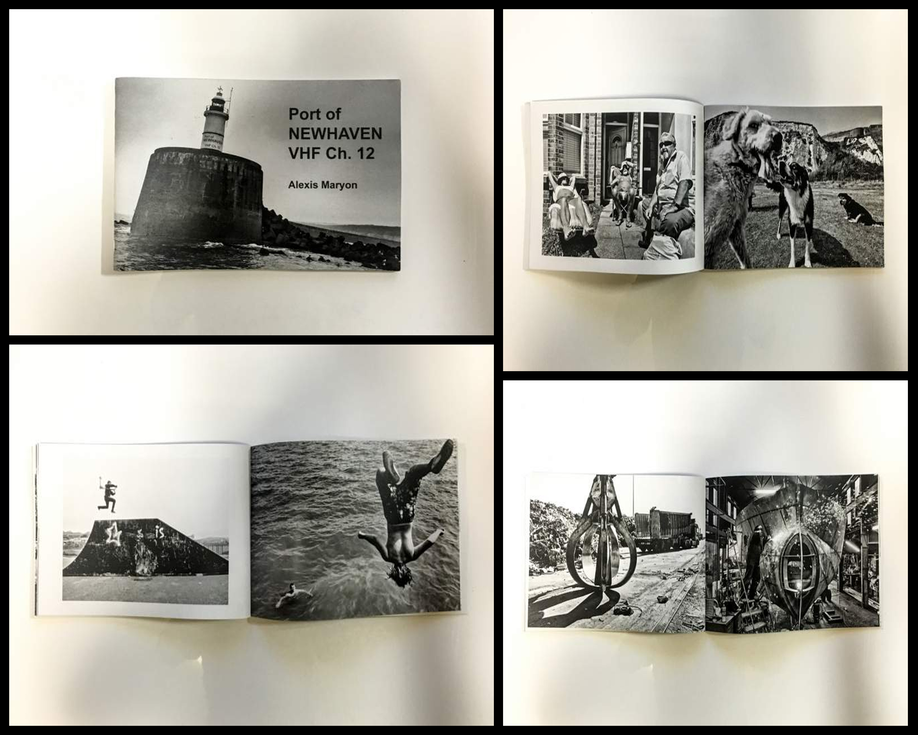 Technical: The photographer uses solely black and white photography to put across their perspective of Newhaven, using it to present the contrasting sides regarding the areas around the port. This is effective as it implicitly highlights different sectors that the port consists of and the variety of life living their, putting my definition on the people and objects rather than backdrop. A relatively high exposure and clarity have also been used to add more detail and depth into the people rather than the places, once again directing the focal point towards what is not suggested in the title, being not the place but society instead. Borders have tended to be used on left hand pages to prevent them becoming too overpowering and clashing with the opposite picture, becoming aesthetically pleasing in the process.
Visual: Visually the piece is created around the focal point of people and their environments, blurring and reducing the backdrop so that we focus and get to know who is in it. A low exposure and high clarity create visually pleasing results as shadows are emphasized and people are presented over dramatically, almost as if it was staged. The use of borders can be seen as representing the contrasting environment that the opposite page possesses, with one being inside a factory and the other outside, this implicitly draws our eyes to the out-of-focused background which we can only relate to so much around the people working and living their.
Conceptual: The zine is meant to represent the different sectors and people within them that make up the port of Newhaven. By highlighting the people rather than place it provides a more accurate representation which reflects the environment surrounding society, however the overall focus of the zine is to provide us an insight into the photographers perception of the port and their love for it. She tries to present this through identifying what should finds beautiful and unique about the area, which in this case is the people and landscape.