Final Result Of Zine

I chose the cover as I felt it represented my theme as a whole. The presence of the domestic cat, home grown plants and furniture enclosed in this small area creates an interesting environment which I carefully composed to feature as much as possible. The use of flash emphasises these details by intensifying the colours of the image. I used a simple font for the title so as to not distract the viewer from the details of the image.

The first two pages show a continuation from the cover of the zine. I placed my images in a reverse order of what I saw in real life as I felt it created a more interesting narrative of looking into someone’s life but not revealing too much about who they are.

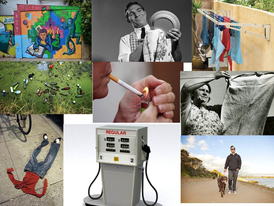
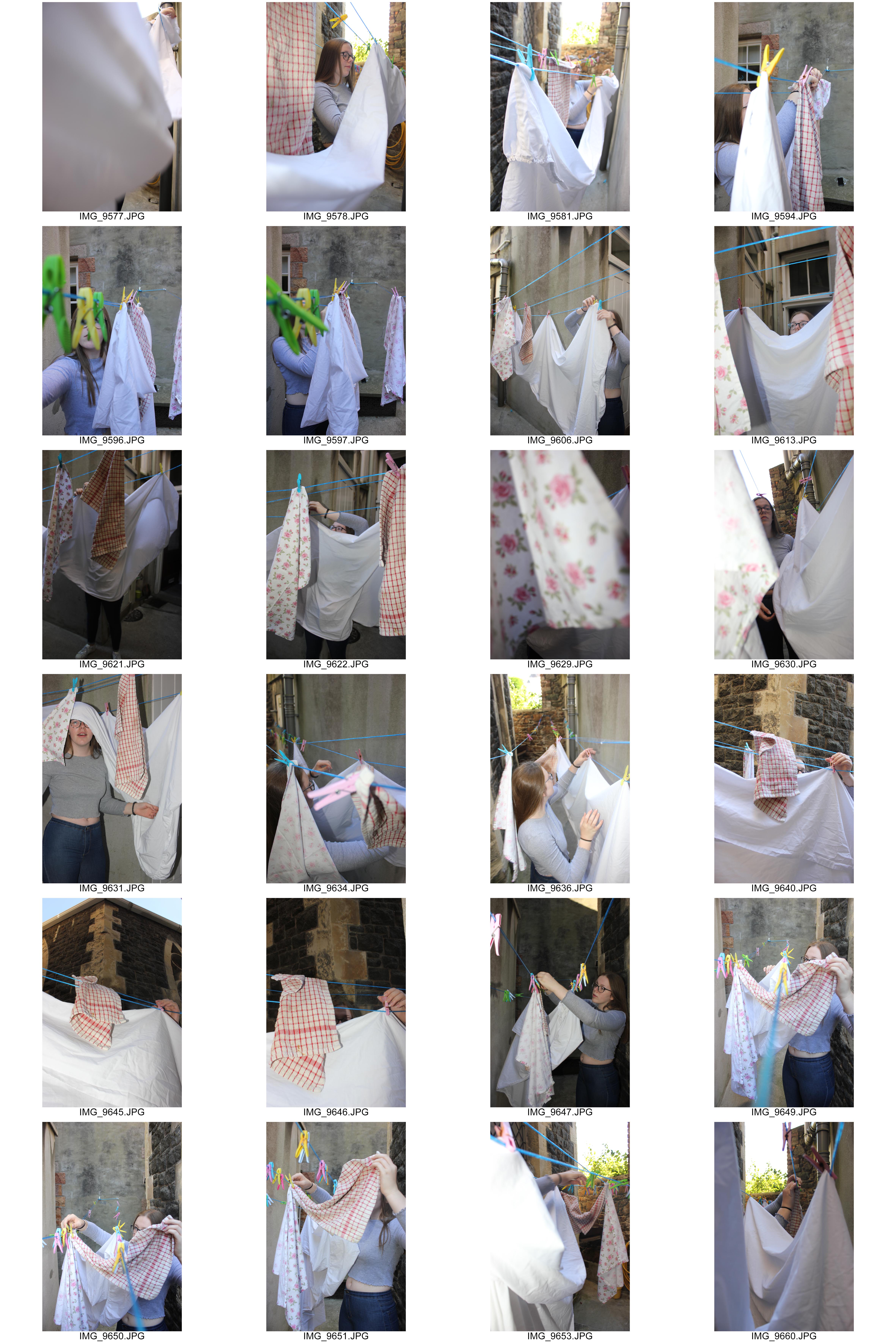
In contrast, the next 4 pages showcase daily life in St Helier from an inside perspective. The image of a girl hanging out sheets is composed to make the viewer become part of the situation, aided by the eye contact of the subject in the image. The photo is partnered with a softer toned colour image also featuring a washing line but viewed from an external perspective. I placed the photo of a subject washing dishes alongside an image of a hose as they shared similarities of colour with the use of saturated yellows and greens, as well as the different uses of water in regular life.

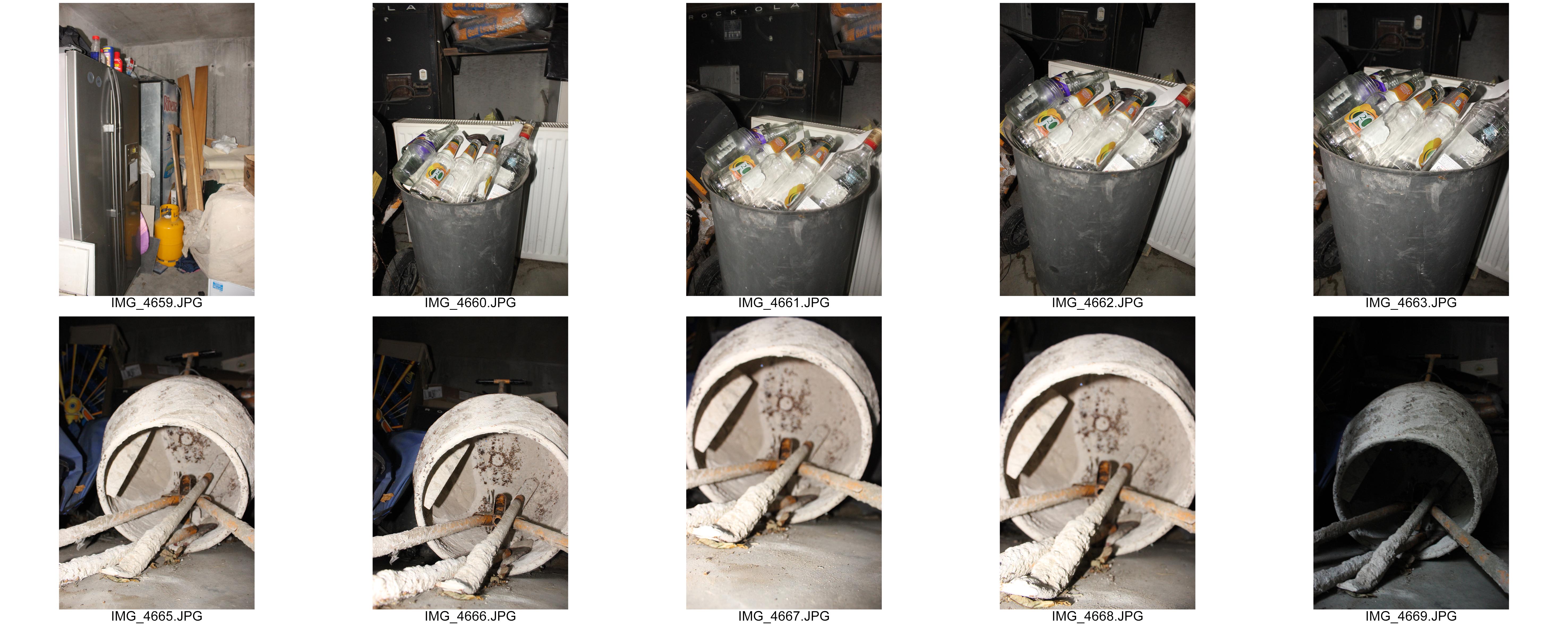
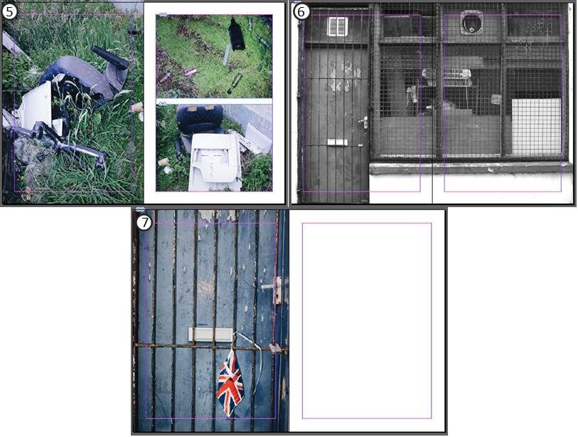
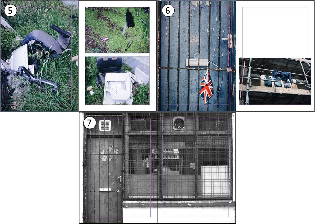
The zine continues on to take a different approach through showcasing darker topics as an underlying meaning. Abandonment and Isolation is shown in images of an empty storage  unit as well as a mattress placed by a bin due to no longer being used. Pollution is seen in images of glass bottles, lighters and broken furniture disposed off in an act of fly tipping in what was once a religious building.

I used the same image that I used for the cover as a back page however in a flipped orientation.

Zine Layout Experimentation

Using the same techniques as James Moreton, I will experiment more simplistically by using 1 or 2 images on each page that express a narrative together.

Experiment 1

Firstly, I took a balanced approach in my layout by using a proportionate amount of large images to small images. This is a safe option as it is more aesthetically pleasing when looking at as a whole.

I decided that I did not like when one image crossed across both pages but was not full size (e.g. page spread 4) as the large abundance of negative space in one corner did not appeal to me visually.

Experiment 2

I removed the empty pages in this version in favour of using more images to tell my narrative. I resized images on page spreads 3 and 5 as their colour scheme shared similarities with images on the opposing page. I also resized images on page spreads 2 and 6 to demonstrate the different perspectives between the images. For example taking a voyeuristic view in comparison to a personal one, or being up close to a subject in comparison to viewing from afar and seeing the subject as a whole.

Combining features from both of these versions, I created a final third version.

Final Version

It was not until the end that I attempted to create my front and back cover. I chose this image as it lead into the first page spread as they were both taken in the same location. I flipped the image in reverse for the back cover as the image was not landscape and I believed the colours would look weird if I was to use a different image.

Additionally, I placed another image from the same location on the first page spread to become apart of the narrative of things we leave behind.

The final version still uses the same simplicity that James Moreton shows in his zines, however I provided my own inspired style on such page spreads as 1 and 5 in order to place more images that shared similarities with what was already there.

Zine Artist Reference

James Moreton


In the eyes of James Moreton, zines are seen to be the most accessible and favourable medium of photography thanks to their ability to create an impact through the use of pairing, juxtaposing and narrative flow to tell a story or instill an emotion, a method “unsurpassed by any other photographic medium”.

“a very interesting and intriguing modern art form.”

~ 3 page spreads from the zine “Down Town”

Moreton has produced his own solo zines as well as collaborating on collective zines, two processes he says are very different. His techniques are used for both experiences but in a smaller portion for group zines where he is only enabled limited space for his images. This inspires him to make more zines to present his projects in.

Analysis


“Figments” is a project that looks deep into the subconscious of James Moreton. Inspired by the poetry of W.B. Yeats, his work represents his thoughts, dreams and nightmares. The above image depicts a dark figure standing before a bright door of light, possibly hinting at something stopping him from reaching a goal. The figure is faceless as he does not know what this factor is.

An eerie atmosphere is created by the use of a vignette that surrounds this central figure, the focus is maintained due to a harsh overexposed portion of artificial light that falls behind them. The tones of darkness are emphasized by converting the image to black and white. A slower shutter speed is used to cause a soft blur of motion by the figure also adding to the nightmarish effect.

Moreton’s placement of images in his zines is very simplistic as he relies more on narrating a story or emotional sequence through the order of images. This is the reason for his choice of single large images on a page or spread.

Providing a big inspiration, W. B. Yeats’ poetry shows his fascination with the occult, made up of symbolism in a traditional form in many of his poems revolving around dreams.

Her Dream

“I dreamed as in my bed I lay,
All night’s fathomless wisdom come,
That I had shorn my locks away
And laid them on Love’s lettered tomb:
But something bore them out of sight
In a great tumult of the air,
And after nailed upon the night
Berenice’s burning hair.”

W.B. Yeats

Layout of Newspaper

I created various different versions to experiment with the layout of my images. I tried to balance the number of black and white images to the number of coloured images that I used in order to keep a balanced aesthetic.

I did not like the first few versions as I believed I was trying to fit too many images on the page spreads. This was very distracting and prevented the viewer from being able to analyse the important details in the images.

Chosen Edit for the Newspaper spread:

I liked this version the most as the two people in the images are facing away from each other therefore representing the two different directions of the future, religion and construction. The difference in views is also represented by the difference in colour to black and white.

Another of my images was placed on a separate page alongside one of my peers as they both share soft tones of colour.

Third St Helier Shoot

For my final shoot, I will completely focus on the theme of “Signs of Life”.

Before completing the shoot, I brainstormed my ideas of things relating to the theme. Some topics I came up with included graffiti and pollution that people create, daily tasks such as washing the dishes and hanging out washing, and objects we use regularly such as gas pumps.

I will explore the area once again looking for these specific themes to capture.

Concept: I will continue to use the flash especially for the images featuring the rubber gloves when washing up as this will really emphasize their colour in a familiar but dramatic way.

Location: Images featuring a person will be taken inside the subject’s house. The subject of the image will be a person who lives within the area I was given.


In many of the images, I tried to conceal the face of the subject as I wanted the attention to be on the action rather than the person. I did this in different ways such as cropping the face out entirely with the camera or by using other materials in the photo like the clothes pegs.

Design and Layout

Layout is important as it is what catches the viewers eye. The placement of images can be based on colour, shape, or on a narrative to present a dynamic meaning.

For the layout of my images in the newspaper, I want my images to narrate the contrast between the two people and their lifestyles in the two images as religion and construction were two important factors in the previous development of St Helier. I also want to use colour as a way to show this contrast for example by using a black and white image on one page and a coloured image on the other.

I may choose to alter the size of the images based on the importance of one image over the other.

A similar theme that I will think about when selecting and laying out my images in my actual zine is “signs of living” as St Helier is the most populated parish on the Island. I will match images by colour in order to show difference or similarity.

Narrative and Sequencing Workshop

During this workshop, we learned the importance of the sequencing of images in order the tell a story.  Some of the images I will take may be simplistic on their own but make more sense when partnered with another image.

Above are two examples of a sequence of images by Duane Michals. Changing the order of the images would change the narrative which is why it is important to get the sequence right.

In my project, I want to capture the signs of living such as things people leave behind on the streets or everyday tasks that they complete. For example, clothes hanging out on a washing line is a sign of life as it shows that someone is living there but you don’t know anything about this person.

The theme will not be clear if I choose to partner the wrong images, therefore I want to sequence my images on their pages based on the different aspects of life.

Second St Helier Shoot

For my second shoot, I will revisit the same area from the first shoot but with the aim of capturing a different effect from the different lighting or weather conditions that may occur. I am hoping to visit the area at around 6 – 7pm as there is still natural daylight but shadows will also appear as the sun is close to setting.

It is also important to keep a sharp eye as there may be details that I missed from the first visit or an event may have occurred to cause the environment to look different.

I decided to focus on the large buildings such as the tower block and the churches as I thought the light would hit them better and shadows would become more visible.

The area was not busy which meant I could get wider shots to capture the whole of the buildings.

Experimentation with Colour, Cropping and Montage

Cropping


My main aim when cropping my images was to ensure the focus was on whatever the important subject was in the image so as to draw the viewers attention to it.

I took the same image and cropped it into to create 3 different versions that focused on different aspects of the original image. The top two images demonstrate the buildings abstract structure whereas the bottom image focuses on the detail of the window and what is inside.

I also explored changing the image into a negative to see what tones would be emphasized. In this edit, the cracks of the walls stood out.

Colour


For this image, I first increased saturation to bring out the luminosity caused by the blue blur of the bar just outside the right side of the image. The green and blues on the left and right side of the photo puts focus on the man wearing the neon jacket in the centre. I cropped this image into a square so as to present the lined architecture that spirals into the subject in the centre.

Changing the hue of the photos gave a more abstract feeling where in the first image I desaturated it and increased contrast a small amount to give a softer effect for the theme of hanging out laundry in everyday life. In contrast, the second image has an increased saturation to represent the psychedelic theme of alcohol and other substances that appear.

Montage


Using a selection of images in colour, I cut up sections of scaffolding from Convent Court, the tower block across the road from St Thomas’s Church and placed them over the church itself. The contrast in colour reflects the two important and different aspects of the future of St Helier, construction and religion.