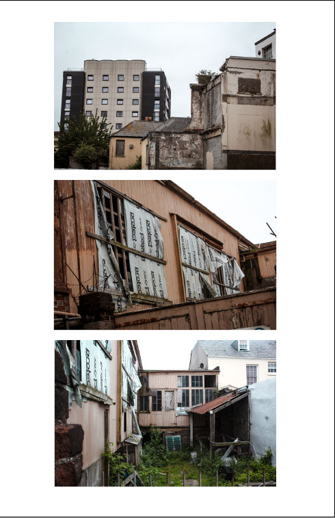
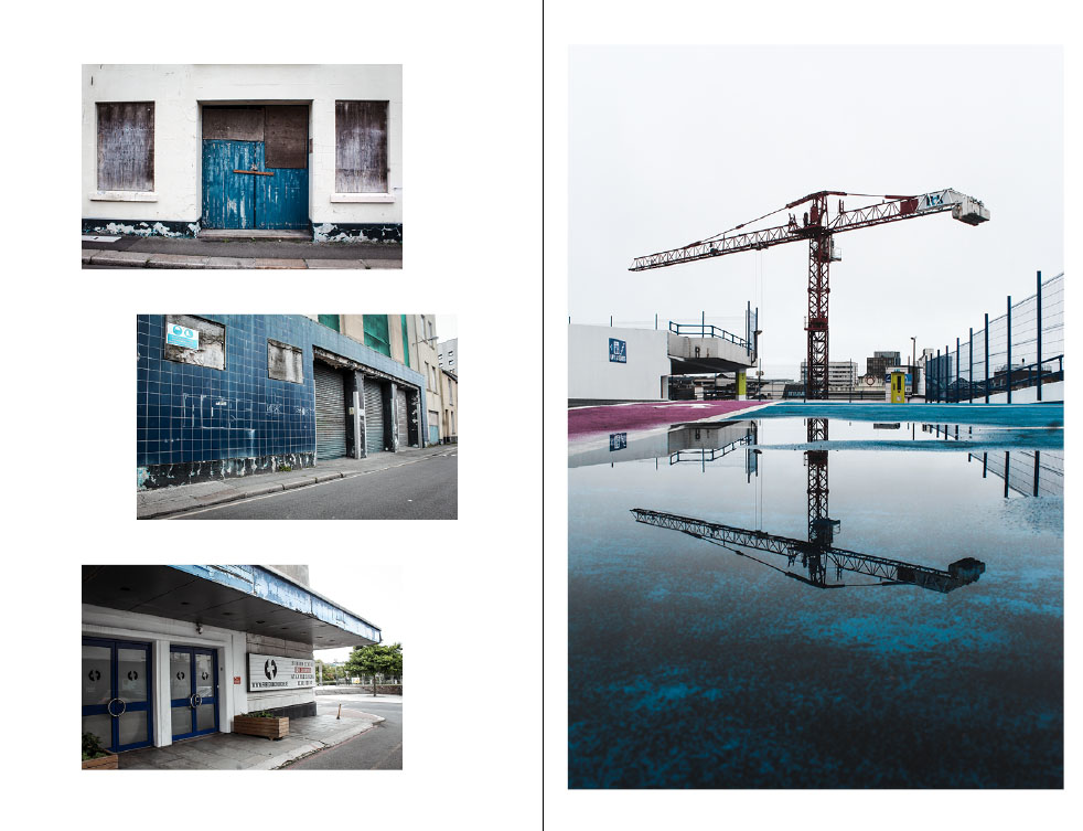
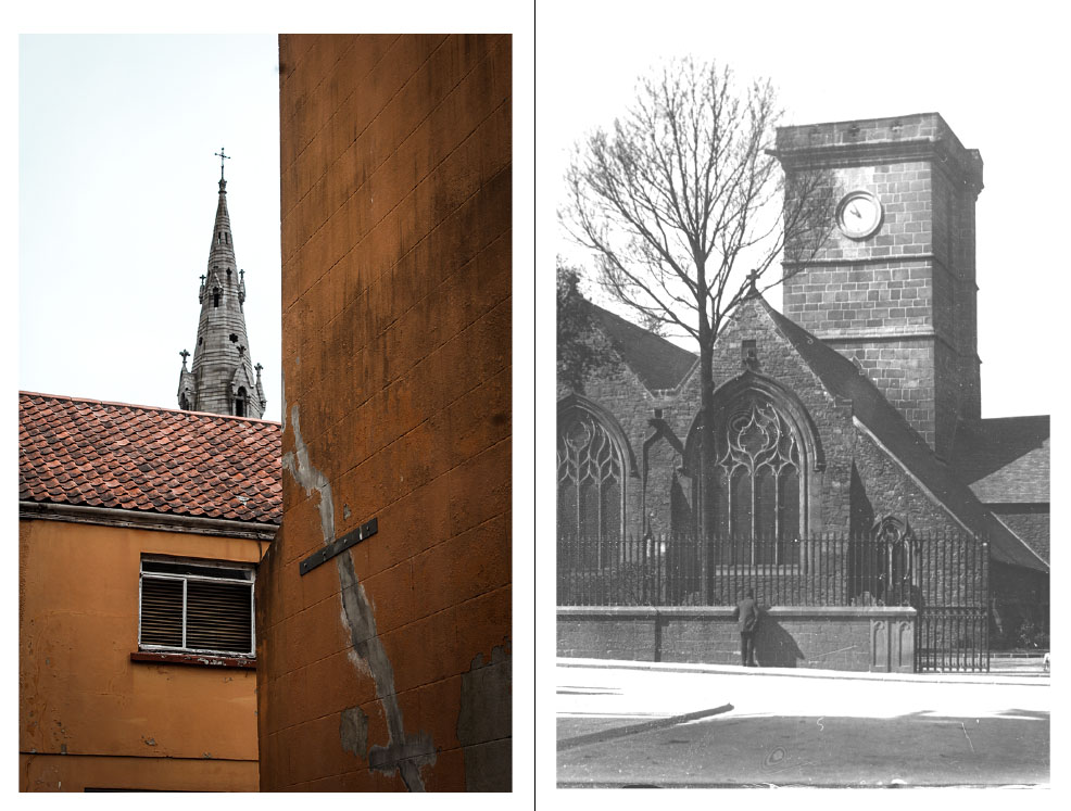
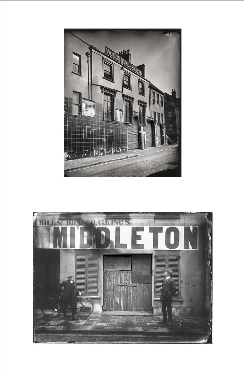
For my final design layout I have primarily focused on the dereliction side of St Helier which is often walked past by members of public without notice. I have incorporated some archival imagery which i believe has great impact through the messages and story they convey. I have merged some of my photography into the archival imagery which creates a strong message that our capital is in decline through the architecture that has been left to rot. The archive images are old images yet the buildings look modern and clean however the images that i have incorporated to the archive images are new however look old and abandoned. I think the composition of each page works well to aesthetically please the audience and i have used similar coloring for each page.


