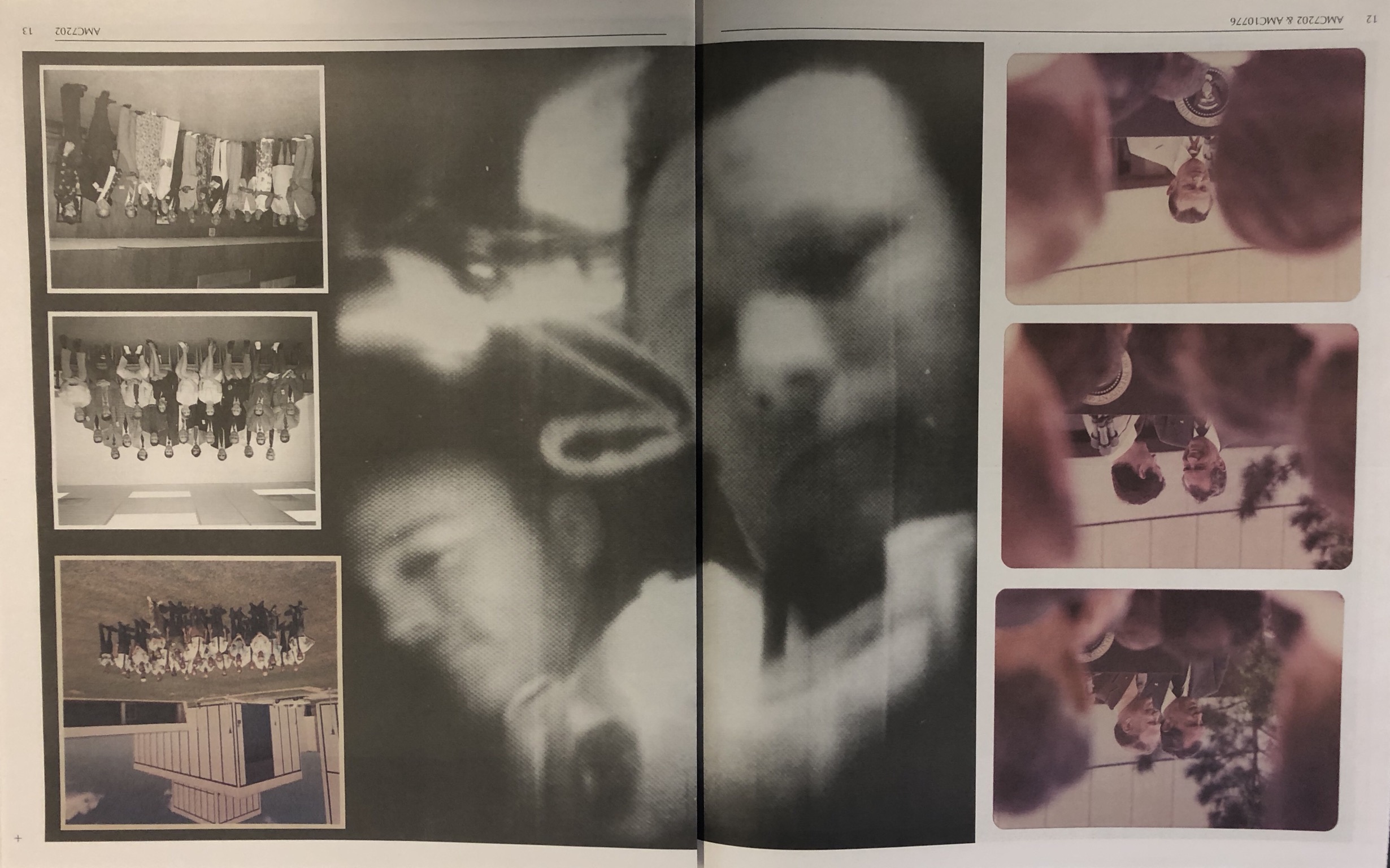
The below design layout is interesting because it uses one photograph over a double page spread which is against the conventions of design. The photograph also has multiple smaller photographs in front of the image to create a montage-style design whilst creating contrast between the colour and the black and white.

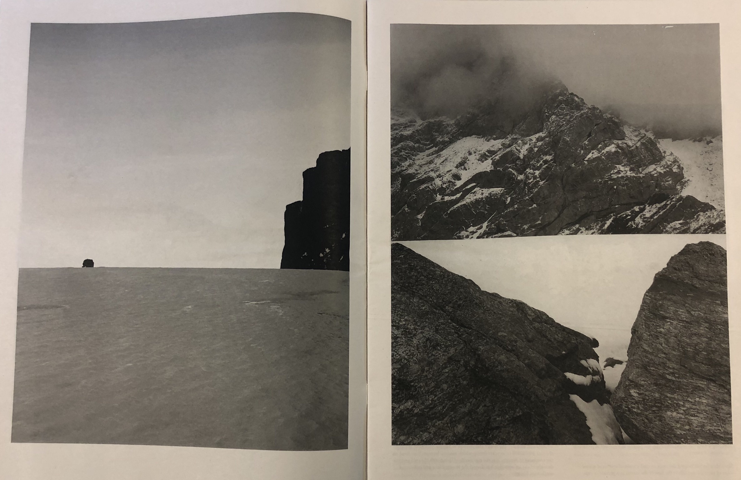
This design layout is more conventional and simple. I like this layout because of the clean borders around the photograph and how it uses larger, blockier designs to create more of an impact. This method helps the viewer to focus on the shapes and tonal ranges in the photographs by looking at the photographs individually.

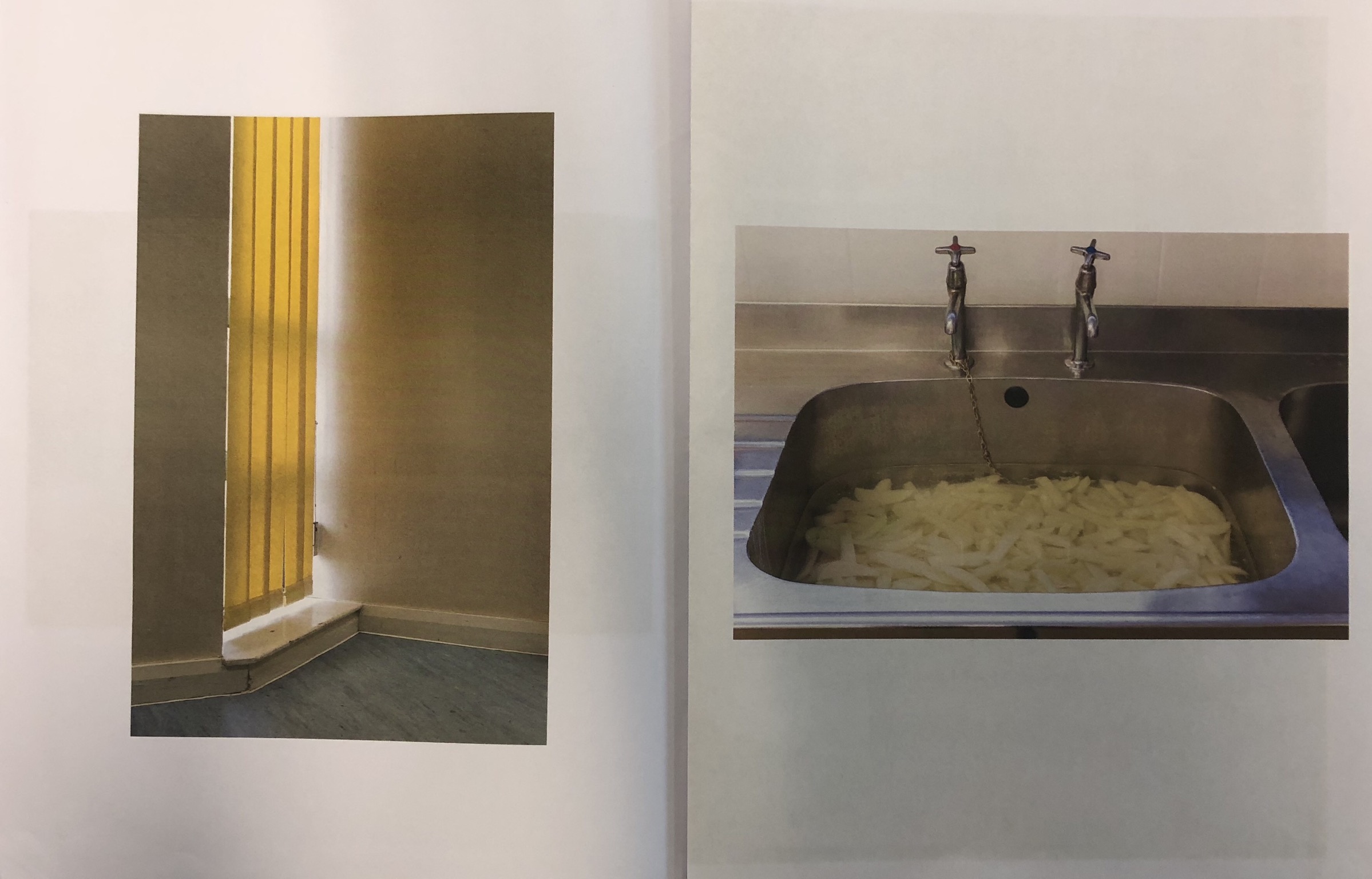
This design layout is similar to the above design layout and has a similar, simplistic effect. The difference is that this layout restricts the design to one photograph to a page. As with the above layout, it creates a structured and effective layout.

This design layout is interesting because it organises lots of similar photographs – in a typographic style – to create an organised but busy design. The colours in the layout all mix well due to them mostly being primary colours. The structure within the design appeals to me.

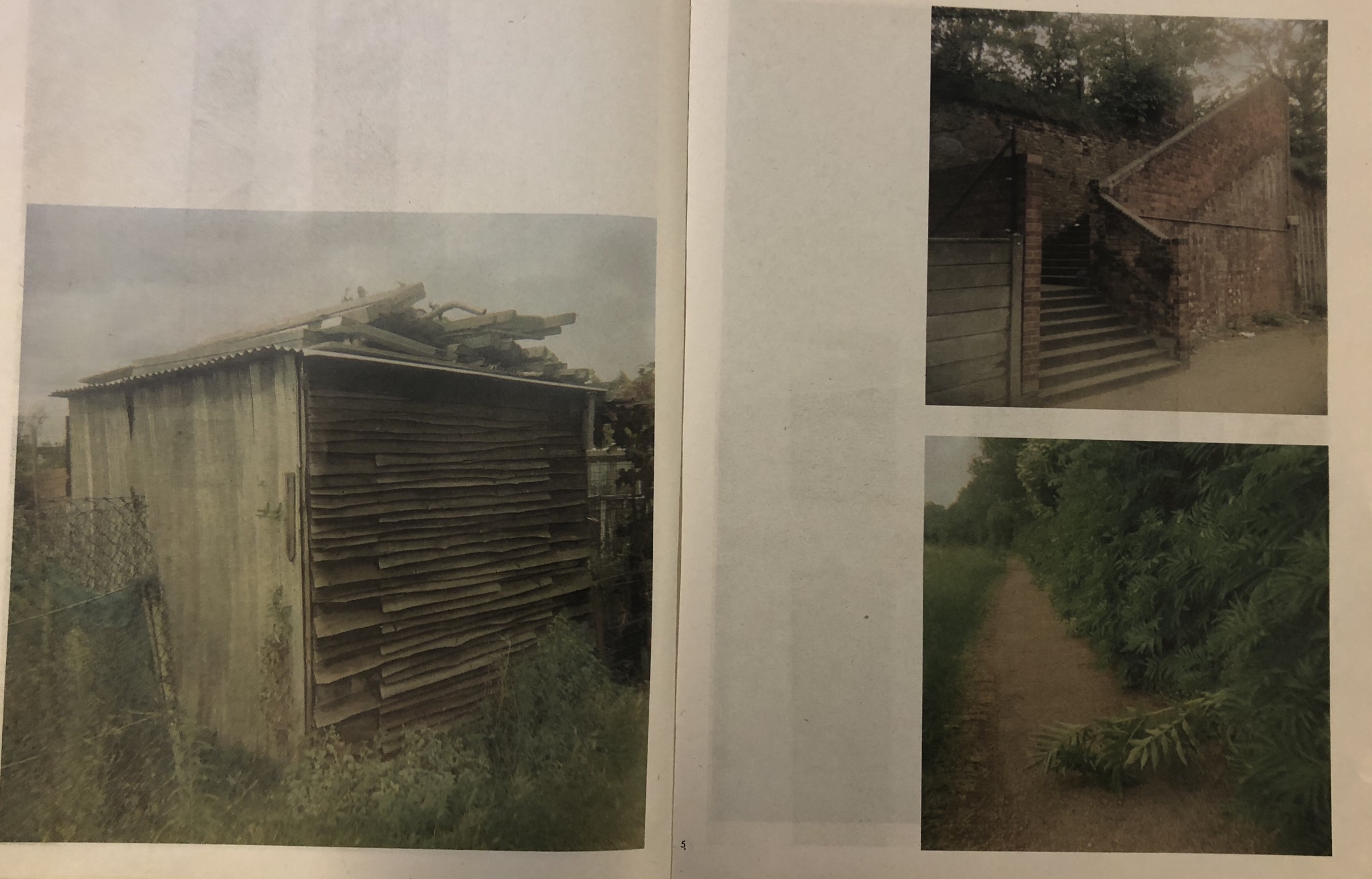
This design layout is similar to design layout two and three in the sense that it uses borders and is simplistic, however this layout goes slightly against the conventions of typical design as the designs are not central, borders are not equal and the design does not seem to gel together well.

