Design Layout 1
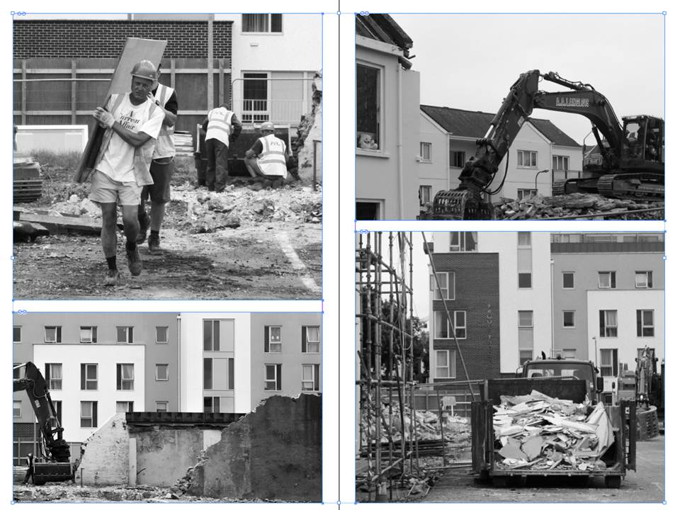
In this design layout I have focused on using borders and keeping space between photographs in order to create a simple and tidy composition. I think that this composition is effective because the photos are large to show the detail within them and the style of the photographs means they compliment eachother.
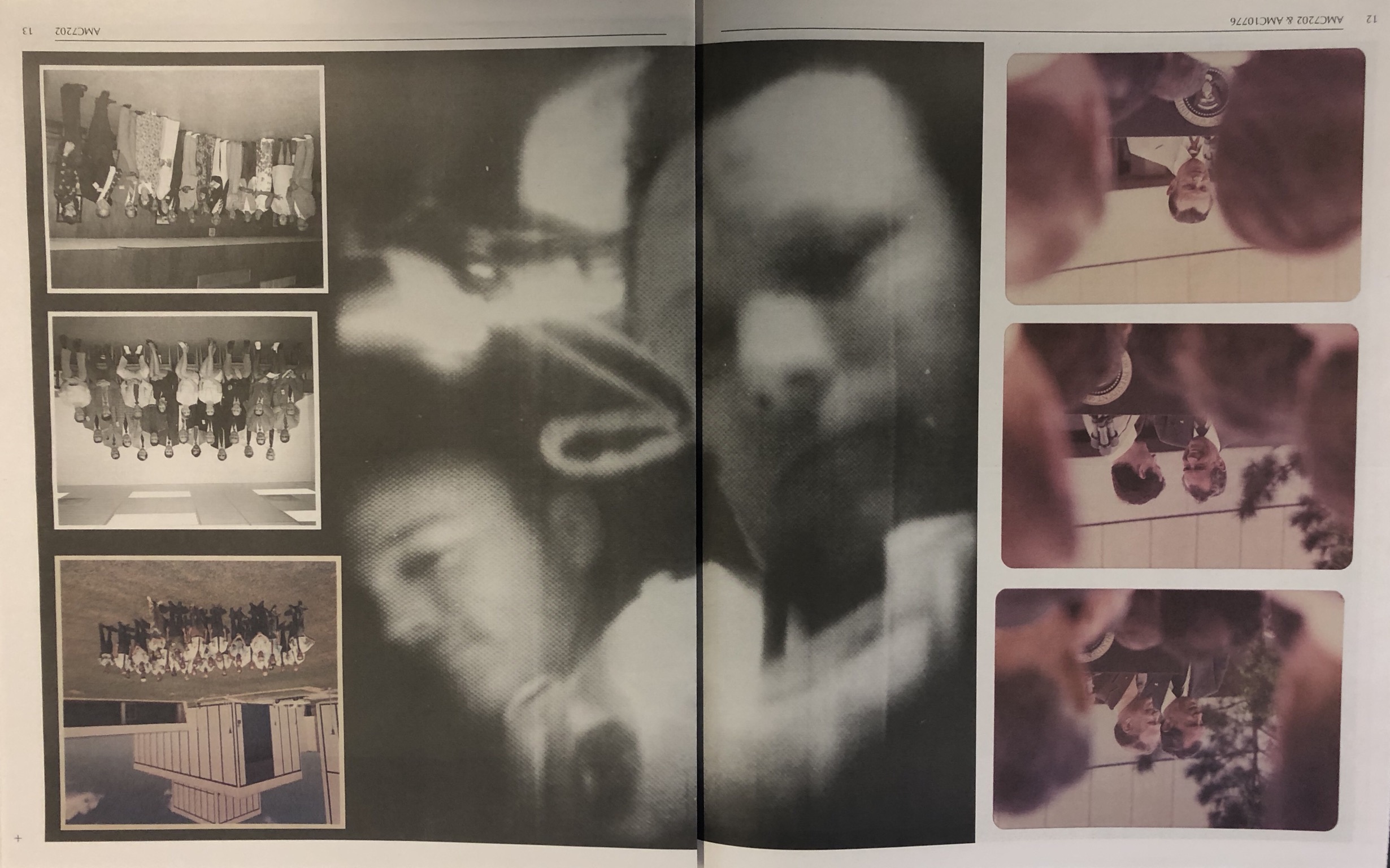
On the below page, I have looked at filling white space by transforming the photograph. I flipped the photograph horizontally twice to create a confusing composition. I like the idea of this but I believe that it does not fit in with the rest of the composition due to its complexity.

Design Layout 2
In this design layout I have looked at doing full bleed spreads along with images overlapping onto the full bleed spread. I think this composition is very effective as it makes the photograph more imposing and bold. The overlapping photographs are subtle but create an alternative look to the composition.


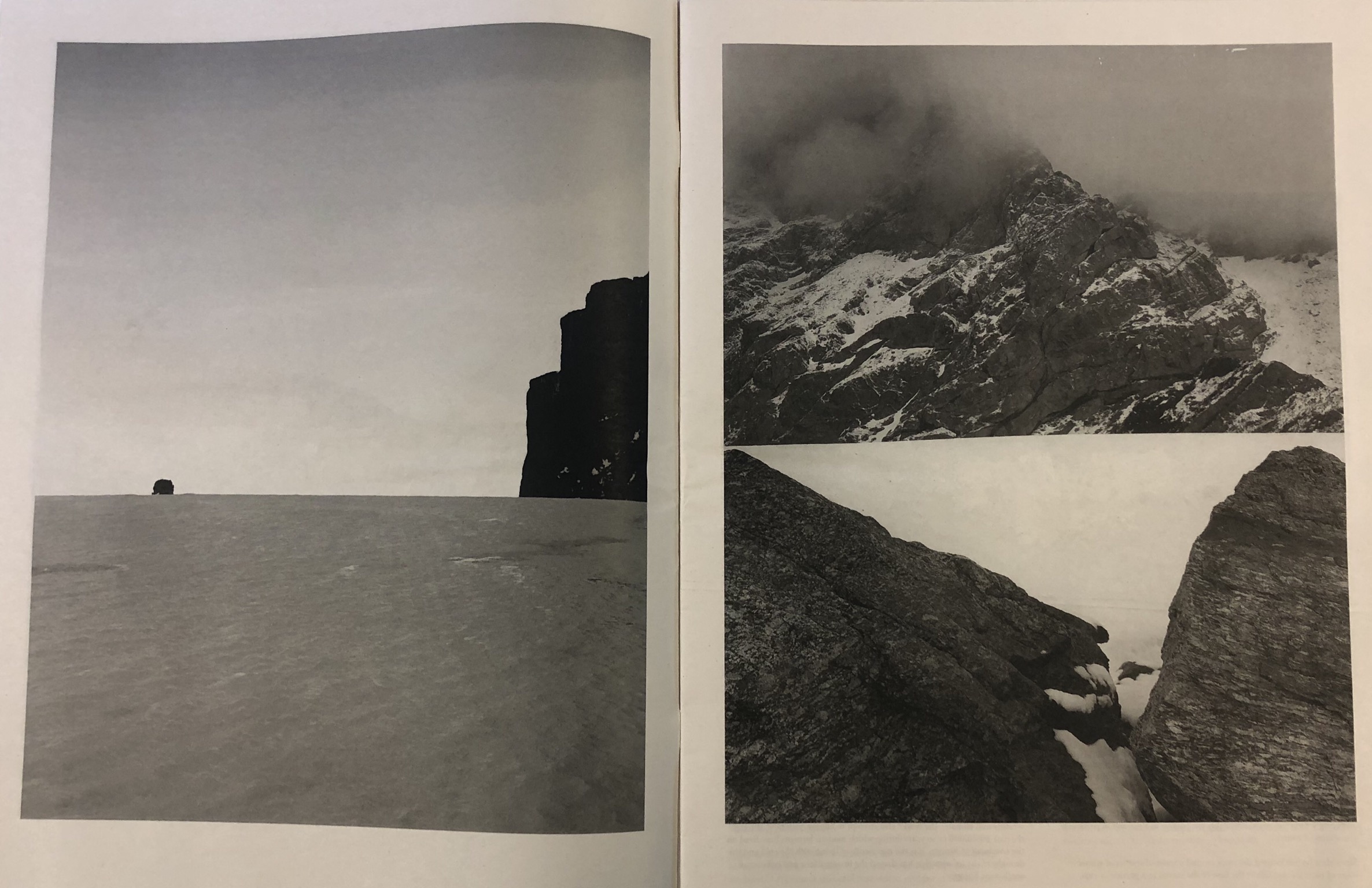
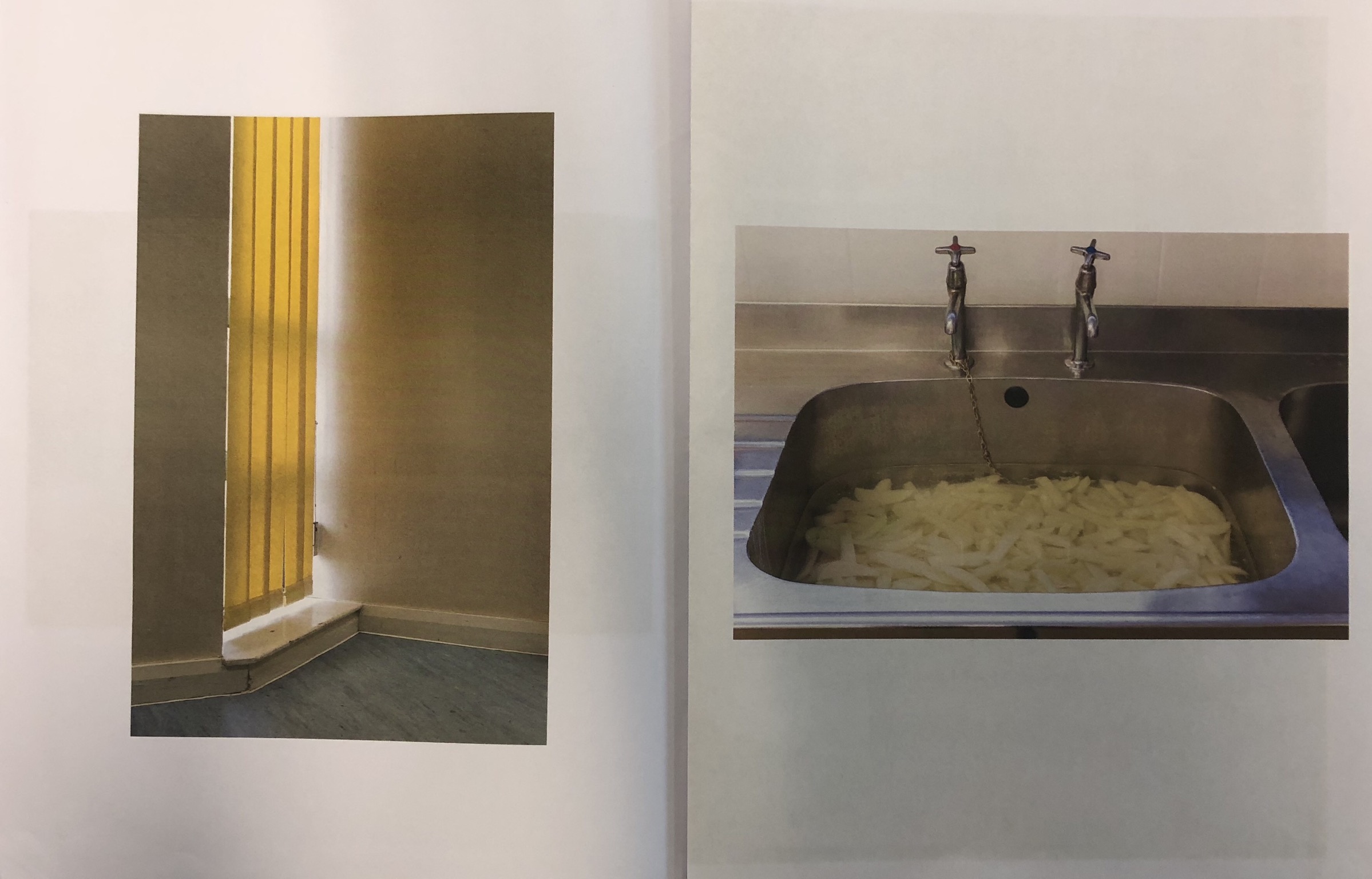
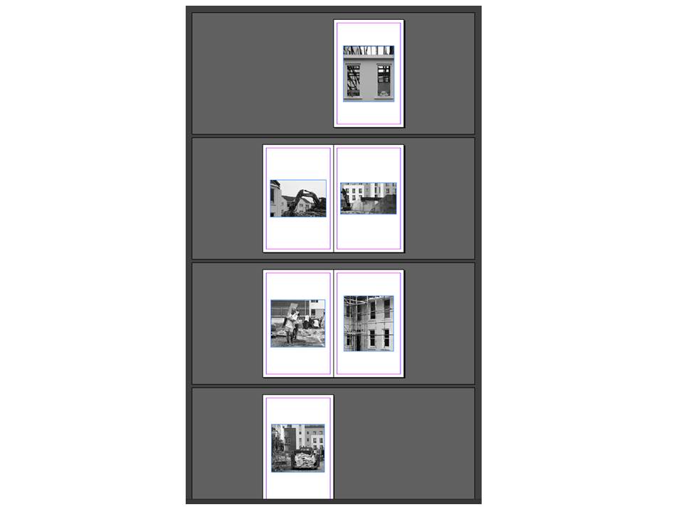
Design Layout 3
In this design layout I have stuck to one photograph per page. This created a simplistic and effective look due to the centralised photographs. I like this design as it is easy to look at and drags the viewers attention to individual photographs but I think that there is too much white space in this design.
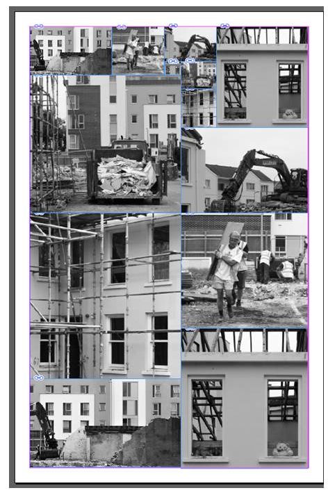
Design Layout 4
In this design I have looked at putting all of the photographs onto one page and using the photographs more than once to erase all white space. This has created a design that is quite abstract but also quite messy – I do not think that it is as effective as my other designs due to this.
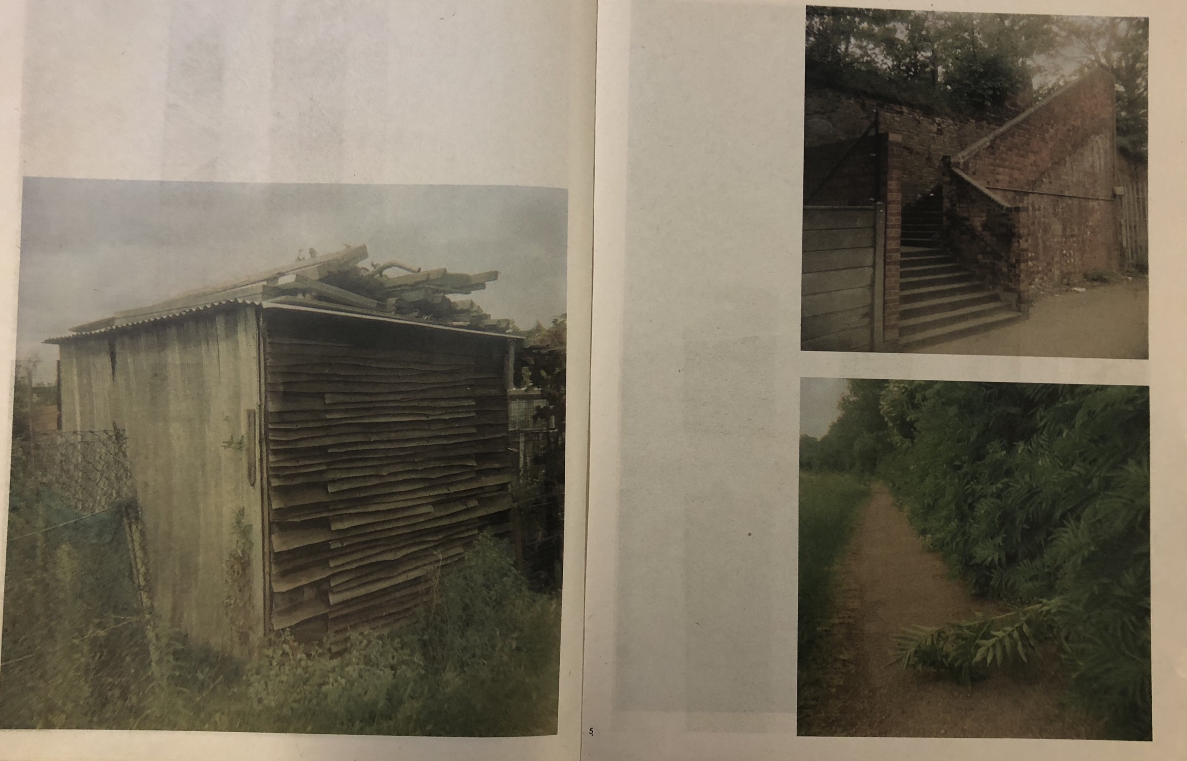
Design Layout 5
This design is similar to the first design but it lays out the images in a way that is not conventional. It leaves white space rather than making an effort to fill it in. I think that this creates too much contrast between the background and the photographs that I have used.