Edits:


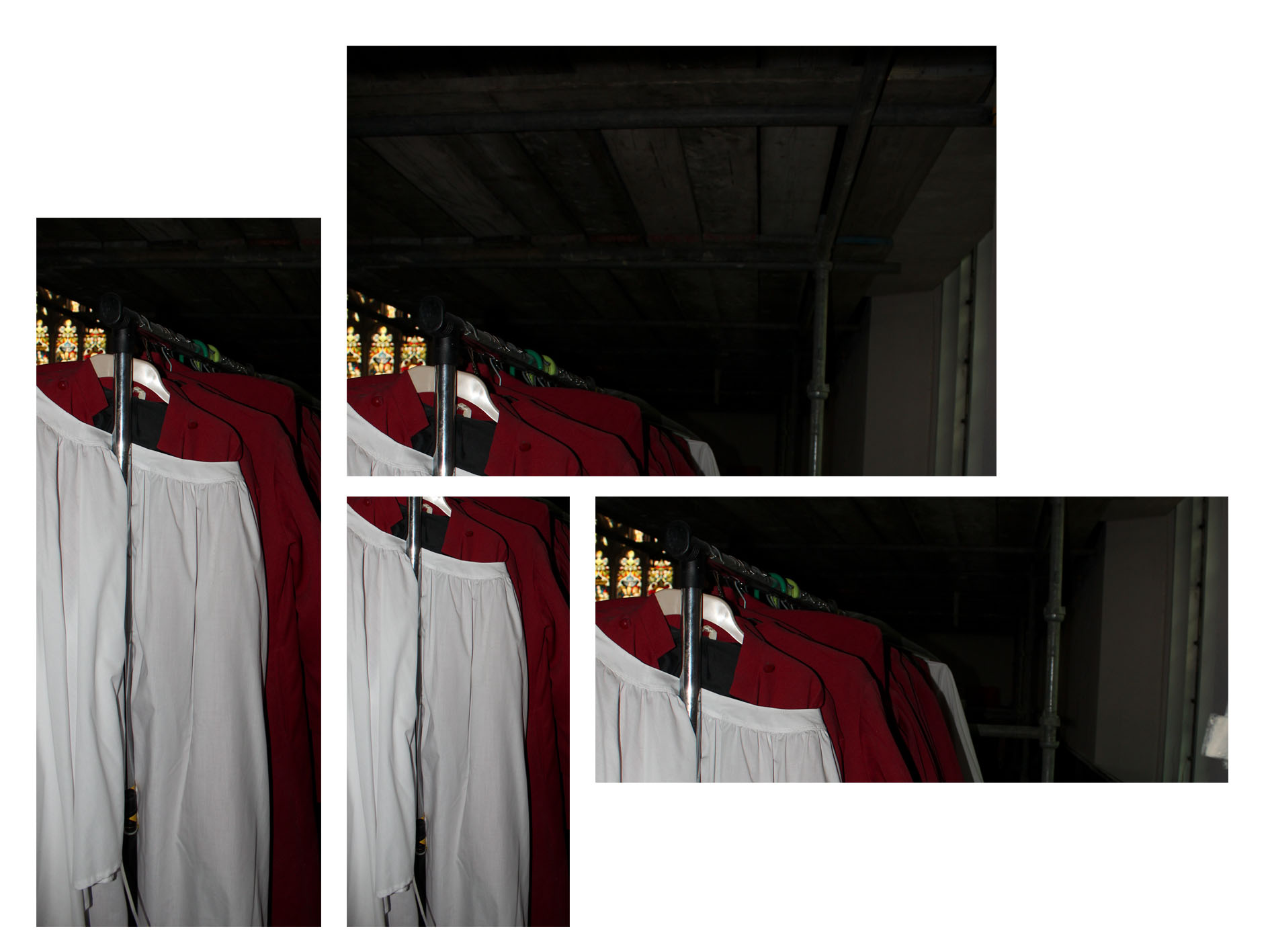
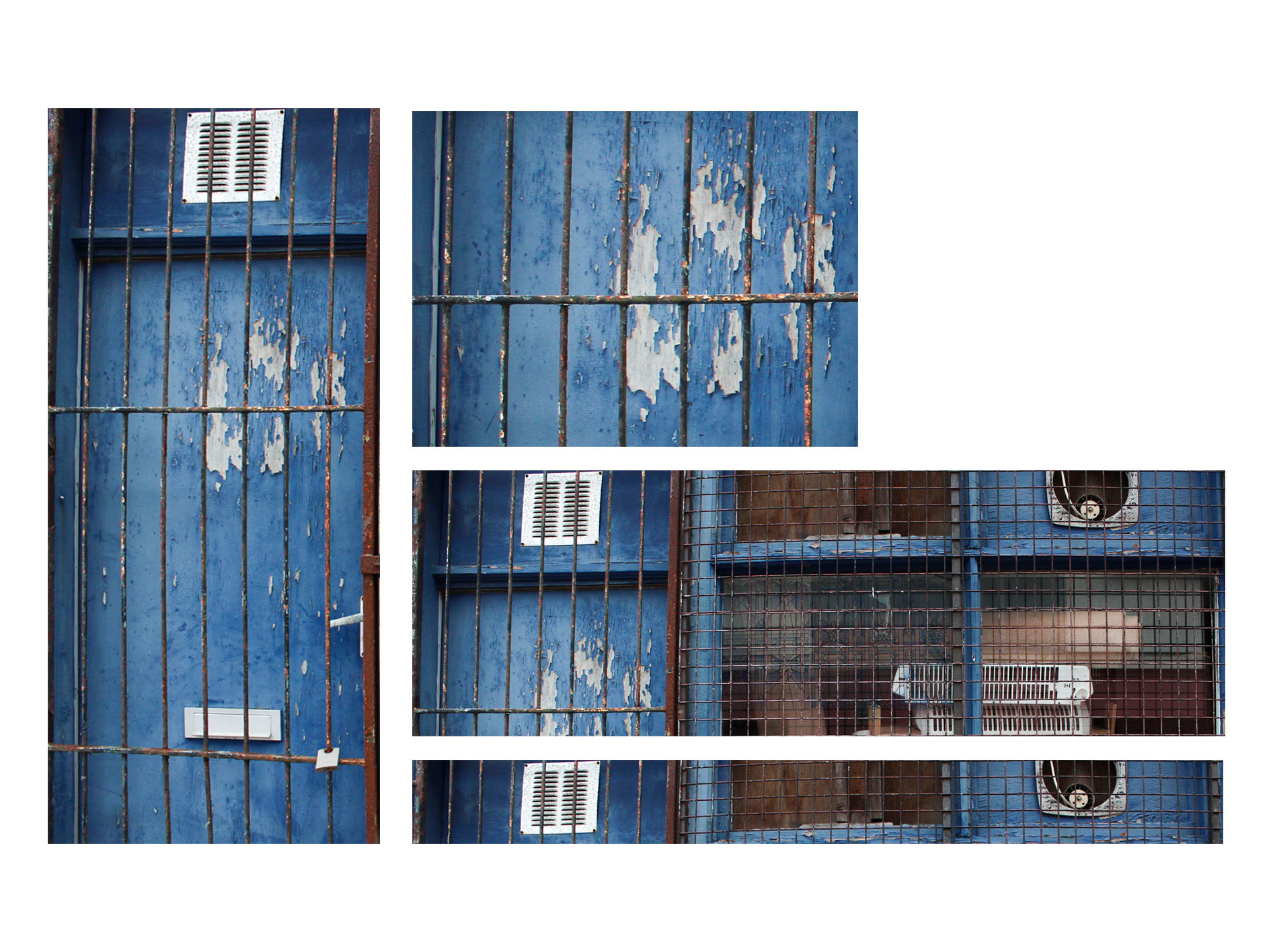
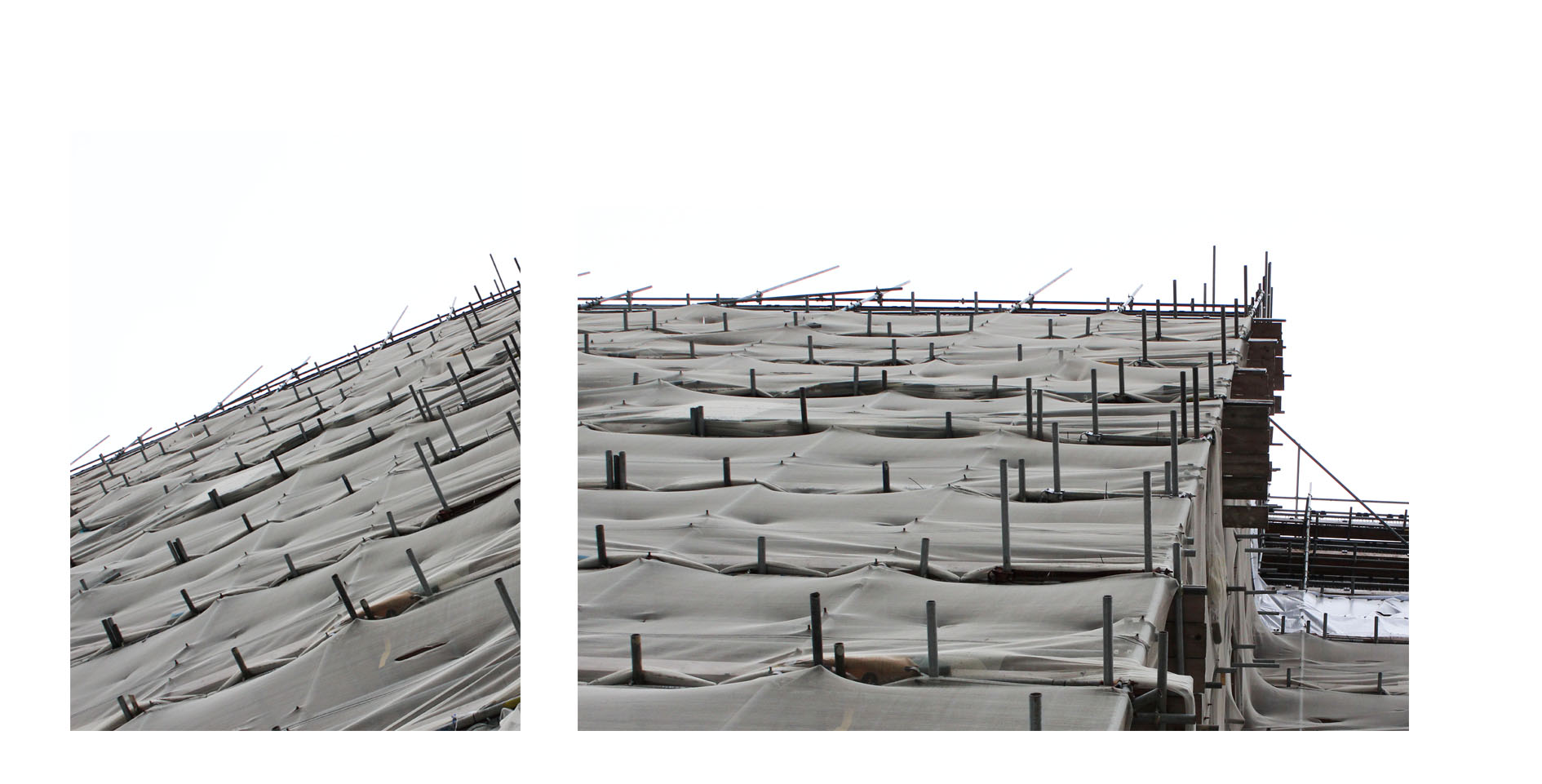
For my first images I wanted to experiment wihtin dividing and duplicating segment of the images to create a fractured dynamic, I think it creates a depth within the images and a disjointed narrative structure which is effective.My second images I wanted to extend the way in which the long corridor is exaggerated, it allows a centre point to the image. Both of these demonstrate cropping in a different manner in order to exaggerate different aspects of a piece. to either lengthen or disorganise a piece to become more abstract and present St Helier in a more iconic method.

Within this image I wanted to form two images together, using instant alpha and moulding two separate environments of town together, one is of a floor covered with de constructed buildings and the other is a buildings falling down, this is interesting to me as they both symbolise the deterioration of St helier and perhaps the near future consequences for the house itself. I think it is a weird composition and almost as if this is a collage but I think this could be further experimented with and perhaps make a successful image altogether.


These two images I wanted to capture the design of a building in an interesting angles,I wanted the images to look as if they have an authority and power, it Presents the modernisation of a building,how the first is the development which looks bad and complicated however the contrast within the second piece and how it looks so smooth and futuristic.This is also interesting as both images were taken next to each other in the same environment. it is a development of how cropping can be copied and expanded to create an abstract piece. 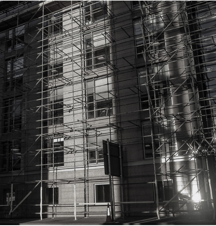

these two images I used photoshop and cropped the shape of them in order to be more focused on a specific section of the original piece itself. it presents the same building from two different perspectives.The first shows a narrowed angle and is stretched in order to show the length of the building itself, it is also interesting as the light is centred throughout in the same mirroring shape. 
This image is similar to the previous it is a lot more abstract themes wihtin the structure and how there looks like a long extension until the horizon.it shows an industrial field,I made the tones within the images copy from different segments of the images and repeat. 
My main interest within this was to crop in on a specific centred angled gate as it has a dynamic pattern and having a highlighted contrast to the dark wall on the right and light wall on the left. 

For the portrait images I wanted to purely crop the images in order to create a straight connection within the person themselves.Tthe crop allows a direct eye contact and allows the shape and proportions to be mirrored by the length of their body of the activity they are doing. 
this last images I cropped in order to look as if you were about the centre the houses it is more centred upon the left sided and I have edited off the road in order to not get distracted by the environment but purely the house and architecture themselves ,and an idea of the people who live in there.


