


When researching inspirations for my zine I decided to reference my ideas to a photography who had in their career produced a zine them self. To do this I would firstly look up any inspirations for zine designs and layout before actually looking into people who made them, I would need to make a moldboard of potential ideas that could influence my mind-set about what I wanted the final outcome to look like. Looking online these were the results I found most effective due to their composition and overall effectiveness: 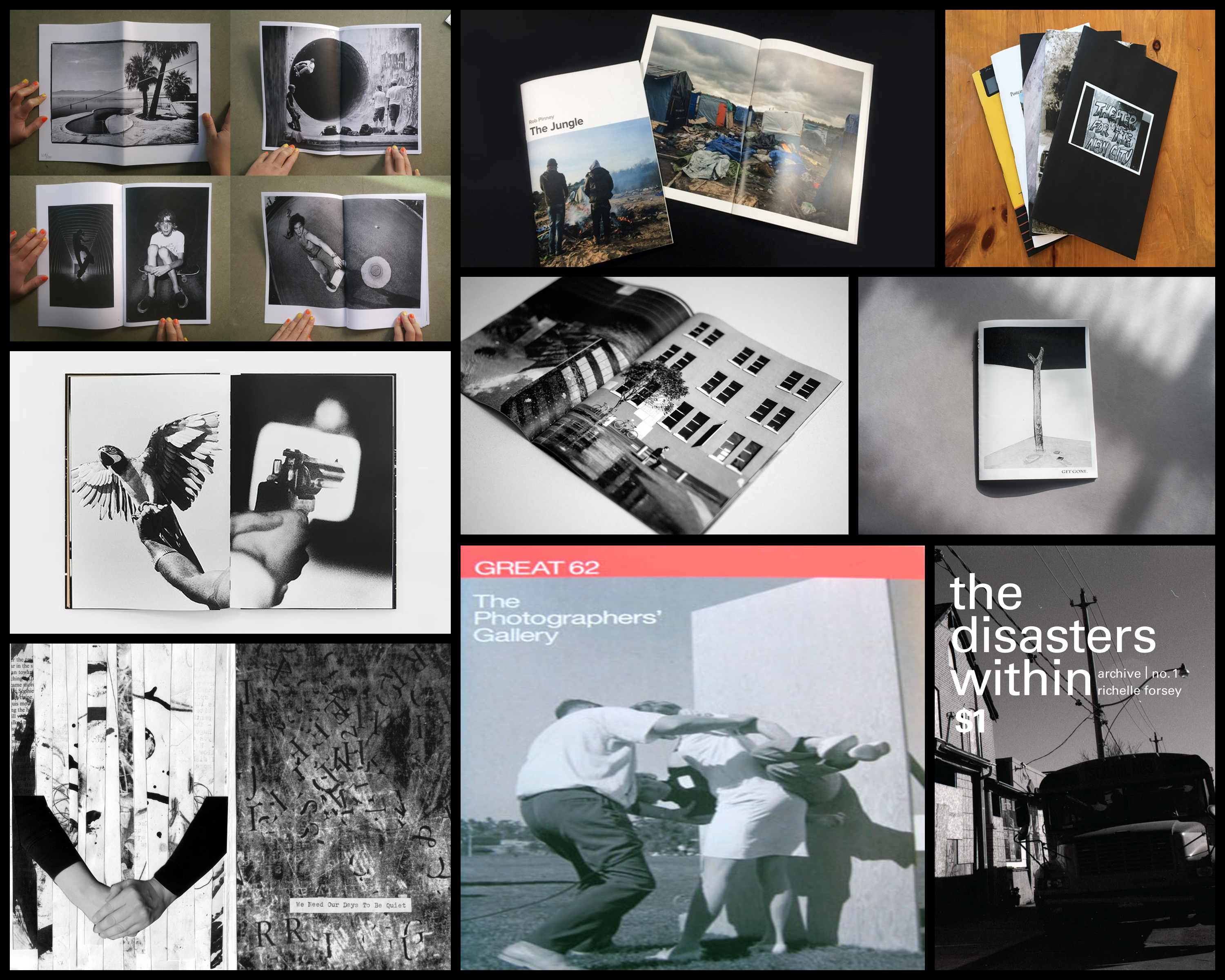 I found the overall thing that drew me into these designs and layouts were the effective use of black and white imagery, borders, and fonts which created a sense of aestheticism on front covers and pages within. A photographer that I found to be particularly useful when looking at zines was Alexis Maryon, a portrait and landscape photographer who has photographed famous and influential figures such as Amy Winehouse, Fatboy Slim, Alicia Keys, travelling world-wide as a photographer for magazines, record covers and long-term projects. Maryon’s zine called Port of Newhaven I found to be an interesting take on his perspective of circumstances regarding the conditions around the people.
To understand what made it in my opinion such an effective zine I would have to analyse three factors regarding the design and layout of it. Technical aspects, visual aspects and conceptual ideas behind the piece will be my main focal point of the analysis due to finding that they sum up the development and process behind the photographers thought.
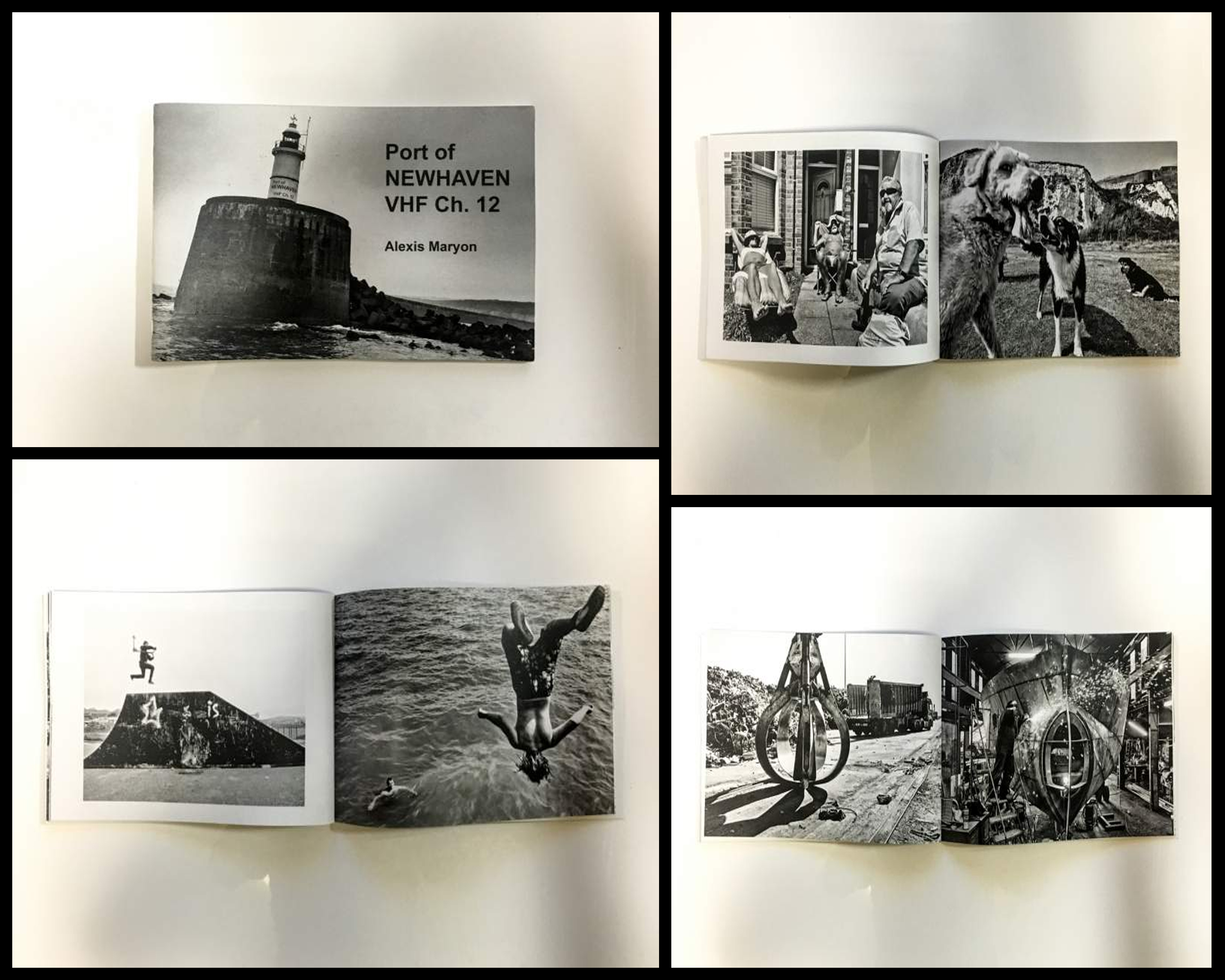 Technical: The photographer uses solely black and white photography to put across their perspective of Newhaven, using it to present the contrasting sides regarding the areas around the port. This is effective as it implicitly highlights different sectors that the port consists of and the variety of life living their, putting my definition on the people and objects rather than backdrop. A relatively high exposure and clarity have also been used to add more detail and depth into the people rather than the places, once again directing the focal point towards what is not suggested in the title, being not the place but society instead. Borders have tended to be used on left hand pages to prevent them becoming too overpowering and clashing with the opposite picture, becoming aesthetically pleasing in the process.
Visual: Visually the piece is created around the focal point of people and their environments, blurring and reducing the backdrop so that we focus and get to know who is in it. A low exposure and high clarity create visually pleasing results as shadows are emphasized and people are presented over dramatically, almost as if it was staged. The use of borders can be seen as representing the contrasting environment that the opposite page possesses, with one being inside a factory and the other outside, this implicitly draws our eyes to the out-of-focused background which we can only relate to so much around the people working and living their.
Conceptual: The zine is meant to represent the different sectors and people within them that make up the port of Newhaven. By highlighting the people rather than place it provides a more accurate representation which reflects the environment surrounding society, however the overall focus of the zine is to provide us an insight into the photographers perception of the port and their love for it. She tries to present this through identifying what should finds beautiful and unique about the area, which in this case is the people and landscape.
What is a Zine?
A zine is a noncommercial, and often small homemade or online publication usually devoted to specialized and often unconventional subject matter. Usually one tens to be the product of a single person or small group who photocopy their designs, and it popularly defined as only having a circulation of 1,000 or fewer copies. The production of a zine is usually intended to share niche-skill, art, or story as opposed to seeking any profit, which tends to disregard the traditional conventions of professional design and publishing houses as an alternative, whilst usually being handwritten to emphasize a personal connection between the reader and the creator. Here are some example of zines below: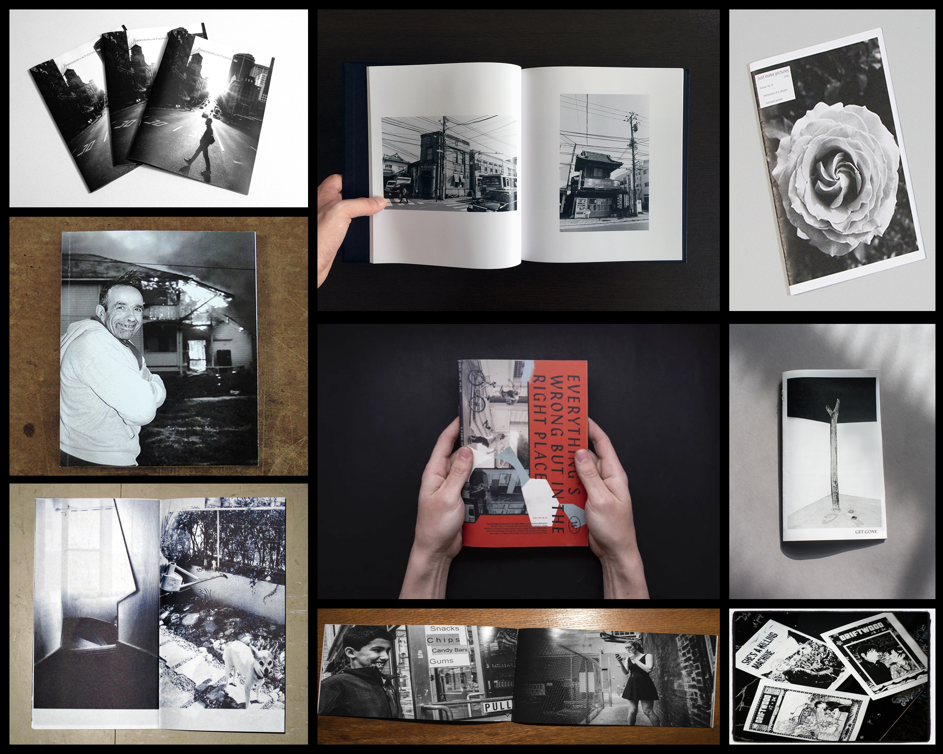 From here I will be analyzing what to me makes a good zine, and the aspects within the design which bring it out to me as a reader. By doing this it would allow me to go ahead with the actual making of my own zine, knowing what I wish to incorporate into it.
 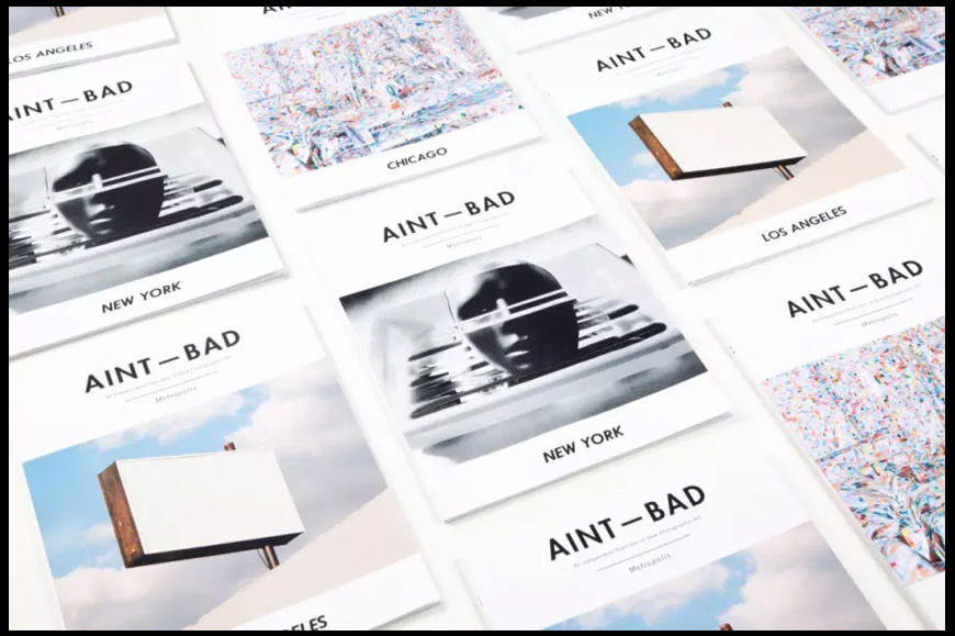 When looking over the cover of these zines titled “AINT – BAD”, I found the use of font to be particularly effective. This is because of the simplicity but boldness it uses, making it not too overpowering, but at the same time fits with the overall design of the pictures and blank space incorporated into the cover. The use of blank space also compliments the image in the center as it defines the vitals of the cover, this is done through how it acts as a natural border for the fonts and the photographs which adds a touch of complex simplicity. The images chosen for each cover I found were not too visually sore, but not too simple, meaning that they perfectly blended into the layout of the design as the mainly bleak colours worked well with the stark black of the writing.
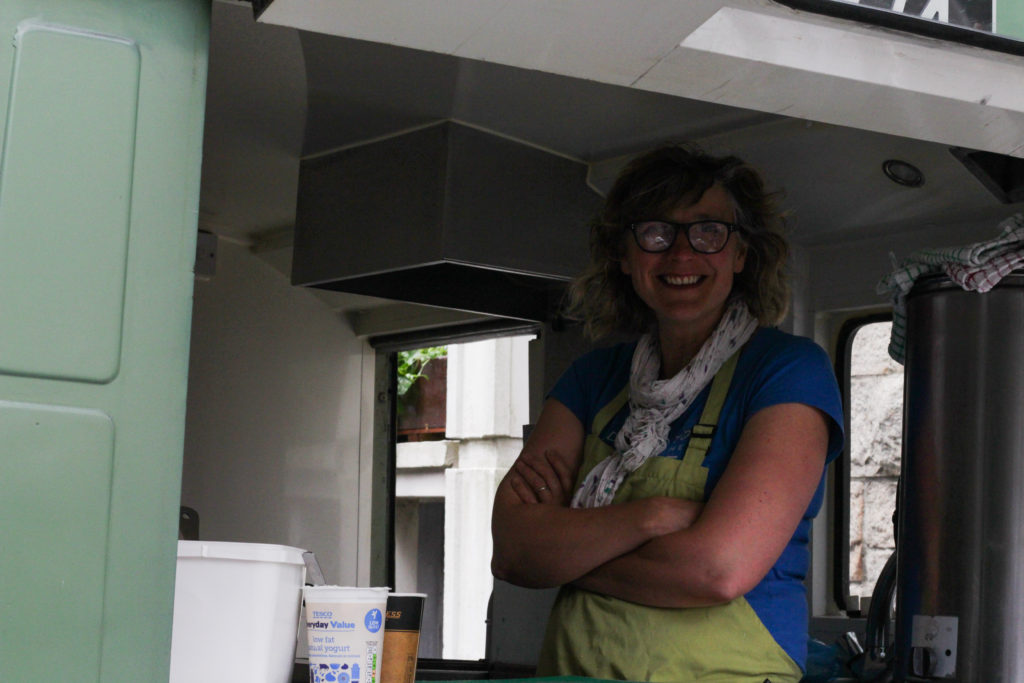
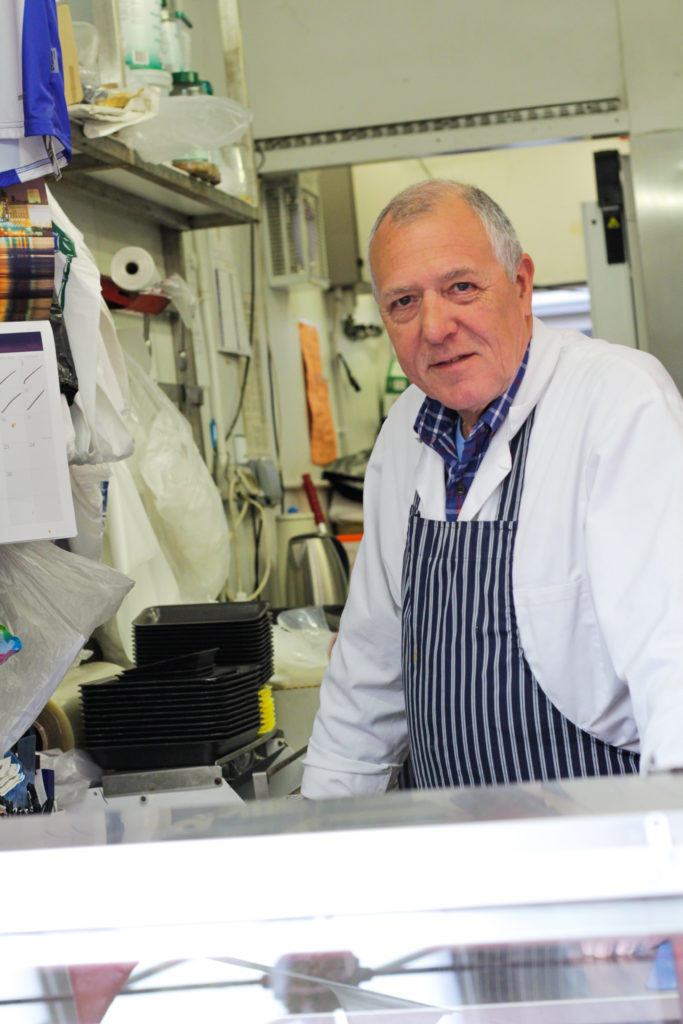
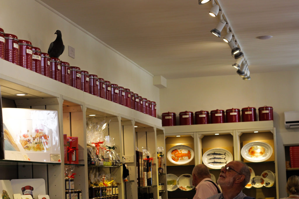
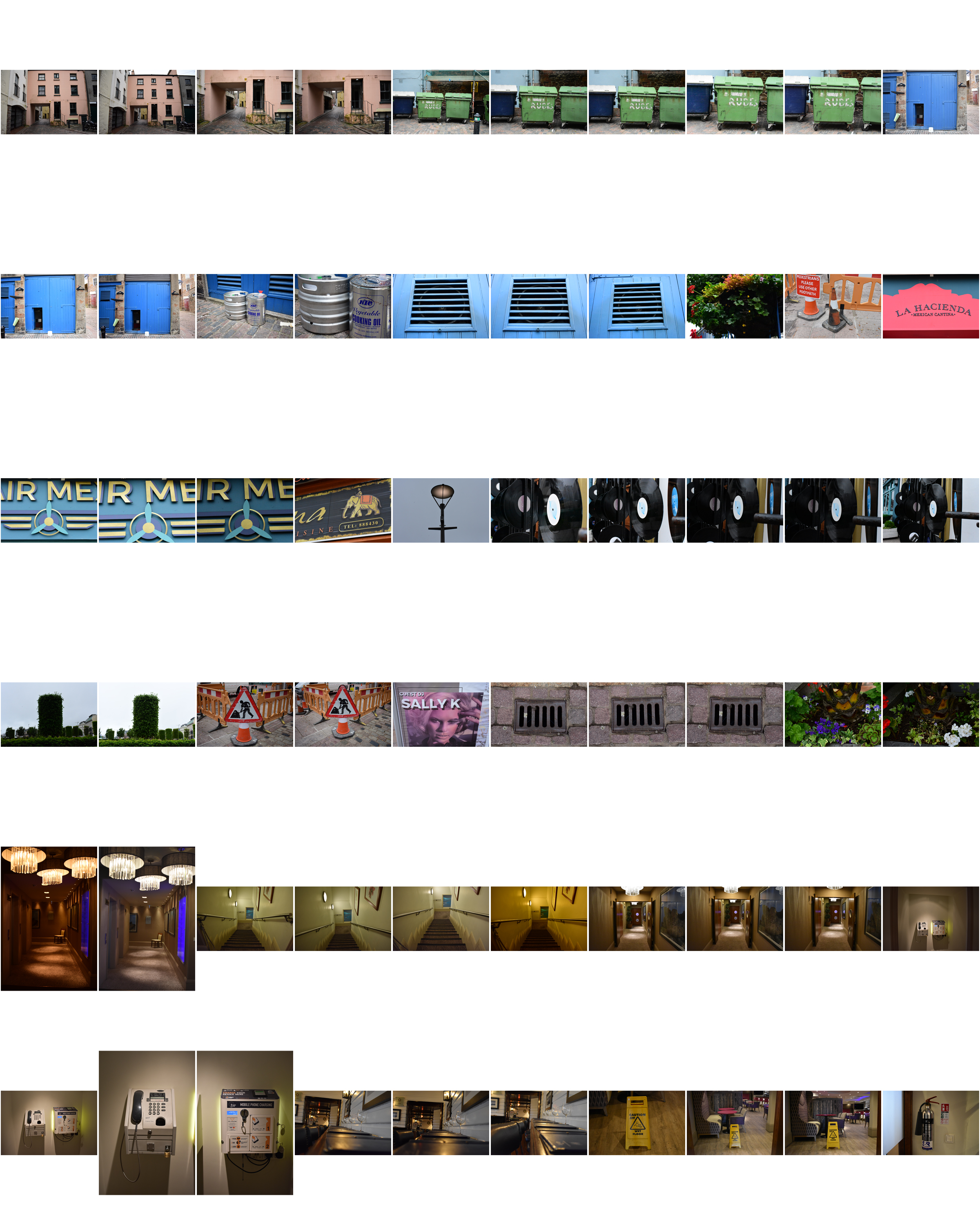
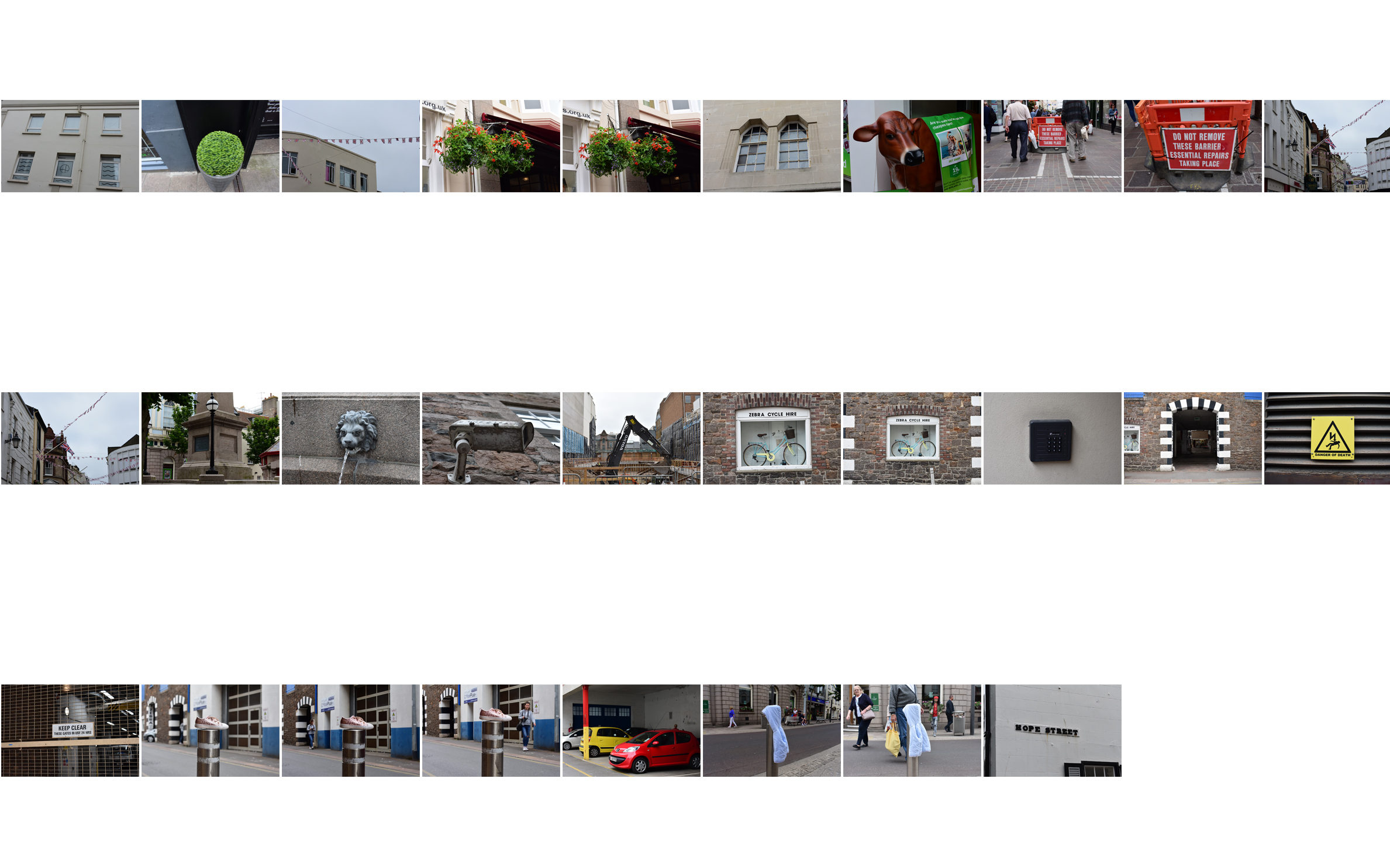
For my final shoot regarding the future of St Helier I wanted to explore the area of the hospital and the buildings that surround it. By doing so I hope to accomplish photographing the architecture present there and the type of people who associate themselves with the area. To do this I would have to look at vivid colours and occasional portraits of local businesses there in the area, providing a reflection of the life in that one place. Before doing this I would need to create a mood board which presents my views and ideas that I would like to achieve by the end result of the process, here are some ideas: 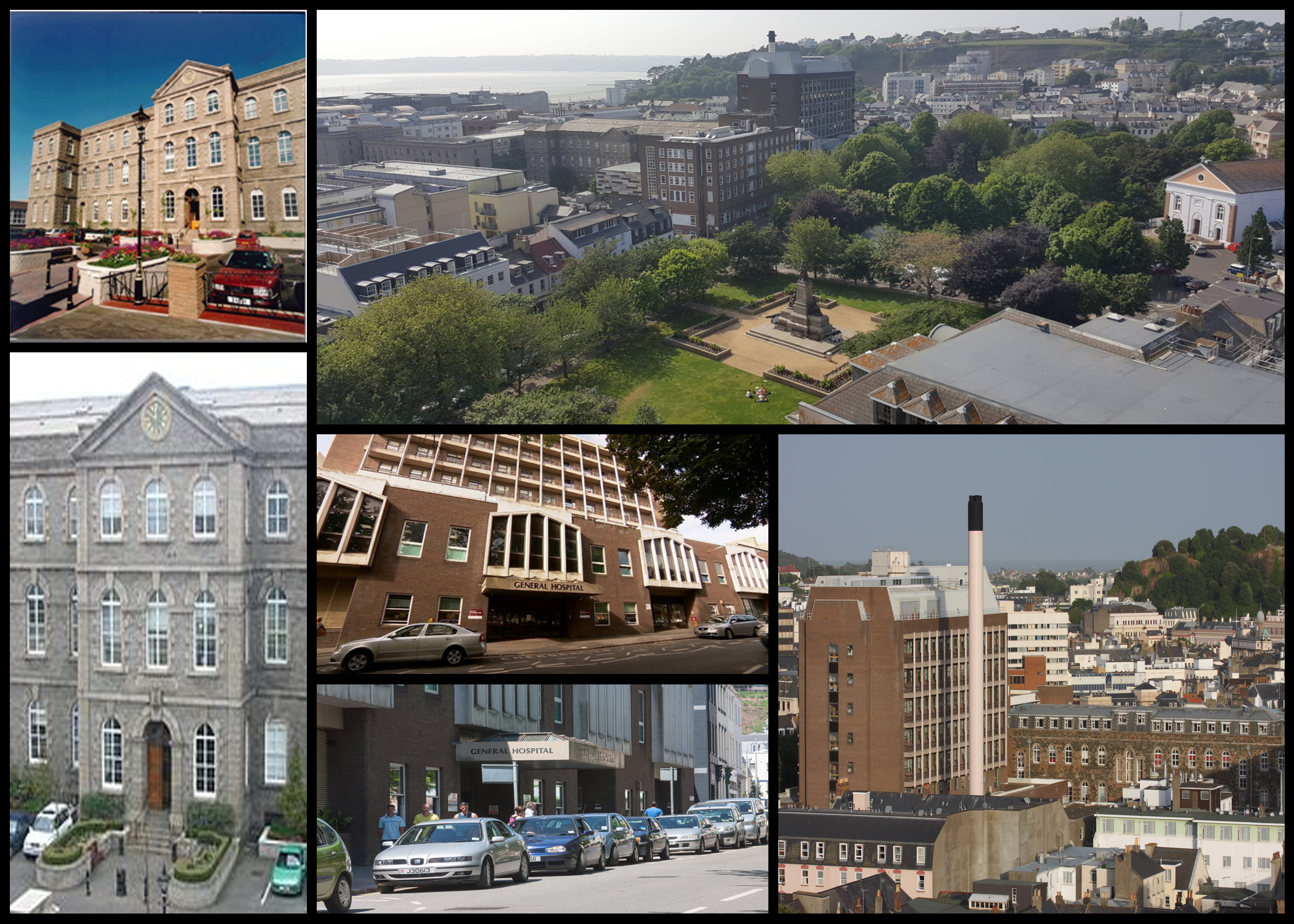 After I had completed this mood board I decided I should make a mind map which would reflect my ideas that I intend to use on the shoot. By doing this it would reduce the amount of time wasted walking around aimlessly and instead give me objectives that I would need to finish by the end of the shoot, producing more imagery as a result. Here are my ideas regarding the shoot:
 Once I had finished this I deemed myself ready to go ahead with the shoot, I would mainly be walking around the area of the hospital and car parks near it in order to capture what the landscape is really like, here are my images from the shoot:
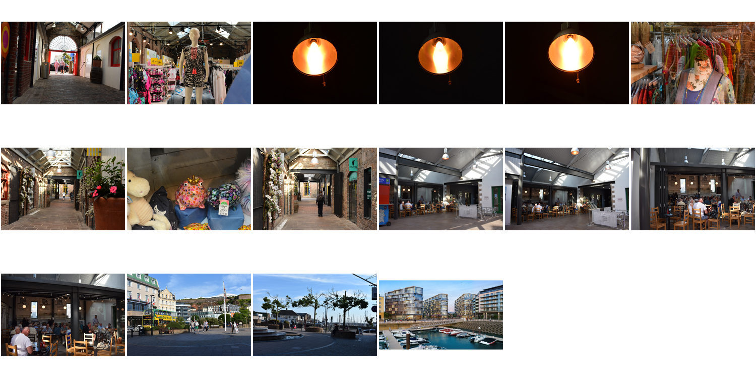
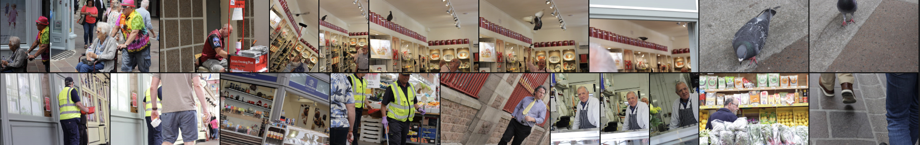
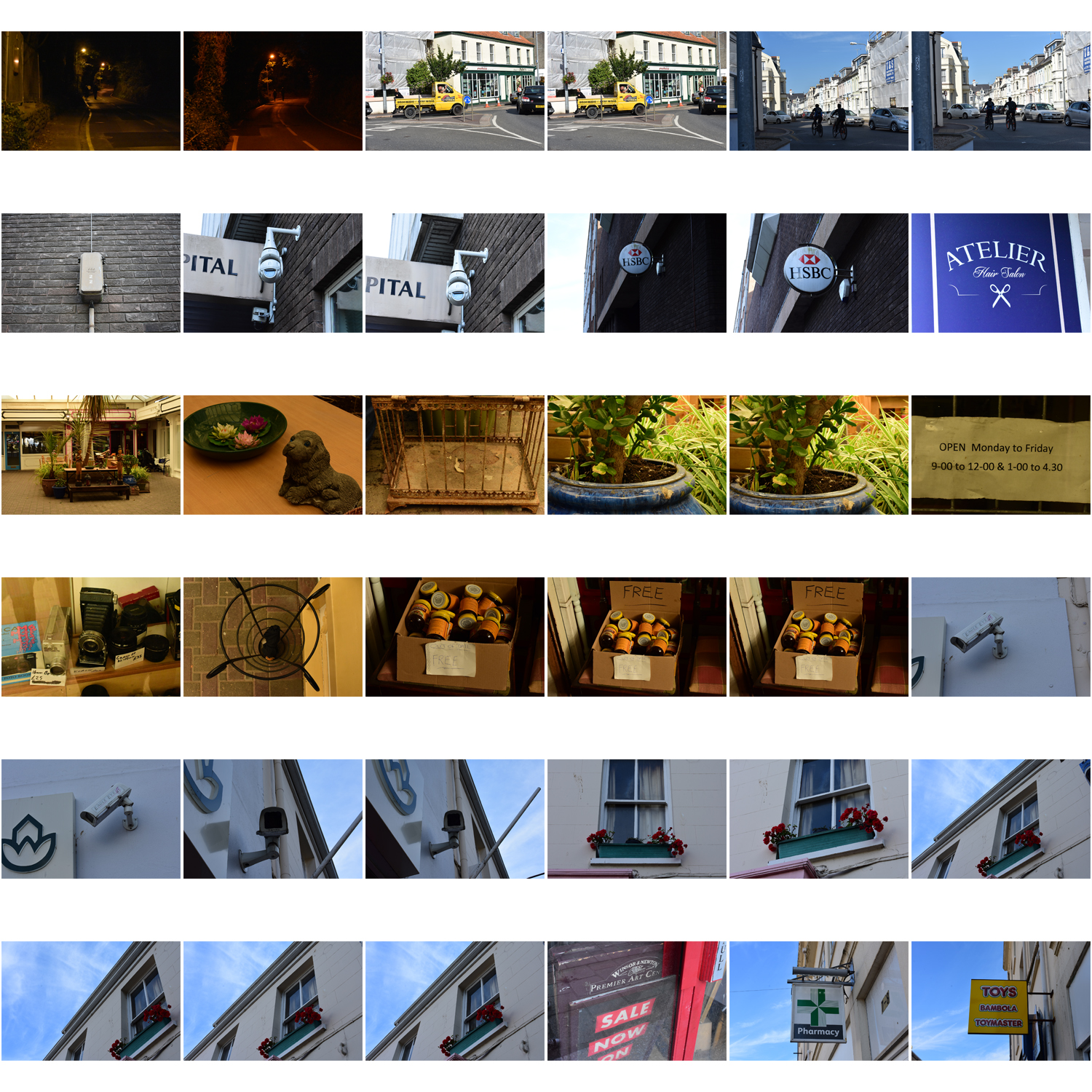
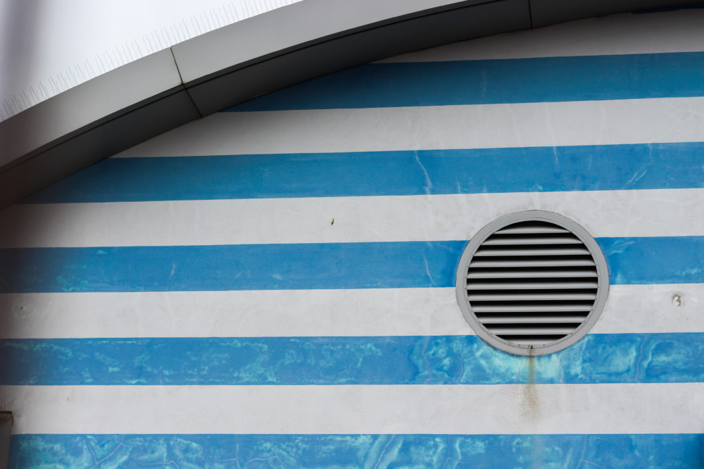
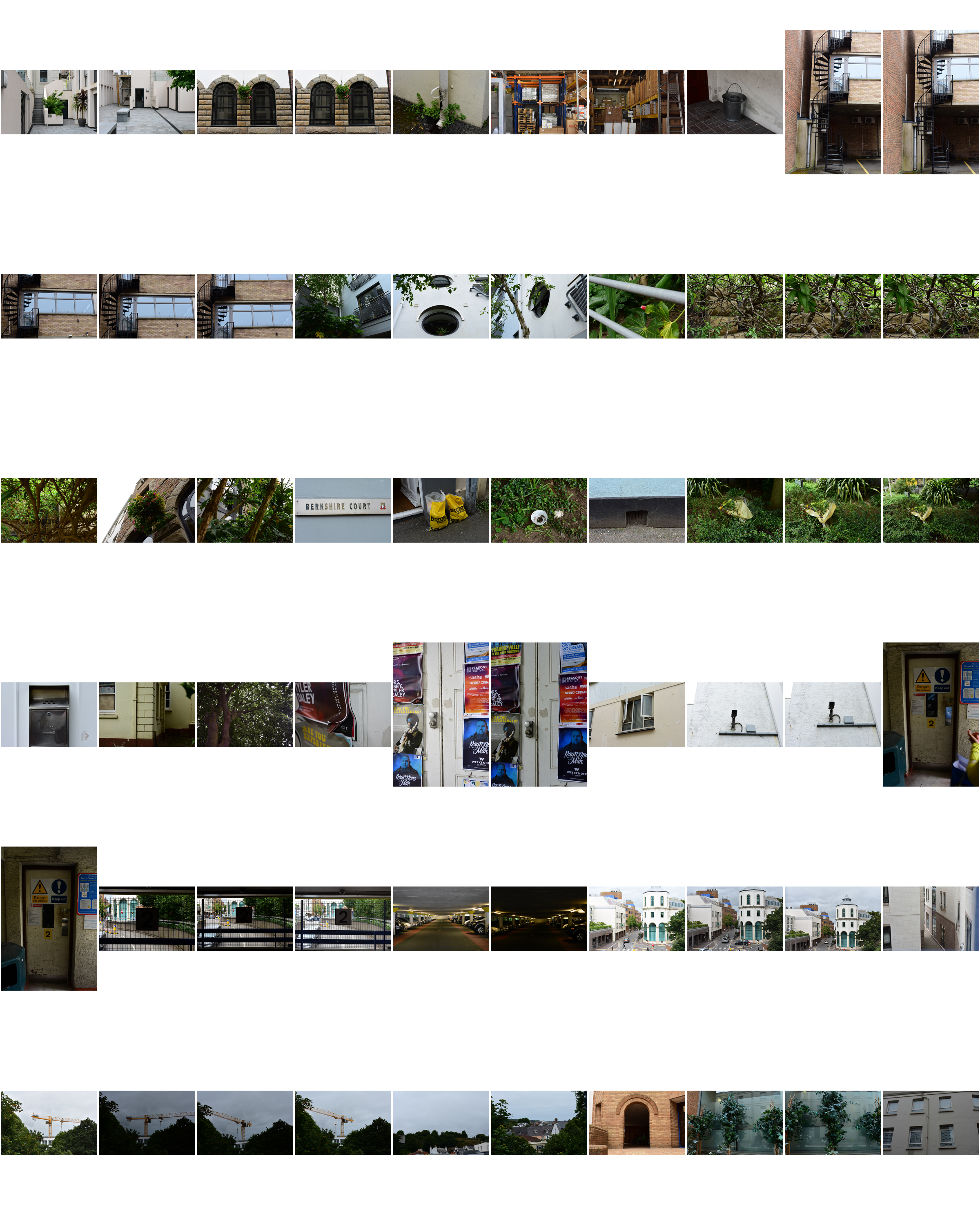
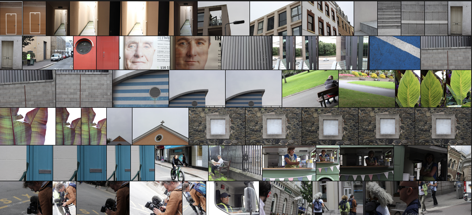 I then proceeded to whittle them down to only ten images in order to select a final image of the shoot that I thought best represented the aim and goal of the purpose. These are the ten images I selected:


Over the next week we would like you to…
Create 5 x examples of alternative layouts for your newspaper using Adobe InDesign and complete a visual blog post that clearly shows your decision making and design process.

CLICK HERE…
ATLANTUS PROJECT | MARTIN TOFT AND GARETH SYVRET
https://www.martintoft.com/atlantus/
Be careful with your choices…aim for impact and originality. Use your crops and edits from your Adobe Photoshop experiments.
for this…you should
Think carefully about how your images compliment each other, contrast against each other or flow as a sequence in a specific order.
2. Design pages / spreads that have a combination of
3. Finally…you must add a colour -coded motif (numbered by page) that indicates your team / zone somewhere in your design.
Use the map from our photo-shoot day in St Helier to help you with this…
Your idea could be a small dot in the corner, or incorporated within your image or page in another way. You can be inventive with this idea, but aim for consistency throughout your pages.
You can export Indesign pages as a PDF or JPEG…but also using screenshots is a great way to illustrate your design process and gives you opportunities to add annotations too…
Deadline for completion : Tuesday 17th July
Be brave…be bold…get creative and have fun!
Newspaper: Your best page will be selected for the Future of St Helier newspaper that will be printed and distributed island-wide on Tue 18 September.
Deadline: Final page must be ready for export end of lesson 10 Sept.


Photo-zine: For the next 4 weeks we would like you to continue to work in Indesign, experiment with layout and design in producing a 16 page photo zine.
Deadline: 16 page zine needs to be printed on both sides and bound on Tue 18 Sept.
Those travelling to GPF 2018 student will be taking your zine with you to be exhibited during Night of Photography Sat 23 Sept
All the zines will be assessed as part of your first coursework that is part of Personal Investigation unit.

Use PLANNING-TRACKING-PERSONAL INVESTIGATION-AUTUMN-TERM-2018 for a full overview of what you are required to do in the next 4 weeks.
You are required to self-monitor your progress and will be asked to upload Tracking-Sheet with an update on a weekly basis to your blog.
TASKS > produce a number of appropriate blog posts
PHOTO-ASSIGNMENT > SUMMER
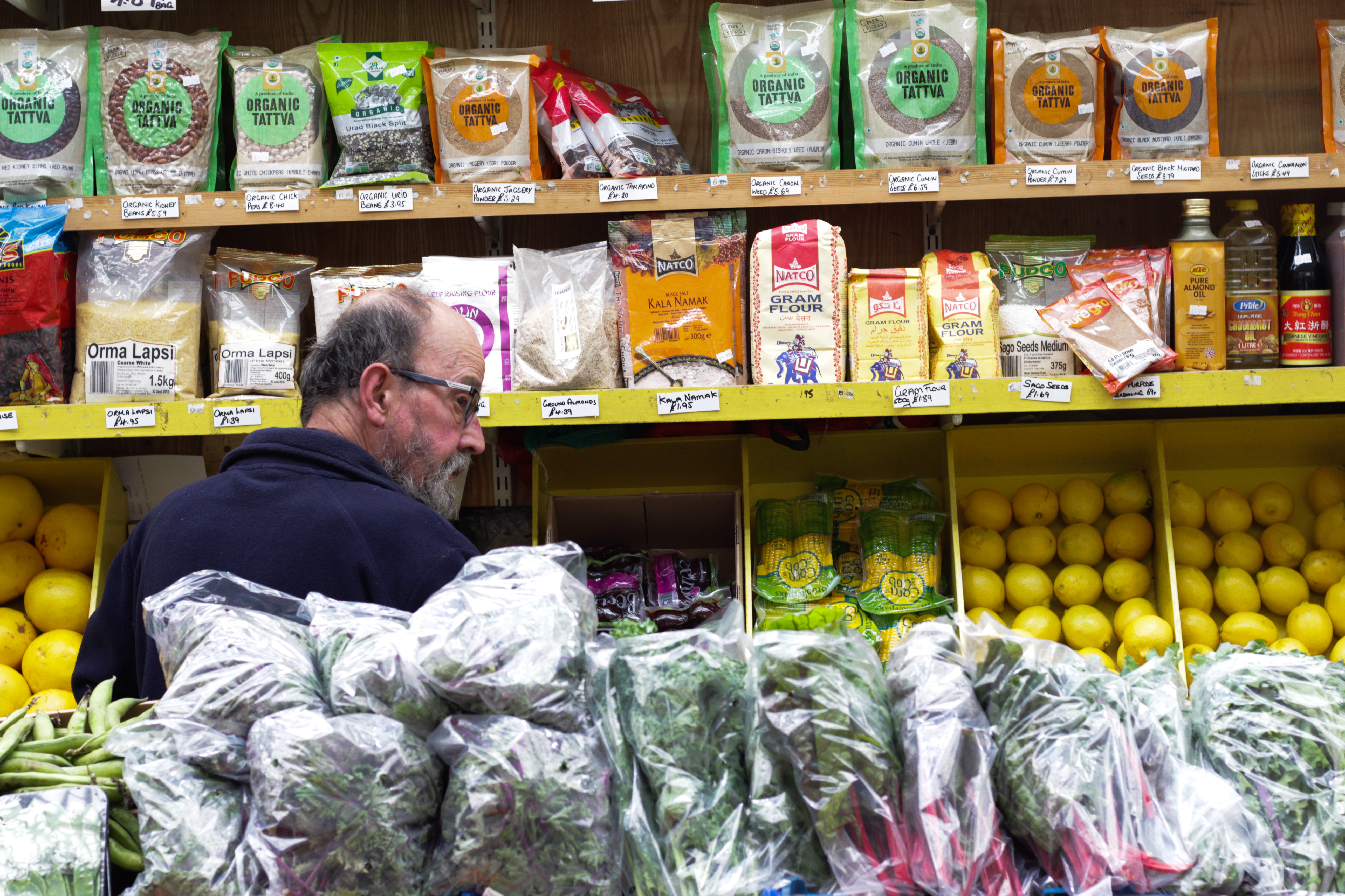
You must return to your area of St Helier over summer and produce at least two more shoots.
Review and evaluate your shoot, identity weaknesses and strength Plan and re-visit for a new shoot that adds value to what you already have.
You have to ask yourself:
Am I satisfied that I have enough images/ material?
What are you going to do differently on next shoot?
How are you going to develop your ideas?
Your photo-zine is a final outcome that will be assessed as part of your Personal Investigation (coursework) giving you marks based on skills, knowledge and understanding of photography as a tool for communication in narrative, sequence and design
Deadline: Bring your new set of images to first day of school Tue 4 Sept.

RESEARCH > ANALYSIS
Café Royal Books is a small independent publisher of photography photobooks or zines, and sometimes drawing, solely run by Craig Atkinson and based in Southport, England. Café Royal Books produces small-run publications predominantly documenting social, historical and architectural change, often in Britain, using both new work and photographs from archives. It has been operating since 2005 and by mid 2014 had published about 200 books and zines and they are held in major public collections
https://www.caferoyalbooks.com/

Editions Bessard is a paris-based independant publishing house created by pierre bessard in 2011. Focusing on working with artists, writers and curators to realise intellectually challenging projects in book form.
https://www.editionsbessard.com/product-category/zine-collection/
Something to read:
ARTISTS REFERENCES: Follow these steps to success!
DEVELOP > EXPERIMENT
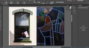
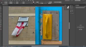
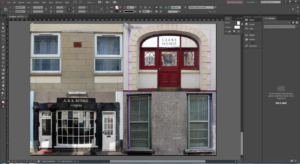
Create 3 examples of alternative layouts for your zine using Adobe InDesign and complete a visual blog post that clearly shows your decision making and design process using print-screens or save each page-spread as a JPEG.
EVALUATE > PRESENT
Write an overall final evaluation (250-500 words) that explain in some detail the following:
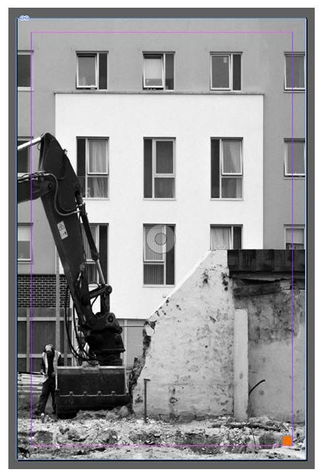
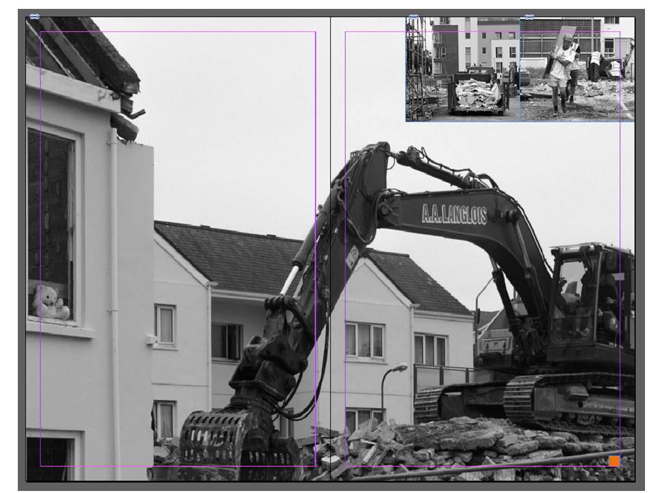
In this design layout I have looked at doing full bleed spreads along with images overlapping onto the full bleed spread. I think this composition is very effective as it makes the photograph more imposing and bold. The overlapping photographs are subtle but create an alternative look to the composition. I think that this composition emphasises the destruction within the photographs whilst showing the rebuilding going on in the background quite subtly. The constant black and white tone throughout the composition reflects the idea that St. Helier is just caught in a constant loop of construction and rebuilding in order to support the financial sector rather than supporting the tourism in the island that was so successful at a time.
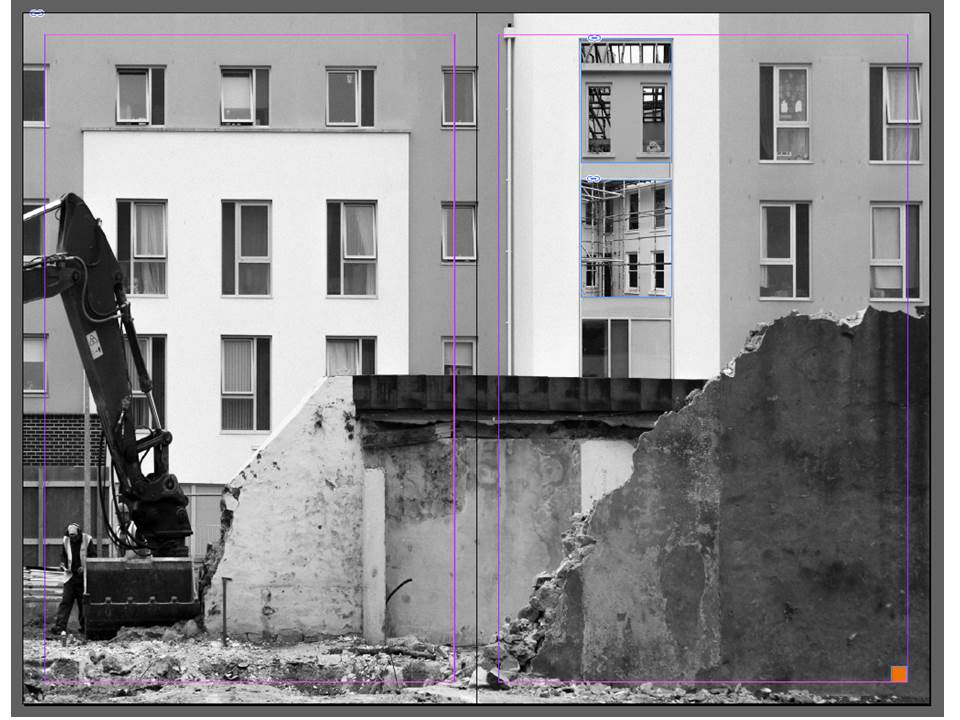
The below design is my alternative design for my single page. It sticks to the full page bleed to emphasise the photograph but crops one of the photographs from the double page spread in half to suit the design.