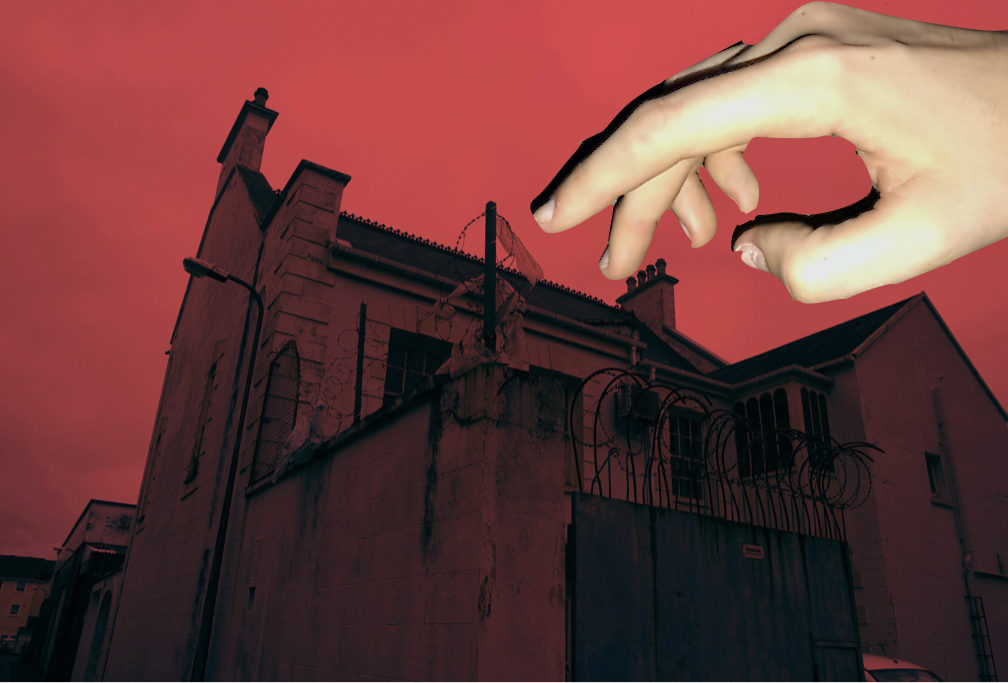
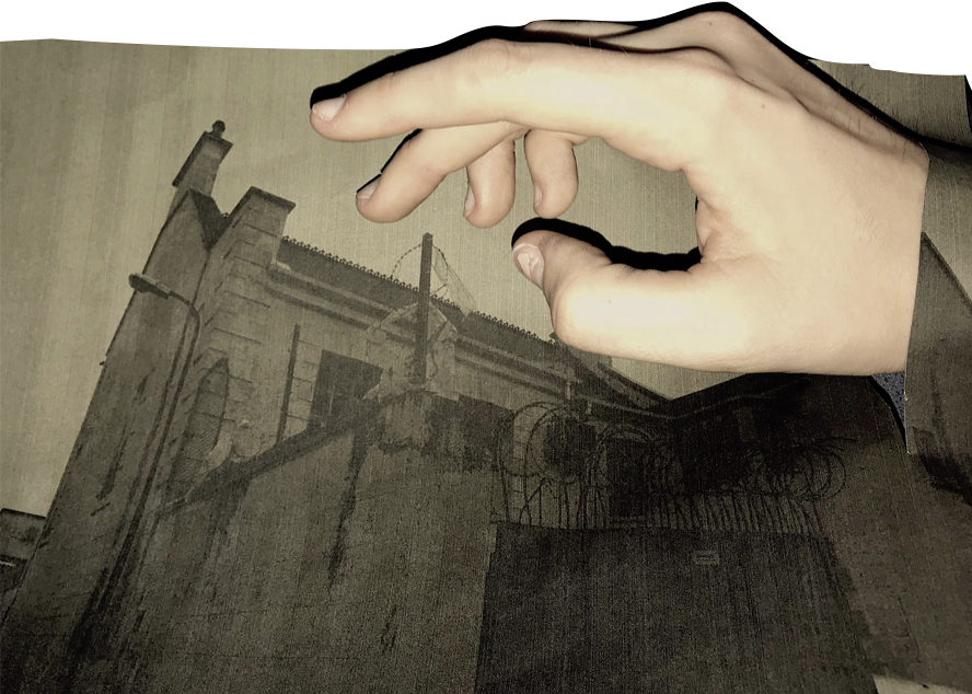
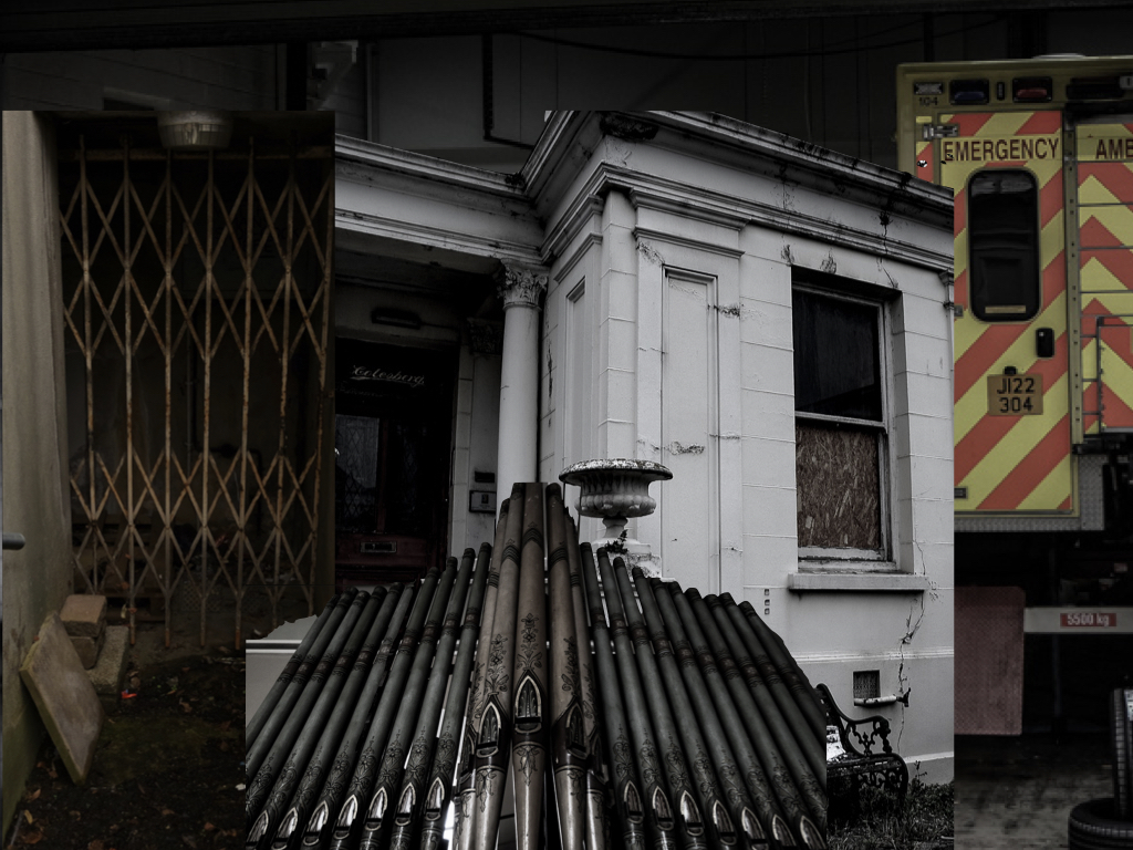
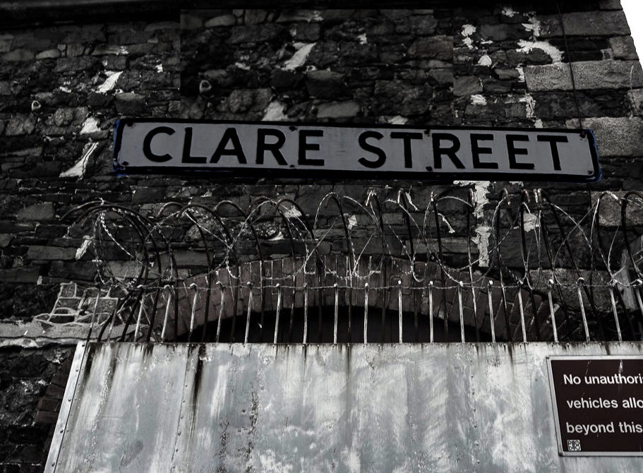
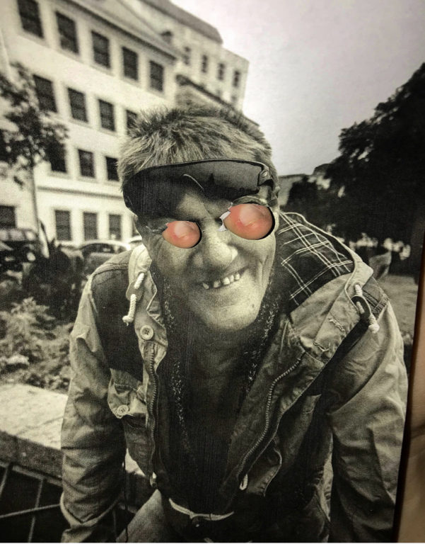
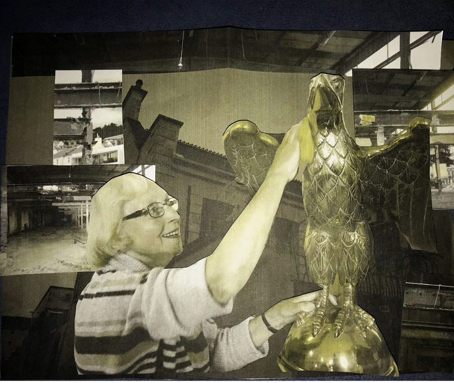
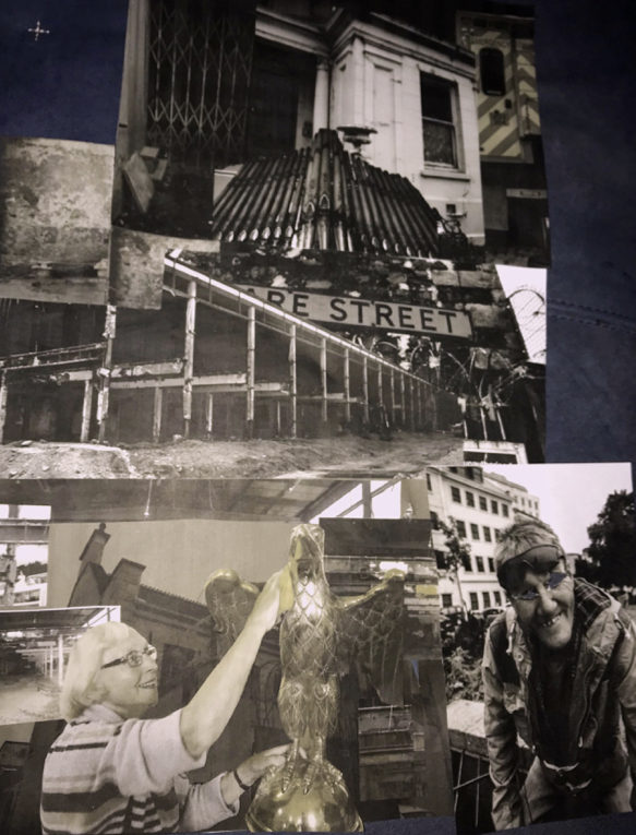
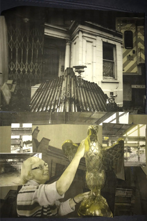
When using collage I wanted to combine different layering of colours, physical collage and photoshop editing. The first images I wanted to combine an essence of the people who live in the area and the area itself, I wanted the hand to form a different tone of vibrancy and show an almost grabbing effect. I used two different examples collaging colour edits with more less saturated images. The next collages I waned to combine different aspects of St Helier and combine them into a large piece all layered on top of each other.
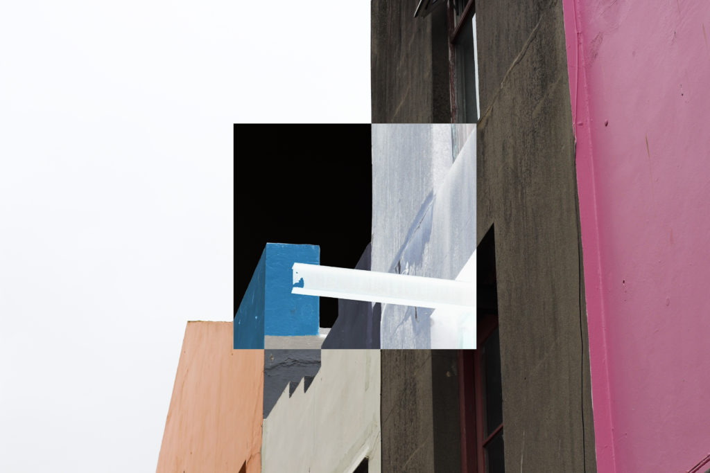
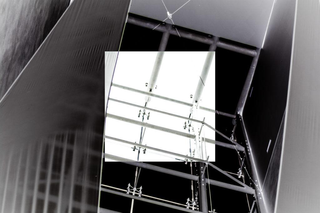
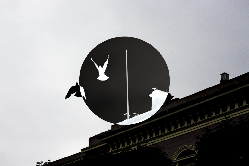
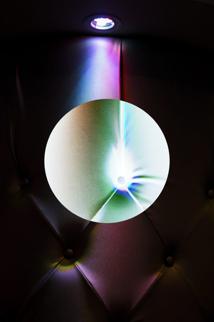
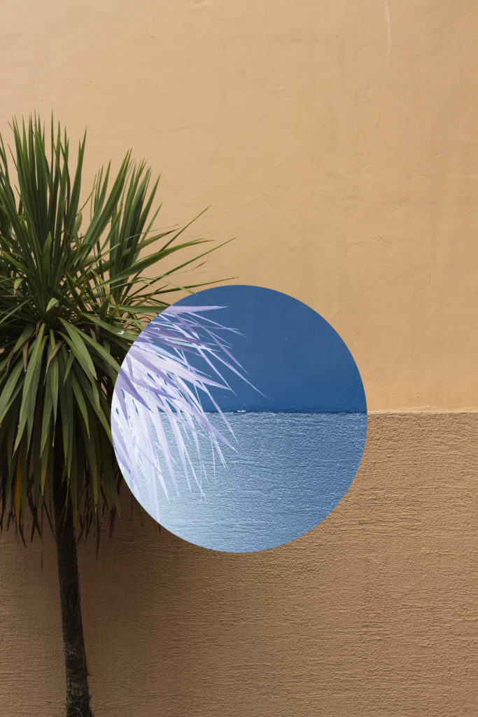
Once the base shoots were done I then wanted to proceed into editing certain images in different styles to explore the effect they had on the presentation of how I saw my area of St Helier. To do this I used a process of inverted collages where I overlapped two images on top of each other (one being inverted) and cropping the un-inverted image into a shape which is placed in the exact same area of the other image. I found that the results of this were quite successful as they defined a more black and white world that I saw the development of St Helier in, whilst presenting them in a more abstract and unique way than they were originally. Here was the process that I went through along with the final outcomes of the edit: Using either the circular or square highlighter I positioned the shape anywhere on the image, choosing to do the center because of the symmetry it would create from the overall picture. Once I was happy with the shape placement I then proceeded to press Ctrl + I, by doing this it would convert the area inside of the shape into inverted colours making an abstract effect to the piece from the layered filters.
After this I used the effect on various images from the shoot to see how the lighting would affect the outcome, these were my results from the experiment:
I found that after editing each image that using shapes to invert certain areas was most effective as it allowed for a more abstract impression on the picture due to it attempting to reflect the shape of the object itself. To me this produced aesthetically pleasing result as the colours used were polar opposites but at the same time complimented each other.

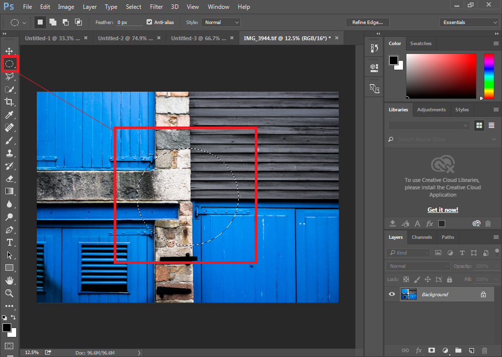 Using either the circular or square highlighter I positioned the shape anywhere on the image, choosing to do the center because of the symmetry it would create from the overall picture.
 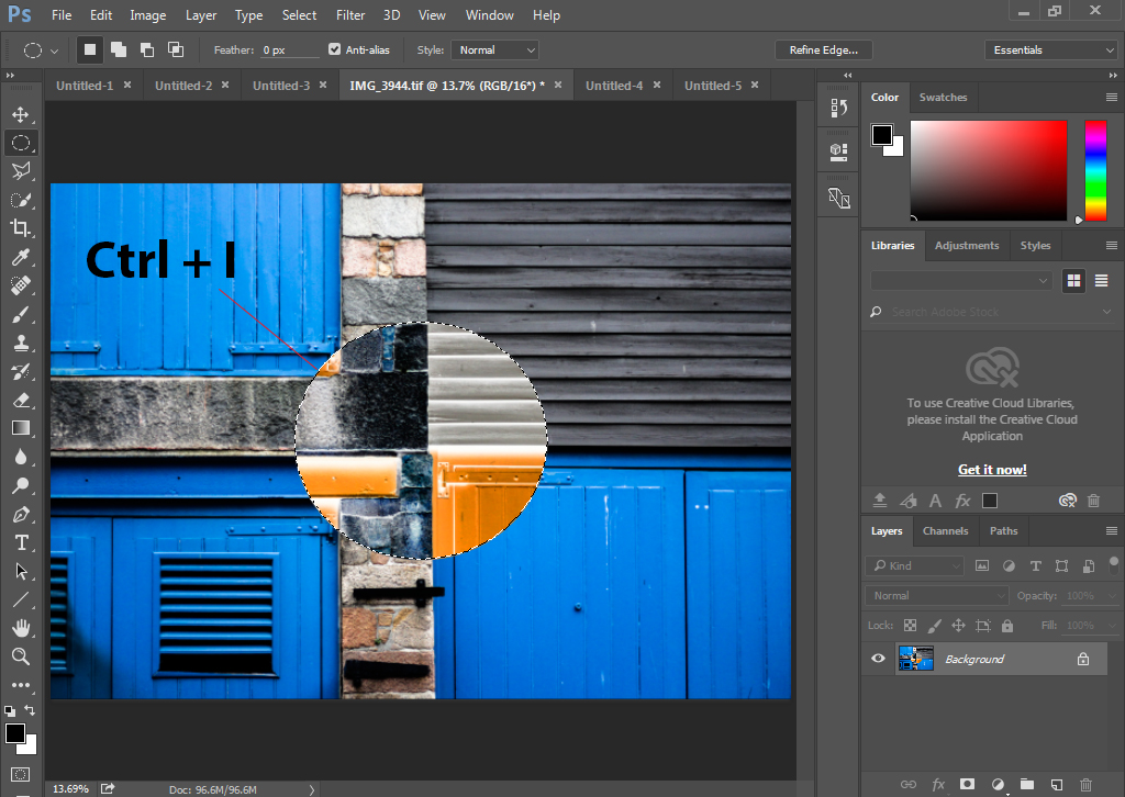 Once I was happy with the shape placement I then proceeded to press Ctrl + I, by doing this it would convert the area inside of the shape into inverted colours making an abstract effect to the piece from the layered filters.