
Once I was satisfied with my research regarding the given area to explore, I decided that it was time to move onto the shoot itself. When put into groups for the given area I came to the conclusion I would use a mind-map I made earlier to help direct my interests and intentions quickly towards what I wanted, by doing so it would allow more time for photographing rather than attempting to figure out what I wanted. Here are my ideas: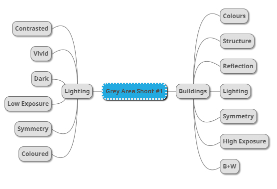 From here I went ahead with the shoot focusing purely on what I wanted to reflect from the assigned area of town, here are my pictures from the first St Helier photography shoot:
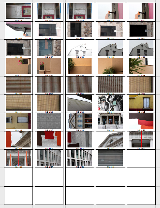
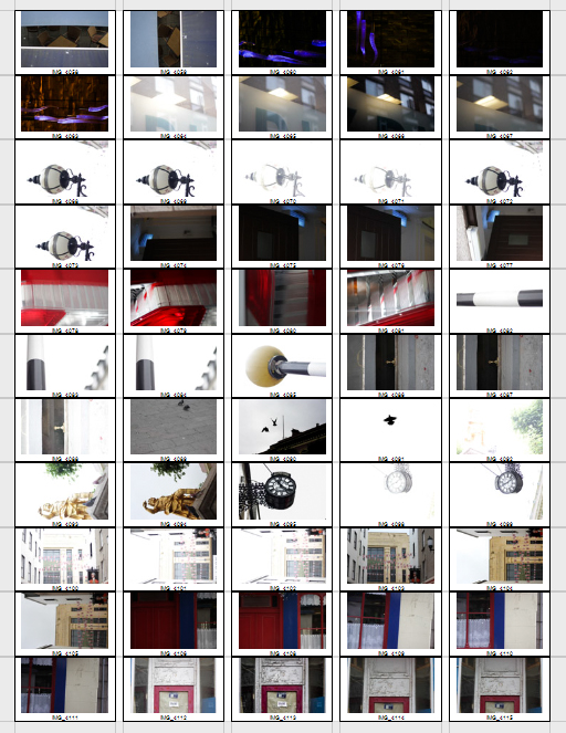
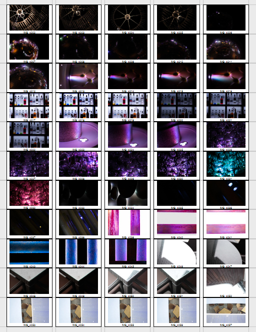
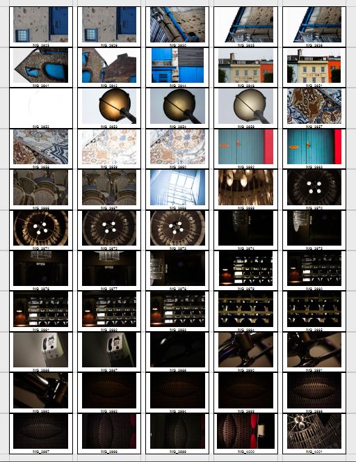
After reviewing my images taken on the shoot I decided to whittle them down to a section of the top ten images that I thought were overall the most successful pieces out of the whole batch. This would allow the process to identify the key images to use for Master plan Jersey easier whilst developing my skills on of being harsh on myself and clearly understanding which pictures are most effective. This was my top ten selection of images I thought best represented the shoot:
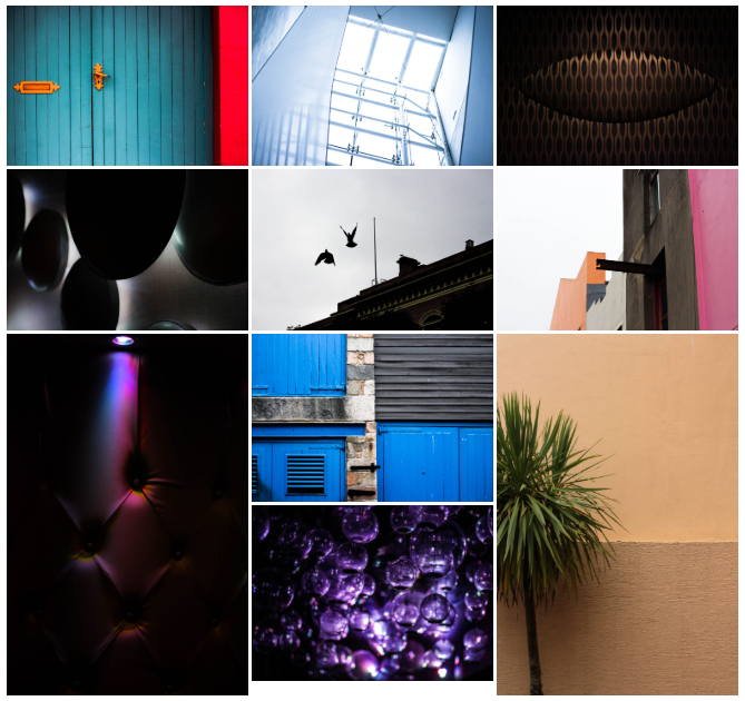
Once done I then proceeded to move onto turning those ten images into five, which I would then go onto analyze the aspects in each one which made them more successful than the others that they were separated from. Here are my decisions:
 The reason I selected this image was because of the contrast between the single coloured source of light and the darkness surrounding the rest of the piece. This was made particularly effective from how the indents within the chair highlighted holes which allowed them to become reflective and a key element in the photo. The result is very abstract and so is not definite what it is meant to be, creating a kind of pattern that is carefully put together.
 I chose this picture because of the broken symmetry present within the left hand side of the picture. I found that the boring backdrop of two contrast oranges is complemented by the green opposing tree which breaks the piece up to become aesthetically pleasing to the viewers. The exposure in the photo highlights the wall, whilst creating a dark shadow to the tree making it stand out consequentially.
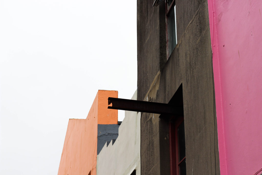 I found that the range of colours in the picture all complemented each other against the bleak sky above. The use of a slanted urban landscape creates an aesthetically pleasing result through the use of blank space which stops the vivid coloured concrete from overpowering the entire picture. There is some use of symmetry which is present through the left and right of the photograph, where half is urban and the rest is natural which can relate to the topic of Masterplan.
 What I liked about this photo is the use of a depth of field which centers into the middle of the piece. This creates a high form of aestheticism for the viewer as it prevents any eye-sore from occurring through any part of the image, this is also complemented by the use of a dark border which boxes the purples in and centralizes attention to the lights in the middle. The colours present within do work well with each other as only black, white and purple are present with odd tints of blue which create a sparking abstract result overall.
 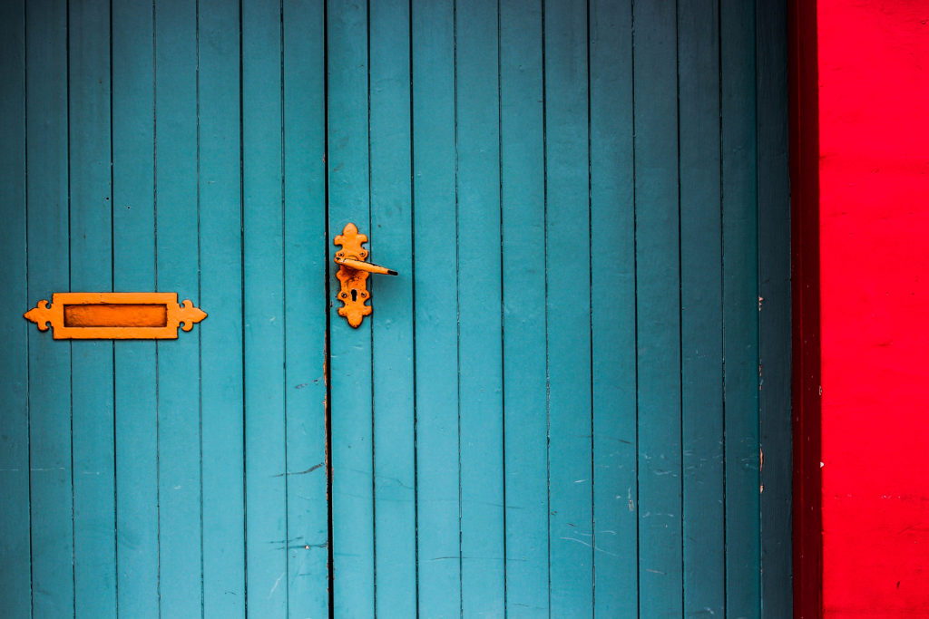 The photograph of the door to me was well composed composition wise, this is became of the continuous use of symmetry present throughout the image. The straight vertical and parallel lines within are complimented by the contrast colours of red, orange and blue, all which and blended together through the use of a black darkened border. I found that the red concrete streak on the right broke up the image from being too bland and overpowered by the blues, and so really balanced it out as a result.
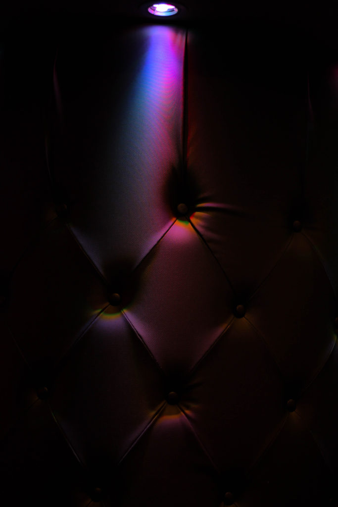
After analyzing each of my top five images, I had decided that I would be able to come to a conclusion of which image I thought was the most effective out of my entire first shoot. I would have to choose this image based on the composition, colours and the overall relevance to the topic of the development within Jersey, this was my final choice:
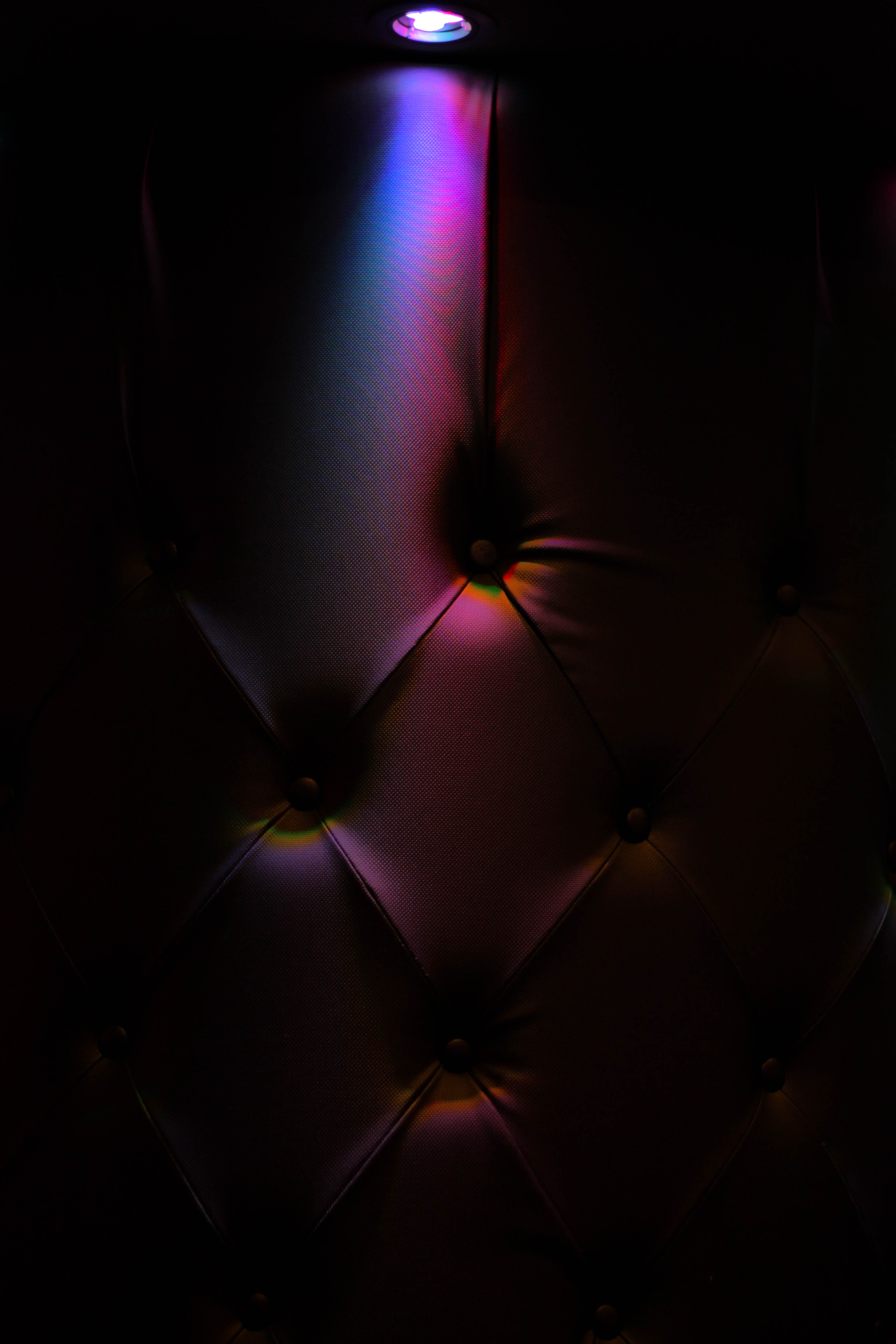 The reason I selected this as the final image for my shoot, which I thought best reflected the overall result from the future of St Helier was this image of a chair. I found that this perfectly reflected how abstract certain parts of the town were, as much of the urban areas were really contrasted against bright unique colours of random buildings. In my opinion this image represented how such vivid colours seemed out-of-place for what it was in the environment, as the chair seemed to be just dotted randomly in the middle of the darkness without any purpose or intention, much like the use of construction within St Helier. The image itself is complemented through the composition, contrasting colours, and use of a dark border to create a sense of mystery and abstract to the design which I found really brought it out as a whole.