
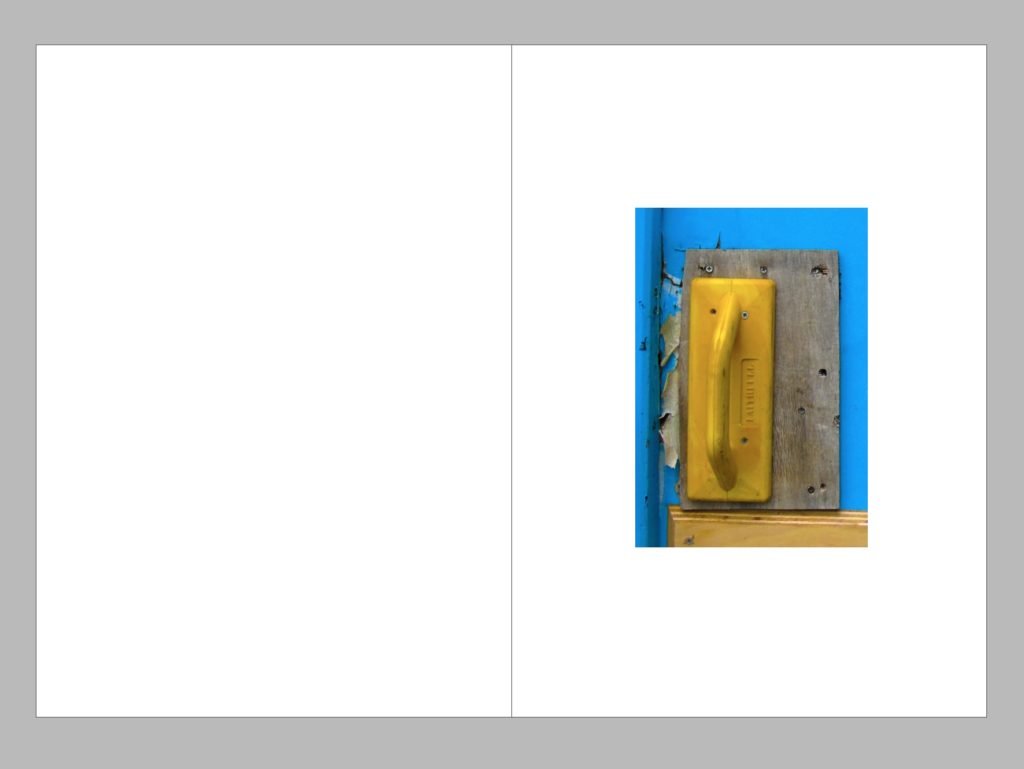
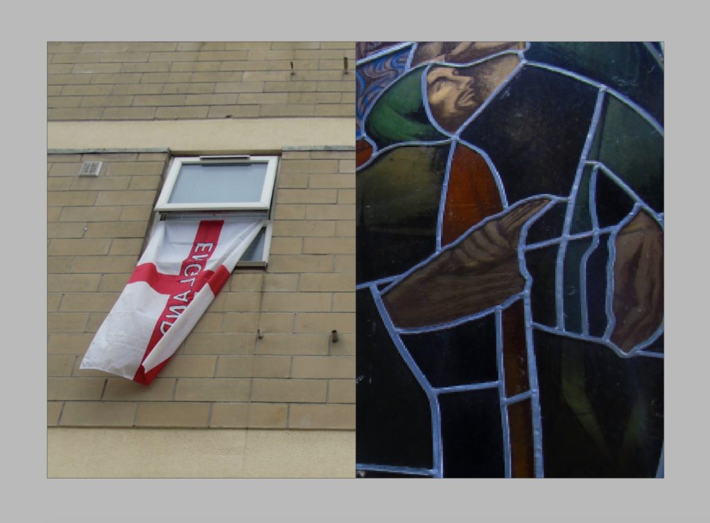
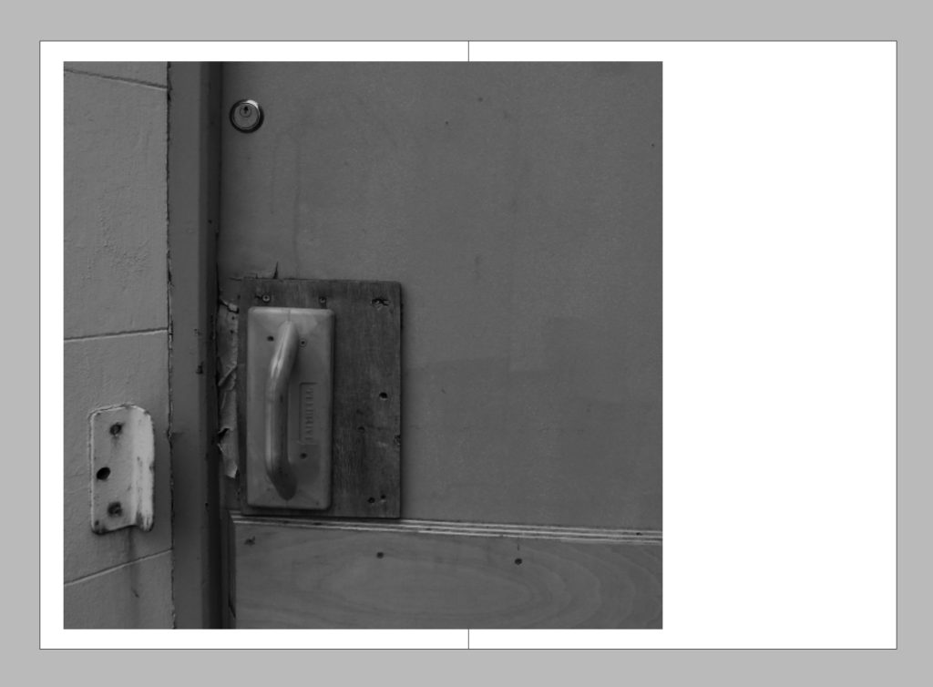
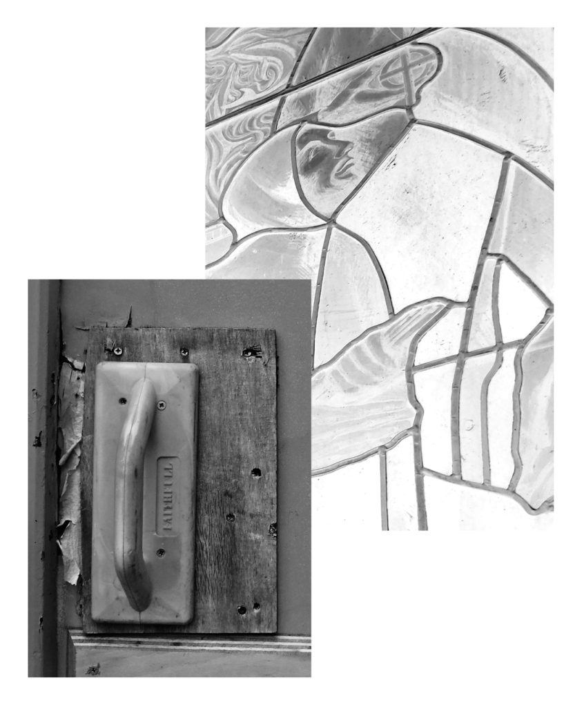
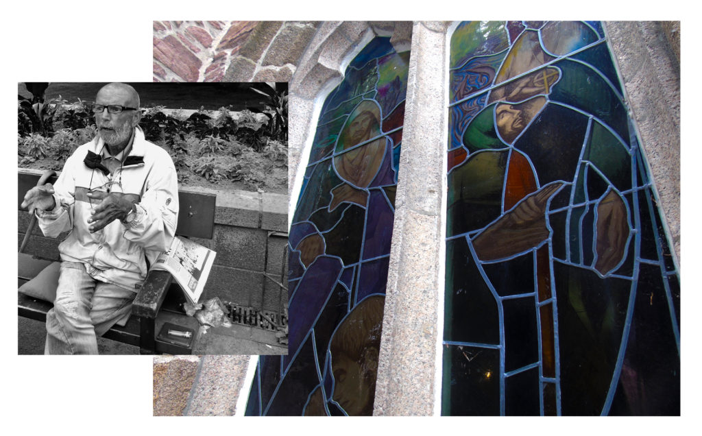
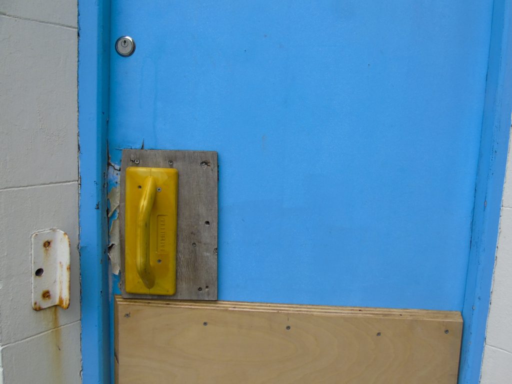
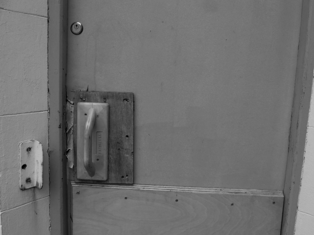
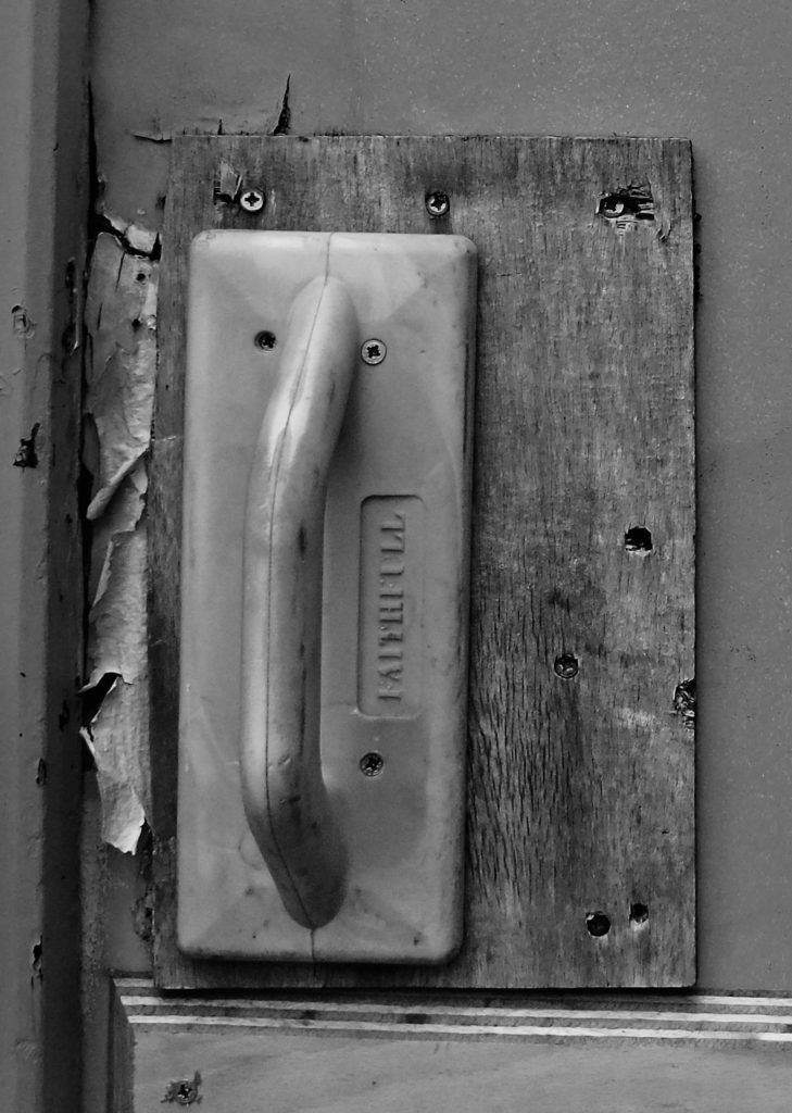
I used InDesign to create a variation of draft page spreads, my intention was to experiment with some different placement and layout ideas and also to experiment with having either all colour photos in my layout or all black and white. In the end I decided that although I did like the colour concept i found that having all the images in black and white helps the layout to link together better and creates a better narrative. Although I decided to go with the black and white layouts I still like the placement of the images on the other coloured pages, I felt that having a variety of page layouts is what would look best for my images as some images looked better by themselves or full bleed on the page or some smaller, I also experimented with having the single photos spread onto a second page slightly to create a break from symmetry, for example I decided to place the bottom right picture on the left of the page because the door handle is on the left of the door, but I still wanted to have something on the right page as when you are looking through a book you tend to look at the right page first so I placed the image slightly off from the left so that it would go over onto the right page.
Daily Archives: June 21, 2018
Filters
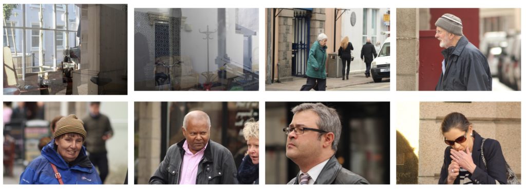
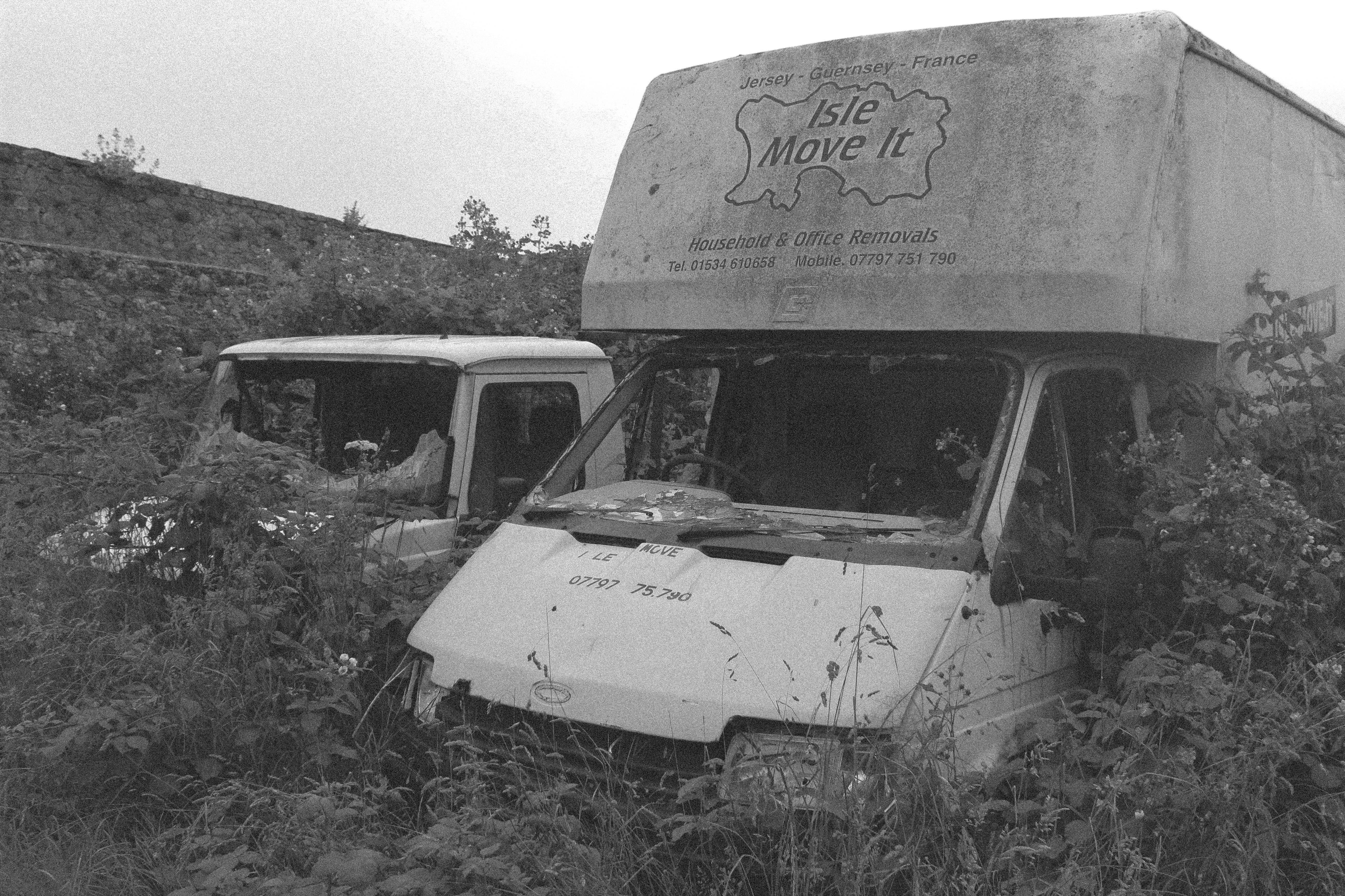
Shoot 2 – area revisit
For my second shoot I revisited the area and explored some new places to get some more photographs, I tried to get a mixture of images of people and buildings so that I would have a good selection to pick from. These are a few of my favourite images from the shoot.
Montages
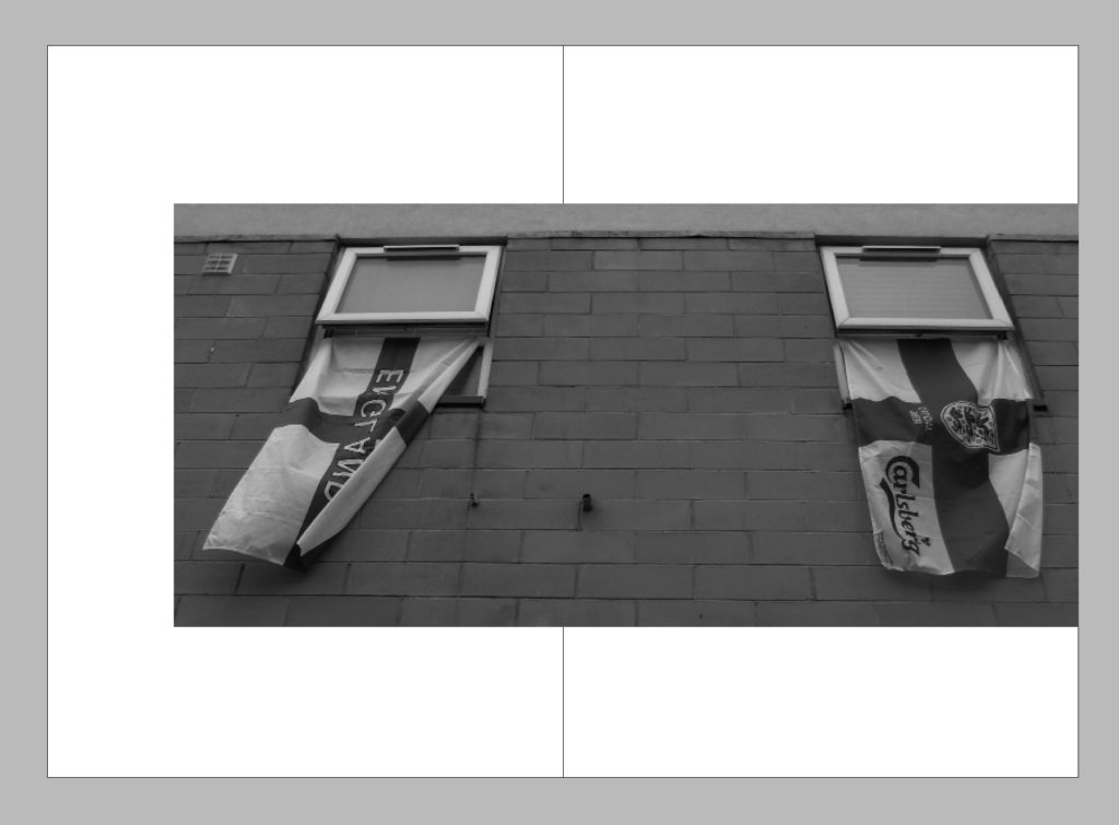
For these montages I decided to experiment with a variation of black and white and colour, I experimented with a variation of compositions and pairings of photographs to create different narratives.

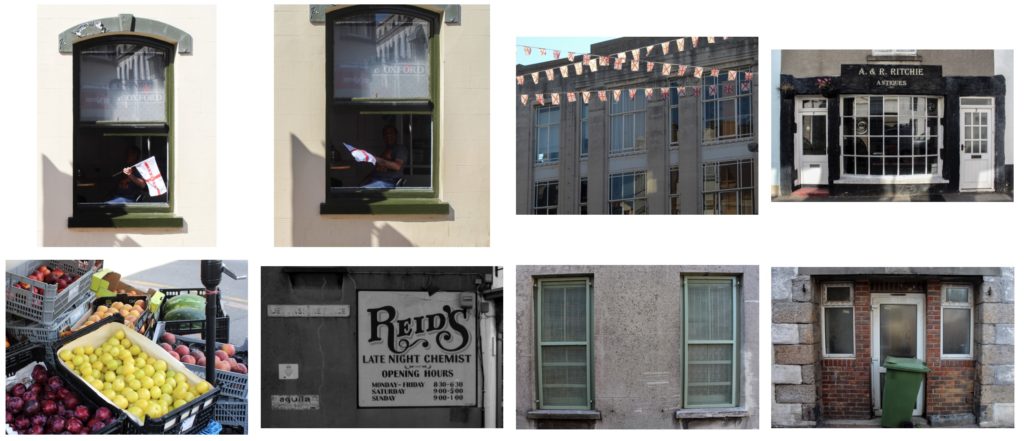
Final Shortlist From St. Helier Photographs
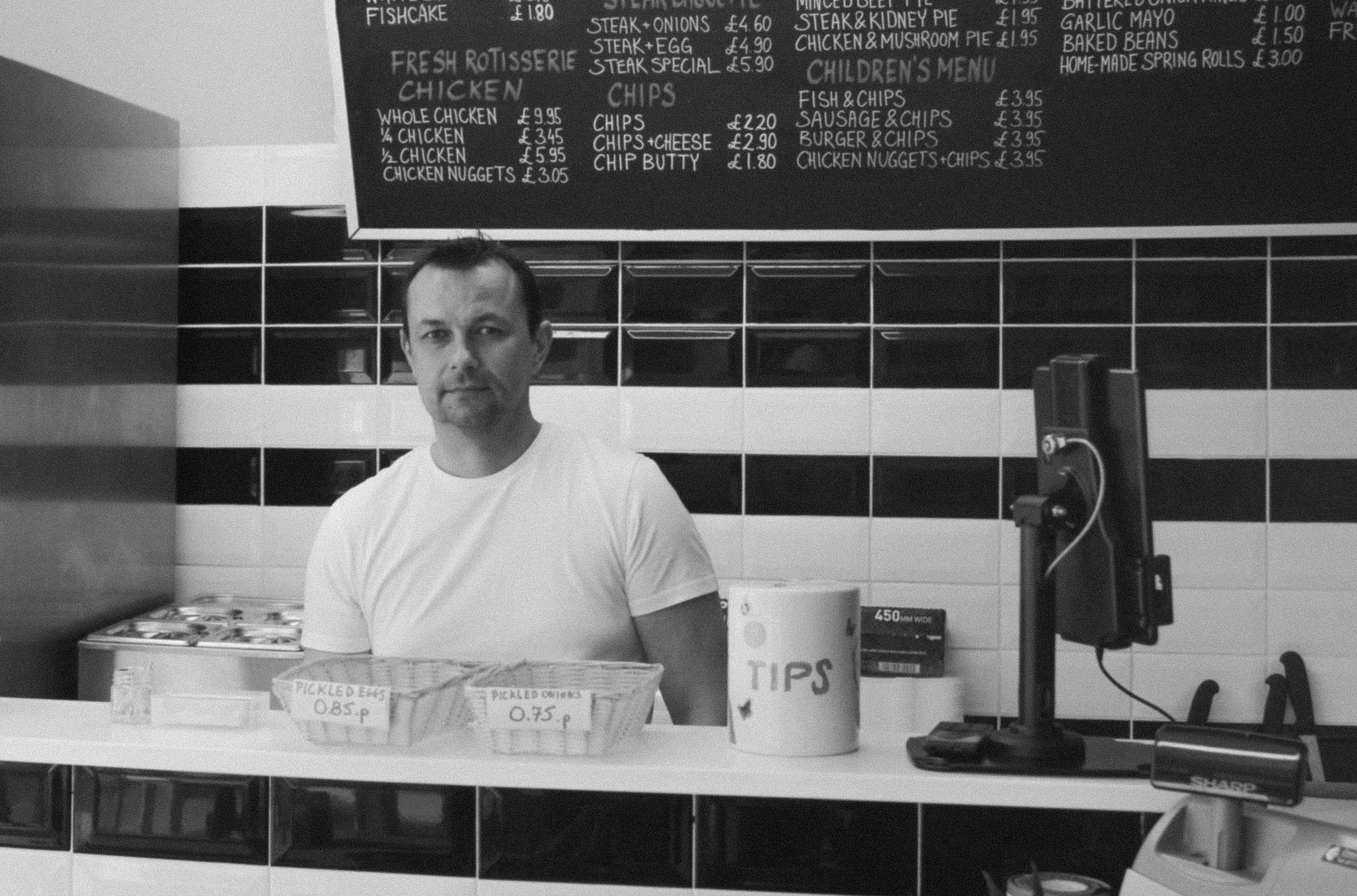
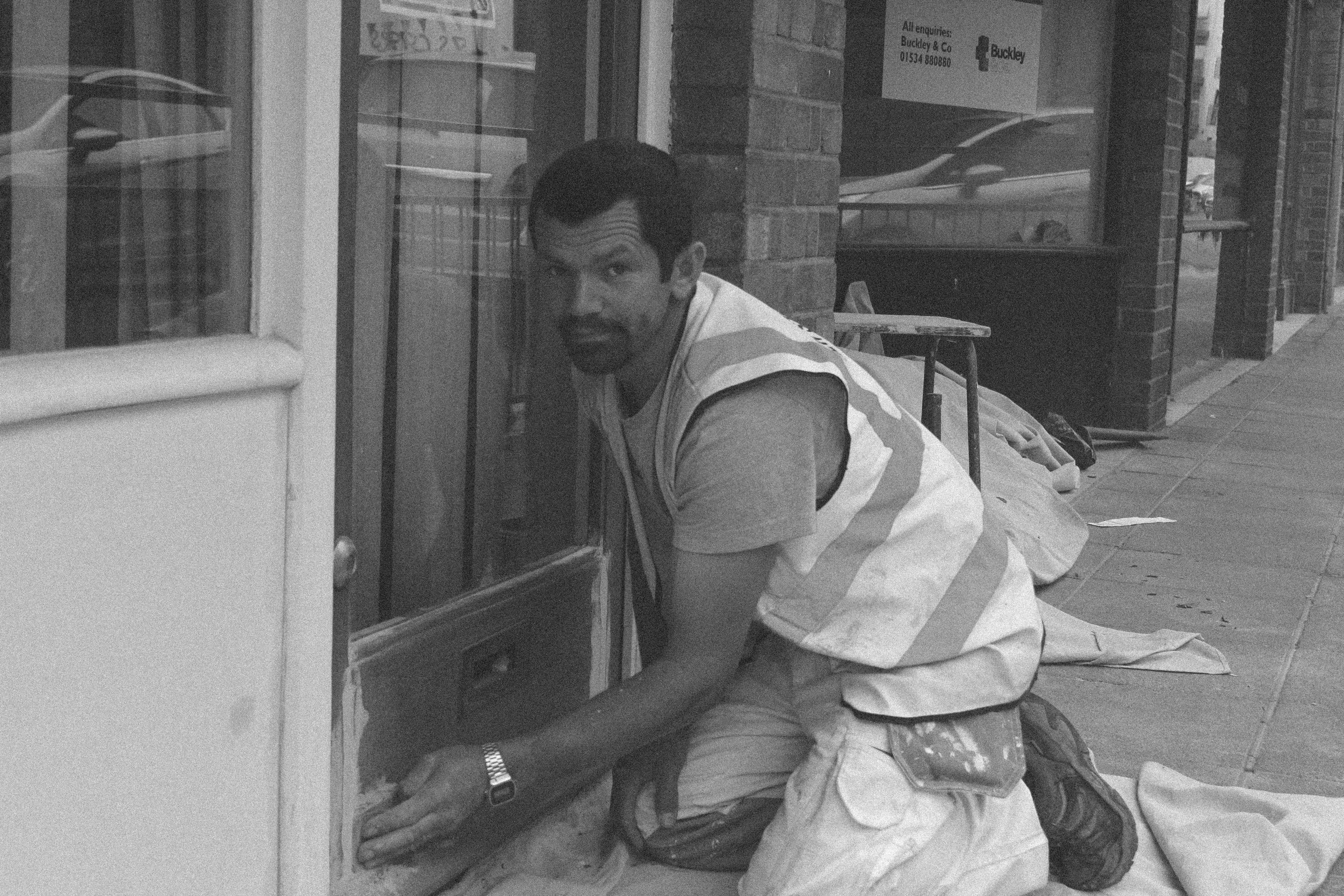
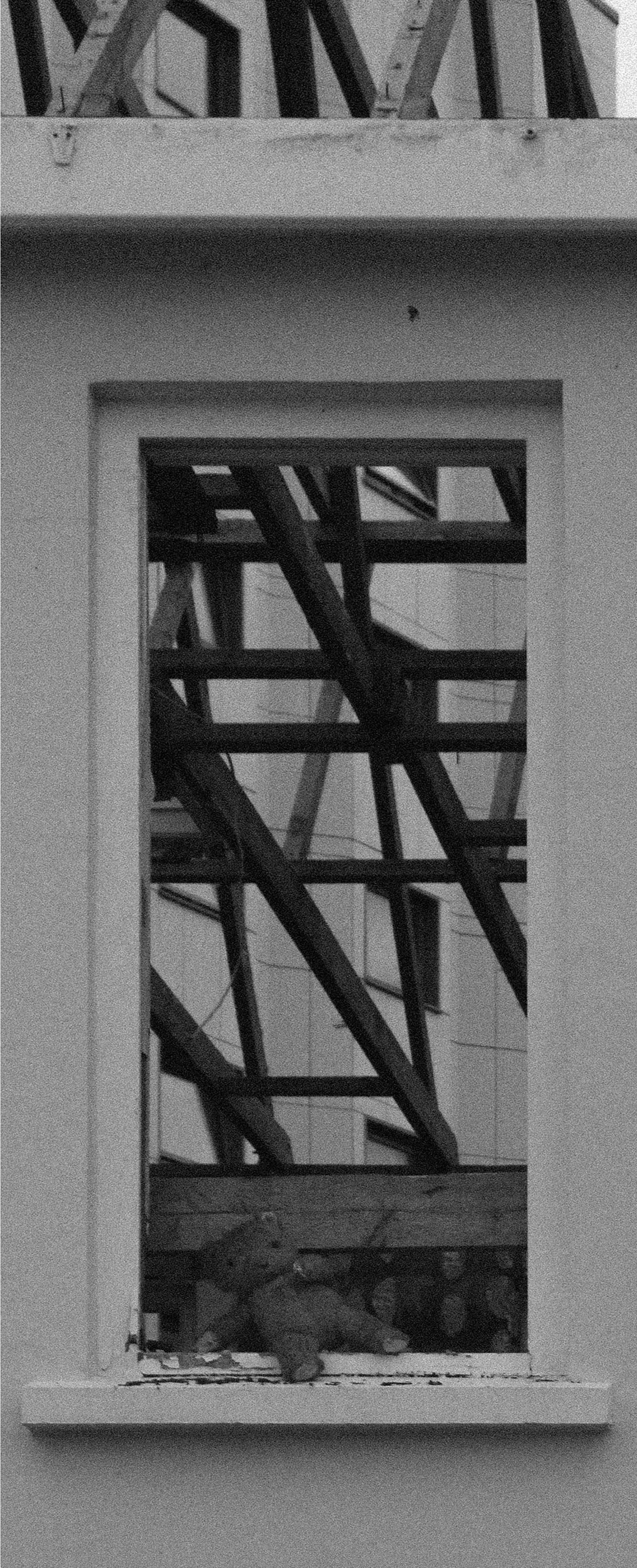
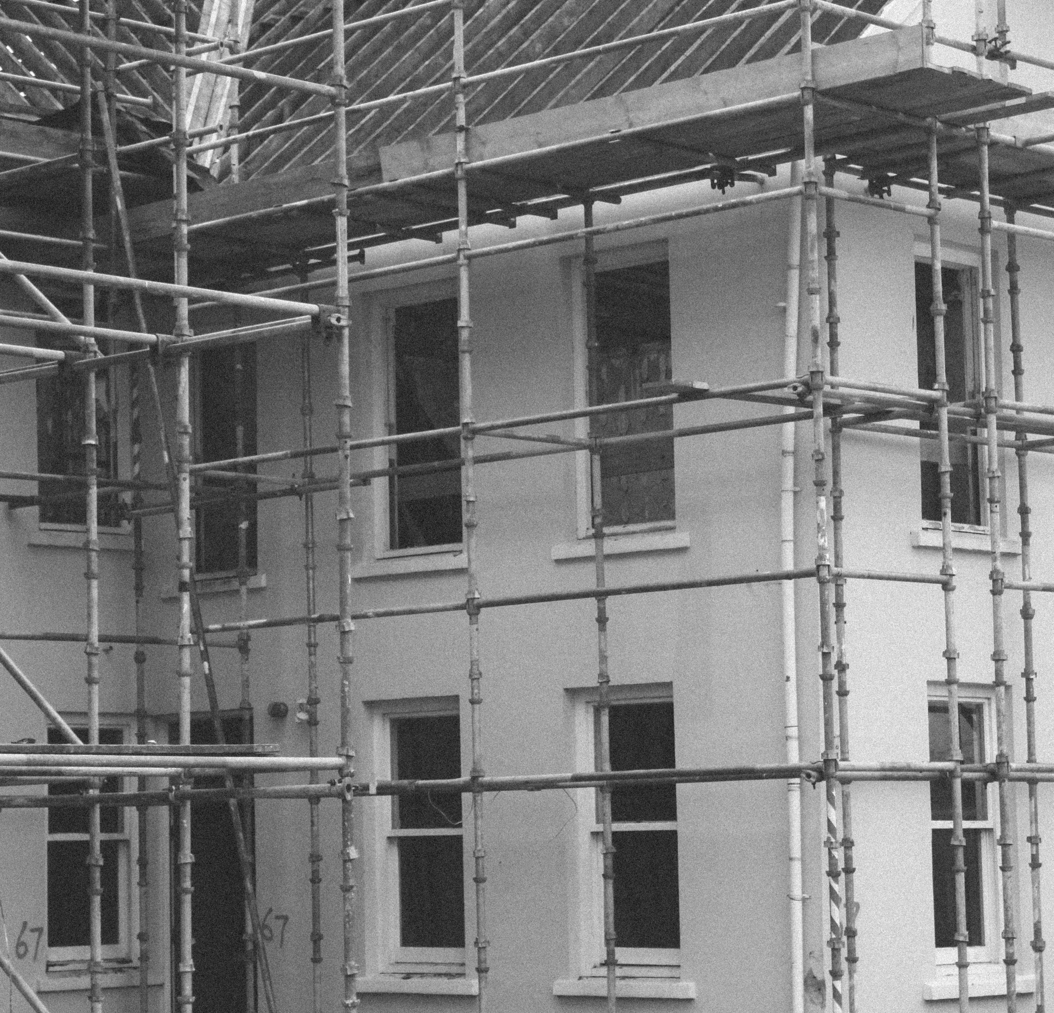
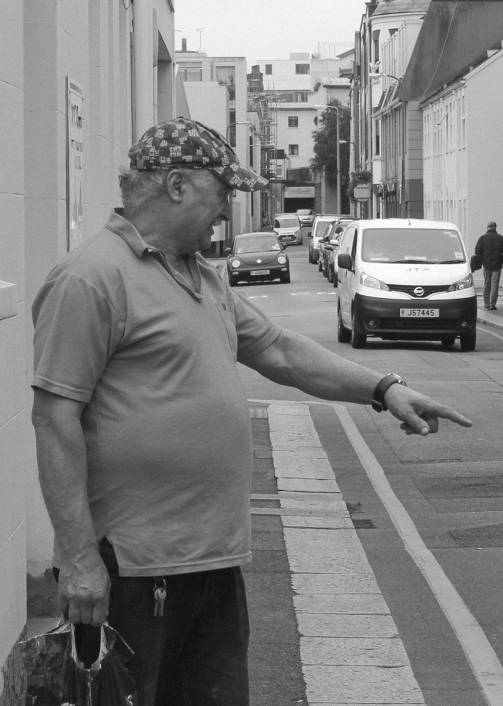
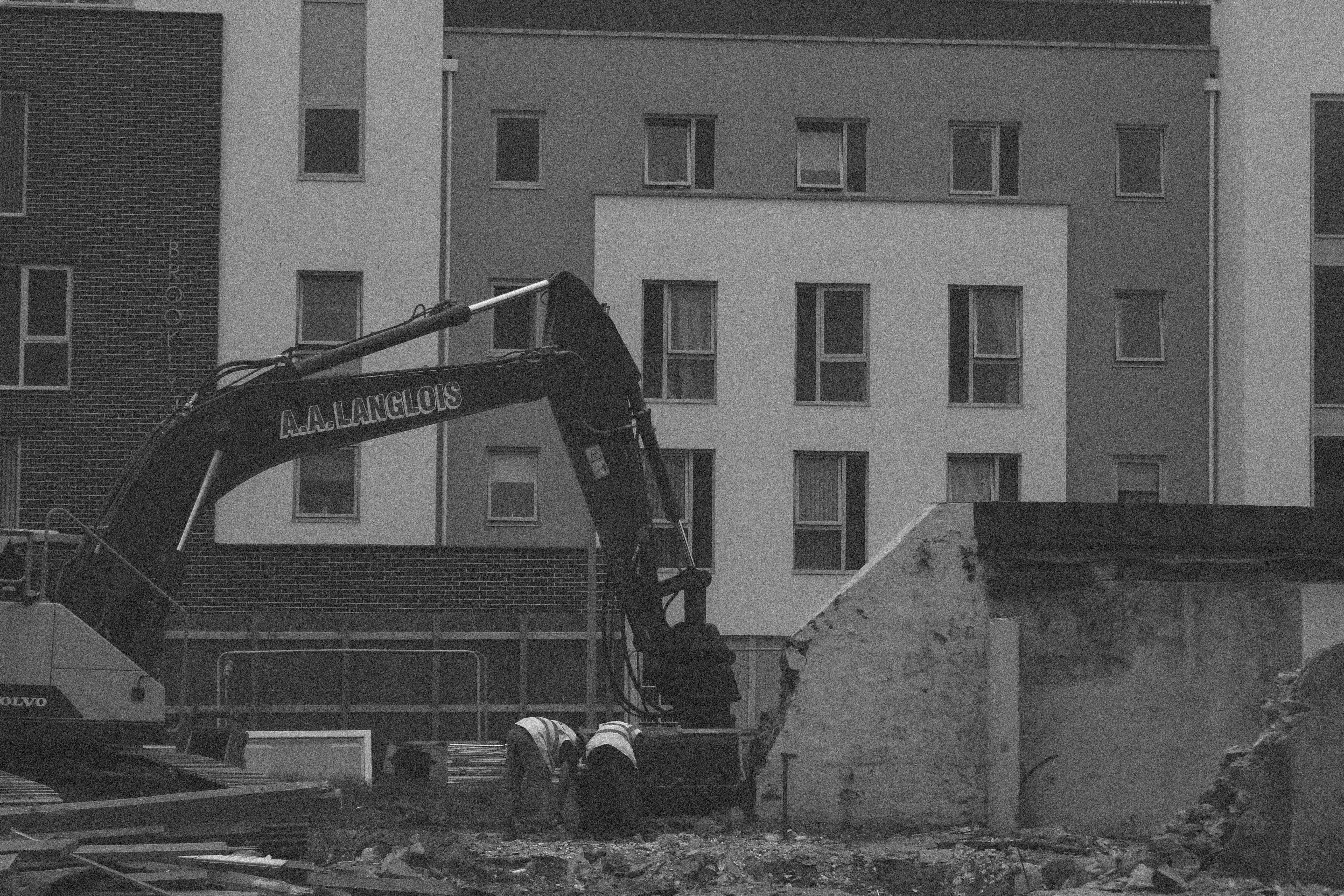
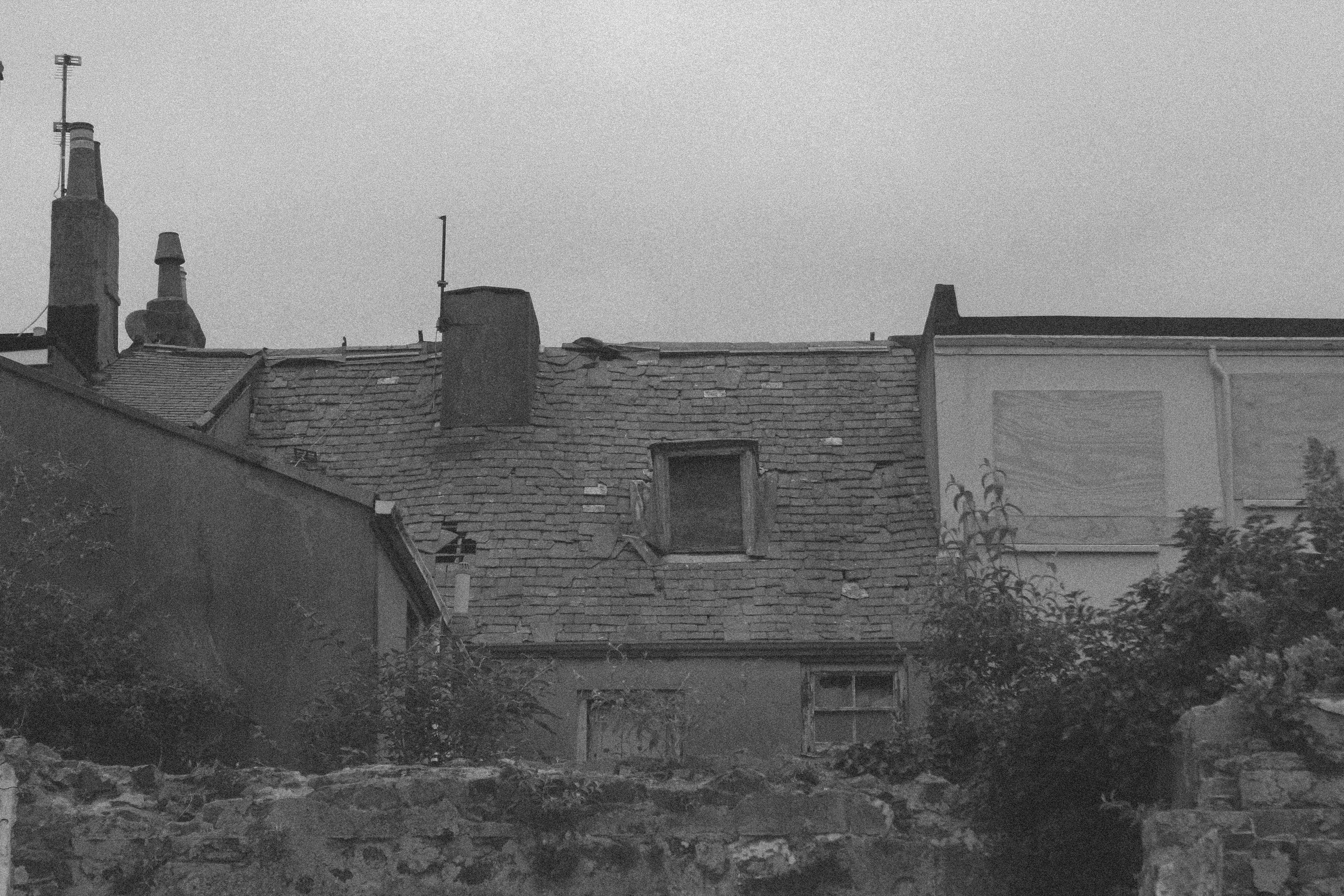
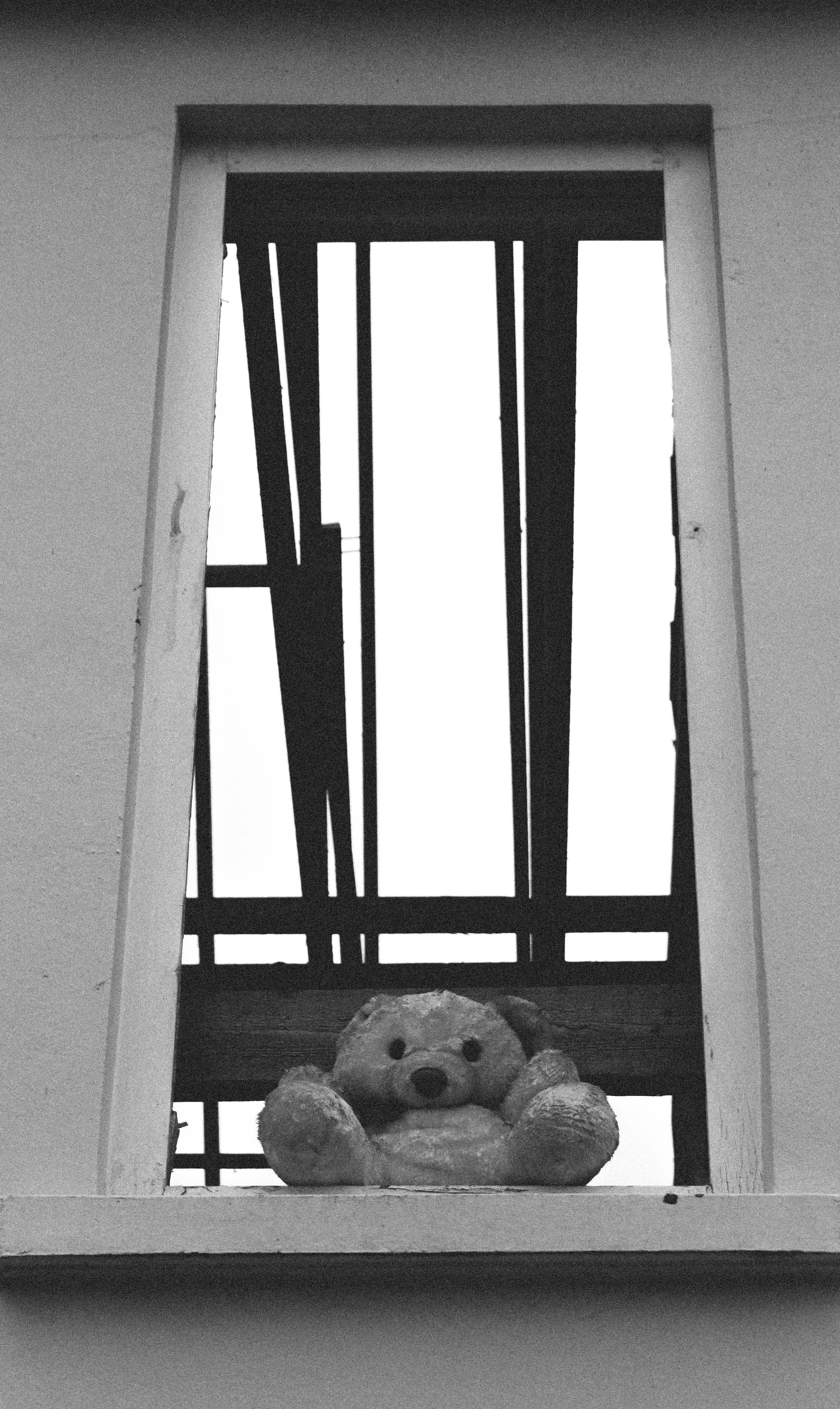
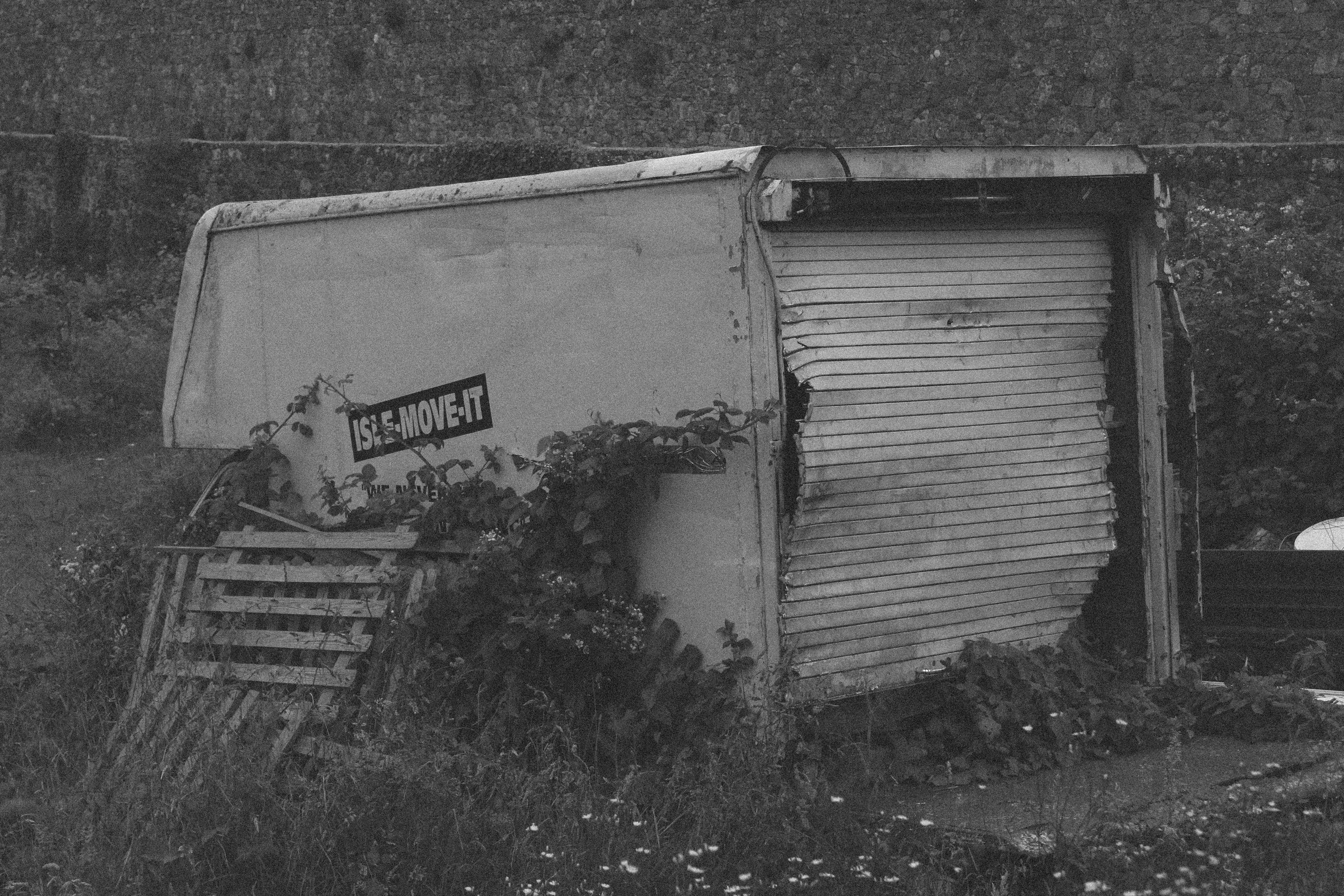
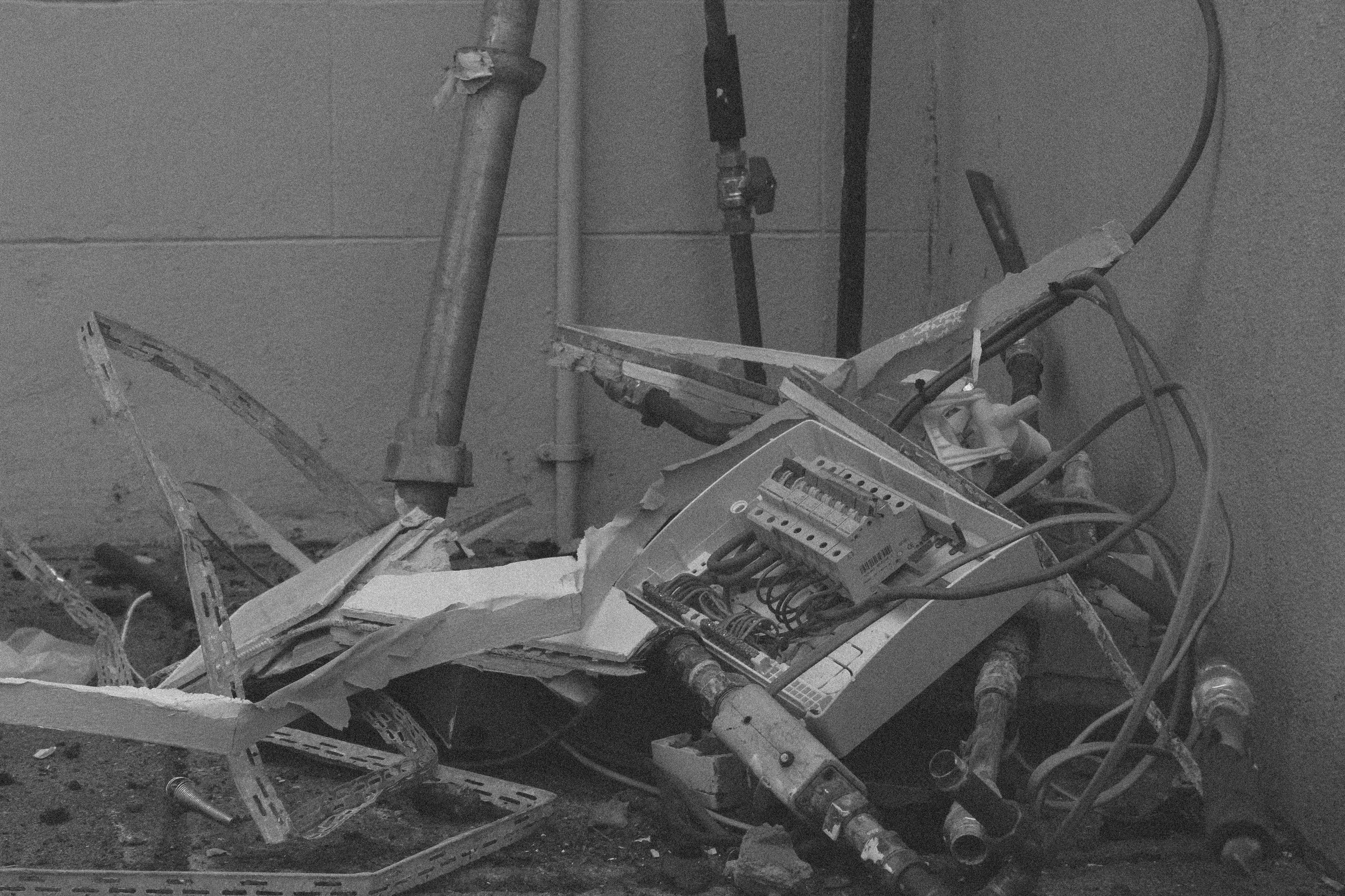
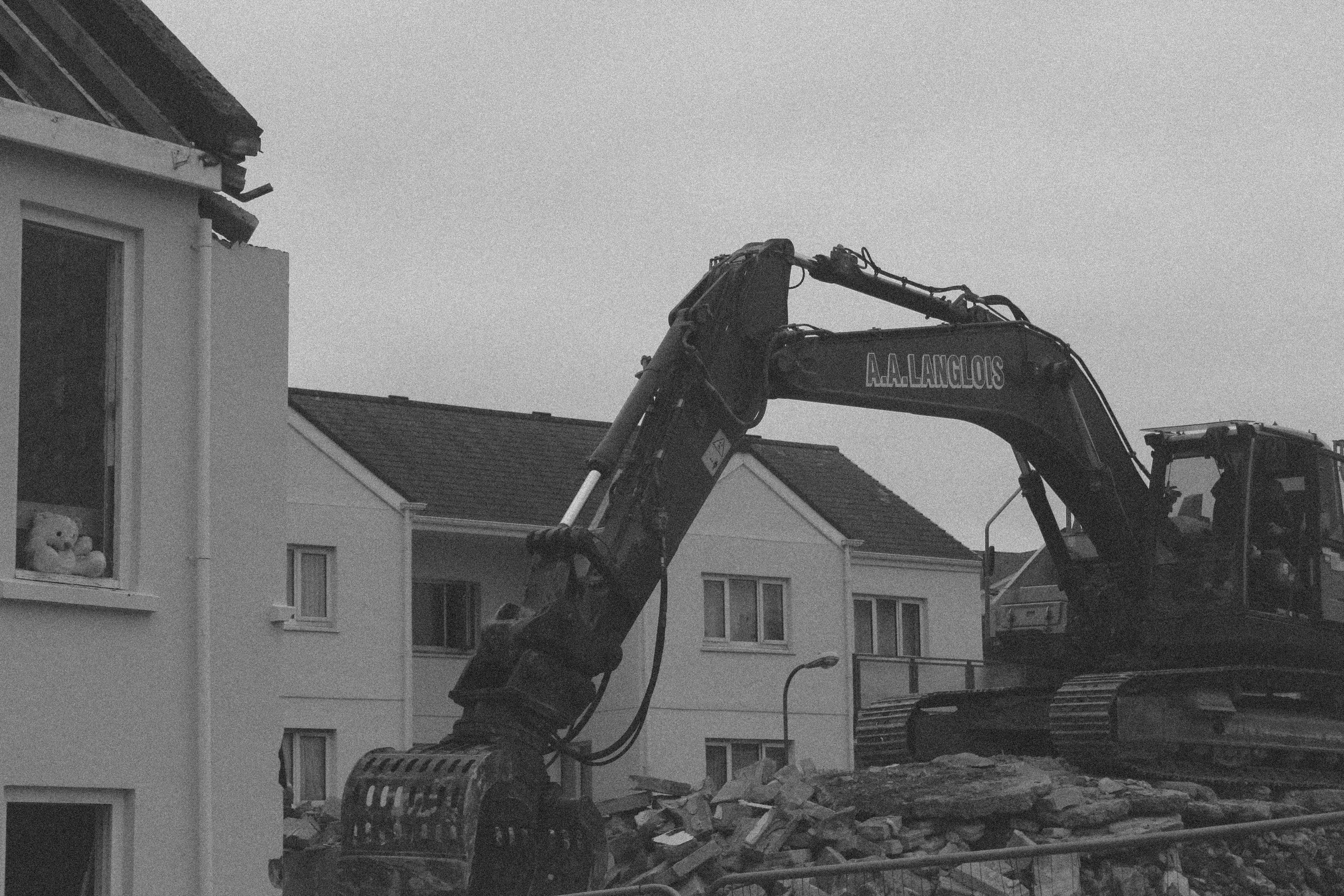
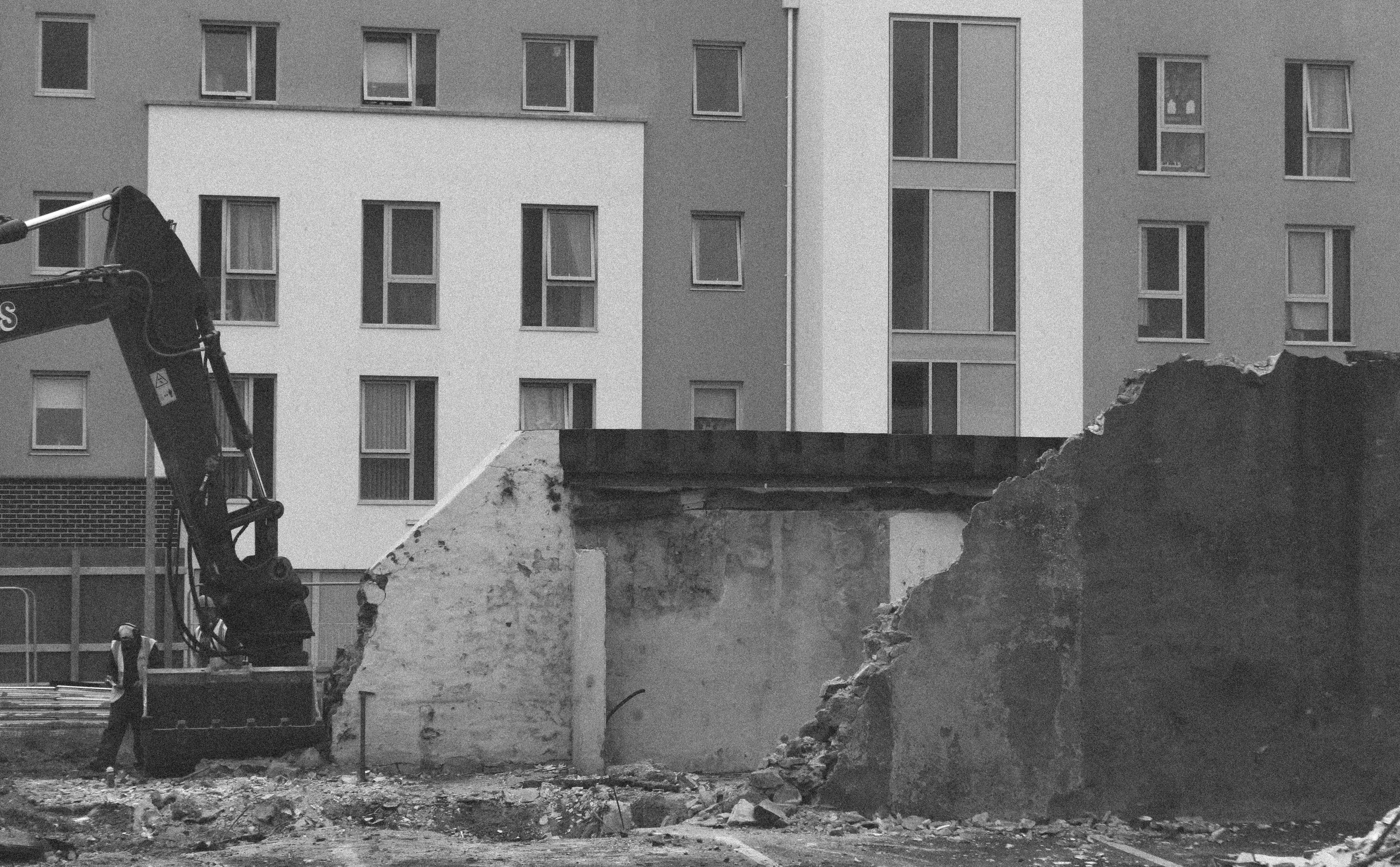
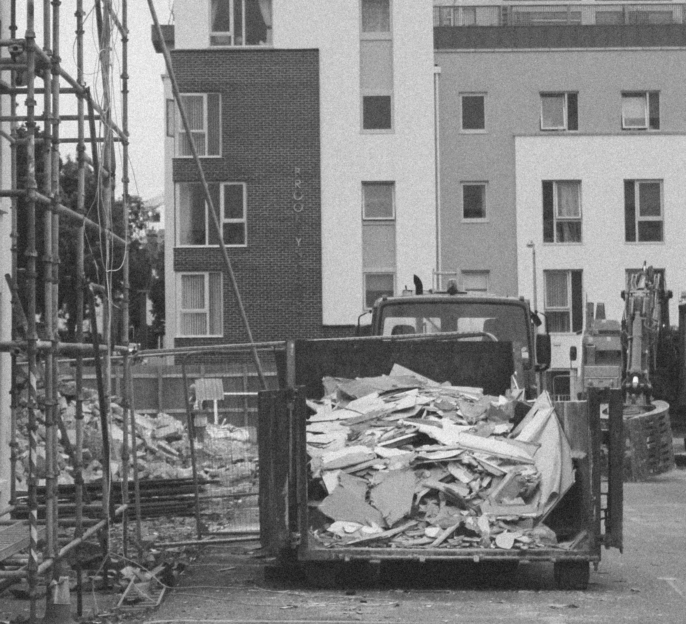
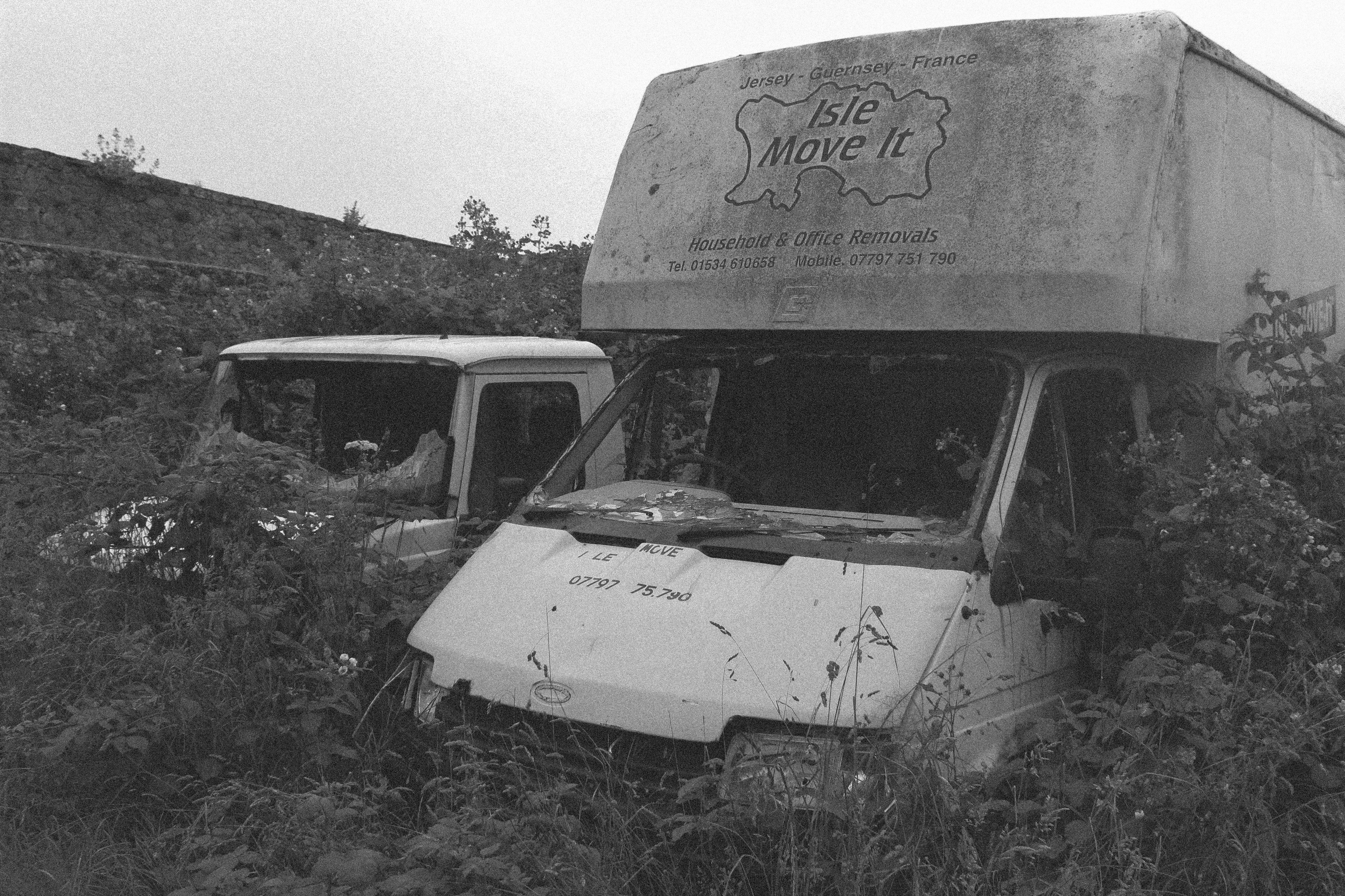
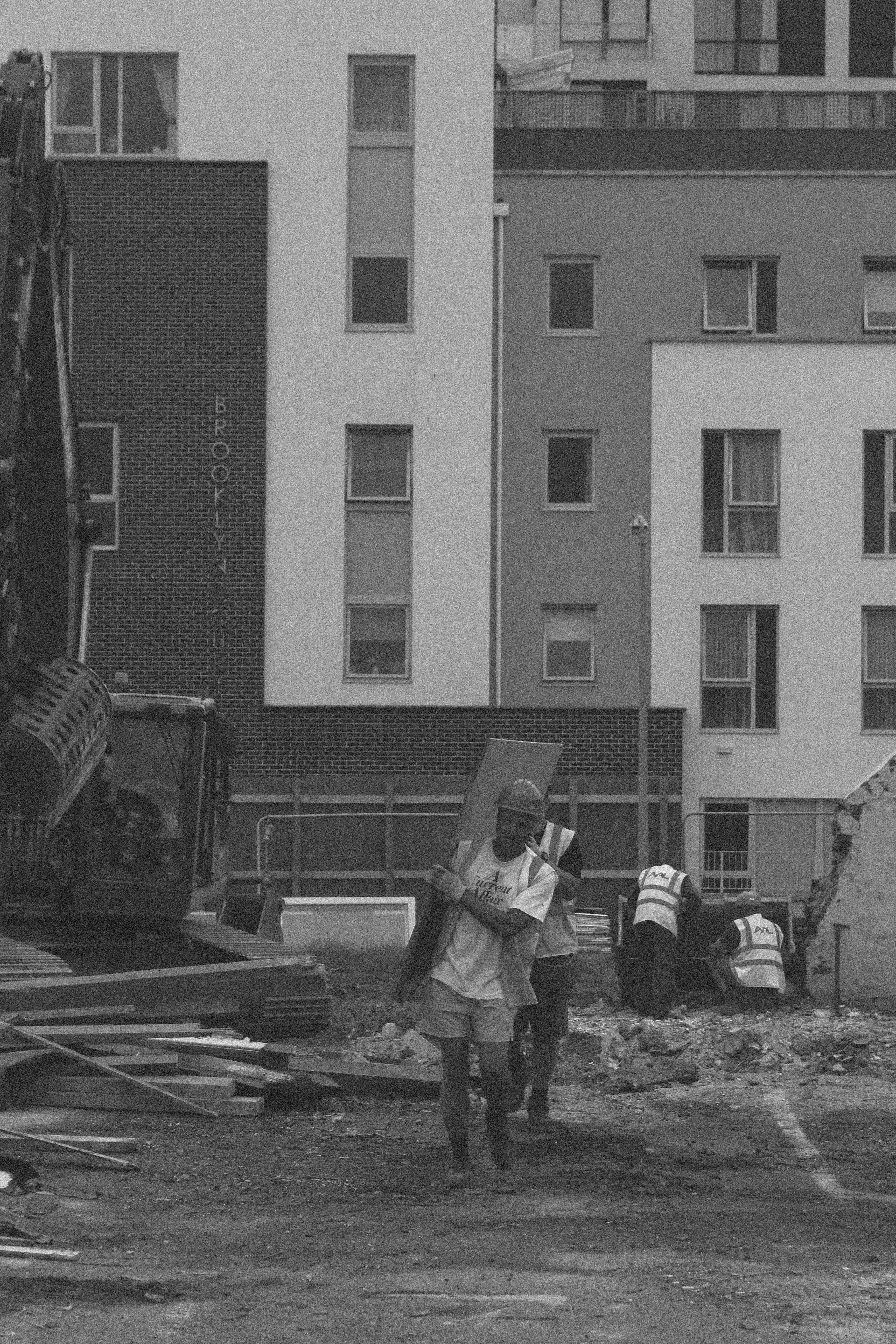
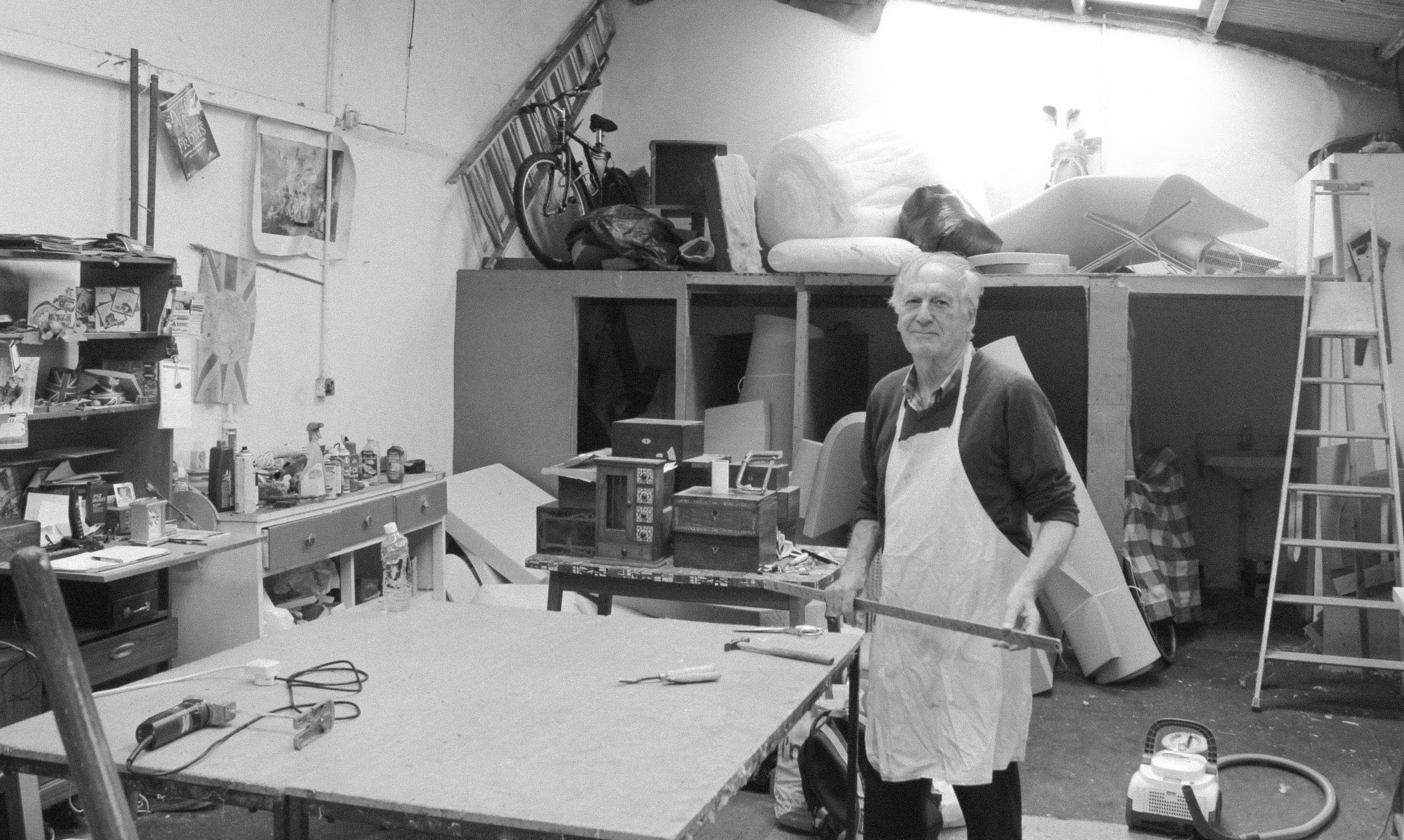
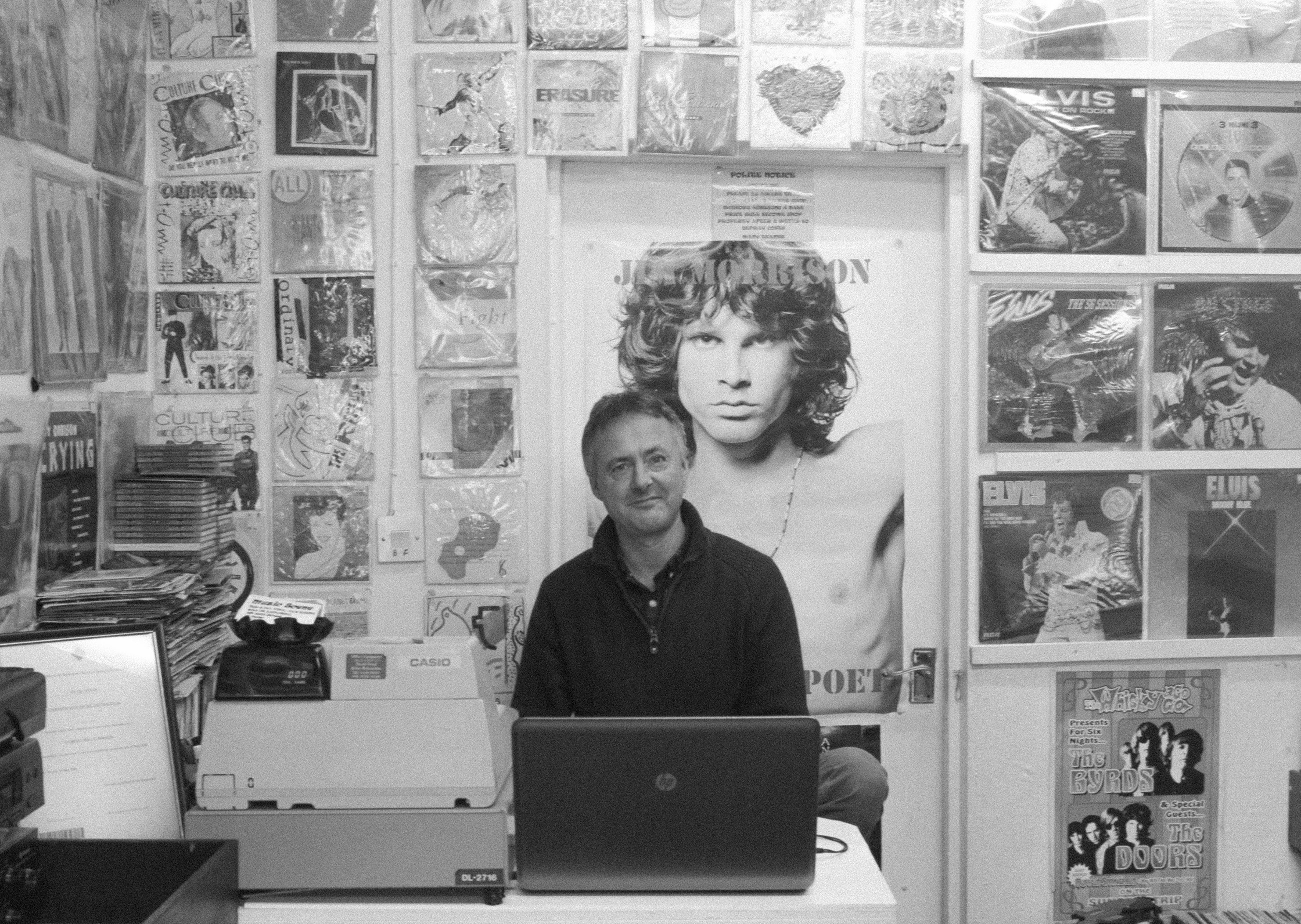
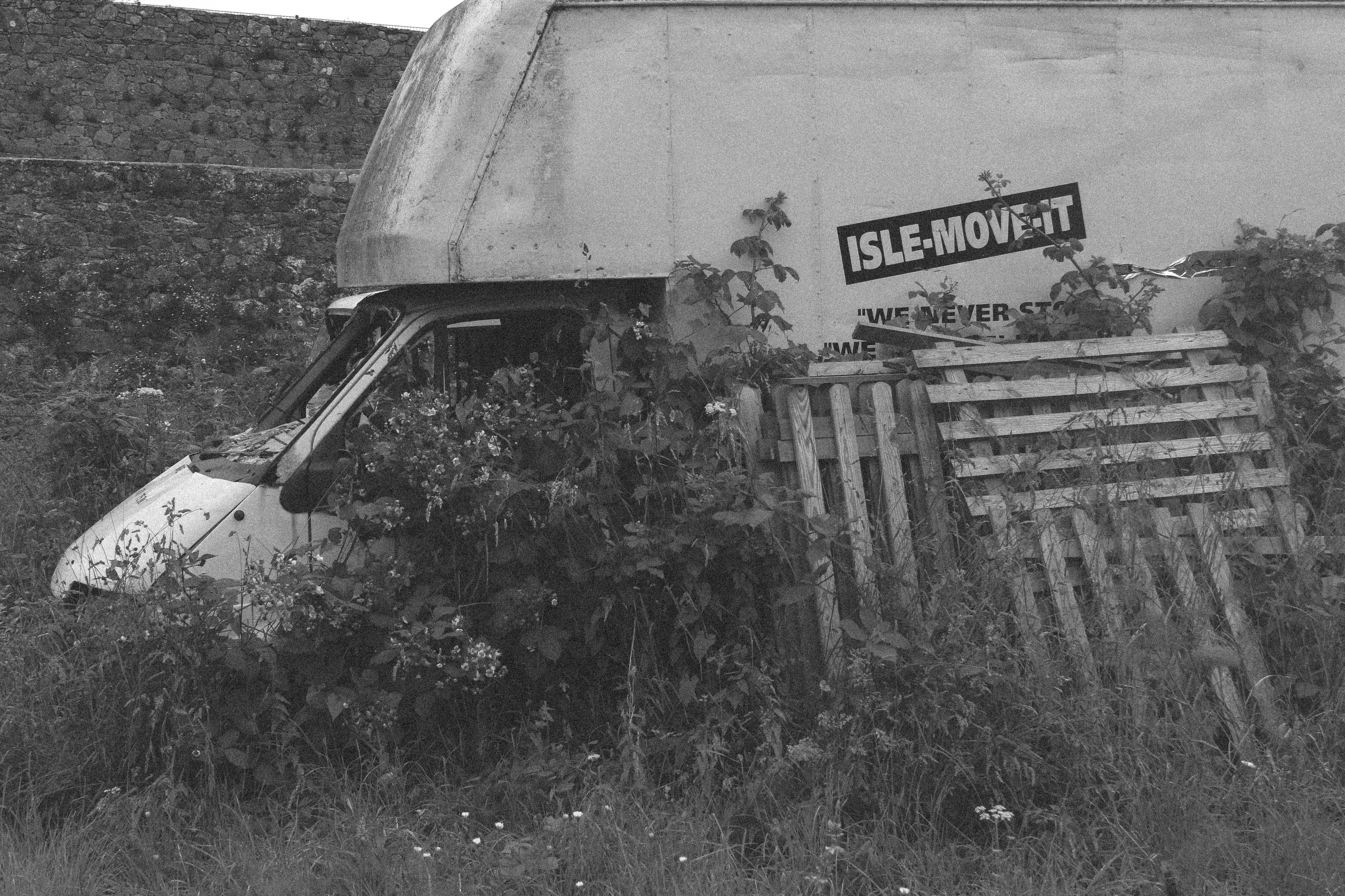
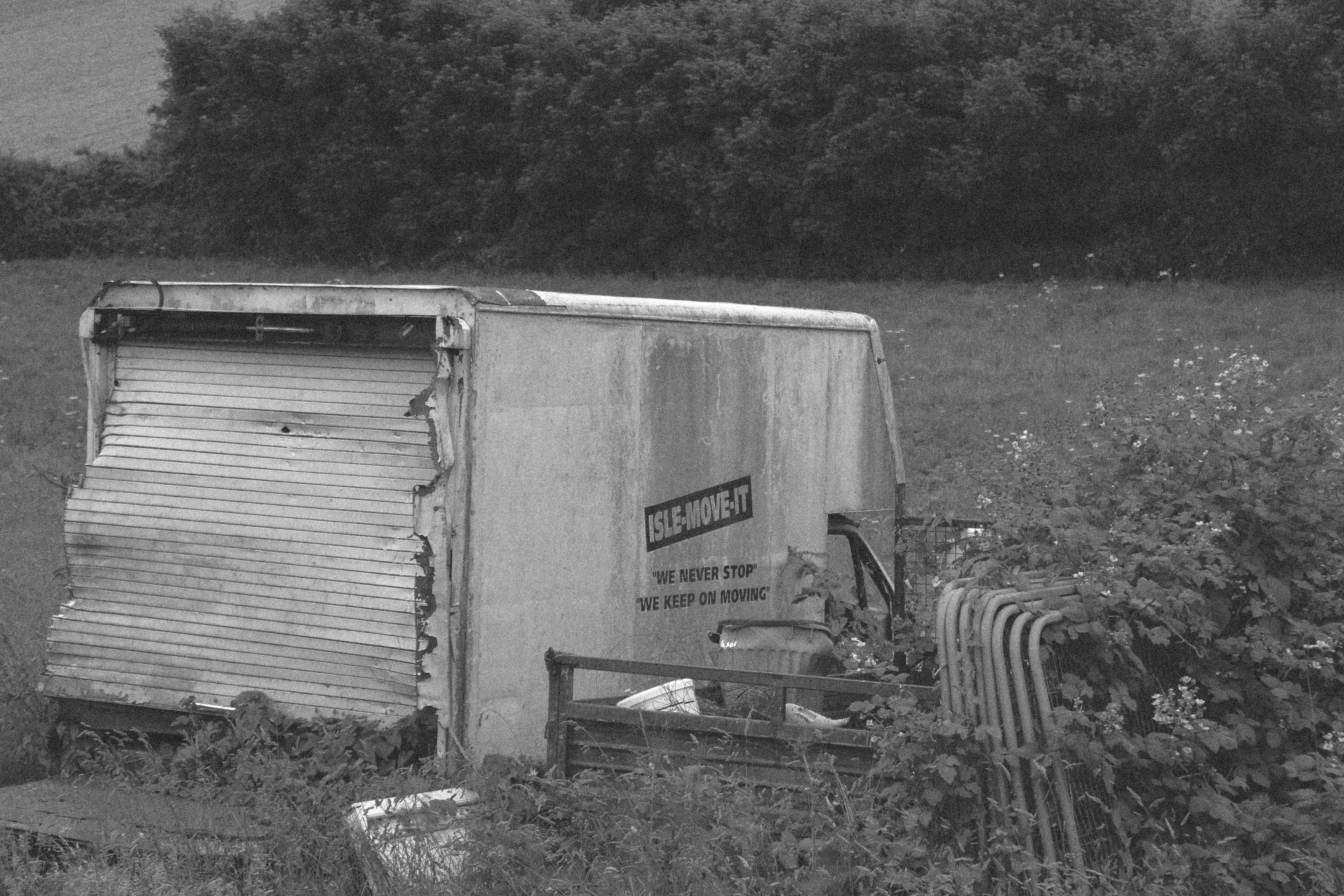
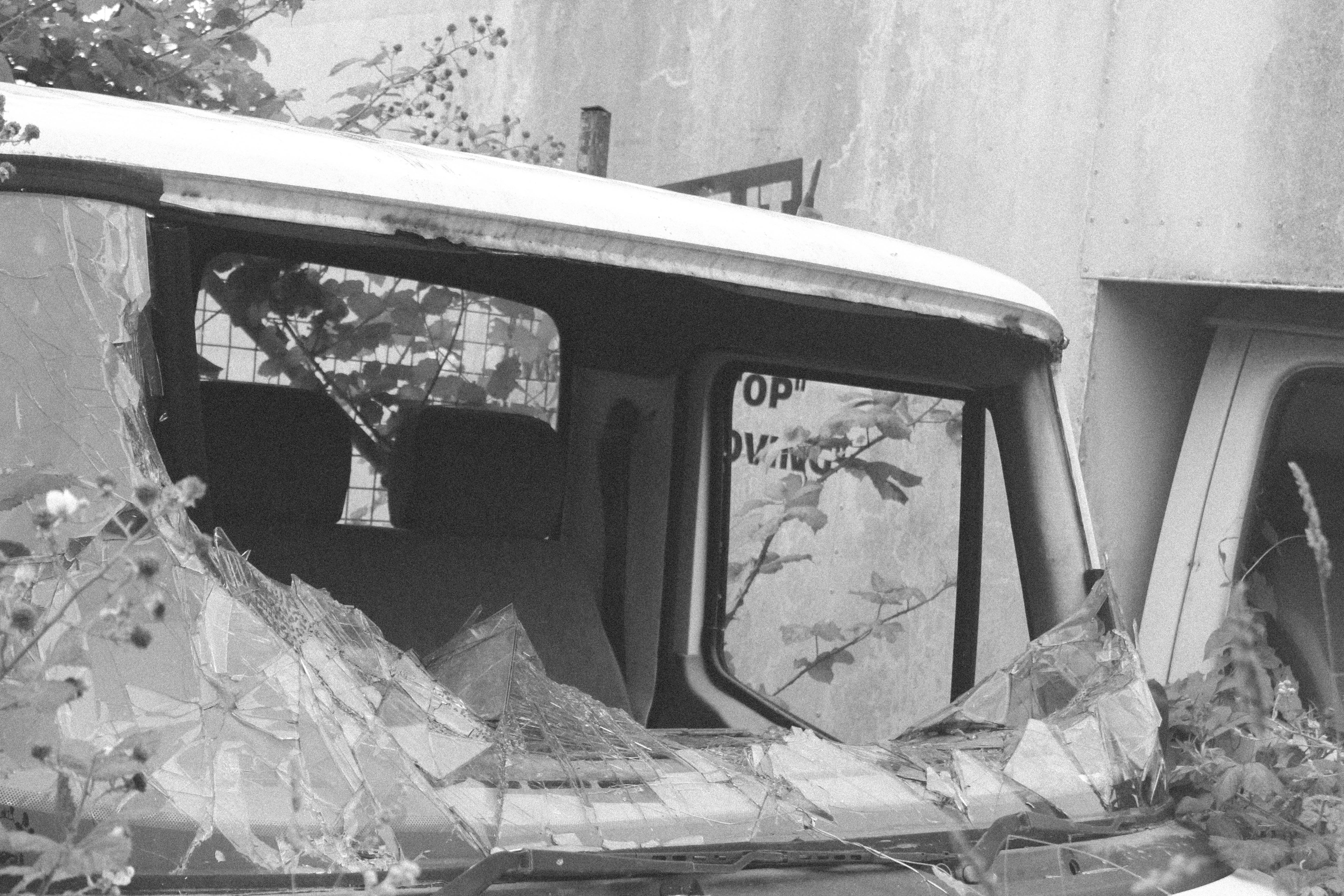
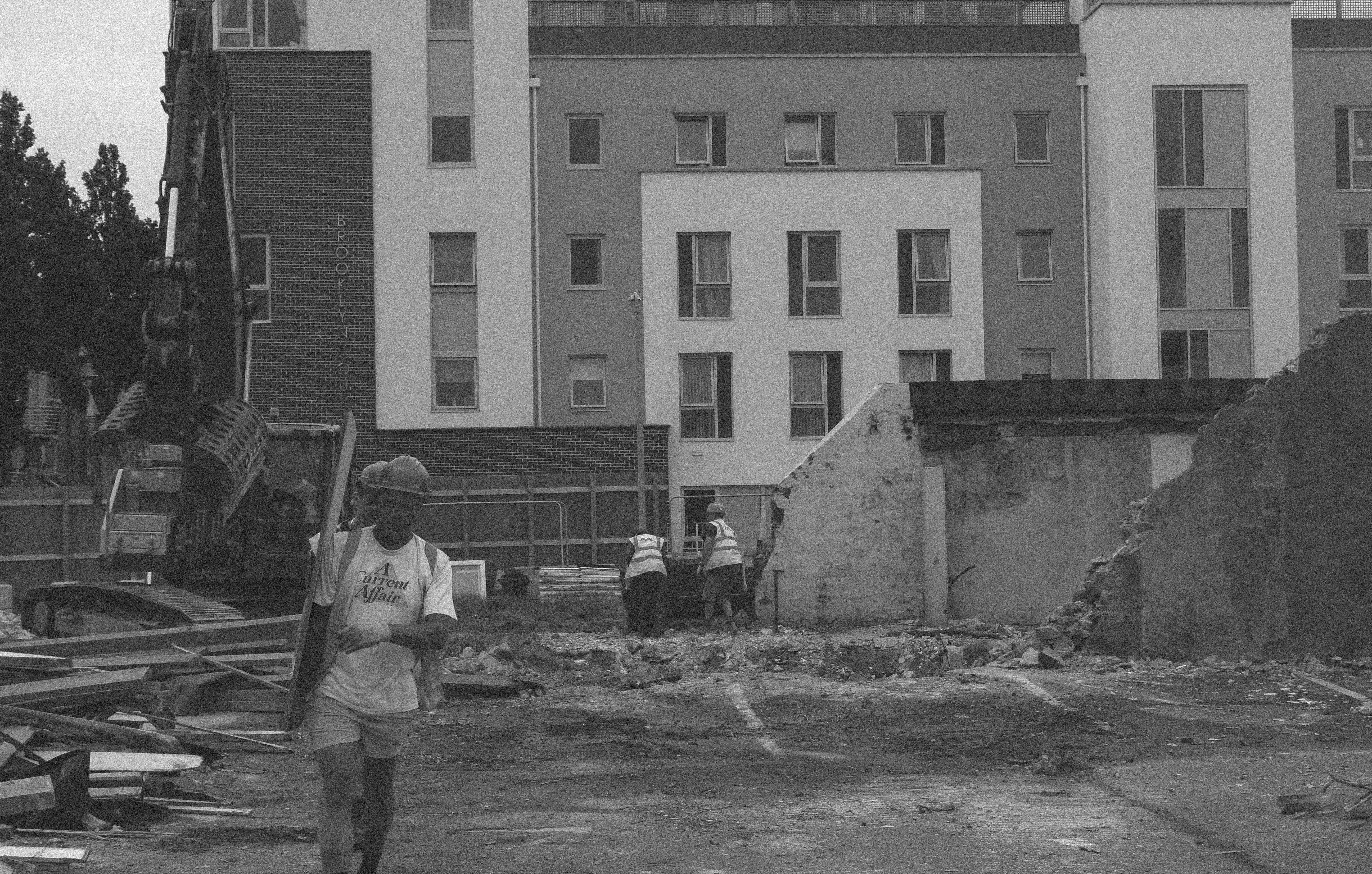
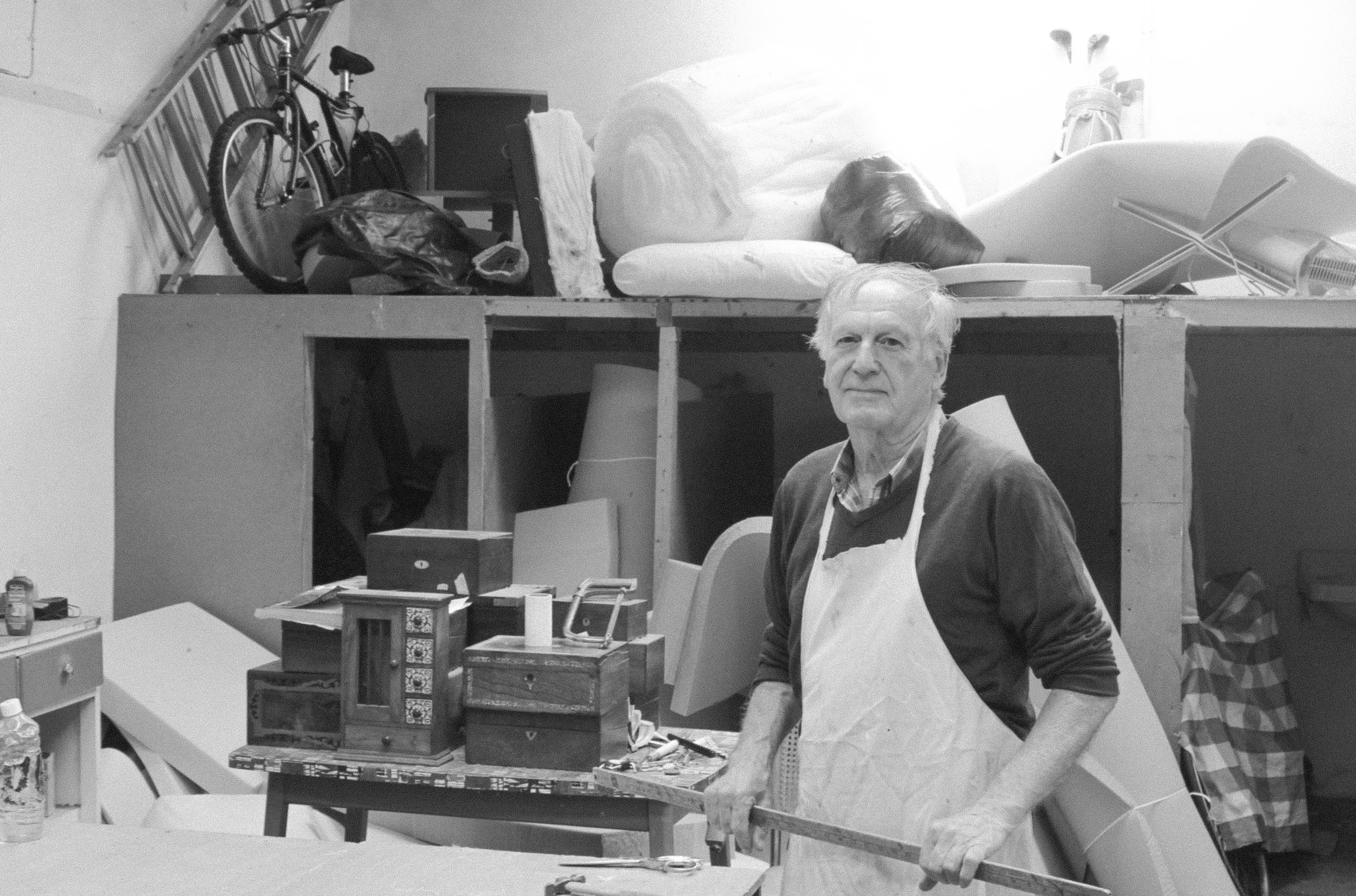
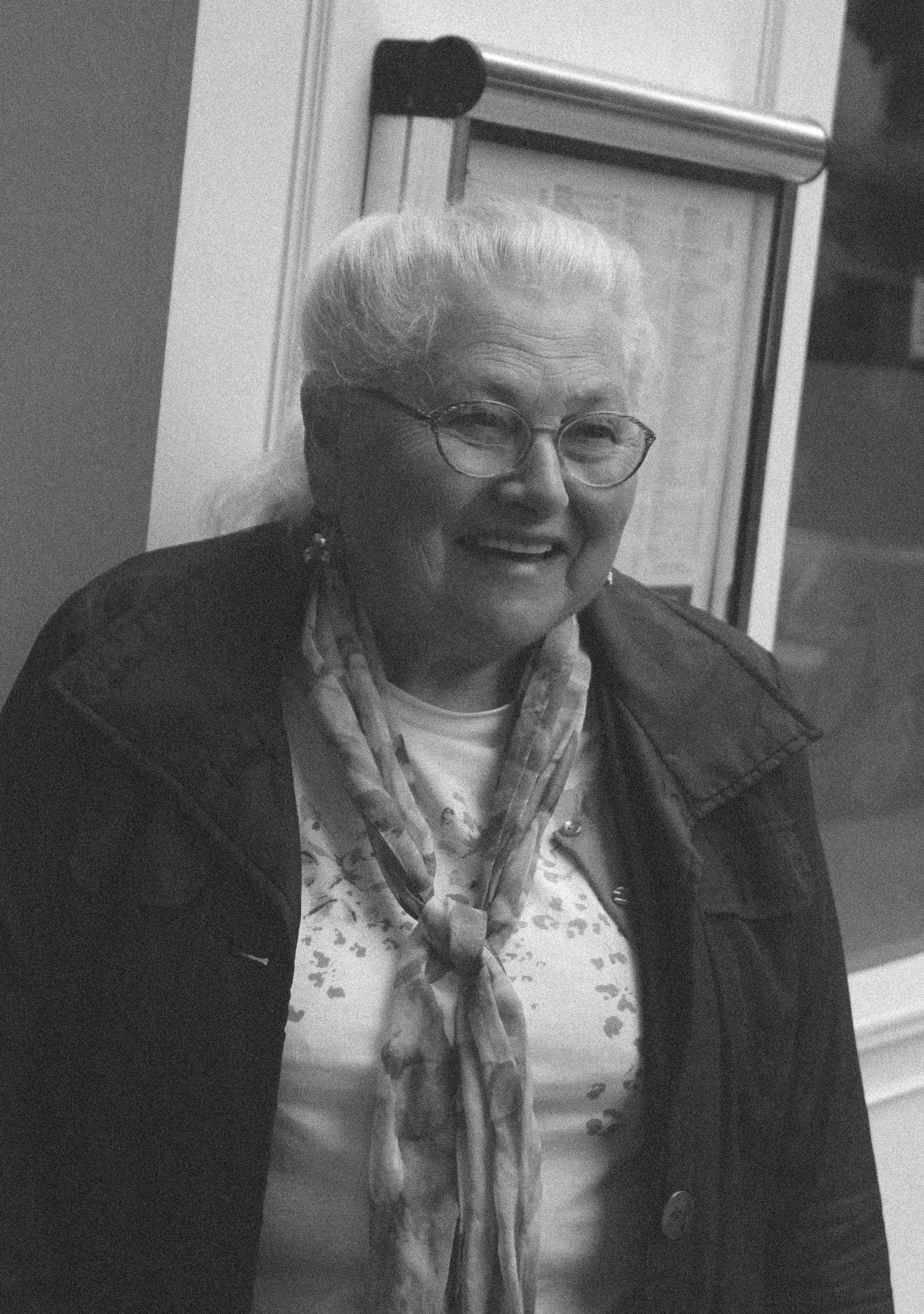
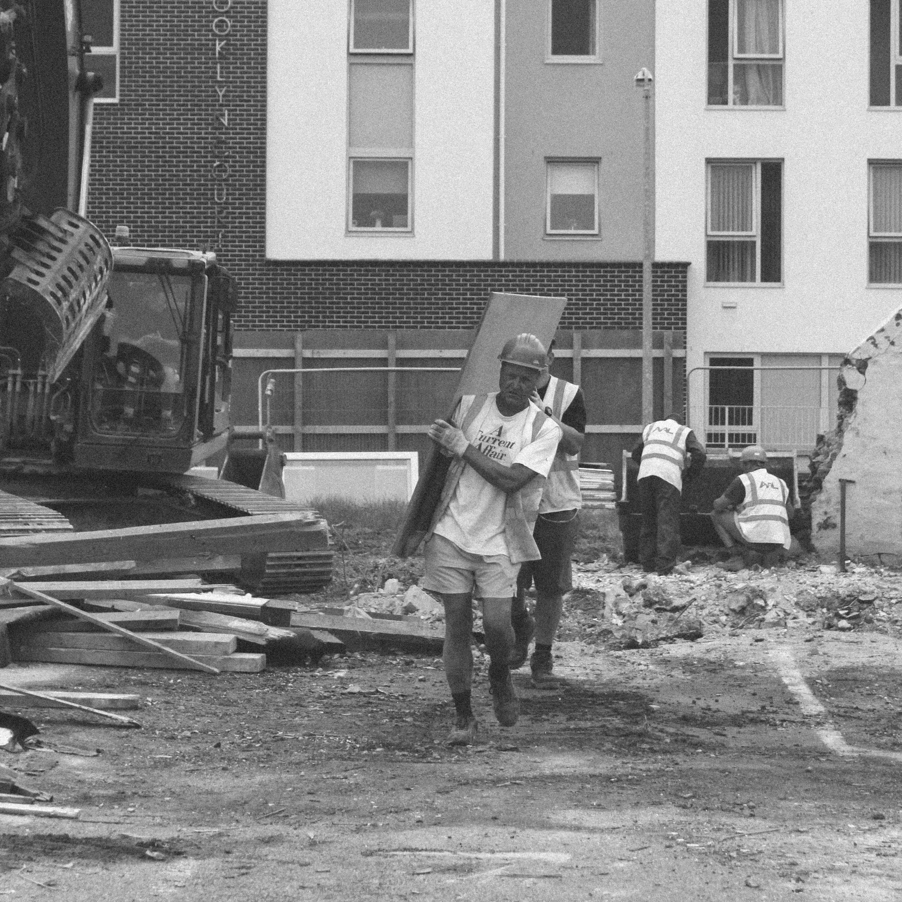
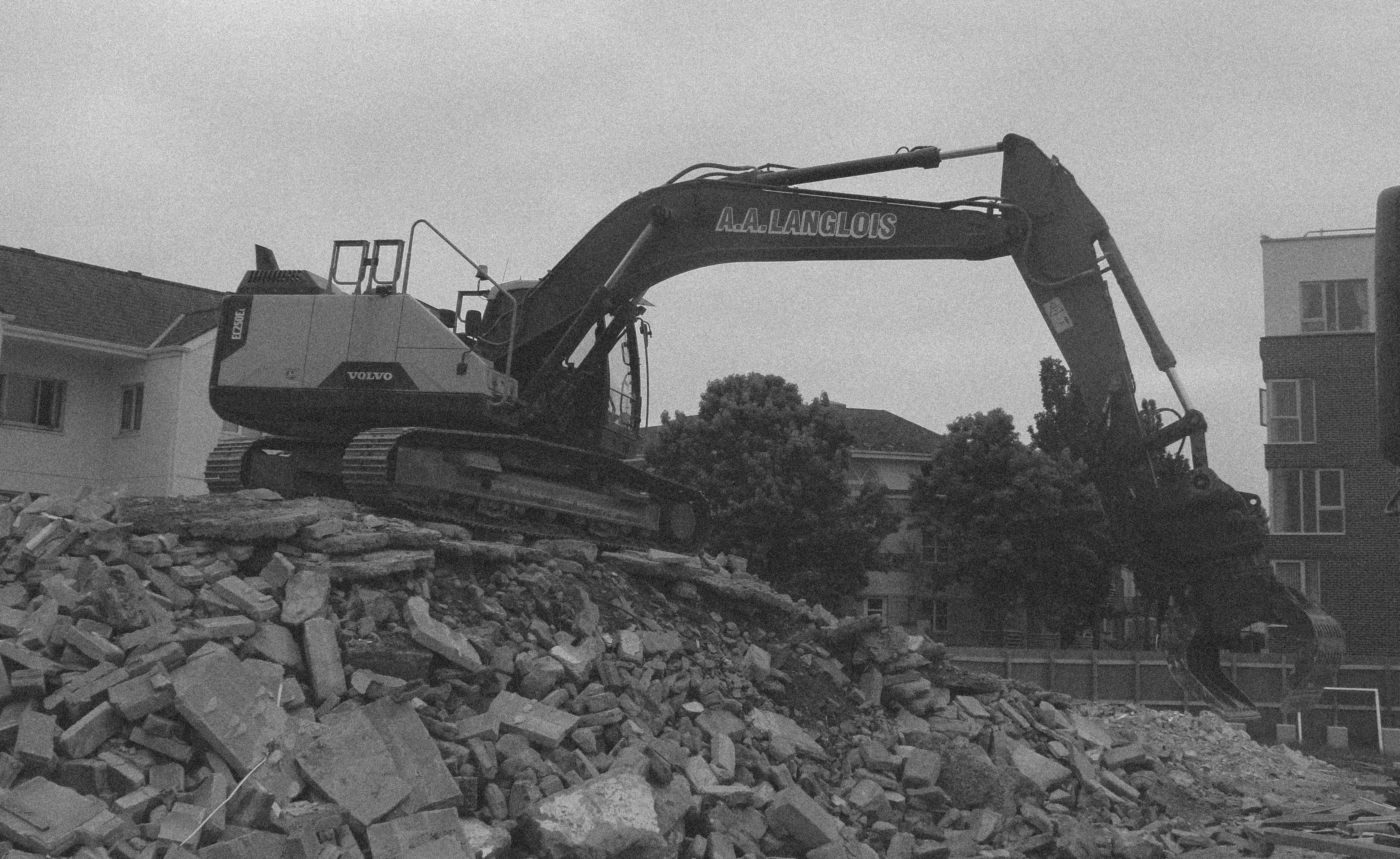
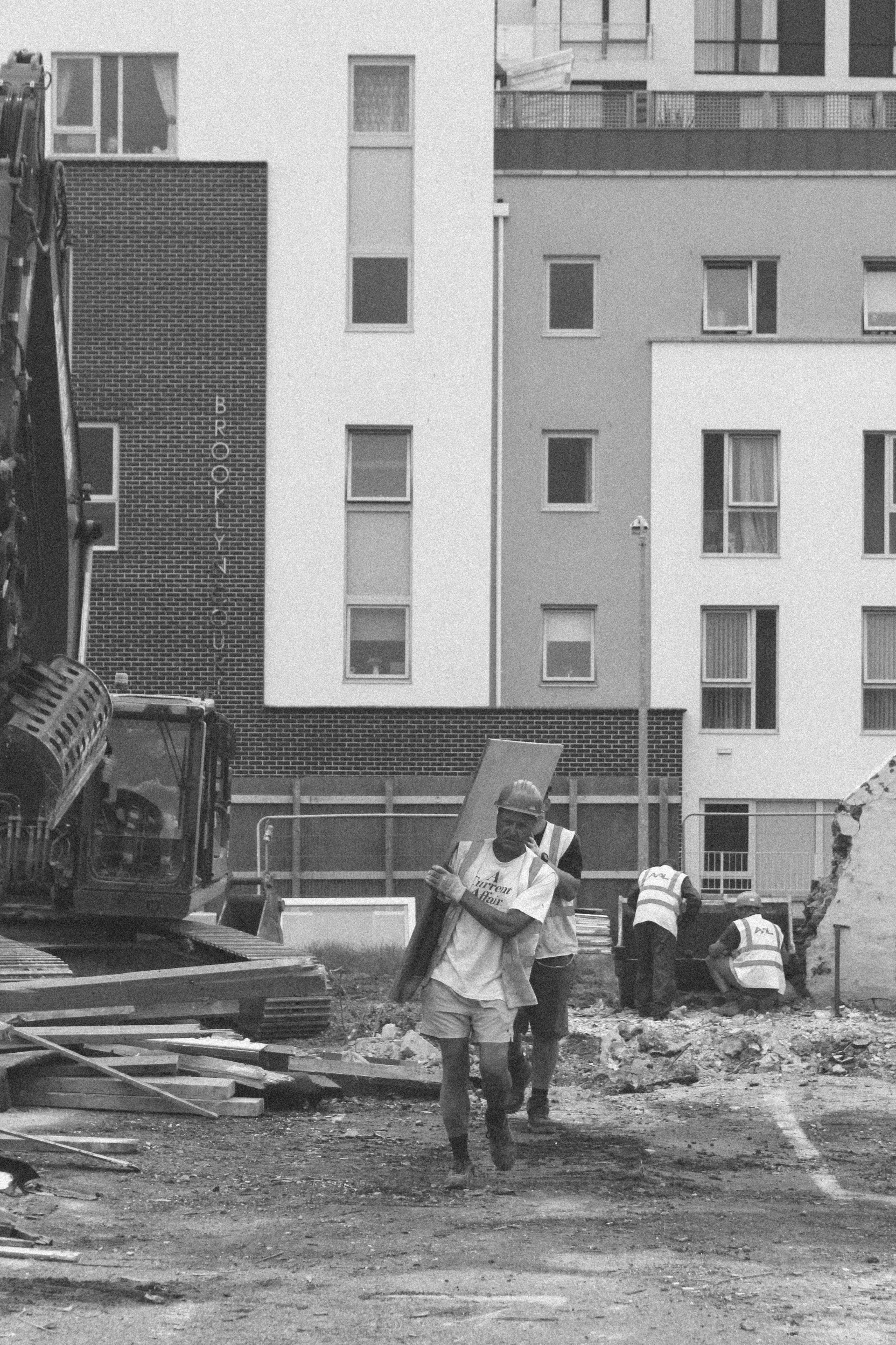
This selection of photographs shows the top 20 images from my shoot in St. Helier. It shows different architectural structures, people, construction and areas that have been abandoned. These photographs take inspiration from Albert Smith and Michelle Sank in the sense that they document the people and their environments along with structures within the environment.
Ernst Haas Research
Who is he?
Ernst Haas (1921-1986) is one of the most influential photographers of the 20th century considered one of the pioneers of color photography. Born in Vienna 1921 he took up photography after the war leading his early works to be on returning Austrian prisoners of war shown in LIFE magazine, Haas later joined Magnum in 1949 developing close relations with Capa, Henri Cartier-Bresson and Werner Bishof.
Haas moved to the United States in 1951 after experimenting with Kodachrome colour film becoming the premier colour photographer of the 1950s. In 1953 LIFE magazine published a 24 page large colour photo feature in New York City making it the first time such a large colour photo feature was published in LIFE. By 1962 the first coloured photography exhibition was held at New York’s Museum of Modern Art.
Haas traveled hugely, photographing for LIFE, Vogue and Look, being the creator of many influential publications. Four books he made in his lifetime were: The Creation (1971), In America (1975), In Germany (1976), and Himalayan Pilgrimage (1978)
Ernst Haas received the Hasselblad award in 1986 the same year as his death. Haas continued from there to be the center of attention for museum exhibitions and publications in examples such as Ernst Haas, Colour Photography (1989), Ernst Haas in Black and White (1992), and Colour Correction (2011).
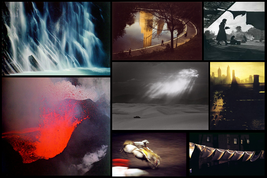
Some examples of his work can be seen below:
 After looking over some of the images from Haas I decided to analyze what made the aspects inside each one so effective, to do this I chose one of his most impressive images; Motion Horses:
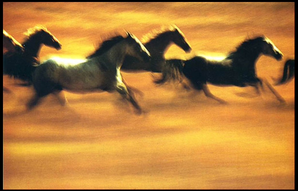 Technical: The image itself uses a vivid long shutter speed to capture the motion of the horses in action. By doing this it creates a sense of realism into how the photo would have looked to the photographer, making an aesthetically pleasing result from how the horses are contrasted sharply against the yellow backdrop of the piece. The picture seems to use a higher saturation to bring out the colours of the field and emphasize the darkness of the horses to create an almost abstract and surreal result.
Visual: Visually the piece it pleasing to the eye, with our focus drawing straight into the symmetrical line of the dark contrasted horses, this reduces any eye-sore for viewers as it creates a perfect balance of blacks and yellows. Composition wise the piece has been straightened so that the line of horses gracefully cross the field, not taking up too much or too little space within the area, and with more focus and detail being on the horses it draws our eyes away from the floor the first time we look at it.
Conceptual: The image is meant to capture the movement and fluidity of the horses whilst running in the wild. The lack of focus on any part of the picture is used to represent the vision of what it could become like moving at that speed, distorting certain features of the creatures to blurs which melt through into the surrounding landscape.
Colour Edits
I decided to experiment with some of the photos from my first shoot, I took inspiration from the artists I researches, Nick Miners and Garry Winogrand, I experimented with things such as cropping and colour adjustments to manipulate the context of the images.
Image 1
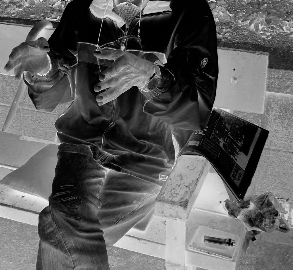
Image 2
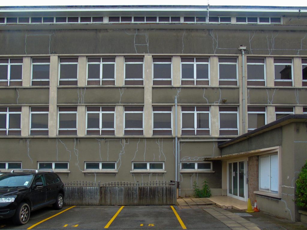
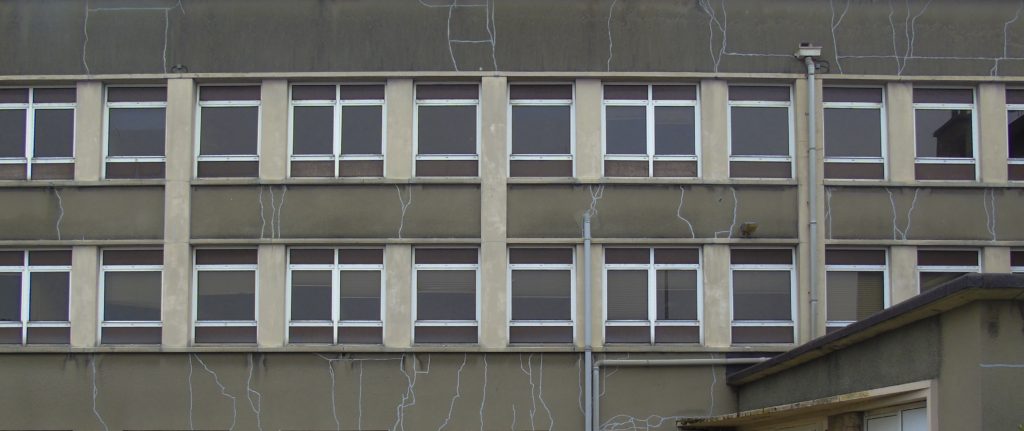
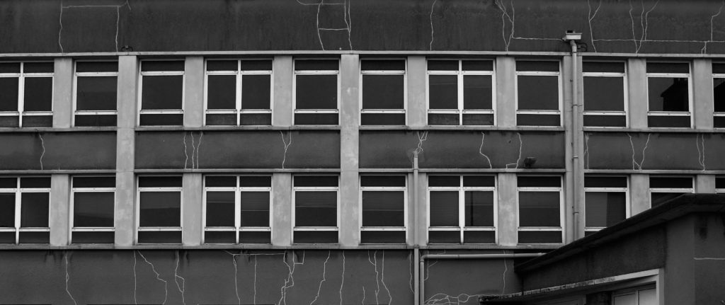
Image 3
Experimentation
Colour Edits:
For the colour experimentation of this shoot i wanted to emphasise the colour green as that was the area of St Helier I was given to explore. First I selected the image that contained green in them and highlighted that, then I found images that I liked and edited green into them so that they could still be included.
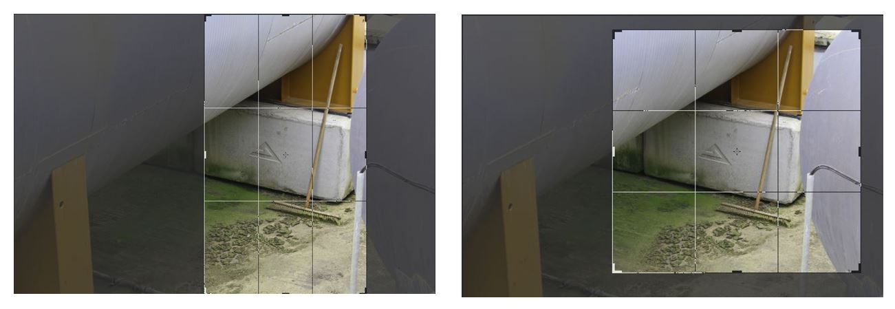
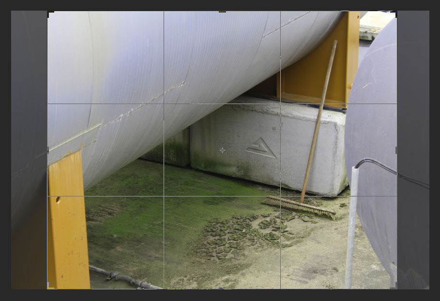
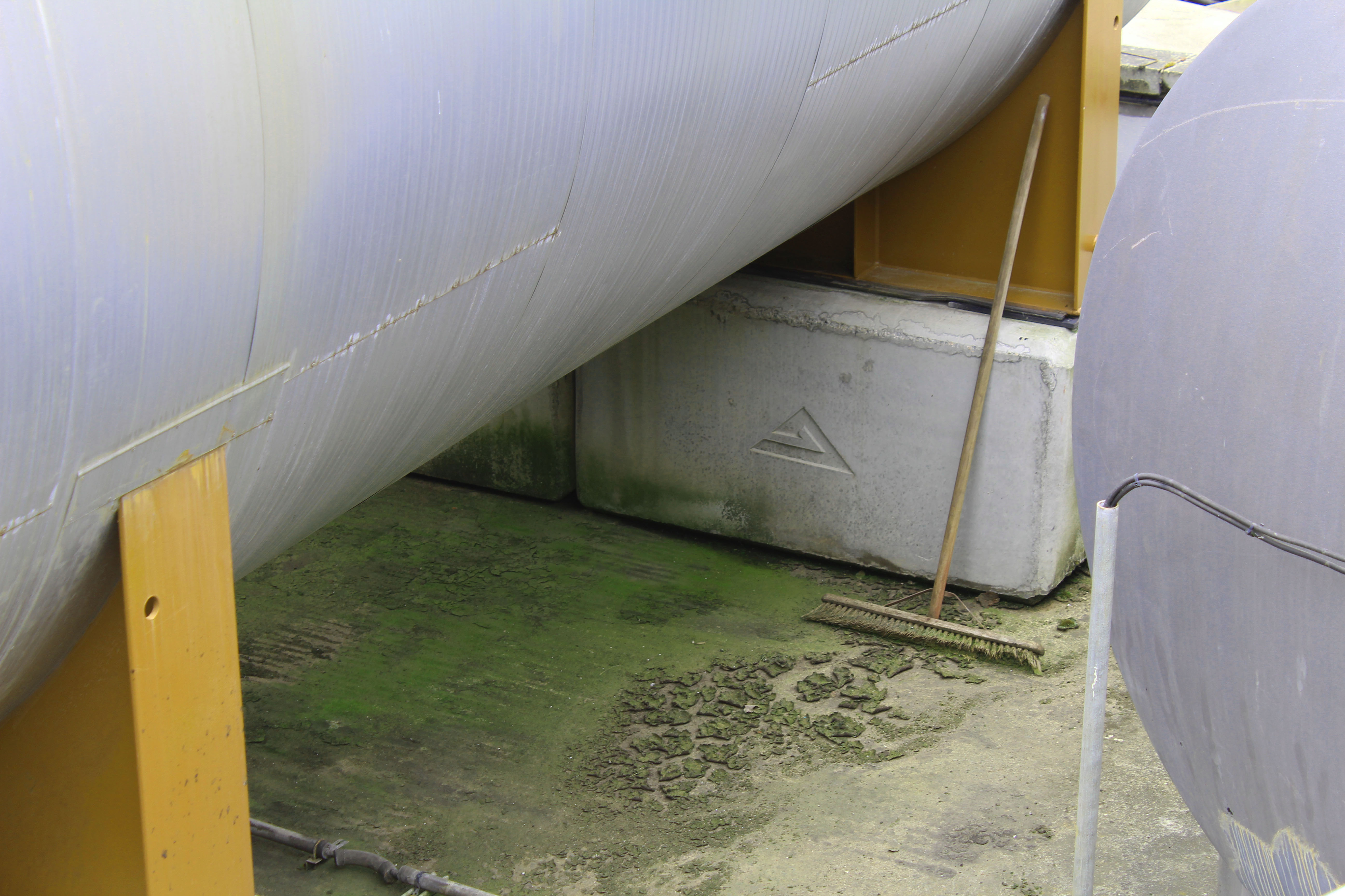
I chose this image to edit as i wanted to highlight the green and I liked the combination of colours i could edit in if I increased the hue of the green, changing the orange colour from the structure to yellow, creating a complementary combination of colours (yellow, green and white/silver). I like this image as the subject of the broom stick, which doesn’t look like its been used in a while from the mould around it, isn’t something that people passing by would notice. I interpret this image as the broomstick being the only signal of life in the image which is surrounded by industrial structures. Similar to how St Helier is being redeveloped into an a more industrial place with new office and buildings being built and abandoning its heritage, similar to how the broomstick has been abandoned and forgotten about. I also like the composition of this image with the industrial structures surrounding all the edges except for the bottom one and the contrast from the round silver structures to the vertical solid yellow blocks creating a juxtaposition in in the shapes and lines. These shapes emphasise the texture of the mould and dirt at the bottom as the other parts of the image don’t have much texture, so the audiences eyes are automatically drawn the the detailed texture in the center of the image.
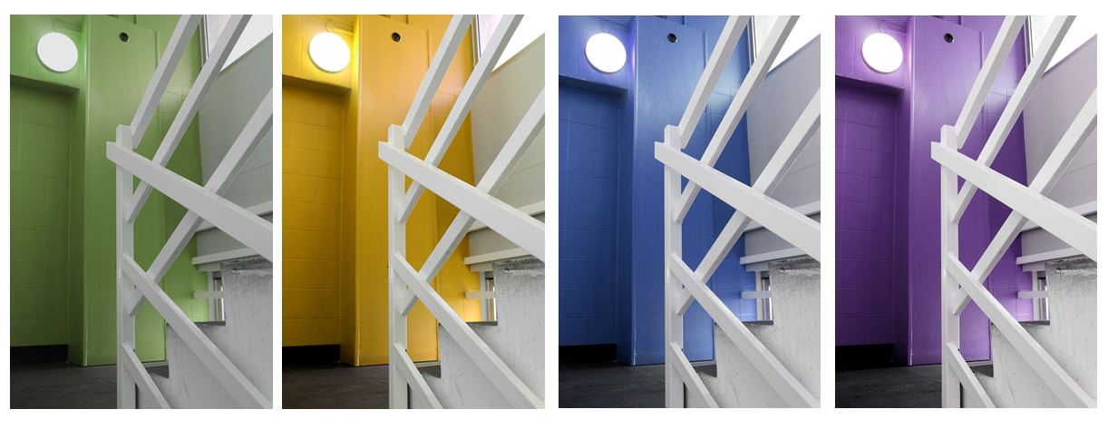
I particularly liked this image where I changed the hue of the red wall behind the stair case to green so I decided I would experiment with different colours others than green in this image to see which one worked the best.
Black and White edits:
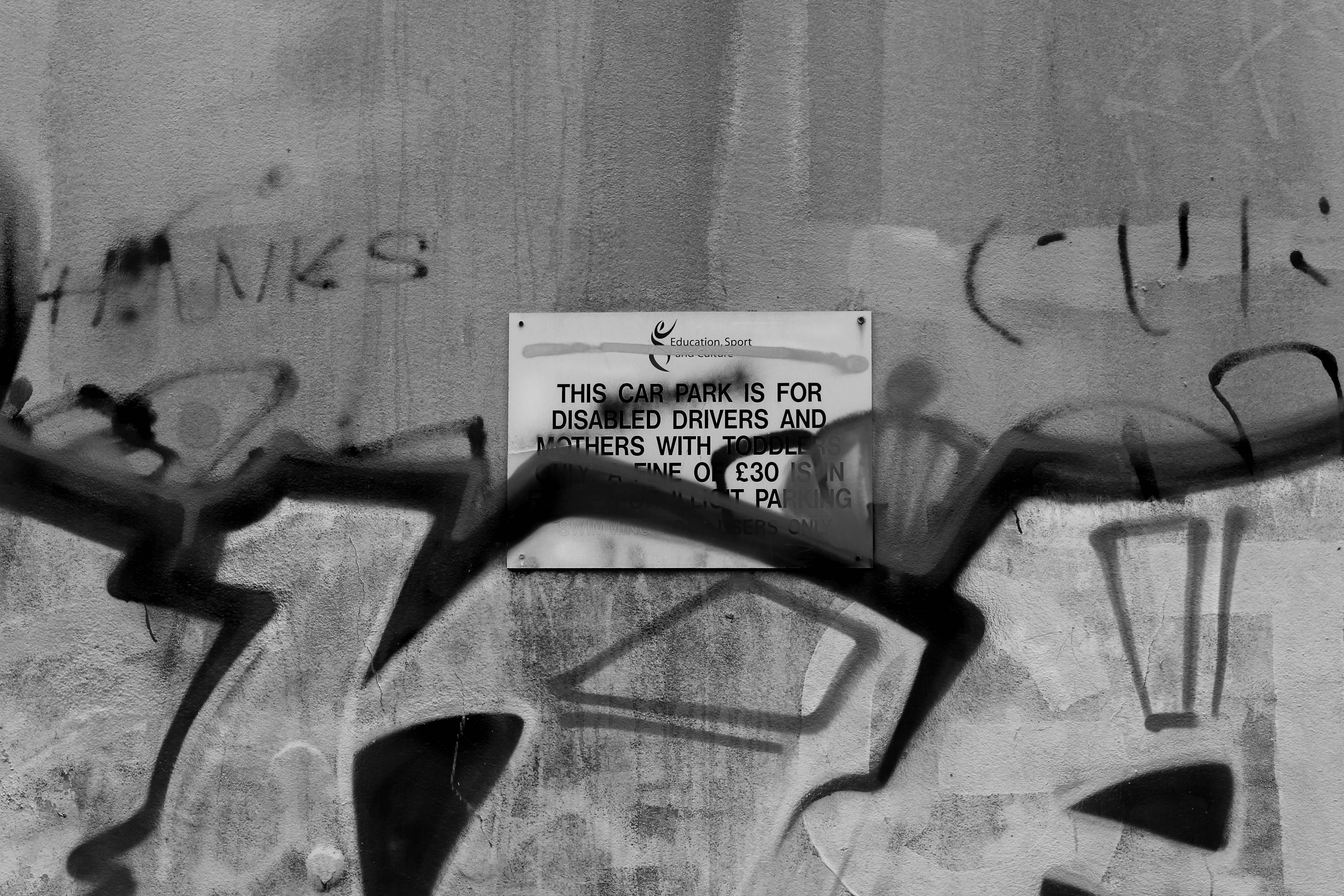
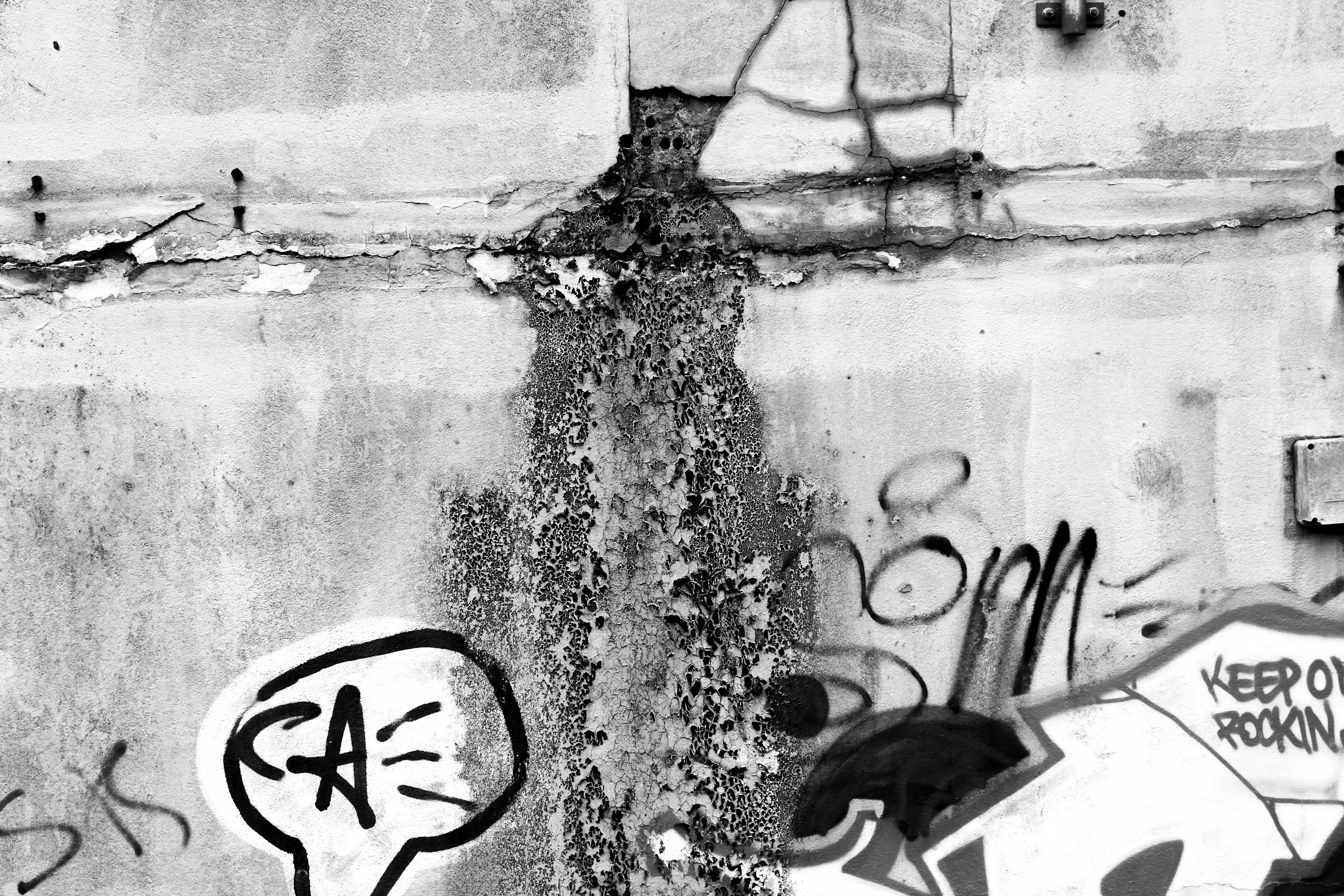
I thought these images would be more effective if i edited them black and white as i wanted to emphasise the dereliction and decay. By turning the image black and white i wanted to darken the shadows where the texture is and emphasise the decomposing of the wall. I like the bottom image as the mould shown looks like its pouring out of the cracks in the wall and the graffiti adds to the derelict look. The top image is also effective as it shows a sign officially put on the wall informing people about parking, and someone has spray painted over it, possibly reflecting how young people care about art and expressing their opinions about the future of St Helier.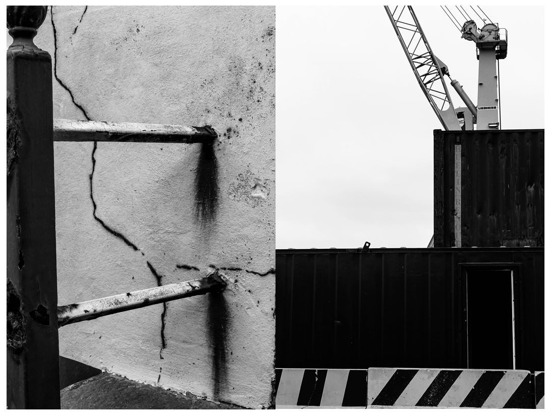
I also like these two images in black and white as they both show structural shapes, the left image portraying more dereliction on the side of a building, shown through the rusting and cracks in the wall, the right image showing objects and machines that are still being used, both images creating a juxtaposition. The image on the left is more effective in black and white as it further emphases the rusting from the metal bars when contrasted the the wall behind and the cracks in the walls are also highlighted. The bold vertical bar along the left of the image creates a division, adding to the differing of lines and angles in the photo. I like the image on the right as it shows two creates stacked onto of one another with a crane behind it, creating a shape that looks like they’ve been conjoined. The striped wall along the bottom of the image is effective as it shows a contrasting pattern compared to the other objects in the image and the colour links together with the crane creating a more balanced and aesthetically pleasing image. I particularly like the composition of this photo as everything is based on the right side on the image with the negative with space on the left.
I next experimented with the threshold in the images making them more bold and structural with only white and black being used in the photos.
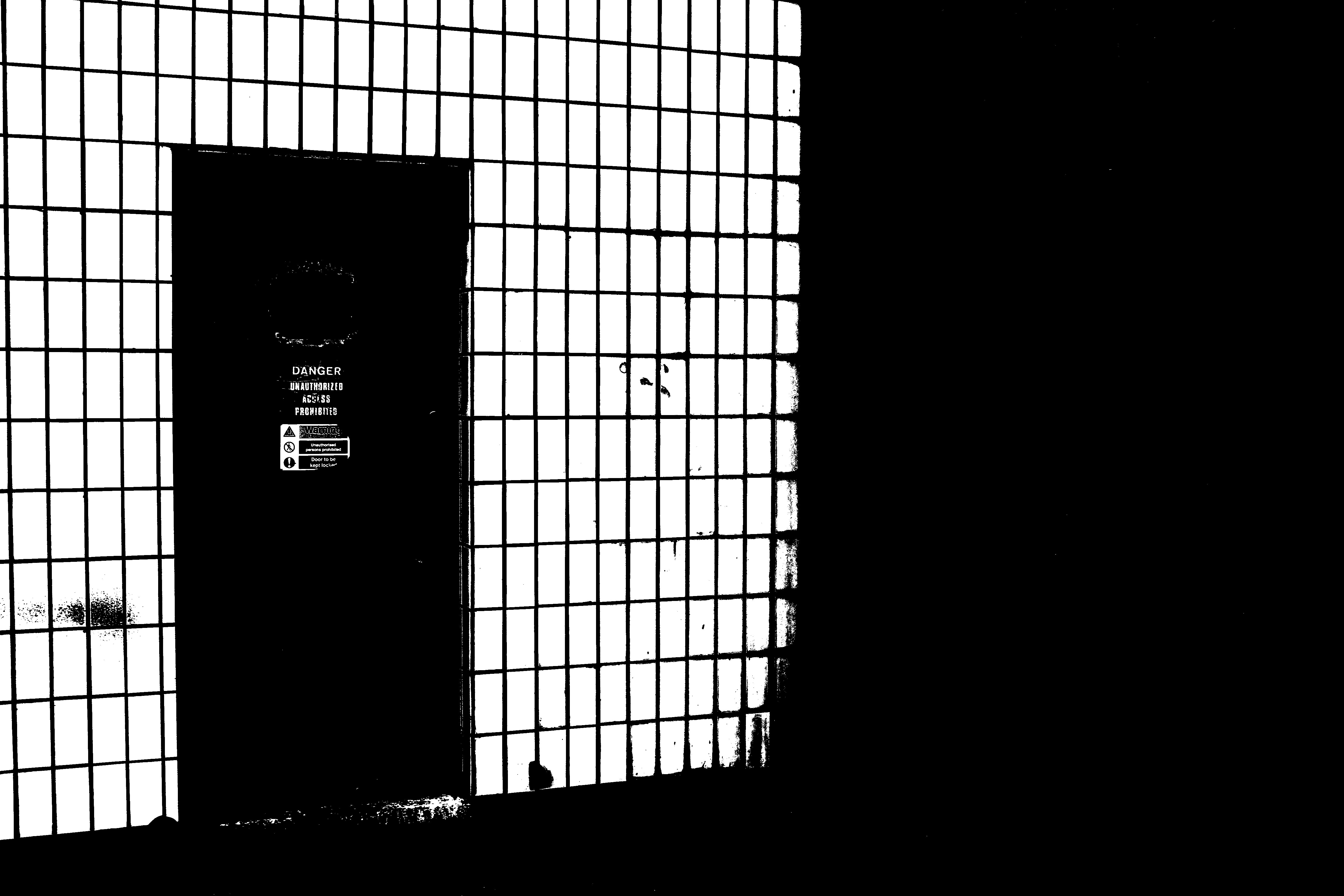
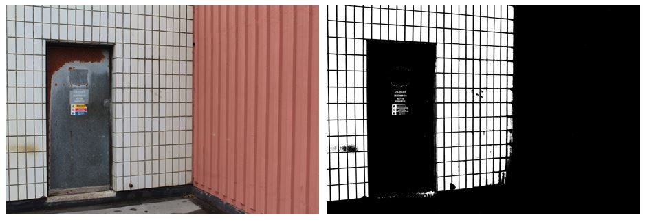
I think that the edited image where i changed the threshold is much more effective than the original image as it emphasises the industrial theme that i want my project to follow. The contrasting black and white lines are a lot more noticeable on the right image as the black in darken and the white it brightened. On the left image there are a lot more neutral tones in colour like the pink wall on the right and the brown rust on the silver door which is completely invisible on the right image, giving it more of a minimalistic but impactful look. The right hand side of the image is completely black out, making nearly half of the image one solid colour, directly the audiences attention the the left. I prefer the right image as the edit gives it a more…. feel, the signs on the door still being visible and the white wall on the left looking more like a fence and the door leading out to nothing.
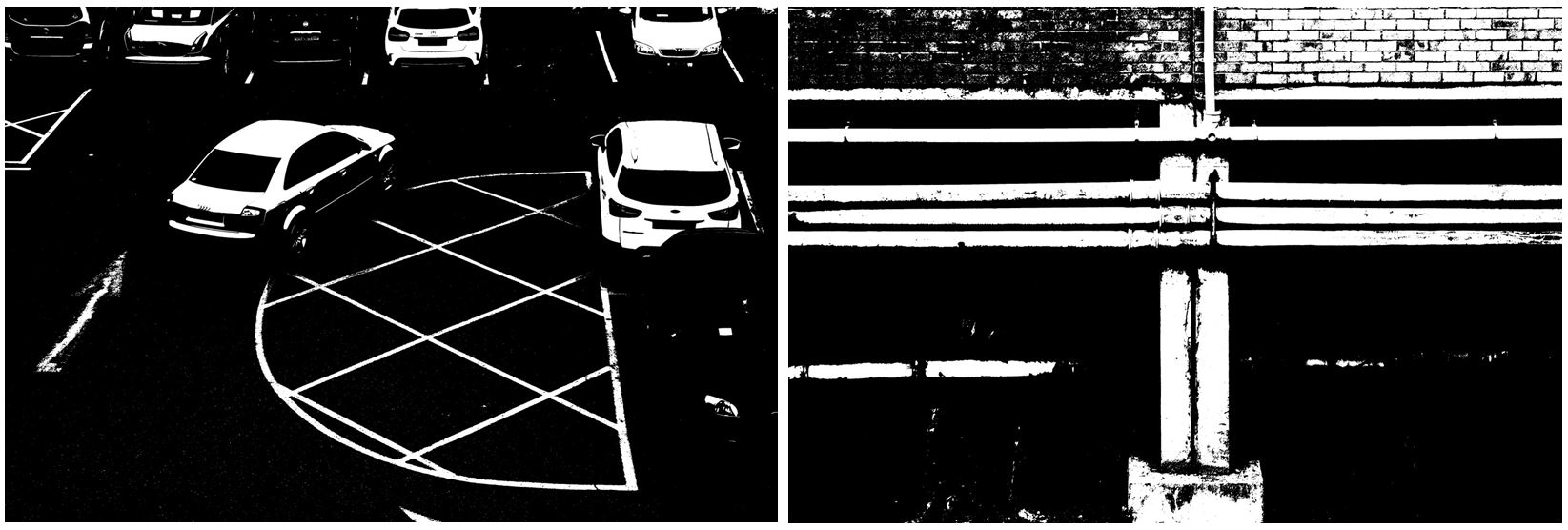
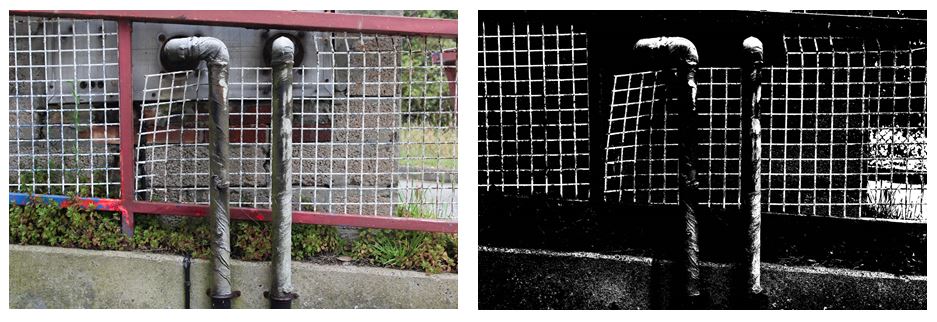
Changing the threshold in these images makes harder to figure out what the image is portraying and makes the lighter points in the image standout more than in the colour image, creating more of an overall impact . With the bottom to images i prefer the colour edit as it makes the images more interesting to look at with the bold red/pink lines and contrasting white bars creating a checkered effect. Also the two pipes in the center of the image are much more noticeable as they don’t blend into the black background, which is why only having 2 colours (black and white) in the right image isn’t as effective. The image on the right also shows more texture in the green leaves on the plants and the rusting on the silver pipes, compared to the left image where not much of this is seen. Although in the left image the bold, structural lines are emphasised more. The horizontal slope that the fencing is on is emphasised more by the solid black shapes ( where the plants are) which is then contrasted more with the vertical piping.