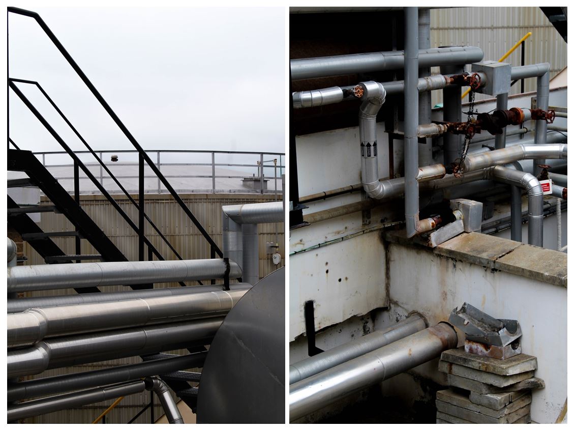
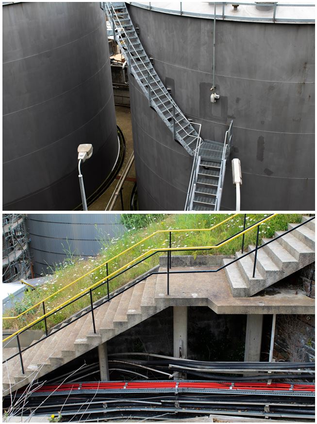
I reviewed all of my images I took on my St. Helier photoshoot and selected the top 100 images from throughout the day. When photographing these images I relaised I was drawn to the bold and abstract shapes and colours and how this contrasts with the background of some images.
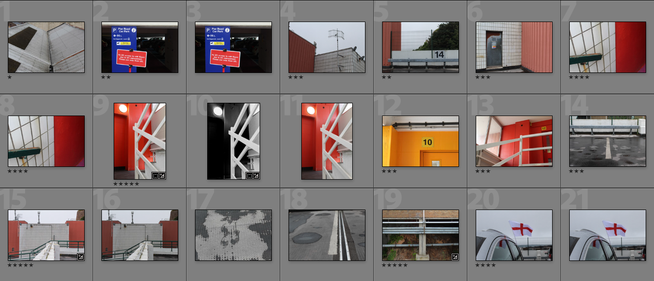
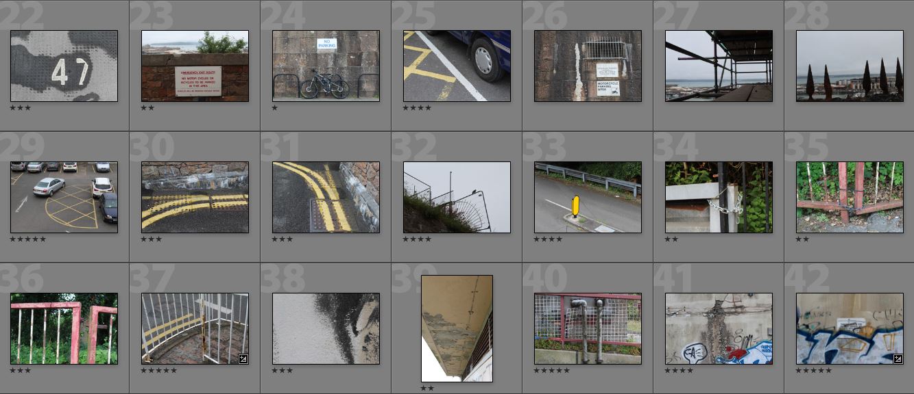
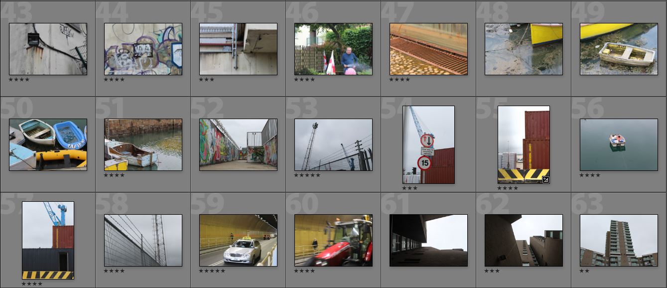
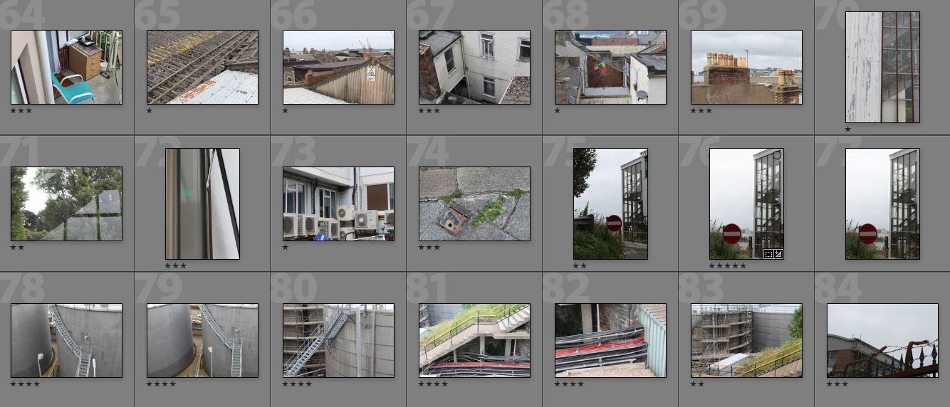
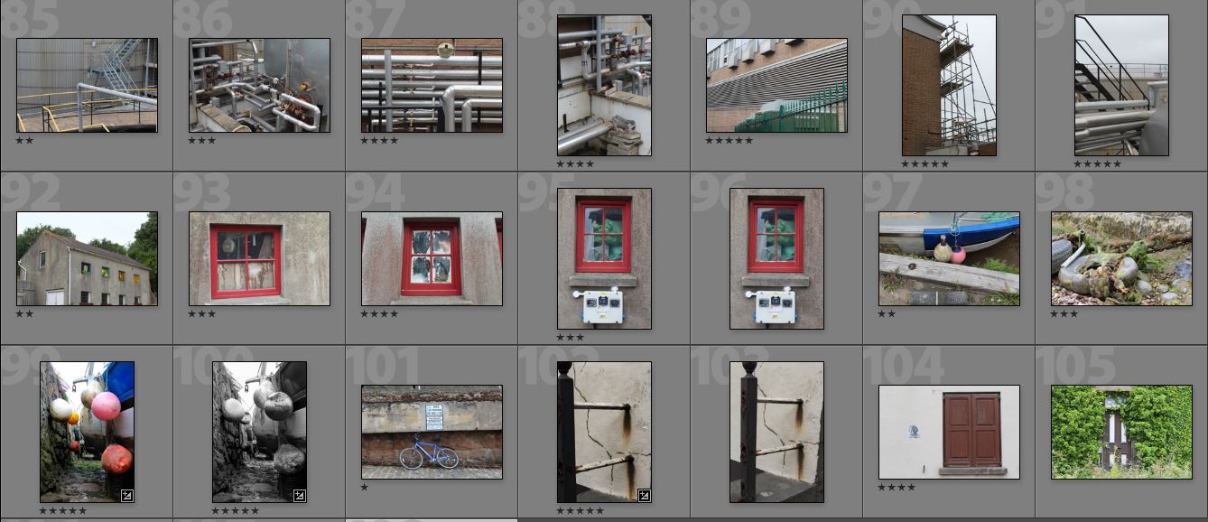
To develop these images I will pick a smaller selection and arrange them in an order together as I think the images I have collected all link together in a way. I wanted to focus on the parts of St Helier that people may not pay attention to in everyday life, similar to Luke Fowler.
Here are selection of my favourite images from the shoot:
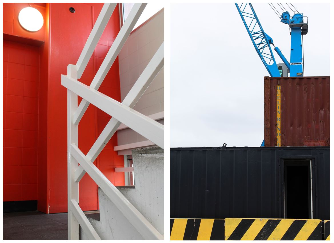
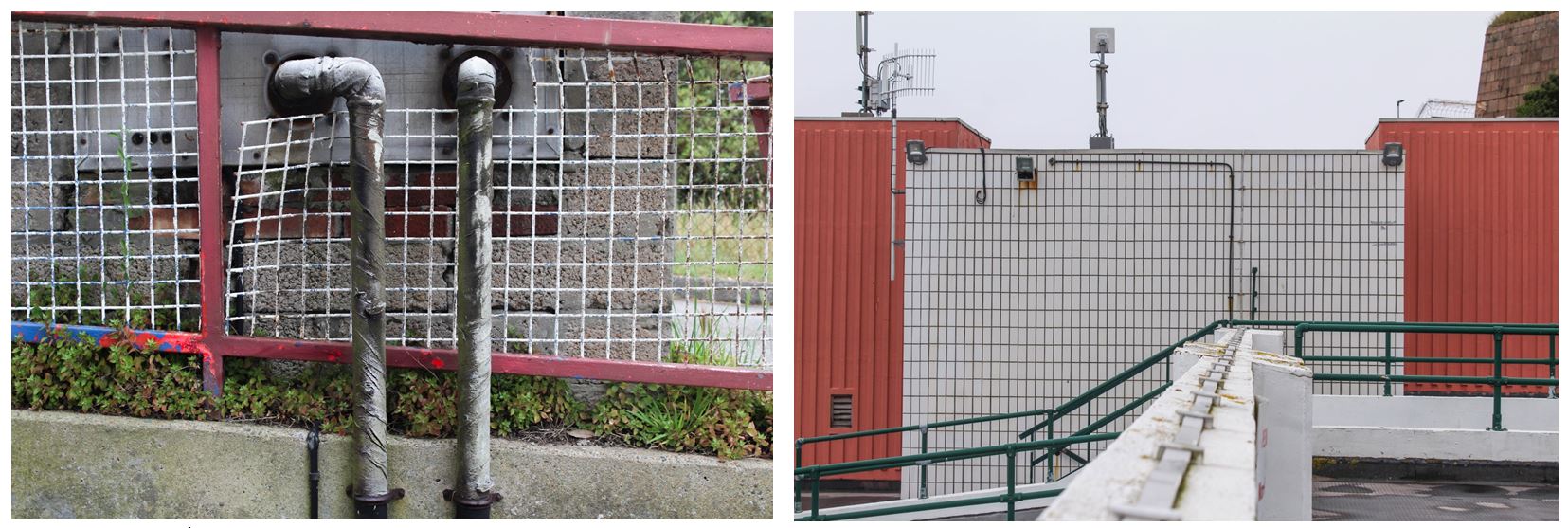
One of my favourite photo from this shoot was the image on the left.
Visual:
- I like this image due to its bold and structural lines and shapes that frame the photo. The right hand side has multiple bold white lines creating a crossed pattern to the middle of the image which is juxtaposed with the simple red wall behind and on the right if the image.
- The contrasts between the red wall behind the white railings gives the image a more abstract feel and only allowing the audience to tell what the shapes are because of the staircase in the bottom right hand side.
- The use of only three main colours in the image gives it a minimalistic appearance, focusing in the structural side.
- I also like the image of the right due to its industrial appearance with the crane and metal crates, focusing entirely on structures.
- The bold black and yellow wall along the bottom the he image contrasted with the rest of the quite dark colours in the image, making the wall more obviously a warning not to cross over.
- The composition in this image shows the structures in layers, starting from the yellow and black wall along the bottom, followed above by the entirely black crate going half way up the image. Above that is a smaller brown crate and a blue crate above. The different layers in the image create obvious divisons between each section, but the way all the shapes are together makes them look conjoined
Industrial Images:
